FRUITIME
鲜果时间
ART DIRECTOR: Nod Young / Guang Yu
DESIGNER: Wang Xiaoshuai / Jing Junjun
YEAR: 2023
CLIENT: FRUITIME
SPATIAL DIRECTION: Space Station
Across all eras and regions, food and drink have always been fundamental choices in daily consumption. Meals provide sustenance, and drinks quench thirst. But drinks also carry stories, weaving together experiences and narratives. Designing a brand for a beverage company is inherently a challenging task. How do we create a fruit and vegetable tea brand that appeals to the public's aesthetic sensibilities while standing out in a market saturated with similar designs? Before beginning the design process, we revisited the essential question: "Why do people buy a cup of fruit and vegetable tea?"
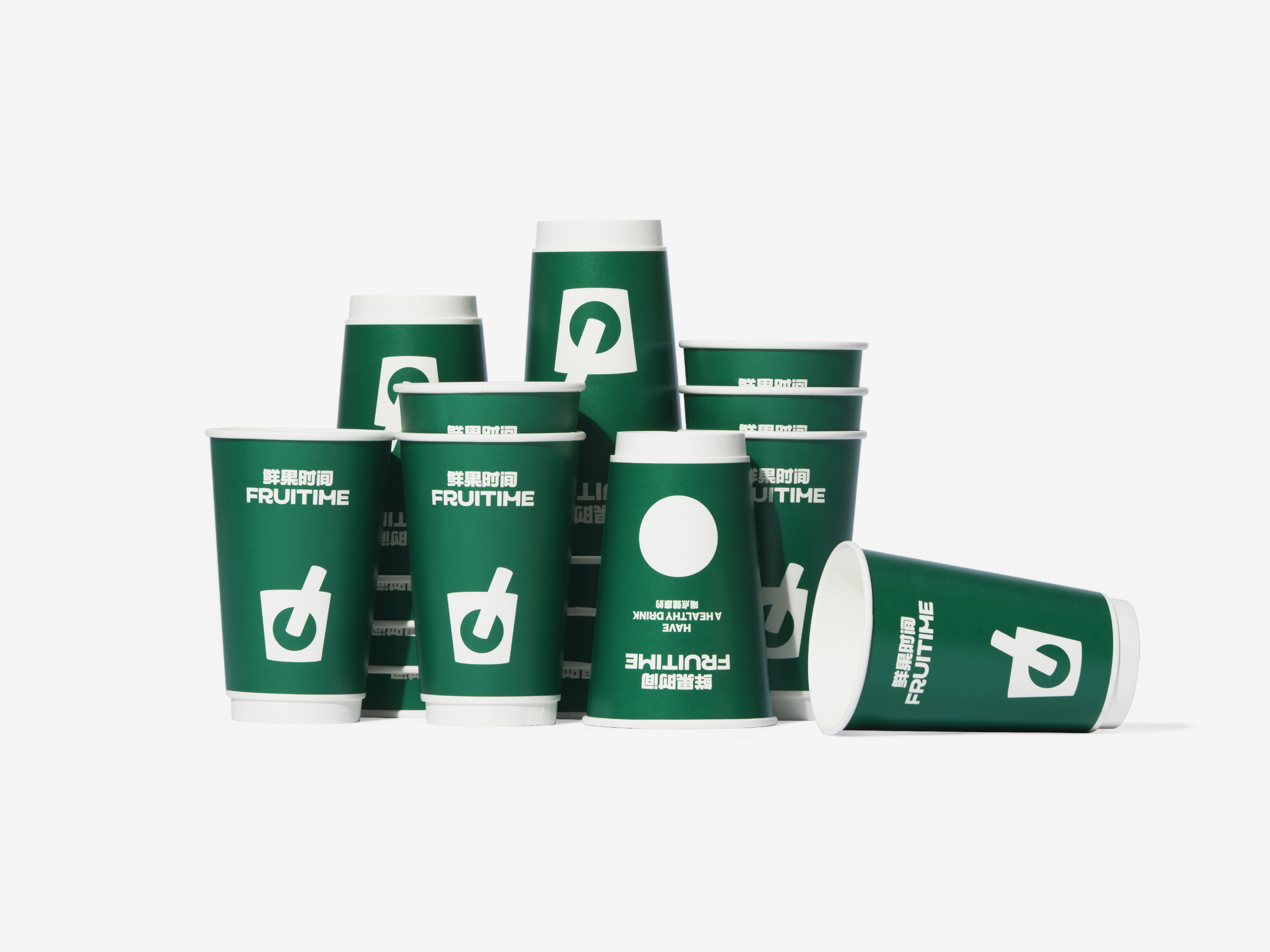
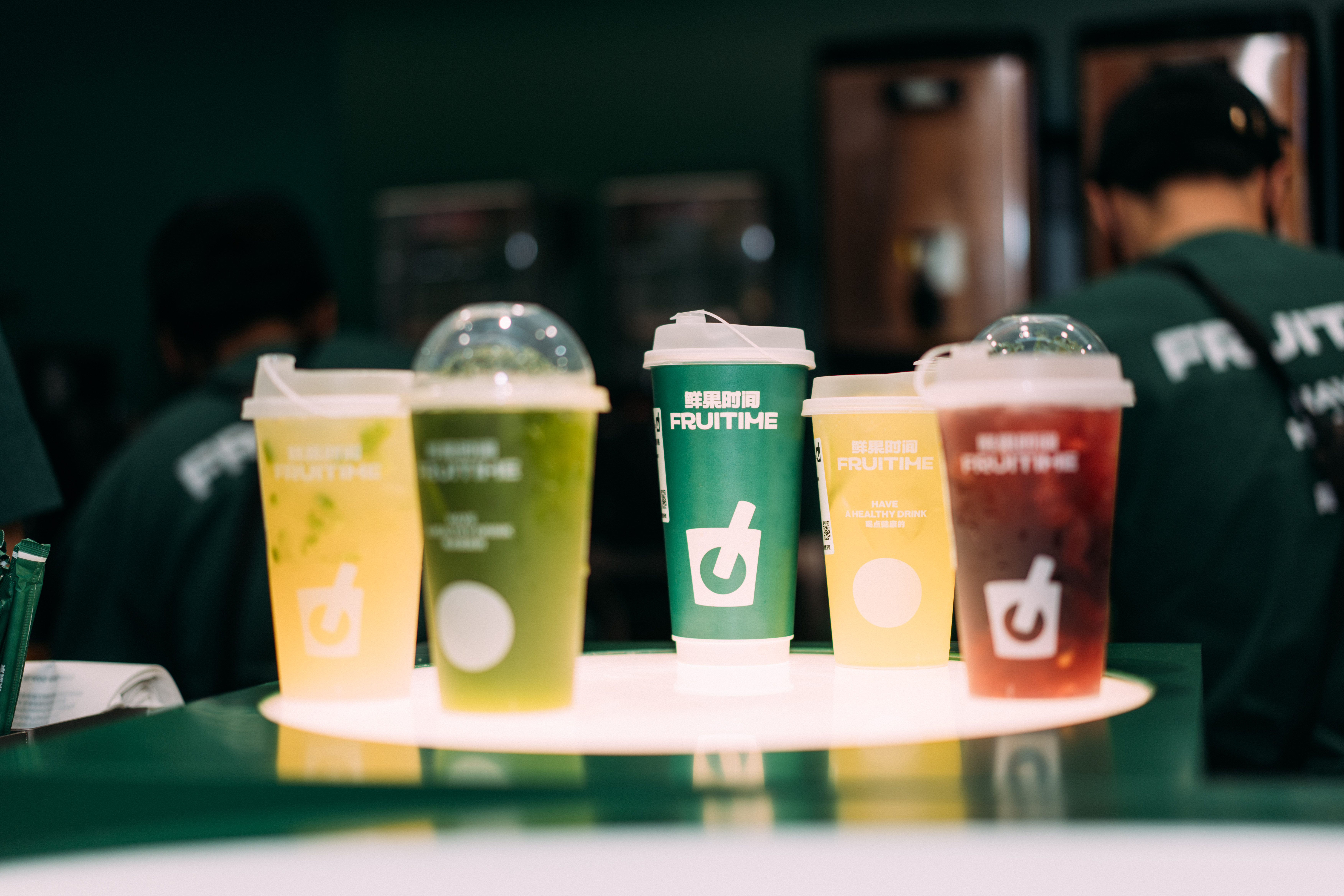
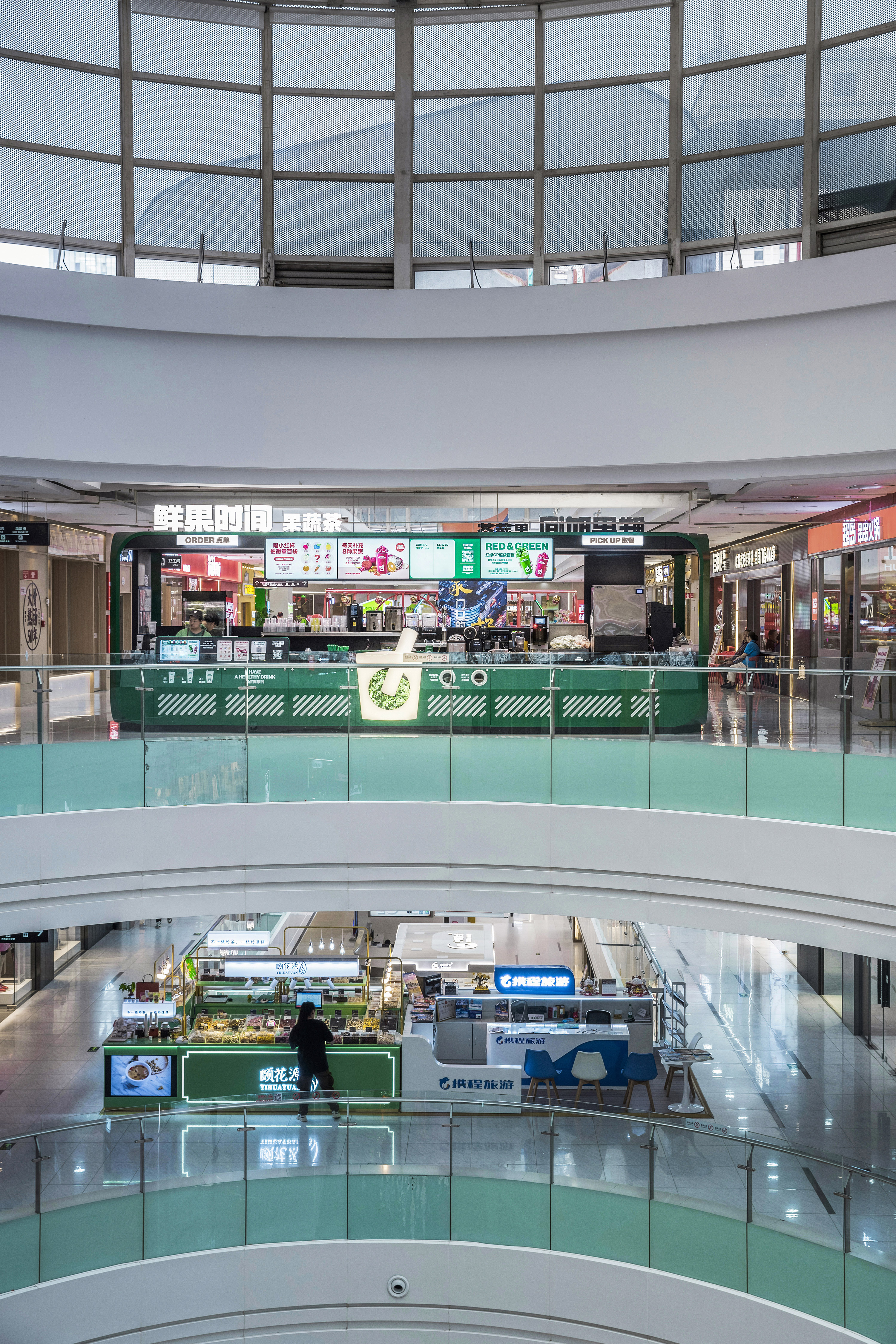
Satisfying thirst and cravings are among life’s most basic desires. Beyond that, the unique tastes associated with fruit and vegetable teas—often accompanied by interesting textures, such as chewable elements—and their rich nutritional value are key factors that attract consumers. We believe that one of the goals of design is to recreate this drinking experience. Are you thirsty? Have a drink. Do you love the taste of oranges? Take a sip. These are instinctive consumer decisions, not complex brand narratives. Therefore, how do we convey the essence of fruits and vegetables? Perhaps the most straightforward way is to visualize inserting a straw directly into a peach. It’s a fresh, appetizing image that immediately conveys the product's appeal.
By placing this image on the cup, we create a logo that is fresh, intuitive, easily recognizable, and memorable. We want the "Fruit Time" logo to evoke drinkability, much like how a knife-and-fork symbol is universally recognized as representing dining spaces. To enhance the design, we refined details by adding subtle curves to improve perspective. The straw doesn’t pierce through the fruit, preserving its completeness and making it appear more nutritious and delicious.
This new logo and brand concept align with the core qualities of the product—freshness, health, vitality, and quality—without resorting to convoluted storytelling. In today's crowded fruit and vegetable tea market, where consumers are often overwhelmed by a barrage of terms and concepts, we believe in simplifying the message. A clear, consistent voice that resonates with consumers fosters trust and builds brand loyalty.
在任何时代、任何地区,餐饮一直是人们最熟悉、最频繁的一种消费选择。餐,即食物;饮,即饮品。饮品,蕴含了无尽的故事线索,衍生出一系列情节和内容,相应地,有关饮品的设计更是层出不穷。因此,为一家饮品企业打造全新的品牌形象是一个极具挑战性的任务。如何设计出一款既符合公众审美习惯又可以脱颖而出的果蔬茶饮品牌形象,以及,当面对市面上百家争鸣的同质化设计,如何确保独树一帜的识别度和记忆度——在着手开始设计前,我们重新审视了“人们为何购买一杯果蔬茶饮”这个最为根本的问题。
解渴和解馋,属于生活中最基本的欲望,与此同时,果蔬茶饮对应的不同口味、包括可能出现的“咀嚼”等特殊口感体验和丰富的营养价值,都是吸引消费者购买的关键因素。我们相信设计的使命之一就是去还原这种饮用的体验。口渴了吗?来一杯。喜欢橙子味道吗?来一杯……这些都是出自本能的消费选择,而非多么繁复的品牌故事。因此,如何让人们感受到果蔬的吸引力呢?最直接的方式不就是将吸管直接插入果蔬、例如一颗桃子当中吗?这无疑是最能体现新鲜与美味的画面了。进而,将这一画面置于杯子上,便得到了一种最新鲜、最直观、最易识别也过目不忘的标志形态。我们希望“鲜果时间”的标志能极富饮用这一本能,也就是说,它应当可以成为公共空间的识别标志(如:代表餐饮区的标识“刀叉”)。同时,在细节上我们对标志进行了优化处理,例如,添加一些必要的曲线,以增强透视效果;吸管没有贯穿水果,这使得水果的形象更加完整,看起来也更为营养美味。更贴近本能的新标志与品牌理念,摒弃了繁琐的“故事弯路”,直接传递产品的核心特质:新鲜、健康、活力、高品质。在我们看来,简化品牌形象传播过程中的信息尤为重要,尤其是在当今果汁果蔬茶饮市场,当消费者已经被各种概念和名词搞得晕头转向时,一个坚定、一致的声音及其回响,将使人们更容易产生信任感和认同感。
解渴和解馋,属于生活中最基本的欲望,与此同时,果蔬茶饮对应的不同口味、包括可能出现的“咀嚼”等特殊口感体验和丰富的营养价值,都是吸引消费者购买的关键因素。我们相信设计的使命之一就是去还原这种饮用的体验。口渴了吗?来一杯。喜欢橙子味道吗?来一杯……这些都是出自本能的消费选择,而非多么繁复的品牌故事。因此,如何让人们感受到果蔬的吸引力呢?最直接的方式不就是将吸管直接插入果蔬、例如一颗桃子当中吗?这无疑是最能体现新鲜与美味的画面了。进而,将这一画面置于杯子上,便得到了一种最新鲜、最直观、最易识别也过目不忘的标志形态。我们希望“鲜果时间”的标志能极富饮用这一本能,也就是说,它应当可以成为公共空间的识别标志(如:代表餐饮区的标识“刀叉”)。同时,在细节上我们对标志进行了优化处理,例如,添加一些必要的曲线,以增强透视效果;吸管没有贯穿水果,这使得水果的形象更加完整,看起来也更为营养美味。更贴近本能的新标志与品牌理念,摒弃了繁琐的“故事弯路”,直接传递产品的核心特质:新鲜、健康、活力、高品质。在我们看来,简化品牌形象传播过程中的信息尤为重要,尤其是在当今果汁果蔬茶饮市场,当消费者已经被各种概念和名词搞得晕头转向时,一个坚定、一致的声音及其回响,将使人们更容易产生信任感和认同感。


Images Copyright © 2024 FRUITIME, Space Station. All Rights Reserved.
GUOXIAOFAN
果小凡
ART DIRECTOR: Guang Yu / Nod Young
DESIGNER: Xu Mingru / Feng Shiwen
YEAR: 2023
CLIENT: 百瑞源
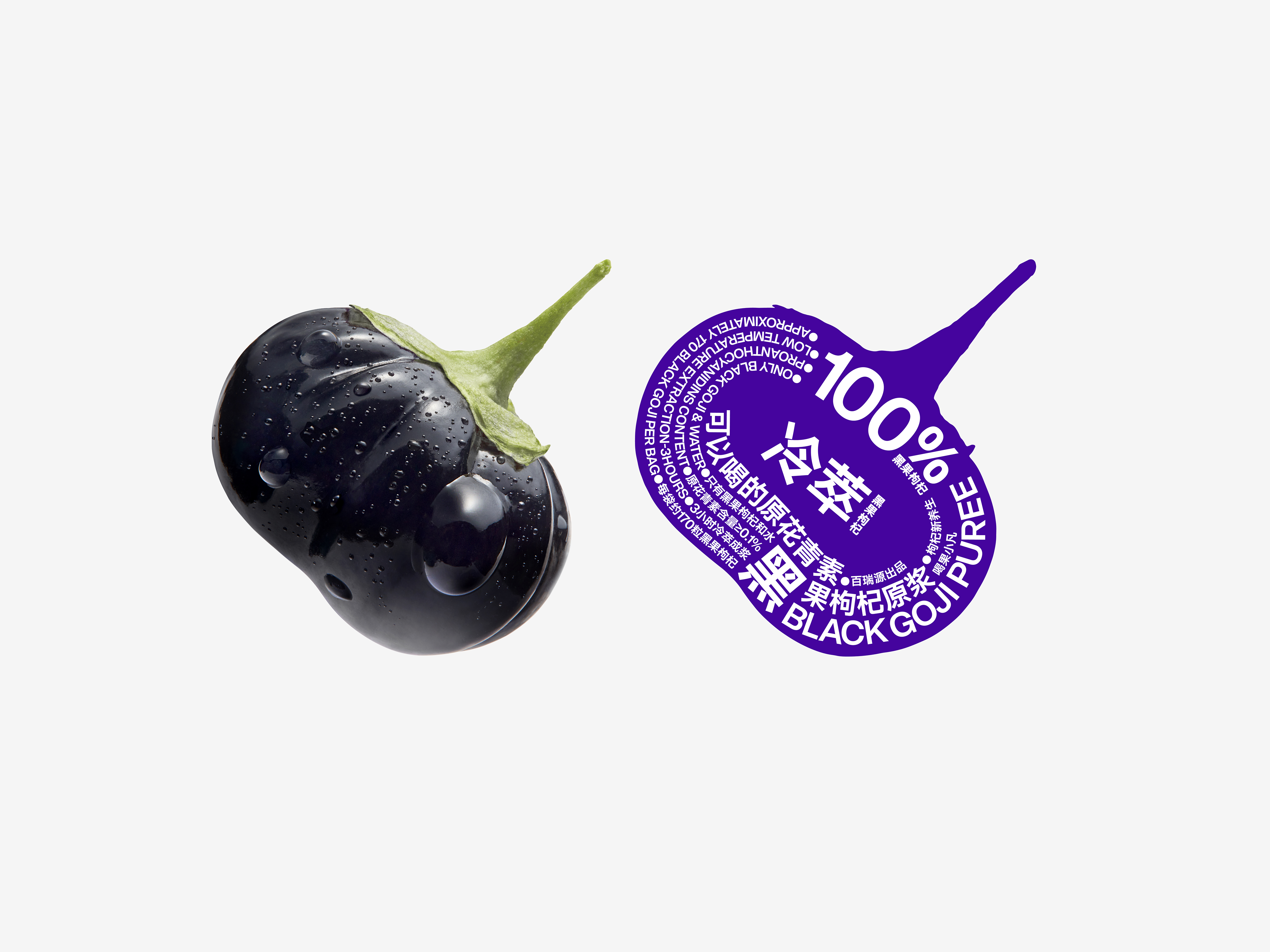
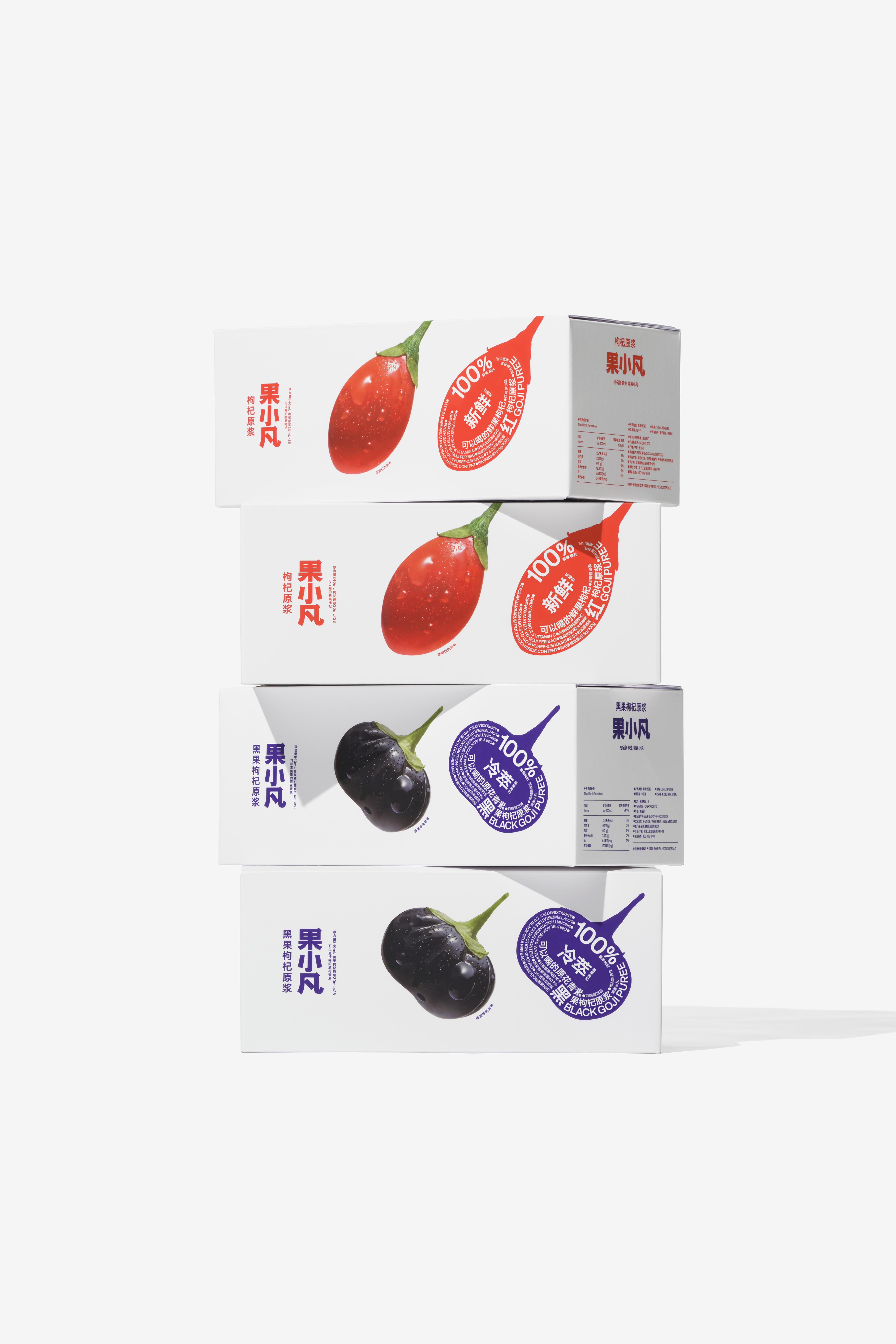
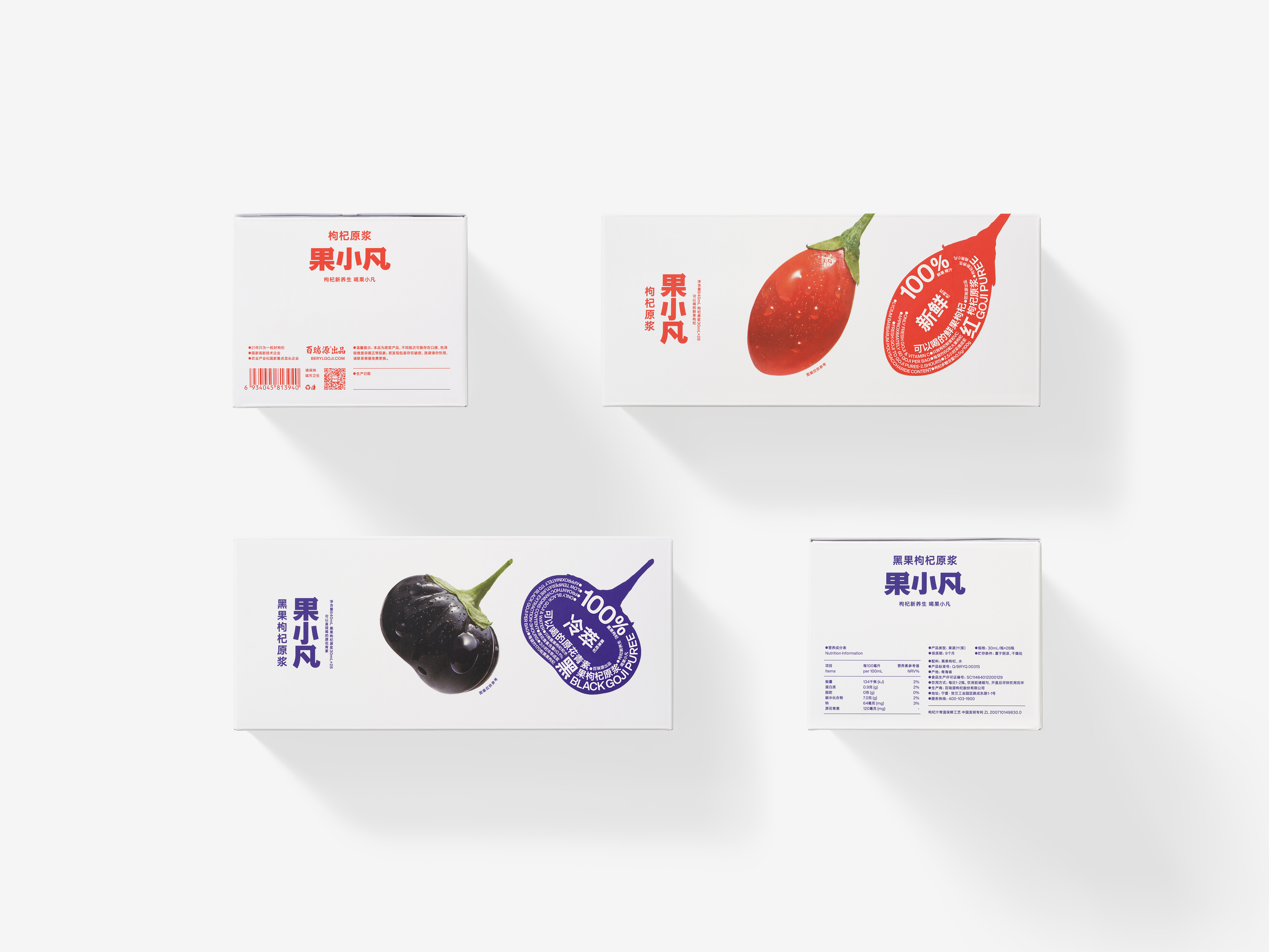
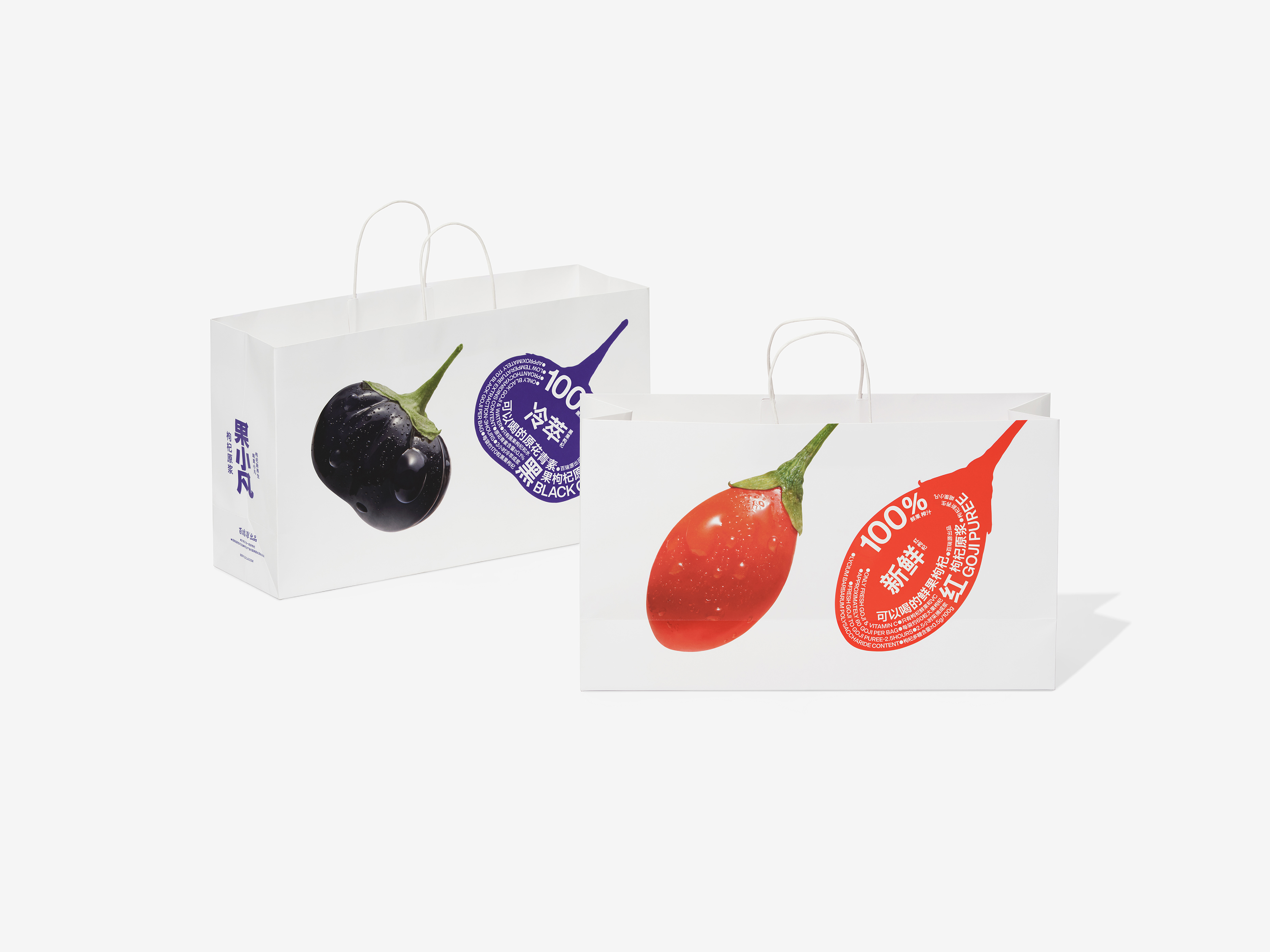
Known as the "red treasure", wolfberries originated in China and have a long history of medicinal use, and now it is gradually being recognized worldwide for its unique nutritional value. As we all know, the best quality wolfberries come from Ningxia, China. As a leading enterprise in wolfberry processing in Ningxia, Berylgoji is also a top brand in the wolfberry industry. In recent years, with the introduction of advanced digital production lines and the shift to intelligent automated production, Berylgoji launched the "lock fresh wolfberry" under the sub-brand "Guo Xiaofan" . This wolfberry pulp, with its easily absorbed small molecules and convenient packaging, not only modernizes the traditional way of consuming wolfberries but also appeals to a younger generation of health-conscious consumers. In particular, the set of "early red and late black" wolfberries, has become a popular choice among the younger generation seeking health benefits.
In the design process of Guo Xiaofan, we focused on reshaping consumers' perception of wolfberry products. Traditionally, wolfberries are seen as dry and rough, but fresh wolfberry pulp is fresh and juicy, which is a subversion of the traditional impression. We aim to introduce a plump,fresh, and vivid image of the wolfberry, which not only meets the design needs of the innovative "lock fresh wolfberry" category, but also meets the general recognition of consumers for "high quality, true nutrition and great taste". To achieve this, we placed a huge, fresh wolfberry on the packaging to strengthen the product’s image and entice consumers. The text is designed to follow the contours of the fruit, creating a visually appealing structure that reinforces the freshness and deliciousness of the product.
From the perspective of design style, Guo Xiaofan is modern, pioneering and bold, but in terms of conveying product characteristics, it also upholds the common simplicity and straightforwardness in traditional narratives. The story of Guo Xiaofan is direct and unembellished, using the pure and essential image of fresh fruit to capture consumers' attention and emphasize the tenderness and freshness of the wolfberry itself.
有“红宝”之称的枸杞原产于中国,它拥有悠久的药用历史,如今凭借独特的营养价值逐渐走向全球。众所周知,品质最为优异的枸杞出自中国宁夏,作为宁夏本土枸杞深加工的龙头企业,百瑞源也是枸杞行业的领军品牌。近年来,随着高端数字化生产线的导入和智能化自动化生产模式的实现,百瑞源推出了“锁鲜枸杞”新品“果小凡”枸杞原浆,其小分子易吸收的优势与方便携带的特点,不仅更新了枸杞传统的食用方式,也收获了一众更为年轻的消费群体。尤其是套装“早红晚黑”,成为追求健康的年轻一代首选的枸杞消费产品。
在果小凡的设计过程中,我们始终思考如何能够重塑消费者对于枸杞产品的认知。以往,枸杞在大众脑海中的形象是干瘪粗糙的,而枸杞原浆则是新鲜多汁的,是对传统印象的颠覆。我们希望推出一个新鲜、圆润、多汁甚至明亮的枸杞形象,不仅满足了创新品类“锁鲜枸杞”的设计需求,也契合消费者对于“高品质、真营养、好口感”的普遍认知。为此,我们将一枚巨大的、新鲜的枸杞放置在包装上,强化新鲜枸杞形象的同时激发消费者对产品的食欲;文字的设计是紧贴果实轮廓的,如此营造出一种饱满的视觉结构,更加强化了锁鲜、可口的产品优势。
从设计风格的角度来看,果小凡是现代的、先锋的、大胆的,但在产品特质的传达方面,它又秉承了传统叙事里的常见的朴素与直白。果小凡的“故事”本就如此质朴无华,借助最为本质纯粹的果实形象,我们让消费者的目光就聚焦在那颗真真切切、水嫩新鲜的枸杞身上。


All Images Copyright © 2024 GUOXIAOFAN. All Rights Reserved.
Alipay 支付宝
ART DIRECTOR: Guang Yu / Nod Young
DESIGNER: Liu Xianping
YEAR: 2024
CLIENT: Alipay
Alipay, established in 2004 by the Alibaba Group. It offers a wide range of financial services, including online payments, money transfers, wealth management, and credit management, enabling seamless transactions for individuals and businesses. Users can complete payments, receive funds, pay utility bills, and manage investments via its mobile app, enjoying a convenient cashless lifestyle. With over 1 billion users worldwide, Alipay ranks among the top digital payment platforms globally. As a crucial tool in China’s digital economy, it is widely applied in daily life and business scenarios.
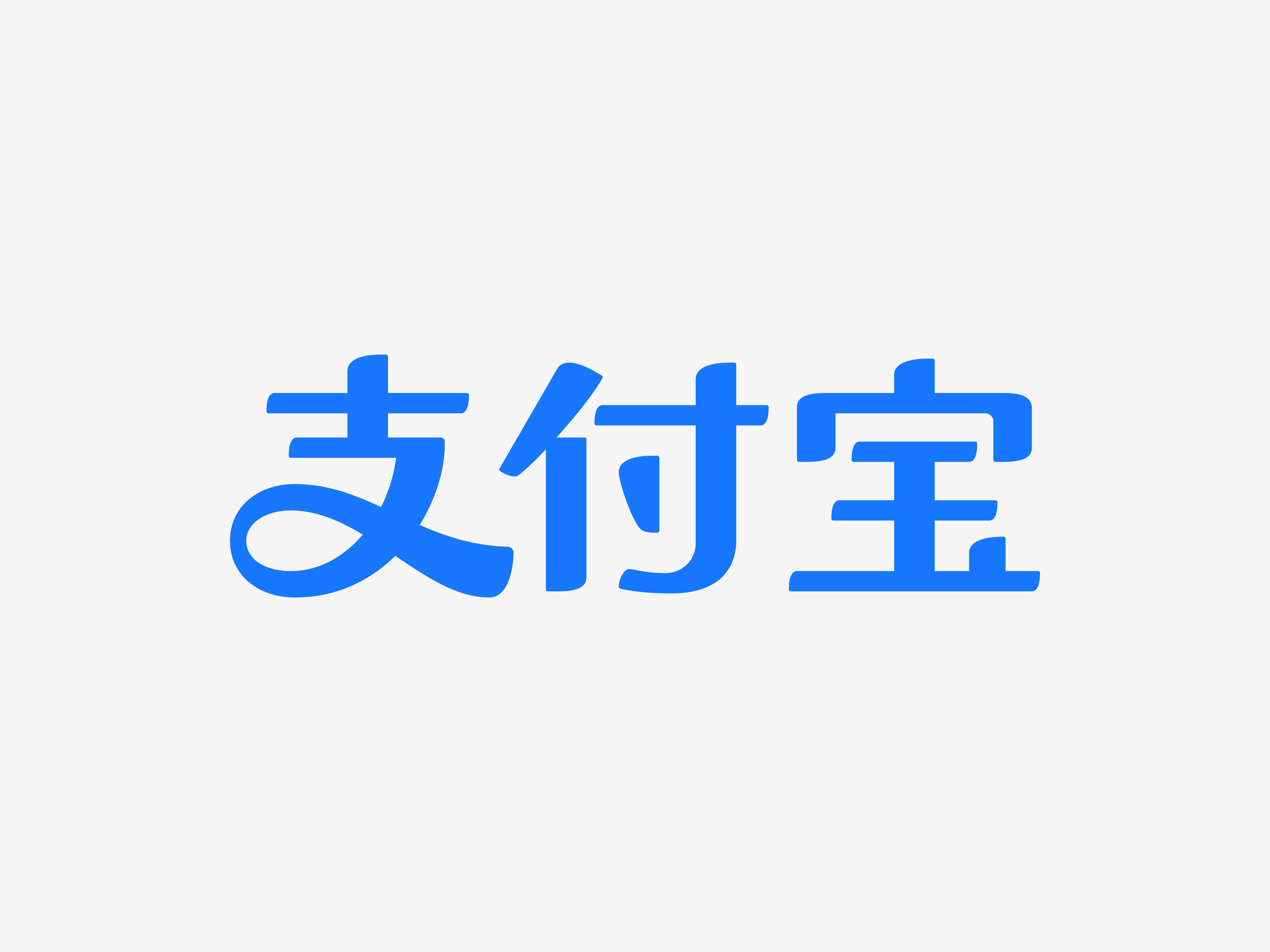
Having a set of executable, standardized VI system is a necessary visual asset for all mature enterprises. We are proud to have completed the optimization and visual specifications of the brand identity for Alipay. The font logo, featuring the iconic "支" (branch) character, has been a cornerstone of Alipay's identity since its inception, earning widespread recognition and fostering a deep sense of trust among users. While maintaining the brand’s visual integrity, we refined and restructured the character's proportions, local details, and overall design. Drawing from the contemporary official script style of "支," we expanded the full "支付宝" (Alipay) name to meet the demands of various future online and offline applications across different channels and contexts.
Having a set of executable, standardized VI system is a necessary visual asset for all mature enterprises. We are proud to have completed the optimization and visual specifications of the brand identity for Alipay. The font logo, featuring the iconic "支" (branch) character, has been a cornerstone of Alipay's identity since its inception, earning widespread recognition and fostering a deep sense of trust among users. While maintaining the brand’s visual integrity, we refined and restructured the character's proportions, local details, and overall design. Drawing from the contemporary official script style of "支," we expanded the full "支付宝" (Alipay) name to meet the demands of various future online and offline applications across different channels and contexts.
支付宝由阿里巴巴集团于2004年创立。它提供包括在线支付、转账、理财和信用管理在内的多种金融服务,为个人和商家提供便捷的交易体验。用户可以通过其手机App完成支付、收款、水电缴费和投资管理,享受便利的无现金生活方式。支付宝全球用户超过10亿,位列世界顶级数字支付平台之一。作为中国数字经济的重要工具,它已广泛应用于日常生活和商业场景。
拥有一套可被执行的、标准化的VI体系,是所有成熟企业必备的视觉资产。我们很高兴为支付宝完成这次品牌标识的优化与视觉规范的升级工作。支付宝在应用中最为常见的“支”字,其字体标识自创立以来,已经形成广泛的认知度,在用户心目中树立起极高的信任感。我们在确保品牌视觉印象并无损失的前提下,在“支”字的架构关系、局部细节以及物理比例上展开精细化打磨和重构。在“支”字的当代隶书风格基础上,拓展出“支付宝”三个字的全称,以满足未来线上与线下多渠道、多场景的应用所需。
拥有一套可被执行的、标准化的VI体系,是所有成熟企业必备的视觉资产。我们很高兴为支付宝完成这次品牌标识的优化与视觉规范的升级工作。支付宝在应用中最为常见的“支”字,其字体标识自创立以来,已经形成广泛的认知度,在用户心目中树立起极高的信任感。我们在确保品牌视觉印象并无损失的前提下,在“支”字的架构关系、局部细节以及物理比例上展开精细化打磨和重构。在“支”字的当代隶书风格基础上,拓展出“支付宝”三个字的全称,以满足未来线上与线下多渠道、多场景的应用所需。
Kasimir
卡西米尔
ART DIRECTOR: Guang Yu / Nod YoungDESIGNER: Wang Xiaoshuai / Wang Anan
YEAR: 2023
CLIENT: Kasimir
Taking pencils as an example, more than 70% of the world's annual production of approximately 15 billion pencils is made in China. As China's largest pencil manufacturer, Hongxing Stationery produces around 3 billion pencils each year, accounting for 15% of global production. Kasimir, a new stationery brand launched by Hongxing Stationery founded in 2021, not only meets the evolving needs of the young generation in study and life, but also strives to explore the infinite possibilities of stationery categories. It is committed to becoming a high-quality domestic stationery brand suitable for all ages.
We position Kasimir as a professional stationery brand with a smooth, clear and enjoyable user experience at its core, and this concept is inspired by the benefits that "a good pen" can provide.
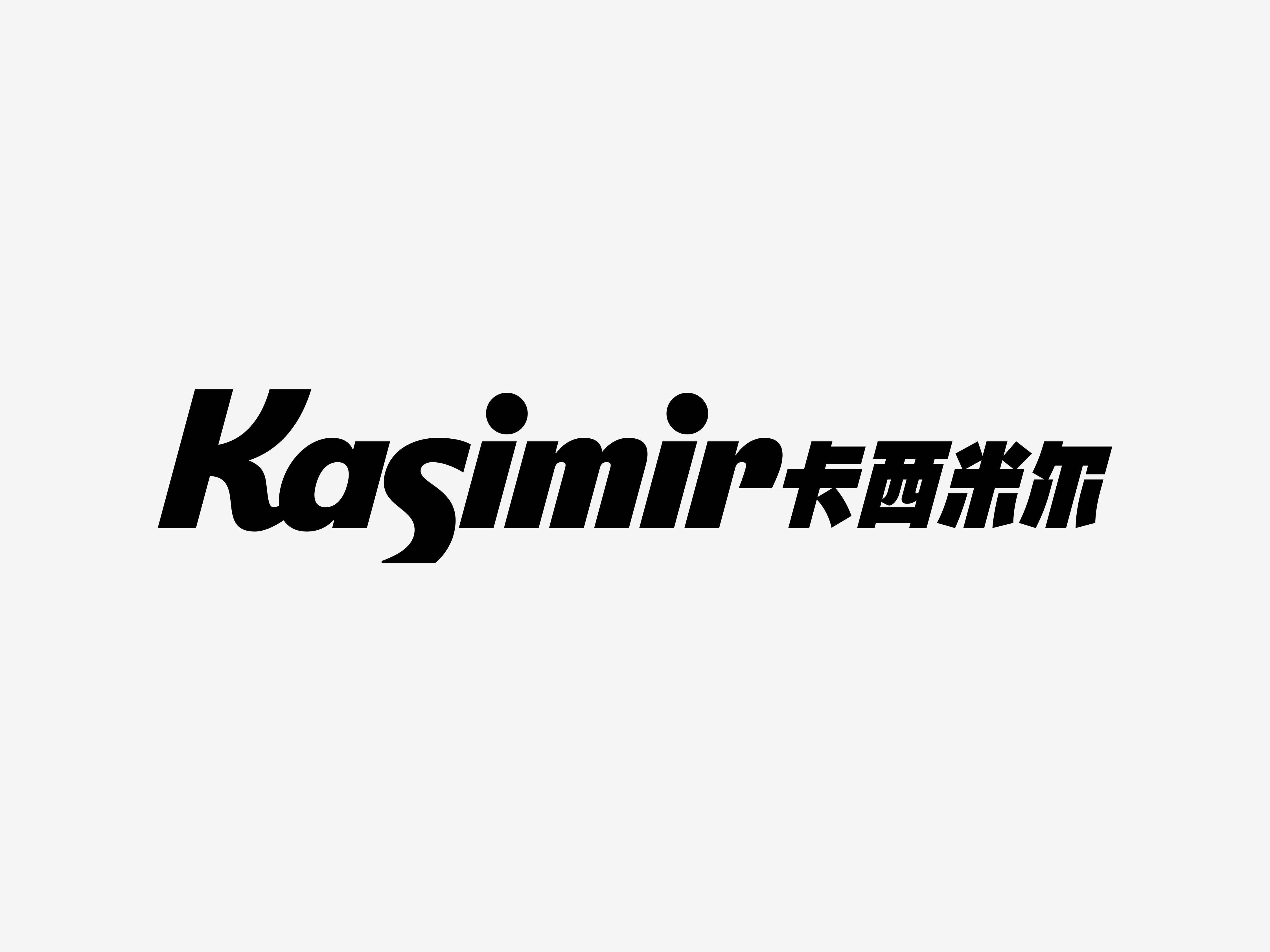
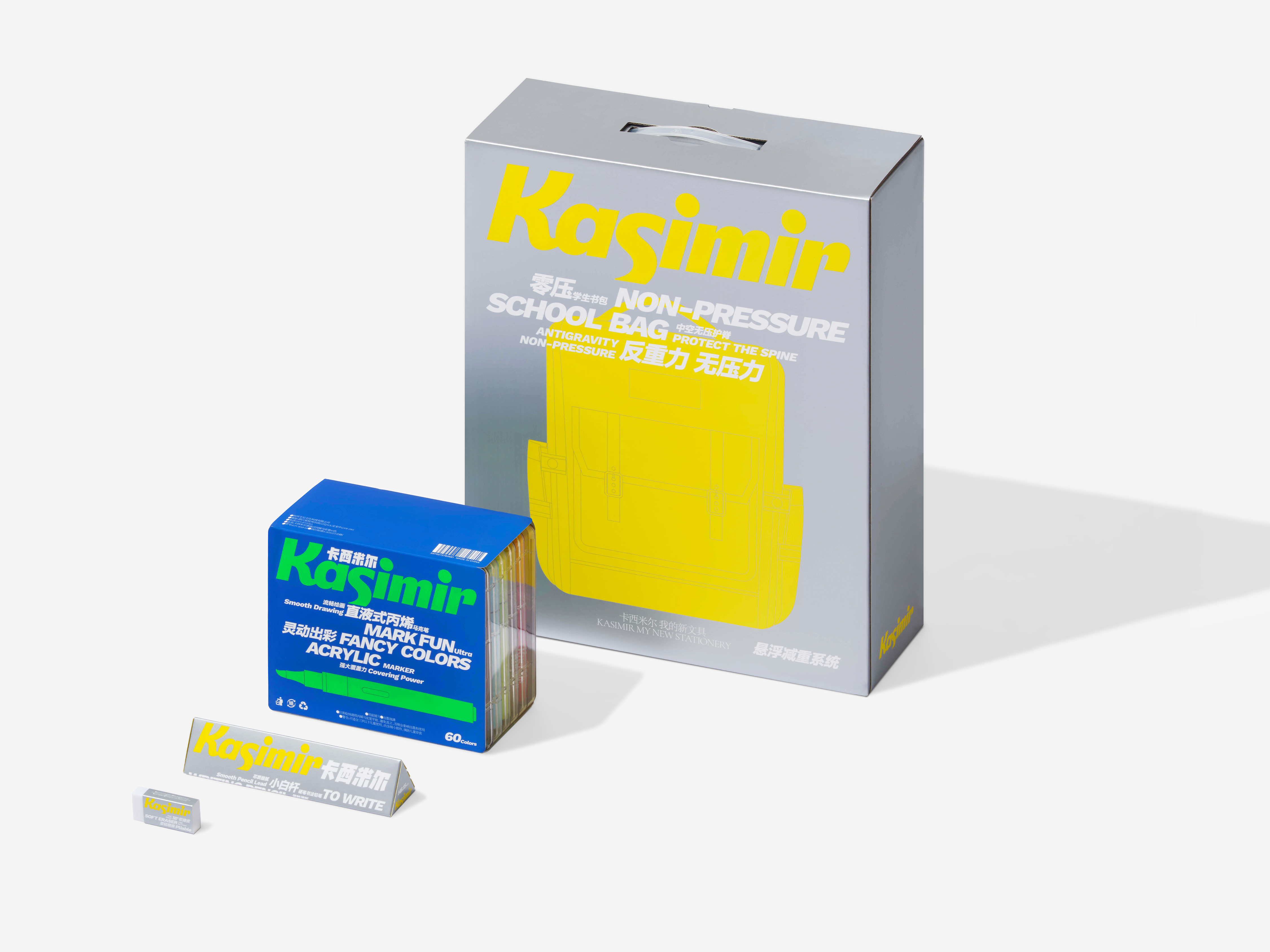
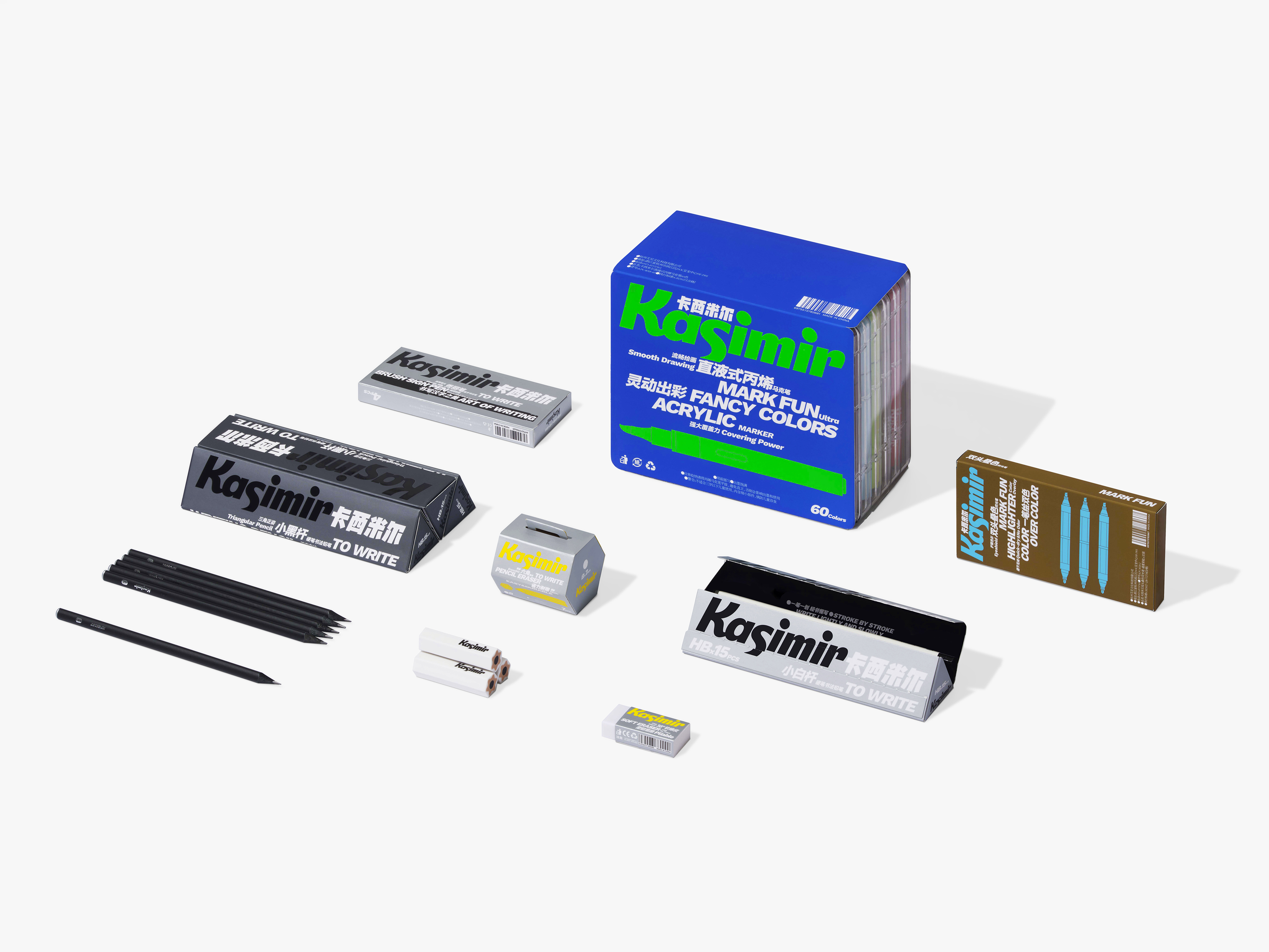
In the design of the brand identity, we integrated the sensation of writing into the font design, exaggerating the "K" and "S" to enhance both information clarity and the expressive brushstroke qualities that highlight the brand’s stationery attributes. To further convey the "smooth" experience, the logo design adopts the italic way, as one of the design elements, which has become the core element of Kasimir's visual recognition system. For packaging, key details such as product names and specifications are displayed in italics, with delicate and concise illustrations to create a visual effect that is both dynamic and rhythmic, which is exactly the intuitive feeling users get when using high-quality, practical, and convenient stationery.
Color is also one of the most important elements in stationery design. Kasimir’s color palette is vibrant and engaging, featuring bold, high-saturation hues, including fluorescent colors. Rather than being dictated by the designer, Kasimir’s color system is derived directly from the products themselves, with the design faithfully reflecting the brand’s identity through its color characteristics.
We position Kasimir as a professional stationery brand with a smooth, clear and enjoyable user experience at its core, and this concept is inspired by the benefits that "a good pen" can provide.
In the design of the brand identity, we integrated the sensation of writing into the font design, exaggerating the "K" and "S" to enhance both information clarity and the expressive brushstroke qualities that highlight the brand’s stationery attributes. To further convey the "smooth" experience, the logo design adopts the italic way, as one of the design elements, which has become the core element of Kasimir's visual recognition system. For packaging, key details such as product names and specifications are displayed in italics, with delicate and concise illustrations to create a visual effect that is both dynamic and rhythmic, which is exactly the intuitive feeling users get when using high-quality, practical, and convenient stationery.
Color is also one of the most important elements in stationery design. Kasimir’s color palette is vibrant and engaging, featuring bold, high-saturation hues, including fluorescent colors. Rather than being dictated by the designer, Kasimir’s color system is derived directly from the products themselves, with the design faithfully reflecting the brand’s identity through its color characteristics.
中国无愧于“文具生产大国”之称,以铅笔为例,全球每年生产的约150亿支铅笔中有70%以上为中国制造,而作为中国最大的铅笔制造商,鸿星文具每年生产铅笔约30亿支,占全球产量的15%。作为鸿星文具旗下的文具新品牌,创立于2021年的卡西米尔不仅满足了年轻一代在学习生活场景下的新诉求,还不断拓展文具品类的无限可能,致力于成为全年龄段适用的国产优质文具品牌。
我们将卡西米尔 Kasimir 定位为一个以流畅、清晰、愉悦感受为核心的专业文具品牌,这一品牌理念源自“一支好用的笔” 所能带来的用户体验。
在品牌标识的设计中,我们将书写的体验融入字体设计中,对“K”和“S”进行了夸张处理,既确保了信息传递,又放大了笔触特征,强化了品牌的文具属性。为了更好地体现“流畅”的感受,标识设计采用了斜体的方式,作为设计元素之一,它成为卡西米尔 Kasimir 视觉识别系统的核心基因。在包装设计中,产品名称和规格等重要属性信息均以斜体表示,配合精致简洁的插图一同营造出充满力量感和律动感的视觉效果,而这也正是用户在使用任何一件高品质、实用、顺手的文具时的直观感受。
色彩,同样是文具品类的重要元素之一。卡西米尔 Kasimir 的色彩体系富有活力,愉悦拉满,我们大胆地选择了高饱和度色彩,其中还包括荧光色的使用。事实上,品牌的色彩规则并非由设计师定义,而是源自产品本身,设计只是将卡西米尔 Kasimir 的色彩特征忠实地还原于品牌识别系统。


All Images Copyright © 2024 Kasimir. All Rights Reserved.
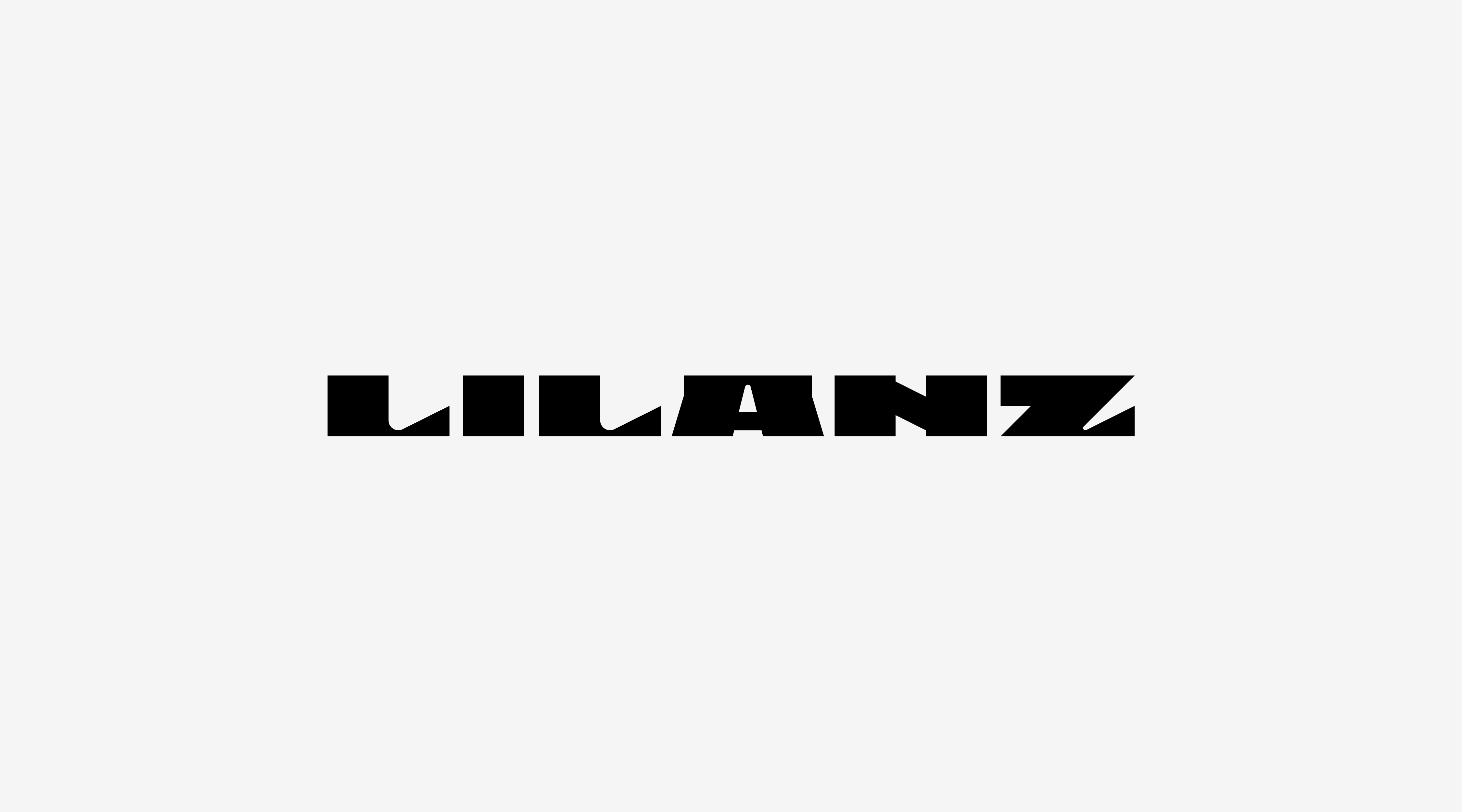
LILANZ 利郎
ART DIRECTOR: Nod Young / Guang Yu
DESIGNER: Wen Di / Feng Shiwen
YEAR: 2023
CLIENT: LILANZ
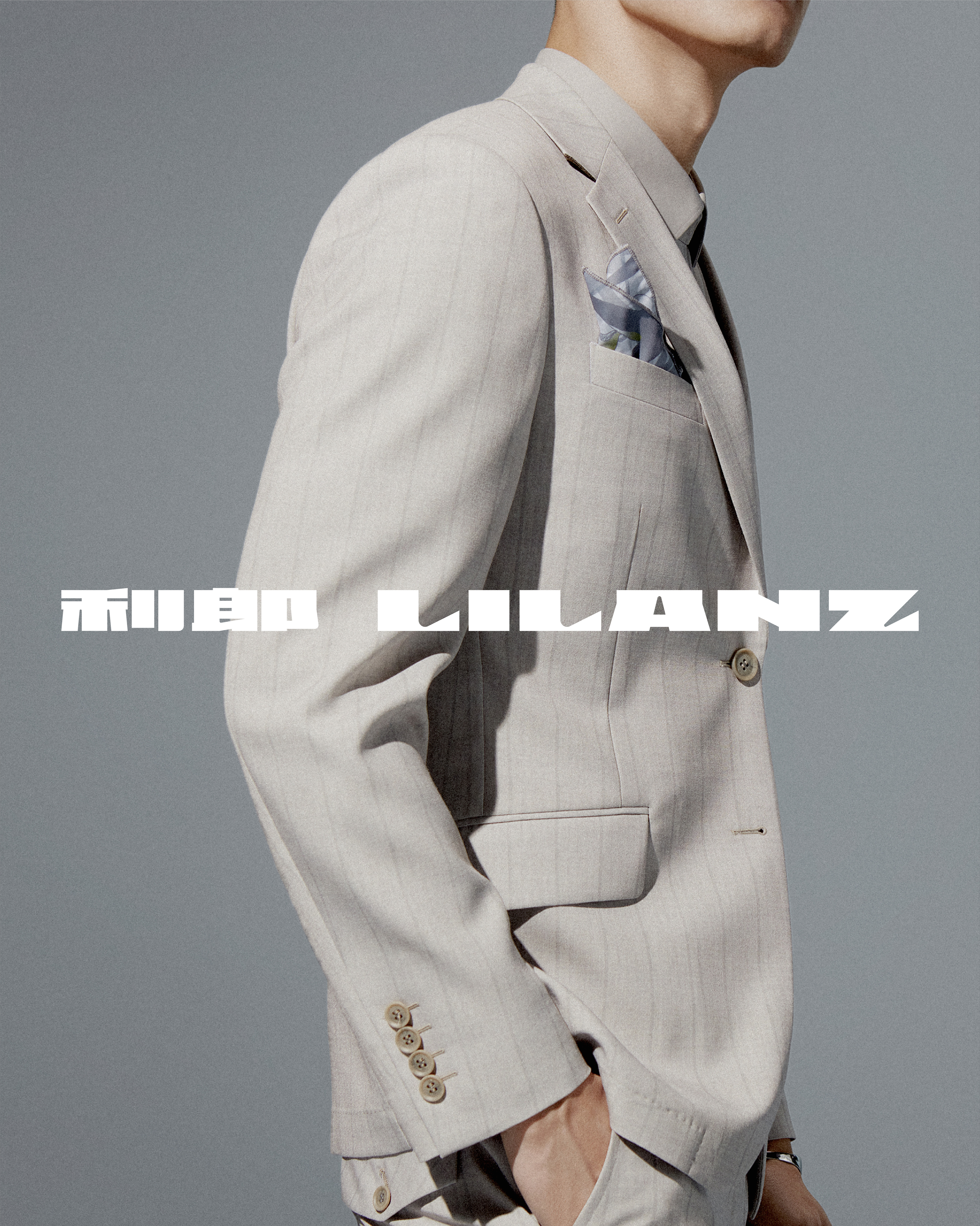
Lilanz, a well-known men's fashion brand in China, has undergone significant transformations since its founding in the 1980s, continually adapting while maintaining its vitality and influence. We were fortunate to be invited to participate in the brand's image reconstruction project in its 36th year, helping to define a new starting point for the next phase of Lilanz's development. "Simplicity is not simple" has been the guiding aesthetic and business philosophy of Lilanz for many years. However, fully grasping the meaning behind this concept is not easy—how can one reflect years of experience and careful deliberation through minimal expression? This has been the central challenge throughout the design process. After a lot of internal attempts, we came to a conclusion: achieving 'simplicity is not simple' isn't possible through mere simplicity. It requires a sense of "breakthrough".
In Lilanz's new brand identity, we did three important things.
Today, Lilanz has refined its brand slogan from "Simplicity is not simple" to a more concise "Simple men's wear," removing a word to reduce the slogan-like feel while adding a tone of confidence and calm. We hope that Lilanz’s refreshed brand image will continue to uphold its core philosophy of "simplicity is not simple," guiding the company toward a future of confident and steady growth.
In Lilanz's new brand identity, we did three important things.
-
Balancing the Typography:
Maintaining harmony between bilingual signage and ensuring readability is extremely important at all times. We aimed to ensure that the relationship between the Chinese and Western forms of LILANZ is balanced, harmonious, and inevitable. We retain the original combination of Chinese and western characters, and also introduced an alternative where the Chinese name precedes the English one. Both combinations coexist, even appearing together in visuals. This openness in text design introduces a fresh way to perceive balance, encapsulating our understanding of "simplicity is not simple."
- Proportional Visual Design:
Lilanz's new logo has a standard ratio of 100:5, resembling a long and full horizontal line. The reason for choosing this proportion is because it reflects the key quality that men’s fashion should embody: strength. A simple, elongated line evokes a sense of power and clarity, which aligns with the brand's philosophy of "simplicity is not simple."
-
Modern Classic:
In the clothing industry, tile pattern is a very classic design language in the brand image, and even often outlasting logos themselves. However, tile patterns can lose vitality if their style is too rigid or lacks versatility. Considering both applicability and durability, we extracted the most basic element the letter “L” from the Lilanz logo, and extended it into a user-friendly and recognizable tile pattern. By doing so, we filled a gap in Lilanz’s visual assets, creating a user-friendly and enduring design. This also embodies our approach to "simplicity is not simple."
Today, Lilanz has refined its brand slogan from "Simplicity is not simple" to a more concise "Simple men's wear," removing a word to reduce the slogan-like feel while adding a tone of confidence and calm. We hope that Lilanz’s refreshed brand image will continue to uphold its core philosophy of "simplicity is not simple," guiding the company toward a future of confident and steady growth.
利郎,是中国家喻户晓的男装品牌,自上世纪八十年代创立到今天,风云变幻,利郎几经转变,始终保持着品牌活力与影响力。我们有幸受邀在利郎三十六年之际,参与到品牌形象重塑的项目中,为利郎的下一个品牌发展阶段去寻找新的起点。“简约不简单”,是利郎秉持多年的美学理想,更是企业的经营哲学。如何理解简约不简单,不是一件容易的事——如何在尽可能少的表达或表现中,体现出经年累月的沉淀和深思熟虑的慎重,这是我们在利郎方案设计过程中一直在探讨、在论证的核心问题。在经历了大量内部尝试后,我们得出了一个结论:解释“简约不简单”这个概念,仅靠简约的表现形式是不可能实现的,必须要通过“突破”。
在利郎的新品牌形象中,我们做了三件重要的事。
一,文字的平衡。平衡双语标识的重心和阅读关系,在任何时候都是极为重要的。在文字的体量关系上,我们希望利郎的中文和西文LILANZ是融洽的,是平等的,是必然的关系。我们保留了利郎原有的西与中的文字组合方式,同时提供了中与西(中文前置)的组合方式,并允许两种组合方式共存,甚至可以同时出现于画面内。文字组合的开放性设计,带来一种新的平衡理解方式。这是我们所理解的简约而不简单。
二,视觉的比例。利郎的新标识标准比例为100 : 5,像是狭长且饱满的一道横线。之所以设计这样的视觉比例关系,是我们认为最能体现男装用户需求的关键就在于:力量。而一道简洁而干练的长线,更容易让用户感受到力量,一种干脆而爽快的感觉。这是我们所理解的简约而不简单。
三,现代的经典。服装行业中,平铺图案是品牌形象中非常经典的设计语言,甚至经典的平铺图案的使用寿命要长于标识。导致平铺图案缺乏生命力的可能性很多,最突出的问题是风格性太强导致适用性差,以及造型语言不够扎实耐不住时间的考验。我们从适用性和耐用性的角度去思考,从利郎标识中提取最基本的元素 L,将其延展成为既好用又具辨识度的平铺图案。专属平铺图案的缺席,是利郎视觉资产的短板,我们借用这个更新的机会,把这个问题解决了。这是我们所理解的简约而不简单。
今天的利郎,将品牌口号从“简约不简单”升级为更加精炼的“简约男装”,减去的一个字数,削弱了口号感,平添了自信与从容。希望利郎的品牌新形象亦能曾经秉承“简约不简单”的品牌主张,为企业带来更加自信和从容的发展视野,助力品牌远航。


All Images Copyright © 2024 LILANZ. All Rights Reserved.