usmile 笑容加
ART DIRECTOR: Guang Yu / Nod Young
DESIGNER: Han Lu / Xu Mingru / Jing Junjun / Feng Shiwen
YEAR: 2022
CLIENT: usmile
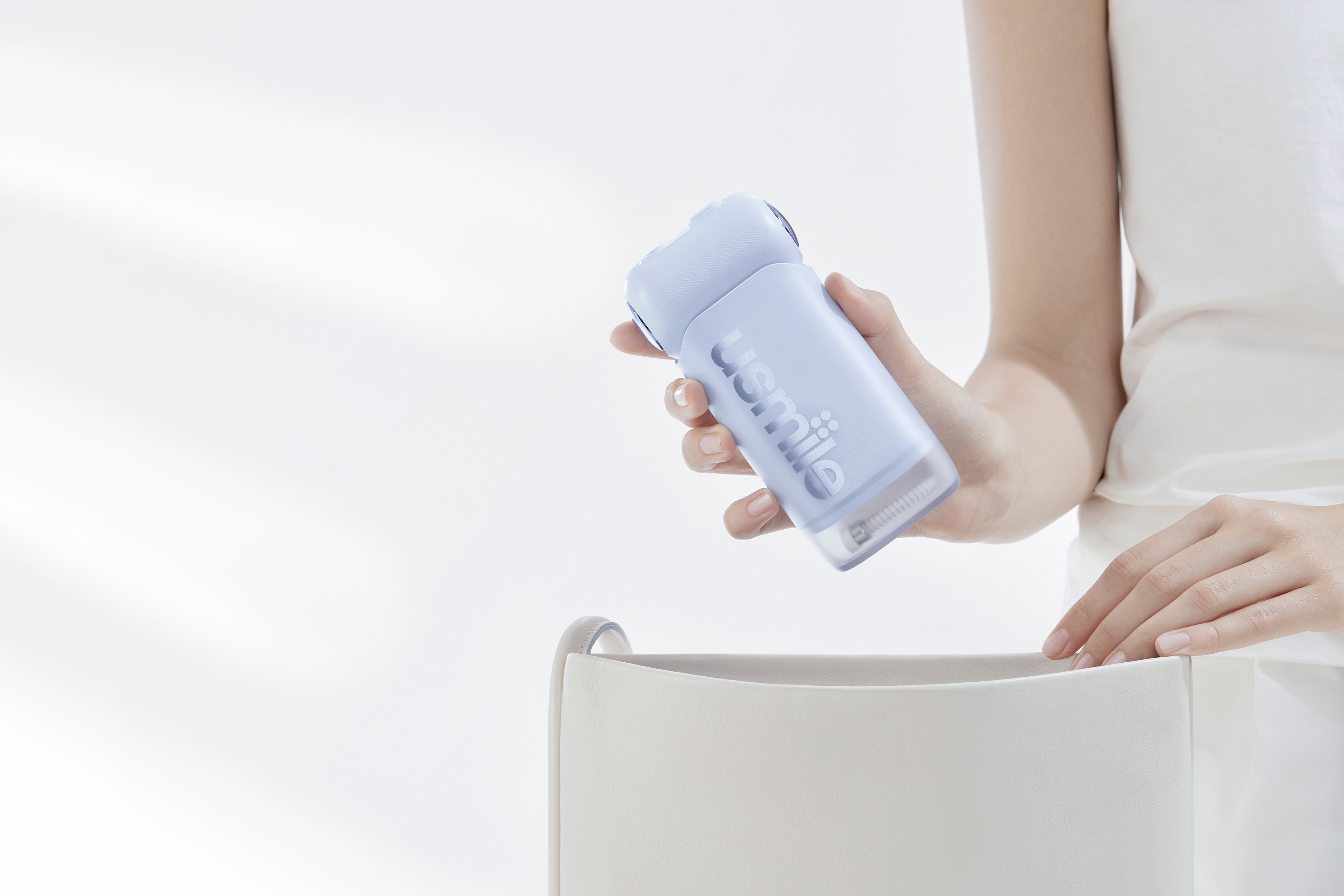
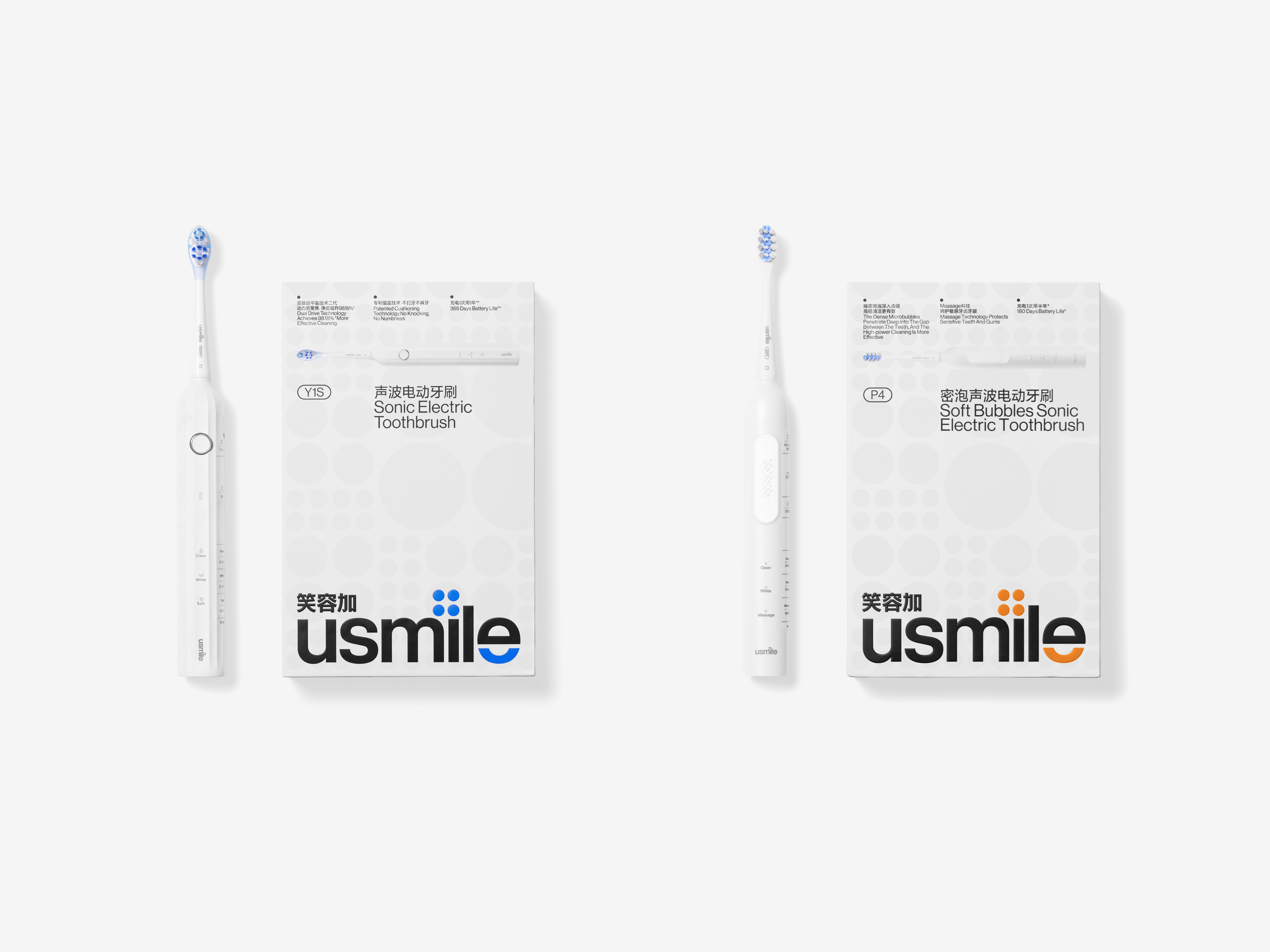
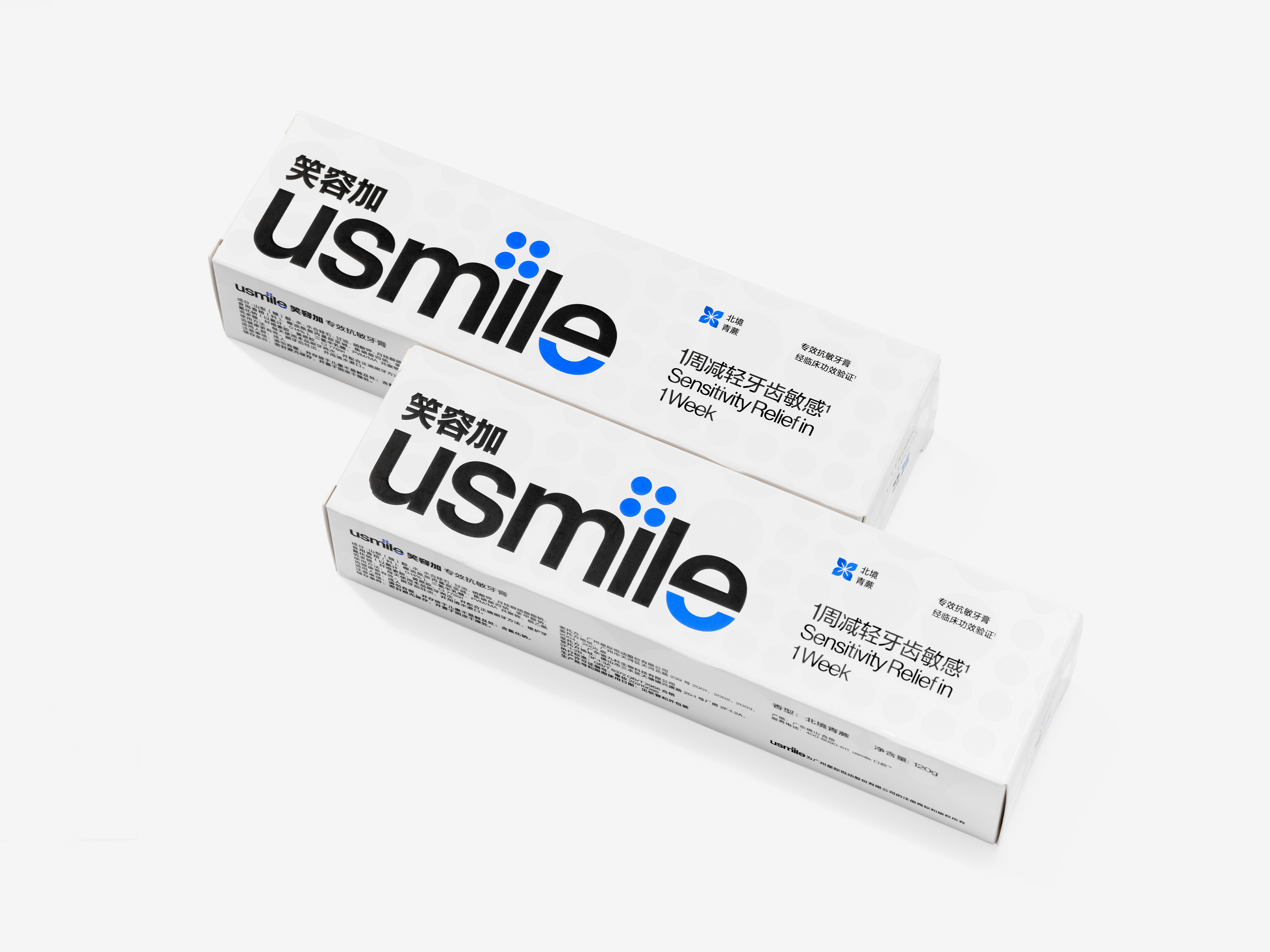
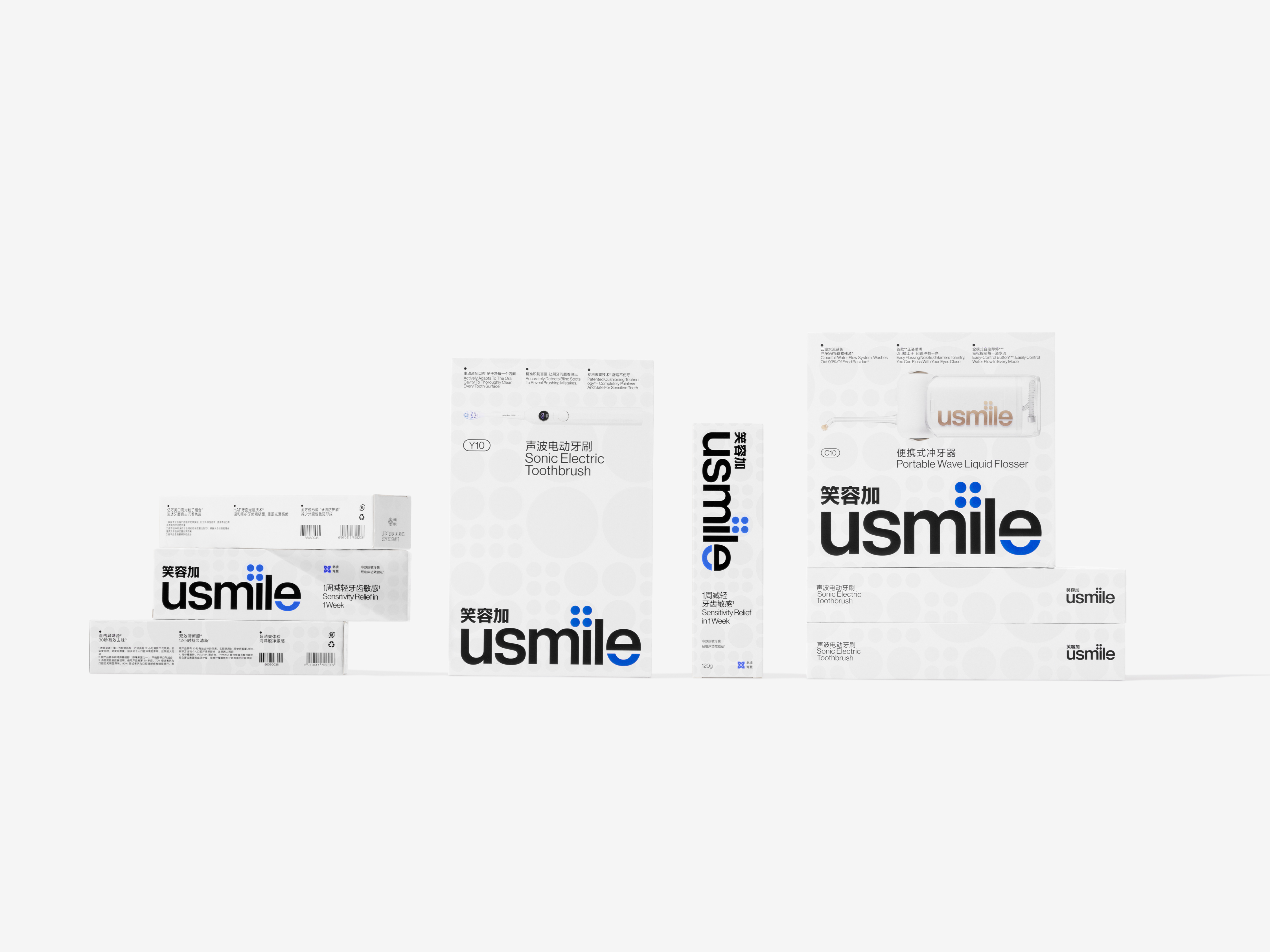
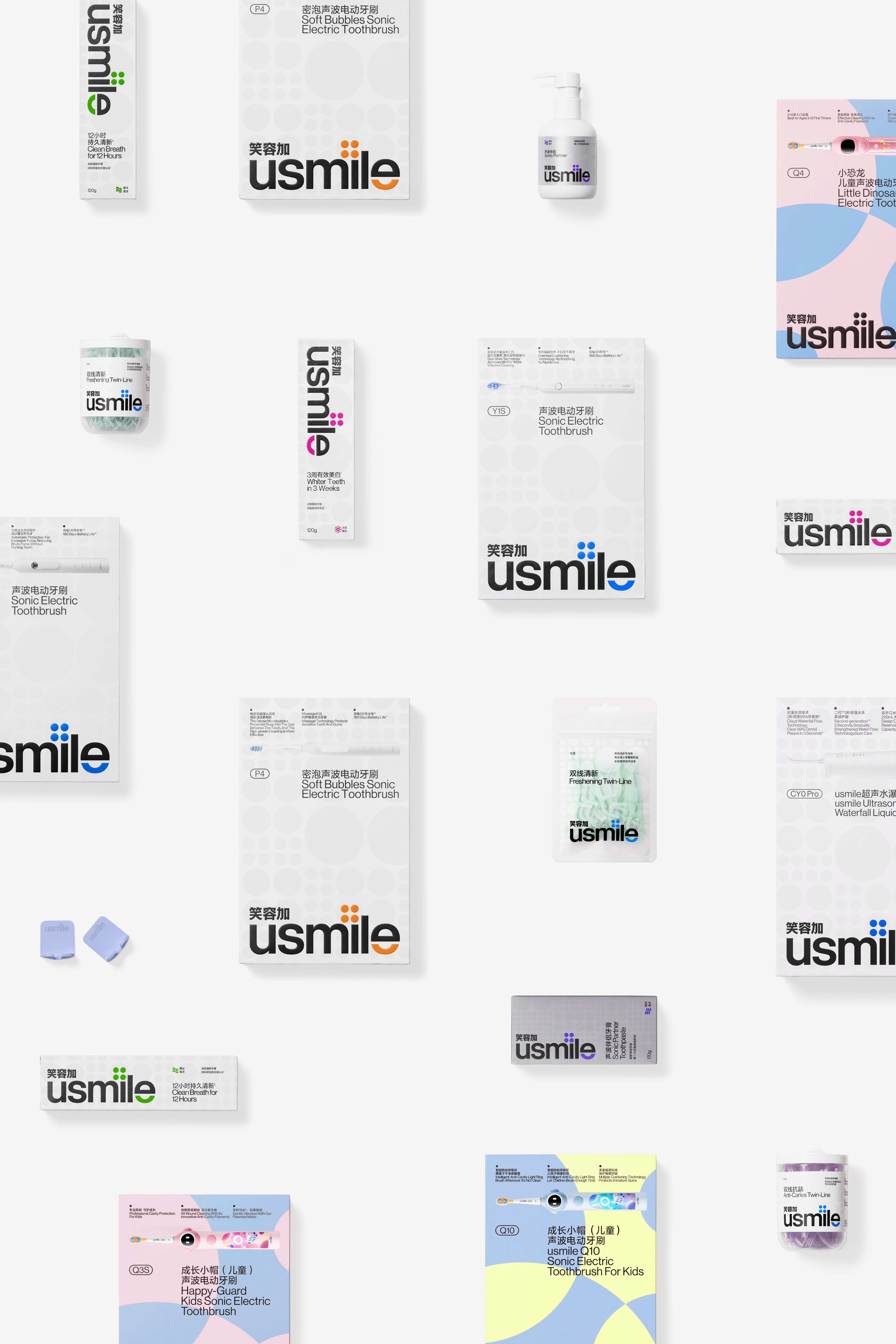
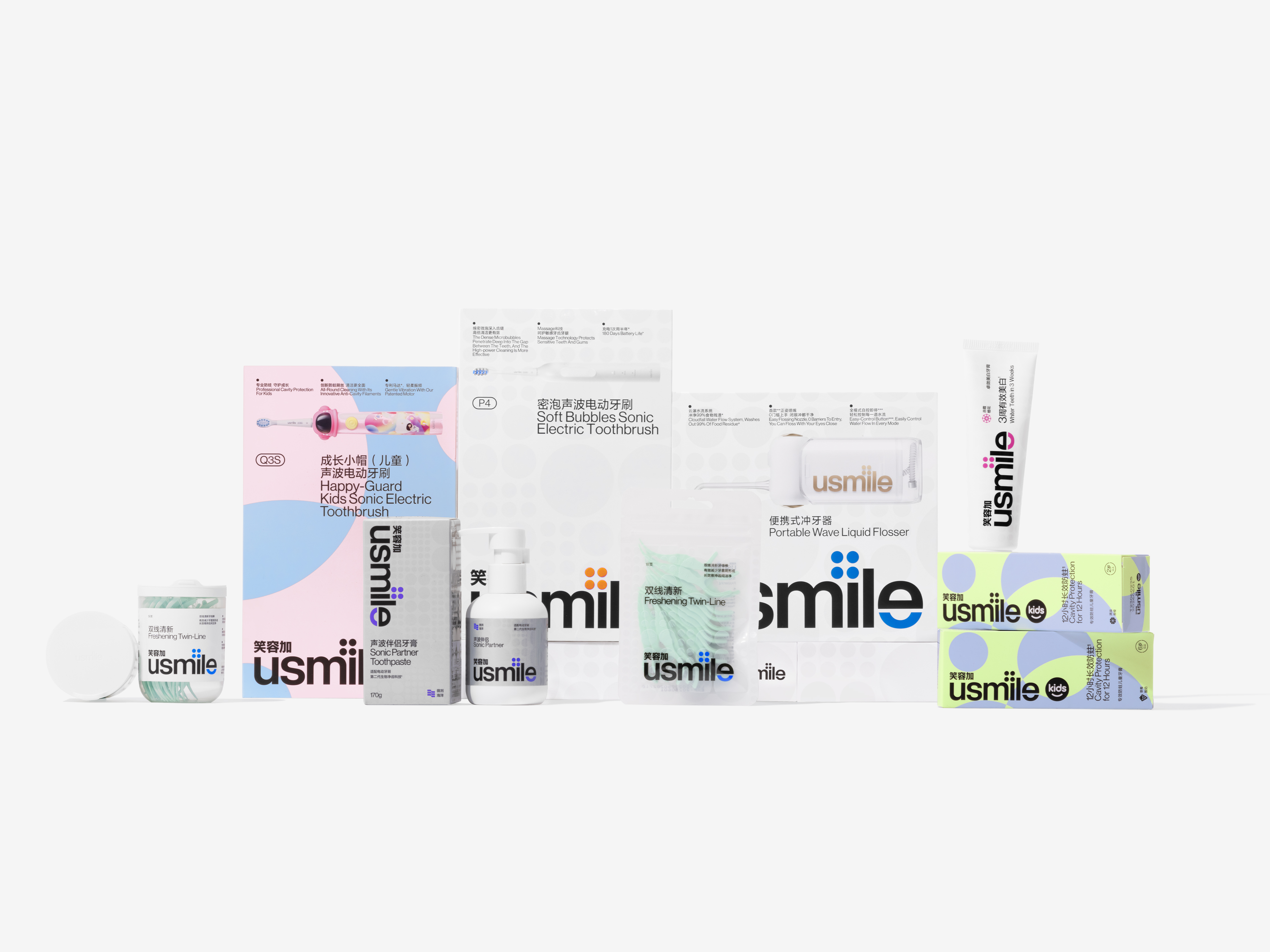
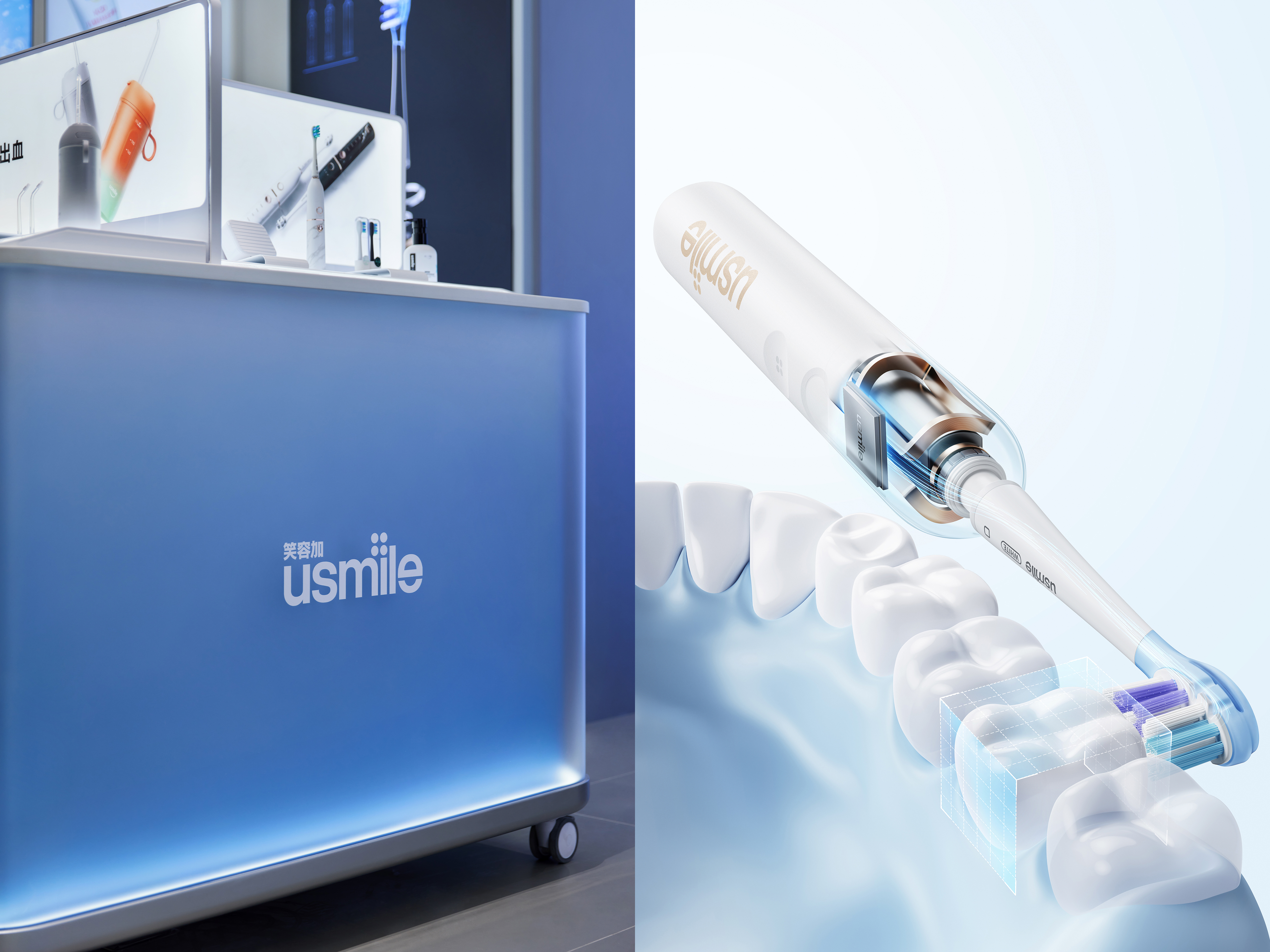
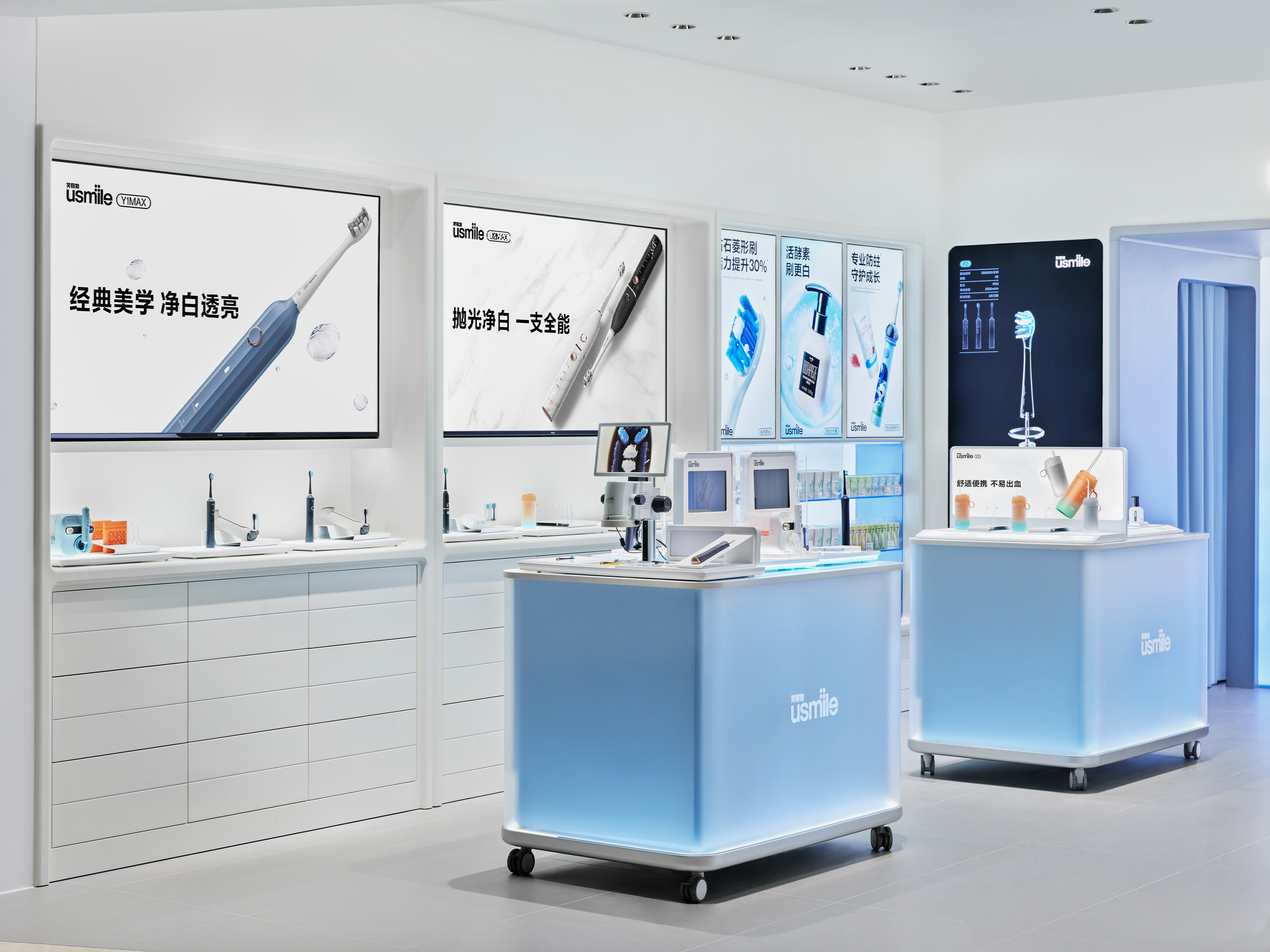
As a leading comprehensive oral care brand, usmile has established a strong user base through advanced technology, exceptional research and development, and outstanding product design. It delivers excellent products and services to over 20 million consumers worldwide, solidifying its position as a frontrunner in the field of oral care. With this brand upgrade, usmile aims to enhance its professionalism, upscale its positioning, and embrace internationalization, further fortifying its competitive edge. Through visual language optimization of the brand identity, usmile focuses on reshaping different product lines with distinct professional attributes. By integrating technology, gentle medical care, a sense of quality, and user experience, it conveys a new image that is "more professional," "more friendly," "more international," and inspires a greater sense of trust among consumers.
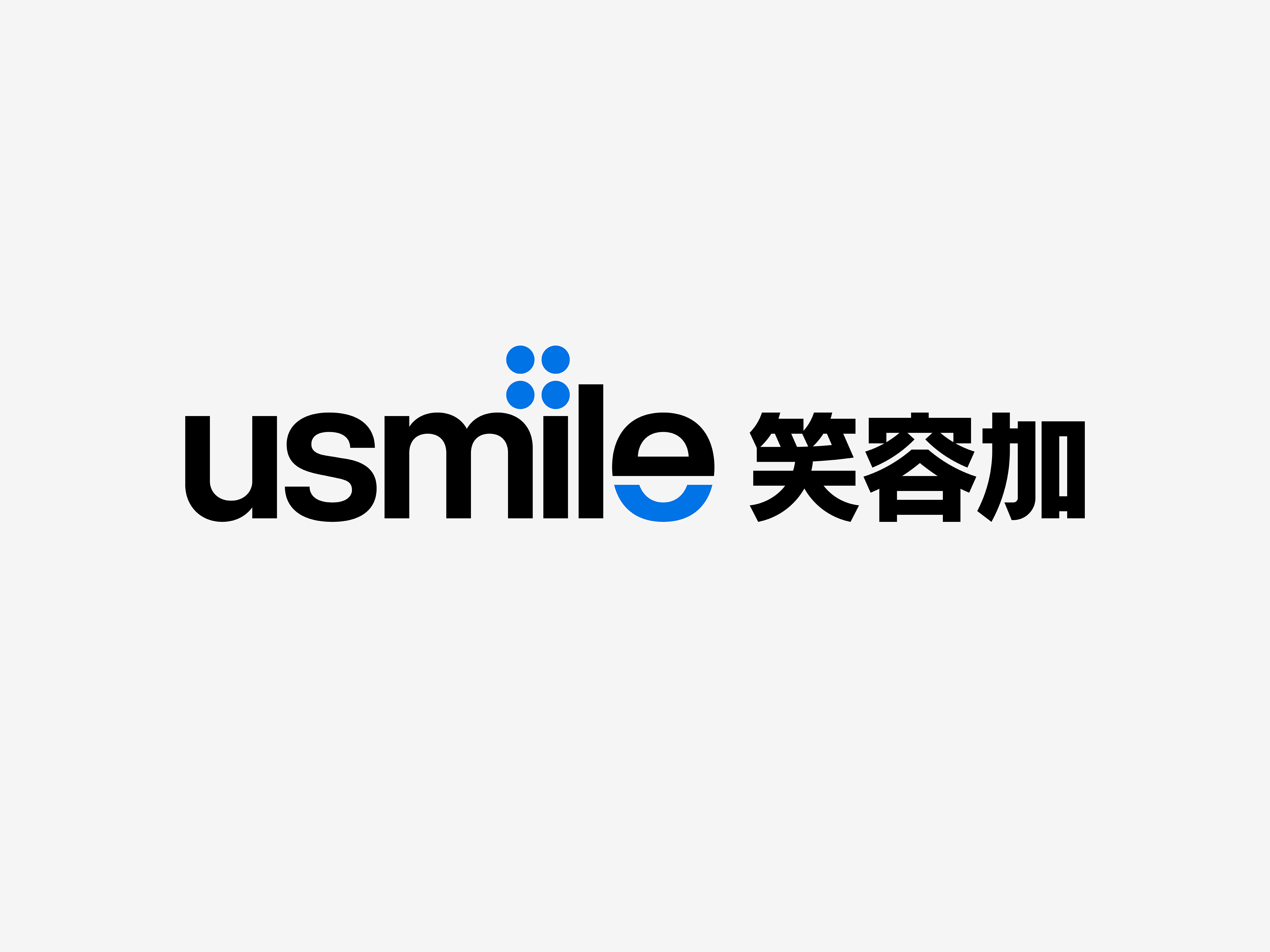
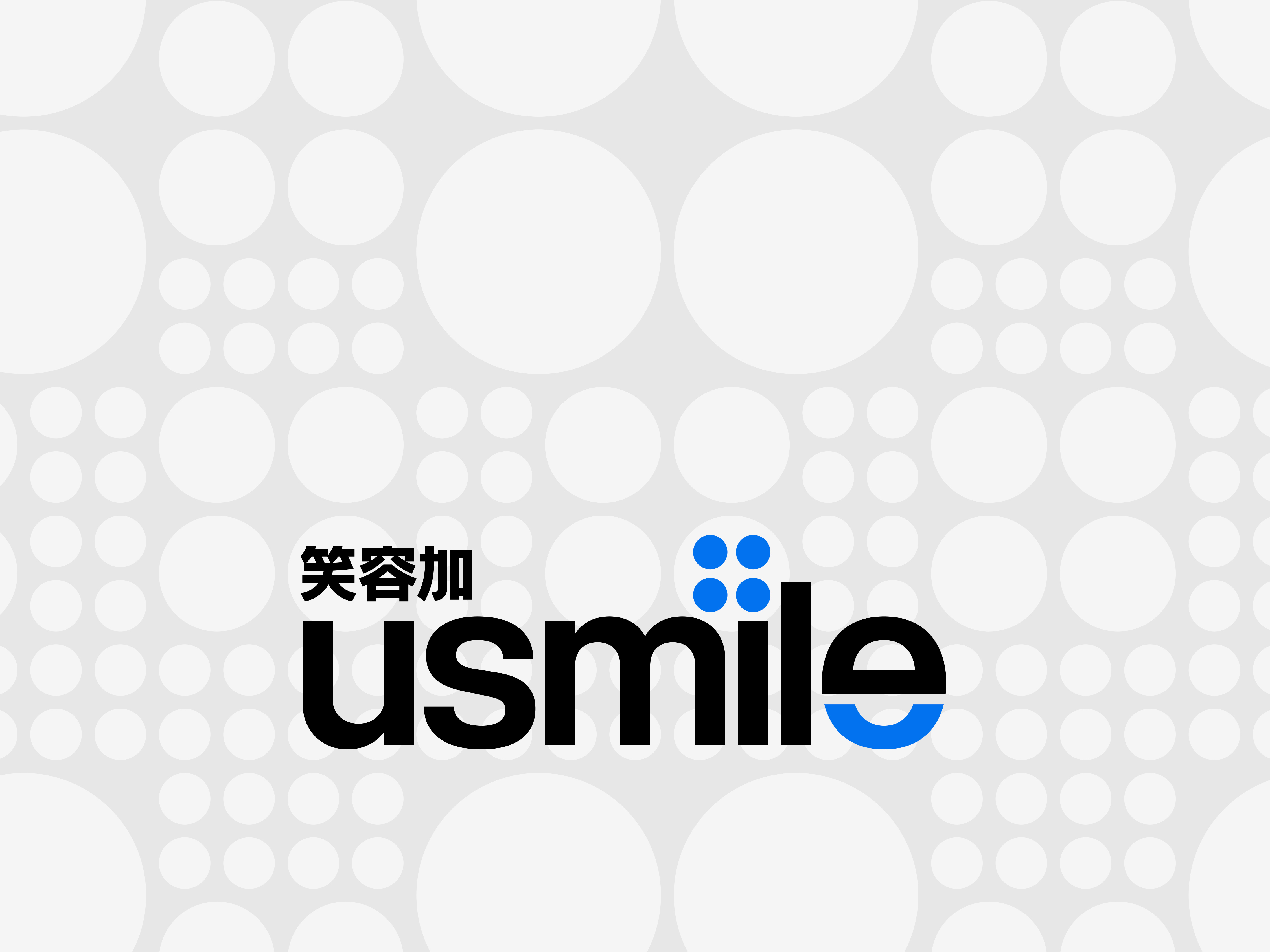
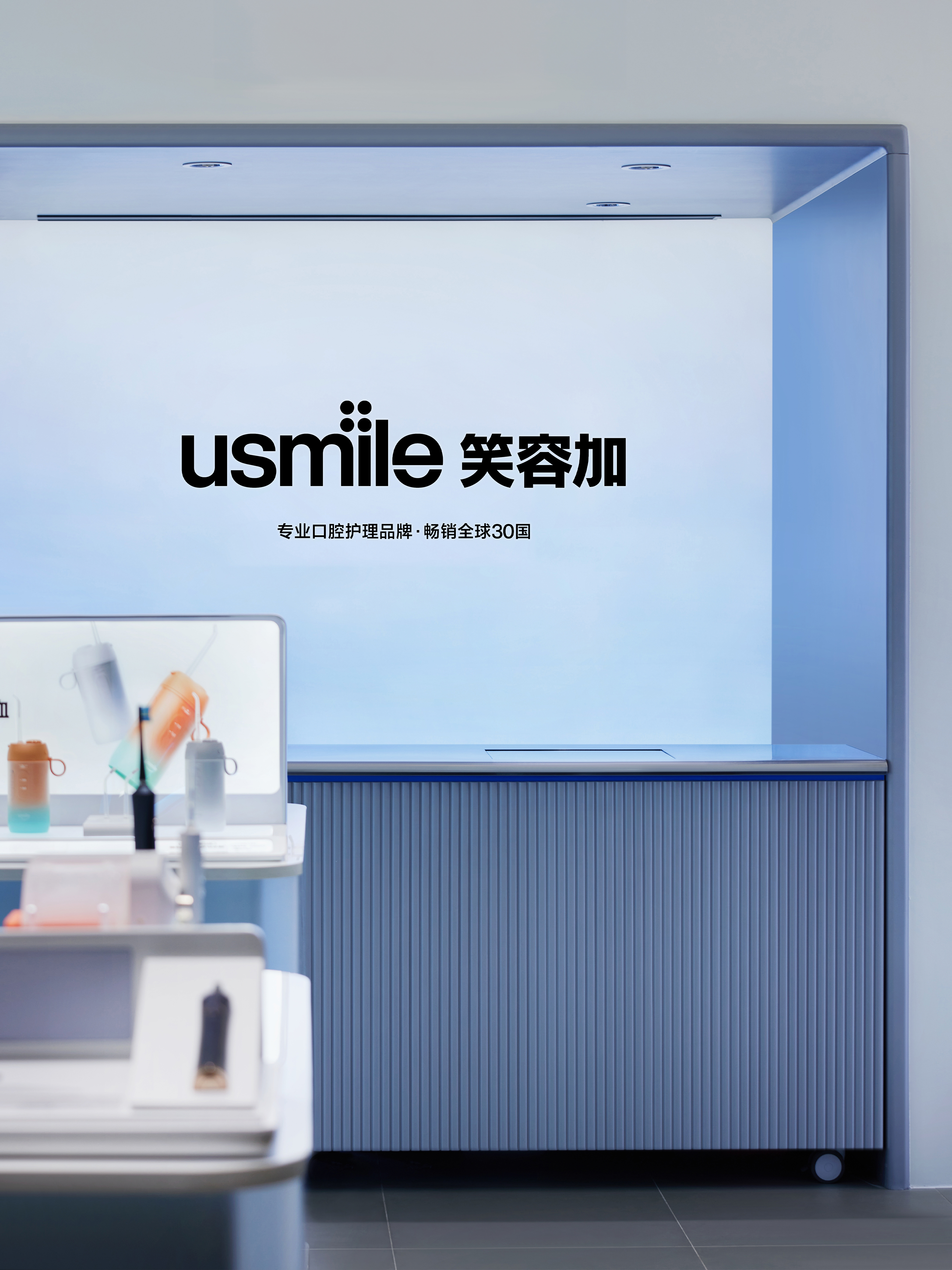
usmile's logo design primarily features English with Chinese as a secondary element. Two highlights are incorporated into the English typography: a "+" sign composed of four dots and a "smile" represented by a lower semicircle. These elements resonate with the brand's interpretation of usmile: smile and addition. The graphical language has a relatively small proportion in the overall logo, but it stands out brightly, just like the role of teeth in human facial expressions. While they may occupy only a small percentage, they can brighten the entire face and even one's mood throughout the day. The Chinese component of the logo can be used independently in specific contexts. When used in combination with the primary logo, its function focuses on assisting identification and providing brand annotations.
usmile's logo design primarily features English with Chinese as a secondary element. Two highlights are incorporated into the English typography: a "+" sign composed of four dots and a "smile" represented by a lower semicircle. These elements resonate with the brand's interpretation of usmile: smile and addition. The graphical language has a relatively small proportion in the overall logo, but it stands out brightly, just like the role of teeth in human facial expressions. While they may occupy only a small percentage, they can brighten the entire face and even one's mood throughout the day. The Chinese component of the logo can be used independently in specific contexts. When used in combination with the primary logo, its function focuses on assisting identification and providing brand annotations.
作为一个领先的全面口腔护理品牌,usmile 以先进的技术、卓越的研发,以及出色的产品设计建立起强大的用户群体,为全球超过 2000万消费者提供优异的产品和服务,已然成为口腔护理赛道的佼佼者。此次品牌升级,usmile 以专业、高端化和国际化作为导向,进一步打造品牌竞争护城河。通过视觉语言优化品牌标识,重塑专业属性各有侧重的不同产品线,将科技、轻医疗、品质感与用户体验相结合,为消费者传达一个“更专业”“更友好”“更国际”,也更具信赖感的新形象。
usmile 的标识设计以英文为主,中文为辅。在英文字体设计中,融入两处亮点,分别是:由四个圆点组成的“加号”,以及由一个下半弧表现的“微笑”,它们呼应了 usmile 的品牌释义:笑容、加。图形语言在整体标识中的占比很低,但又是尤为明亮的,正如牙齿之于人类的表情,虽然可能只有一点点的占比,却能点亮整个面部甚至一天的心情。中文标识部分,在特殊环境中可被独立使用,在与主体标识的组合使用中,其功能侧重于辅助识别,以及品牌注释。
usmile 的标识设计以英文为主,中文为辅。在英文字体设计中,融入两处亮点,分别是:由四个圆点组成的“加号”,以及由一个下半弧表现的“微笑”,它们呼应了 usmile 的品牌释义:笑容、加。图形语言在整体标识中的占比很低,但又是尤为明亮的,正如牙齿之于人类的表情,虽然可能只有一点点的占比,却能点亮整个面部甚至一天的心情。中文标识部分,在特殊环境中可被独立使用,在与主体标识的组合使用中,其功能侧重于辅助识别,以及品牌注释。
All Images Copyright © 2022 usmile 笑容加. All Rights Reserved