ubras
ART DIRECTOR: Guang Yu / Nod Young
DESIGNER: Han Lu
YEAR: 2021
CLIENT: ubras
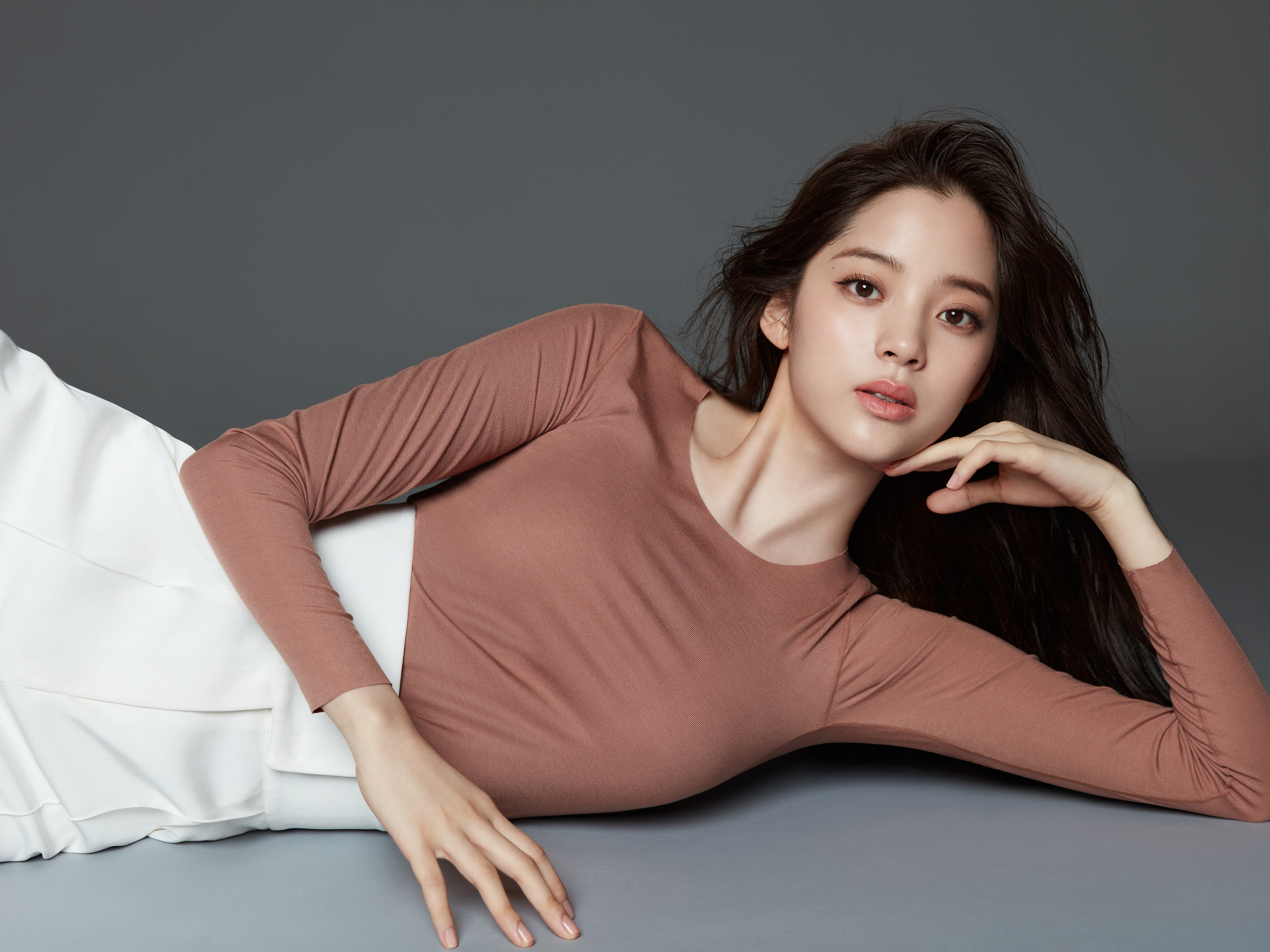
Ubras has always been the backbone force of women’s underwear brands and the representative of free women. Since a few years ago, Ubras has been favored by a new generation of consumers by its free and fresh product proposition and approachable brand image as well as comfortable dressing experience it brings. As a result, comfort, freedom and kindness have naturally become the most important brand impressions ubras gives us, which has taken root in every user’s mind. As Ubras grows into a holistic lifestyle brand, it begins to find a more precise and high-quality brand orientation in order to be deeply connected with the loyal consumers.
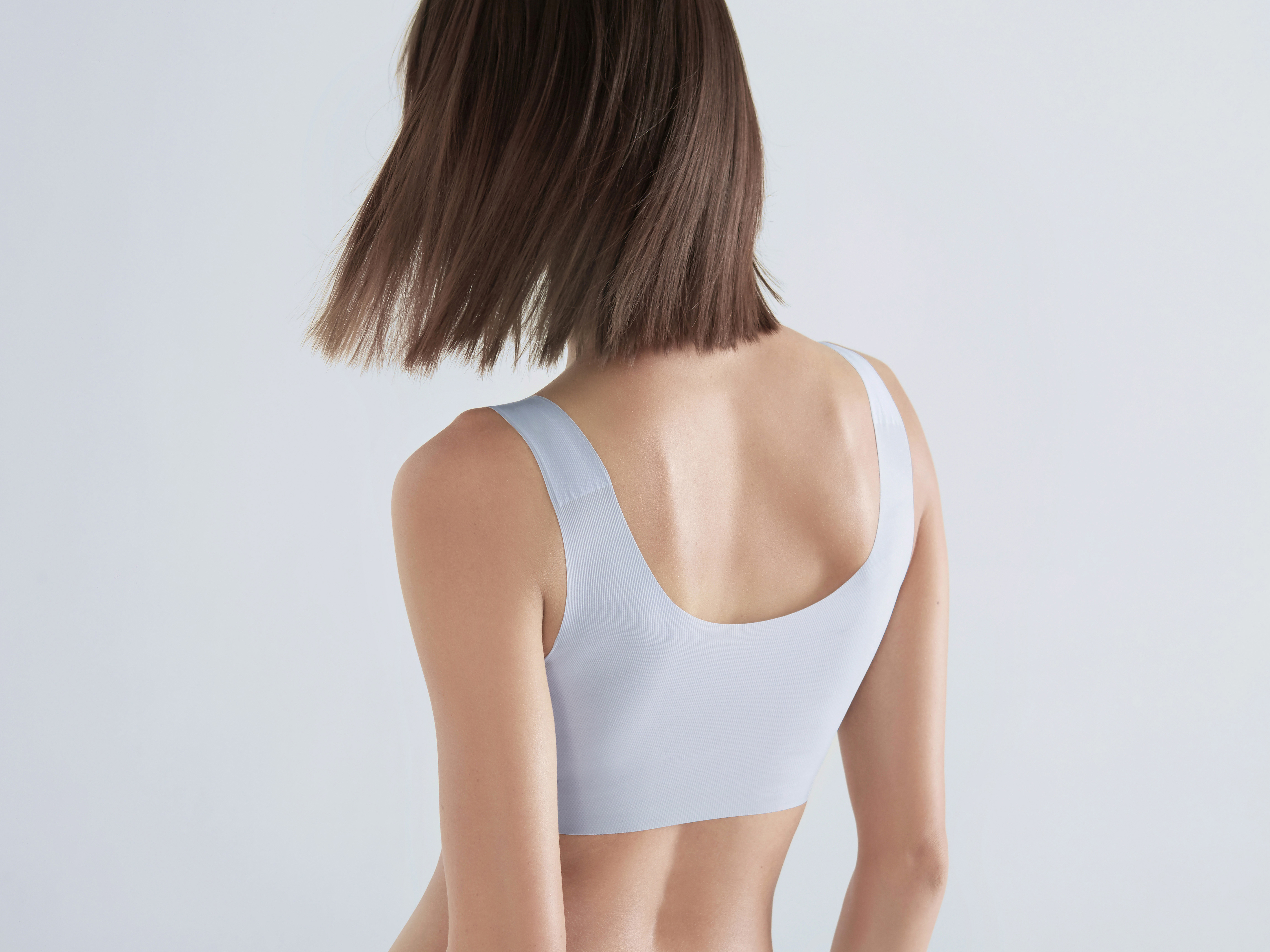
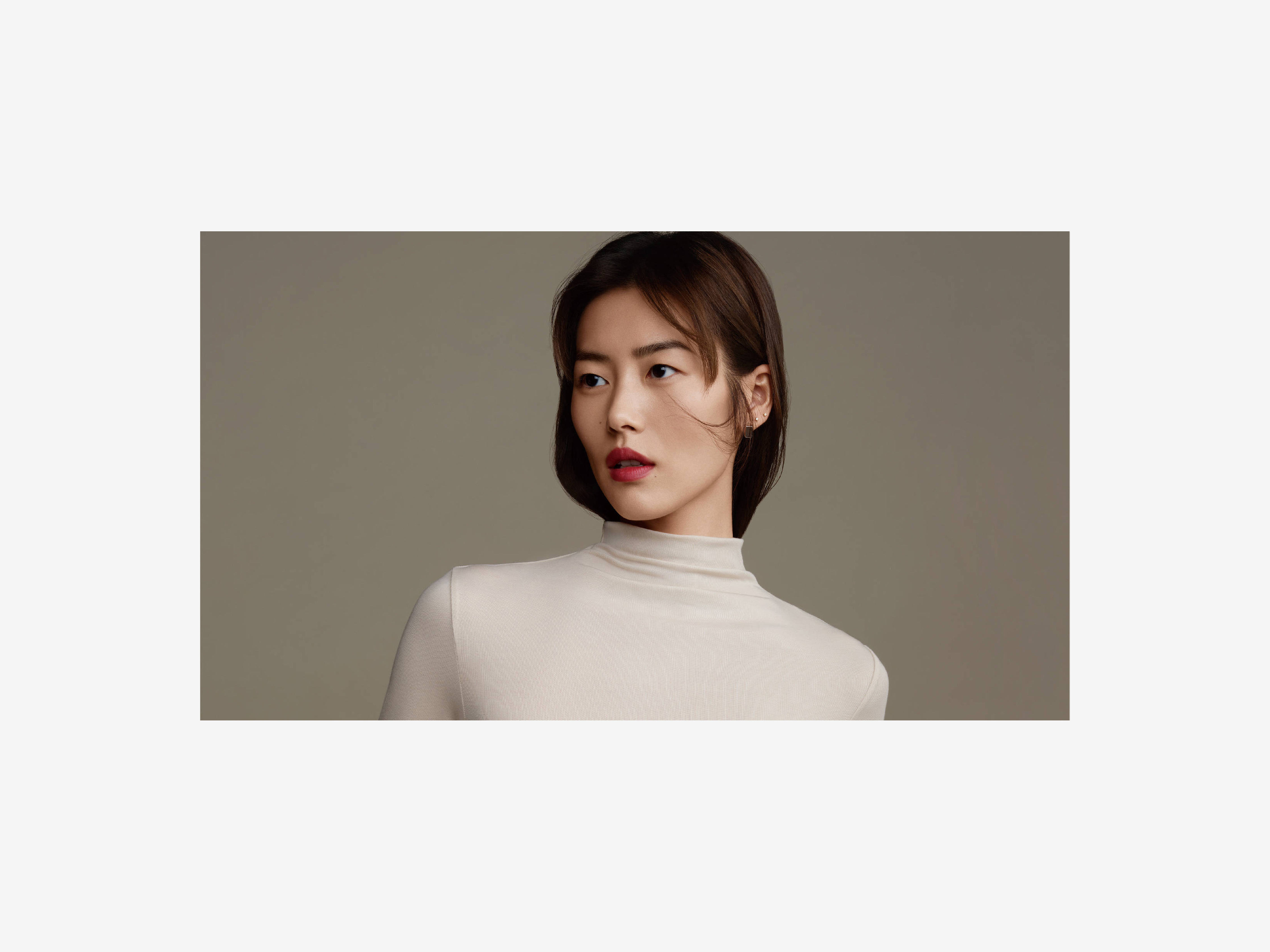
We hope that Ubras’ new brand image will be highly consistent with consumers’ idea. The overall design of Ubras is set to be more modern while maintaining the characteristics of comfort, freedom and kindness; at the same time, quieter and simpler peculiarities are added in the design. It conforms to consumers’ current expectations for underwear: comfortable touch, moderate elasticity, restraining and modesty.
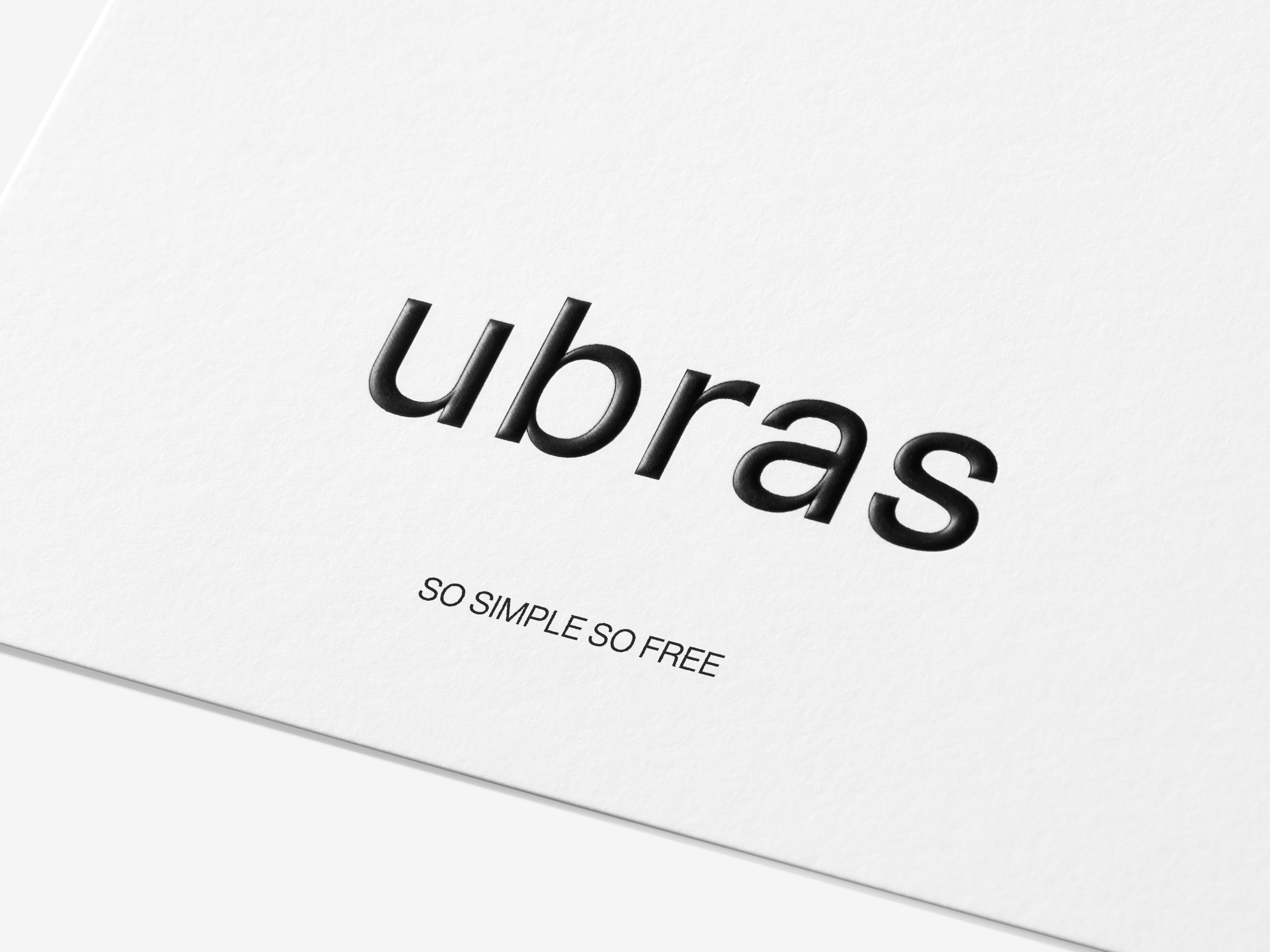
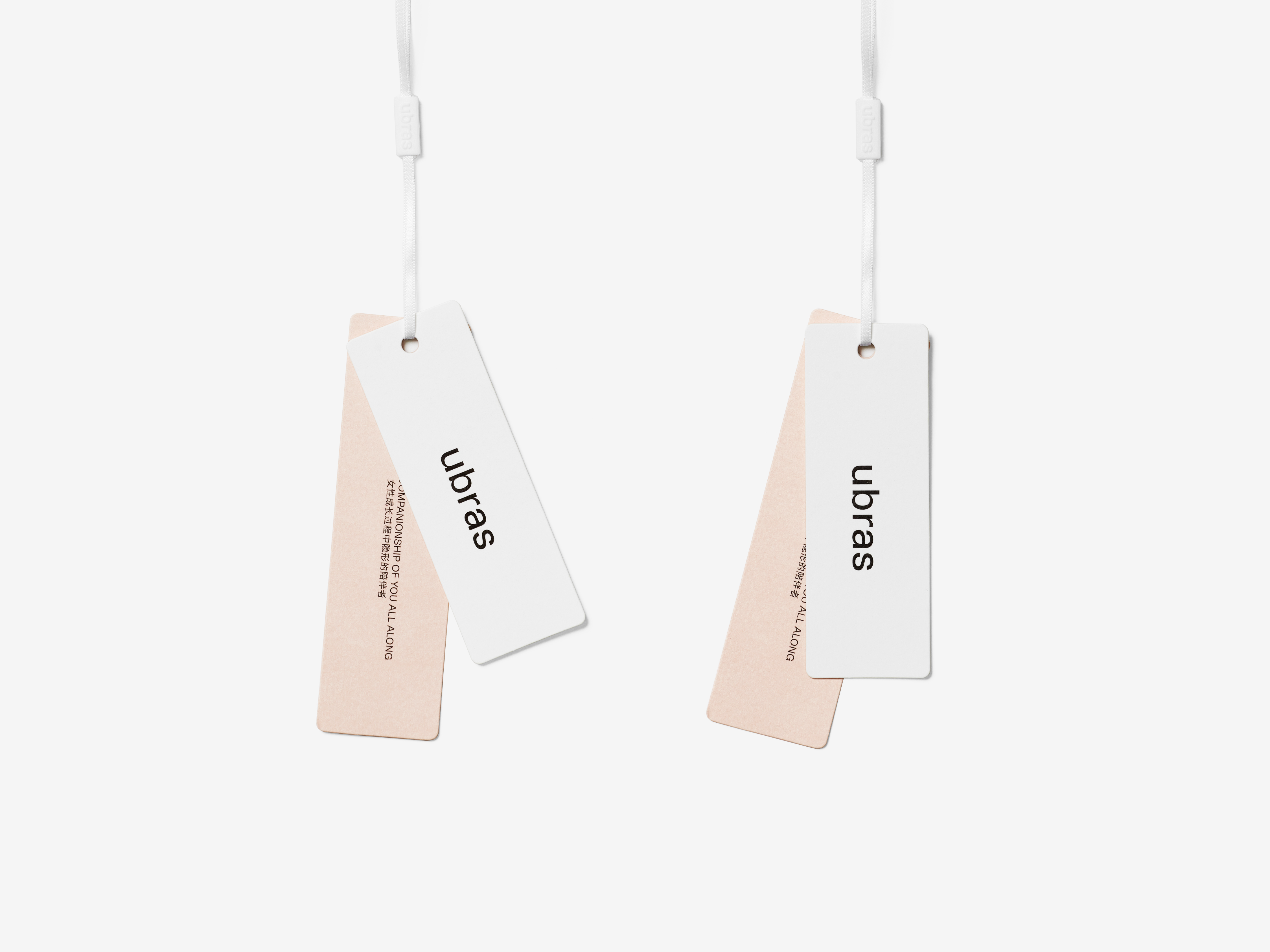
We redesigned the font of Ubras and changed the initial uppercase U into the lowercase u. The purpose is to make the font form of the logo steadier and neater, and the lowercase version conveys a more cordial and friendly atmosphere which is in line with the quieter and simpler peculiarities. In terms of the characteristic of font, we added beautiful and delicate detail changes based on the modern sans-serif style, so that consumers can fully feel beauty of details from the changes in the gray scale and curves. In fact, we have even made a lot of attempts in the gray scale, including the repeated consideration of letter weight and spacing. The final effect of wordmark shows to be appropriate in shade, balanced, clear and accurate.
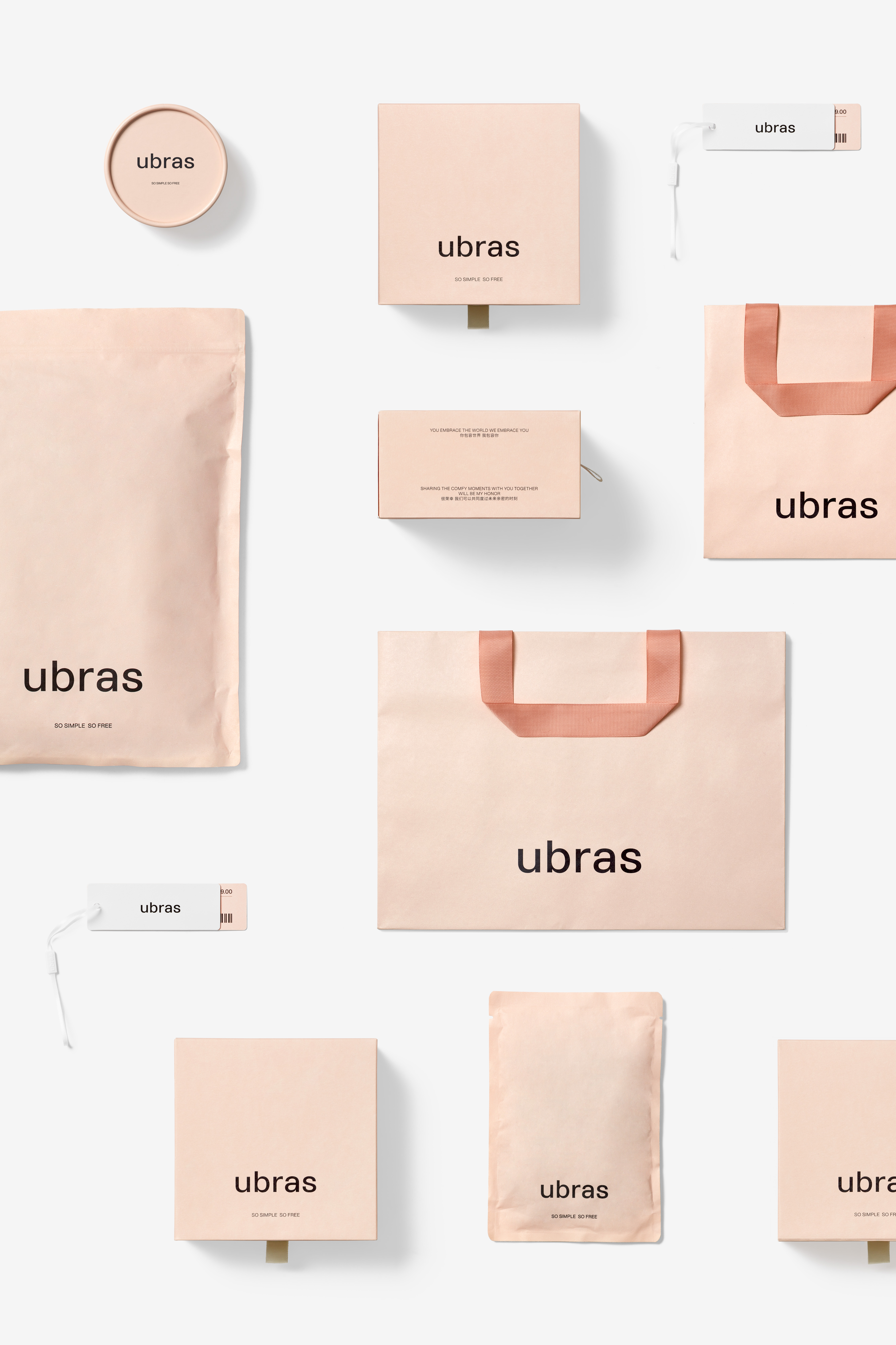
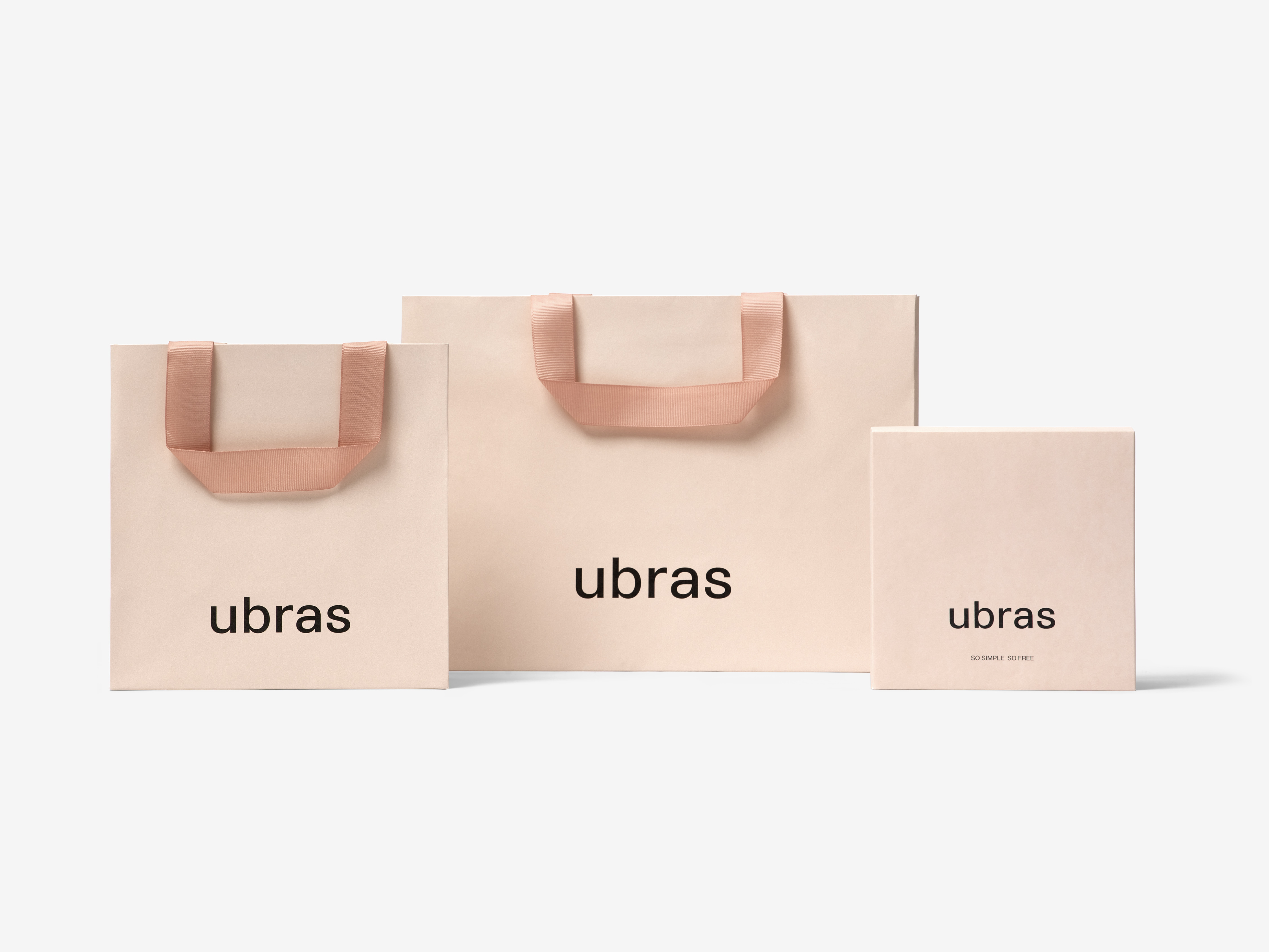
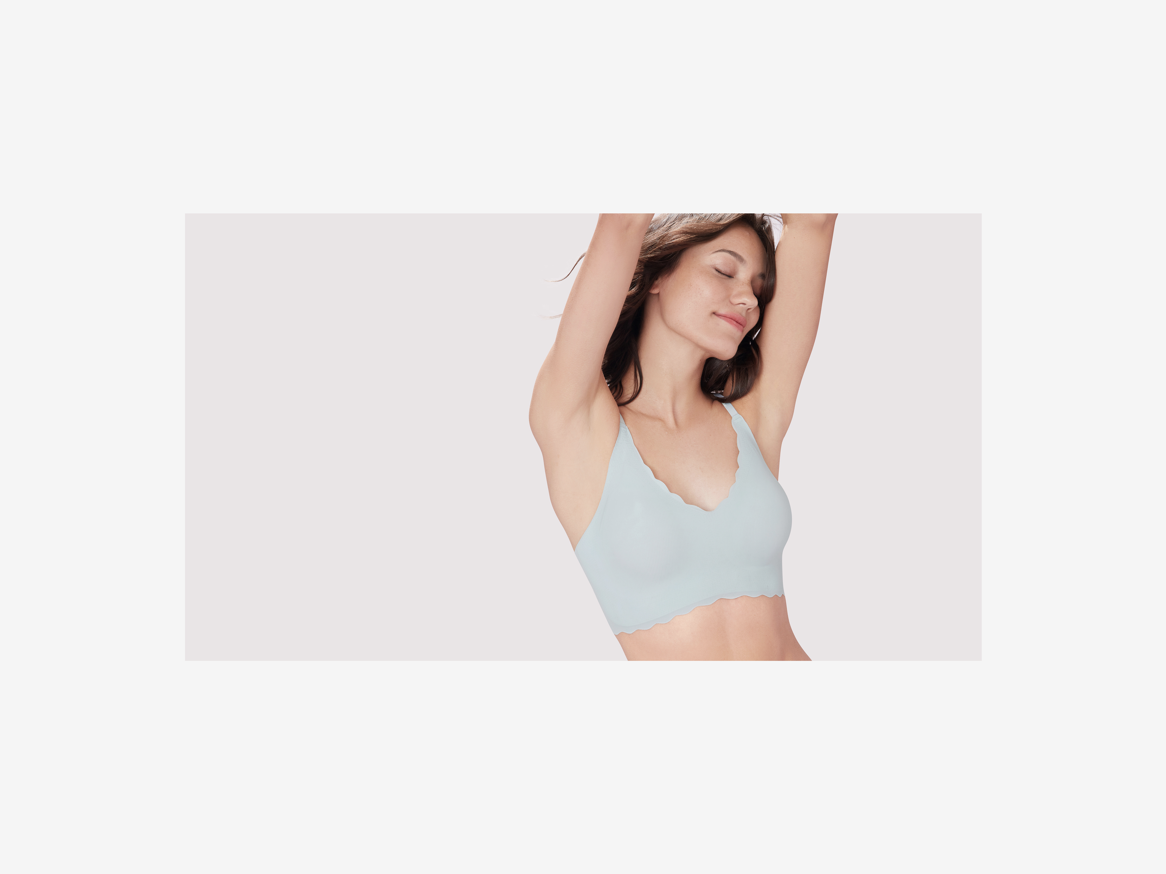
A complete system of visual applications are matched with the new logo of ubras to ensure that the logo can be used in an environment that maximizes its value and peculiarity. The brand peculiarity of ubras is uniform, rigorous and exquisite, from packaging to advertising images, and from e-commerce environment to the offline presentation. Consumers may have a sense of comfort, freedom and kindness when they see ubras anywhere in an attempt to evoke their amazing experience when using ubras products.
We hope that Ubras’ new brand image will be highly consistent with consumers’ idea. The overall design of Ubras is set to be more modern while maintaining the characteristics of comfort, freedom and kindness; at the same time, quieter and simpler peculiarities are added in the design. It conforms to consumers’ current expectations for underwear: comfortable touch, moderate elasticity, restraining and modesty.
We redesigned the font of Ubras and changed the initial uppercase U into the lowercase u. The purpose is to make the font form of the logo steadier and neater, and the lowercase version conveys a more cordial and friendly atmosphere which is in line with the quieter and simpler peculiarities. In terms of the characteristic of font, we added beautiful and delicate detail changes based on the modern sans-serif style, so that consumers can fully feel beauty of details from the changes in the gray scale and curves. In fact, we have even made a lot of attempts in the gray scale, including the repeated consideration of letter weight and spacing. The final effect of wordmark shows to be appropriate in shade, balanced, clear and accurate.
A complete system of visual applications are matched with the new logo of ubras to ensure that the logo can be used in an environment that maximizes its value and peculiarity. The brand peculiarity of ubras is uniform, rigorous and exquisite, from packaging to advertising images, and from e-commerce environment to the offline presentation. Consumers may have a sense of comfort, freedom and kindness when they see ubras anywhere in an attempt to evoke their amazing experience when using ubras products.
Ubras 一直是女性内衣品牌的中坚力量,是自由女性的代表。几年前,Ubras 为消费者带来舒适的穿着体验、自由清新的产品主张、以及平易近人的品牌形象,很快获得新一代消费者的青睐,而舒适、自由、亲切便自然而然地成为 Ubras 最重要的品牌印象,并深深植入每位用户的心智中。随着 Ubras 成长为一个整体生活方式品牌, Ubras 开始寻找更为准确且高品质的品牌方向,从而与忠实的消费者产生更深的联系。
我们希望 Ubras 新品牌形象能与消费者的理解保持高度一致,在维护好舒适、自由、亲切等特征的前提下,将 Ubras 的整体设计定义得更加现代,同时加入更安静和更简单的特质——这是符合当下消费者对于贴身衣物的预期的:触感舒适,弹性适中,不张扬、不卖弄的现代主张。
我们重新设计了 Ubras 的字体,并将首字的大写 U 改为小写 u,其背后的目的是将标识的字体形态设置得更加平稳和整齐,而且全字母小写传递出更为亲切友好的气息,符合更安静和更简单的品牌特质。在字型的特点上,我们基于现代无衬线风格,加入了优美细腻的细节变化,在灰度和曲线的变化中可以充分感受到细节之美的诠释。事实上,仅在标识字面灰度上,我们就进行了大量的尝试,包括字重以及字距的反复考量,它浓淡相宜,张弛有度,干净利落,细节精准。
配合 ubras 的新标识,对应着一套完整的视觉应用系统,用以确保标识的使用环境最大程度地烘托标识的价值与特点。从包装到广告画面,从电商环境到线下呈现,ubras 表现出来的品牌特质是统一的,是严谨且细腻的。消费者在任何环境中看到 ubras 时都能感受到舒适、自由、亲切的高品质感,而这一切都在试图唤醒消费者在使用 ubras 产品时获得的卓越体验。
注:仅为设计效果展示,并非最终销售产品

All Images Copyright © 2021 ubras. All Rights Reserved