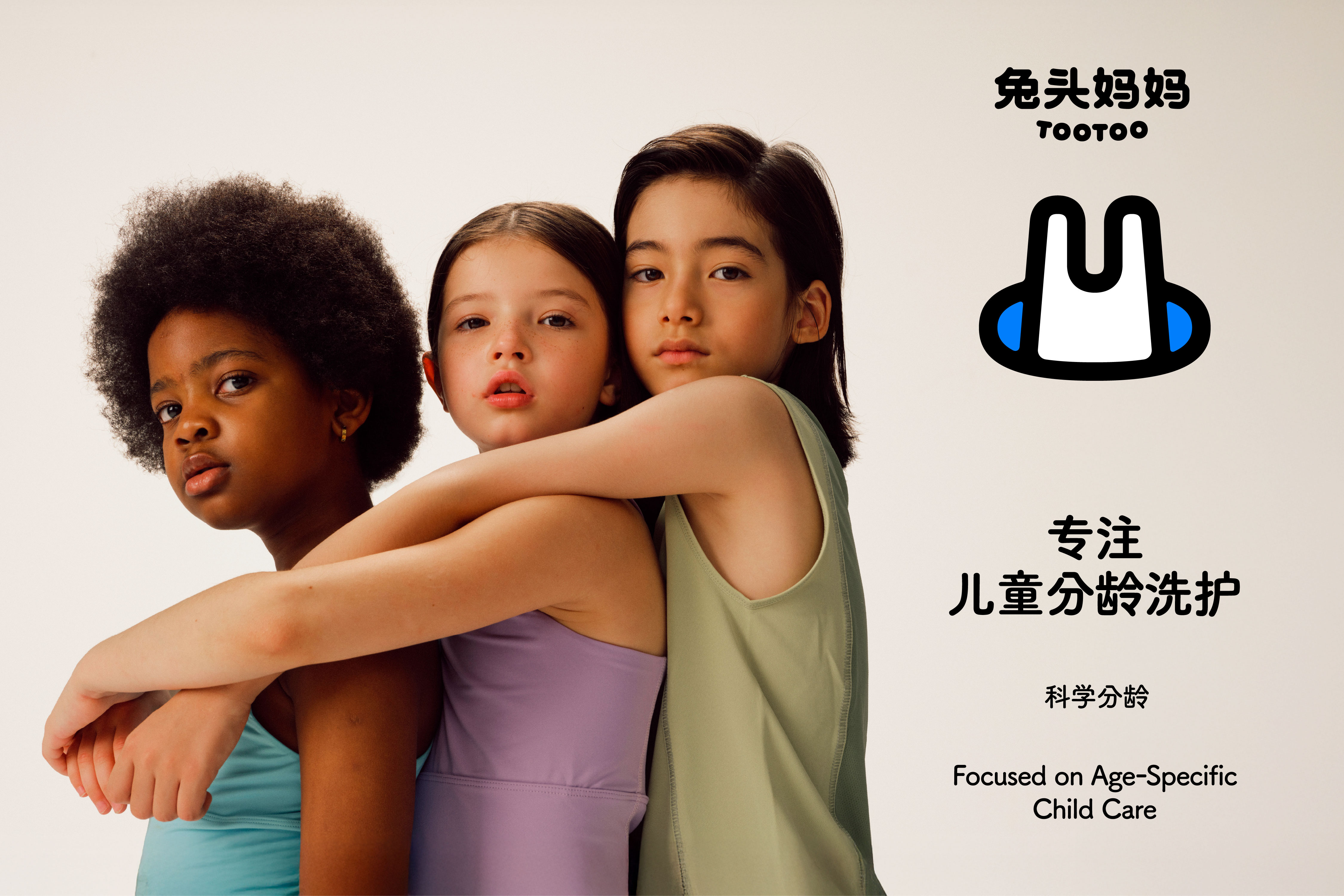
兔头妈妈 TooToo
ART DIRECTOR: Guang Yu / Nod Young
DESIGNER: Jing Junjun / Liu Xianping / An Yunjing
YEAR: 2025
CLIENT: TooToo
The founder of TooToo, known affectionately as “The Rabbit Mom,” is a modern urban woman who was once a talk show comedian on a popular variety program. With sincerity and humor, she connected deeply with her audience—and with the same warmth, she loves her child. She is both performer and mother, able to balance reason with emotion, understanding how to care for children with both intelligence and tenderness.
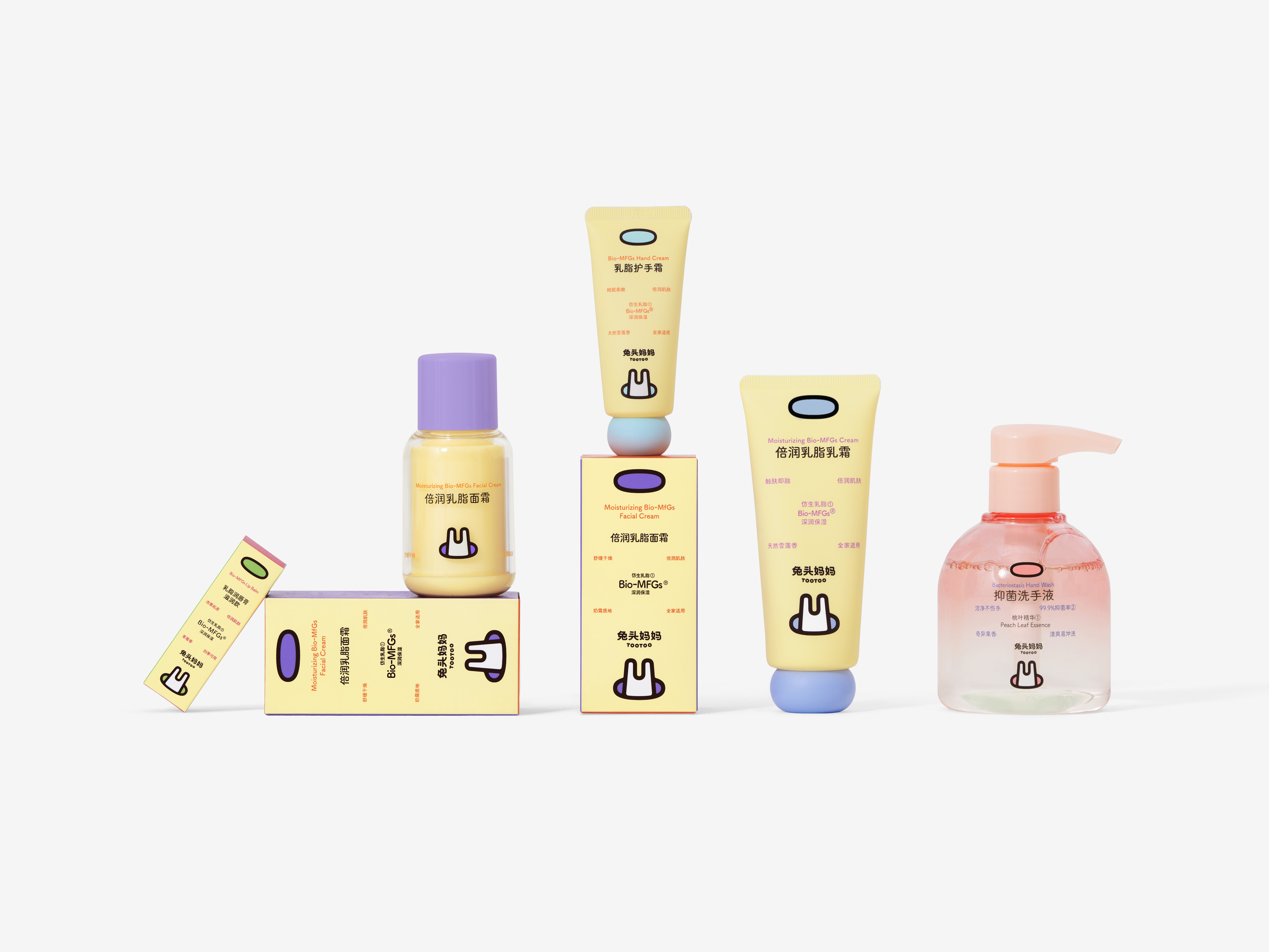
TooToo is a brand dedicated to age-specific skincare for children. We believe that love for a child is not just emotional overflow, but a form of care that is both scientific and rhythmic. The brand’s visual system is built on this belief: maintaining structure within imagination, and preserving warmth within order.
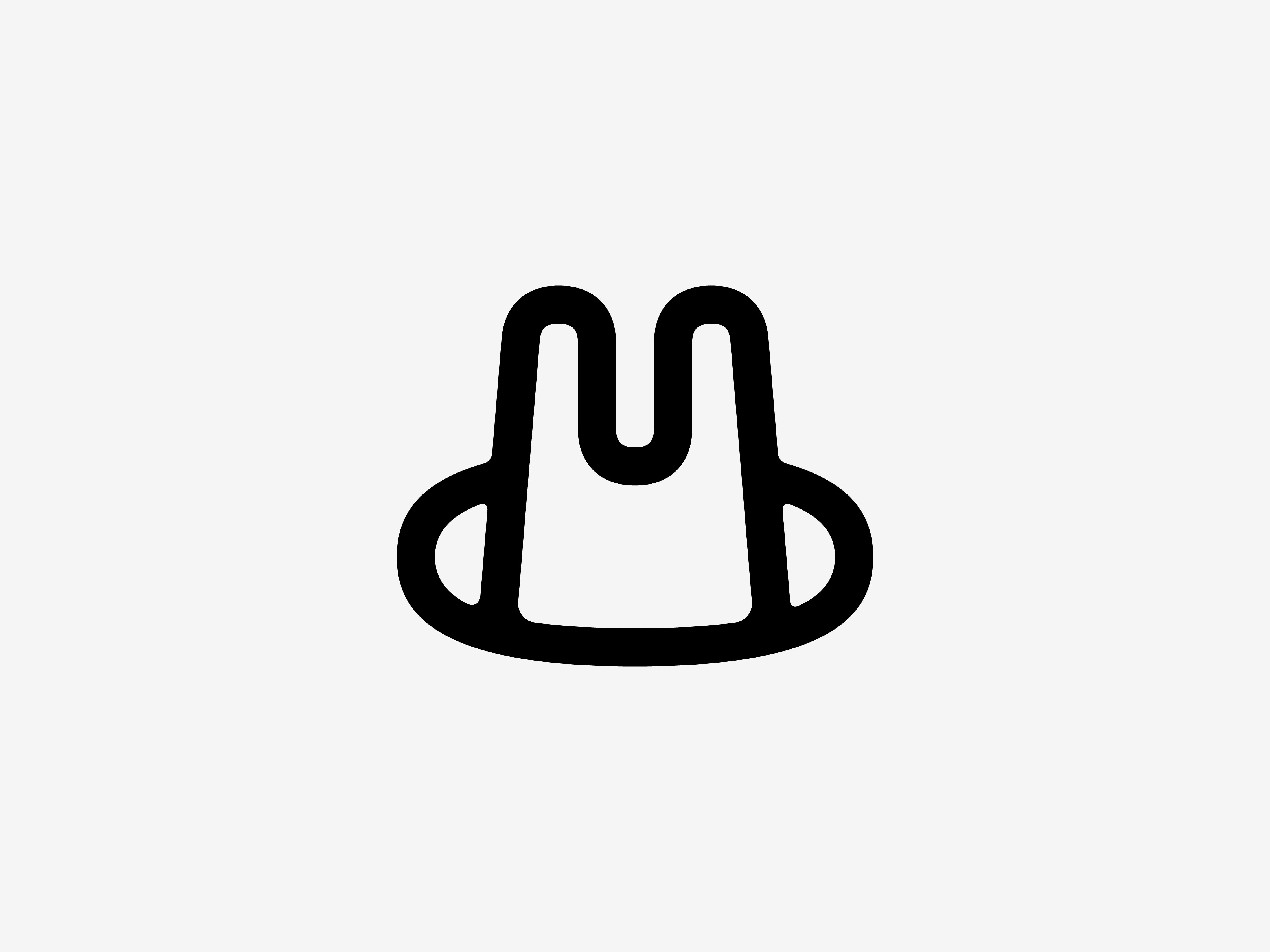
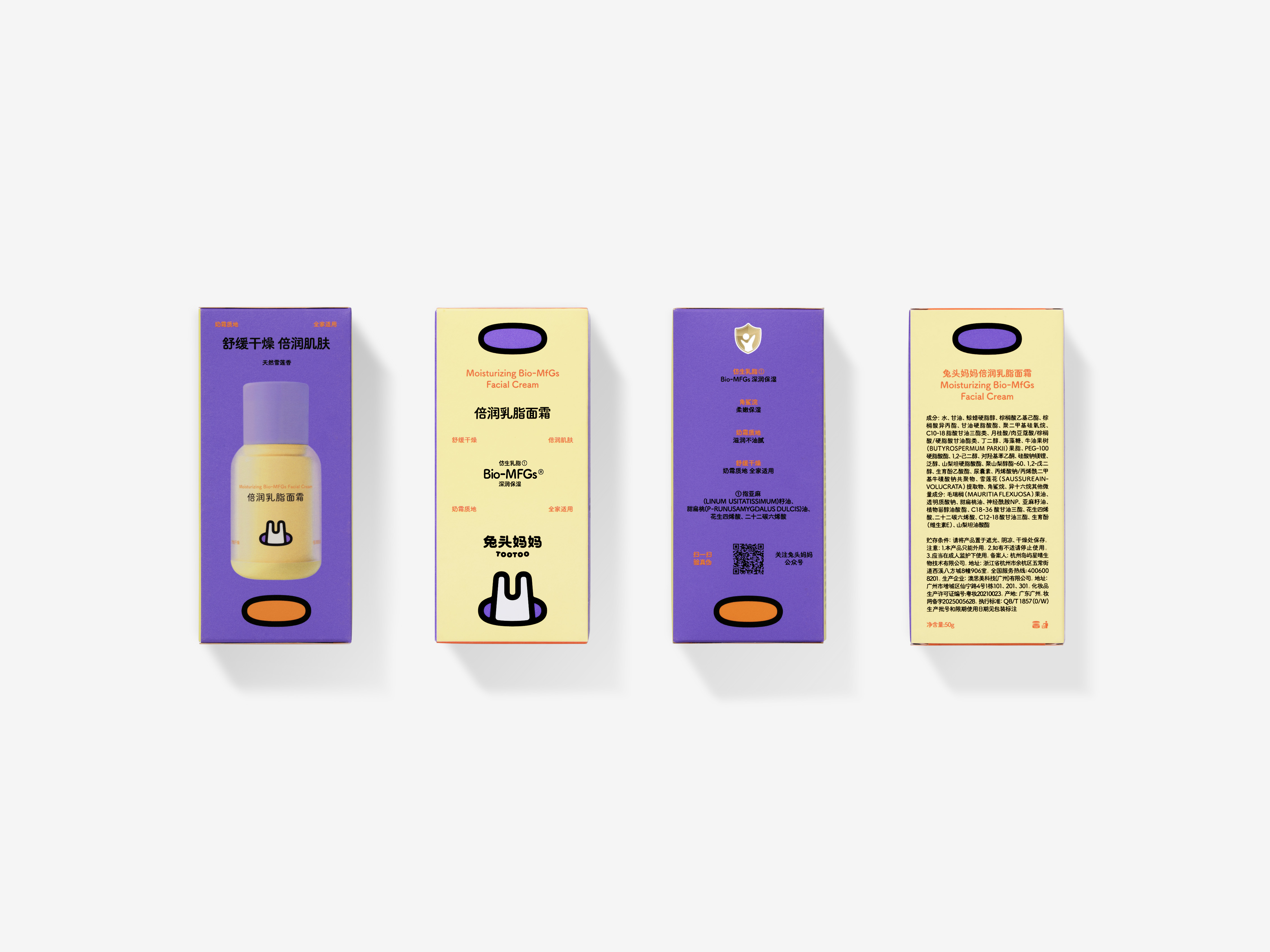
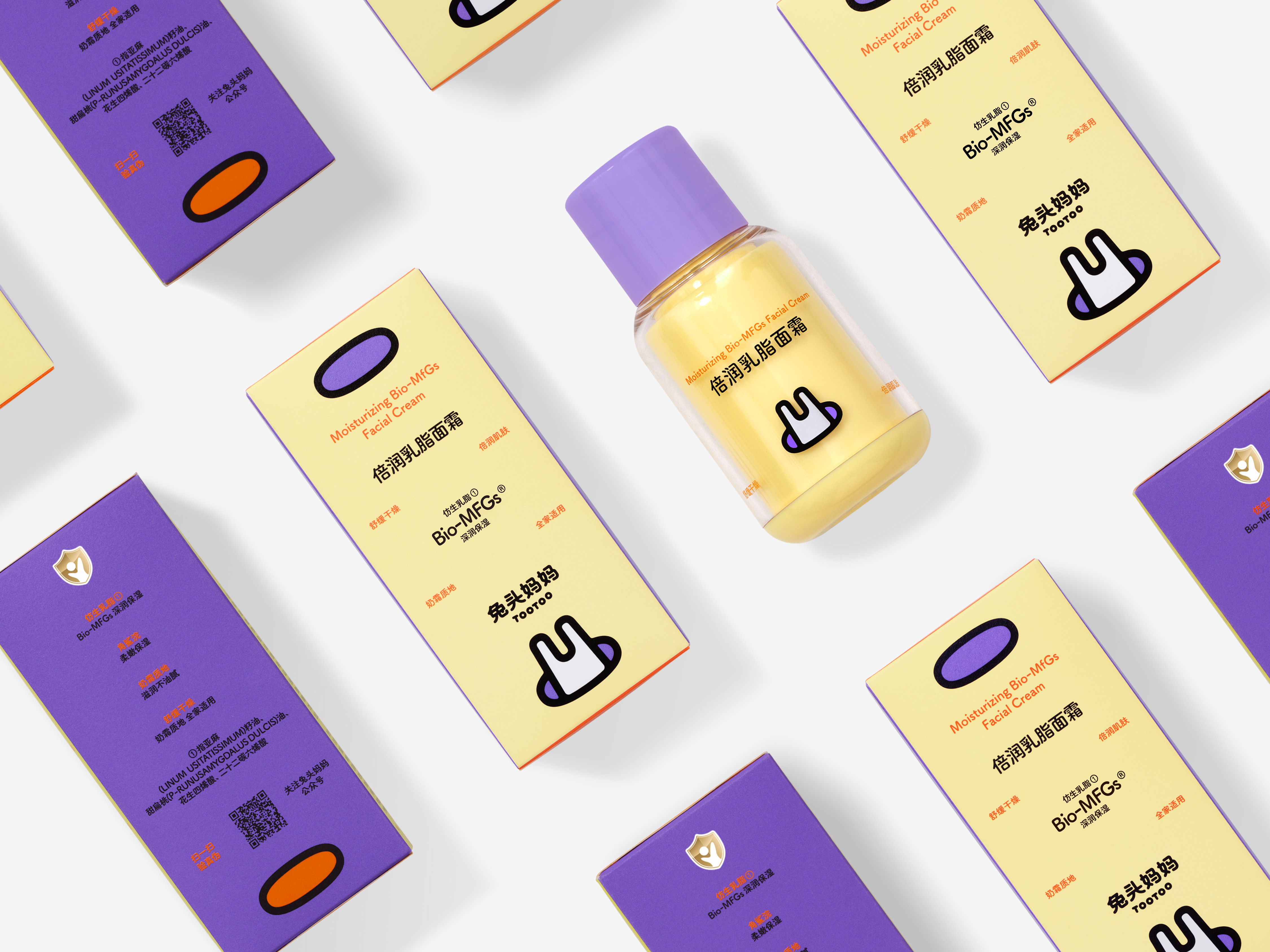
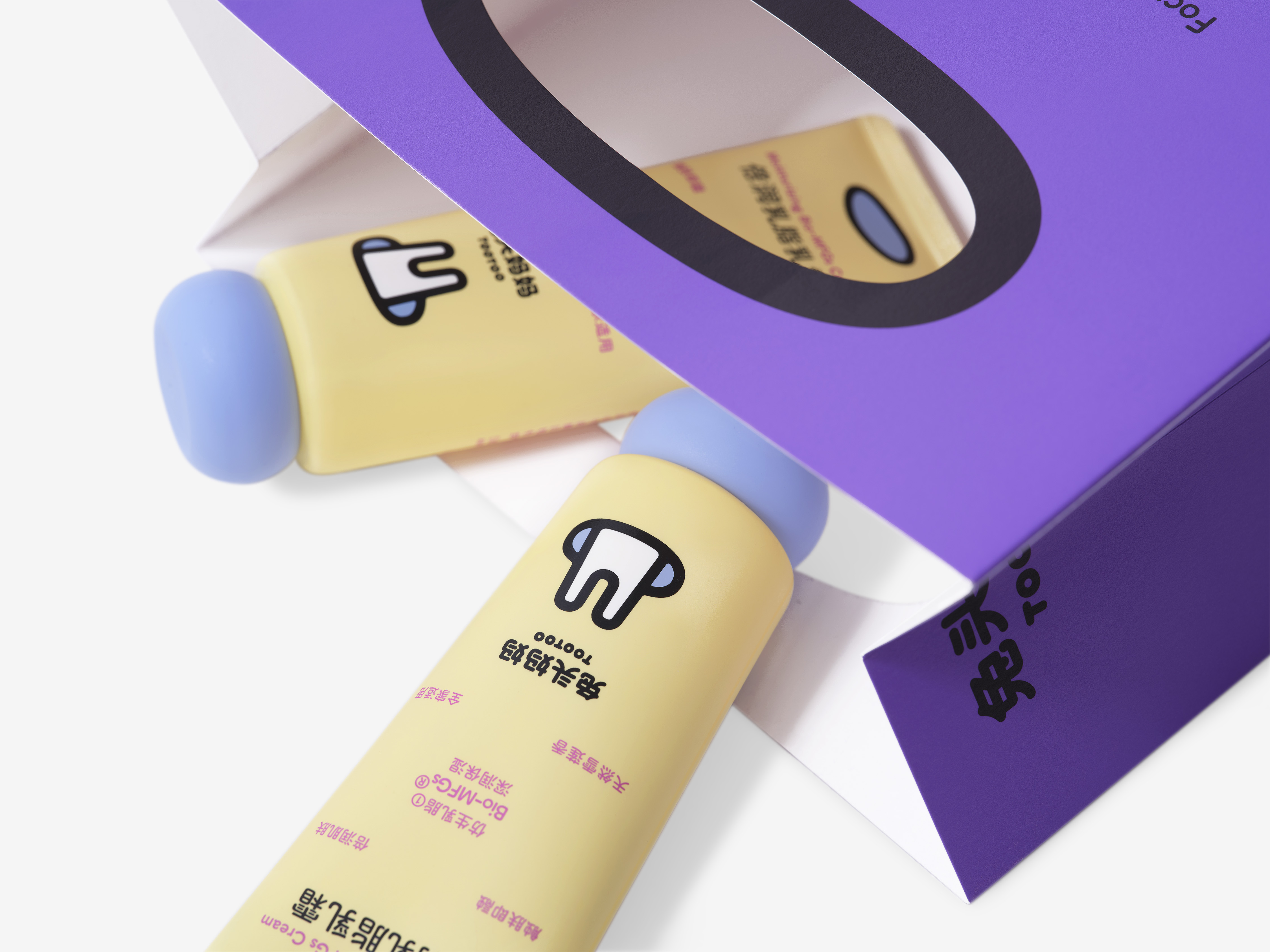
The logo draws inspiration from the “rabbit hole”—the entrance to a wondrous world in fairy tales. For children, the hole represents the unknown, play, and discovery; for mothers, it symbolizes protection, inclusion, and belonging. We transformed this dual meaning into the core of the brand’s visual identity: an open oval form that resembles a rabbit’s burrow, while also evoking the embrace of a mother.
In application, this concept of the “hole” continues to unfold across different media and contexts, appearing in varied ways as a quiet emotional code between the brand and its audience. It serves as both a visual motif and a psychological entry point, inviting people to rethink the relationship between care and growth.
TooToo is not a brand that seeks cuteness for its own sake. It is an understanding of growth—protecting innocence with reason, nurturing love with science. It turns “care” into a bridge between affection and exploration.
TooToo is a brand dedicated to age-specific skincare for children. We believe that love for a child is not just emotional overflow, but a form of care that is both scientific and rhythmic. The brand’s visual system is built on this belief: maintaining structure within imagination, and preserving warmth within order.
The logo draws inspiration from the “rabbit hole”—the entrance to a wondrous world in fairy tales. For children, the hole represents the unknown, play, and discovery; for mothers, it symbolizes protection, inclusion, and belonging. We transformed this dual meaning into the core of the brand’s visual identity: an open oval form that resembles a rabbit’s burrow, while also evoking the embrace of a mother.
In application, this concept of the “hole” continues to unfold across different media and contexts, appearing in varied ways as a quiet emotional code between the brand and its audience. It serves as both a visual motif and a psychological entry point, inviting people to rethink the relationship between care and growth.
TooToo is not a brand that seeks cuteness for its own sake. It is an understanding of growth—protecting innocence with reason, nurturing love with science. It turns “care” into a bridge between affection and exploration.
兔头妈妈 TooToo 的创始人是一位现代都市高知女性,也曾以辩手身份参与一档热门脱口秀辩论节目。她以理性真诚、犀利而不失幽默的风格走入公众视线,也以同样诚挚的方式去培养、爱护她的孩子。她的身份多元,既是辩手,教育行业的KOL,也是一位母亲,懂得平衡理性与温度,也清楚孩子需要何种呵护。
兔头妈妈 TooToo 是一个专注“儿童分龄洗护”的领导品牌。我们相信,父母对孩子的爱不应只是情感的溢出,更是一种科学而有节奏的陪伴。品牌的视觉系统正是由此建立:在充满童趣的想象中保持结构,在专业的秩序里留存温度。
图形标识的灵感来自于“兔子洞”——那个在童话世界中通往奇幻天地的入口。对于孩子来说,“洞”意味着未知、游戏与发现;而对于母亲,它对应着保护、包容和归属。我们将这种双重意义转化为品牌的核心视觉:一个开放的椭圆形,如同兔子洞的入口,也是母亲怀抱的象征。
在品牌的具体应用中,这个“洞”的概念也被不断延展:它在不同的媒介、不同的位置、以不同的方式出现,成为品牌与消费者之间的情感暗语。既是视觉语言,也是心理入口,引导人们重新理解“呵护”与“成长”之间的关系。
兔头妈妈 TooToo 不是一个追求可爱的品牌,而是一种对成长的理解:以理性守护天真,以科学呵护亲情。它让“护理”成为爱与成长之间的一座桥梁。


All Images Copyright © 2025 ABCD. All Rights Reserved