pidan NEW
ART DIRECTOR: Guang Yu / Nod Young
DESIGNER: Hu Wen / Xu Mingru
YEAR: 2022
CLIENT: pidan
We designed the brand image of pidan in 2018, which was widely recognized by our customers and the public and won some professional awards. In 2022, we were commissioned by pidan again to redesign a new brand image for pidan in accordance with the future brand development trend. We modified and embellished the details of the logo by increasing the gray scale of word. What will happen to the overall visual style of pidan due to the above change in detail?
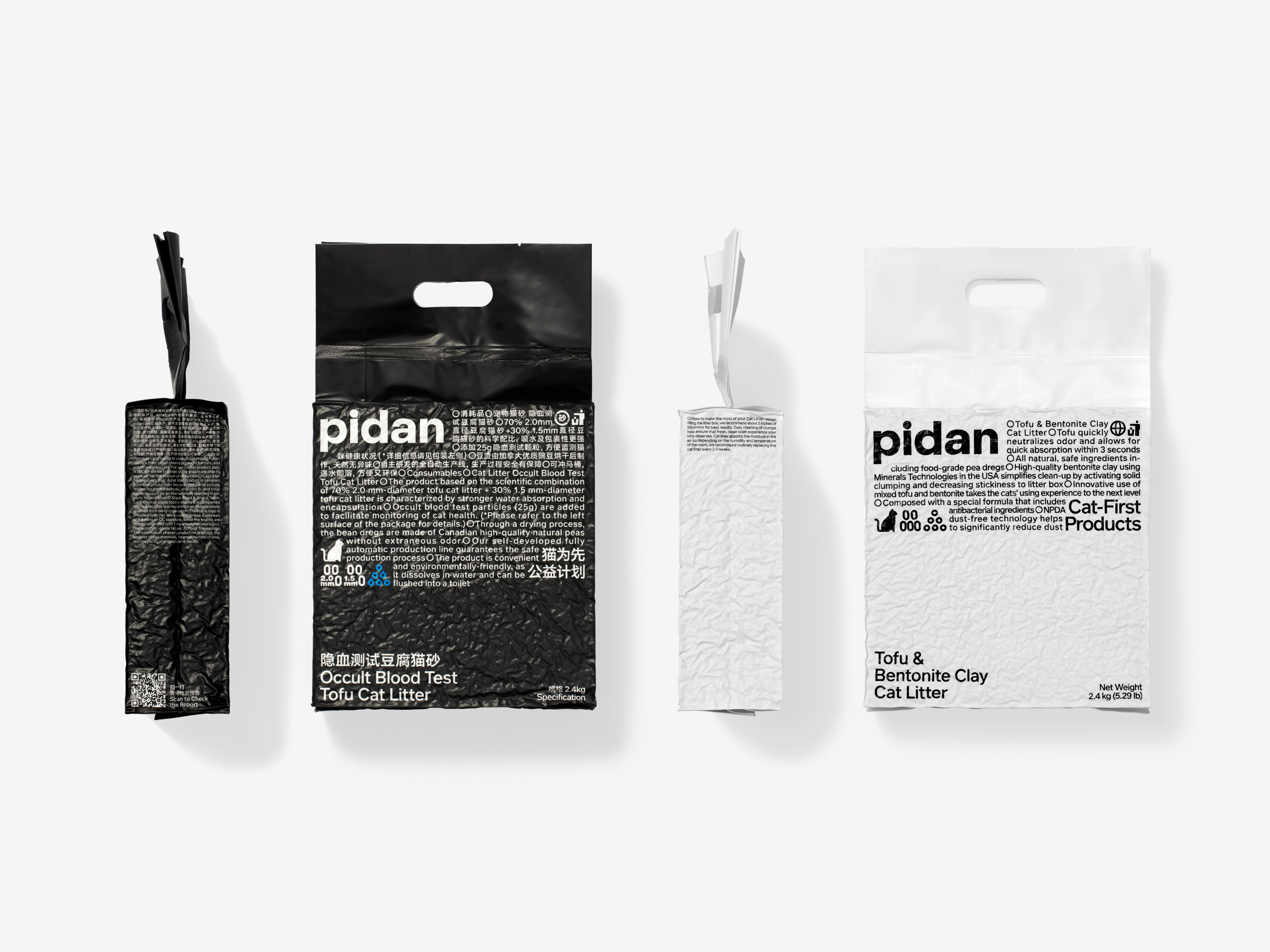
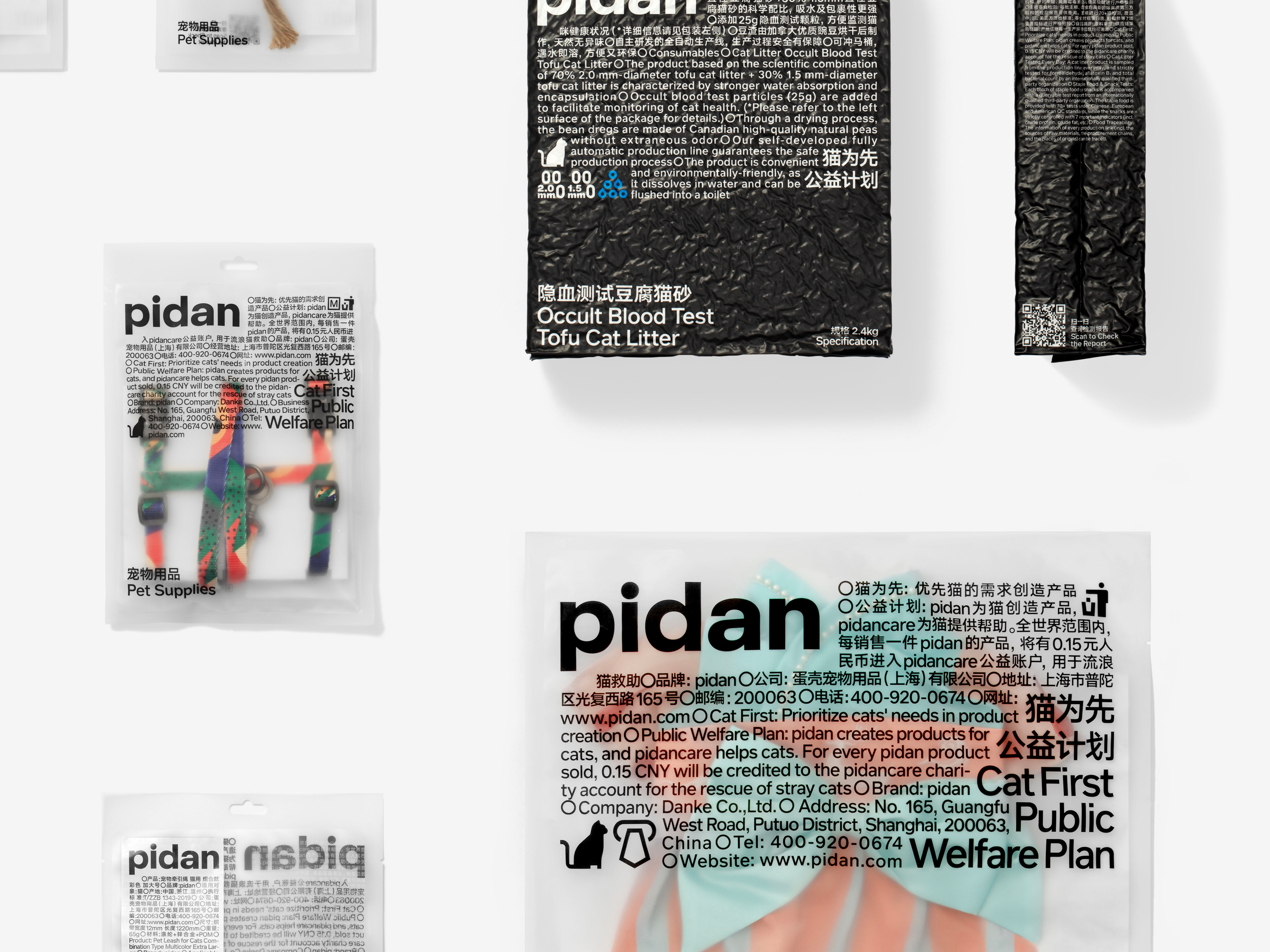
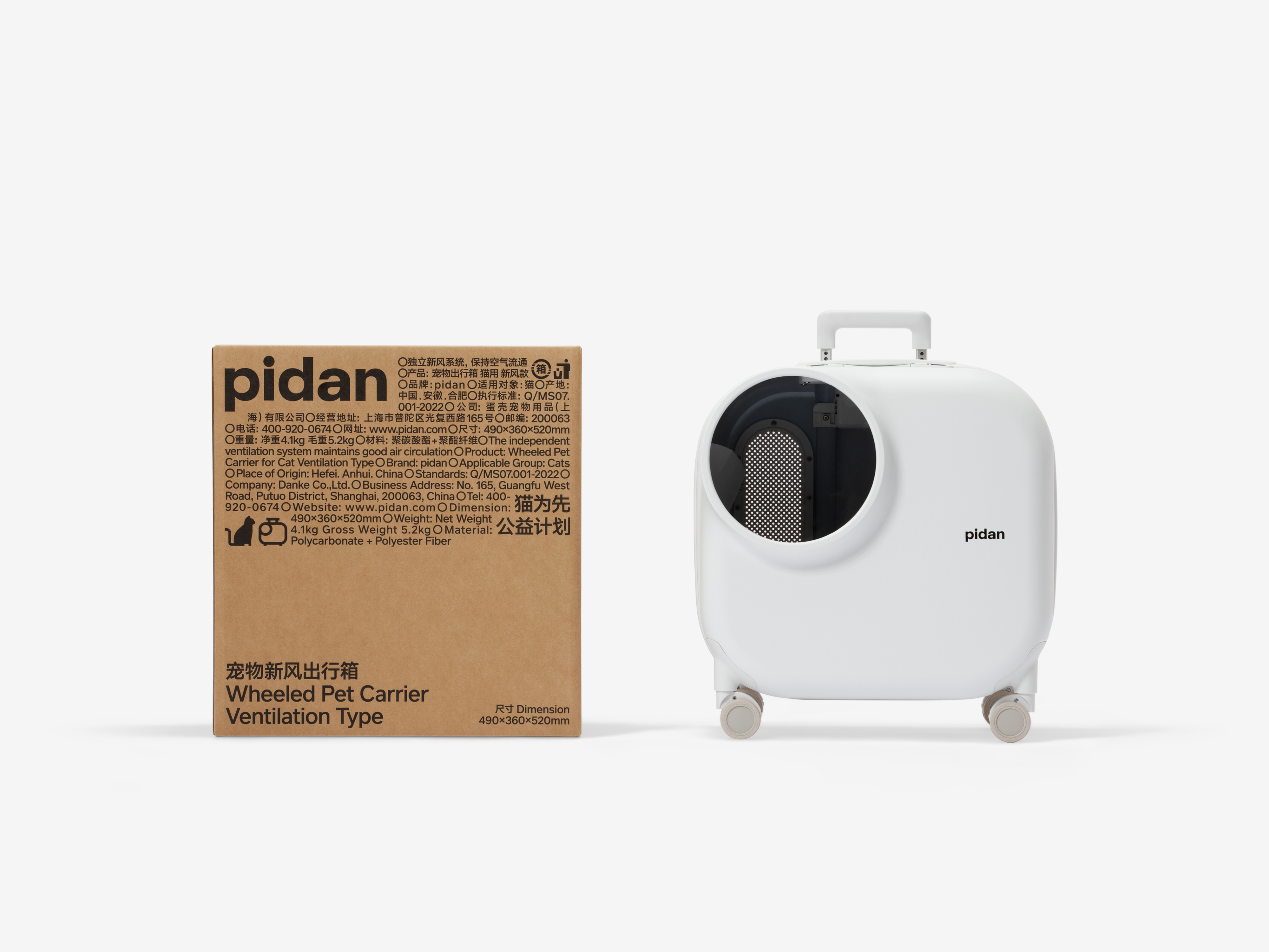
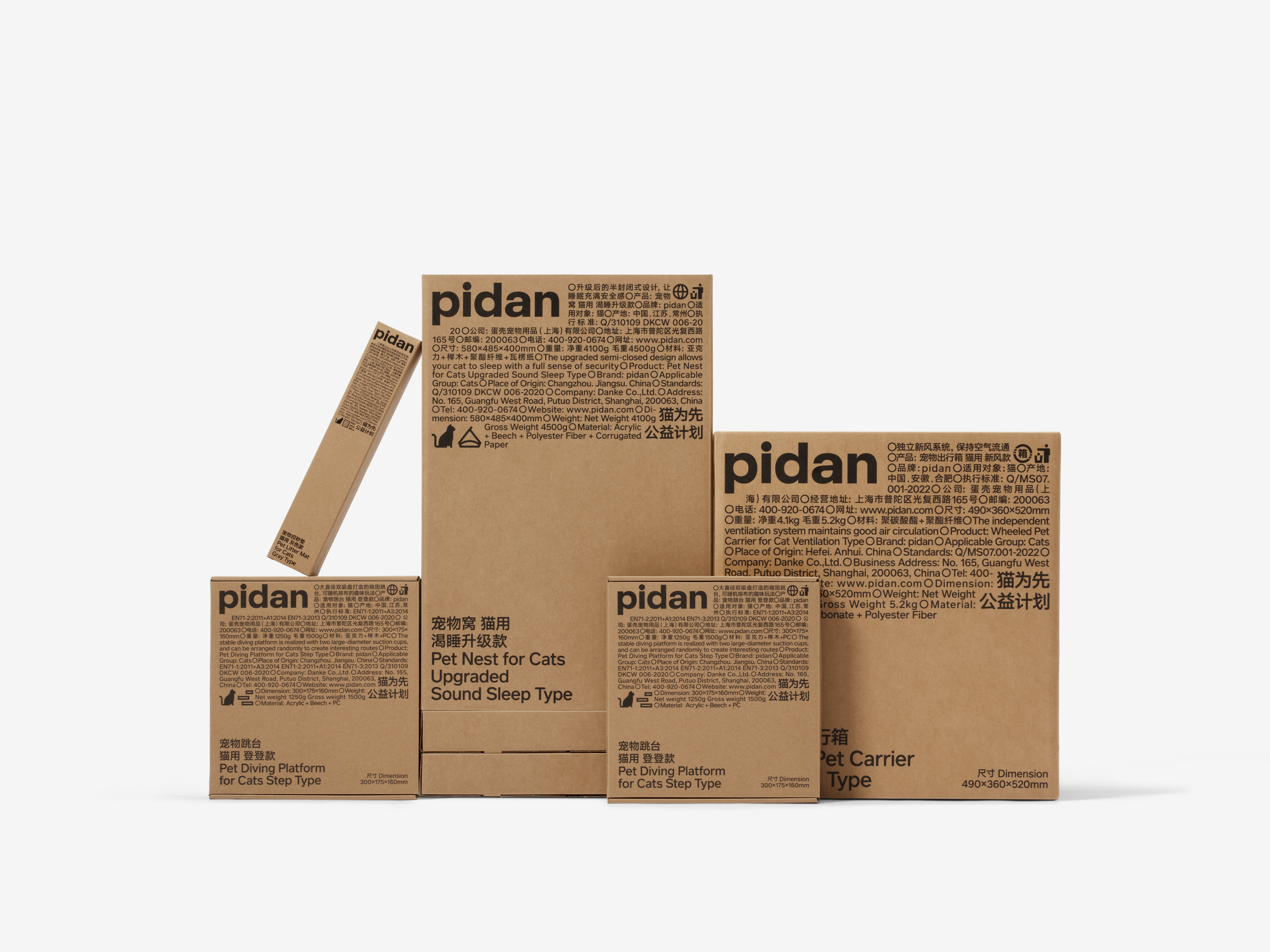
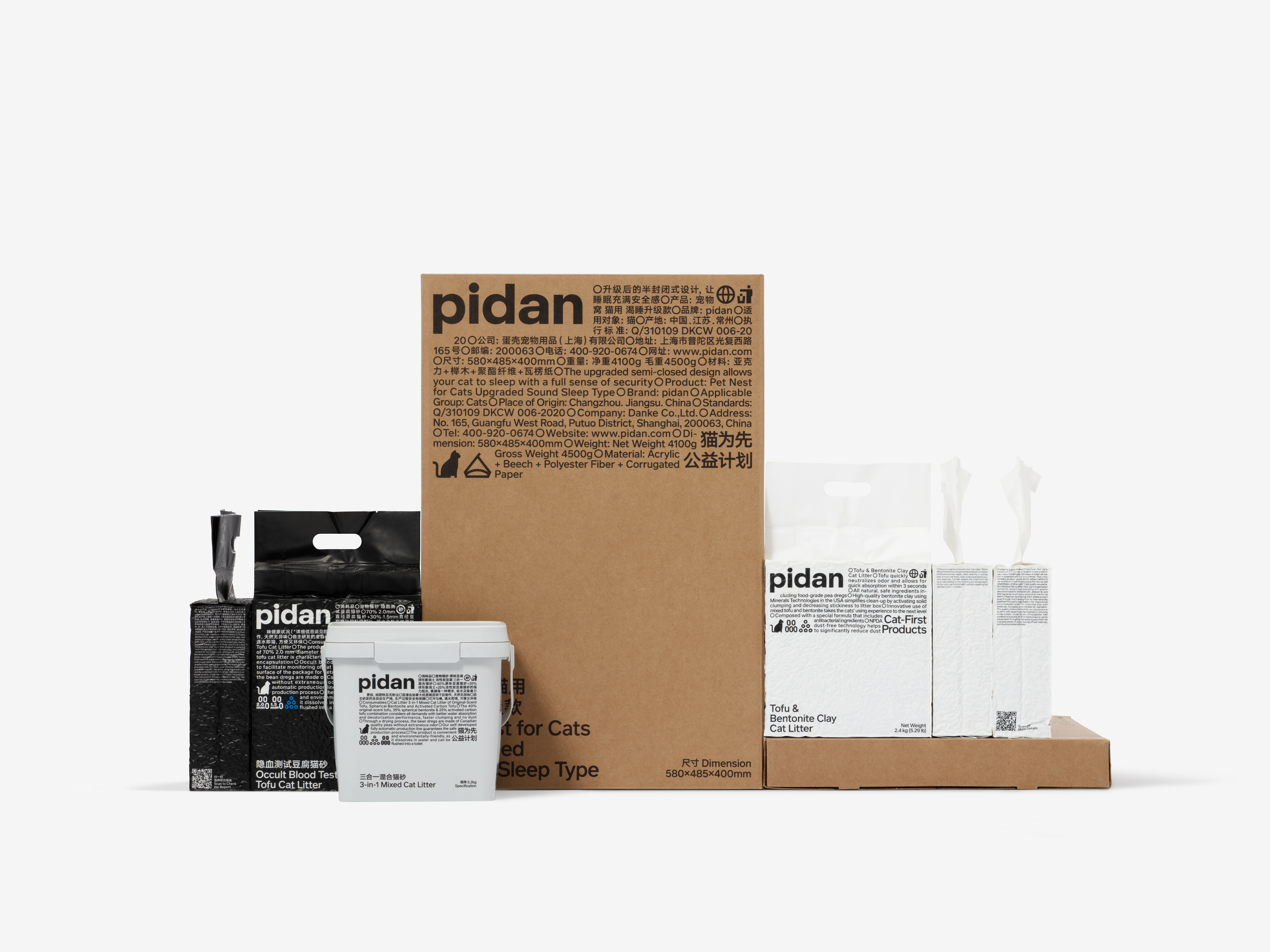
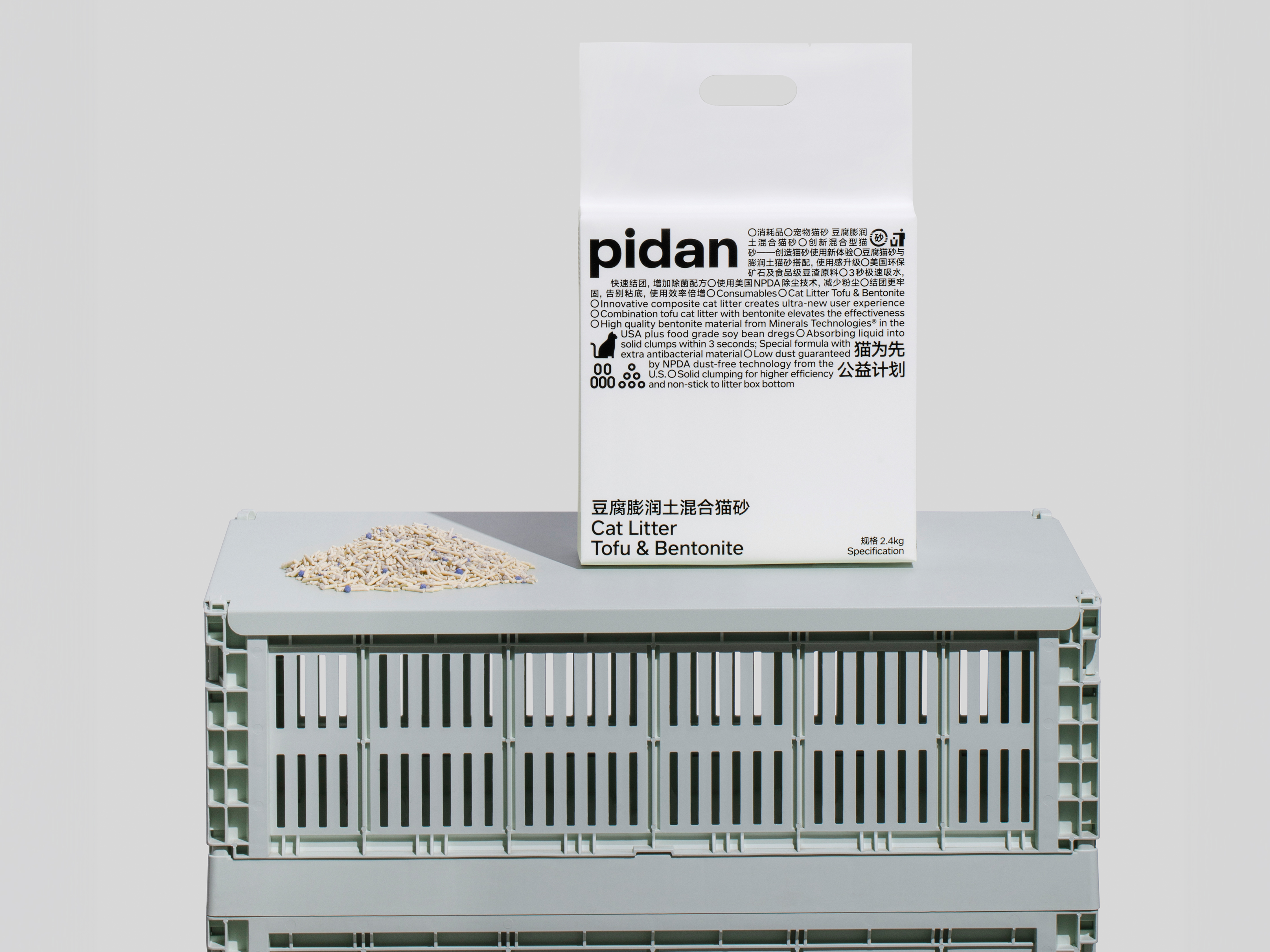
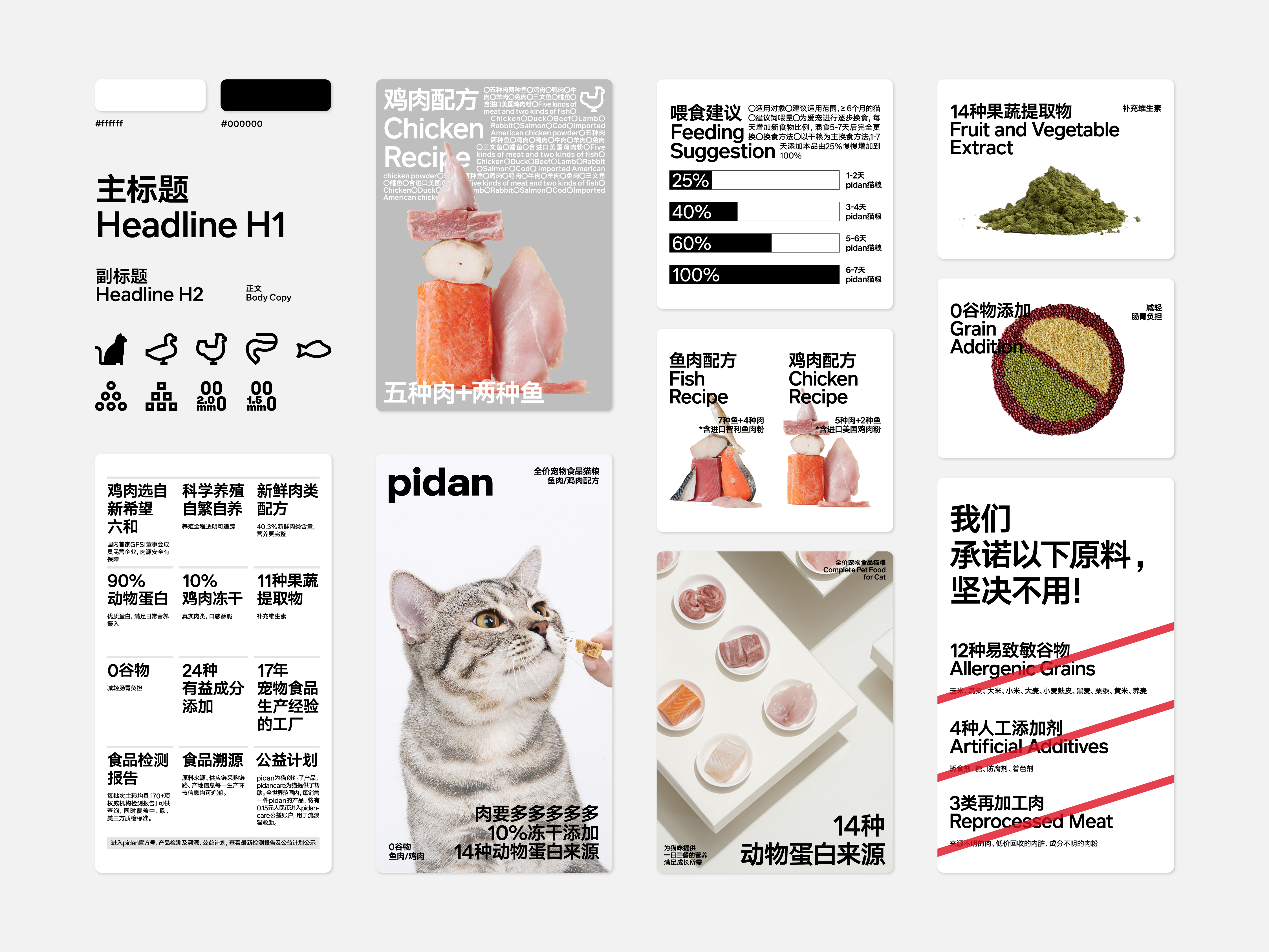
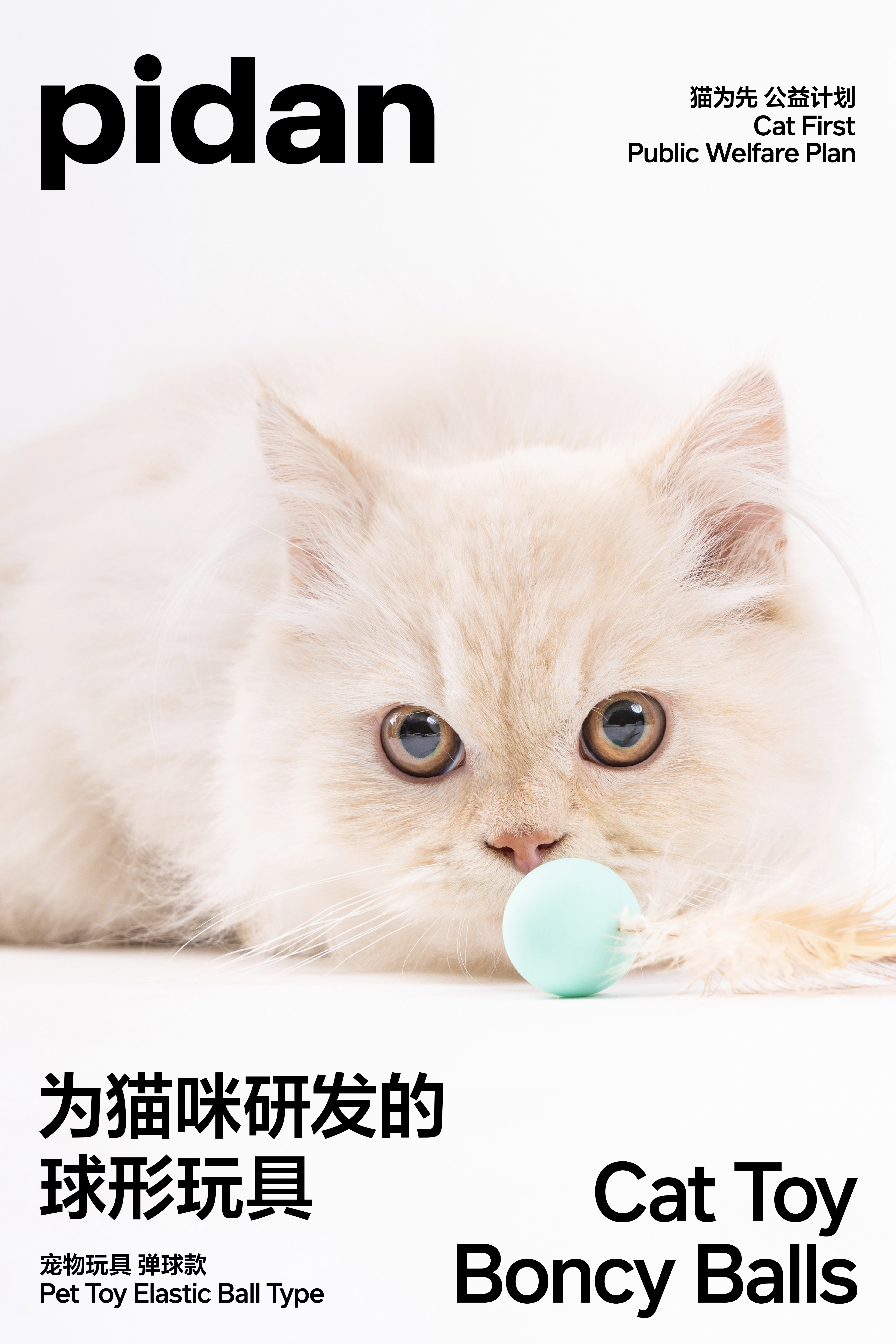
pidan had sufficient visual identity, but during the continuous development of the brand, the growing product types and quantity resulted in more difficulties in visual asset management. At the same time, pidan will focus more on the pet category in the future, so more attention should be paid to the logic of visual categorization. Therefore, the core theme of pidan rebranding will be “More Focused, More Prominent and Calmer”.
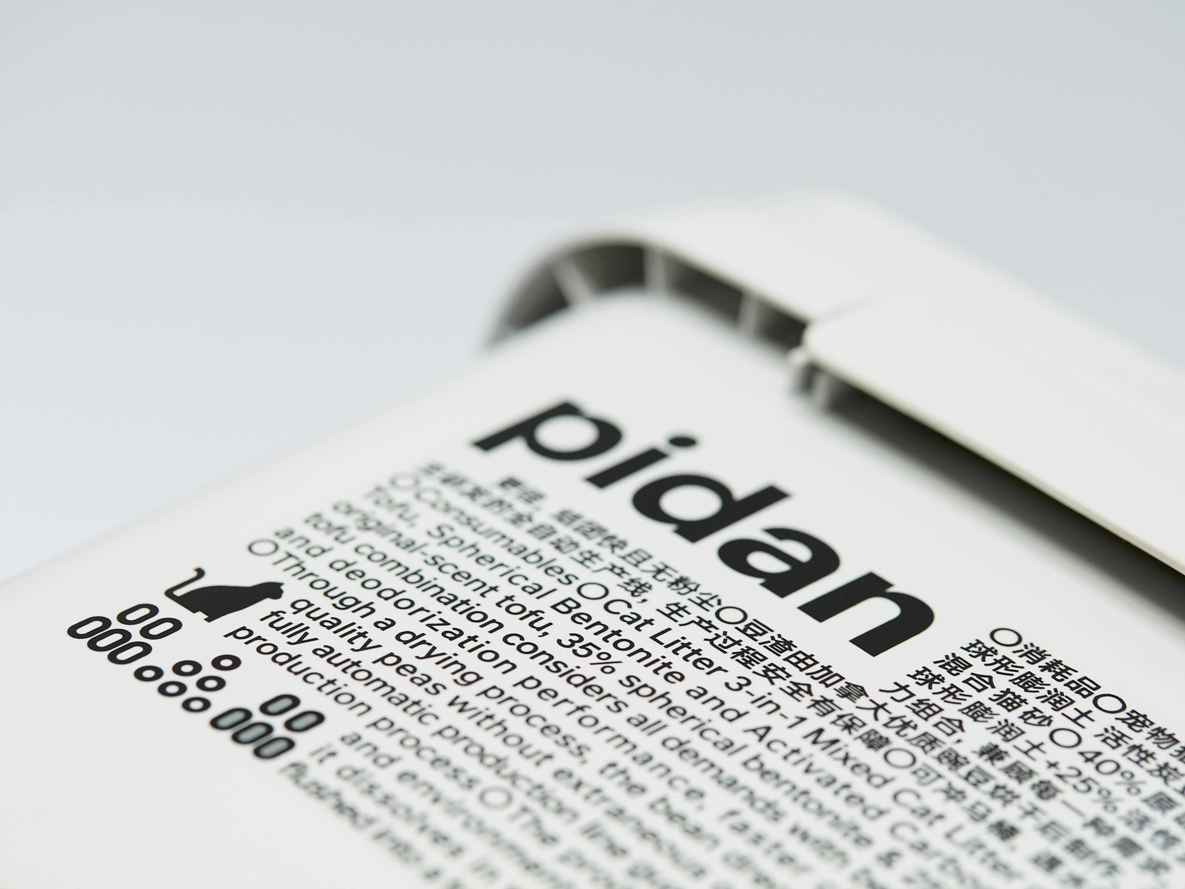
We set up a concept of information group that is composed of pidan’s logo and necessary functional information with the core demand of giving prominence to efficiency. Four points of definition are given to increase the visual identity. In the context of pidan’s brand application, all information is necessary and all specifications serve the content rather than being decoration. In the final scheme, pidan’s packaging system is merely presented in monochrome in order to avoid any hints or distractions from colors. This is a choice indicating complete calmness.
We received a lot of support from our customers during the design process. They showed a more decisive and resolute attitude towards brand output. In the view of pidan, the products designed for pets should always focus on pets; reason, focus and calmness are the most valuable characters for design. The consumers who really care about their pets’ using experience may understand pets’ language and skills that “touch the owners” and return to the original nature of pets. This is pidan.
pidan had sufficient visual identity, but during the continuous development of the brand, the growing product types and quantity resulted in more difficulties in visual asset management. At the same time, pidan will focus more on the pet category in the future, so more attention should be paid to the logic of visual categorization. Therefore, the core theme of pidan rebranding will be “More Focused, More Prominent and Calmer”.
We set up a concept of information group that is composed of pidan’s logo and necessary functional information with the core demand of giving prominence to efficiency. Four points of definition are given to increase the visual identity. In the context of pidan’s brand application, all information is necessary and all specifications serve the content rather than being decoration. In the final scheme, pidan’s packaging system is merely presented in monochrome in order to avoid any hints or distractions from colors. This is a choice indicating complete calmness.
We received a lot of support from our customers during the design process. They showed a more decisive and resolute attitude towards brand output. In the view of pidan, the products designed for pets should always focus on pets; reason, focus and calmness are the most valuable characters for design. The consumers who really care about their pets’ using experience may understand pets’ language and skills that “touch the owners” and return to the original nature of pets. This is pidan.
在 2018 年,我们设计了 pidan 的品牌形象,得到了客户和公众的认可,并获得了专业的奖项。2022 年,我们再一次接受 pidan 的委托,根据未来的品牌发展设计新的品牌形象。我们重新润色了 pidan 标识的细节,让字面的灰度增加。这个细节的改变,预示着 pidan 整体视觉风格将会发生怎样的变化?pidan 原有的视觉识别性是足够的,但在品牌不断发展中,产品品类和单品数量都在不断增加,视觉资产管理难度变大。同时,pidan 未来将更加聚焦于宠物类目,这也要求在视觉分类的逻辑上更加专注。因此,我们认为更专注、更突出、更冷静,可以作为此次 pidan 品牌升级的核心主旨。
我们设置了一个信息团的概念,将 pidan 的标识与必要的功能性信息形成一个以突出效率为核心诉求的信息团,并通过四个点的突出定义来增加视觉识别性。在 pidan 的品牌应用环境中,一切信息都是必要的,一切规范都是服务于内容,而非装饰。在最终的方案中,为了屏蔽色彩带来的暗示或干扰,pidan 的包装系统甚至仅使用单色呈现,可以说是冷静到底的一种选择。
在方案设计过程中,我们得到很多来自客户的支持,在品牌输出的态度上,客户比我们表现得更加果断和坚决。在 pidan 看来,为宠物设计的产品应该永远站在宠物的立场之上,而理性、专注和冷静正是最难能可贵的设计品质,消费者如果真的在乎宠物的使用感受,就应该理解并懂得应该如何过滤那些“打动主人” 的语言和技巧,回归到本质世界中。这就是pidan。


All Images Copyright © 2022 pidan. All Rights Reserved.