pidan
ART DIRECTOR: Guang Yu / Nod Young
DESIGNER: Tian Cai / Guang Yu
YEAR: 2018
CLIENT: pidan
The brand reconstruction of pidan, one of the fastest growing and most influential local pet product brands
in recent years, needs to endow “pets” with a brand-new understanding and definition through design.
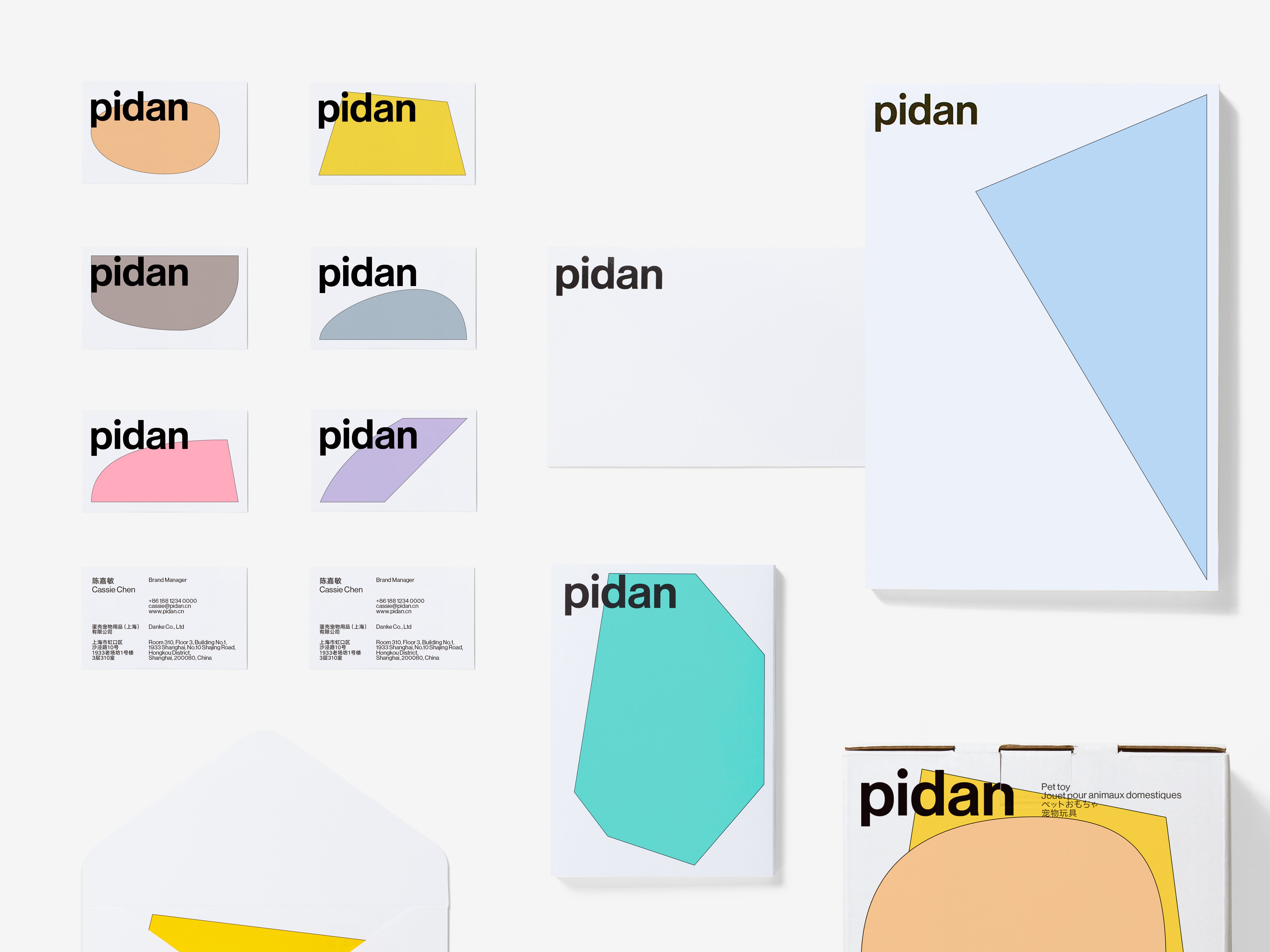
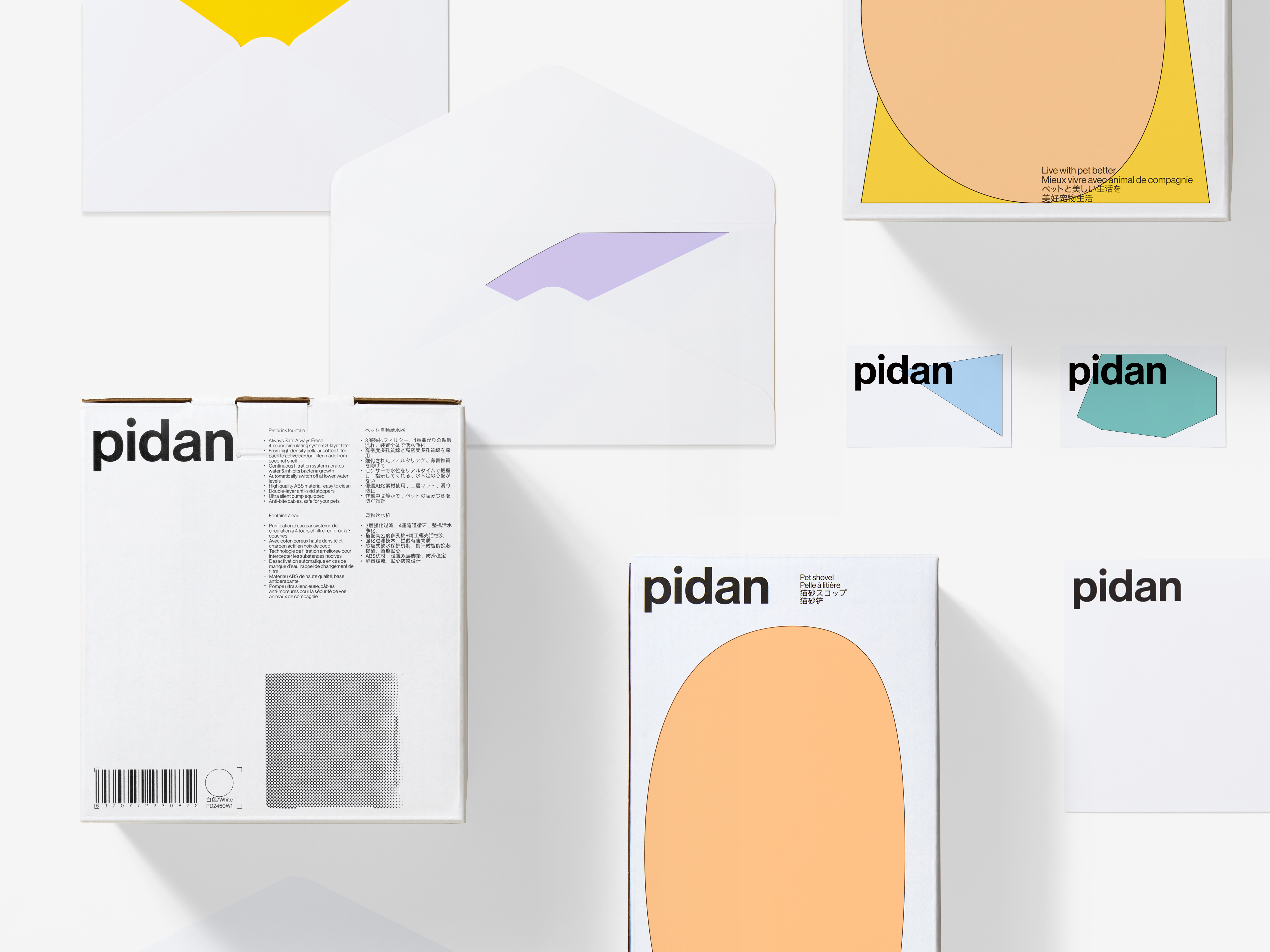
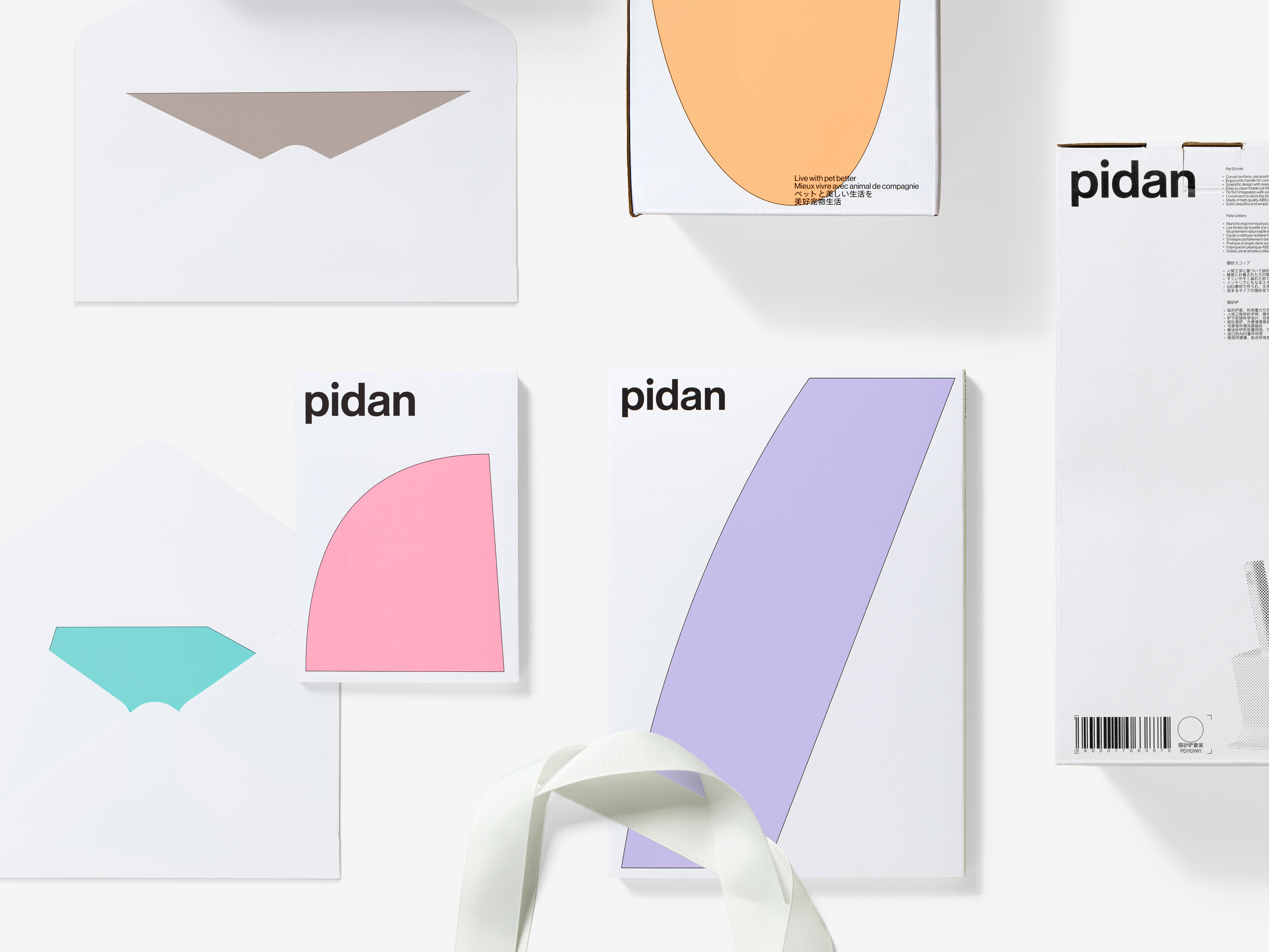
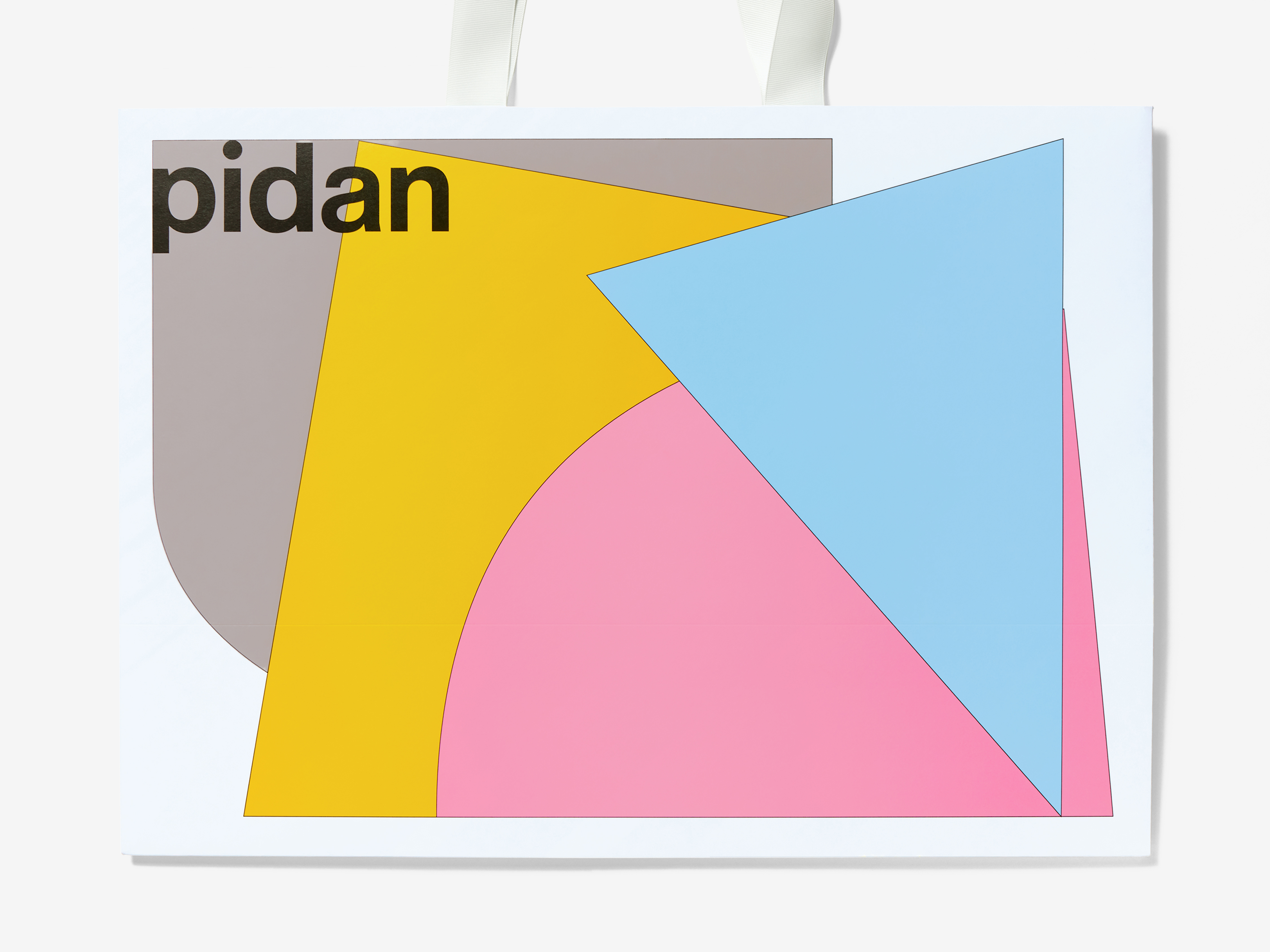
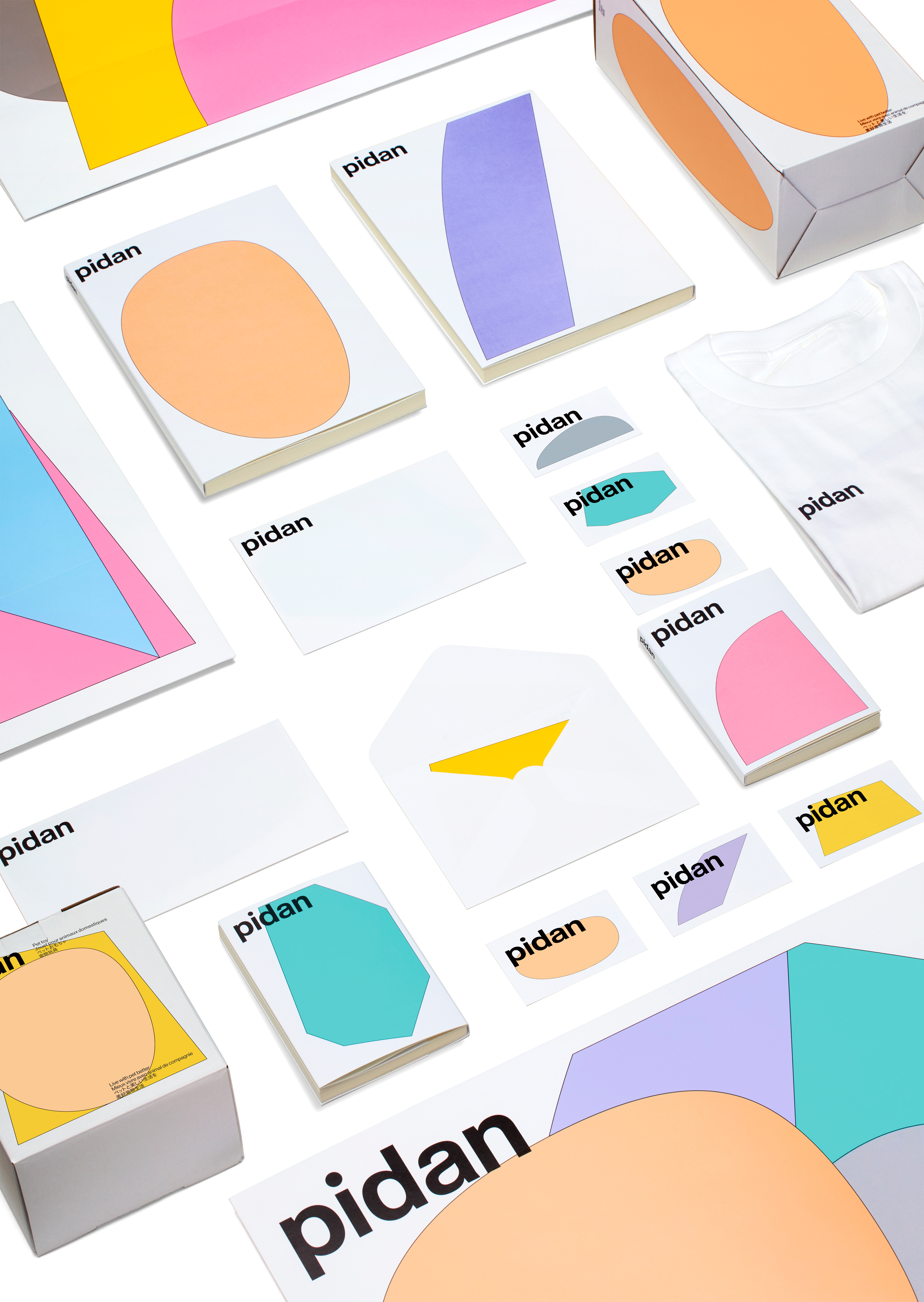
In terms of the brand conception of “allowing animals to live more harmoniously with humanity”, the future pidan’s products will be closer to the design intended for people rather than for cats, dogs, fishes and insects. We used eight geometric figures, respectively corresponding to eight animal categories in the current product catalogue of pidan. Each type of animal has its own unique shapes and color usage specifications, which, along with the different temperaments emanating from in the details, allow the pidan’s brand to stand out in the complex environment of the pet product market that causes visual fatigue.
The impressive bright and eye-catching new image and clear information enable users to quickly distinguish product types by recognizing graphics and colors. At the same time, the vivid communication of product attitude is more conducive to establish and consolidate emotional relationships.
作为近年来发展最快、影响力最大的本土宠物用品品牌之一,pidan 的品牌重建,需要通过设计赋予“宠物”全新的理解与定义。
在“让动物更加平等地与人相处”这个品牌构想之上,未来 pidan 的产品面貌将更接近于为人所做的设计,而非专为猫狗鱼虫所做。我们使用了八个几何图形,分别对应 pidan 目前产品线中的八个动物门类,每一种动物都拥有自己的专属形状和色彩使用规范,连同细节中流露出来的不同性情,让品牌得以在宠物用品市场这个令人视觉疲劳的复杂环境中,脱颖而出。
新形象中的亮丽醒目、信息清晰,令用户仅通过对于图形和色彩的识别便可快速分辨产品类型,印象深刻;同时产品态度的鲜明传递,更有利于情感关系的建立和巩固。
在“让动物更加平等地与人相处”这个品牌构想之上,未来 pidan 的产品面貌将更接近于为人所做的设计,而非专为猫狗鱼虫所做。我们使用了八个几何图形,分别对应 pidan 目前产品线中的八个动物门类,每一种动物都拥有自己的专属形状和色彩使用规范,连同细节中流露出来的不同性情,让品牌得以在宠物用品市场这个令人视觉疲劳的复杂环境中,脱颖而出。
新形象中的亮丽醒目、信息清晰,令用户仅通过对于图形和色彩的识别便可快速分辨产品类型,印象深刻;同时产品态度的鲜明传递,更有利于情感关系的建立和巩固。


All Images Copyright © 2020 pidan. All Rights Reserved