minibala
迷你巴拉
ART DIRECTOR: Guang Yu / Nod Young
DESIGNER: Liao Liao / Hu Wen / Wen Di
YEAR: 2022
CLIENT: minibala
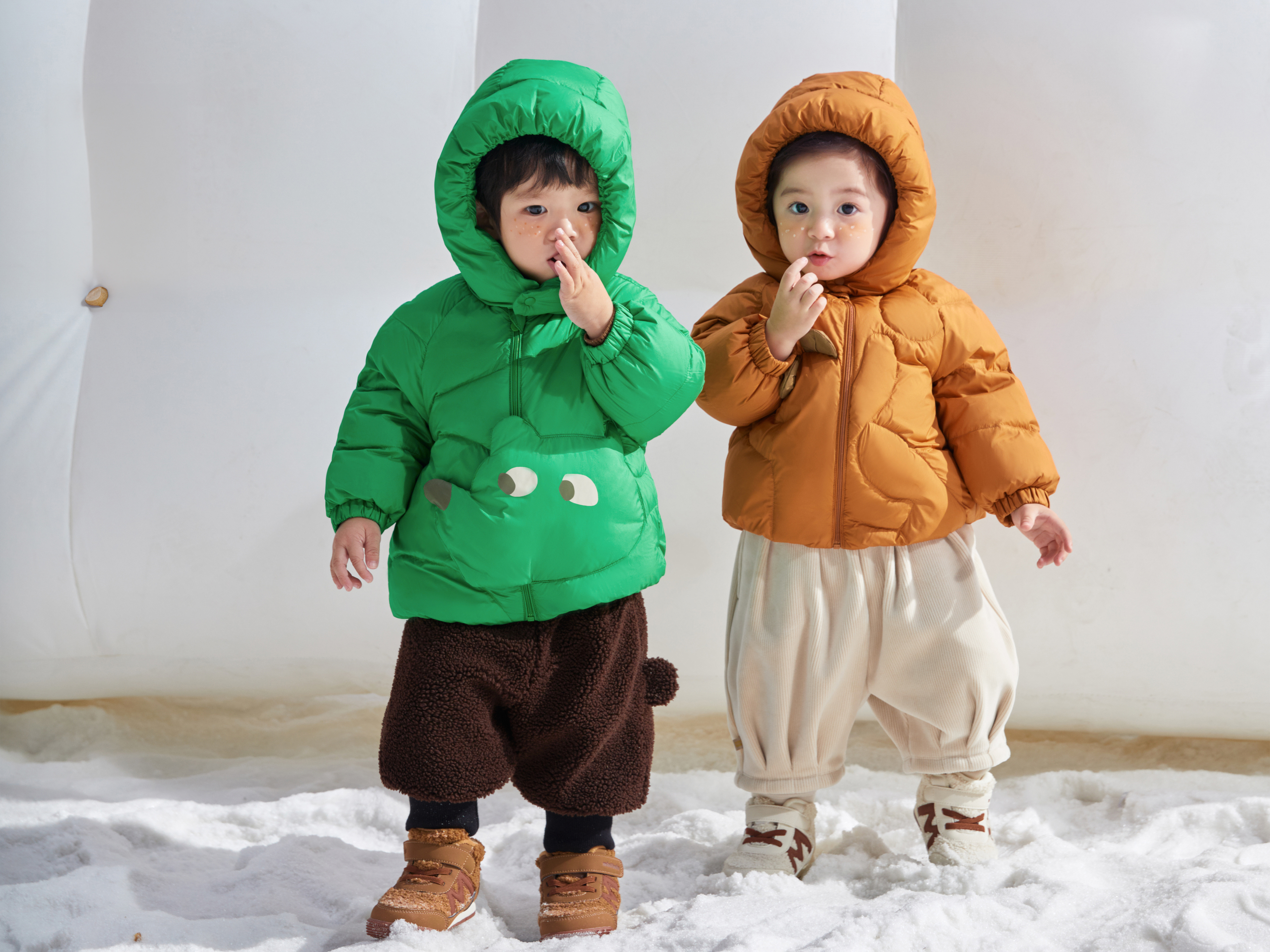
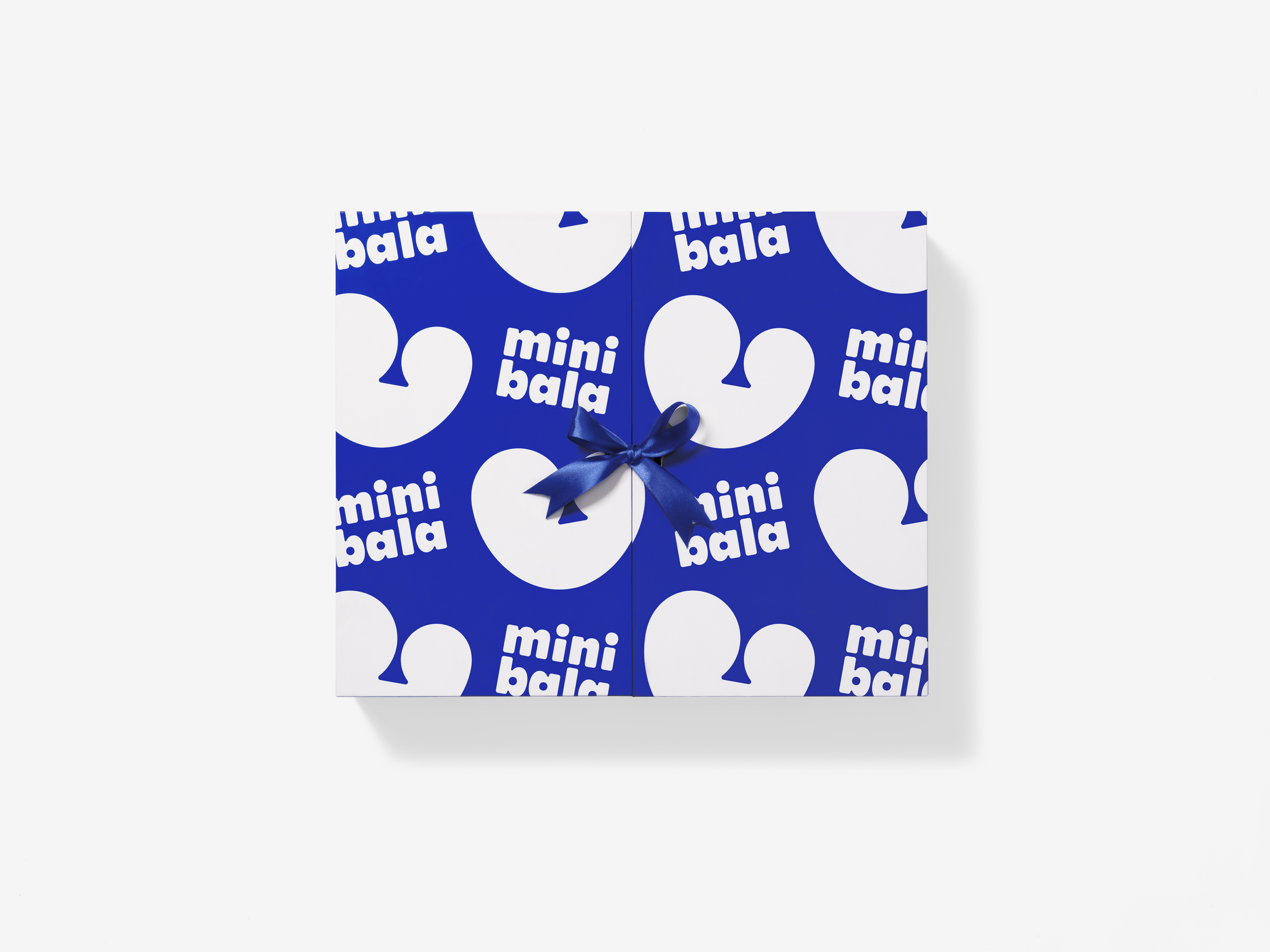
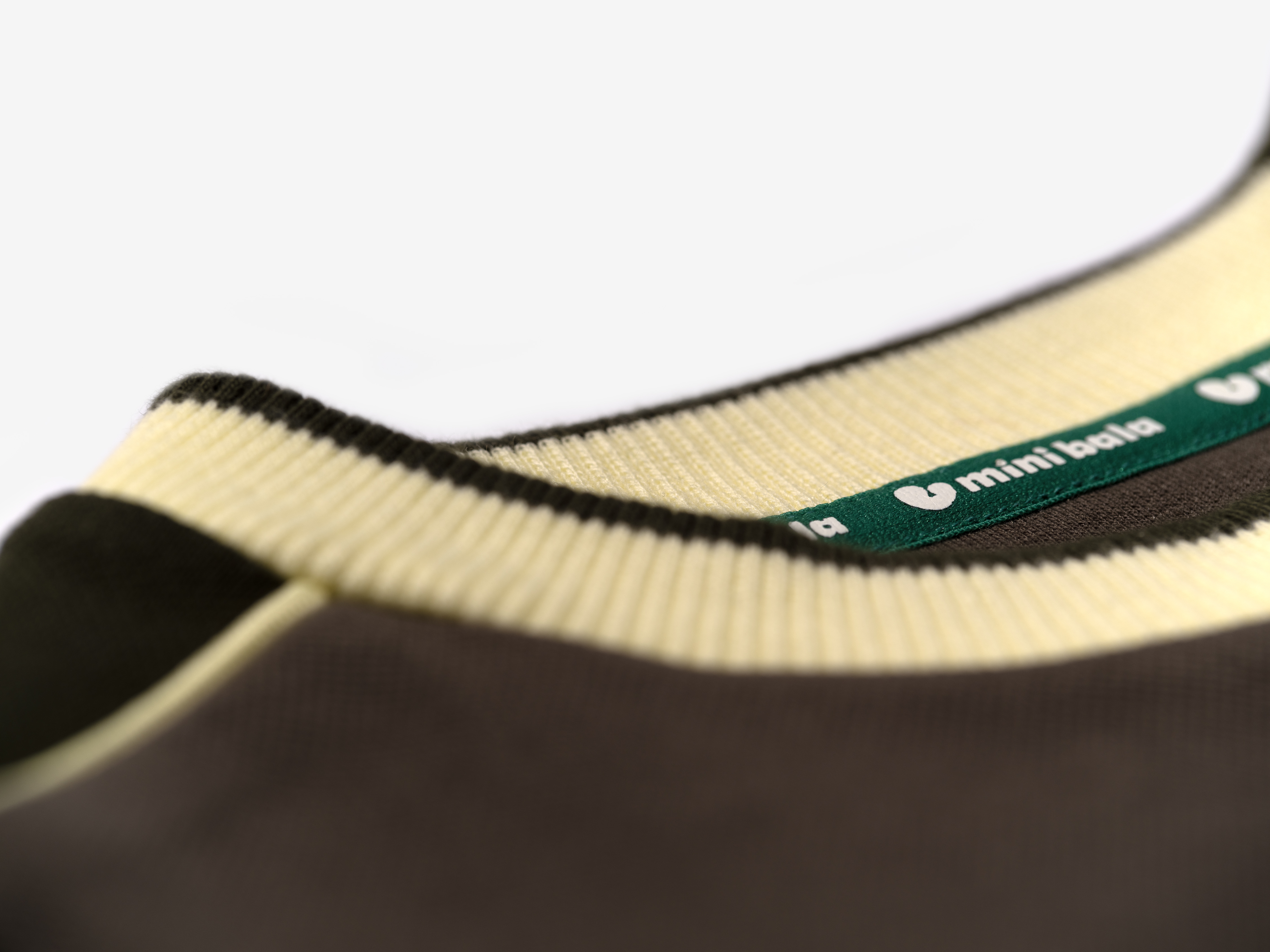
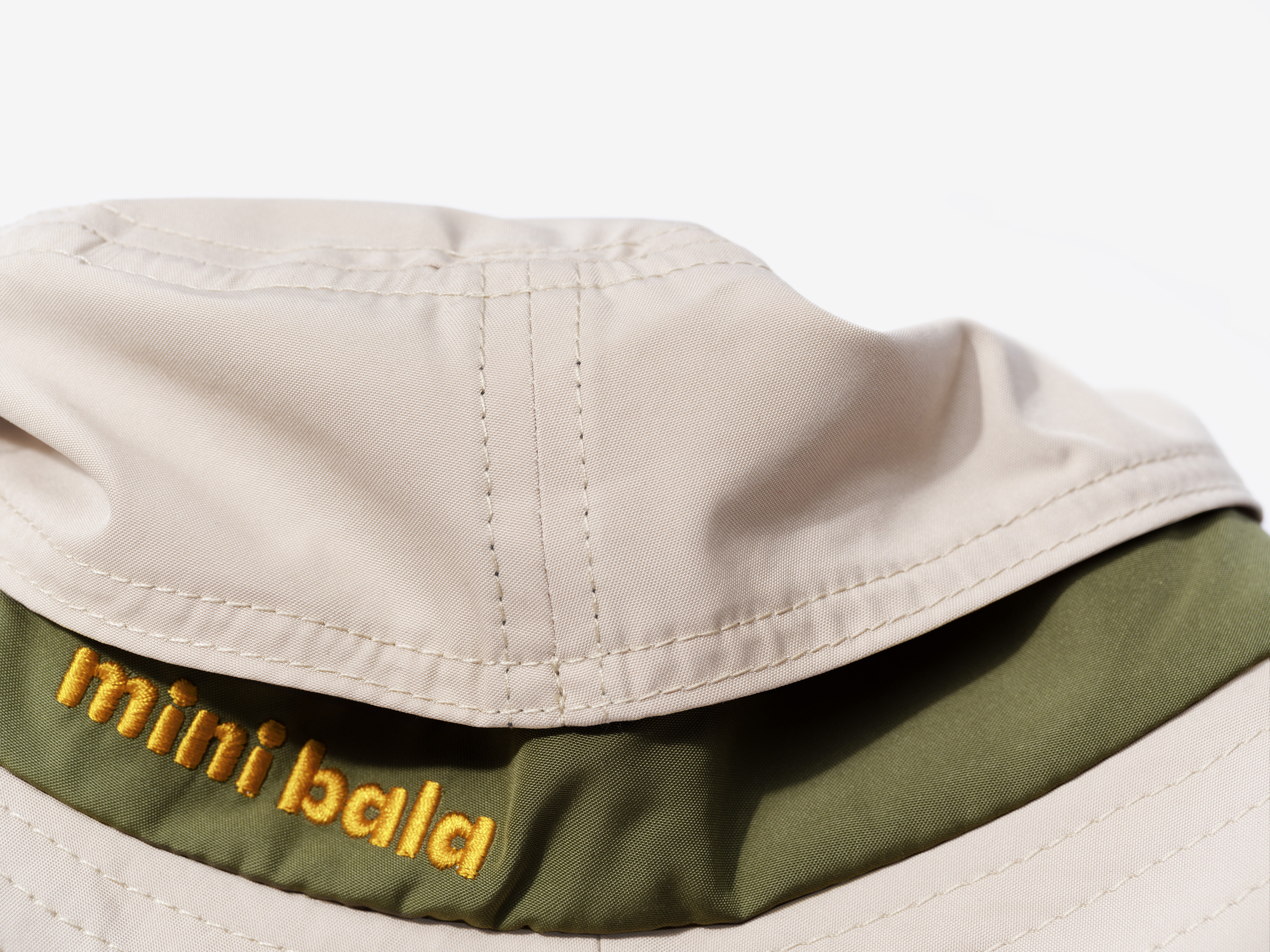
Nurturing and accompanying are the most crucial actions and responsibilities parents undertake during their baby's growth. Inseparable from this are the immense feelings of happiness and joyful experiences. It is upon this foundation that minibala, a mother-and-child brand, builds its brand philosophy. By extracting the emotions of happiness and joy from this seemingly simple parent-child relationship, minibala aims to establish a universal image of barrier-free communication for global consumers.The brand identity of minibala consists of a graphic emblem and a wordmark that can be used separately. The main element of the graphic emblem is a heart-shaped design that represents "nurturing and accompanying." The shape of the heart transcends language barriers and stands as a timeless representation of love and emotions, possessing an irreplaceable quality. The prominent semi-circular shape at the top can be understood as parents and their baby gazing at each other, symbolizing a defining moment of nurturing and accompanying. The font design in the wordmark is solid and stable, instilling a sense of both security and quality that is necessary for the category. The rounded corners convey a friendly feeling, signifying the meticulous care and nurturing parents provide to their baby.
养育及陪伴,是父母伴随宝宝成长过程中最为重要的行为和责任,与此如影随形的是莫大的幸福感与快乐体验——母婴品牌迷你巴拉的品牌理念正基于此,将“养育”与“陪伴”作为品牌的基因,在这一看似朴素的亲子关系中提炼幸福与快乐的情感认同,面向全球消费者,树立一个无障碍沟通的经典形象。迷你巴拉的标识包括图形标识与文字标识,它们可以分开使用。其中图形标识的主体是一个对应“养育与陪伴”的心形造型,“心”的形状属于一种世界语言,也是爱意与情感的经典呈现,它在某种程度上具备不可替代性。顶端突出的半圆造型可以理解为是在彼此凝视的父母与宝宝,这是一个养育与陪伴的标志性瞬间。文字标识中的字体设计扎实且稳定,兼具品类必须的安全感和品质感,而采用了圆角的处理方式于细节之中传达出友善的感觉,意味着父母对宝宝无微不至的关怀与呵护。


All Images Copyright © 2022 minibala 迷你巴拉. All Rights Reserved.