gaga
ART DIRECTOR: Nod Young / Guang Yu
DESIGNER: Liao Liao
YEAR: 2020
CLIENT: gaga
"To make goodness more genuine and happiness purer". Gaga wants to bring consumers not just delicious food and a quality environment, but a lifestyle that combines companionship, growth and
happiness. What we discovered during the rebranding process is that there is a warmth flowing through the gaga team, the source of the warmth that comes from gaga's love of life, which is pure
and slow, determined and elegant - the logo of gaga was designed with these keywords.
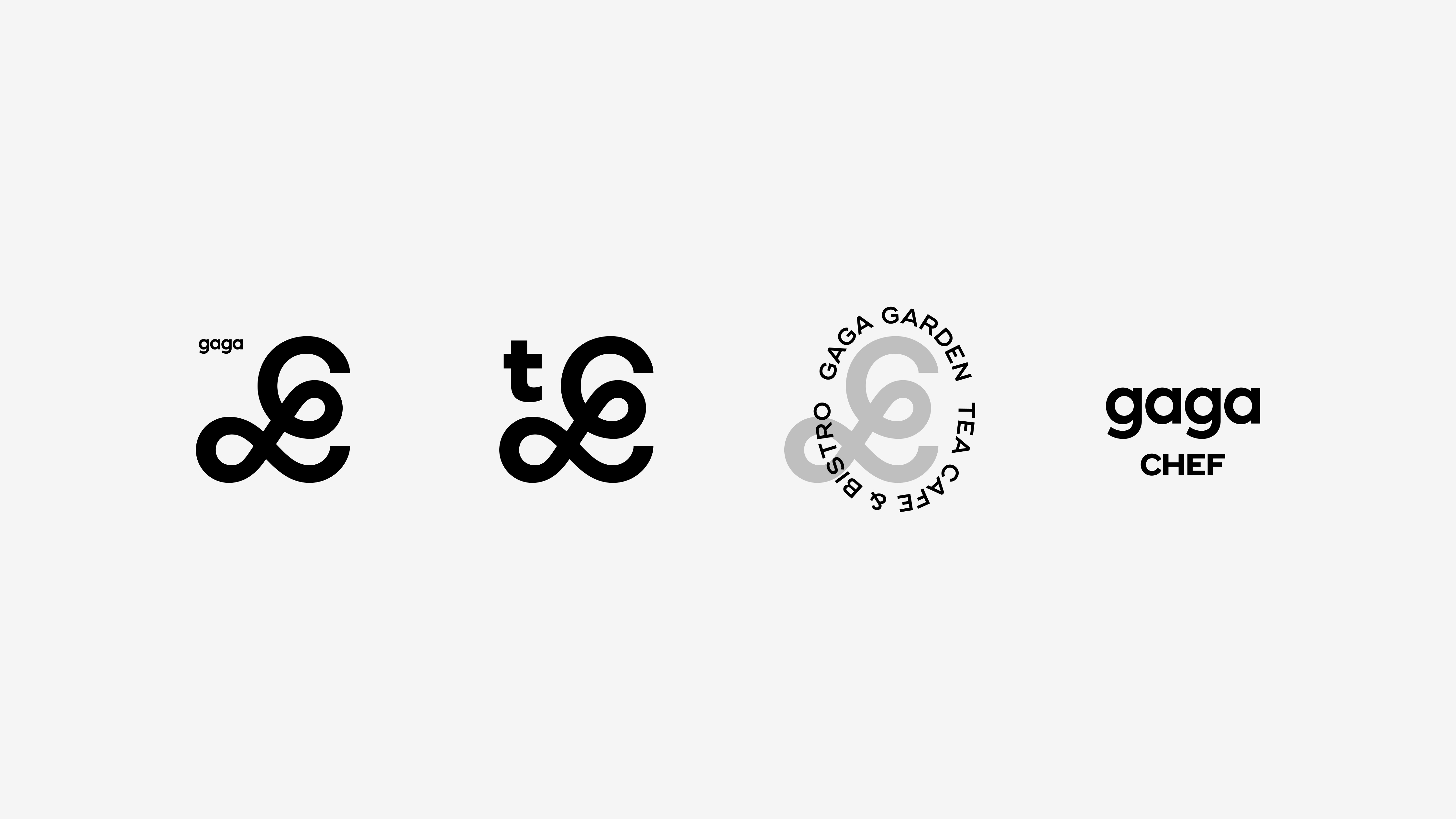
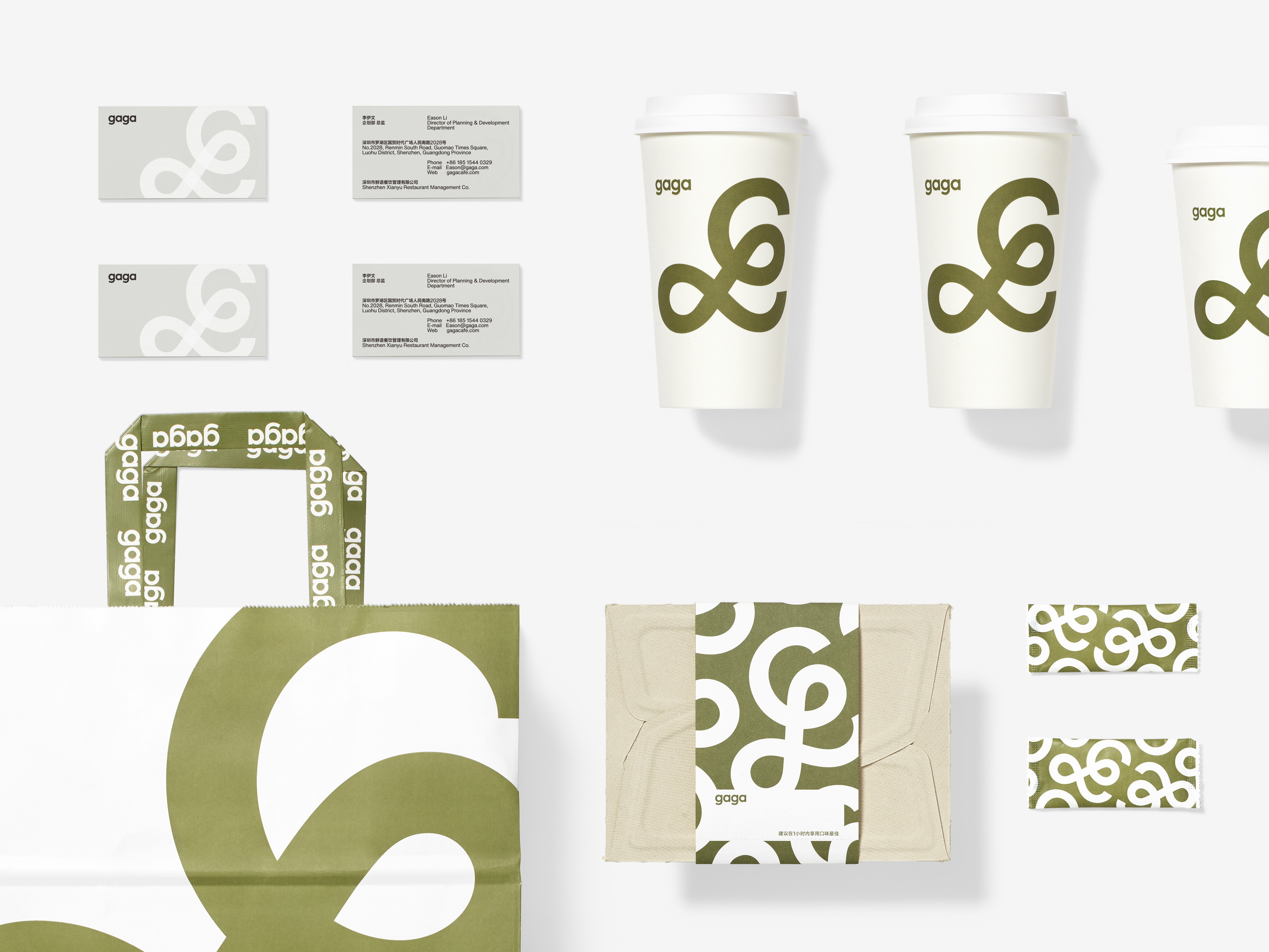
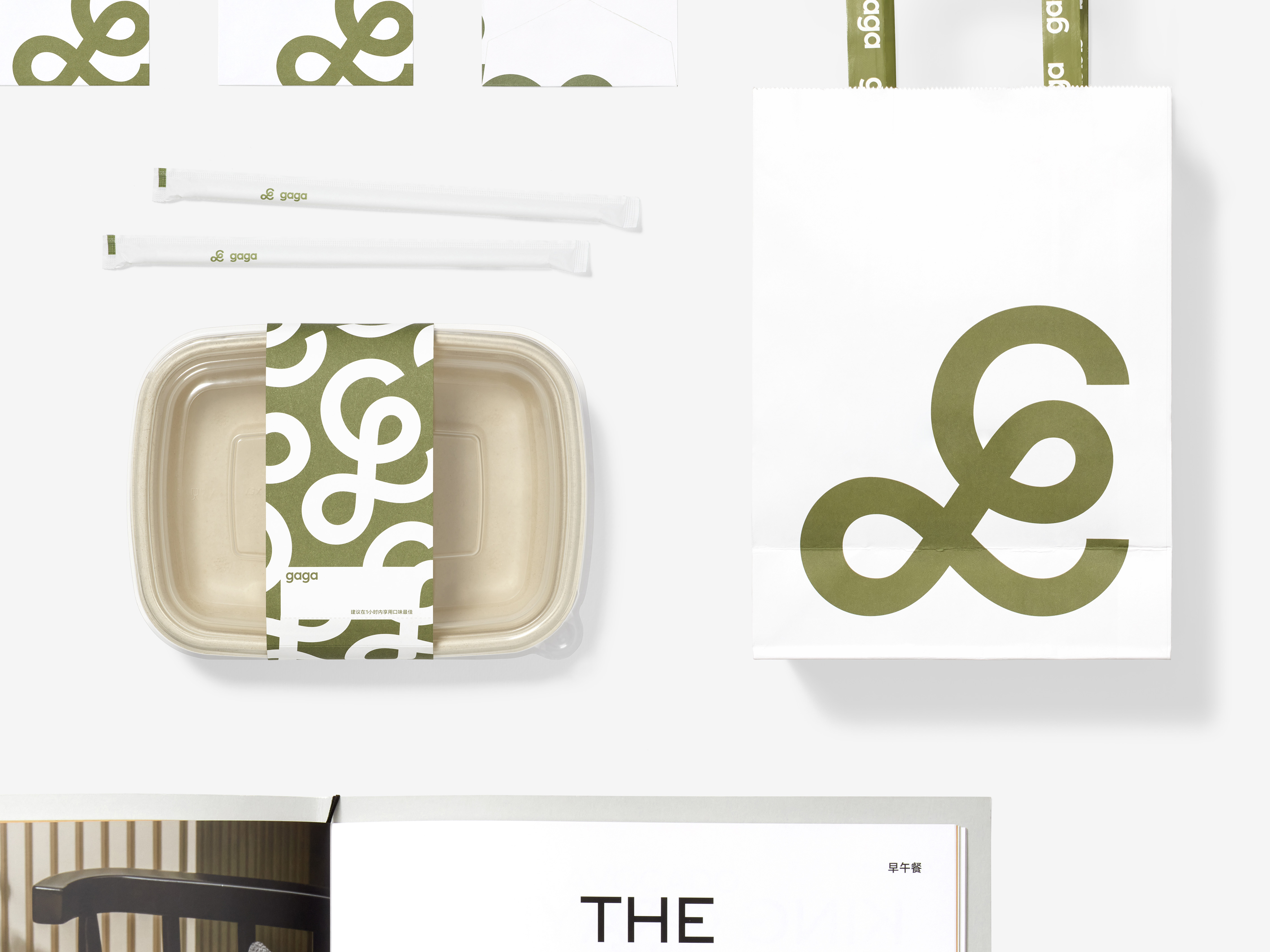
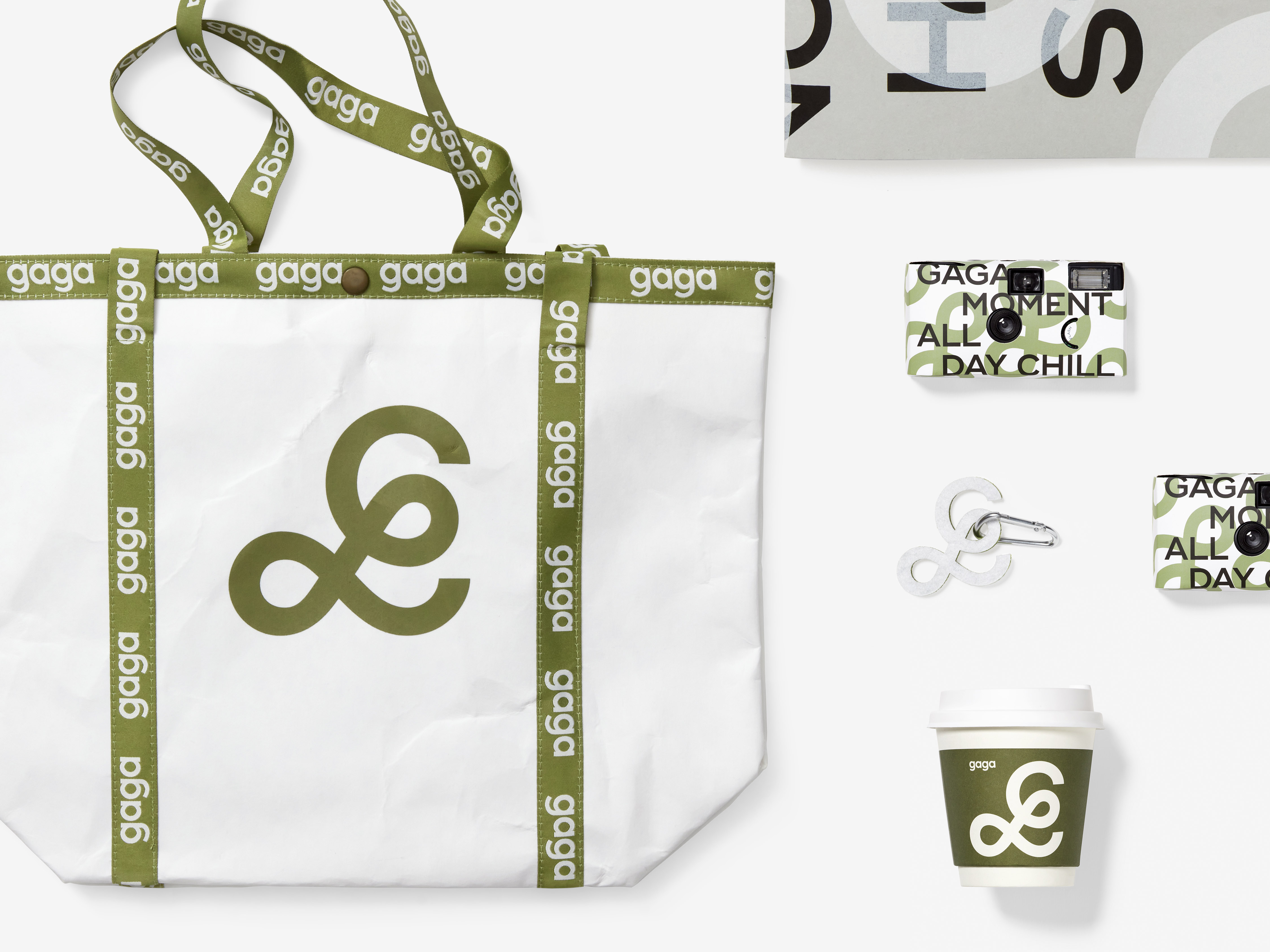
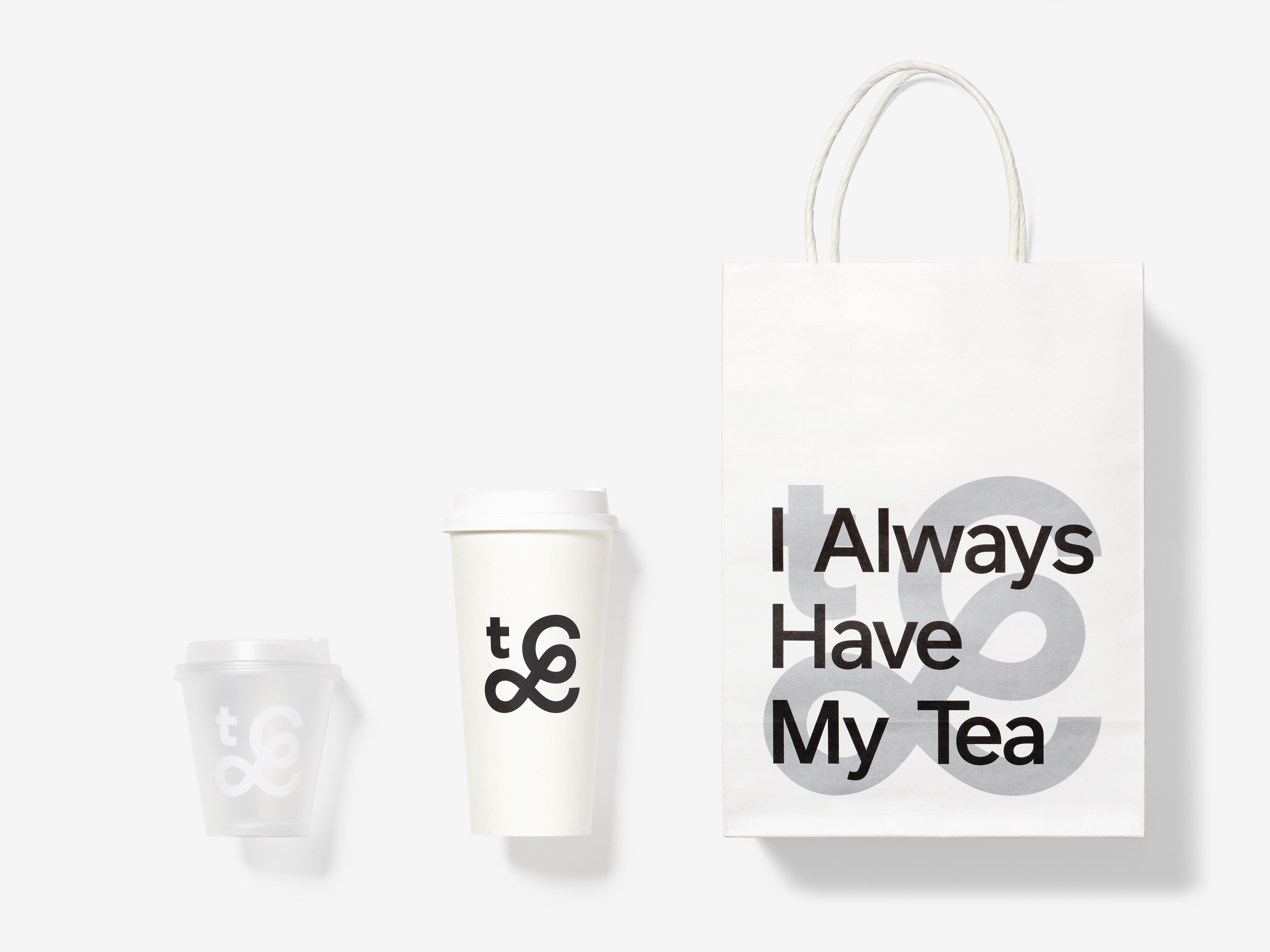
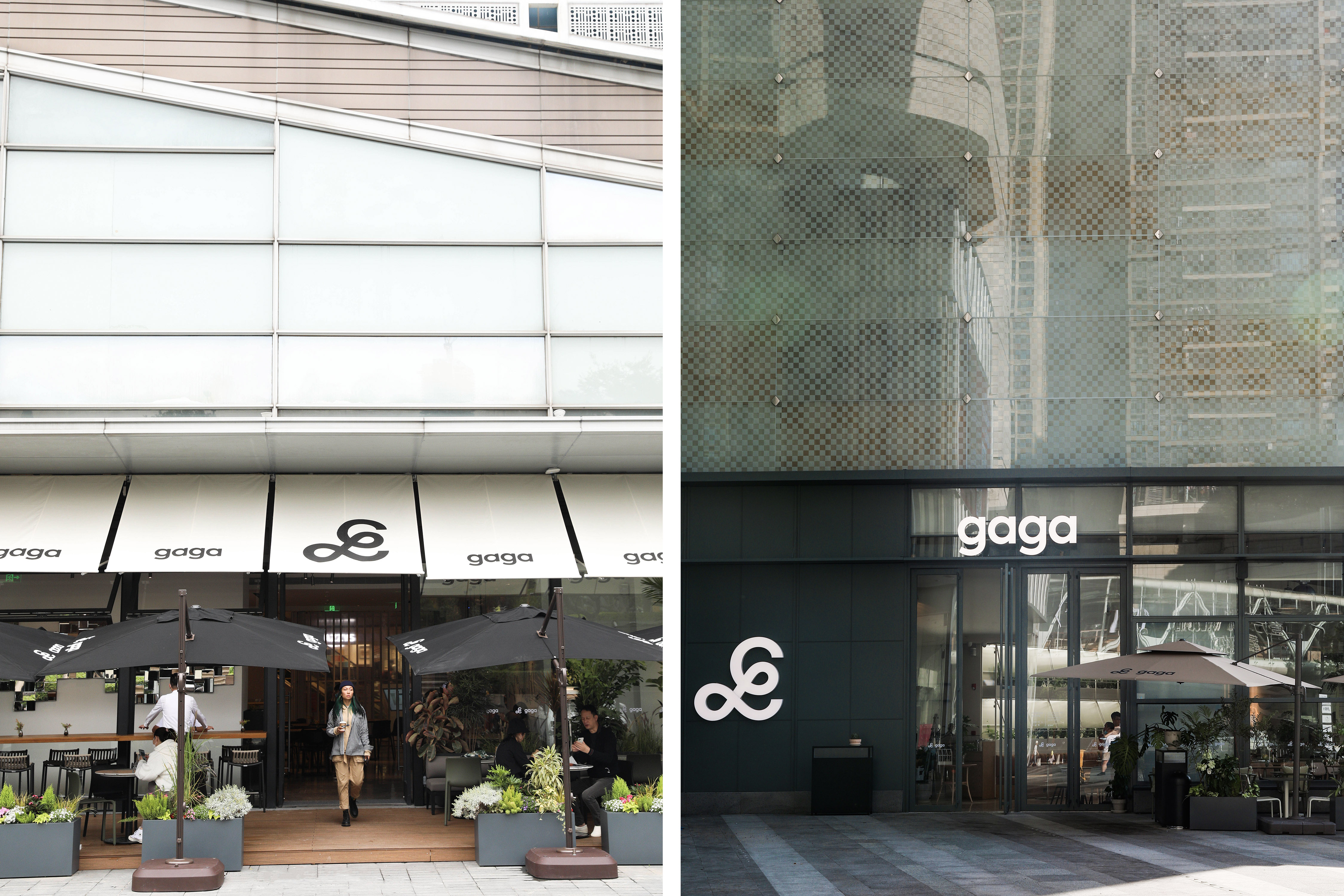
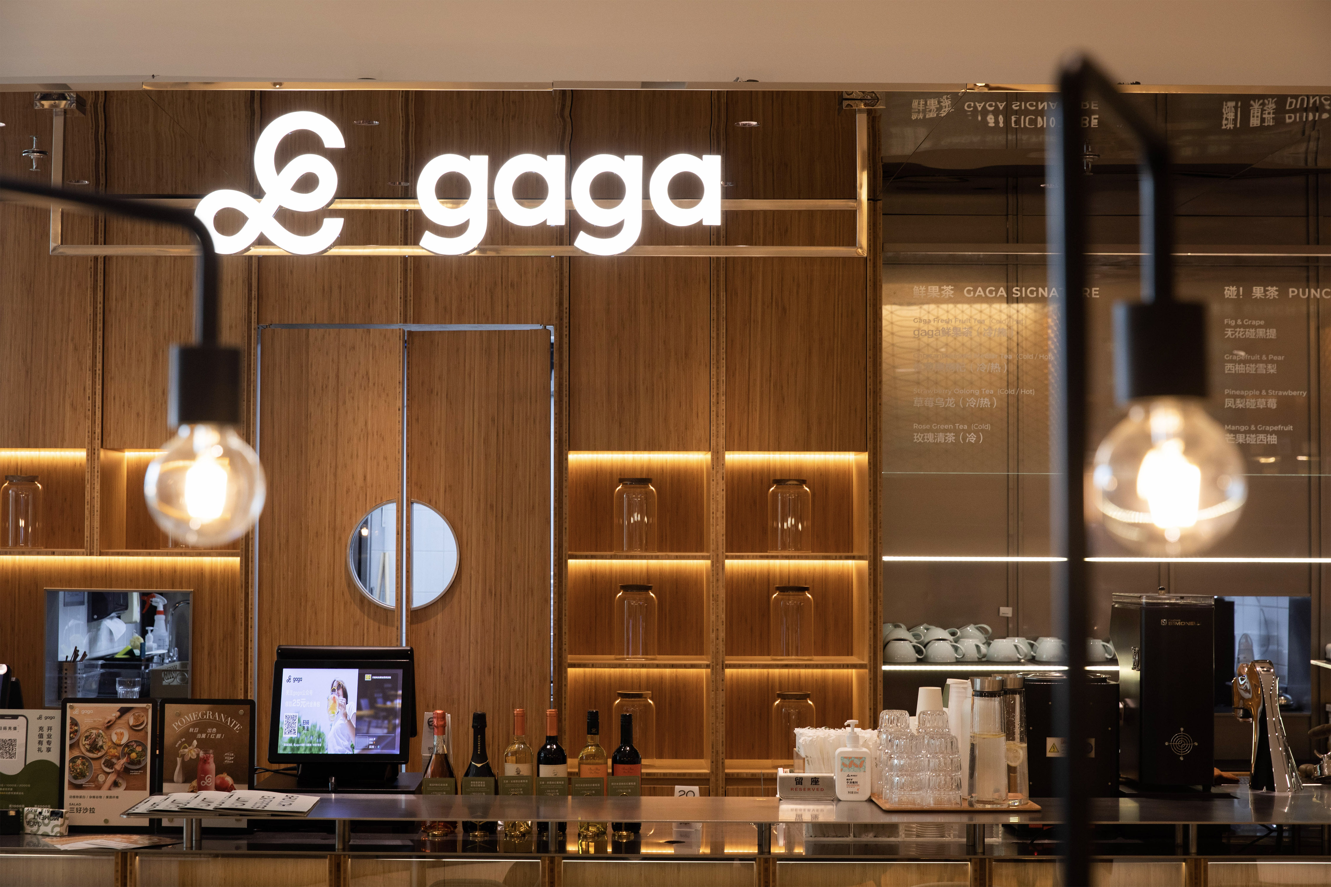
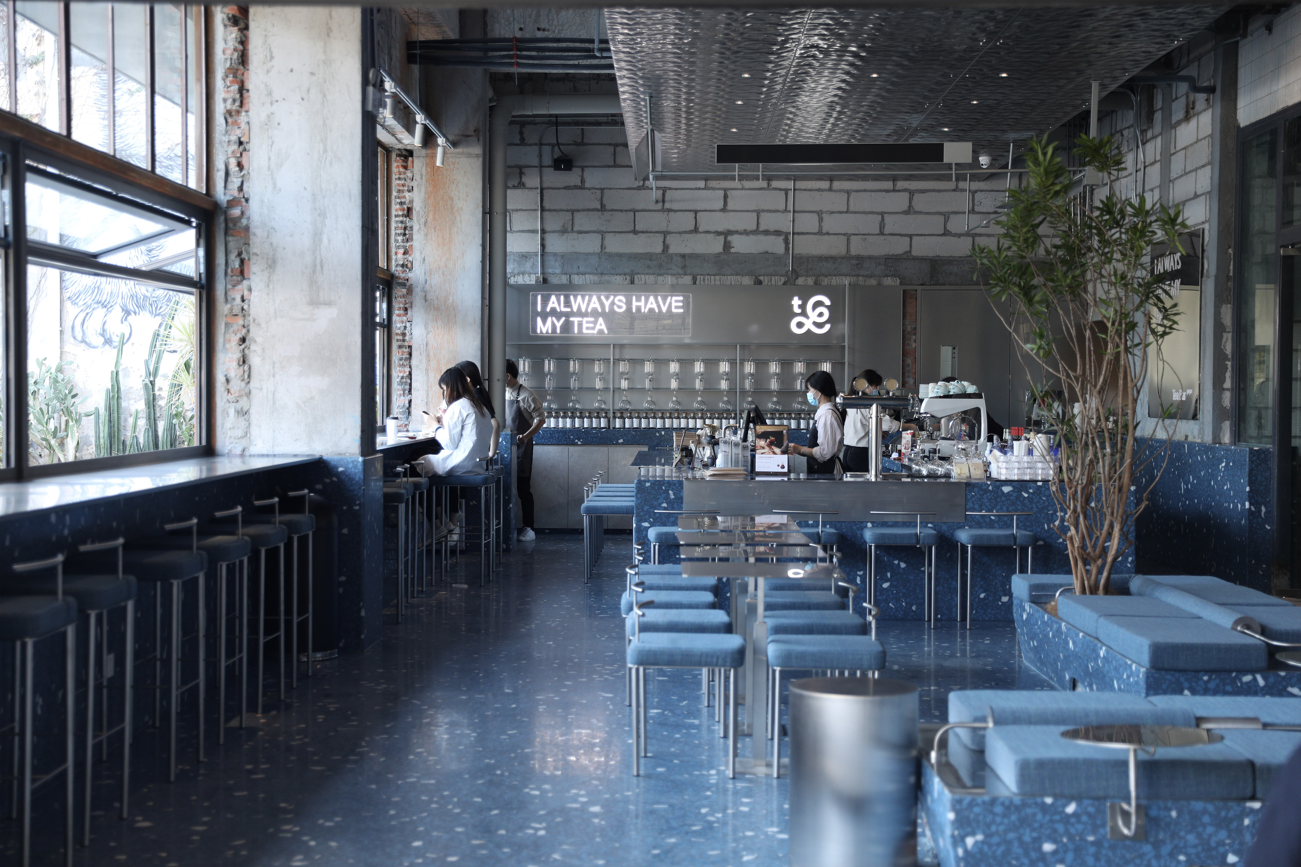
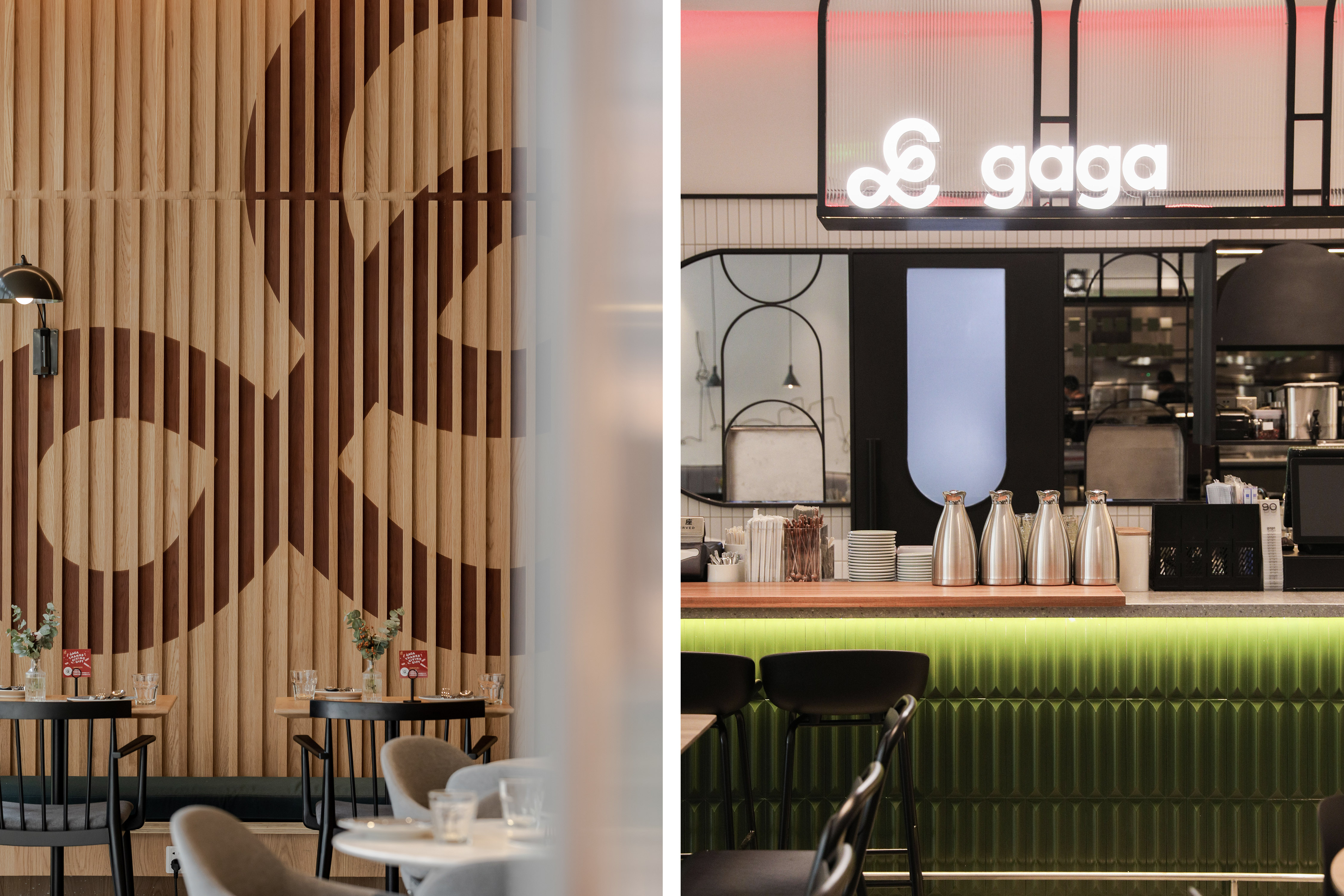
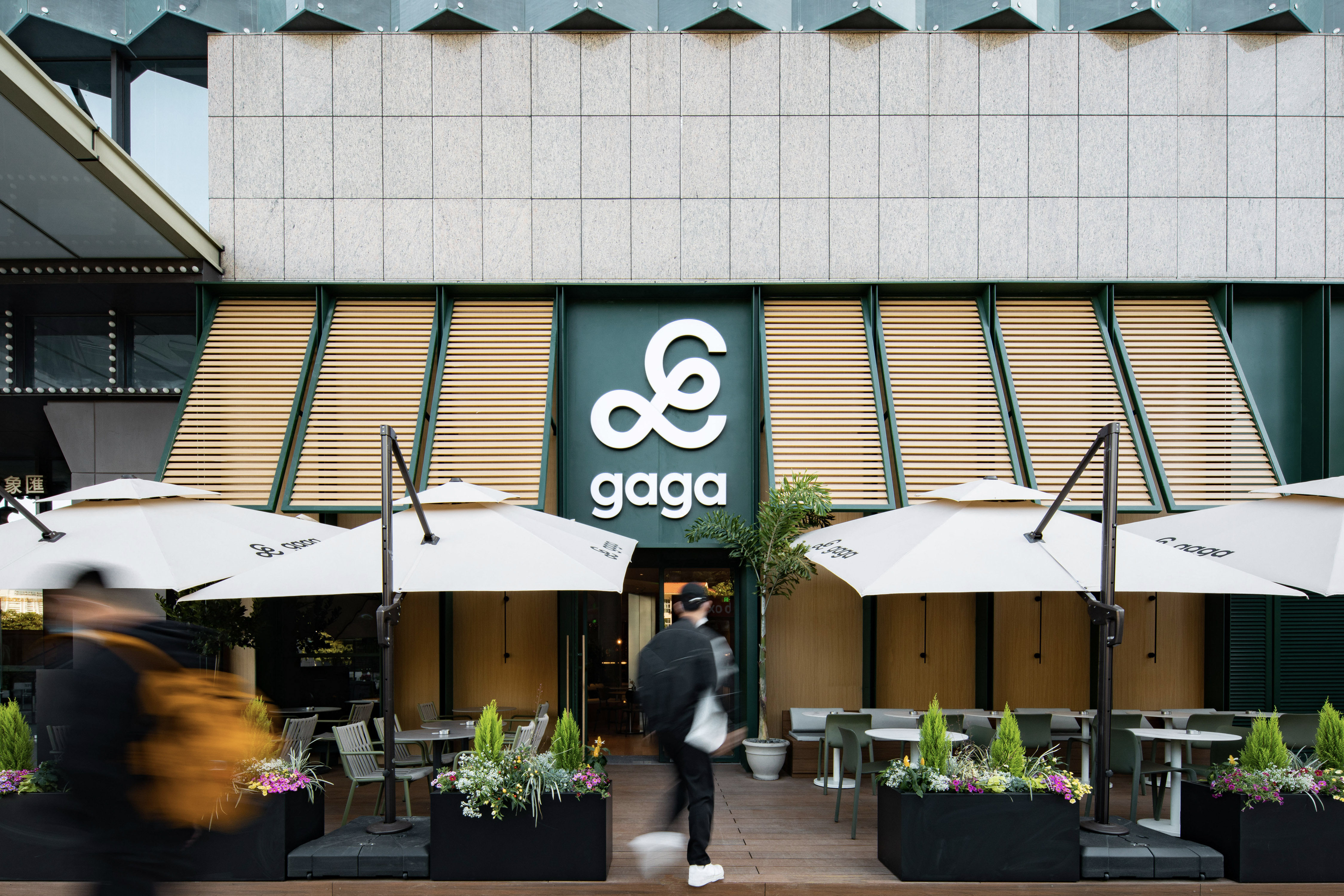
The logo of gaga is composed of two parts: the symbol and the logotype. The symbol is the most significant element of gaga's visual identity, taken from the handwriting of the Latin letter g, which is romantic, sprawling and modern. The story of this handwriting goes back to the founding of gaga, when the founder's daughter wrote her name, gaga, and we have kept the meaning of this beautiful story and redrawn it with a modern twist to give it a new, gentle and dignified character. The symbol can be scaled up, down, tiled or cropped to create different scenes and feels, and we can also make text wrapping and overlays on it for gaga sub-brands, including gaga garden, gaga chef and gaga tea bar.
The logo of gaga is composed of two parts: the symbol and the logotype. The symbol is the most significant element of gaga's visual identity, taken from the handwriting of the Latin letter g, which is romantic, sprawling and modern. The story of this handwriting goes back to the founding of gaga, when the founder's daughter wrote her name, gaga, and we have kept the meaning of this beautiful story and redrawn it with a modern twist to give it a new, gentle and dignified character. The symbol can be scaled up, down, tiled or cropped to create different scenes and feels, and we can also make text wrapping and overlays on it for gaga sub-brands, including gaga garden, gaga chef and gaga tea bar.
“让美好更加真诚,让幸福更加纯粹”。gaga 希望带给消费者的,不仅是美味的食物和优质的环境,更是一种融合了陪伴、成长与快乐的感性生活方式。我们在品牌重塑的过程中发现,在 gaga 的创始人及其团队中流动着一种温暖的力量,这个力量来自于 gaga 对生活的热爱,是单纯且缓慢的,是坚定且优雅的—— gaga 的标识就是基于这样的关键词设计而成。
gaga 的标识分为两个部分:花体图形标与文字。其中花体图形标是 gaga 最主要的识别要素,整体趋势取自于西文 g 的手写体,浪漫舒展并充满现代感。这个手写体的故事要追溯到 gaga 建立之初、由创始人女儿写下的自己的名字—— gaga,我们保留了这个美好故事的寓意,并以现代的手法重新绘制,使它焕发生机,更具温婉端庄的特征。在应用中,花体图形标可以通过放大、缩小、平铺、裁切来适配不同的场景, 营造不同的氛围,还可以使用文字绕排和叠加的方式来塑造 gaga 旗下的子品牌,包括: gaga garden, gaga chef 与 gaga tea bar 等。
gaga 的标识分为两个部分:花体图形标与文字。其中花体图形标是 gaga 最主要的识别要素,整体趋势取自于西文 g 的手写体,浪漫舒展并充满现代感。这个手写体的故事要追溯到 gaga 建立之初、由创始人女儿写下的自己的名字—— gaga,我们保留了这个美好故事的寓意,并以现代的手法重新绘制,使它焕发生机,更具温婉端庄的特征。在应用中,花体图形标可以通过放大、缩小、平铺、裁切来适配不同的场景, 营造不同的氛围,还可以使用文字绕排和叠加的方式来塑造 gaga 旗下的子品牌,包括: gaga garden, gaga chef 与 gaga tea bar 等。


All Images Copyright © 2021 gaga. All Rights Reserved