ffit8
ART DIRECTOR: Nod Young / Guang Yu
DESIGNER: Wang Xiaoshuai
YEAR: 2022
CLIENT: ffit8
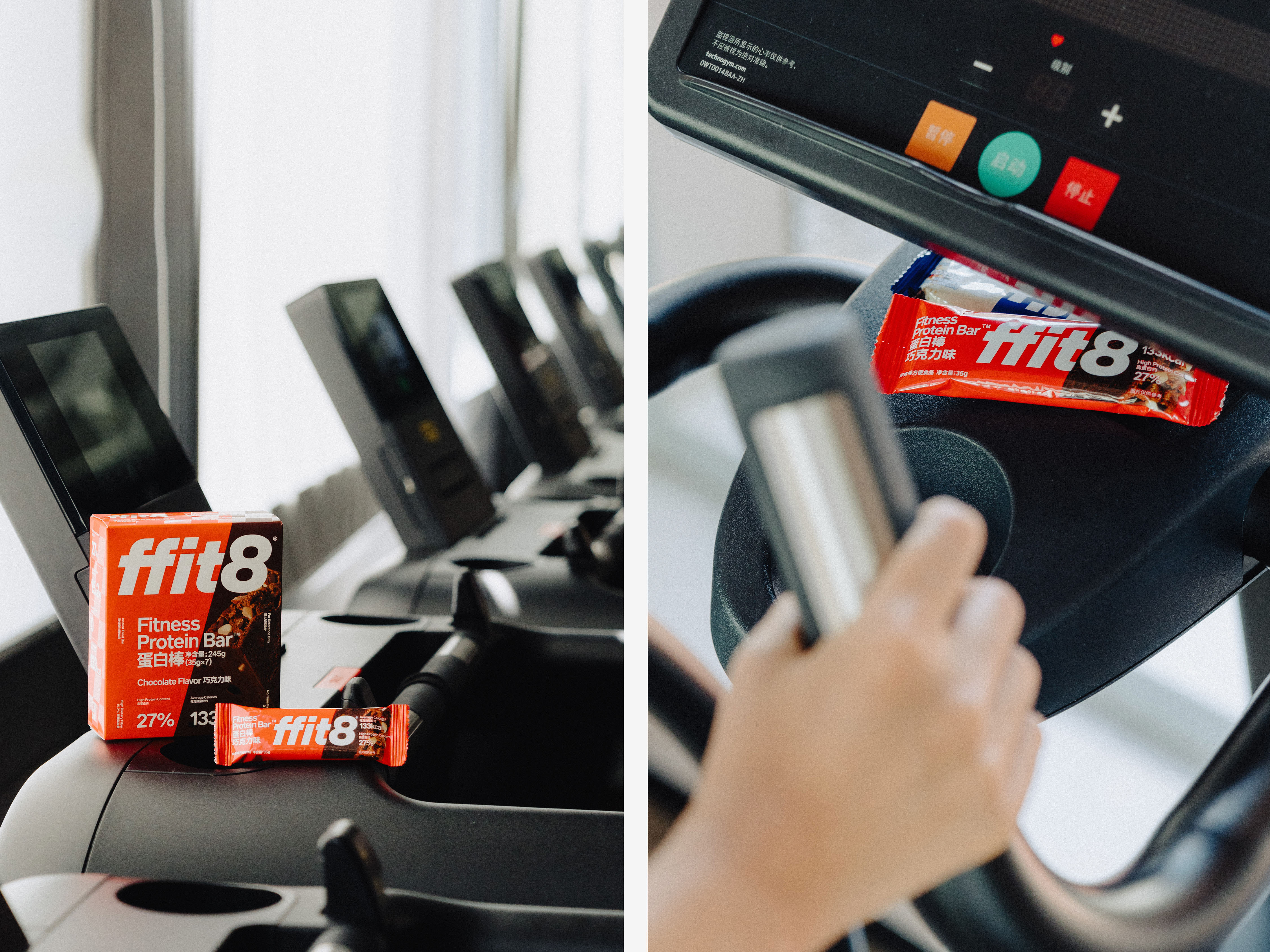
ffit8, which debuted at the end of 2019, has rapidly gained popularity among those interested in fitness, fat loss, sports, and fitness. By utilizing light meal replacement as its entry point, it has identified its target market and is now a market leader in the healthy snacks sector. With the mission of “what young people will eat in the future”, ffit8 presents novel opportunities for maintaining a healthy lifestyle amidst the dominance of sports consumption. As the first health food brand to create superfoods around “protein”, ffit8 has also formulated the development strategy of “Protein Company”, which is committed to redoing all foods with protein and enhancing consumer convenience and efficacy via technological advancements, ffit8 aims to make it easier, more efficient, and more fun for consumers to consume more high-quality protein.
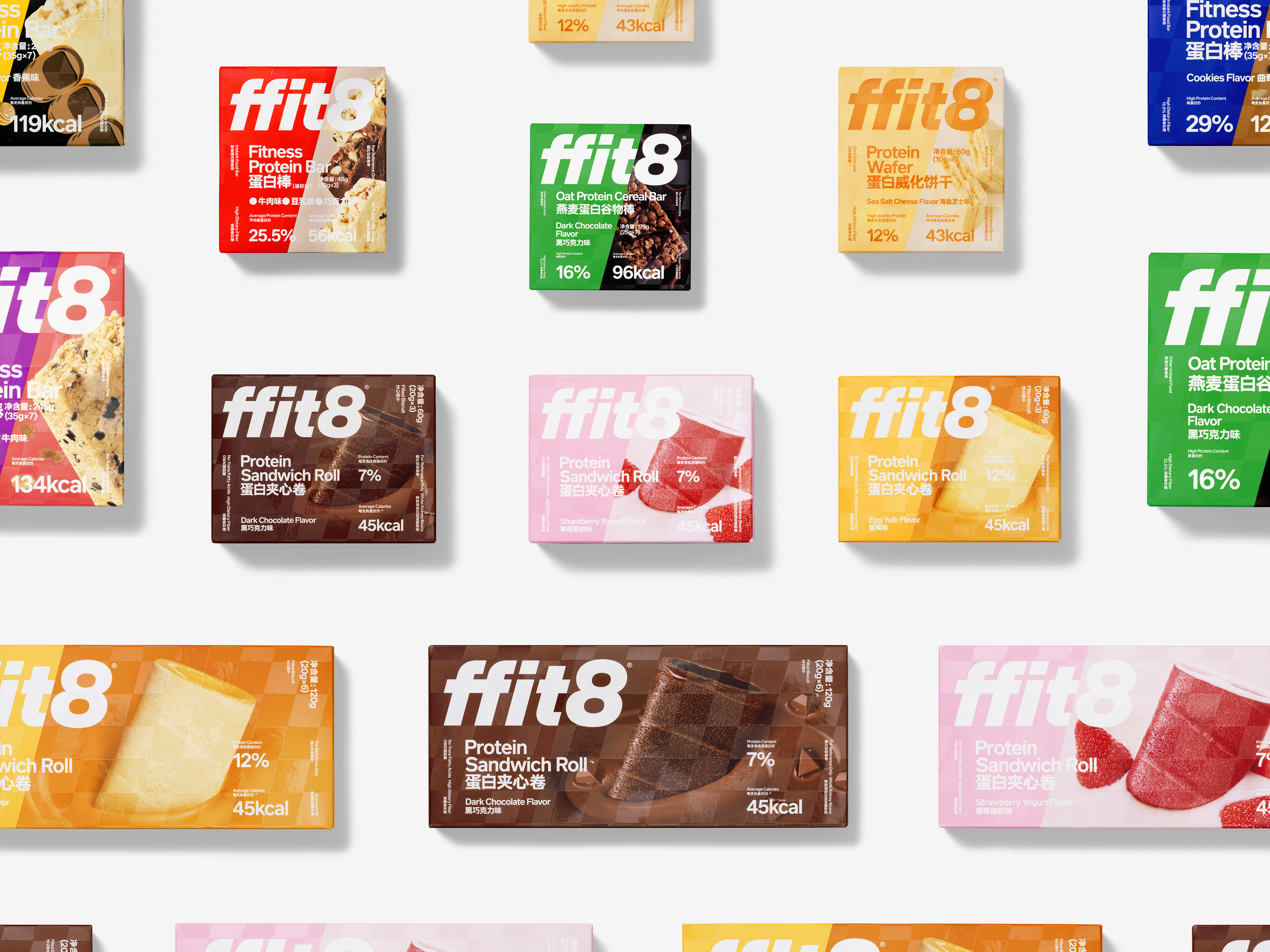
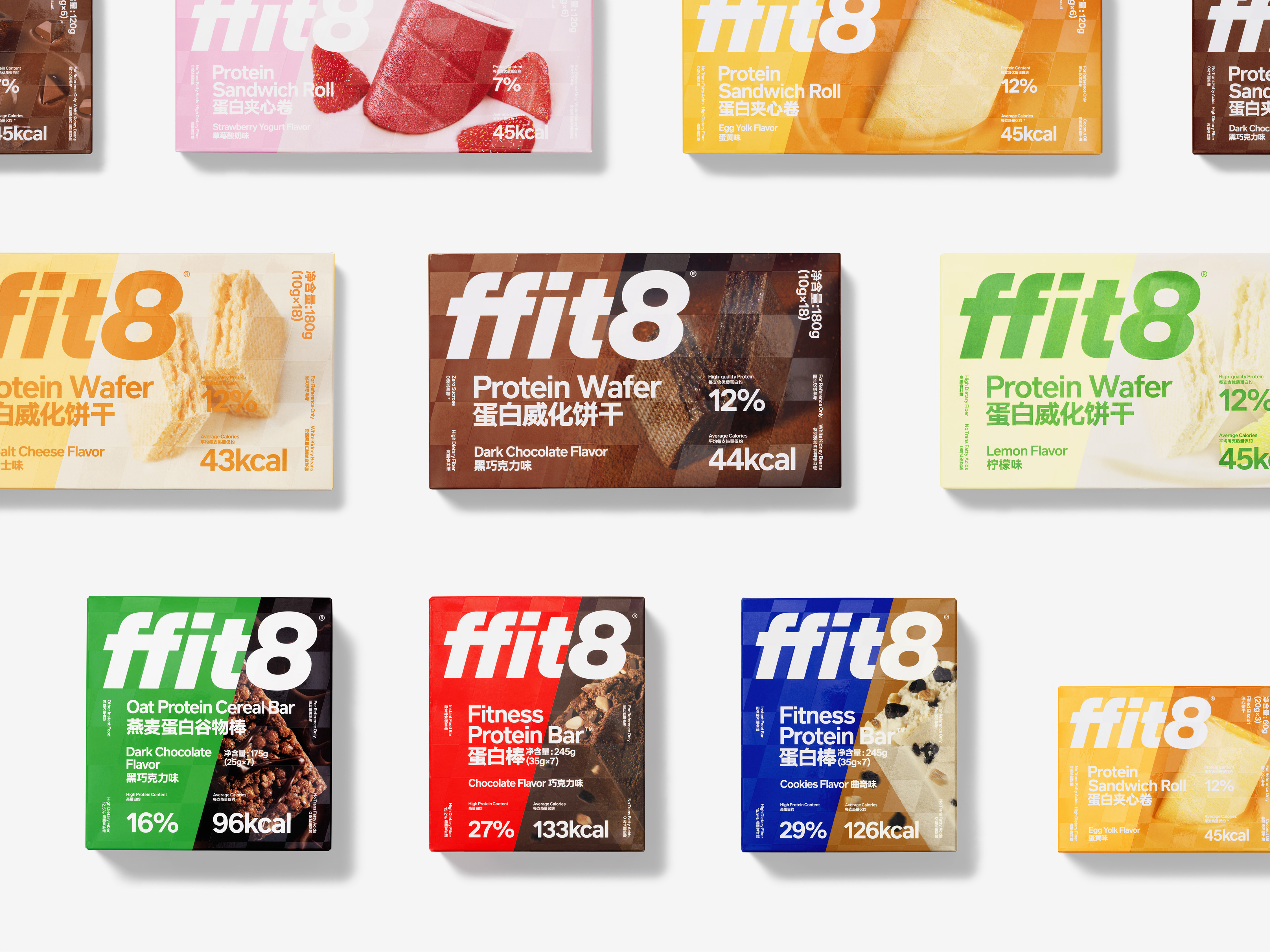
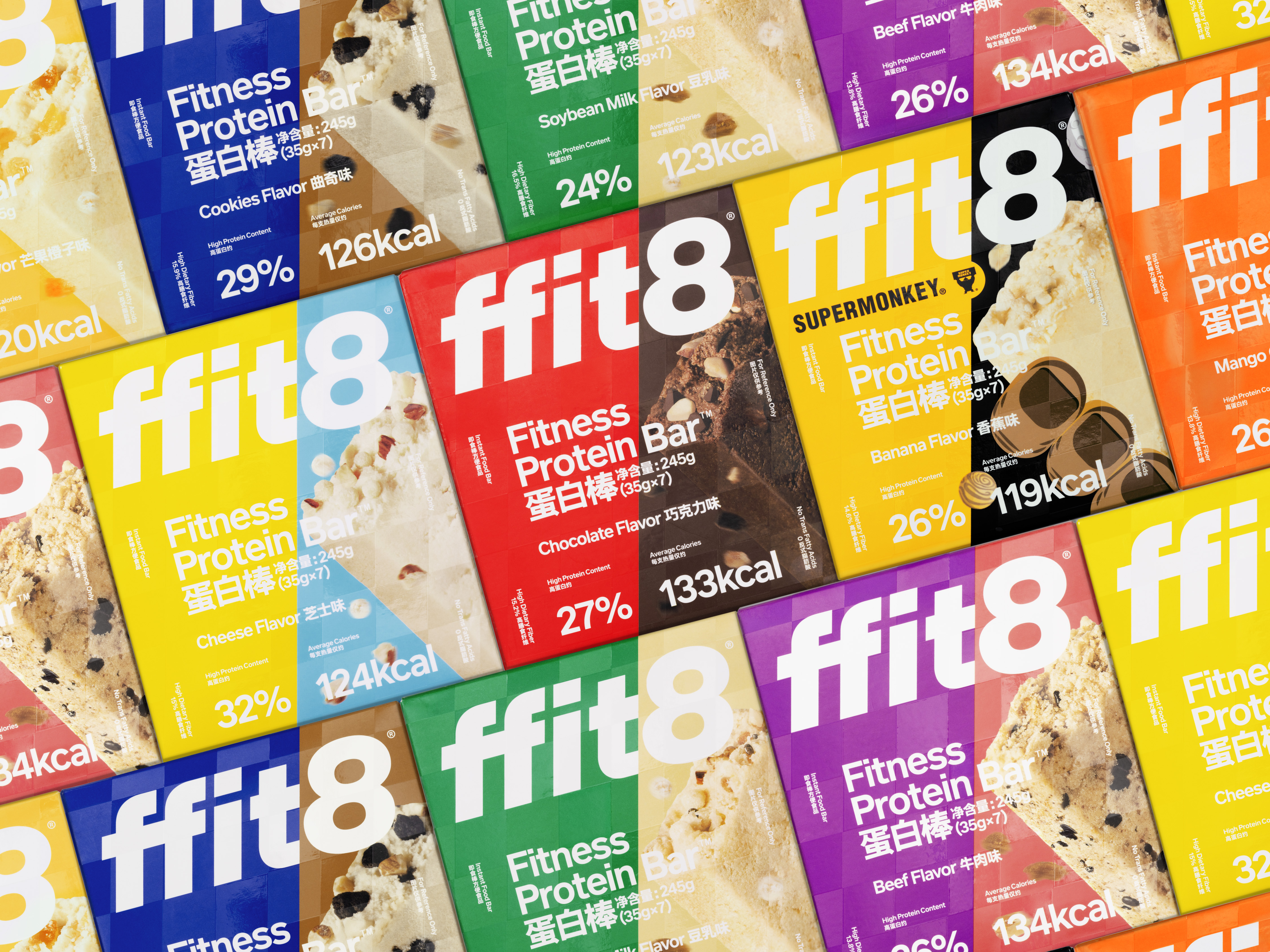
Consequently, we categorize ffit8’s core user group as an elite urban population with a relentless pursuit of health and fitness, and we are trying to alternatively describe this group: they are all people who are running by themselves. In light of this, we determined that the most effective visual language to convey the revolutionary spirit of aggression that should be associated with the ffit8 brand is speed. We designed the ffit8 logo with a slight tilt forward to bring the concept of being in motion into the brand. At the same time, we added a dark pattern system to the package design. A layer of flags comprised of light and dark grids will encircle the ffit8 product packaging. These flags resemble those seen after a racetrack and represent speed, passion, and pursuit. We deemed it appropriate to reflect the mindset of “those who run alone”!
Consequently, we categorize ffit8’s core user group as an elite urban population with a relentless pursuit of health and fitness, and we are trying to alternatively describe this group: they are all people who are running by themselves. In light of this, we determined that the most effective visual language to convey the revolutionary spirit of aggression that should be associated with the ffit8 brand is speed. We designed the ffit8 logo with a slight tilt forward to bring the concept of being in motion into the brand. At the same time, we added a dark pattern system to the package design. A layer of flags comprised of light and dark grids will encircle the ffit8 product packaging. These flags resemble those seen after a racetrack and represent speed, passion, and pursuit. We deemed it appropriate to reflect the mindset of “those who run alone”!
成立于2019年底的ffit8 ,已经成为运动健身、减肥减脂人群的首选品牌,从轻体代餐切入目标人群到成为健康零食赛道的开创者,以“未来年轻人吃什么”为使命的ffit8,在运动消费时代为健康生活提供了新可能。作为国内首个围绕“蛋白质”打造超级食物的健康食品品牌,ffit8还制定了“蛋白质公司”的发展战略,致力于用蛋白质重做一切食品,通过科技创新让消费者更便捷、更有效、同时也是更有趣地摄入更多优质的蛋白质。
我们将 ffit8 的核心用户群归纳为对健康和体态有着不懈追求的都市精英人群,我们试图更换一种方式去形容这个群体:TA们都是与自己赛跑的人。相应地,我们认为 ffit8 的品牌形象应该拥有一种锐意进取的突破精神,而体现这种突破精神的最佳视觉语言就是:速度感。我们将 ffit8 的标识设计成微微前倾的状态,把时刻处于运动中的概念带入品牌理念中。同时,在包装设计中加入了一个暗纹体系,当消费者拿到 ffit8 的产品包装时TA们会发现在盒体上包裹着一层由明暗网格组成的旗帜,这是一面常见于赛车场上赛道终点的旗帜,它象征着速度、激情与追逐,我们认为用这样的精神呼应“与自己赛跑的人”,实在是再合适不过了!
我们将 ffit8 的核心用户群归纳为对健康和体态有着不懈追求的都市精英人群,我们试图更换一种方式去形容这个群体:TA们都是与自己赛跑的人。相应地,我们认为 ffit8 的品牌形象应该拥有一种锐意进取的突破精神,而体现这种突破精神的最佳视觉语言就是:速度感。我们将 ffit8 的标识设计成微微前倾的状态,把时刻处于运动中的概念带入品牌理念中。同时,在包装设计中加入了一个暗纹体系,当消费者拿到 ffit8 的产品包装时TA们会发现在盒体上包裹着一层由明暗网格组成的旗帜,这是一面常见于赛车场上赛道终点的旗帜,它象征着速度、激情与追逐,我们认为用这样的精神呼应“与自己赛跑的人”,实在是再合适不过了!


All Images Copyright © 2021 ffit8. All Rights Reserved