Z:SEA
DIRECTOR: Nod Young / Guang Yu
ART DIRECTOR: Han Lu
DESIGNER: Han Lu
YEAR: 2022
CLIENT: Z:Sea 海洋至尊
Men have very similar skin care demands as women in fact, such as cleansing, moisturizing, hydrating, removing oil, and removing acne. However, men spend less time on skin care than women, and men prefer the form of clear and straightforward communication in the choice of skin care products. We took male users’ general characteristics into full consideration in the design of Z: Sea and believed in the key point of this brand design was how to express the energetic side of products explicitly in a simple and forceful way.
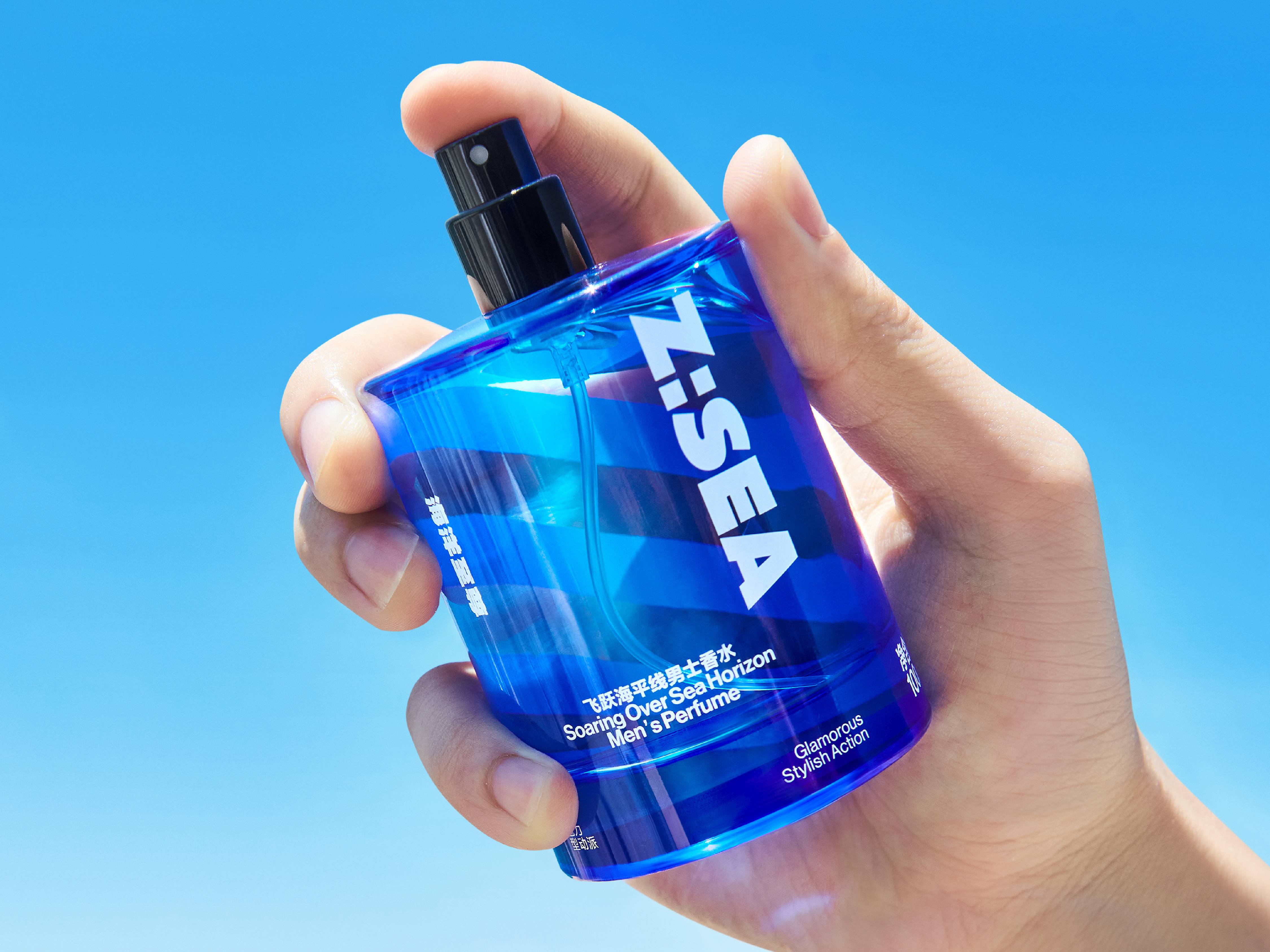
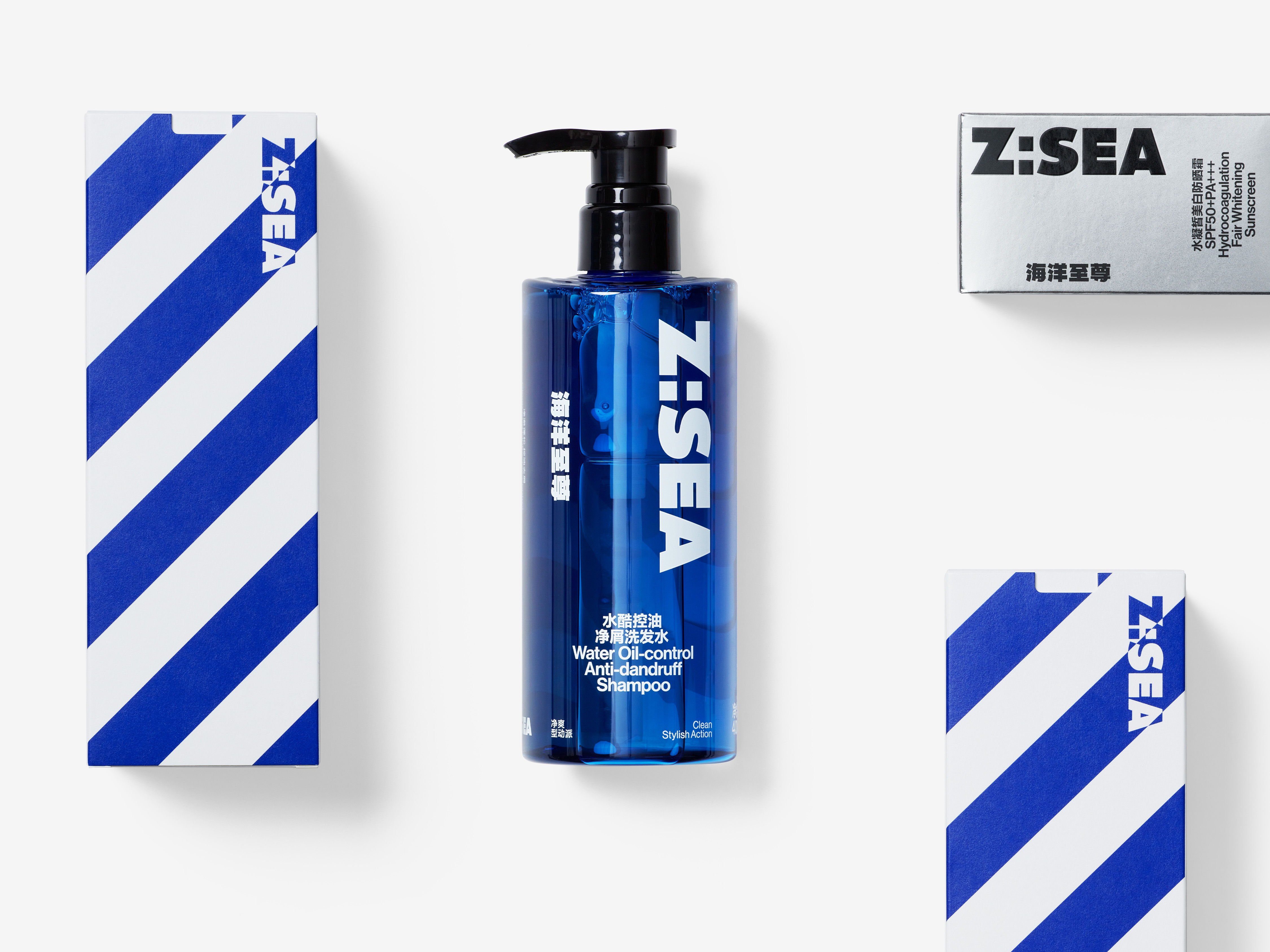
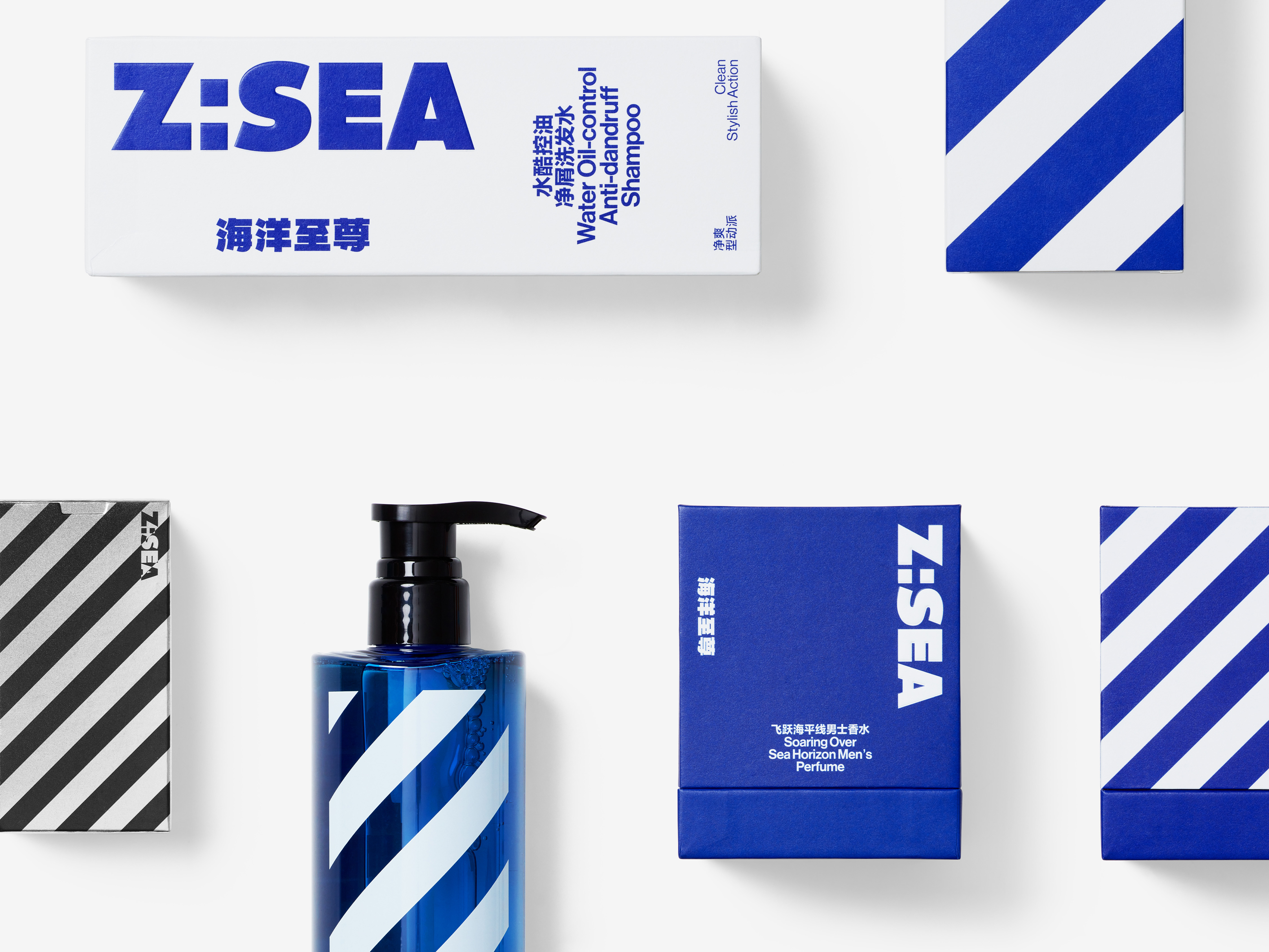
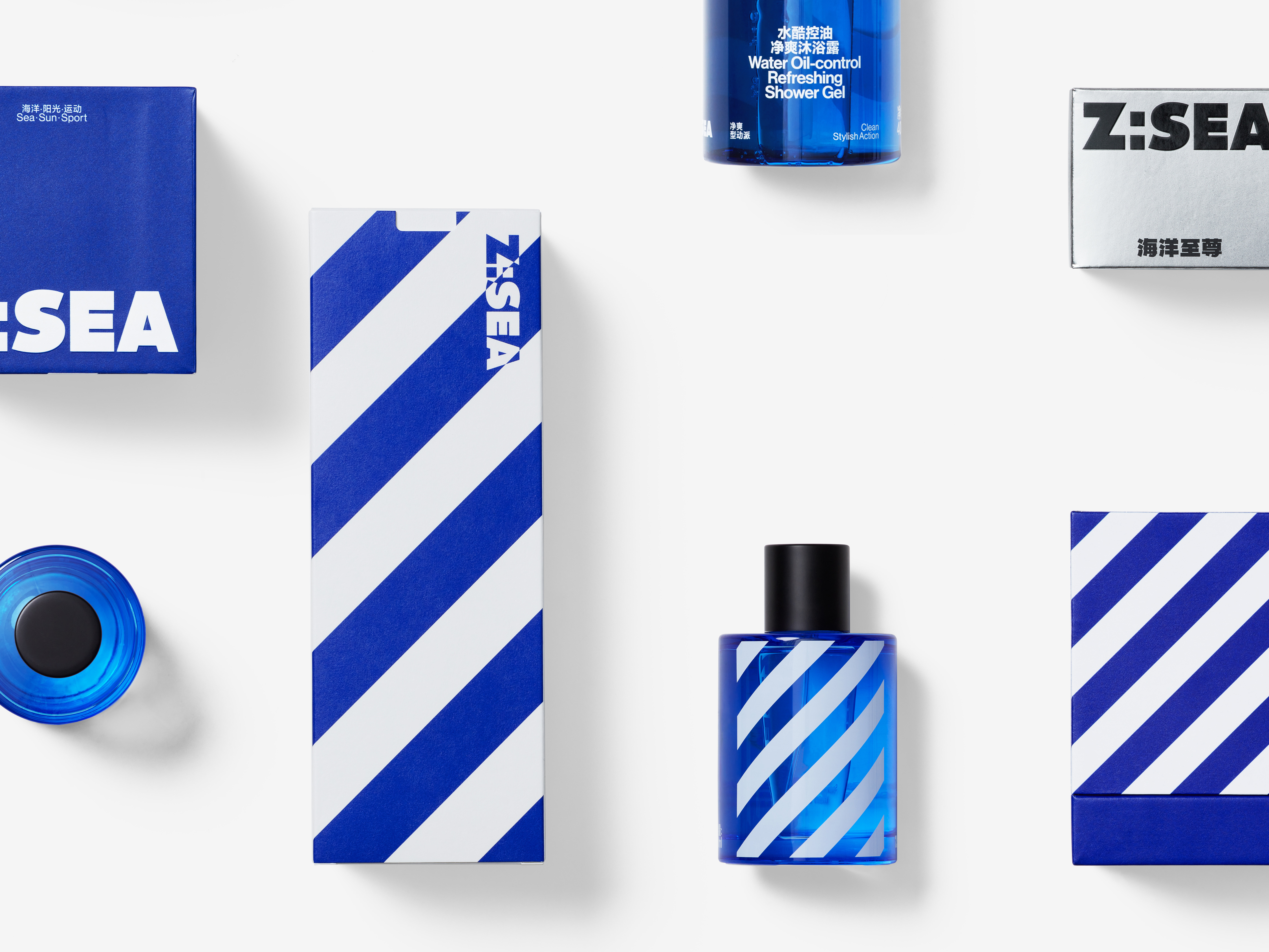
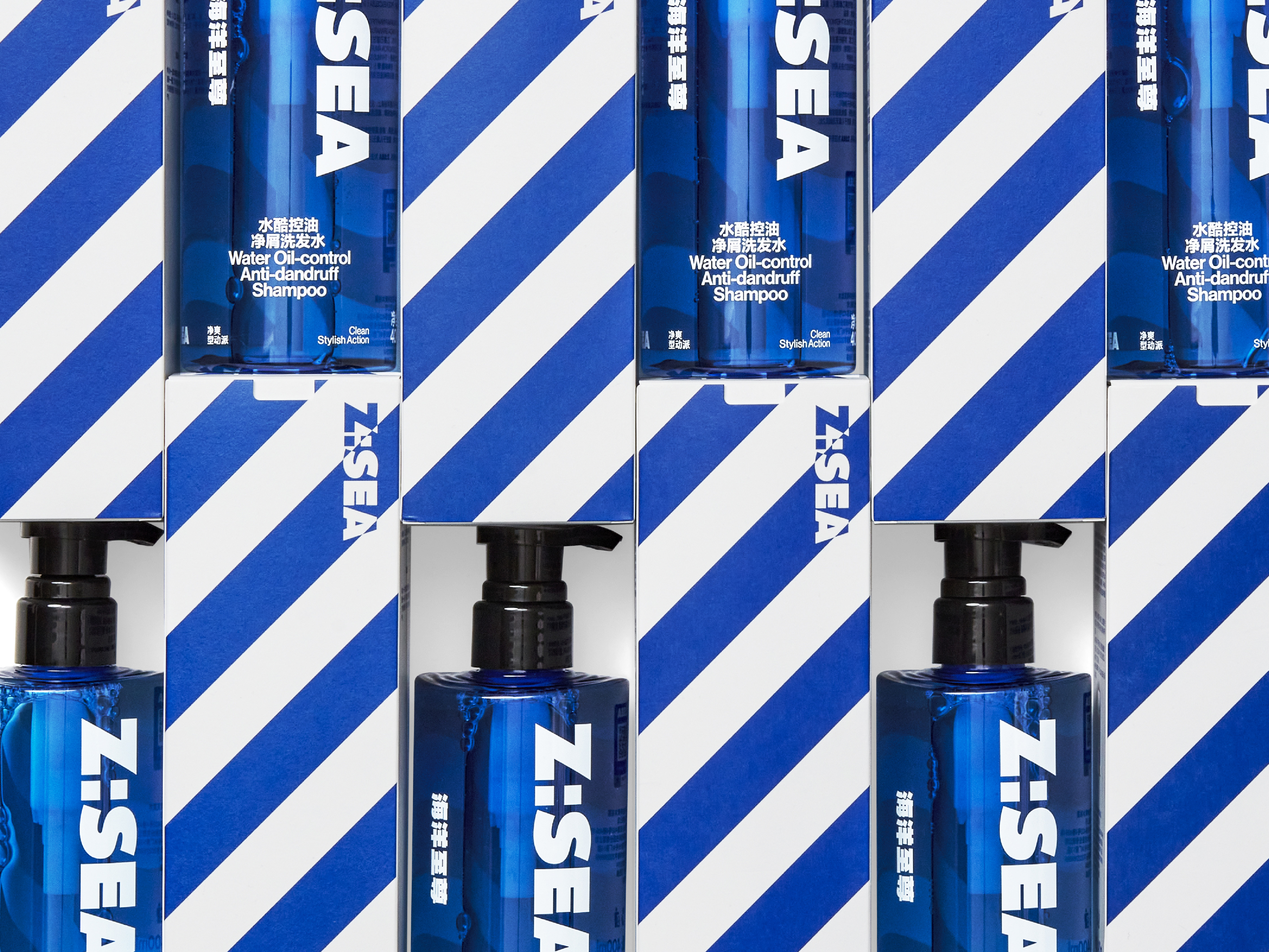
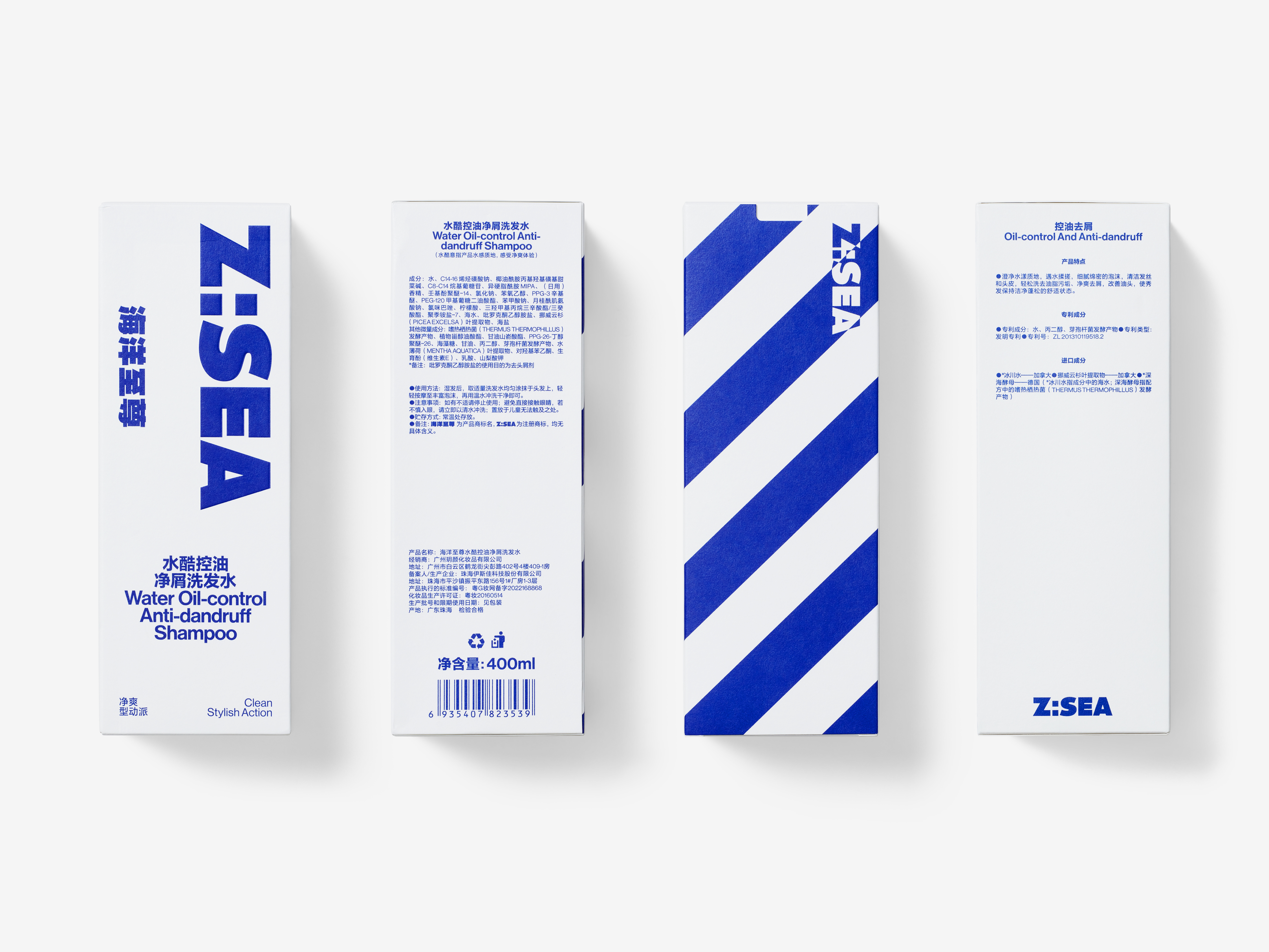
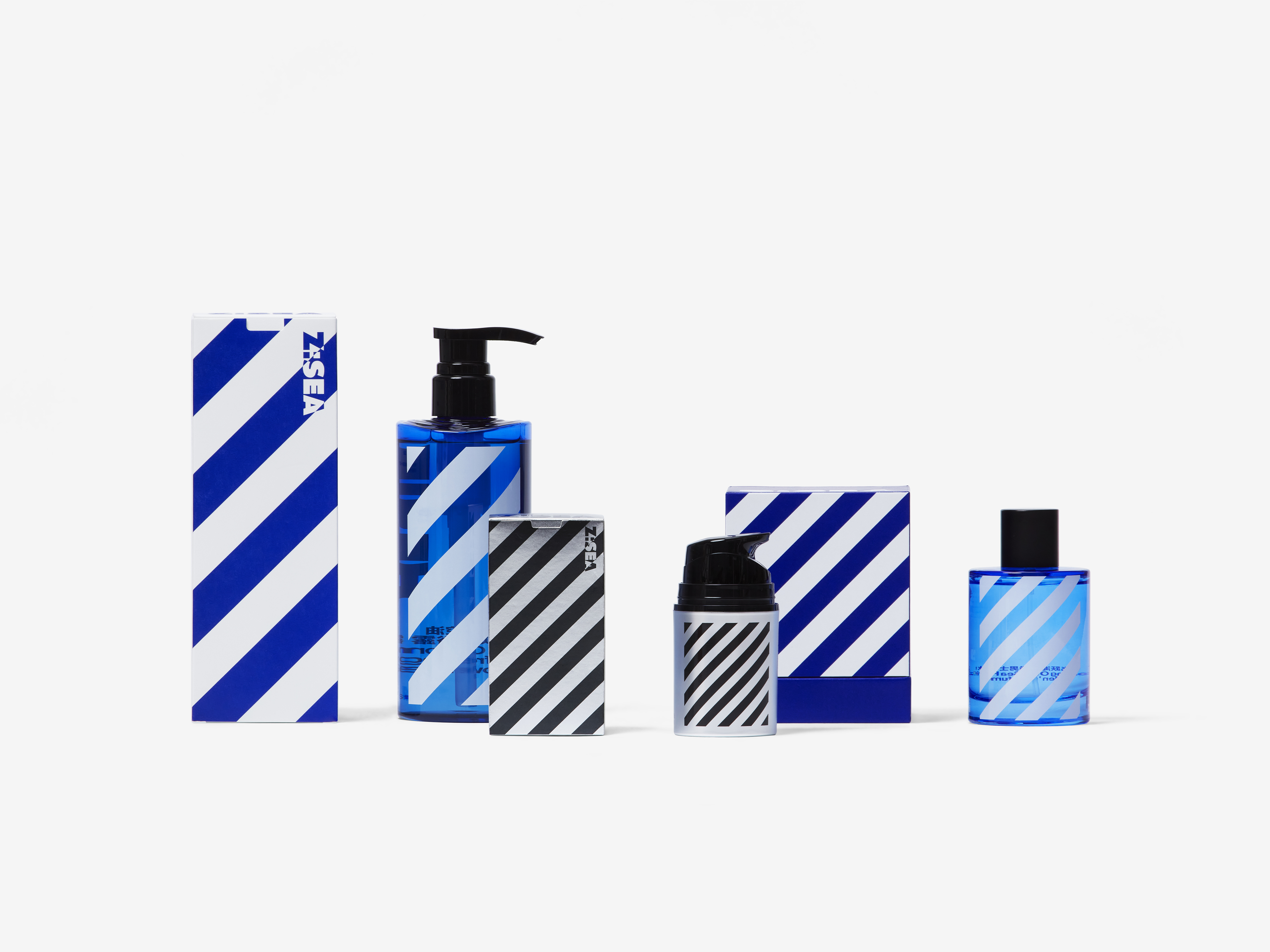
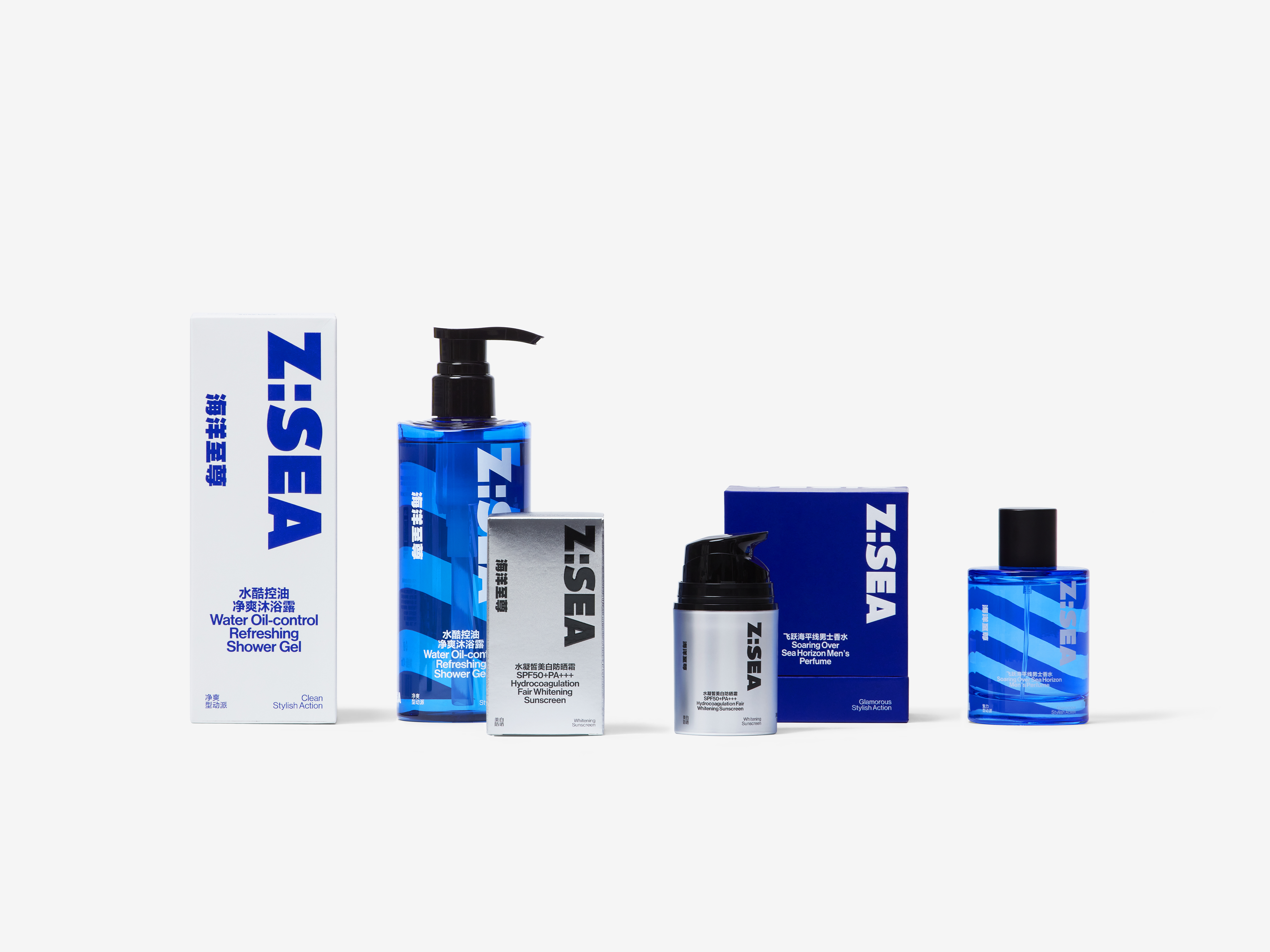
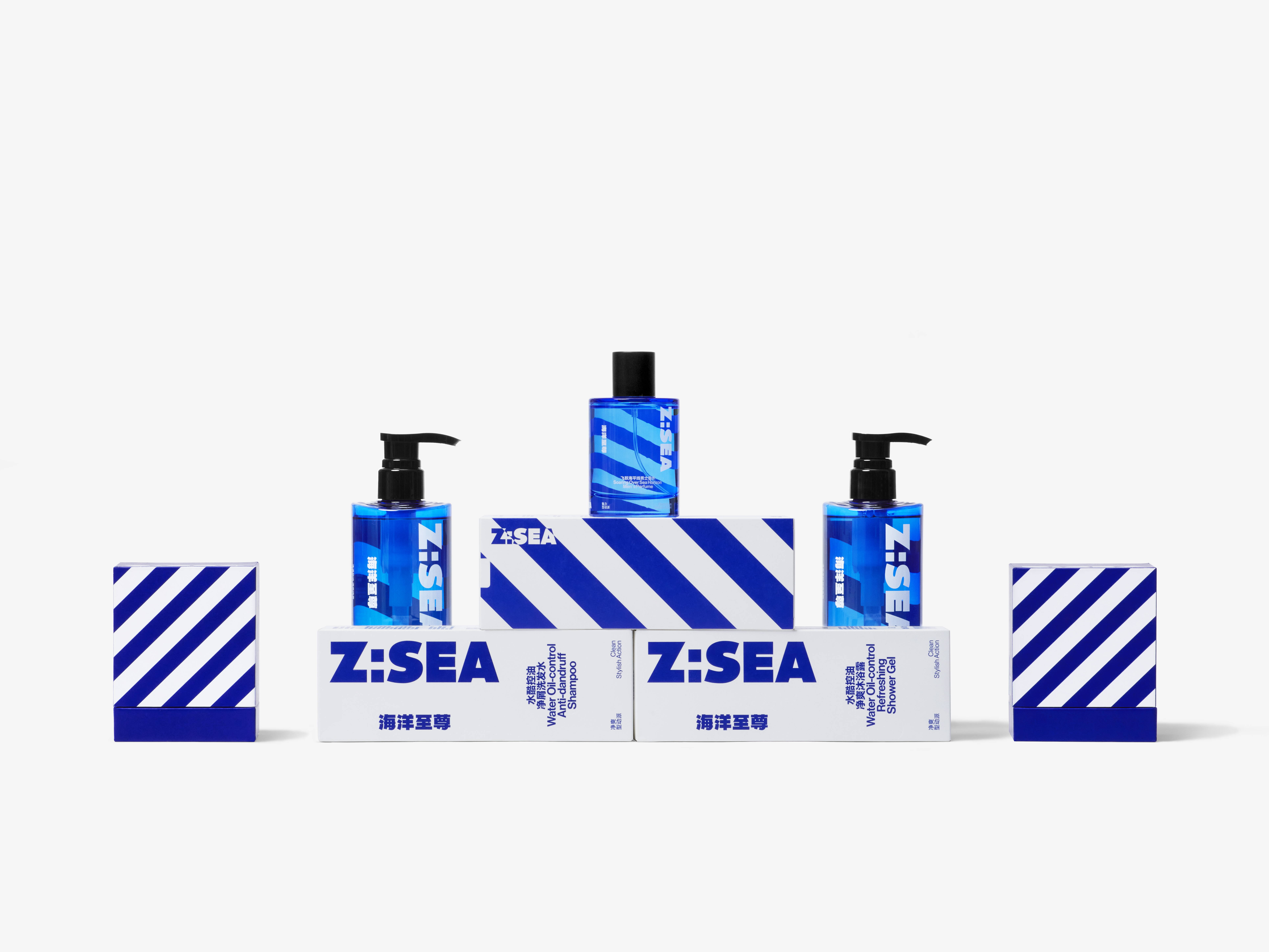
We took the letter Z of Z: Sea as the main identification feature, and then extracted and extended the slash of Z as the core identity in the whole visual identity system. The big decorative sloping grain of hale and hearty sports style finished the construction of visual identity together with the English logo of Z: Sea. Z: Sea’s main logo and product name are displayed on the front of the packaging and the bottle, and the big decorative sloping grain is located on the opposite side, forming a back-and-forth relationship with the information on the front side. It not only ensures the simple and effective information transmission but also gives products a strong sense of movement and decoration to a certain extent. In terms of product classification, we used color division from silver and black, blue and white, to dark blue and light blue. Different color rules correspond to different product demands. It both vivifies the style of the entire product family and interprets the deep and vast sea of Z: Sea through the setting of color relationships.
We took the letter Z of Z: Sea as the main identification feature, and then extracted and extended the slash of Z as the core identity in the whole visual identity system. The big decorative sloping grain of hale and hearty sports style finished the construction of visual identity together with the English logo of Z: Sea. Z: Sea’s main logo and product name are displayed on the front of the packaging and the bottle, and the big decorative sloping grain is located on the opposite side, forming a back-and-forth relationship with the information on the front side. It not only ensures the simple and effective information transmission but also gives products a strong sense of movement and decoration to a certain extent. In terms of product classification, we used color division from silver and black, blue and white, to dark blue and light blue. Different color rules correspond to different product demands. It both vivifies the style of the entire product family and interprets the deep and vast sea of Z: Sea through the setting of color relationships.
从皮肤护理需求角度来看,男性与女性其实是非常相似的,清洁、滋润、补水、保湿、去油、祛痘等,但男性用户在皮肤护理上投入的精力与女性相比更少,且在护肤产品的选择上,男性更倾向于直白、爽朗和干脆的沟通方式。我们在海洋至尊 Z: Sea 的设计中充分考虑了男性用户的普遍特点,将设计的关键点设置在如何通过简洁且强烈的方式将产品活力的一面直白地表现出来。
我们选取了海洋至尊 Z: Sea 中的 Z 作为主要识别特征,将 Z 的斜线提取出来延展成为整套视觉系统中的核心识别:具有硬朗运动风格的大斜纹装饰,并配合Z: Sea的英文标识共同完成视觉识别的搭建。Z: Sea的主标以及产品名称处于包装和瓶体的正面,大斜纹装饰位于对侧,与正面的信息形成正背呼应的关系,既保证了信息传达的简洁有效,又在一定程度上为产品赋予了很强的运动感和装饰性。在产品分类中,我们使用色彩建立区隔,从银色黑色,到蓝色白色,到深蓝浅蓝,不同的色彩规则对应不同的产品需求,既活跃了整个产品家族的样式,又将海洋至尊中“海洋”的深邃浩瀚通过色彩关系的设定进行了诠释。
我们选取了海洋至尊 Z: Sea 中的 Z 作为主要识别特征,将 Z 的斜线提取出来延展成为整套视觉系统中的核心识别:具有硬朗运动风格的大斜纹装饰,并配合Z: Sea的英文标识共同完成视觉识别的搭建。Z: Sea的主标以及产品名称处于包装和瓶体的正面,大斜纹装饰位于对侧,与正面的信息形成正背呼应的关系,既保证了信息传达的简洁有效,又在一定程度上为产品赋予了很强的运动感和装饰性。在产品分类中,我们使用色彩建立区隔,从银色黑色,到蓝色白色,到深蓝浅蓝,不同的色彩规则对应不同的产品需求,既活跃了整个产品家族的样式,又将海洋至尊中“海洋”的深邃浩瀚通过色彩关系的设定进行了诠释。


All Images Copyright © 2021 Z:SEA. All Rights Reserved