WOMO NEW
ART DIRECTOR: Guang Yu / Nod Young
DESIGNER: Han Lu / Xu Mingru / Xue Taiyu / Feng Shiwen
YEAR: 2021-2024
CLIENT: WOMO
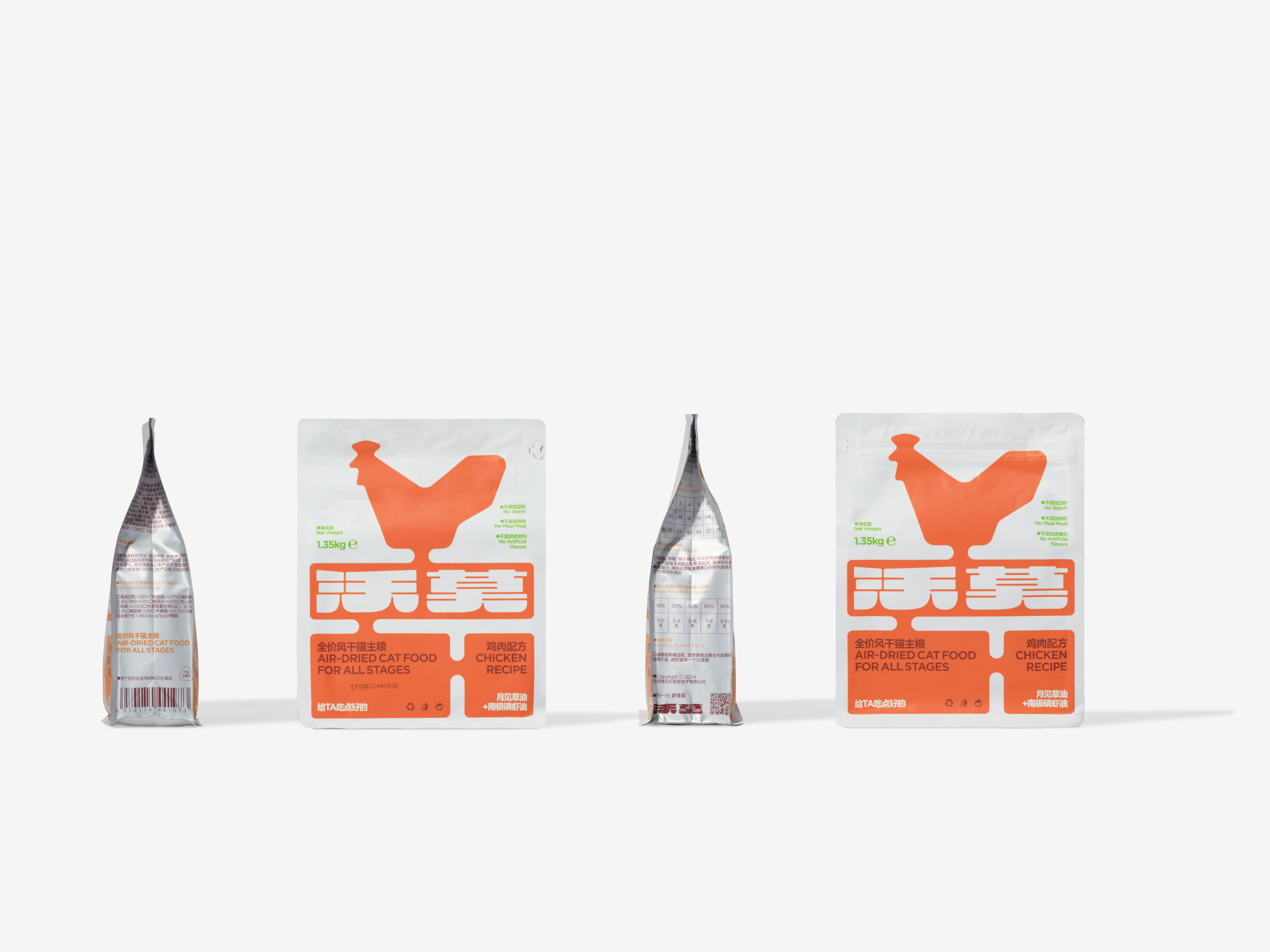
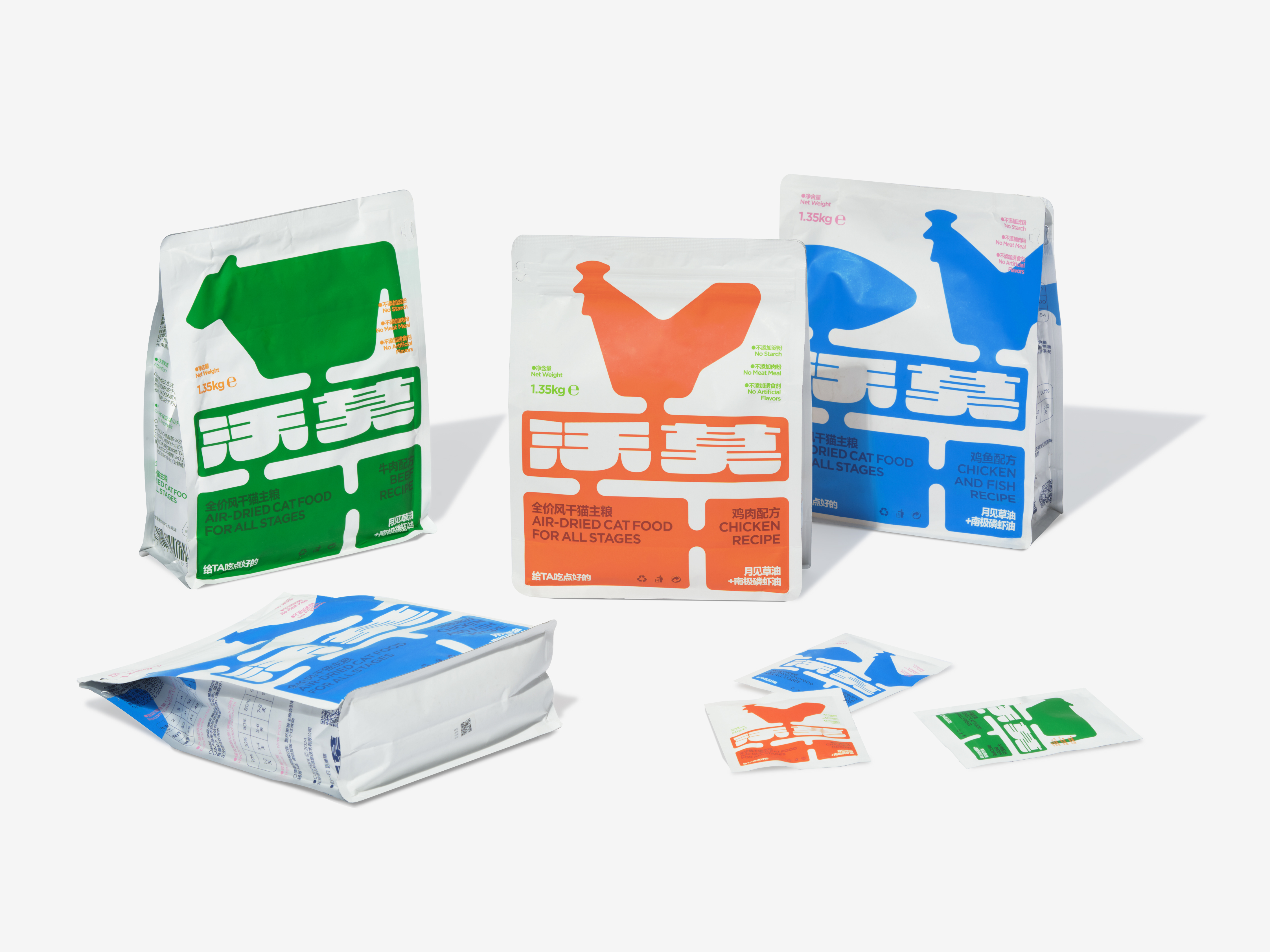
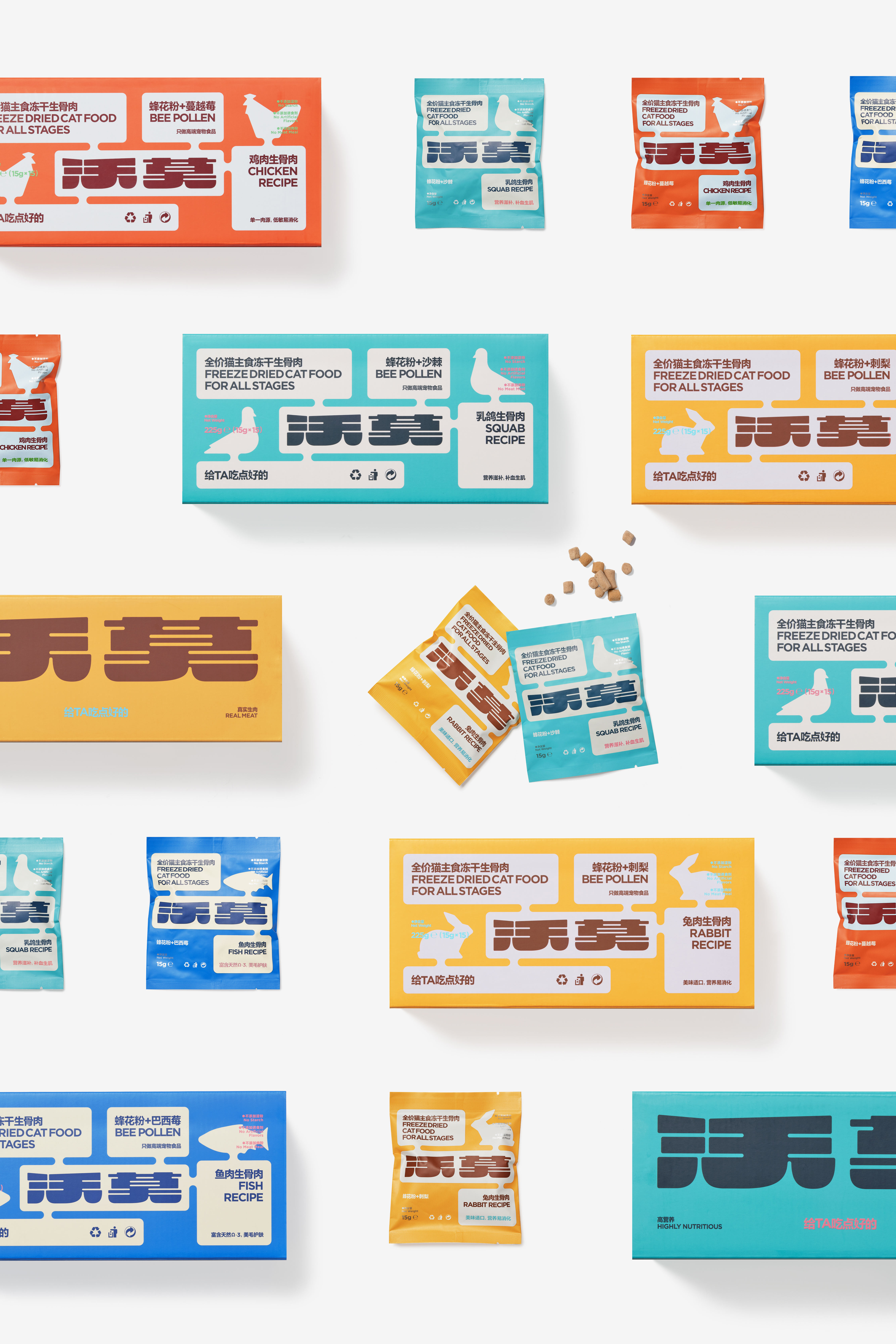
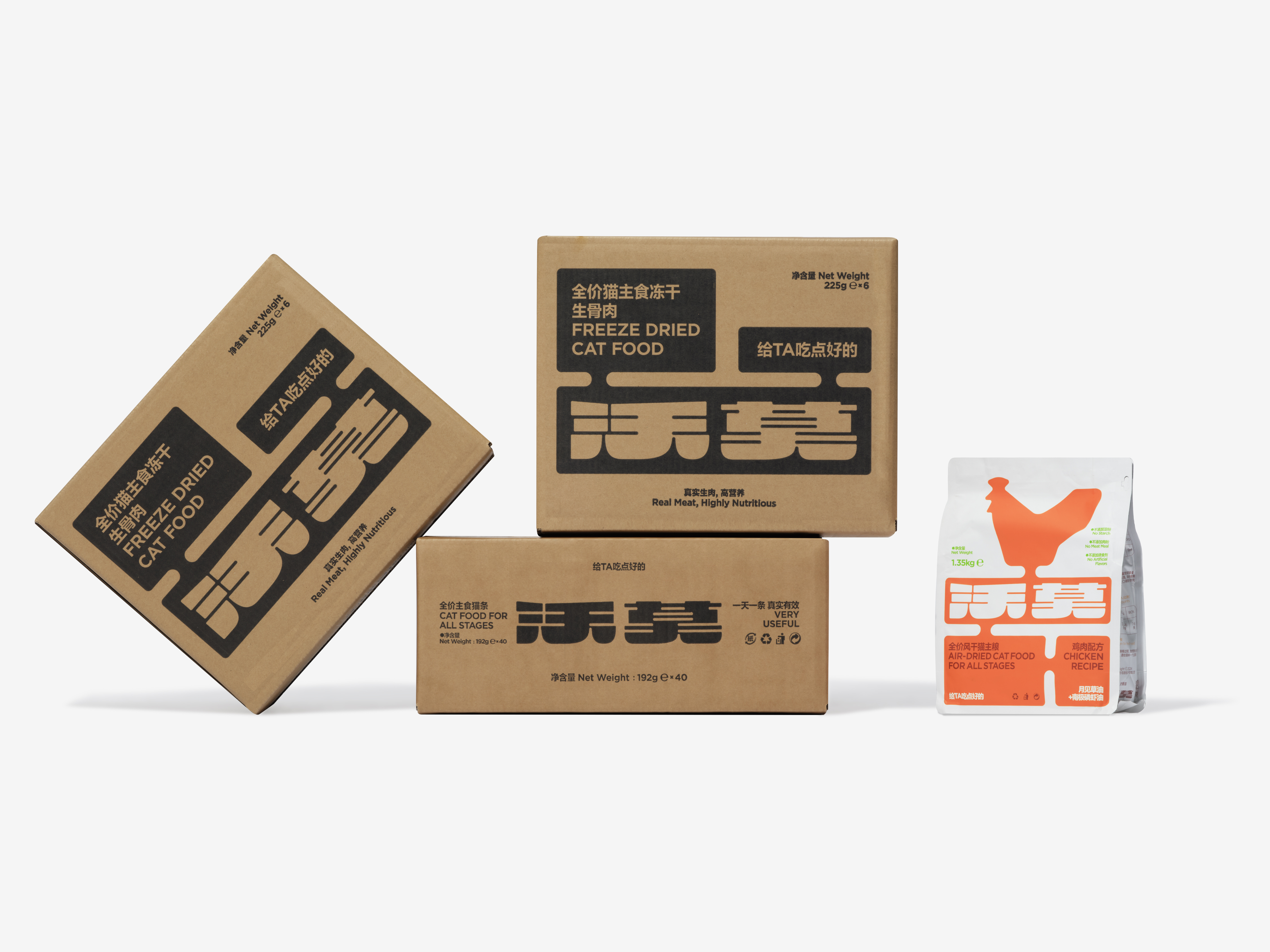
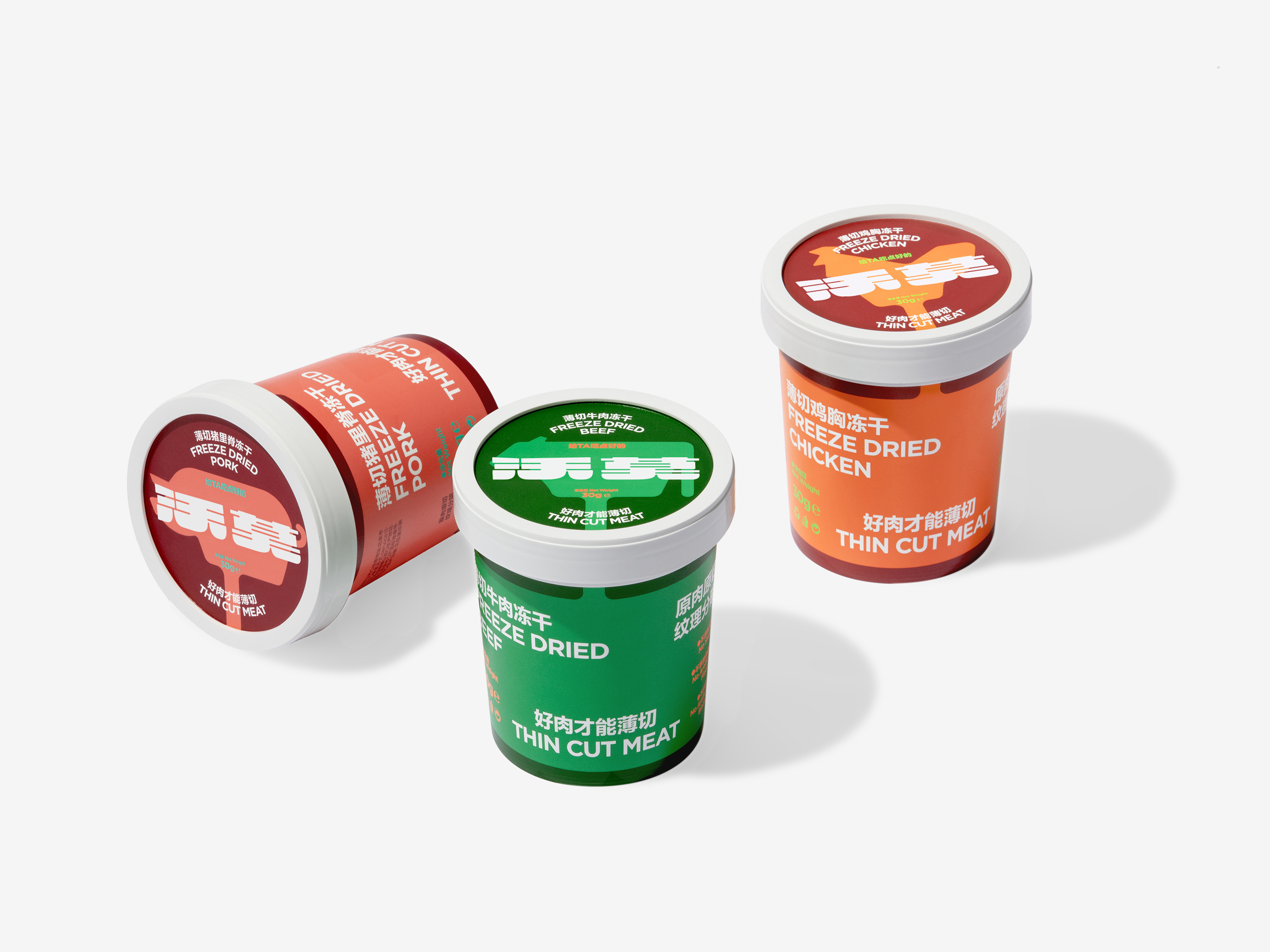
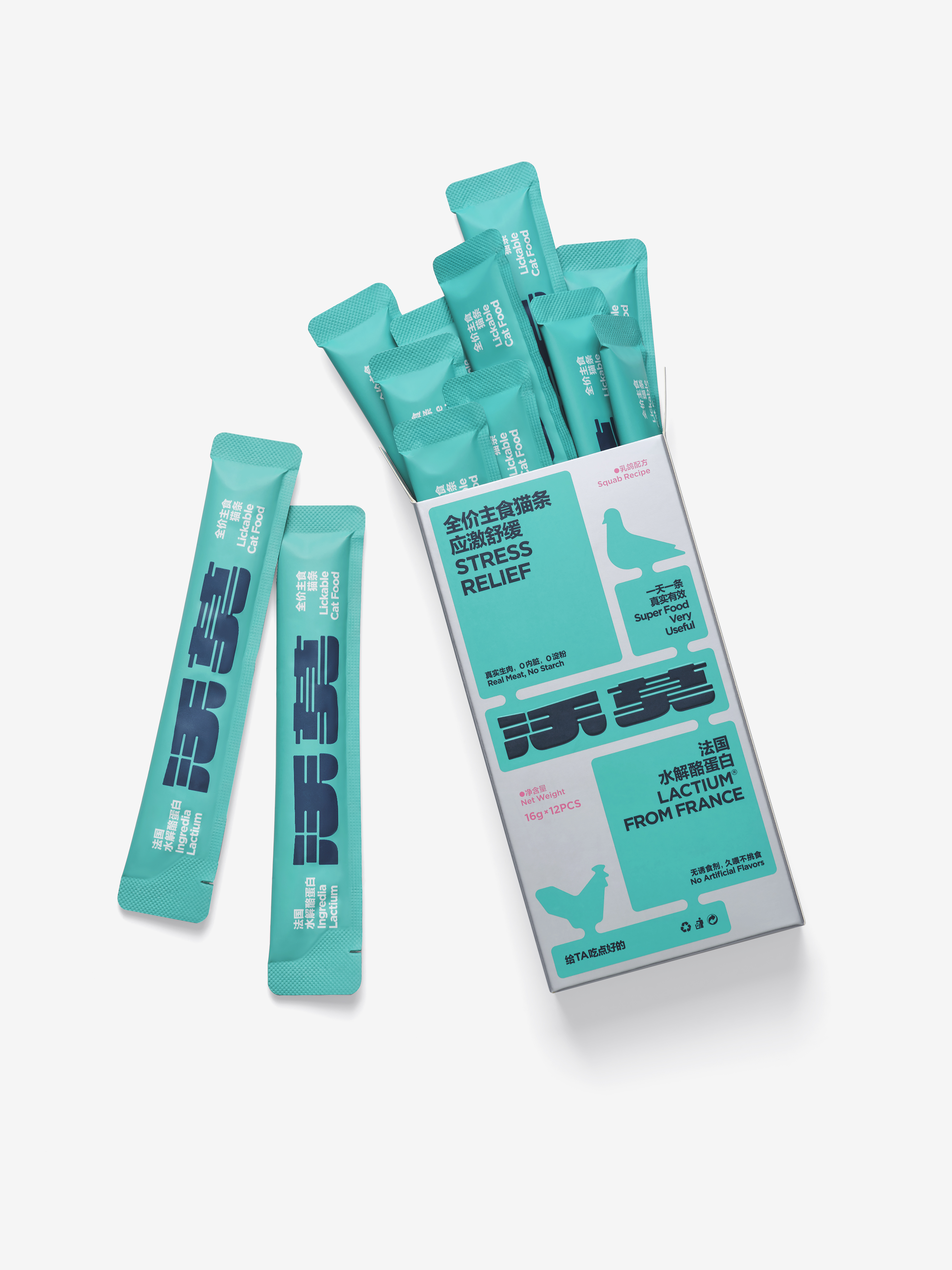
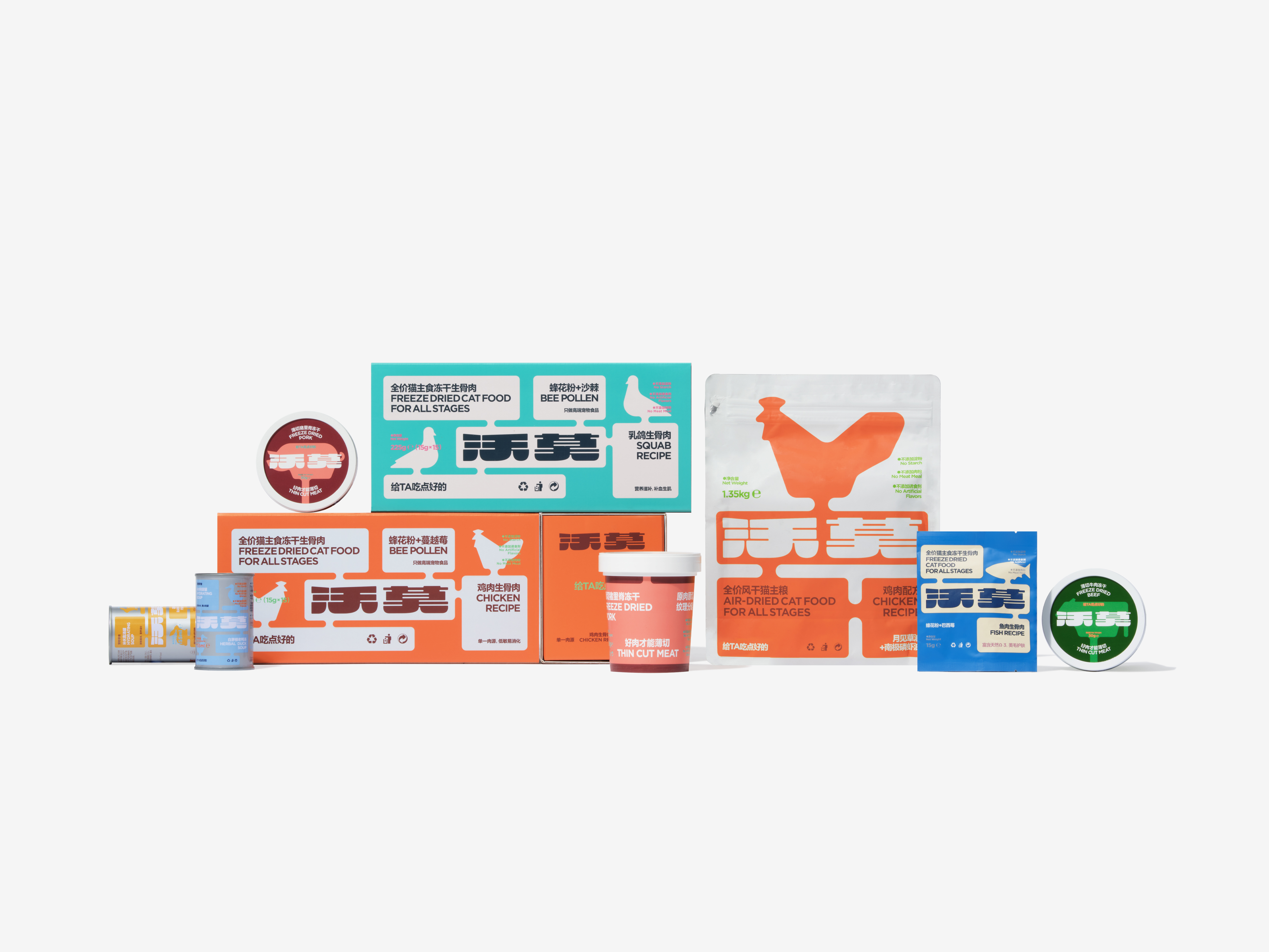
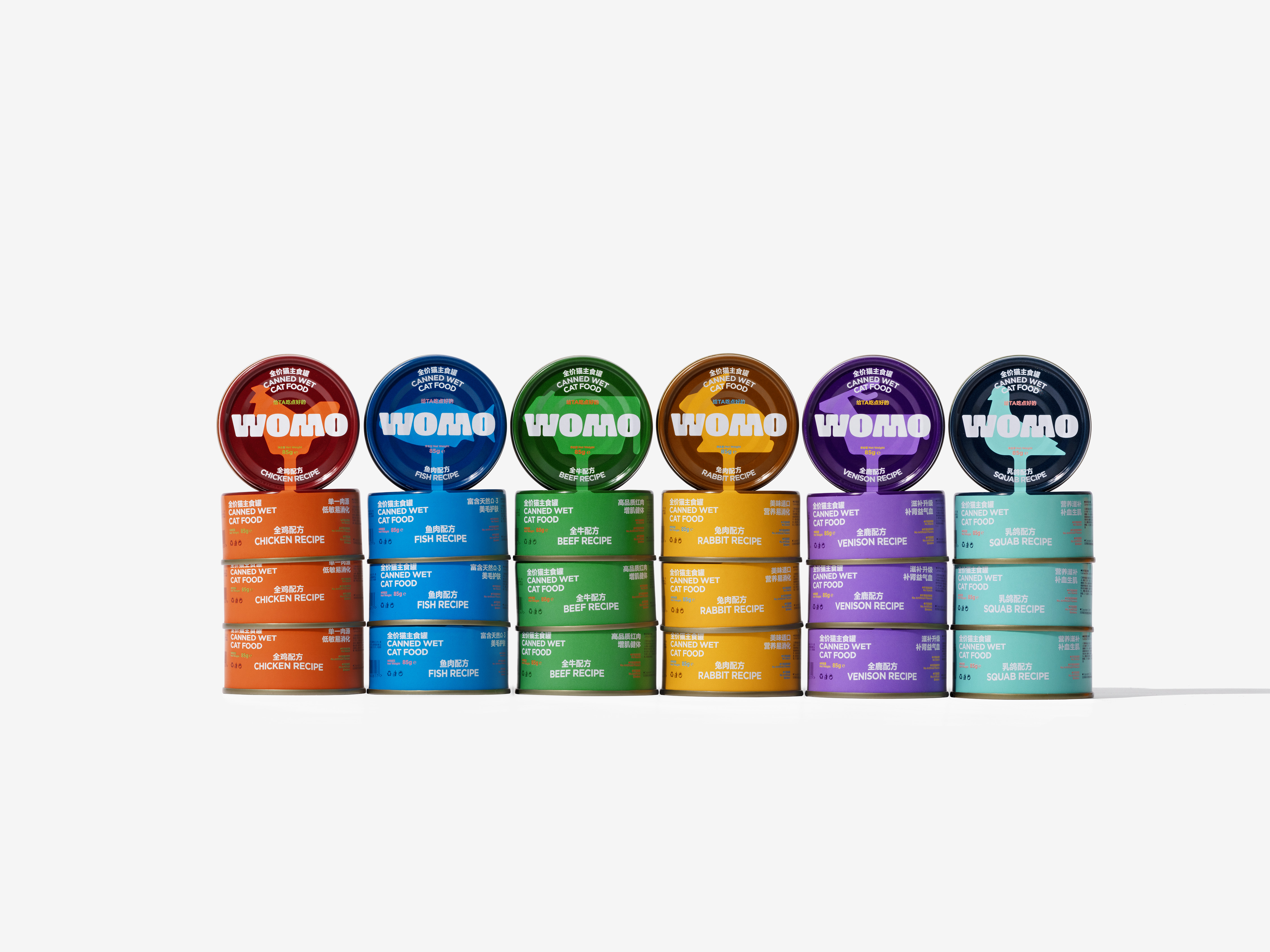
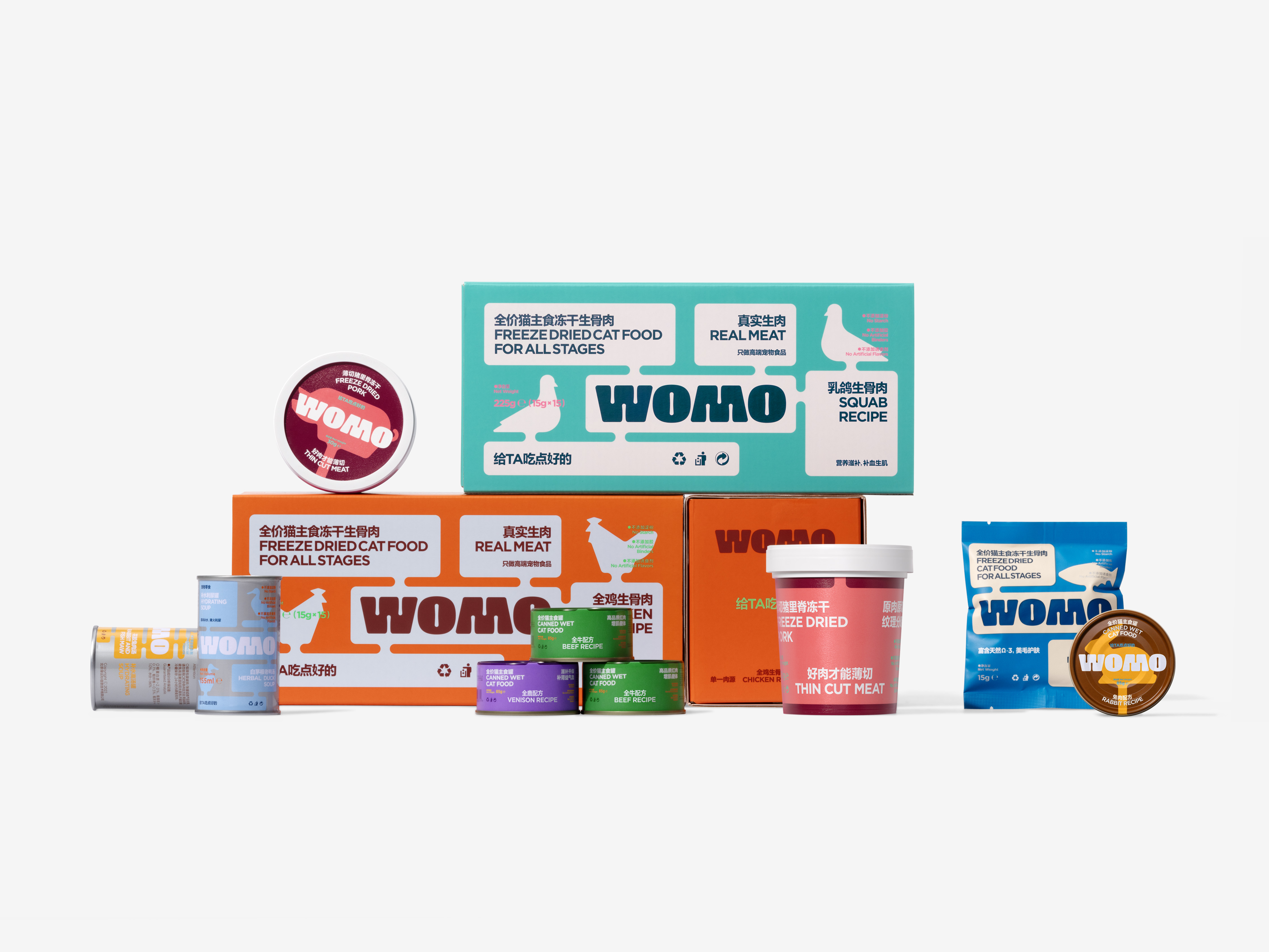
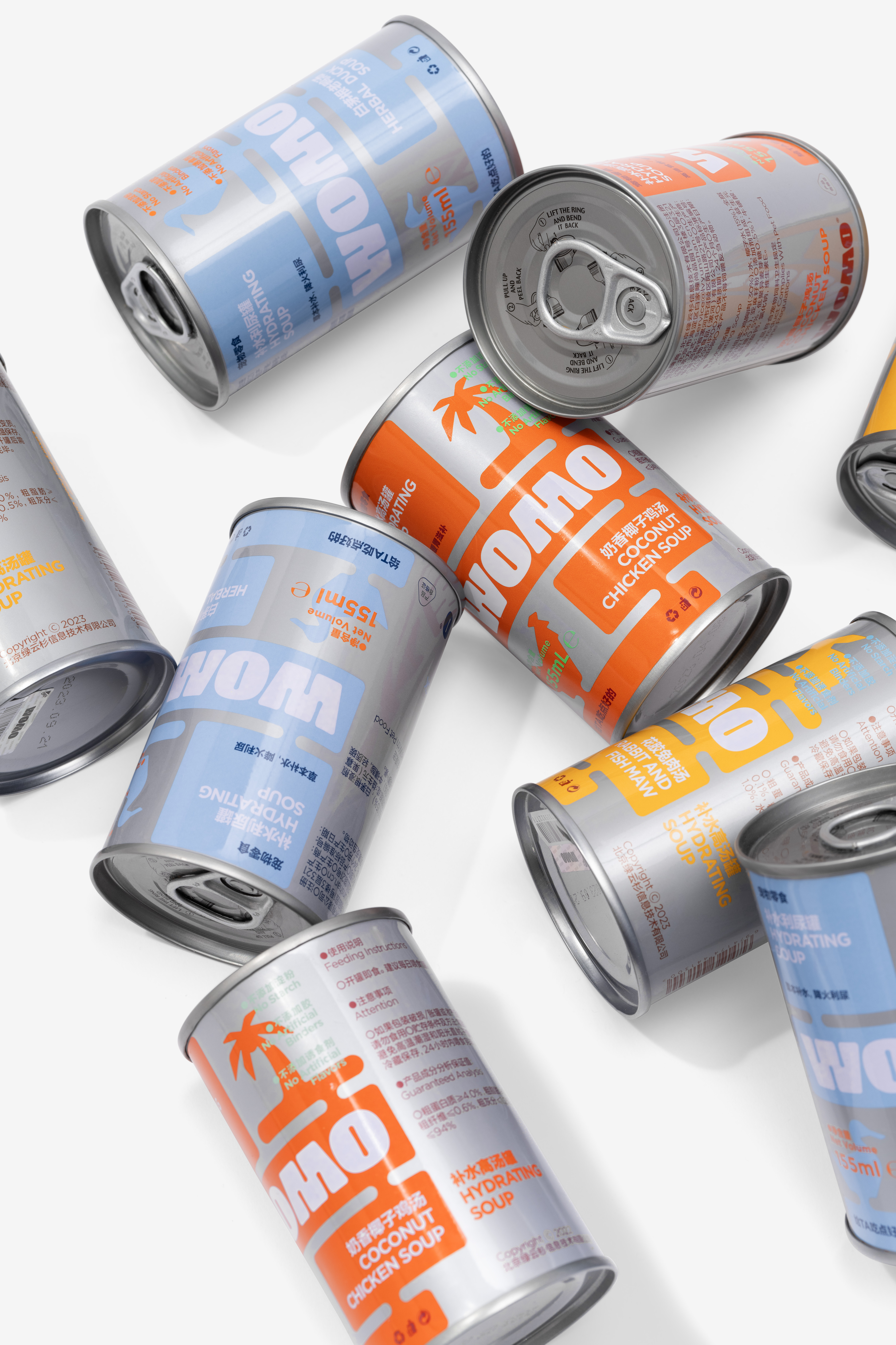
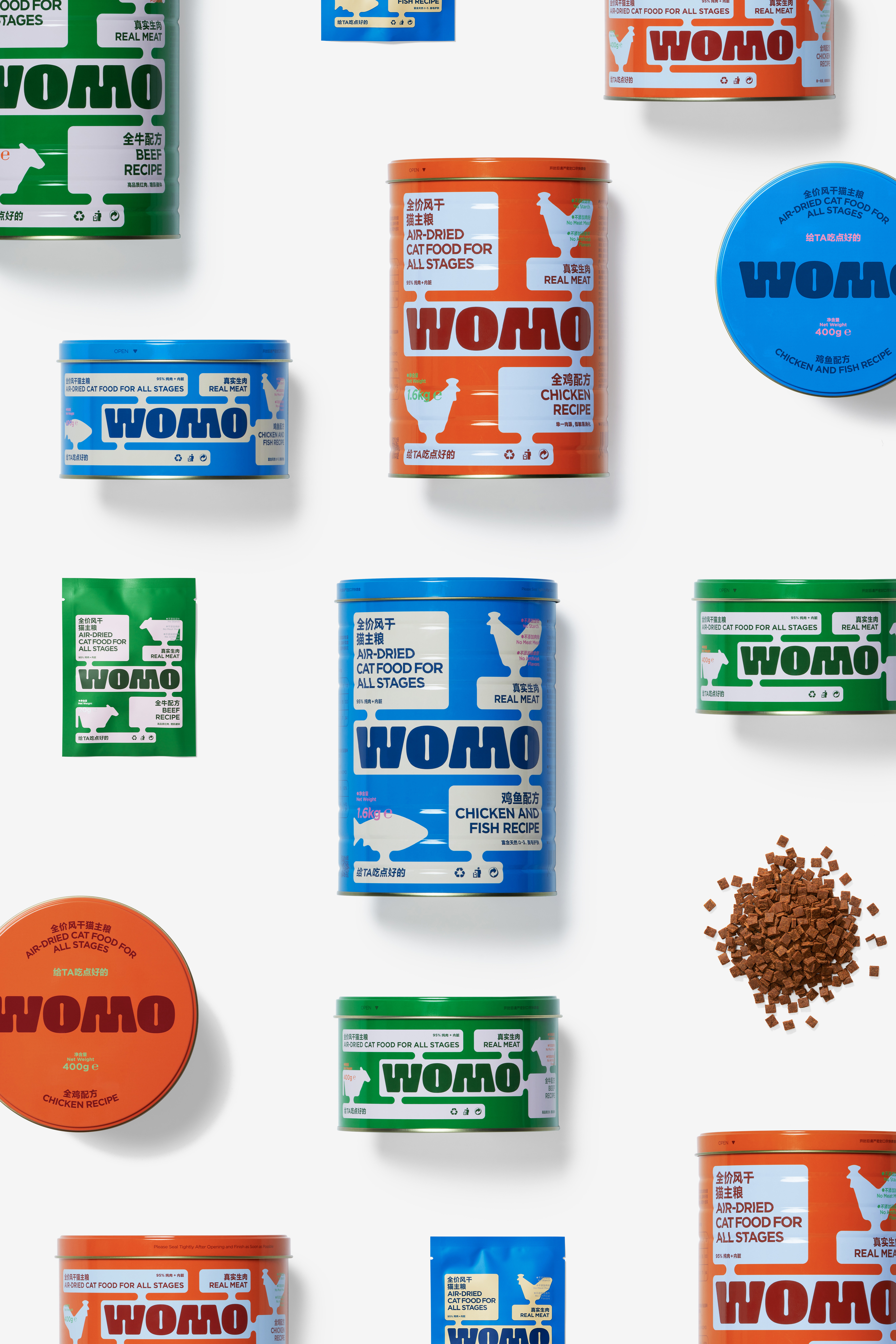
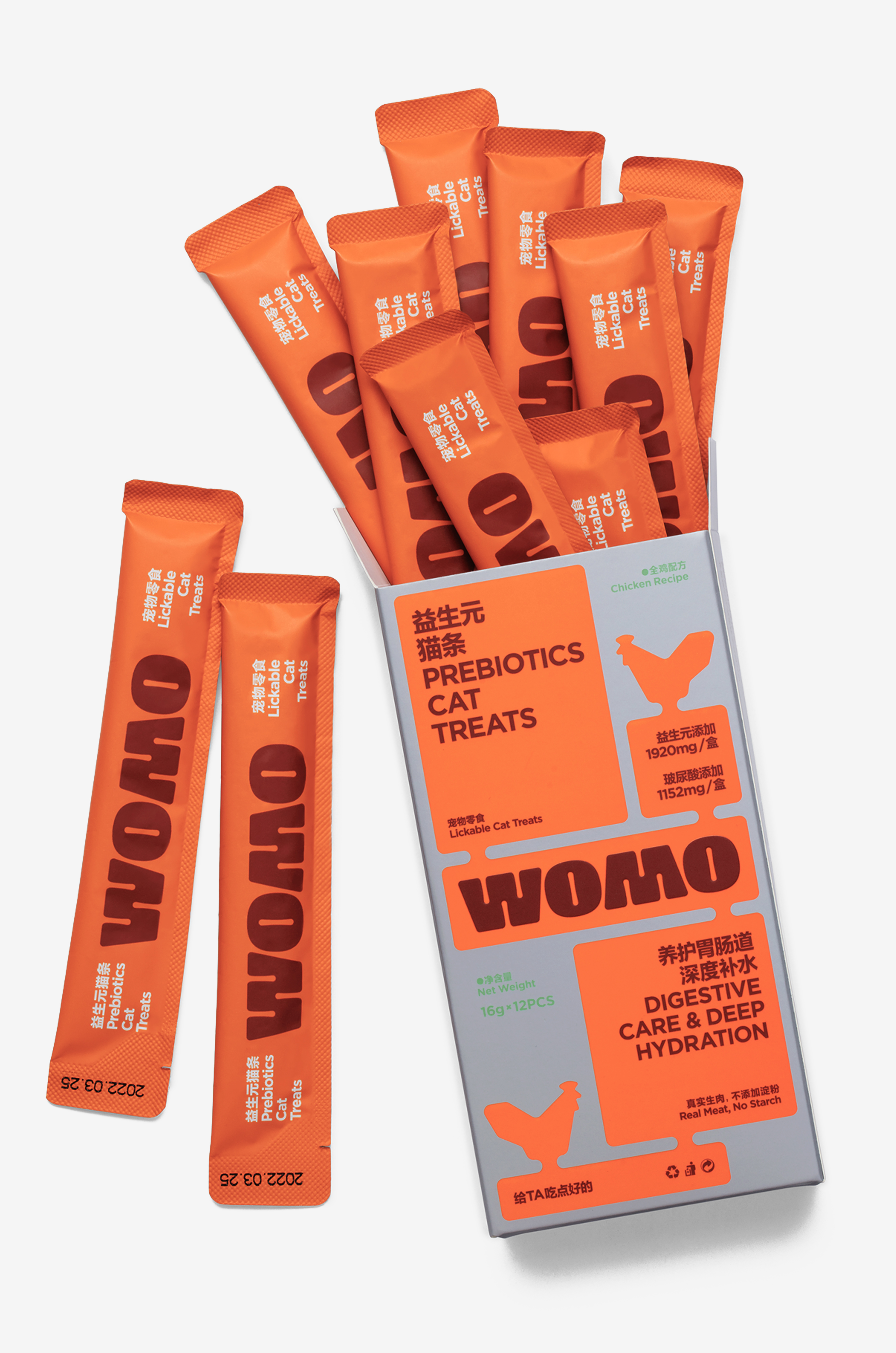
As a rising star in the pet industry, WOMO positions its cat food products in the mid- to high-end market. In the design of this new brand's image, we aim to define a design language that is not only iconic and distinctive in the pet industry, but also conveys a sense of high quality, enabling consumers to quickly recognize the brand and generate a strong willingness to purchase. The new brand lacks storytelling abilities, which is why it is crucial to convey the brand's characteristics through direct and straightforward means. We believe that a mid- to high-end cat food brand needs to demonstrate three key attributes to consumers: deliciousness, fun, and visual appeal. In terms of packaging design, we have moved away from the traditional large bags and adopted a more convenient and storage-friendly bucket format. Corresponding content structures are set for different sizes and specifications of bucket designs. The packaging features highly saturated vibrant colors, which enhance the perception of freshness and deliciousness in the ingredients. The inclusion of illustrations and speech bubbles adds interest and logical relationships to the layout elements. In terms of content and material craftsmanship, we strive for richer detail presentation. We want consumers to experience WOMO's relentless pursuit of quality when they receive the products, leaving them with a delicious, fun, and lasting impression, thus forming a complete brand recognition.
Cats have unique personalities, making it a demanding task to be a cat owner. They are typically more discerning in their preferences. Therefore, we aim to incorporate some distinct and playful language in the branding of products related to pet cats, allowing cat owners to experience a sense of being "special." This is our interpretation of WOMO (pronounced as "wo mao" in Chinese), a play on words that can be understood as "my cat."
Cats have unique personalities, making it a demanding task to be a cat owner. They are typically more discerning in their preferences. Therefore, we aim to incorporate some distinct and playful language in the branding of products related to pet cats, allowing cat owners to experience a sense of being "special." This is our interpretation of WOMO (pronounced as "wo mao" in Chinese), a play on words that can be understood as "my cat."
作为宠物行业的一颗新星,沃莫将主营的猫粮产品定位于中高端市场。而我们需要在这个新品牌的形象设计中定义一种在宠物行业里兼具标志性、差异性,同时也是高品质的设计语言,能够让消费者在快速识别的同时,产生充分的购买意愿。新品牌在“讲故事”方面的能力是有欠缺的,所以才需要尽可能通过直接明了的方式传达出品牌的特性。我们认为中高端猫粮品牌需要向消费者展现出三方面特性:好吃、好玩、好看。在产品包装的形态设定上,我们摒弃了原有的大包装袋形式,采用更利于长期保存、也更方便提取的桶装形式。同时,针对不同尺寸、规格的桶形结构,相应设定了不同的内容结构。包装上高饱和度的鲜艳色彩,更能烘托出食材的新鲜和美味;插图与气泡框的设计元素,增加了版式内容的趣味性和版面逻辑关系;在内容表现和材料工艺上,我们考虑到更为丰富的细节呈现,希望消费者在拿到沃莫的产品时,感受得到品牌对于品质的极致追求,收获一个好吃也好玩的好印象,从而形成完整的品牌认知。
猫的个性是比较特殊的。所以作为猫的主人,也会是比较辛苦的,他们通常会更为挑剔。我们希望能在与宠物猫相关的品牌塑造上增加一些与众不同的有趣的语言,让猫的主人们在选择和使用产品的过程中,体会到一种被“特别关注”的感觉。这就是我们对沃莫WOMO (谐音“我猫”)的一种解读方式。
猫的个性是比较特殊的。所以作为猫的主人,也会是比较辛苦的,他们通常会更为挑剔。我们希望能在与宠物猫相关的品牌塑造上增加一些与众不同的有趣的语言,让猫的主人们在选择和使用产品的过程中,体会到一种被“特别关注”的感觉。这就是我们对沃莫WOMO (谐音“我猫”)的一种解读方式。


All Images Copyright © 2022 WOMO. All Rights Reserved