WOKO'CLOCK
此食此客
ART DIRECTOR: Guang Yu / Nod Young
DESIGNER: Wang Xiaoshuai
YEAR: 2021
CLIENT: WOKO'CLOCK 此食此客
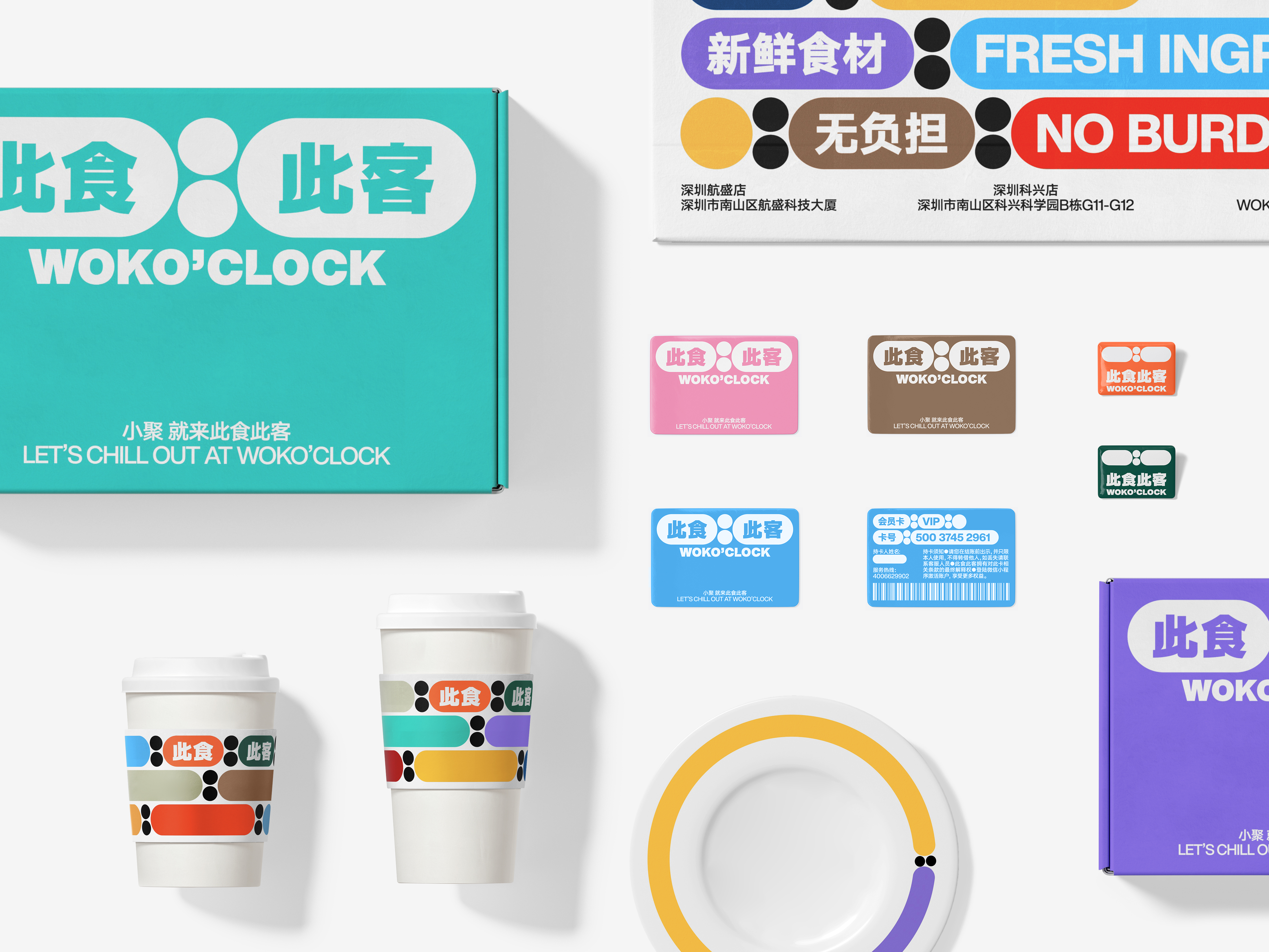
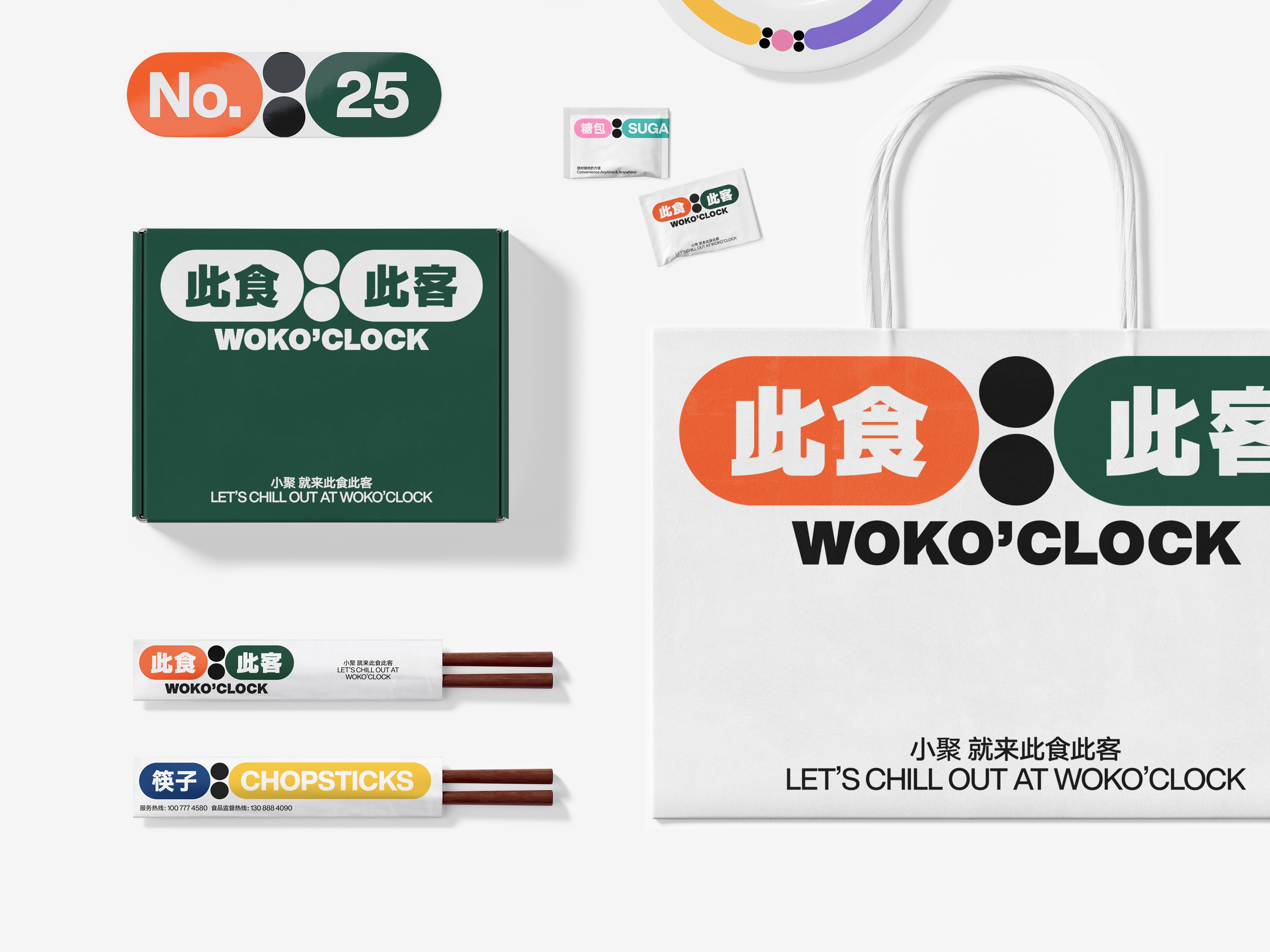
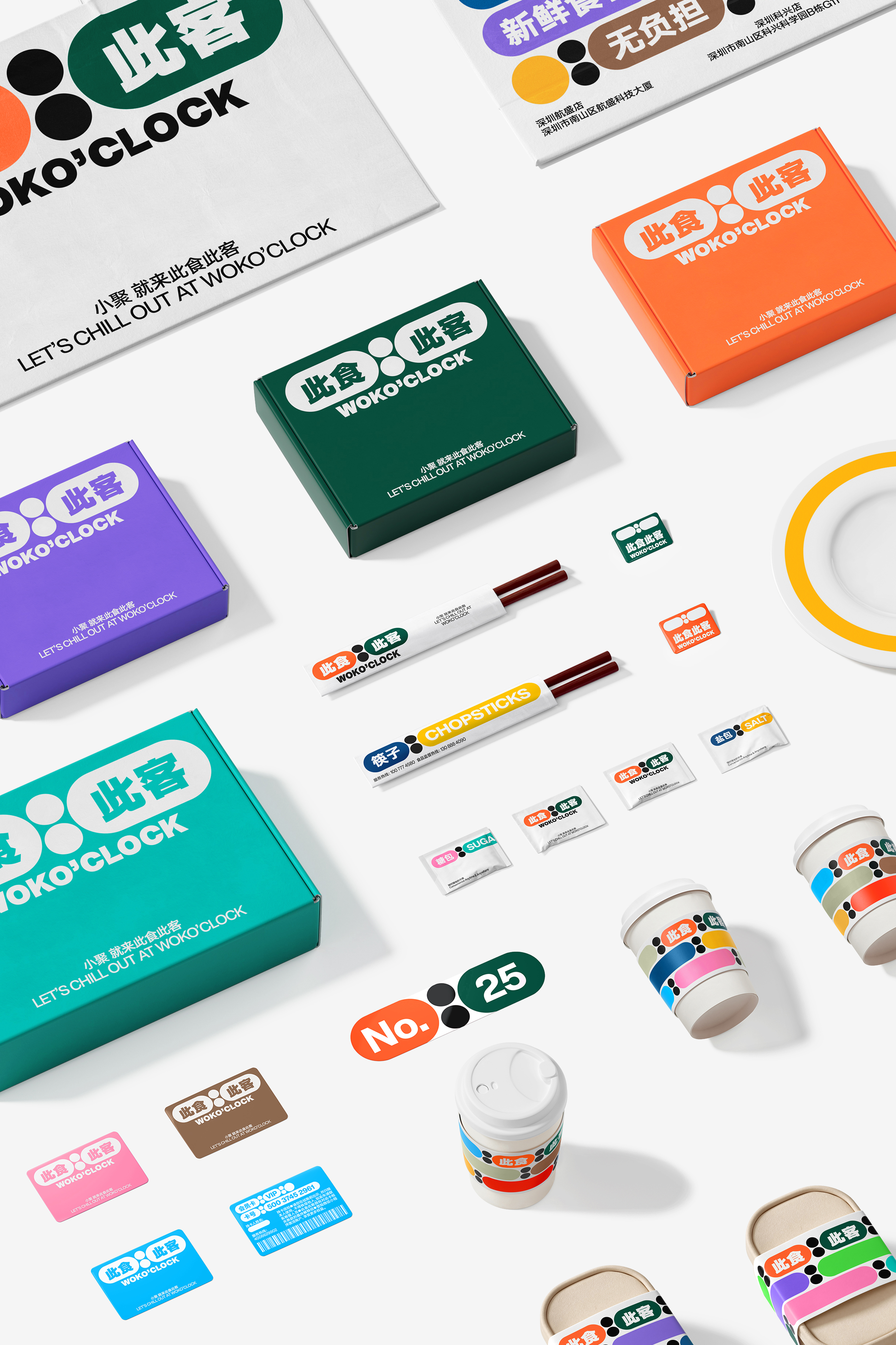
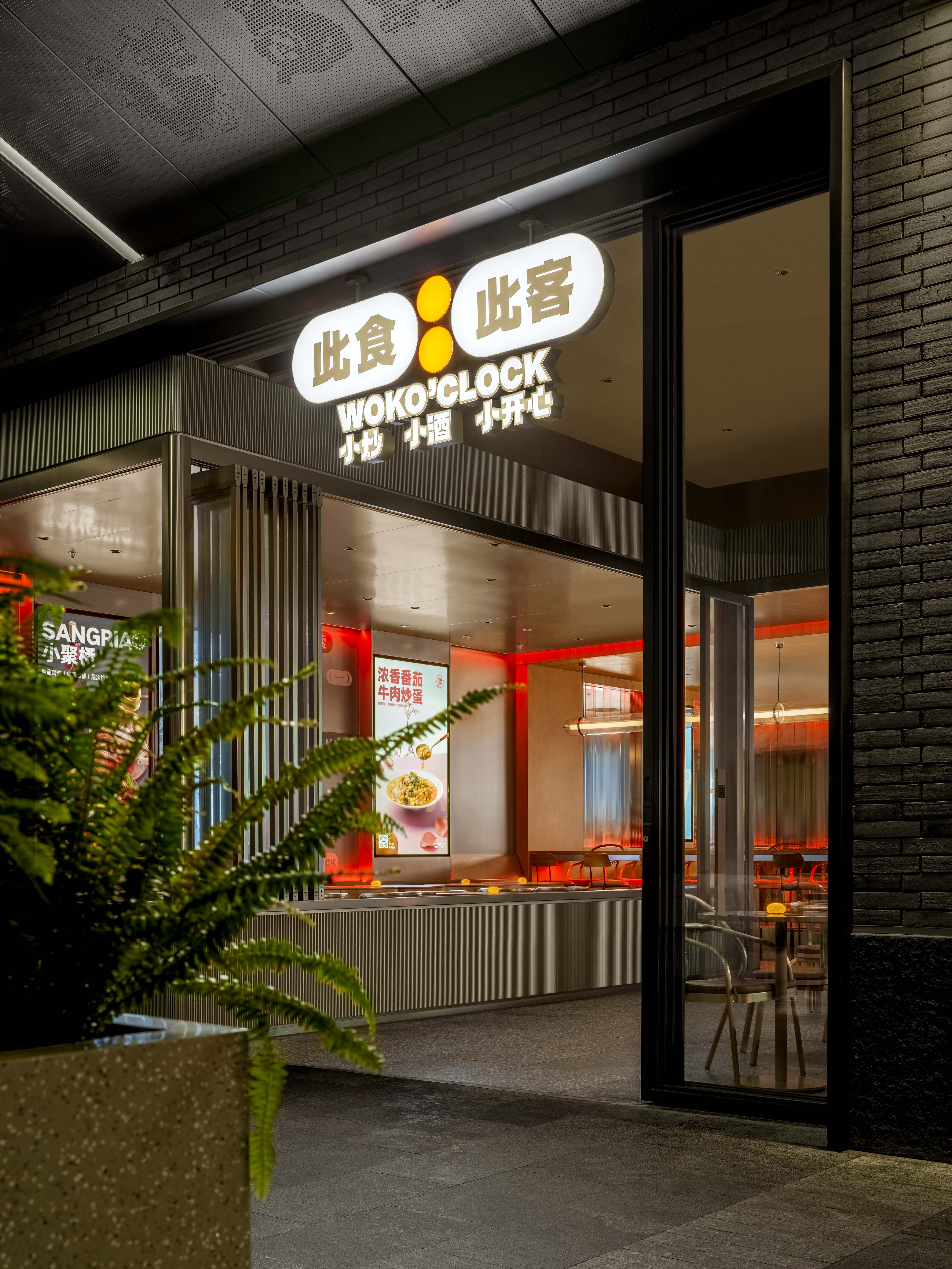
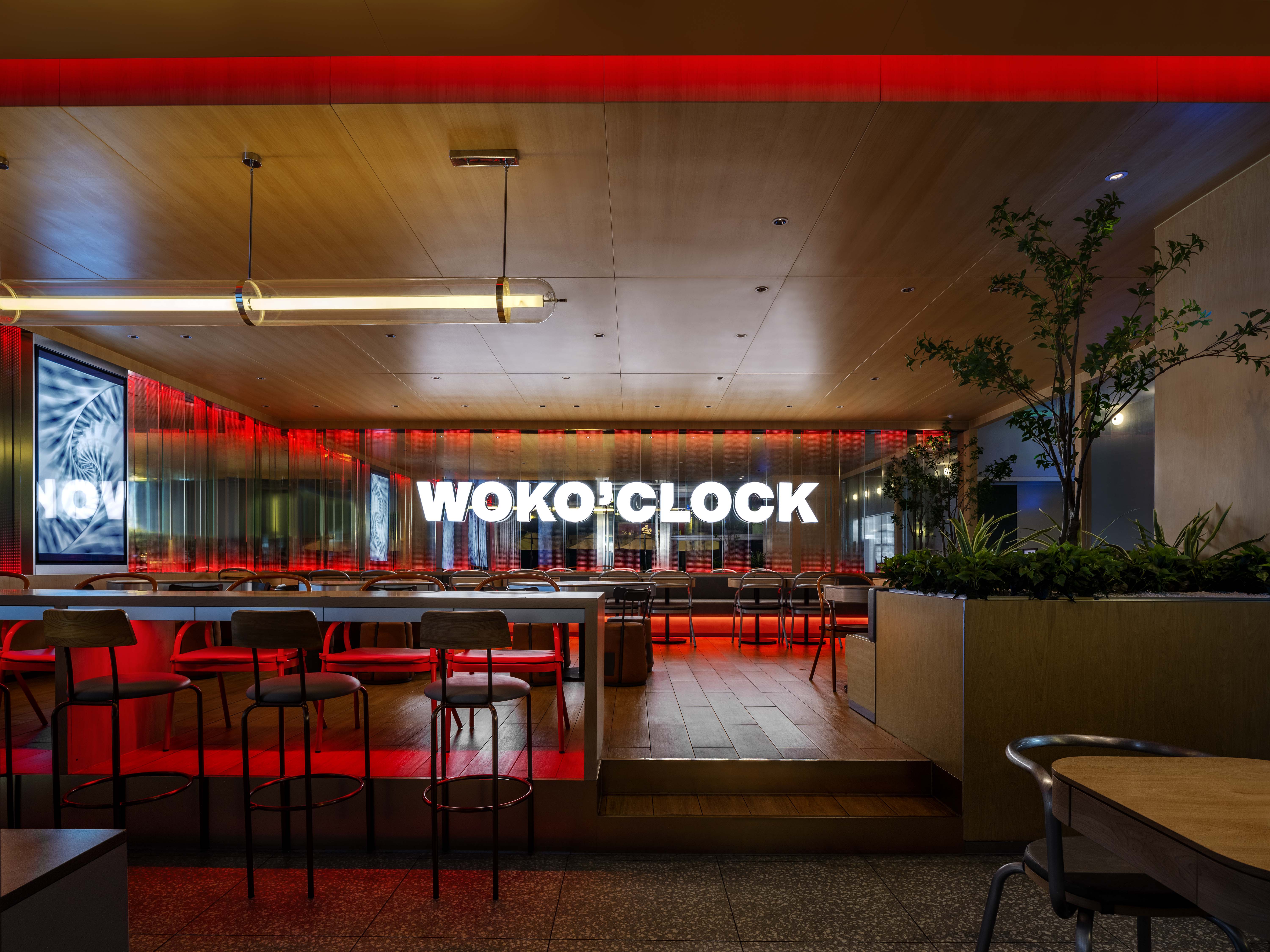
WOKO'CLOCK is a newly established chain restaurant. The name borrows the homonym of "here and now" in the name of this meal, aiming to clearly describe the particularity of the catering service provided by WOKO'CLOCK, that is, to provide customers with different types of meal services at different times. For example, lunch is more in line with the needs of white-collar workers, while dinner has the attribute of party gathering. We hope to connect the relationship between moments and diners through vision, and let consumers more vividly understand the uniqueness of restaurant services with the help of the time concept, so as to form a strong visual impression and reduce memory costs.
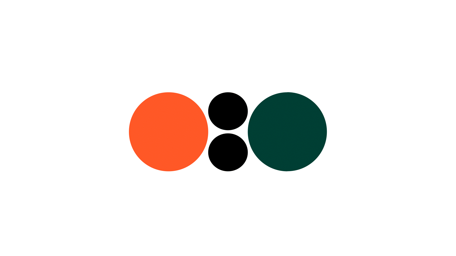
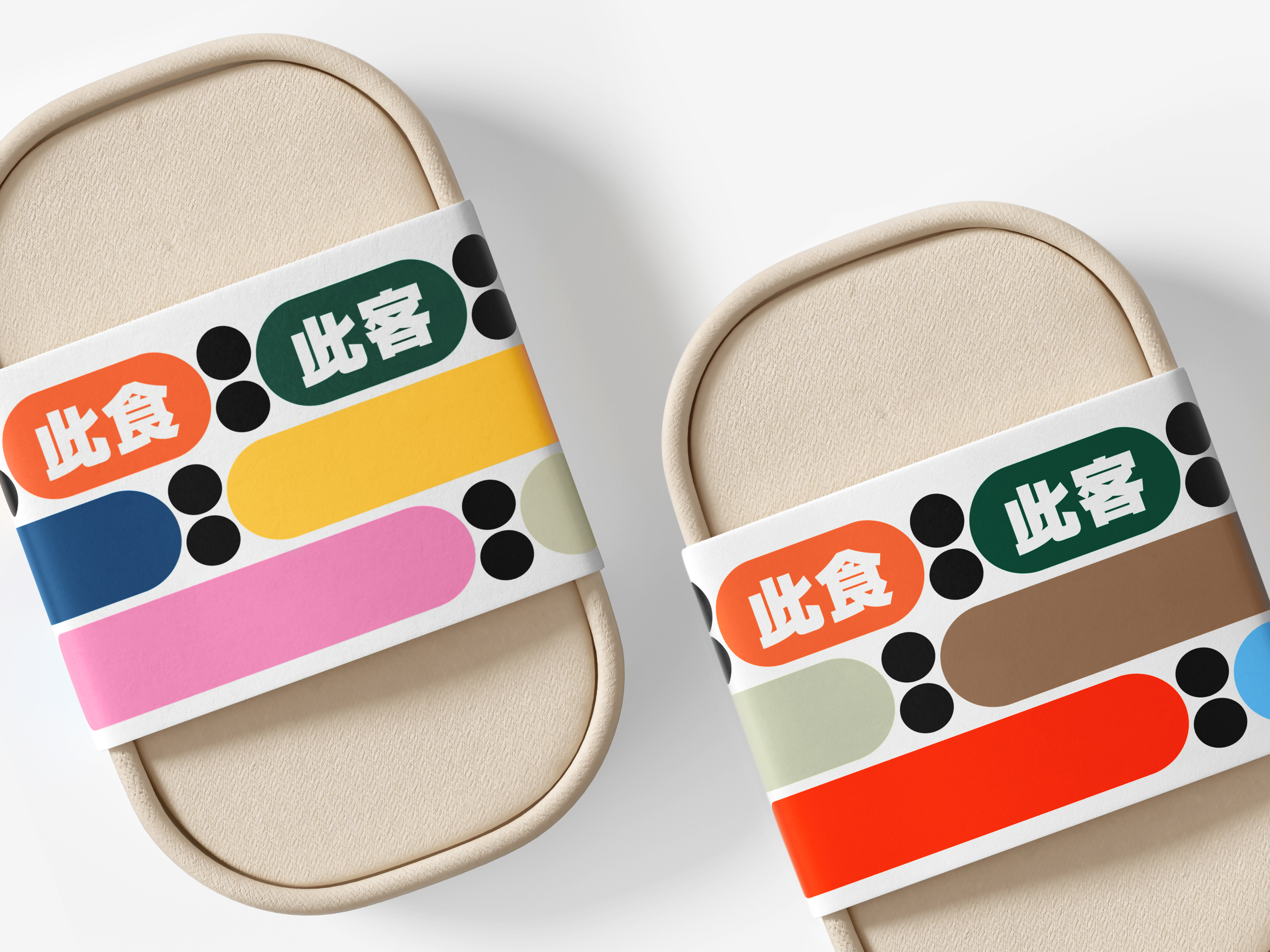
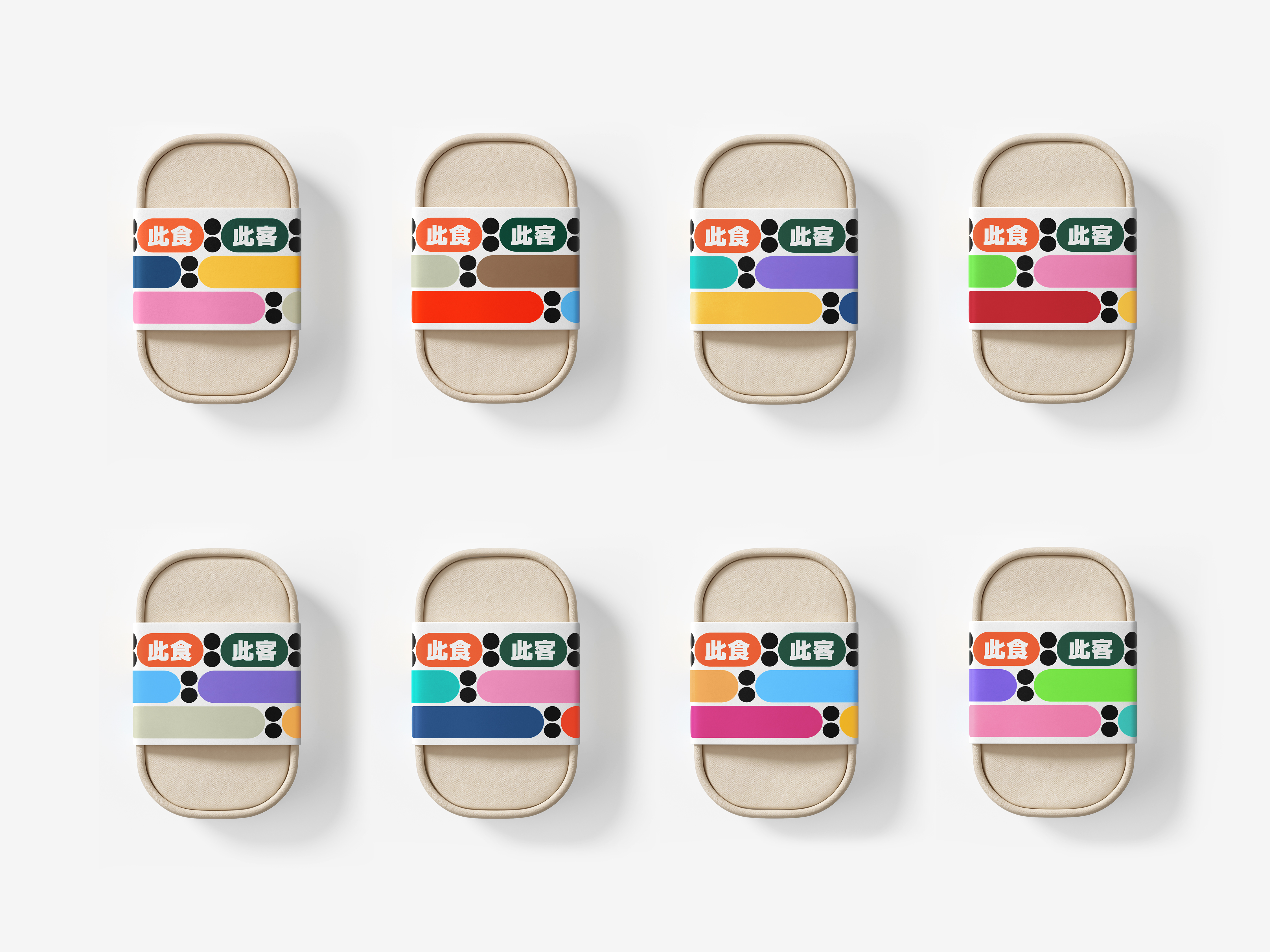
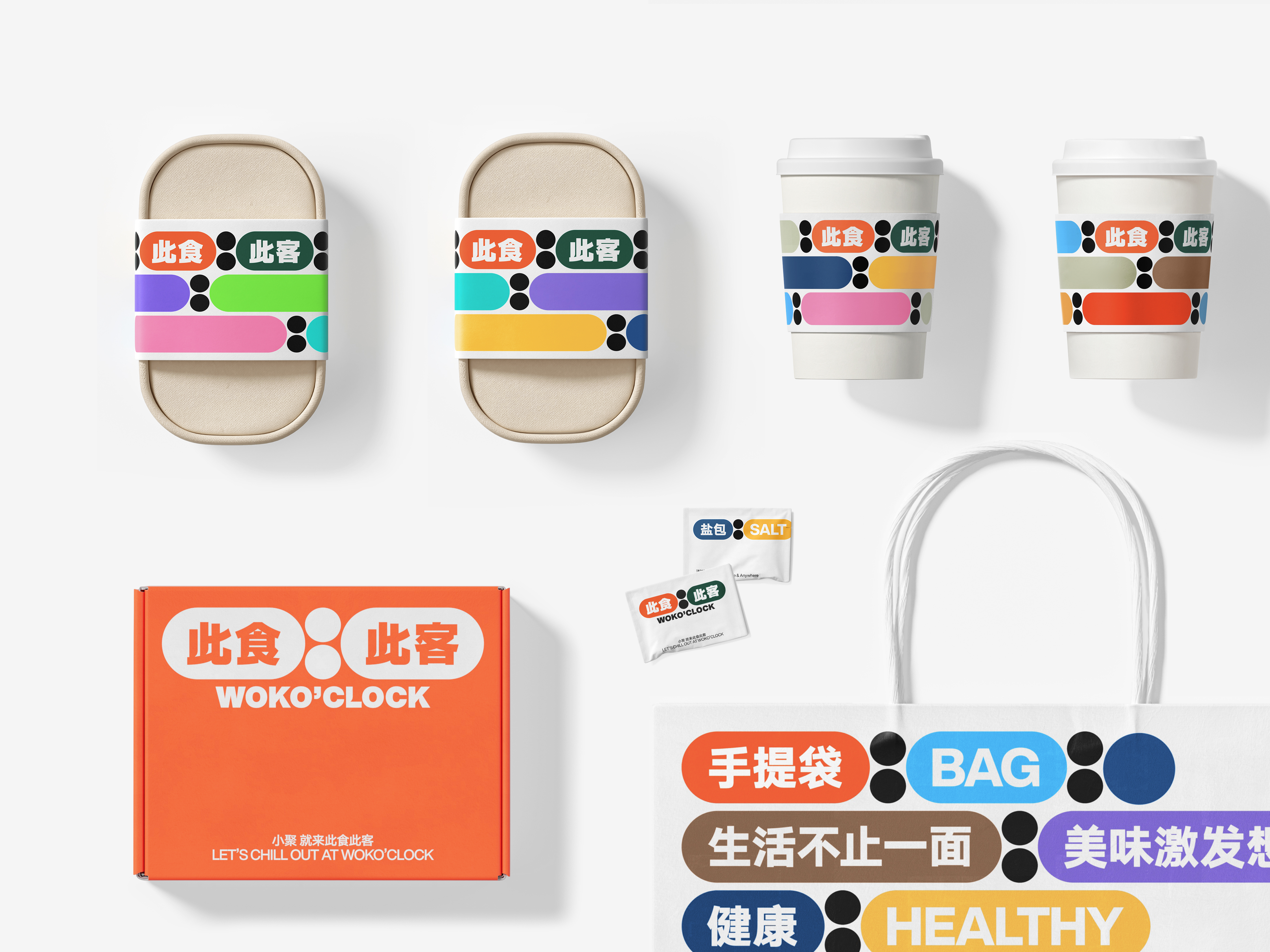
The logo design uses an electronic timer, which is eye-catching and friendly, and shapes multiple combinations through color changes. In the visual system planning, the timer concept of the logo is converted into auxiliary graphics to strengthen the association between the application and the main logo. We understand that WOKO'CLOCK is flexible and diversified, and we can always find the best choice in this rich, interesting, relaxed and friendly visual system, whether it is to provide different meal combinations at different times or catering to different customers.
The logo design uses an electronic timer, which is eye-catching and friendly, and shapes multiple combinations through color changes. In the visual system planning, the timer concept of the logo is converted into auxiliary graphics to strengthen the association between the application and the main logo. We understand that WOKO'CLOCK is flexible and diversified, and we can always find the best choice in this rich, interesting, relaxed and friendly visual system, whether it is to provide different meal combinations at different times or catering to different customers.
此食此客是一家新成立的连锁餐饮企业。此食此客在命名上借用了“此时此刻”的谐音,目的在于清晰地描述客户提供的餐饮服务特殊性,即在不同时段为顾客提供不同类型的餐食服务,例如:午餐的餐食供应更符合白领工作餐的需求,而晚餐则具备派对聚会属性。我们希望通过视觉打通时刻与食客之间的关系,并借助时间的概念让消费者更加具象地理解餐厅服务的独特性,形成强烈的视觉印象,降低记忆成本。
标识设计使用了电子计时器的方式,醒目且友好,并通过色彩的变化来塑造多元的组合。在视觉系统规划中,将标识的计时器概念转换为辅助图形,加强应用与主标识的关联性。我们理解的此食此客是灵活的、多元的,无论是不同时段提供不同餐食组合,还是针对不同顾客的不同饮食需求,都能在这个丰富有趣、轻松友好的视觉系统中寻找到最佳的选择。
标识设计使用了电子计时器的方式,醒目且友好,并通过色彩的变化来塑造多元的组合。在视觉系统规划中,将标识的计时器概念转换为辅助图形,加强应用与主标识的关联性。我们理解的此食此客是灵活的、多元的,无论是不同时段提供不同餐食组合,还是针对不同顾客的不同饮食需求,都能在这个丰富有趣、轻松友好的视觉系统中寻找到最佳的选择。
All Photos Copyright © 2022 WOKO'CLOCK 此食此客. All Rights Reserved.