VfU
ART DIRECTOR: Guang Yu / Nod Young
DESIGNER: Wang Xiaoshuai / Liao Liao / Xu Mingru
YEAR: 2021
CLIENT: VfU
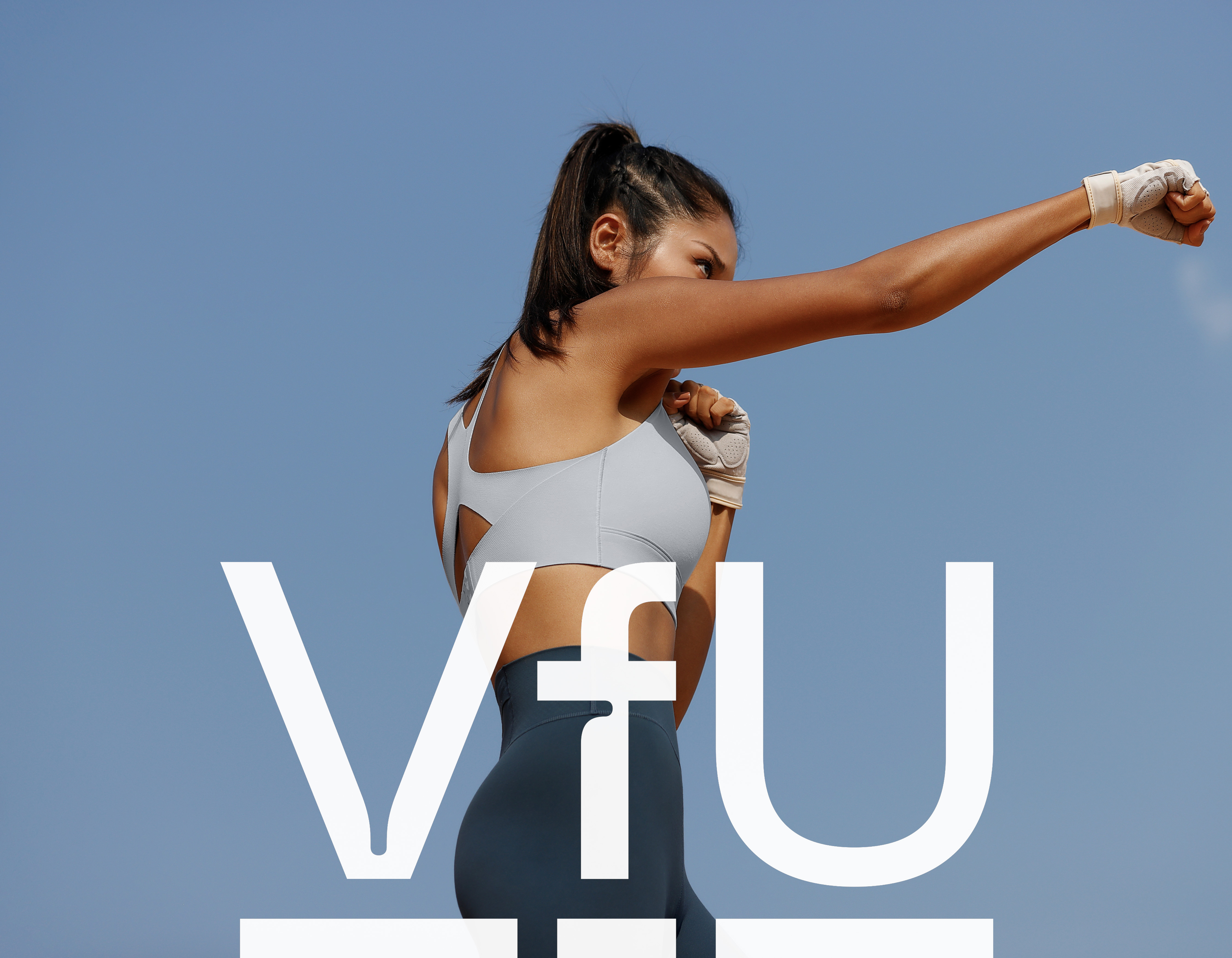
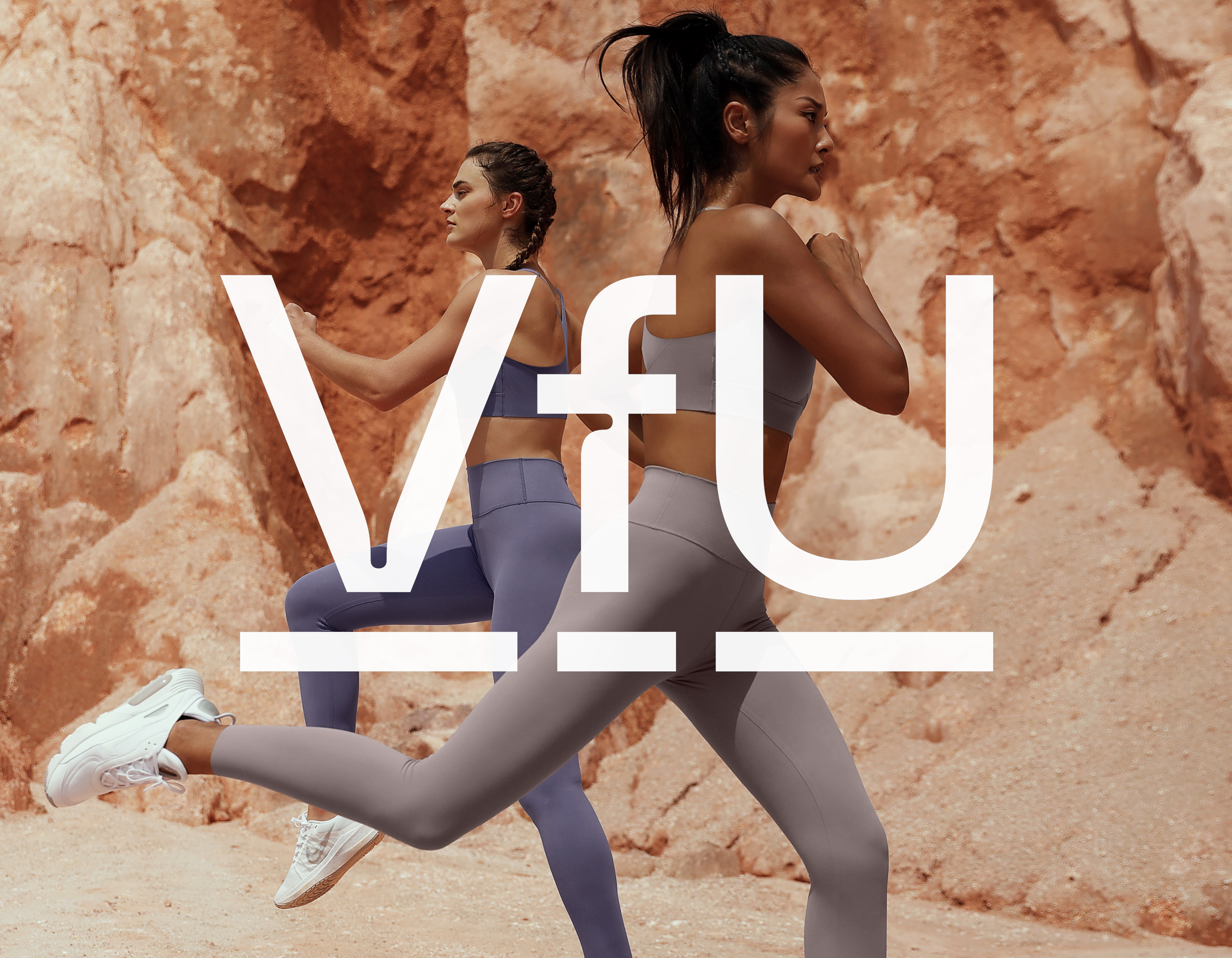
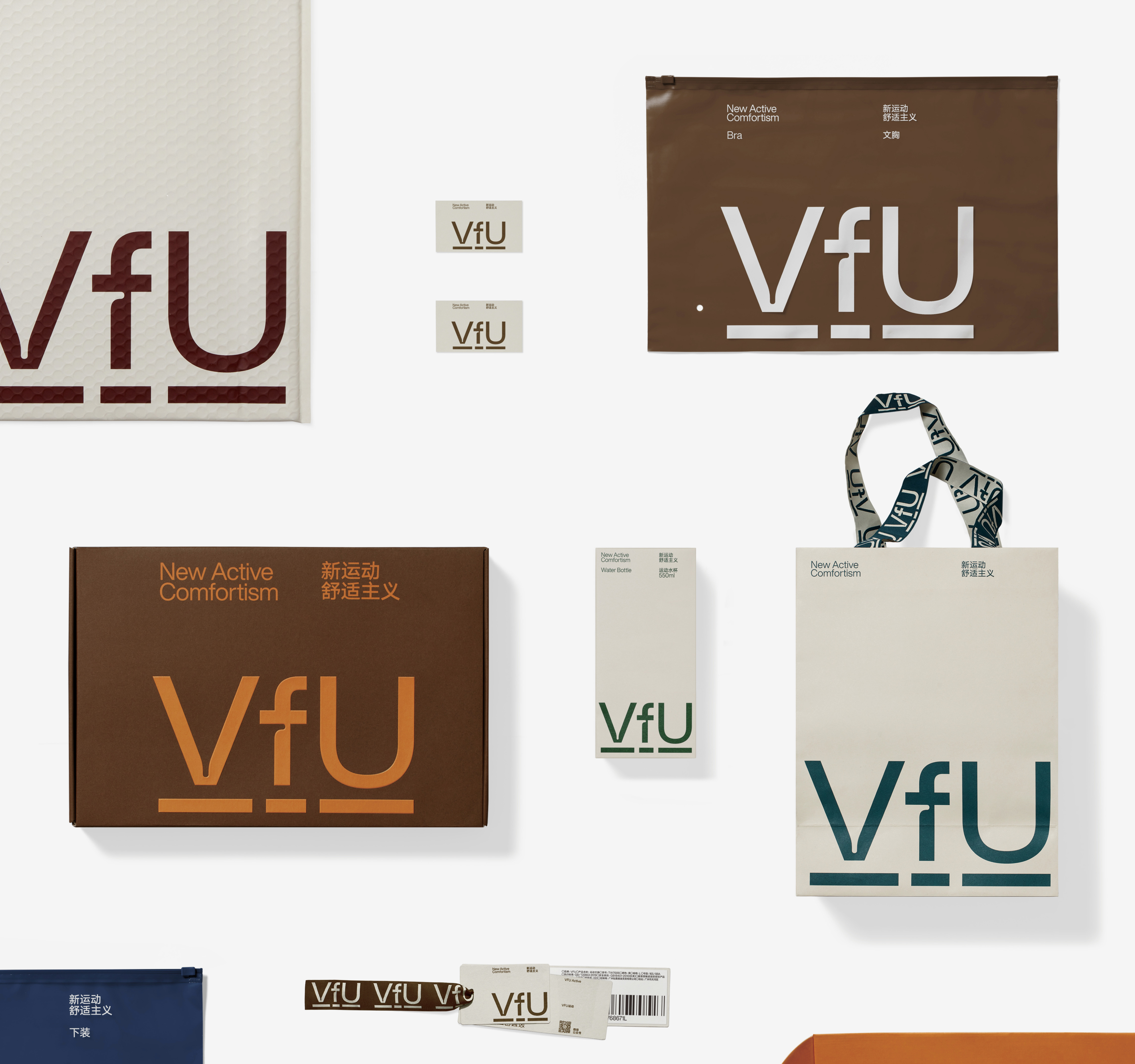
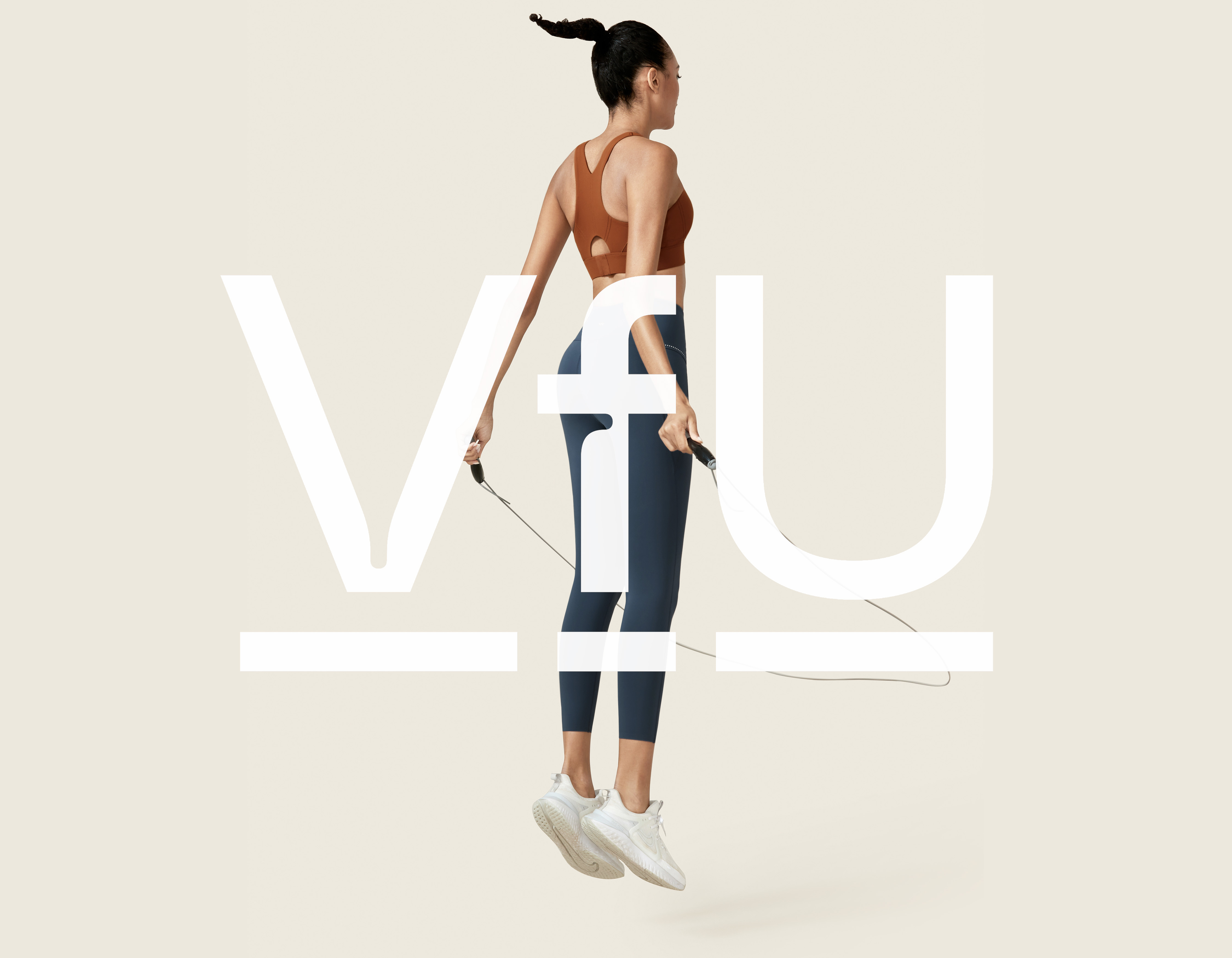
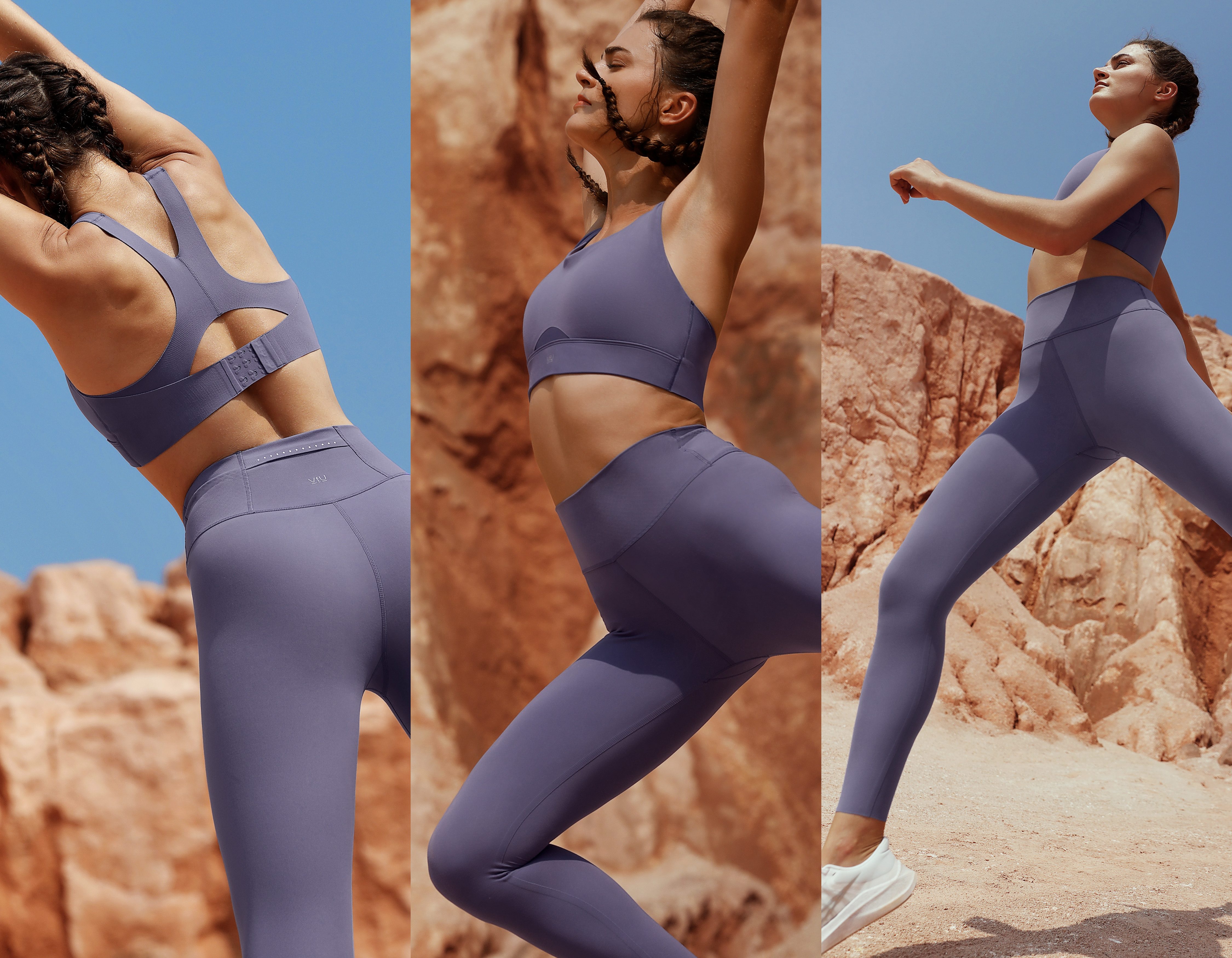
VfU is a sportswear brand for urban women. In our opinion, VfU is a miracle of a national brand,
maintaining excellent sales for several years in the midst of fierce competition, which is quite incredible. VfU's brand personality is unassuming, even somewhat understated, but at the same time
independent and unique, which is perhaps what has made them so popular with a large number of hinese female users. Users sum up VfU's character as: inner strength.
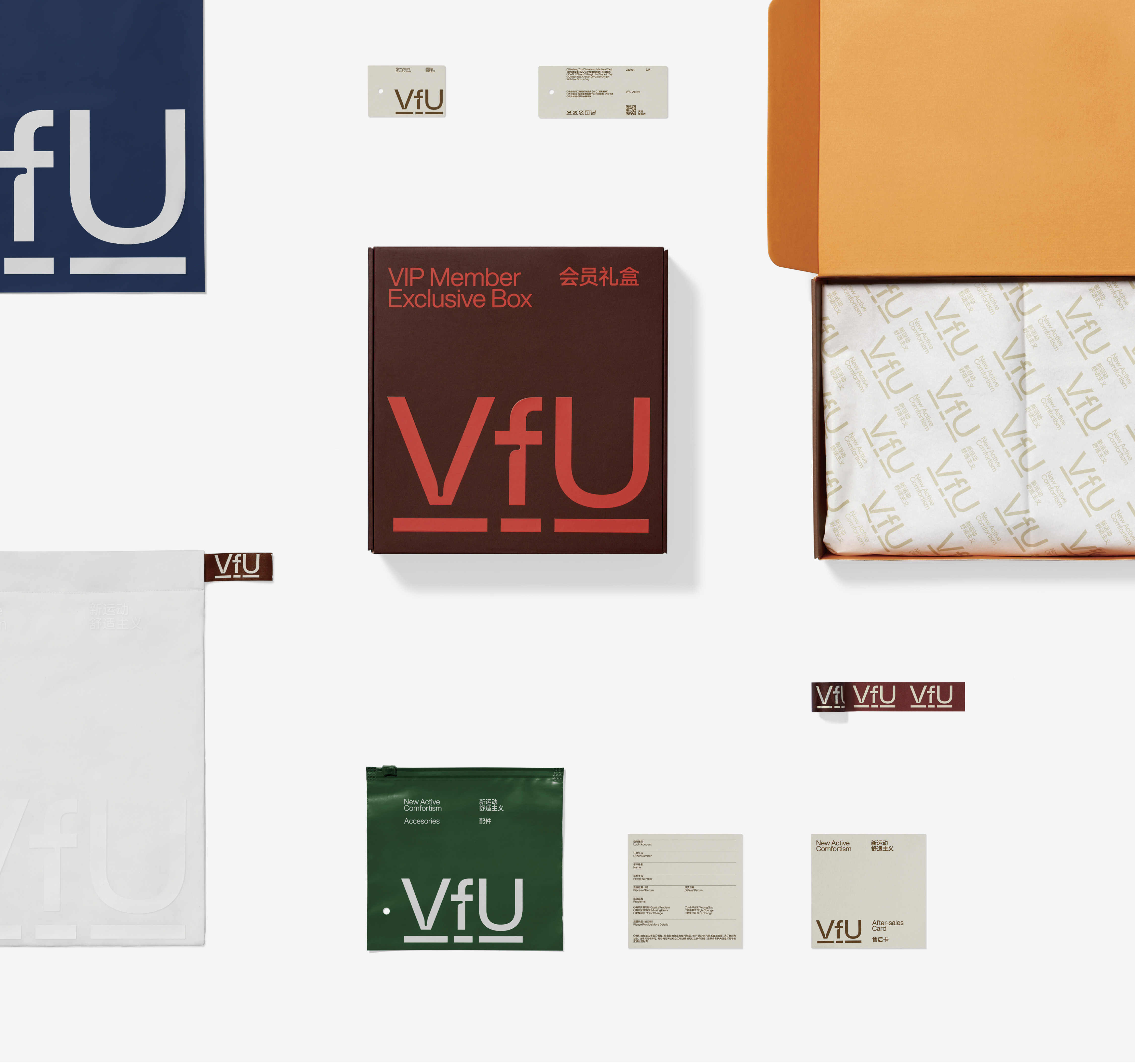
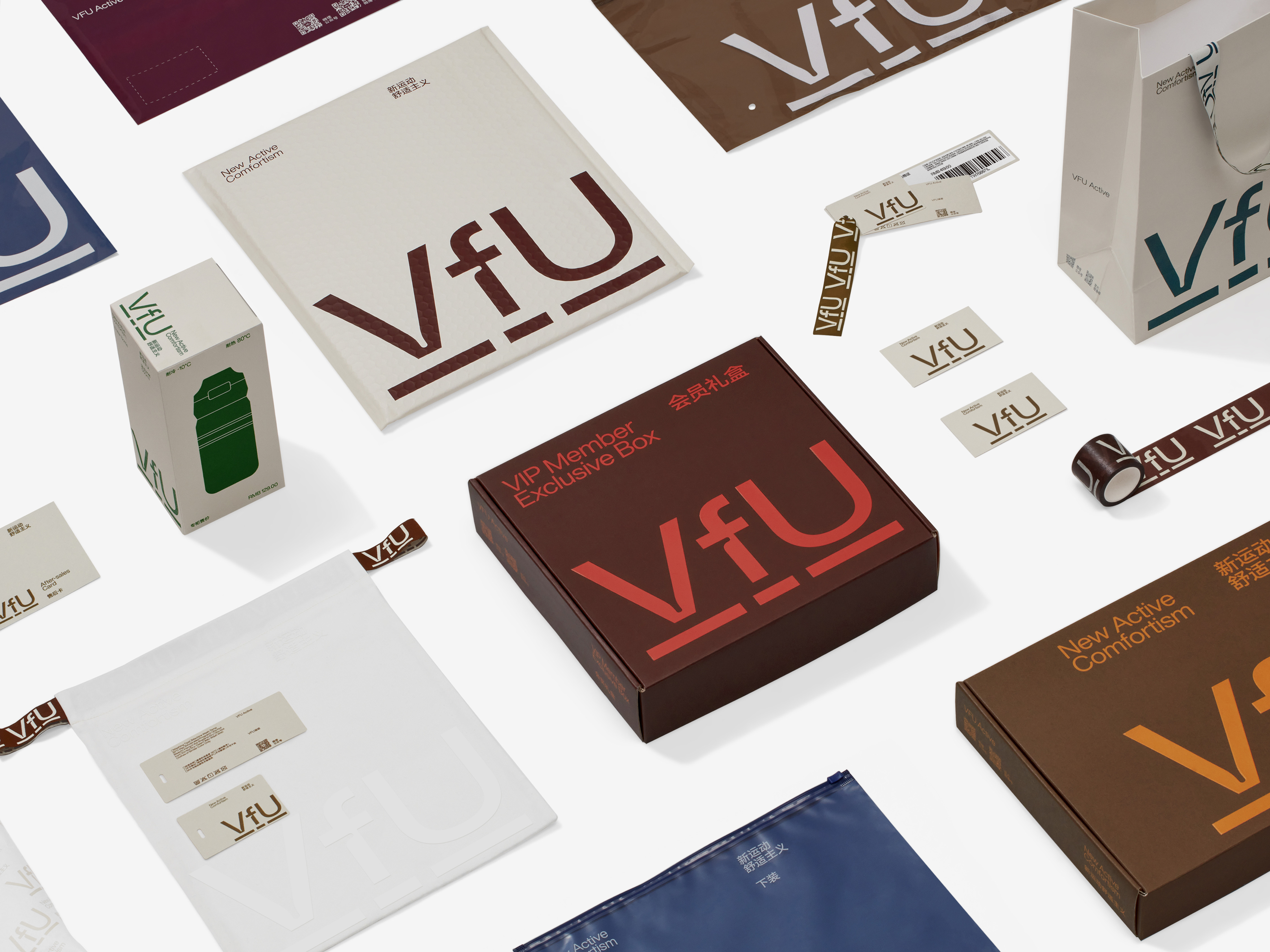
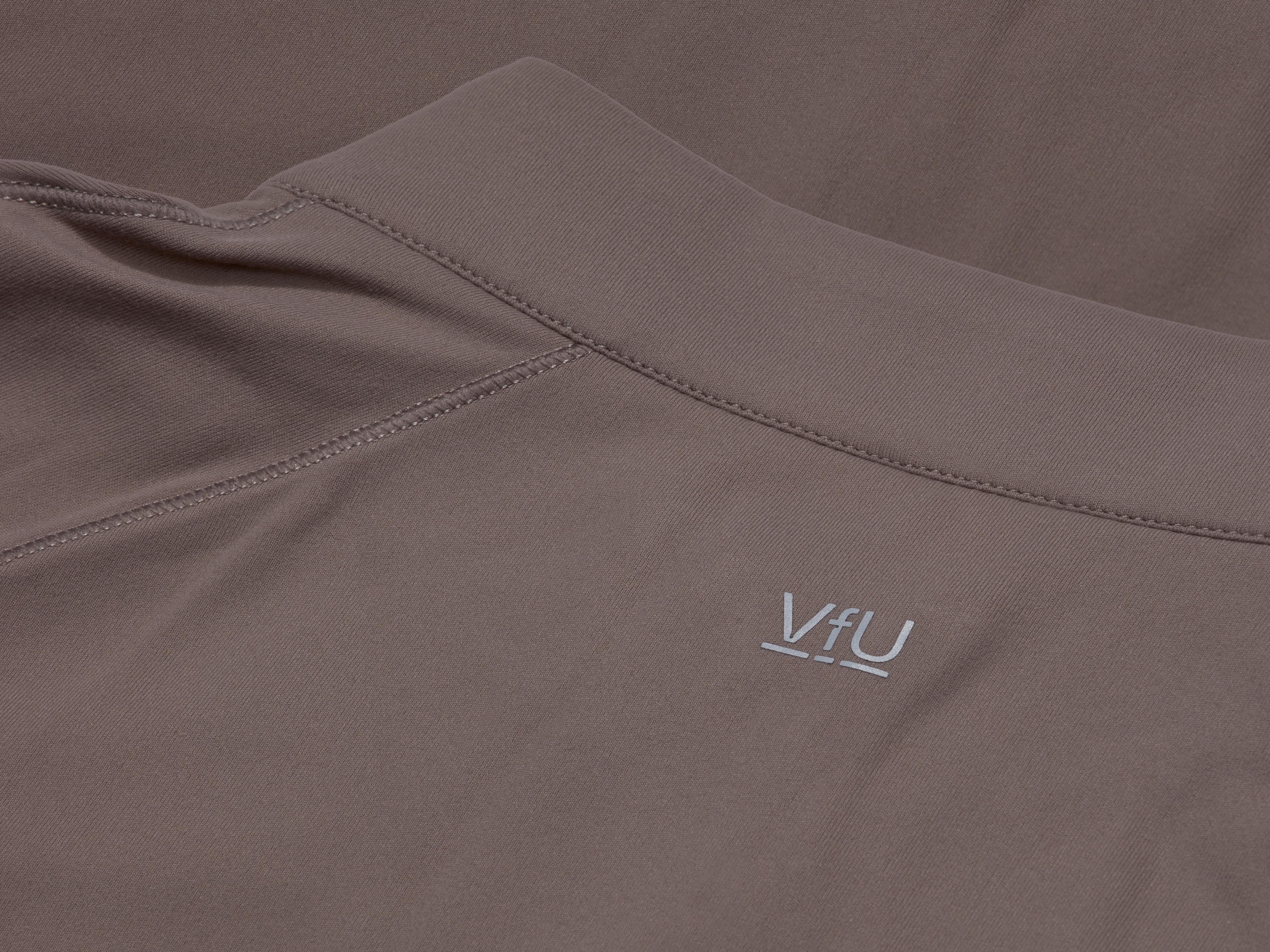
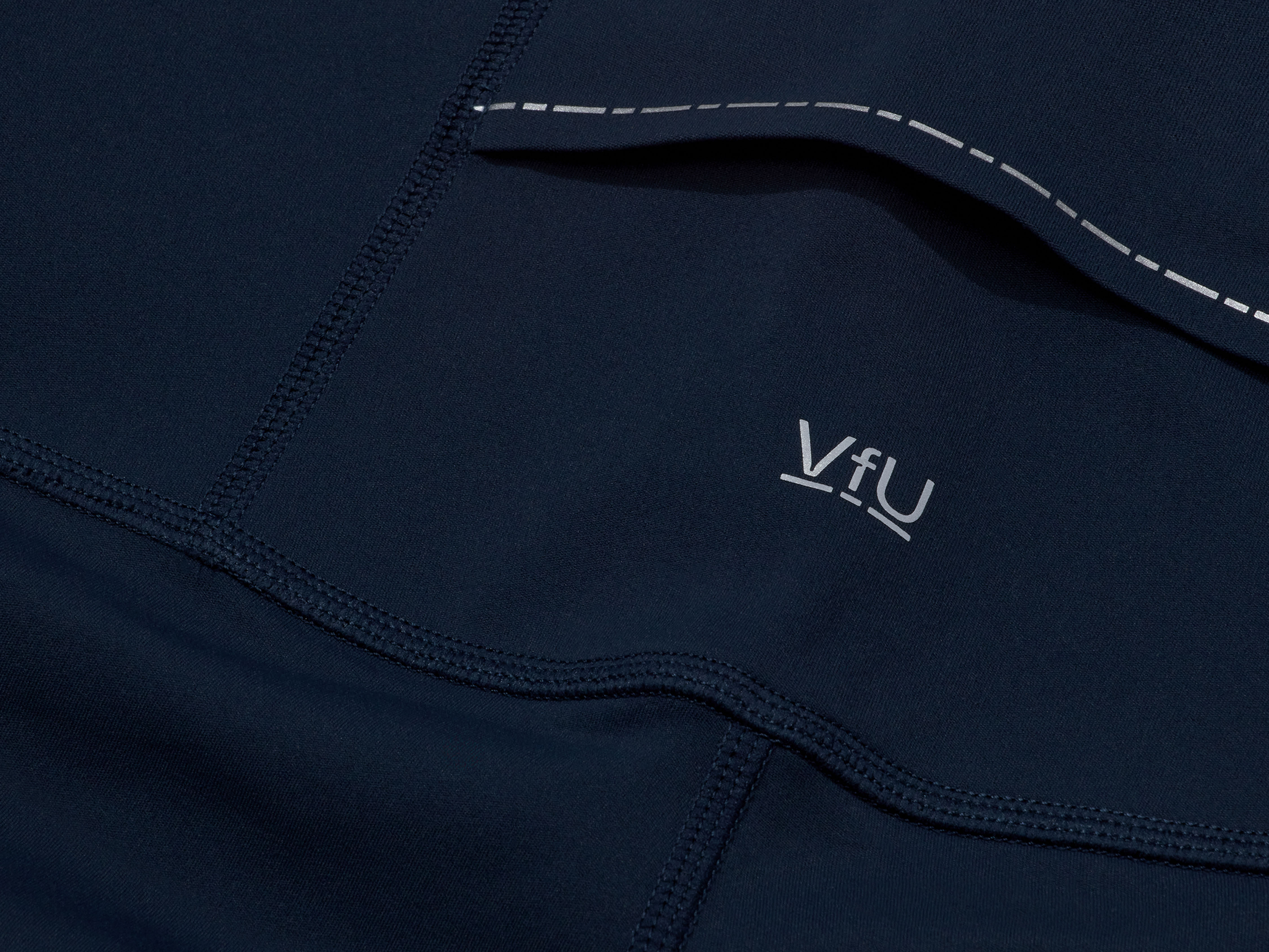
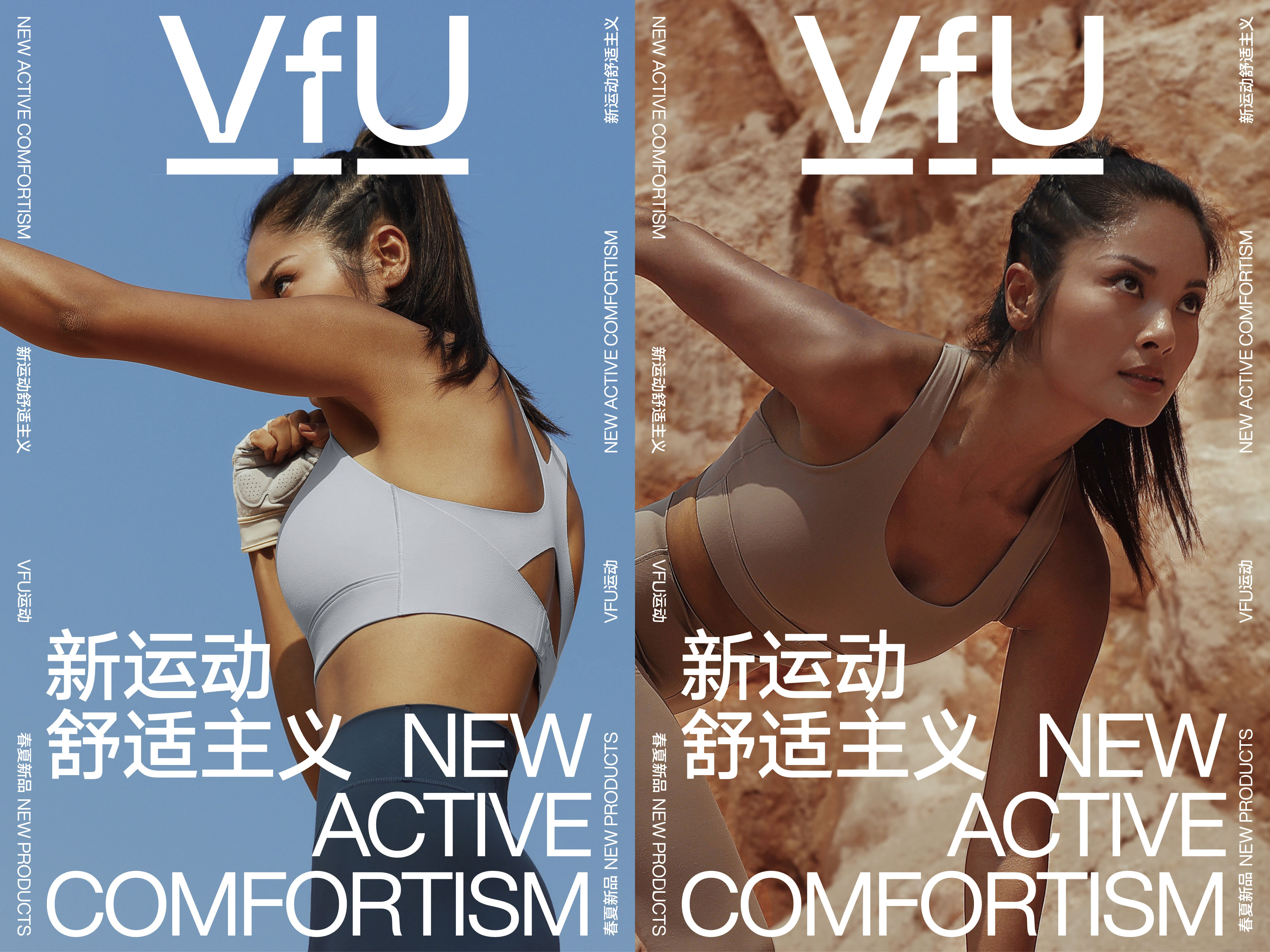
We created a new visual identity based on the character of VfU, restrained in style, yet sporty in detail. We have changed the brand name from VFU to VfU, where the reduced visual space of the lowercase f creates an elastic sense of stretch with the capital V and U. At the same time, the underscores of varying length once again directly attract users attention in a non-intrusive, on-alarming and non-forcing way. In the visual identity system, we follow the principle of "stillness and slowness" and use low-profile colors in order to unleash the power of the self in restraint.
We created a new visual identity based on the character of VfU, restrained in style, yet sporty in detail. We have changed the brand name from VFU to VfU, where the reduced visual space of the lowercase f creates an elastic sense of stretch with the capital V and U. At the same time, the underscores of varying length once again directly attract users attention in a non-intrusive, on-alarming and non-forcing way. In the visual identity system, we follow the principle of "stillness and slowness" and use low-profile colors in order to unleash the power of the self in restraint.
VfU,是一个定位于都市女性的慢运动服饰品牌。在我们看来,VfU 是国产品牌的奇迹,在竞争最激烈的行业里、在强手如林的竞争中连续几年保持卓越的销售成绩,这是非常不可思议的。VfU 的品牌个性并不张扬,甚至有些低调内敛,但又具有独立和独特的品牌精神。朴素内敛、强调运动与生活的边际、很少在产品上放大标识,或许正是因为这样的行事风格,使得她们获得了大量中国女性用户的青睐,用户将 VfU
的品牌特征总结为:内在力量。
我们根据 VfU 的特点设计了新的品牌形象,在保持一贯内敛风格的同时,让运动精神在微妙的变化中展现。我们将品牌名称 VFU 改成 VfU,其中小写字母 f 缩小的视觉空间,与大写字母 V 和 U 形成了富有弹性的伸缩感,同时,长短不一的下划线以不打扰、不警示、不强迫的方式,再一次直接提醒用户的注意。在视觉识别系统的应用中,遵循了“静与慢”的原则,不使用过于高调的色彩,在克制中释放自我的力量。
我们根据 VfU 的特点设计了新的品牌形象,在保持一贯内敛风格的同时,让运动精神在微妙的变化中展现。我们将品牌名称 VFU 改成 VfU,其中小写字母 f 缩小的视觉空间,与大写字母 V 和 U 形成了富有弹性的伸缩感,同时,长短不一的下划线以不打扰、不警示、不强迫的方式,再一次直接提醒用户的注意。在视觉识别系统的应用中,遵循了“静与慢”的原则,不使用过于高调的色彩,在克制中释放自我的力量。

All Images Copyright © 2021 VfU. All Rights Reserved