VOVOS
ART DIRECTOR: Guang Yu / Nod Young
DESIGNER: Wang Xiaoshuai
YEAR: 2023
CLIENT: VOVOS
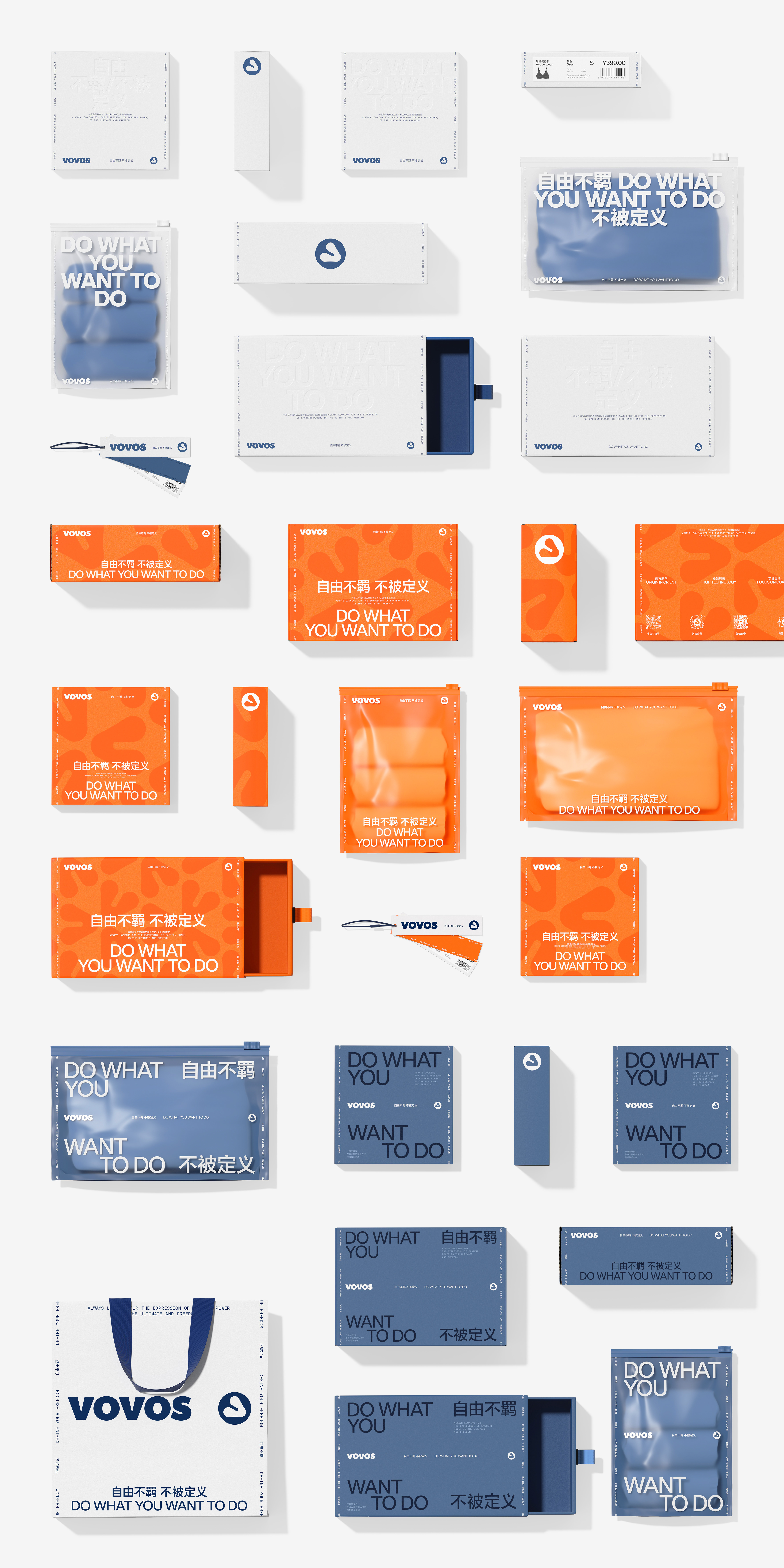
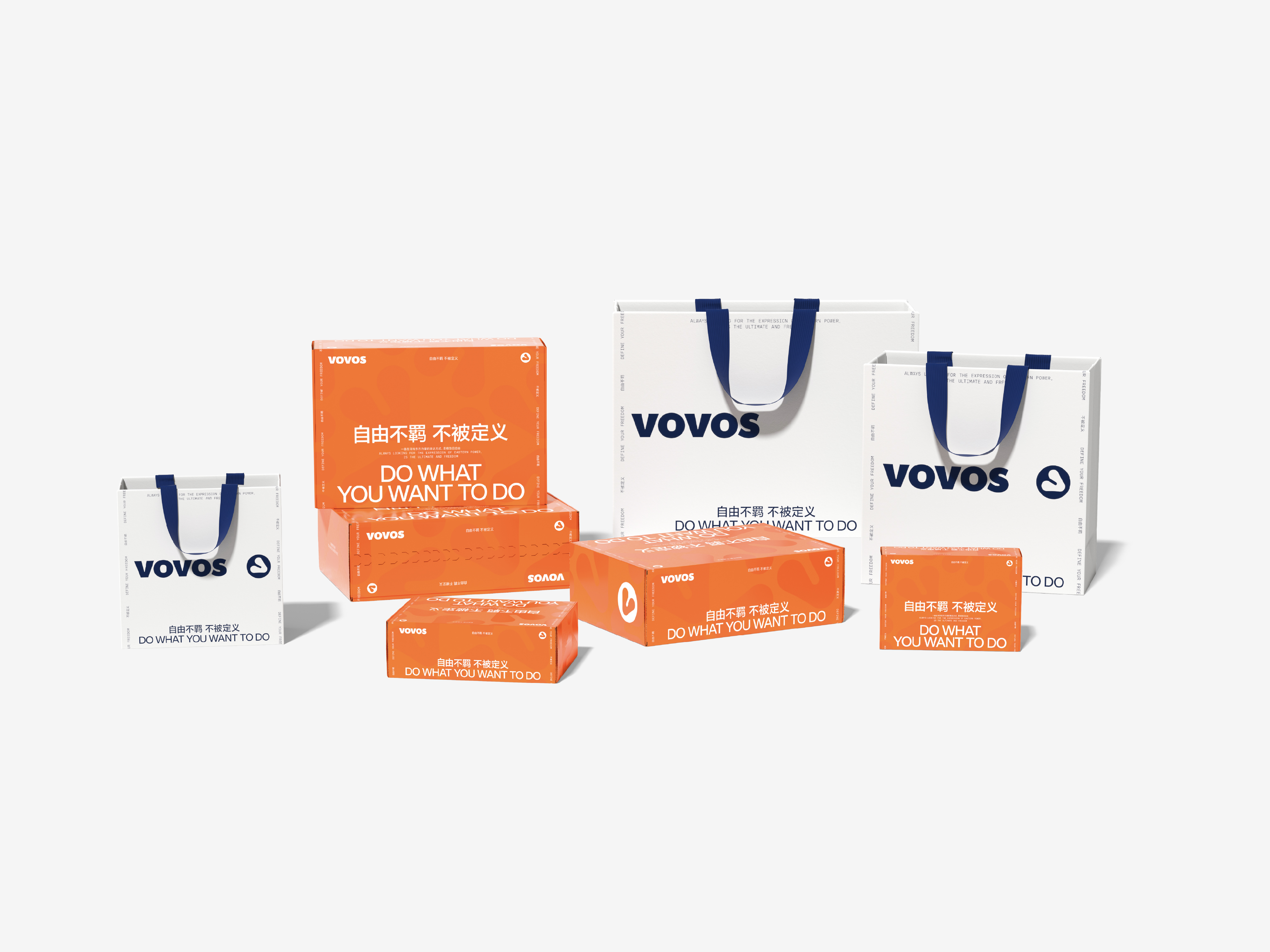
"The spirit of sports embodied by VOVOS is not only the pursuit of strength and speed, but also a lifestyle and healthy mindset, symbolizing the desire for freedom -- freedom from being confined." This is how founder Rocky describes the philosophy behind VOVOS. In today’s competitive yoga and fitness apparel market, standing out is increasingly challenging. How can we seek self-expression in a crowd of competitive products and enhance brand recognition and influence? This question is both universal and specific. In other words, can we set aside our conventional thinking and reimagine the future from a fresh perspective? Can body and mind coexist in harmony? Can sports and leisure be perfectly combined? The answer, we believe, lies in the letter "V". The shape of the "V" conveys a natural sense of strength, often seen in the body’s form during exercise, especially in yoga, where arms and legs frequently assume this shape. At the same time, the V-shape is clean and minimalistic, which perfectly aligned with the ideals of freedom. After a lot of design experiments with the V-shape, finally, a triangle scheme with a rotation of 60 degrees gave us a breakthrough. Although this design met nearly all our aesthetic and functional requirements, to avoid a rigid, unnatural feel that conflicts with the body image, we softened the triangle's sharp edges. The final logo combines muscular strength with the simple characteristics of the V itself, creating a visual that is both soft and strong, relaxed yet stable. As the VOVOS logo, it encapsulates the dual expression of body and spirit. Based on this logo shape, we extended the design into a four-sided, continuous pattern that serves as a decorative element. This allows beauty and strength to flow seamlessly together in our brand visuals.
Back to our original question: Can we break away from conventional thinking and reimagine the future? The answer is yes. At VOVOS, we have never aimed to "be someone else.", but have always focused on expressing the relationship between body and mind. It's through this open exploration that we’ve discovered VOVOS’s true identity—an identity that embraces being undefined.
Back to our original question: Can we break away from conventional thinking and reimagine the future? The answer is yes. At VOVOS, we have never aimed to "be someone else.", but have always focused on expressing the relationship between body and mind. It's through this open exploration that we’ve discovered VOVOS’s true identity—an identity that embraces being undefined.
“VOVOS 所代表的运动精神,不仅仅是对力量与速度的追求,更是一种生活方式与健康态度,象征着精神层面对自由的渴望——自由不羁,不被定义。” 创始人 Rocky 如此描述 VOVOS 的品牌理念。在当下竞争激烈的瑜伽健身服赛道,想要成功突出重围,难度不言而喻。如何于一众竞品中寻求自我表达,提升品牌辨识度和影响力,是一个既具有普遍性又具有特殊性的关键问题。换言之,我们是否能够抛开固有思维,从全新的角度重新思考未来的方向?身体与精神能否同时呈现?运动与休闲能否完美结合?面对这些问题,我们在字母“V”中找到了答案。V 字自身形状的力量感很容易让人联想到运动精神。而在运动过程中,特别是瑜伽动作中,身体、手臂、腿部也经常会呈现 V 字形态。同时,V 形简洁利落,这与自由相关的特征完美契合。经过大量有关 V 字造型的设计尝试后,最终,一个旋转了60°度的三角形方案让我们眼前一亮。虽然它已几乎满足了所有的设计诉求,但为避免与身体意象相冲突的生硬感,我们在设计中以柔和的弧线替换了三角形尖锐的末端。整体造型被赋予肌肉感的同时也保持了 V 字本身简洁的特质,作为 VOVOS 的图形标识,它是柔软的、放松的,兼具力量感与稳定性,能够承载身体和精神的双重表达。基于这一标识造型,我们将其演绎为四方连续的辅助图形,作为装饰元素,美与力量能够更为灵活地切换。
回到最初的问题:我们是否可以抛开既定思维,重新思考未来的方向?答案是肯定的。在 VOVOS 这个项目中,我们从未试图“成为任何人”,而是始终专注于如何表达身体与精神的关系。正因为没有任何预设的提示,我们才找到了真正属于 VOVOS 的“不被定义”的一面。
回到最初的问题:我们是否可以抛开既定思维,重新思考未来的方向?答案是肯定的。在 VOVOS 这个项目中,我们从未试图“成为任何人”,而是始终专注于如何表达身体与精神的关系。正因为没有任何预设的提示,我们才找到了真正属于 VOVOS 的“不被定义”的一面。


All Images Copyright © 2024 VOVOS. All Rights Reserved.