UNFOLD
ART DIRECTOR: Guang Yu
DESIGNER: Guang Yu / Bananafish
YEAR: 2018
CLIENT: 上海艺术书展 / 香蕉鱼
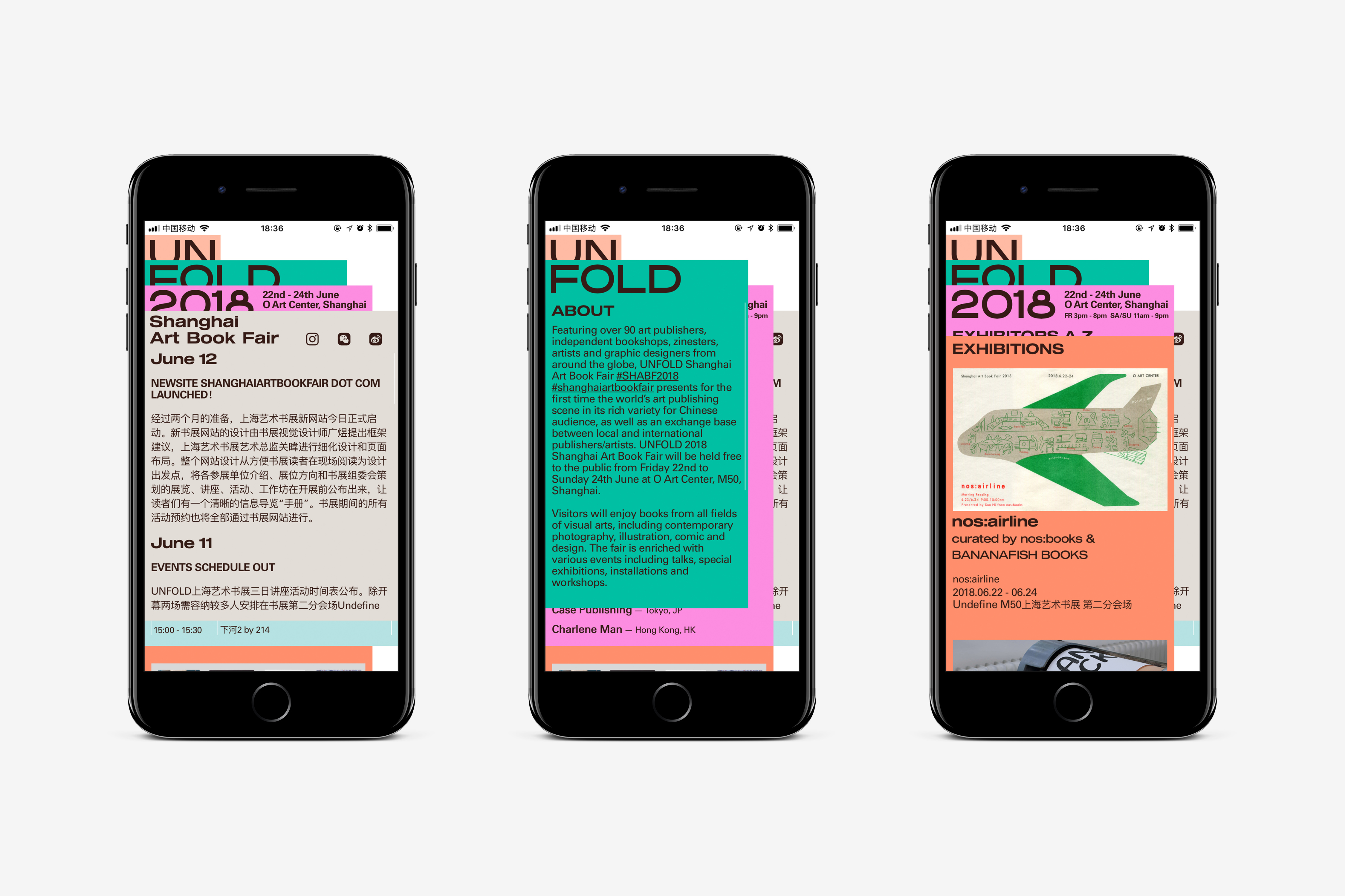
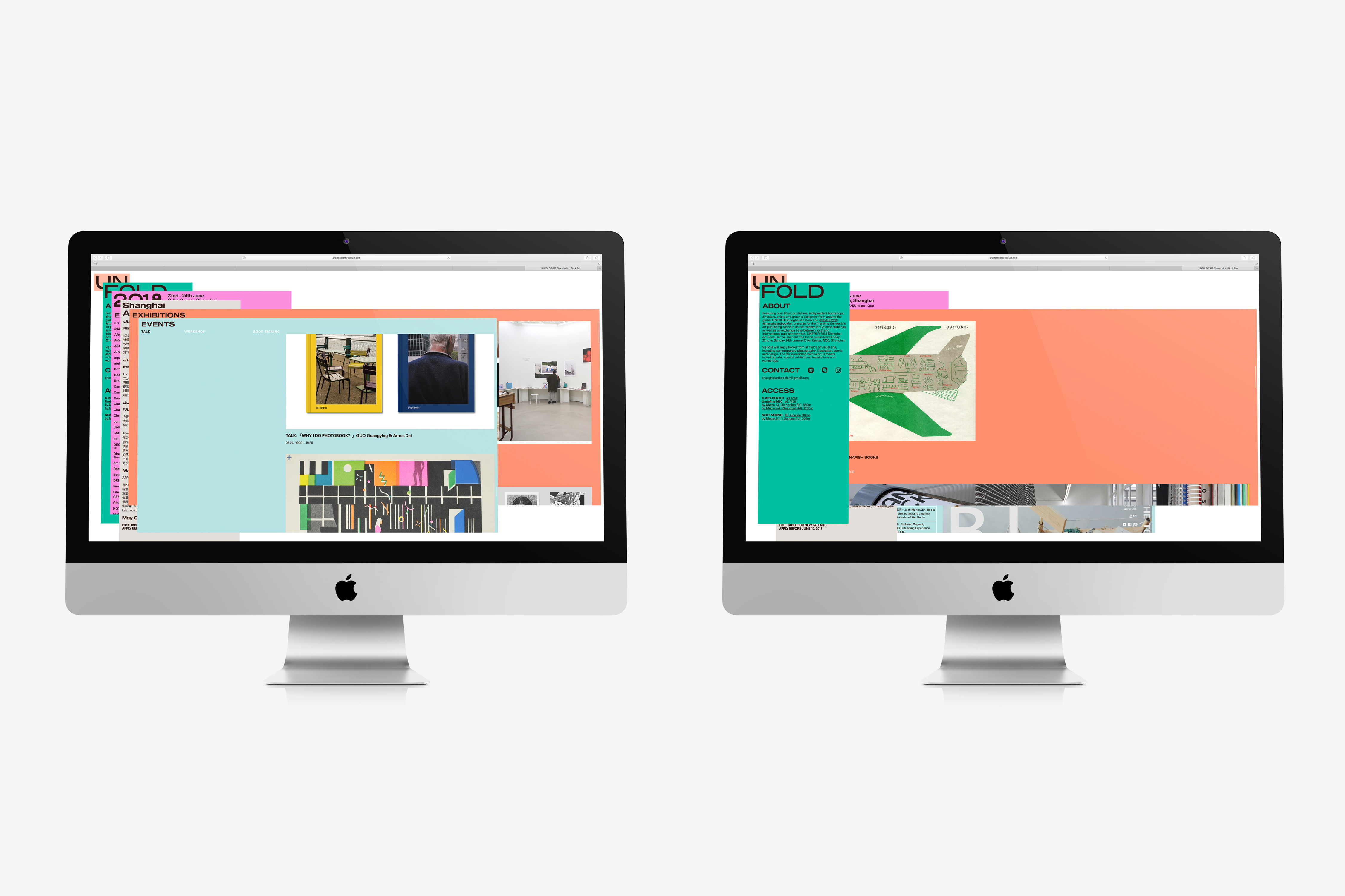
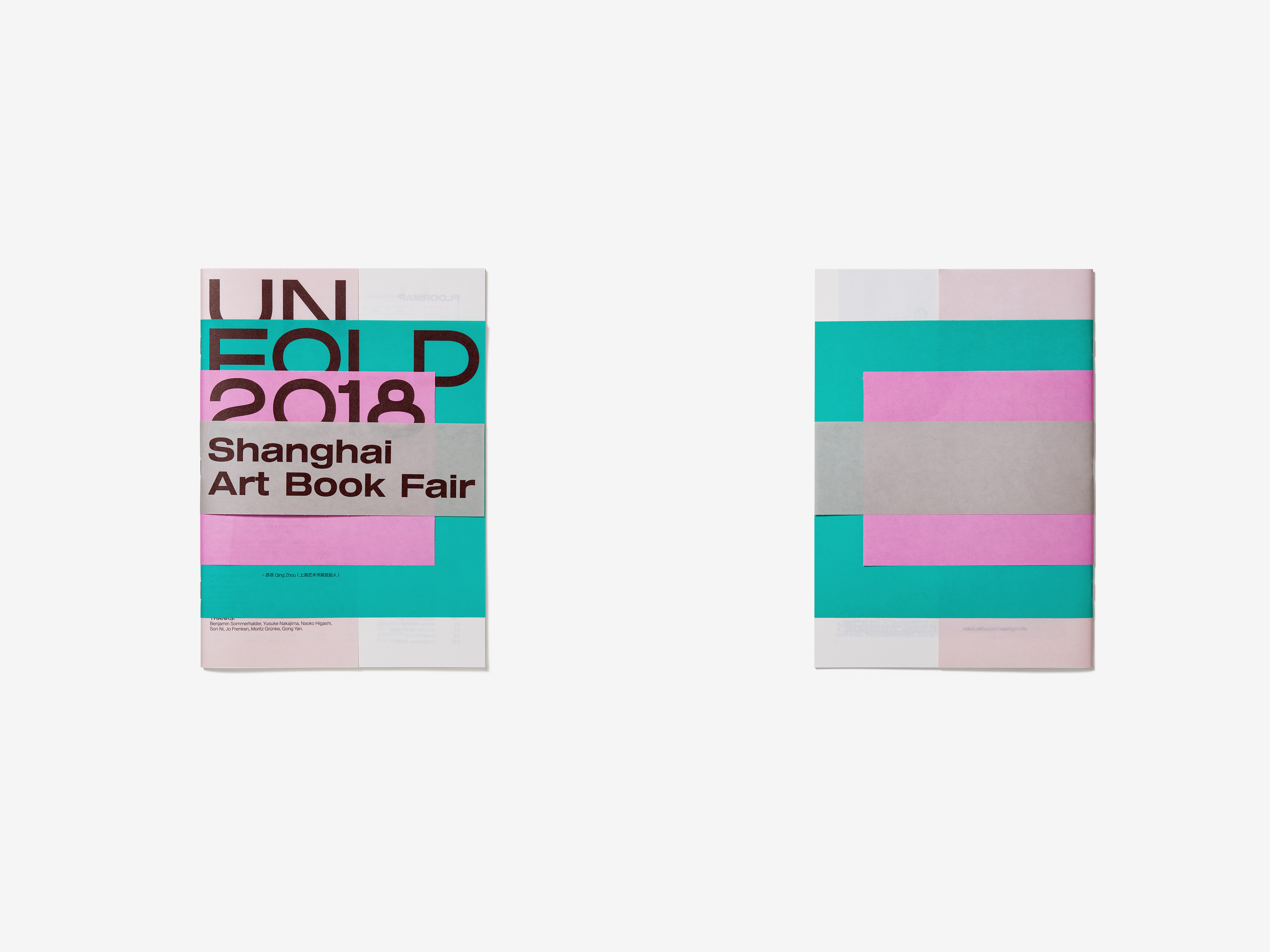
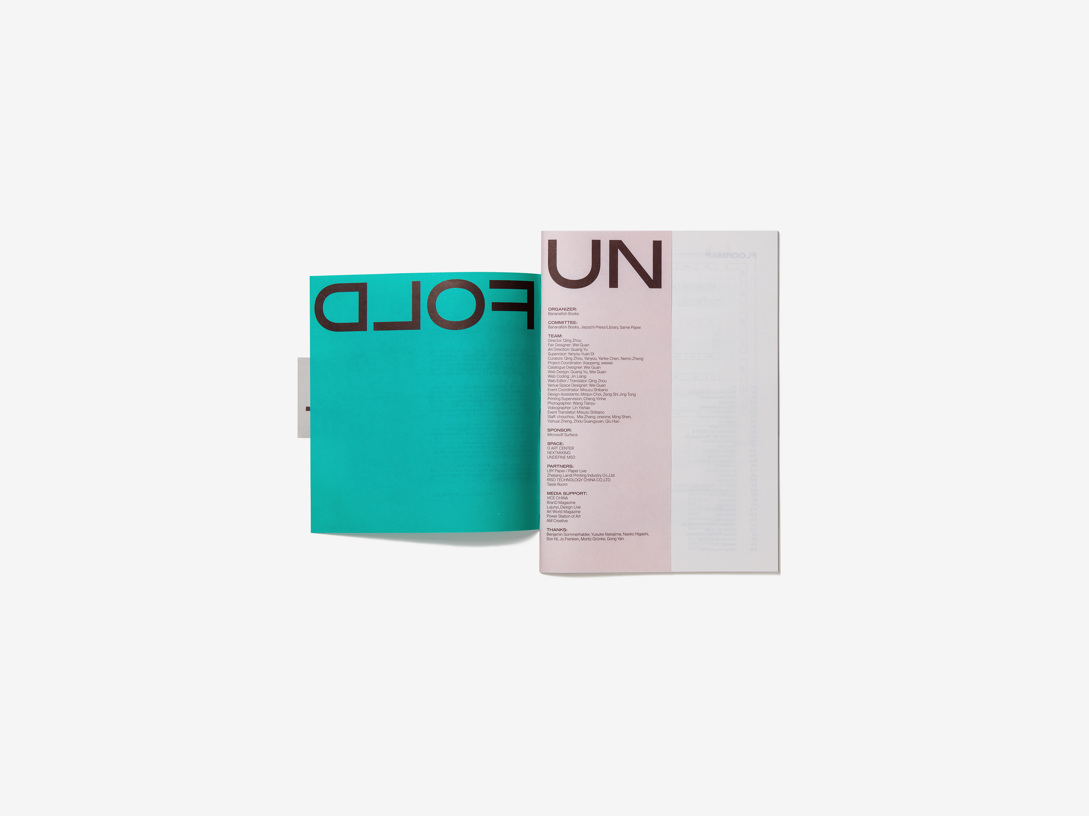
The main visual design of UNFOLD is basically a literal translation of English words. Be it the
event name or related information, it is presented to the reader in its Chinese connotation, namely “open and display”. Its ambiguity awaits the audience to complete the discovery. The
use of pleasant colors weakens the closed, niche impression corresponding to the “independent publishing” of the theme, and the colorful and enthusiastic expression of the
atmosphere is a direct attraction to more people: taking the initiative to participate in the event, and getting access to those independent publications that appear in the event with a relaxed
mindset.
UNFOLD 的主视觉设计,基本上是对英文单词的直译。无论活动名称还是相关信息,皆以它的中文释义之一“展现、打开”的方式呈现。它的半遮半掩,有待观众前往完成全部动作。而愉悦的色彩运用,削弱了与主题“独立出版”相对应的封闭、小众印象,缤纷并热情的气息传递,是对更多公众的直接吸引:自主参与活动,以轻松的心态接触在活动中出现的那些独立出版物。