TSIMKEE 詹记
ART DIRECTOR: Guang Yu / Nod Young
DESIGNER: Xu Mingru / Liu Xianping
YEAR: 2022
CLIENT: TSIMKEE
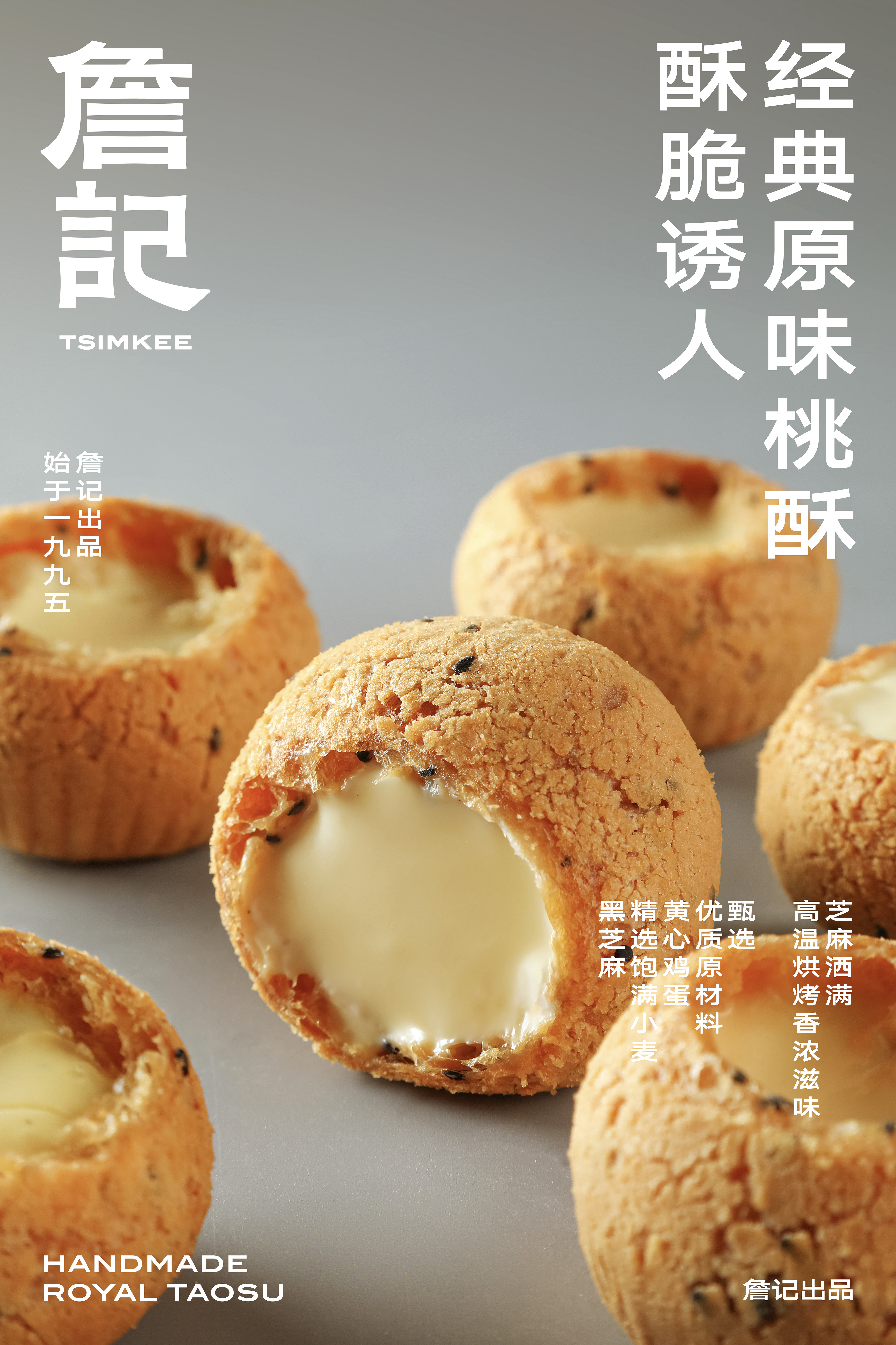
As a traditional pastry brand known all over China, TSIMKEE always remains its original taste and attempts to improve its quality and taste through decades of research. By taking court walnut pastry king as the featured product, TSIMKEE has gradually found its market advantages and won the public praise and reputation. The implied meaning and purpose behind this rebranding is to create the brand personality, improve the brand value, and redefine the brand spirit of TSIMKEE.
In the food industry where cakes and pastries develop, there are strict standards on the product quality, repurchase rate and exquisite packaging. At the same time, TSIMKEE’s product superiority comes from its “authentic” and “traditional” product orientation. Under the above limited conditions, TSIMKEE should be surely characterized by its purpose that “meets consumers’ expectations for the traditional pastry brands but breaks through their conservative views of this category to a certain extent”.
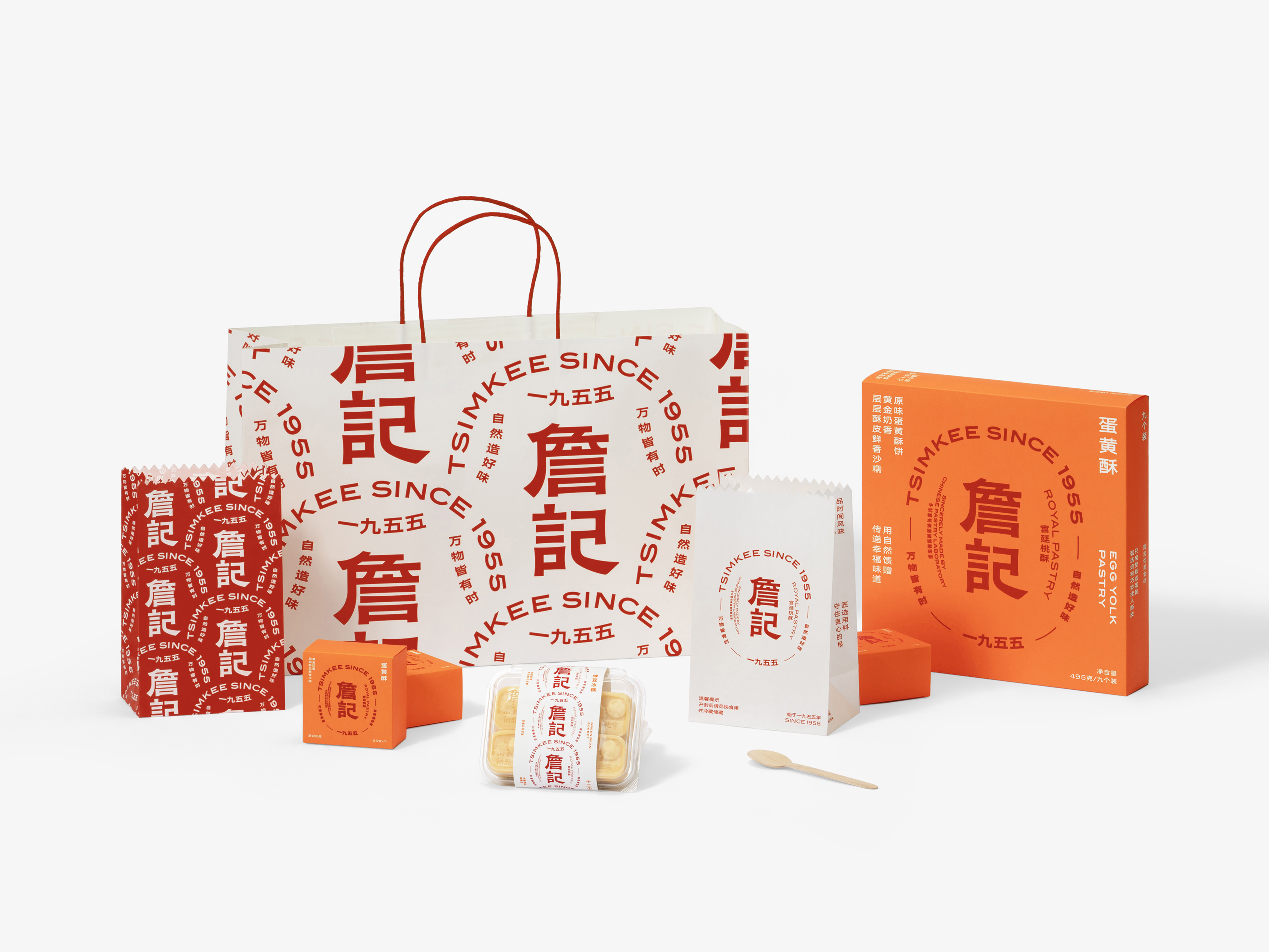
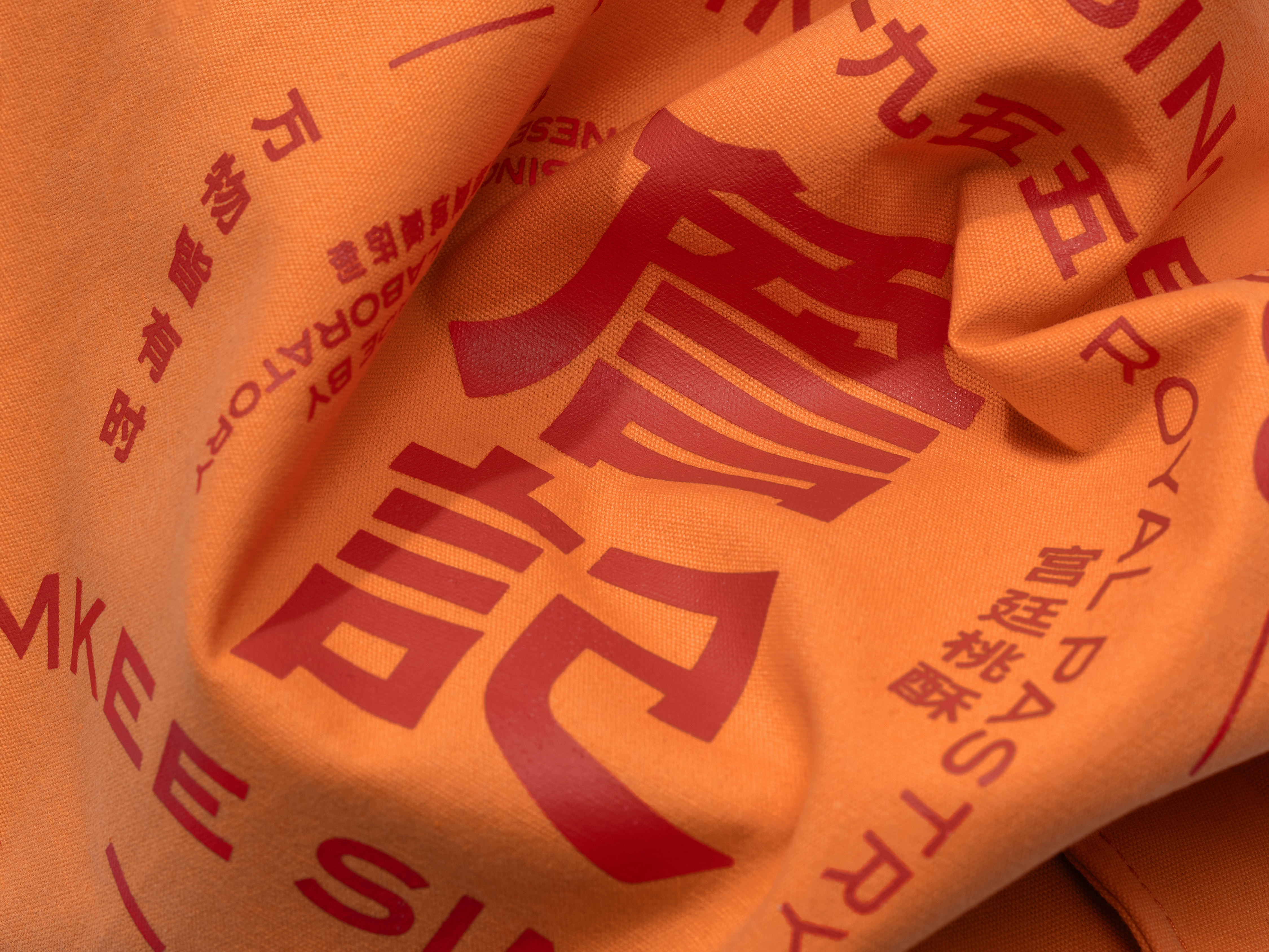
We firstly set the Chinese logo of TSIMKEE in a modern font of primitive simplicity and let the stroke changes in this simple and refined modern font to highlight its exquisite and warm humanistic sense. At the same time, we boldly adopt a pie shape leaving enough blank space inside and put TSIMKEE in the center. The name of TSIMKEE is wrapped with other auxiliary information in four directions for decorative text wrapping. This is layout change based on the Chinese style, so as to highlight TSIMKEE’s brand value and pay its respect to the tradition in this form.
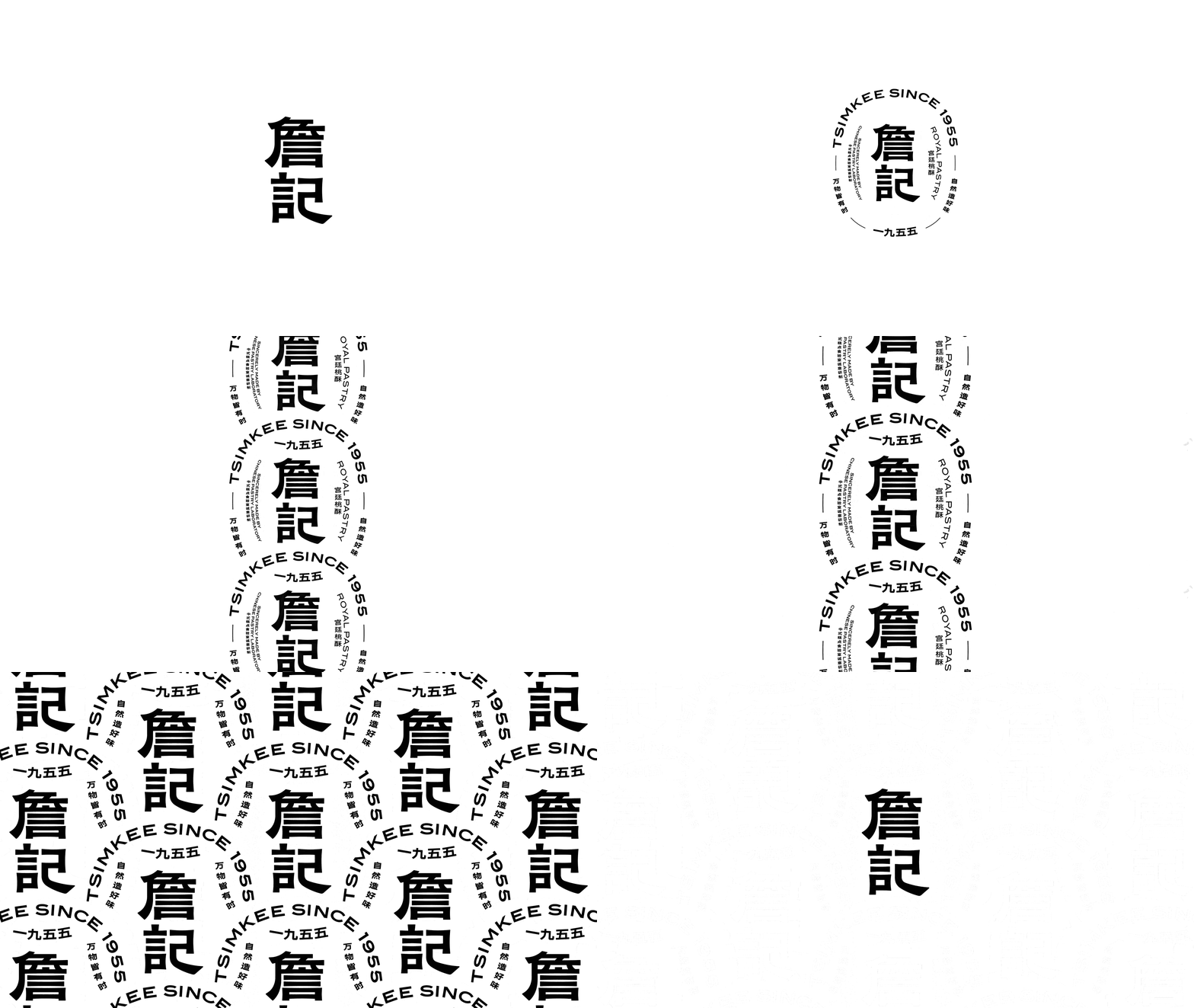
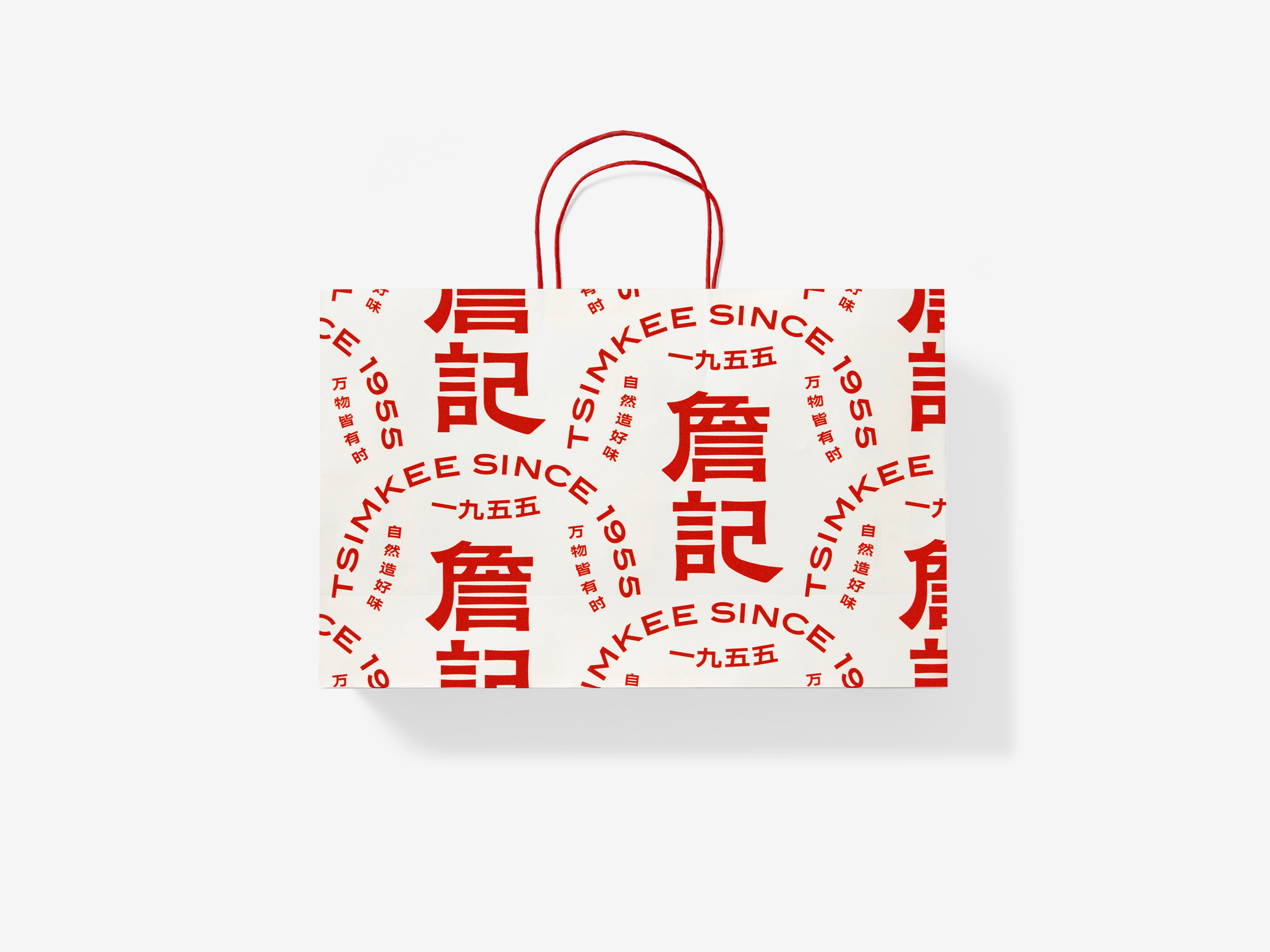
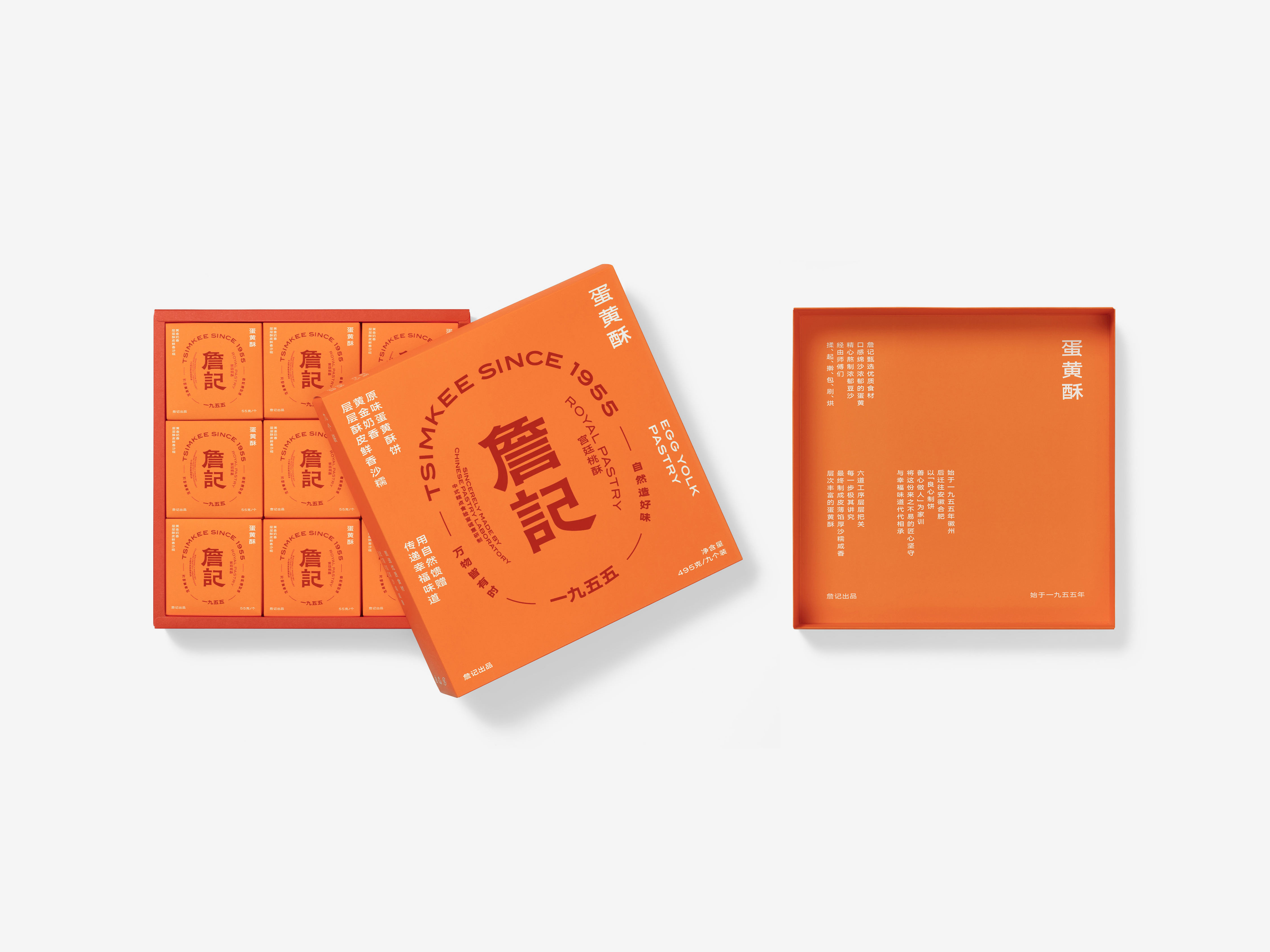
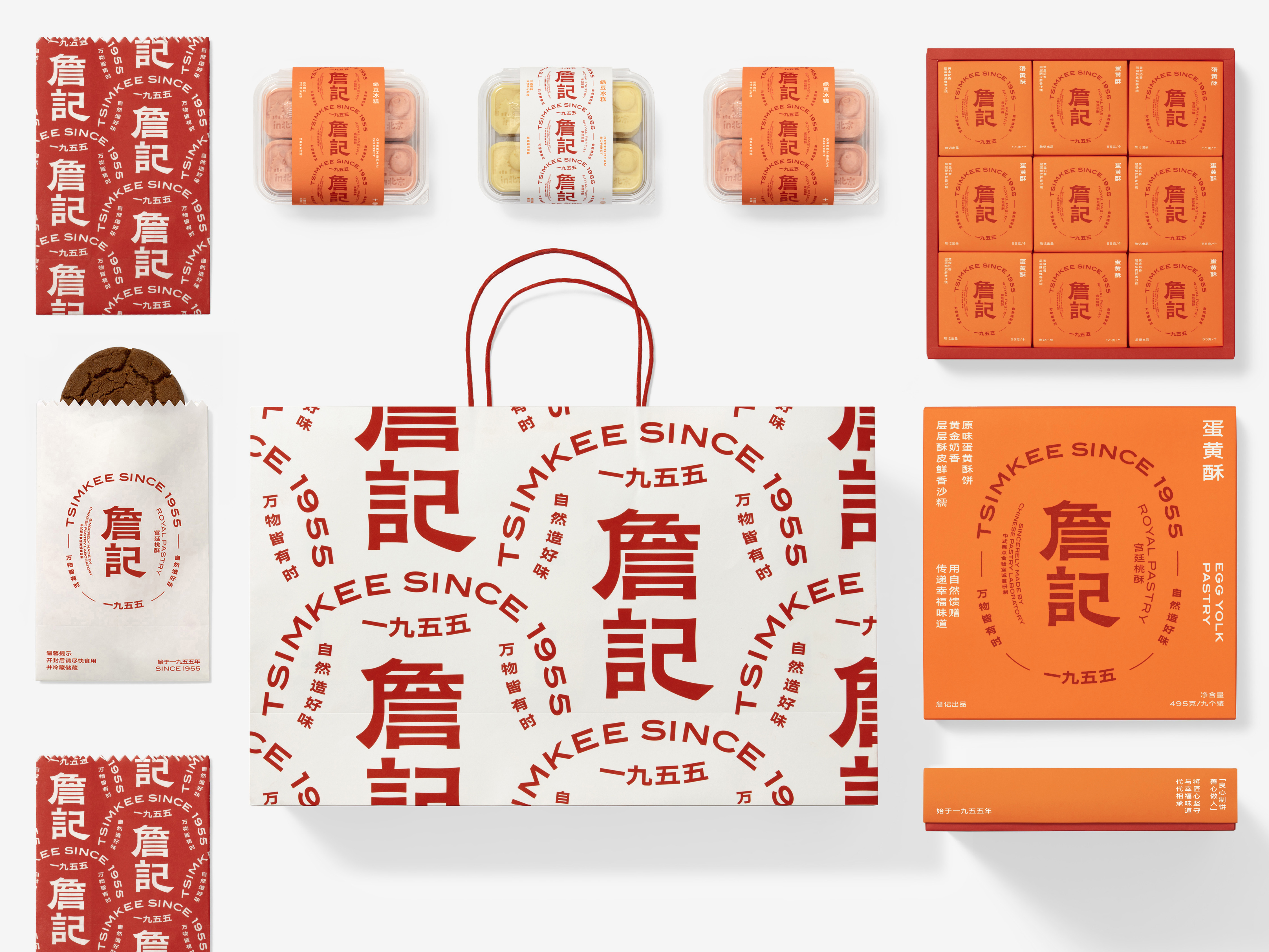
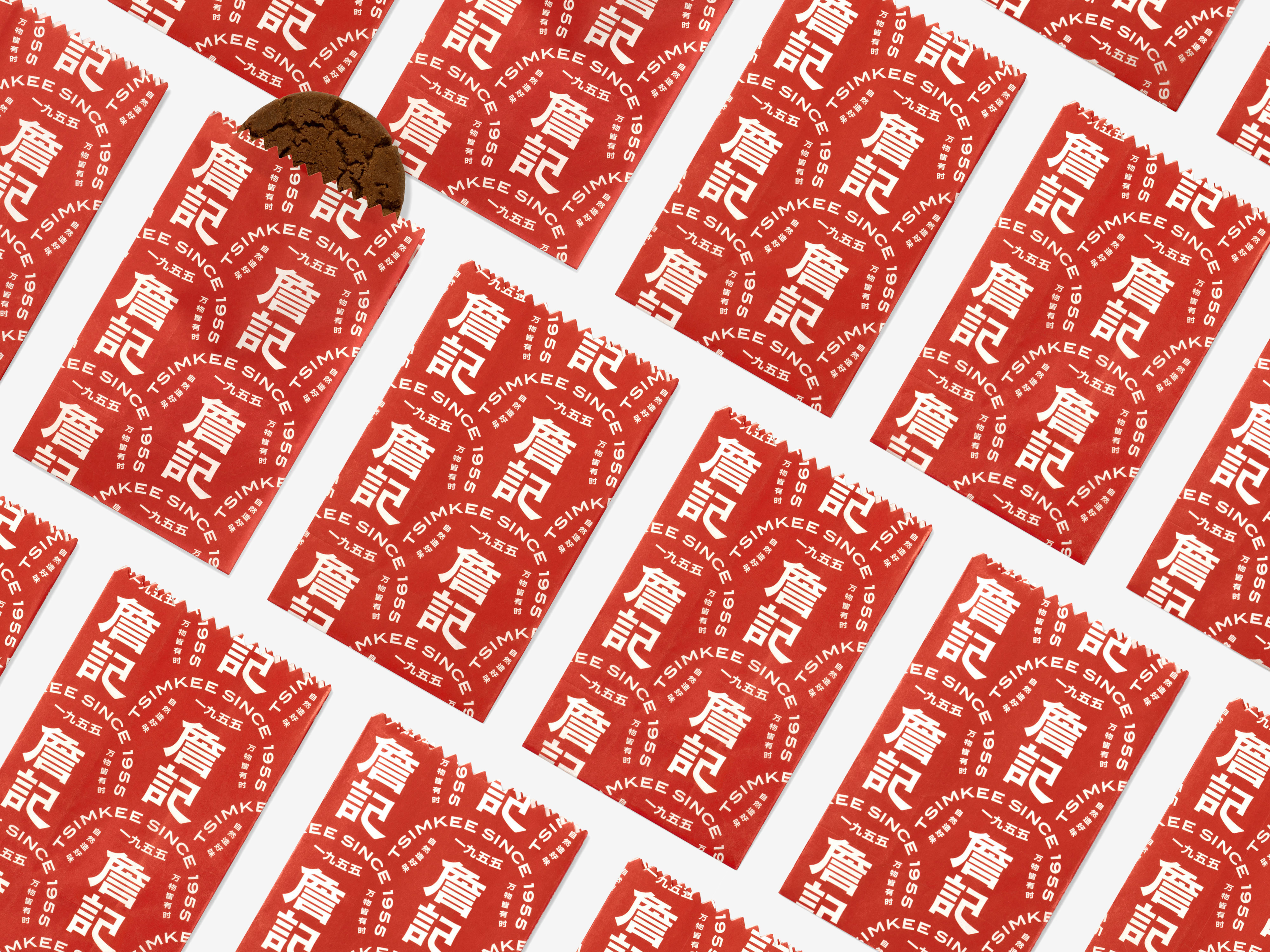
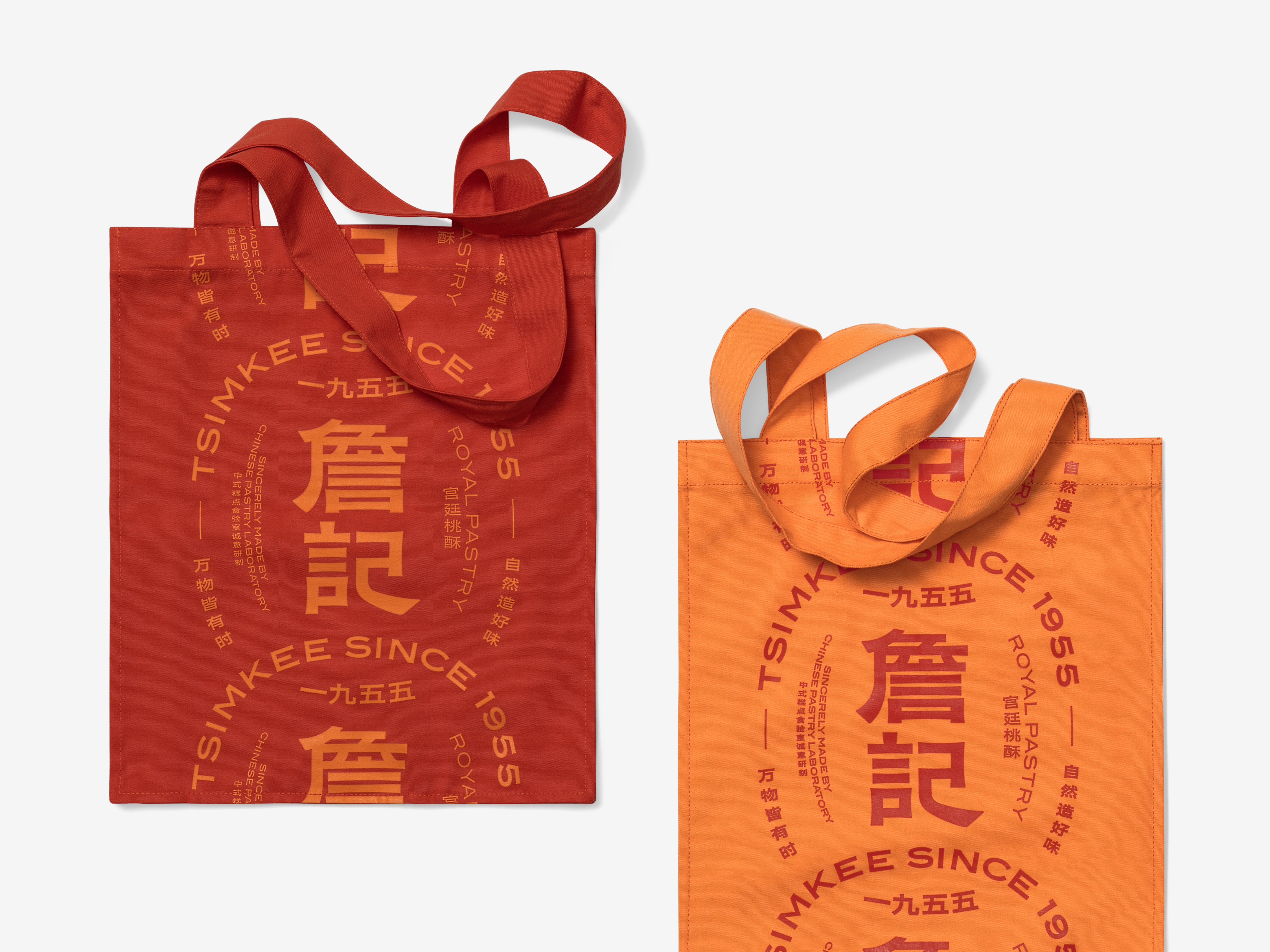
The new logo of TSIMKEE can be used in four different ways and generates changes from simple to gorgeous styles for different application scenarios. The four ways are as follows: (1) TSIMKEE’s Chinese logo; (2) TSIMKEE’s standard pie-shape logomark; (3) chain-type text wrapping for TSIMKEE’s pie-shape logomark; (4) continuous brick-type text wrapping for TSIMKEE’s pie-shape logomark. In consideration of diverse consumption scenarios in the future and changes in logo application media, TSIMKEE’s logo is widely used, which is uniform and eye-catching, showing its very modern and flexible characteristics. This is exactly TSIMKEE’s goal and direction in the future brand development: to provide consumers with more abundant, diversified and modern pastry choices based on the traditional cakes and pastries.
詹记是全国知名的传统糕点品牌,坚持纯正原味,并通过几十年的专研提升品质与口感,以宫廷桃酥王作为主打产品逐渐寻找到市场优势,建立起良好的用户口碑与信誉,而这一次的品牌形象升级,其背后的意义和目的正是为了铸造品牌的个性、提升品牌的价值,以及重新定义詹记的品牌精神。
糕点所处的食品行业,对产品品质感、消费者复购率以及包装精美程度都有其严格标准,同时,詹记糕点的产品优势又是“正宗”与“传统”,在这一系列的条件限定下,詹记品牌的特质要牢牢地锁定在“在符合消费者对传统糕点品牌的预期下,一定程度地突破消费者对于这个品类的保守看法”。
我们首先将詹记的中文标识设定为一种带有古朴气质的现代字体,在简洁、精悍的现代字型中,通过笔划变化来突显其精致和温暖的人文感。同时,在标识的整体呈现与应用上,我们大胆地使用了一个内部充分留白的饼形,将詹记放在正中央位置,并将其他辅助信息进行绕排,从上下左右四个方向围绕着詹记的名称进行装饰性包裹,这是一种基于中式风格的版式变化,以此来突出“詹记”的品牌价值,更是用这样的形式来致敬传统。
詹记新标识有四种不同的使用方式,配合不同的应用场景,将产生从简洁到华丽的程度变化。四种方式分别是:一、詹记中文标识;二、詹记标准饼形标识;三、詹记饼形标识链型排列;四、詹记饼形标识四方连续砖型排列。考虑到未来消费场景的多样性,以及标识应用媒介的变化,詹记的标识应用是丰富的,同时更是统一且醒目的,表现出非常现代和灵活的特点。而这,正是詹记未来品牌发展的目标及方向:在传统的基础上,为消费者带来更加丰富的、多元的、现代的糕点选择。



All Images Copyright © 2021 Tsimkee 詹记. All Rights Reserved