T.N.T
ART DIRECTOR: Nod Young / Guang Yu
DESIGNER: Liu Xianping
YEAR: 2025
CLIENT: T.N.T
THE NEW TOY:
Rethinking toys, redefining trend.
In today’s designer toy market, most brands build their “trend” backwards from an IP. They first create a character, then construct stories and visuals around it. This approach works in the short term, but over time it drains “trend” of its authenticity. T.N.T was born as a response to this inertia. We start from life itself—to understand the relationship between lifestyle and emotion—because a toy is not merely a designed object, but an attitude that can be felt.
T.N.T begins not from characters, but from the way people live. It represents a new position: THE NEW TOY. This is more than a product definition; it is a way of seeing oneself, of shaping taste, of expressing identity. We believe that today’s world needs an emotional economy rather than a blind-box economy. Toys are not just collectibles; they are companions and reflections. They are quiet, lovely, and sincere—like friends who live alongside us. They do not speak, yet they see everything.
The “magazine sensibility” in T.N.T’s design language defines its core spirit. We see trend not as a style, but as a way of expressing attitude. A magazine exists to tell the world who we are, what we think, and what we believe in. T.N.T does the same. It expresses attitude through toys, tells stories through its characters, and records the shared taste and emotional landscape of a generation through its visual system.
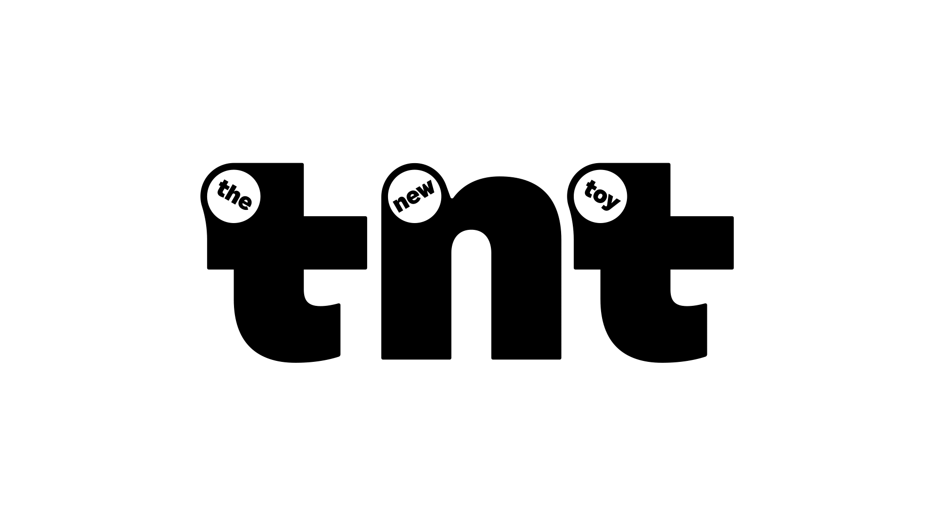
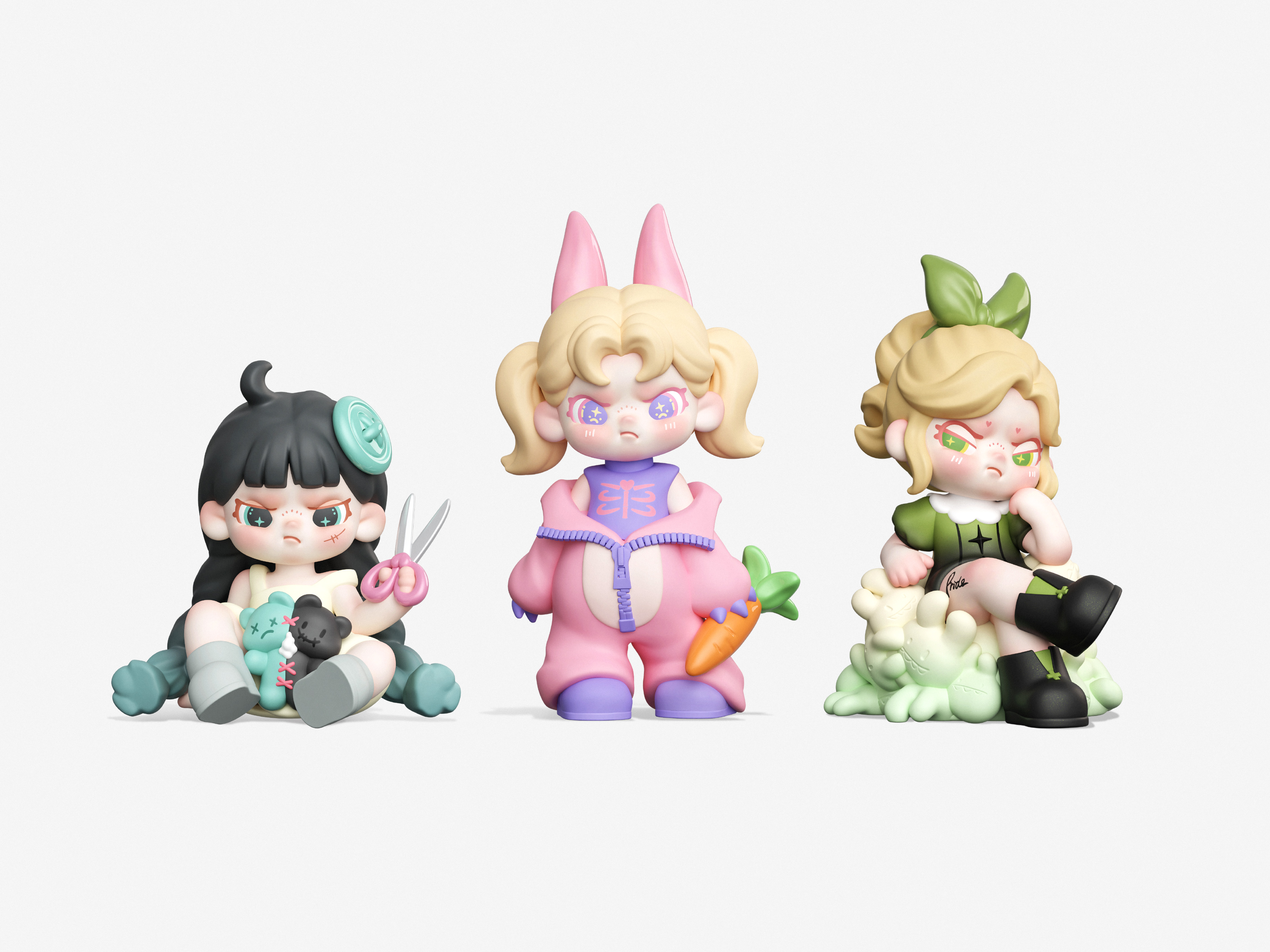
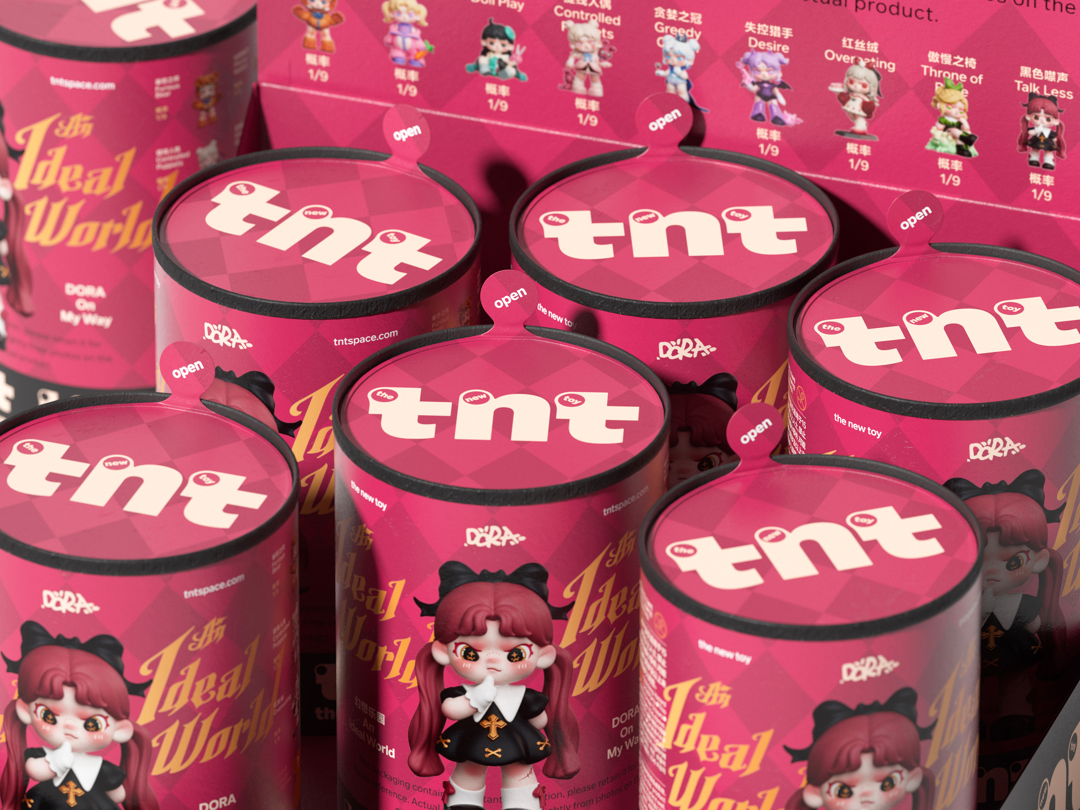
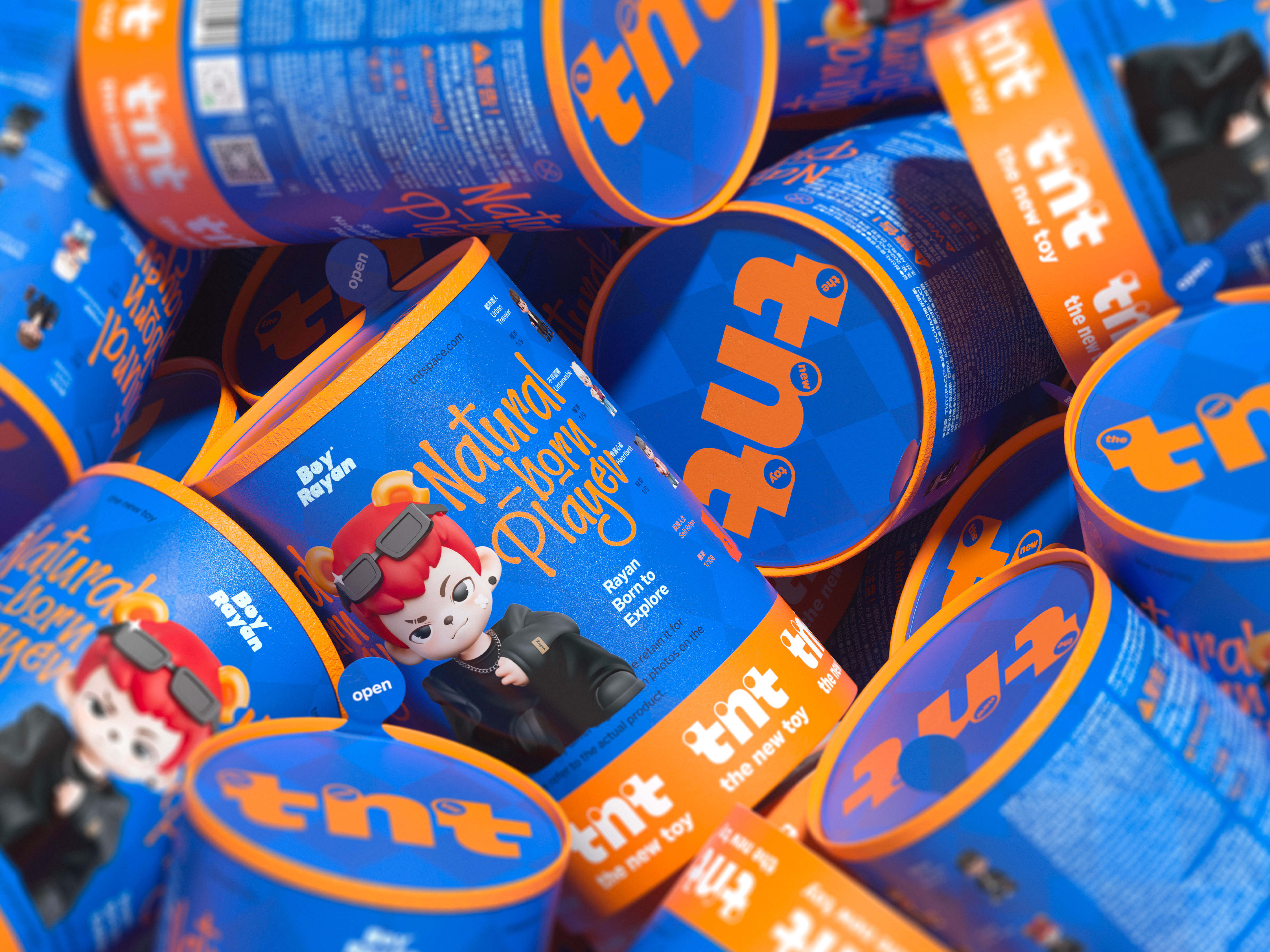
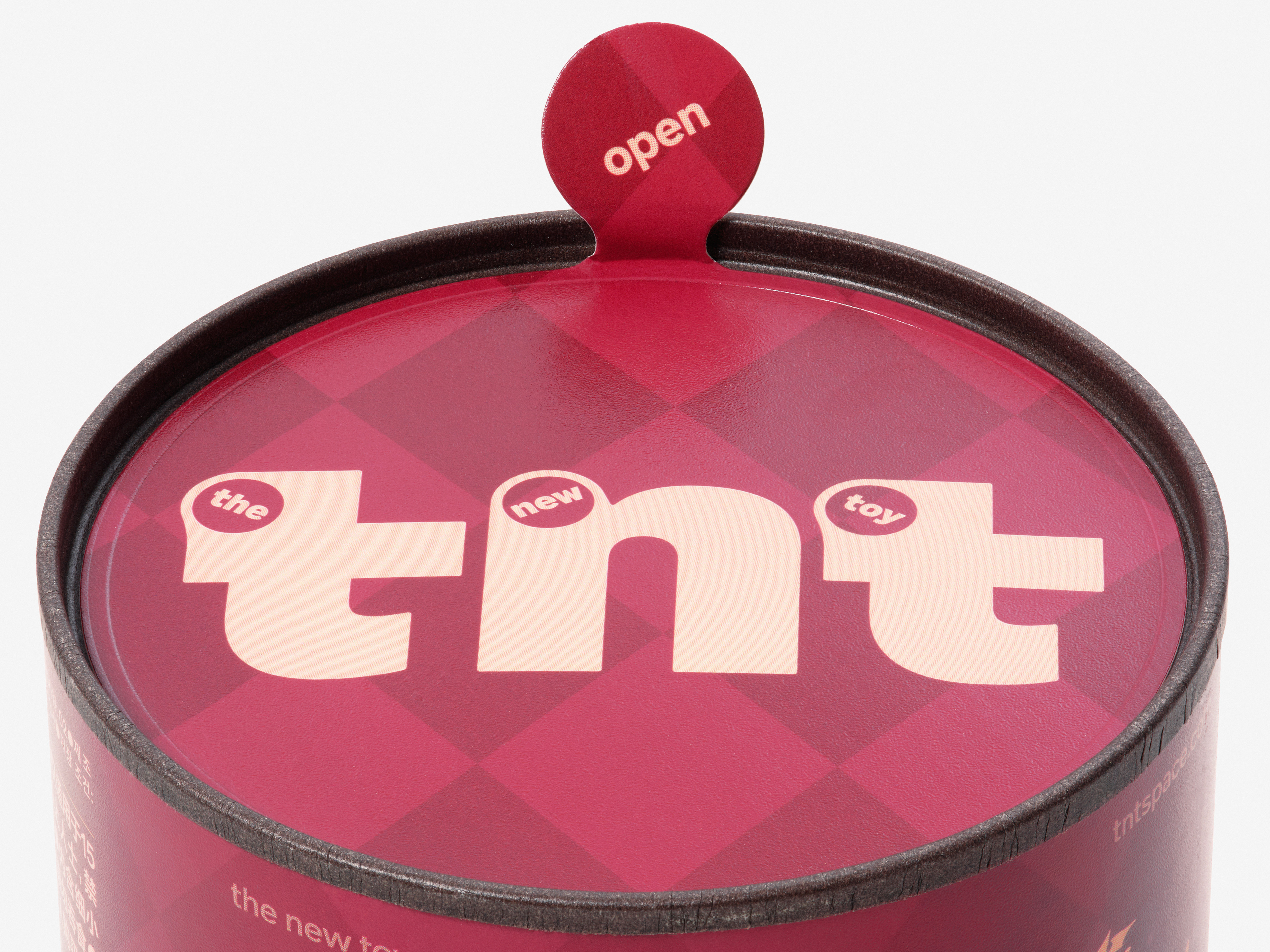
T.N.T’s visual identity balances order and tension. The colors are bold but not loud; the layout is precise yet relaxed; the overall rhythm feels light yet powerful. Within the logo, three screw-like dots contain the words “the / new / toy.” They symbolize the trace of craftsmanship and remind us that true refinement comes from the human hand. Each toy is still hand-painted, and these subtle variations are where warmth and life emerge.
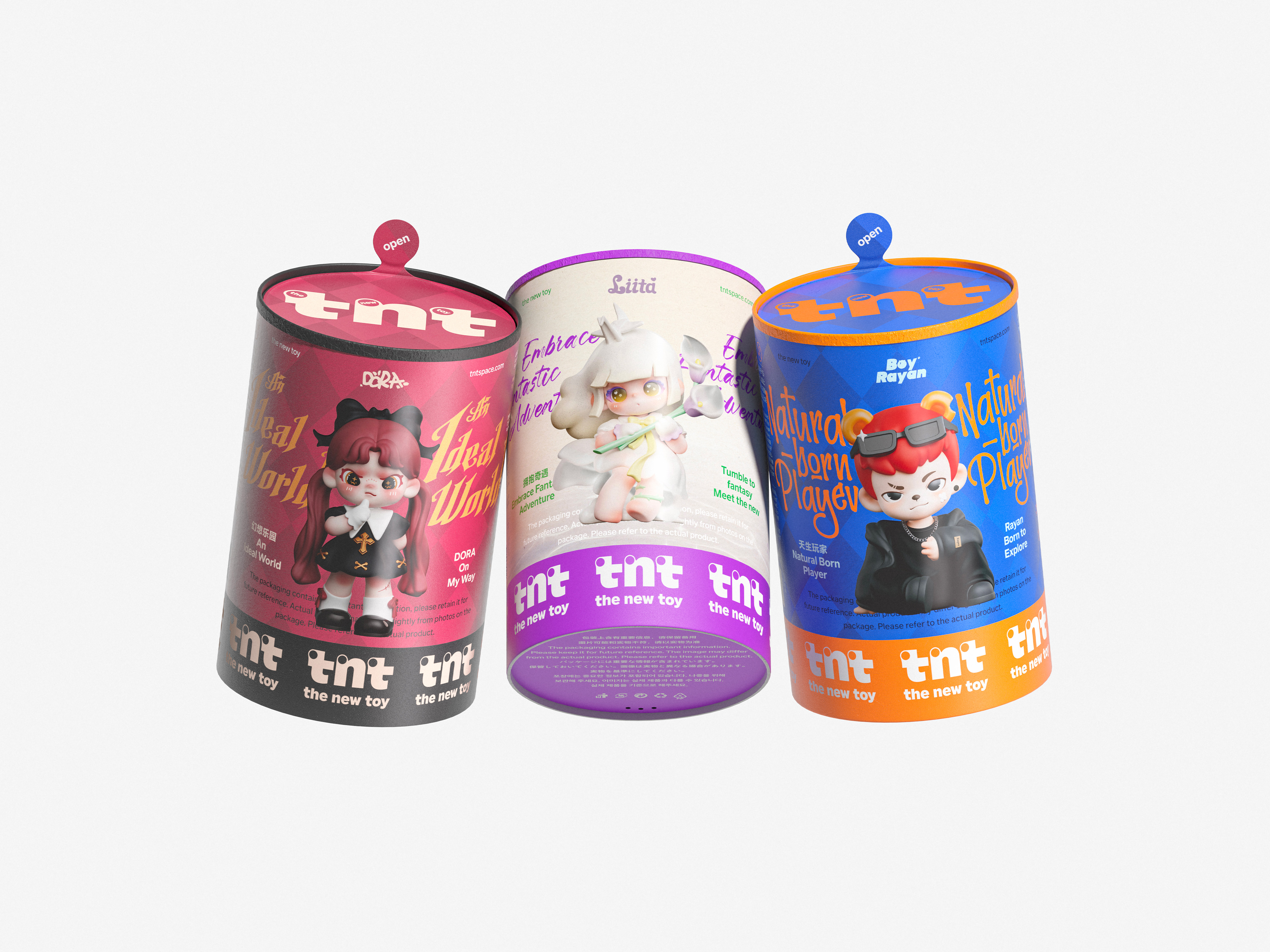
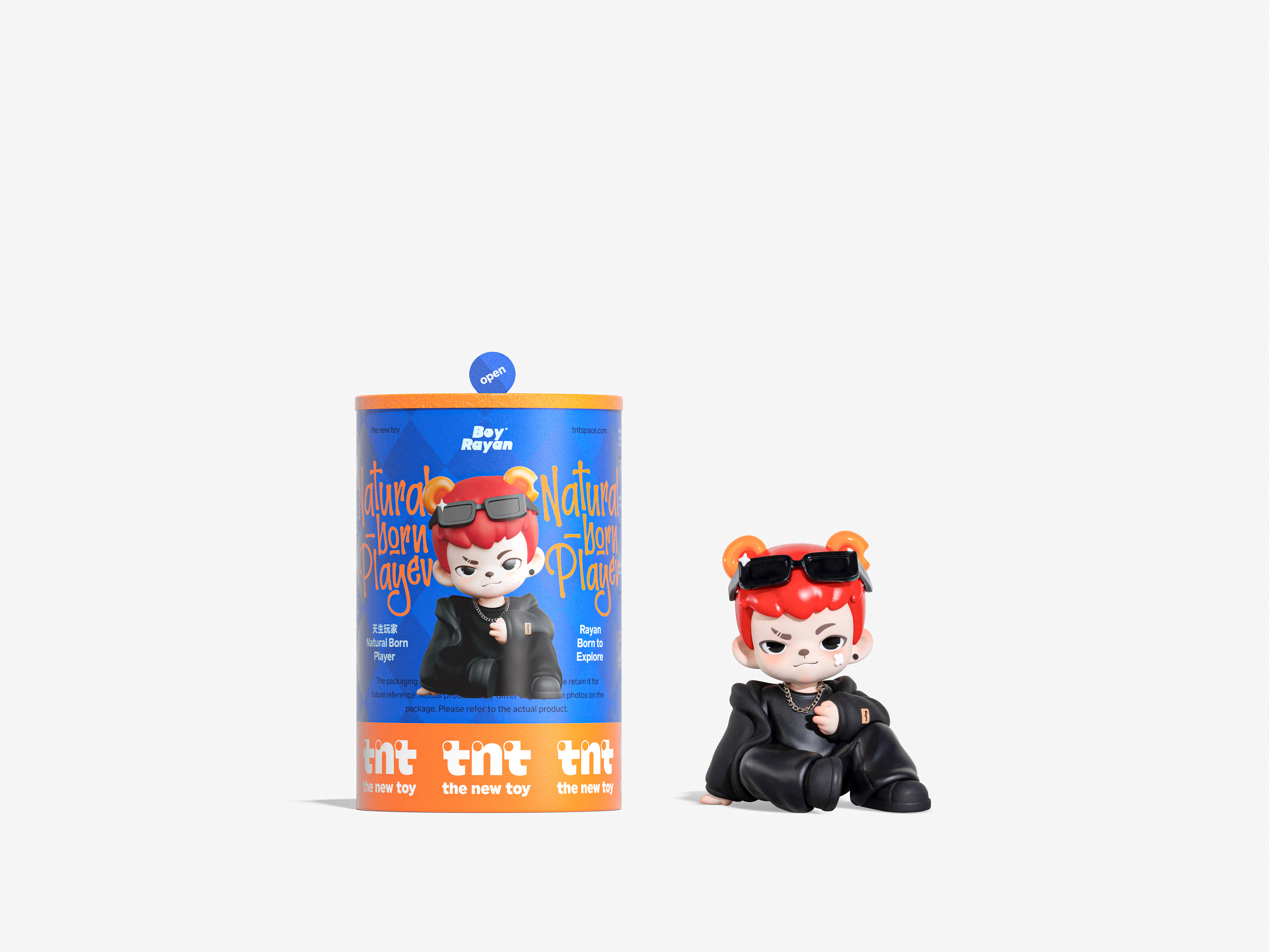
The cylindrical packaging was not designed for form’s sake, but to make touch part of the experience. Holding it feels like holding a soft sense of anticipation. Twisting it open is like entering a private story. Packaging here is not a container but a medium of emotion—turning the act of opening into a small ritual rather than a simple act of consumption.
T.N.T aims to build not just a series, but a universe—a world of characters, emotions, and stories. It contains loneliness, courage, curiosity, and freedom. Each piece stands alone, yet they coexist within the same emotional space. It is both our imagination of the world and our response to life.
Cuteness is not a style; it is a form of judgment. Freedom is not a strategy; it is a choice. Every T.N.T toy is a small declaration: you can be gentle and strong, playful and mature, lonely yet full of hope.
In today’s designer toy market, most brands build their “trend” backwards from an IP. They first create a character, then construct stories and visuals around it. This approach works in the short term, but over time it drains “trend” of its authenticity. T.N.T was born as a response to this inertia. We start from life itself—to understand the relationship between lifestyle and emotion—because a toy is not merely a designed object, but an attitude that can be felt.
T.N.T begins not from characters, but from the way people live. It represents a new position: THE NEW TOY. This is more than a product definition; it is a way of seeing oneself, of shaping taste, of expressing identity. We believe that today’s world needs an emotional economy rather than a blind-box economy. Toys are not just collectibles; they are companions and reflections. They are quiet, lovely, and sincere—like friends who live alongside us. They do not speak, yet they see everything.
The “magazine sensibility” in T.N.T’s design language defines its core spirit. We see trend not as a style, but as a way of expressing attitude. A magazine exists to tell the world who we are, what we think, and what we believe in. T.N.T does the same. It expresses attitude through toys, tells stories through its characters, and records the shared taste and emotional landscape of a generation through its visual system.
T.N.T’s visual identity balances order and tension. The colors are bold but not loud; the layout is precise yet relaxed; the overall rhythm feels light yet powerful. Within the logo, three screw-like dots contain the words “the / new / toy.” They symbolize the trace of craftsmanship and remind us that true refinement comes from the human hand. Each toy is still hand-painted, and these subtle variations are where warmth and life emerge.
The cylindrical packaging was not designed for form’s sake, but to make touch part of the experience. Holding it feels like holding a soft sense of anticipation. Twisting it open is like entering a private story. Packaging here is not a container but a medium of emotion—turning the act of opening into a small ritual rather than a simple act of consumption.
T.N.T aims to build not just a series, but a universe—a world of characters, emotions, and stories. It contains loneliness, courage, curiosity, and freedom. Each piece stands alone, yet they coexist within the same emotional space. It is both our imagination of the world and our response to life.
Cuteness is not a style; it is a form of judgment. Freedom is not a strategy; it is a choice. Every T.N.T toy is a small declaration: you can be gentle and strong, playful and mature, lonely yet full of hope.
如何重新理解玩具,定义潮流。
在当下的潮流玩具市场,大多数品牌的“潮”是从 IP 倒推而来的。它们先制造角色,再围绕角色发展故事与视觉体系。这种方式在短期内确实有效,却让“潮流”逐渐失去了真实的力量。T.N.T 的出现,是对这种惯性进行的一次反问。我们希望从生活本身出发,去理解潮流与情绪的关系——玩具不只是被设计的形象,而是一种被感知的态度。
T.N.T 从潮流的生活出发,而不是从角色出发。它代表一种新的立场:THE NEW TOY。这不仅是一种产品定义,更是一种关于自我、审美与表达的方式。我们相信,相比“盲盒经济”,当下更需要的是“情感经济”。玩具不只是收藏的对象,更是一种陪伴与投射。它们安静、可爱、真实,像朋友一样存在于我们的生活里。它不说话,但它都看得见。
“潮流杂志感”的设计语言,是 T.N.T 的核心气质。我们认为,潮流不是一种造型风格,而是一种表达立场的方式。杂志之所以存在,是为了告诉世界:我们是谁,我们在想什么,我们相信什么。T.N.T 正是在做这样的事。它通过玩具来表达态度,用角色讲述生活,用视觉系统记录这一群人的共同趣味与精神状态。
T.N.T 的视觉系统在秩序与张力之间保持平衡。色彩鲜明却不喧闹,排版精确却不拘谨,整体轻盈而有力量。在标识中,那三个像螺丝一样的圆点写着 “the / new / toy”,它们是手工的象征,也提醒人们:真正的精致来自手的痕迹。玩具的上色仍然依赖手工,而这种细微的差异,正是温度与生命感的来源。
我们选择圆筒包装,并不是单纯为了形式上的差异,而是让触觉成为体验的一部分。握住它,就像握住一种柔软的期待;旋开它,就像进入一个私密的故事。包装不只是容器,而是情绪的媒介,让“打开”成为一种仪式,而非一次消费。
T.N.T 想要构筑的,不是一个系列,而是一个宇宙,是一个有角色、有情绪、有故事的世界。它包含孤独、勇气、好奇与自由。它们相互独立,却在同一个精神空间中共存——那是我们对世界的想象,也是我们对生活的回应。
可爱不是风格,而是一种判断;自由不是策略,而是一种选择。T.N.T 的每一个玩具,都是一个微小的宣言:你可以温柔,也可以坚定;你可以俏皮,也可以成熟;即使孤独,也依旧充满了希望。


 All Images Copyright © 2025 ABCD. All Rights Reserved