Snowplus 雪加
ART DIRECTOR: Nod Young / Guang Yu
DESIGNER: Han Lu / Wang Xiaoshuai
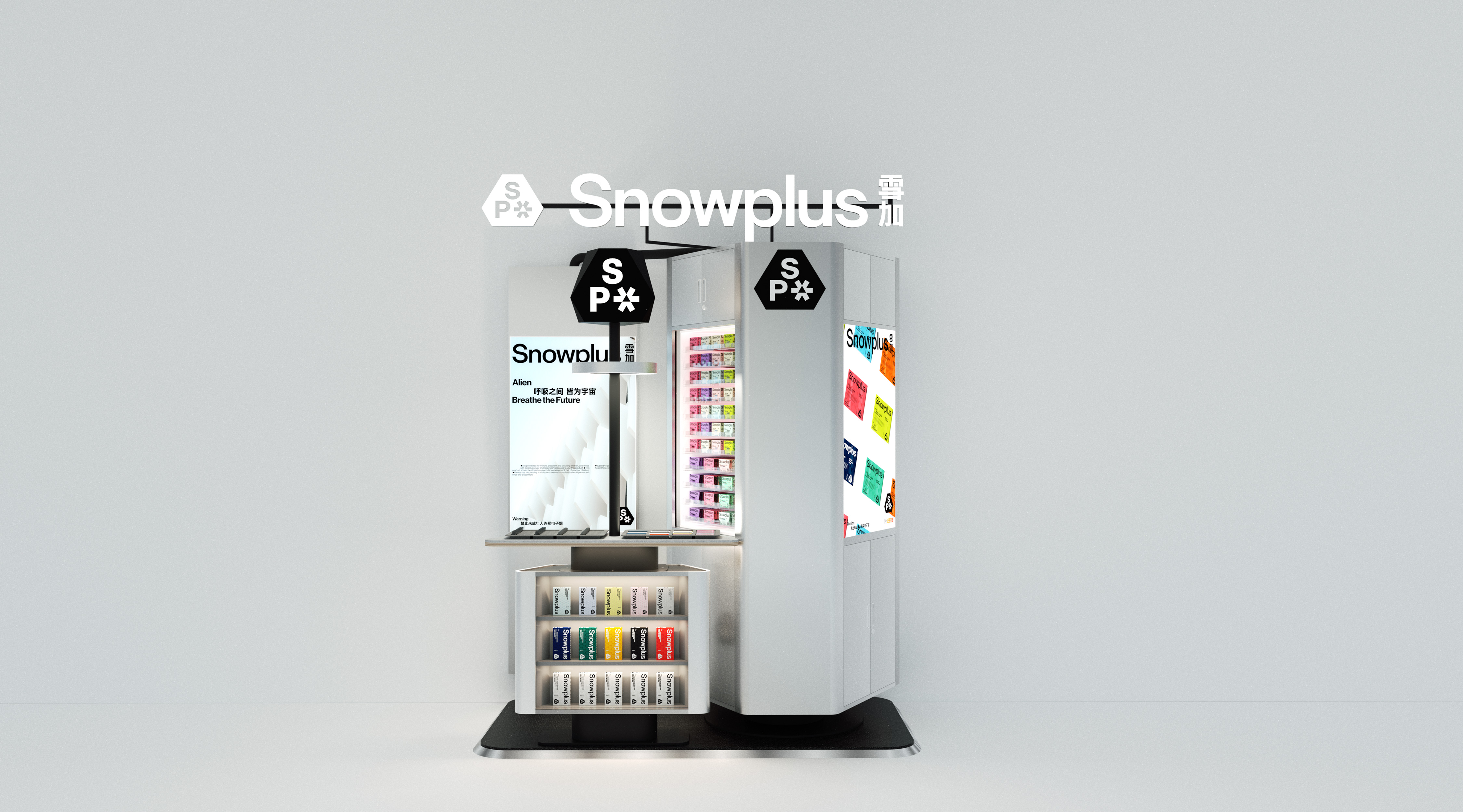
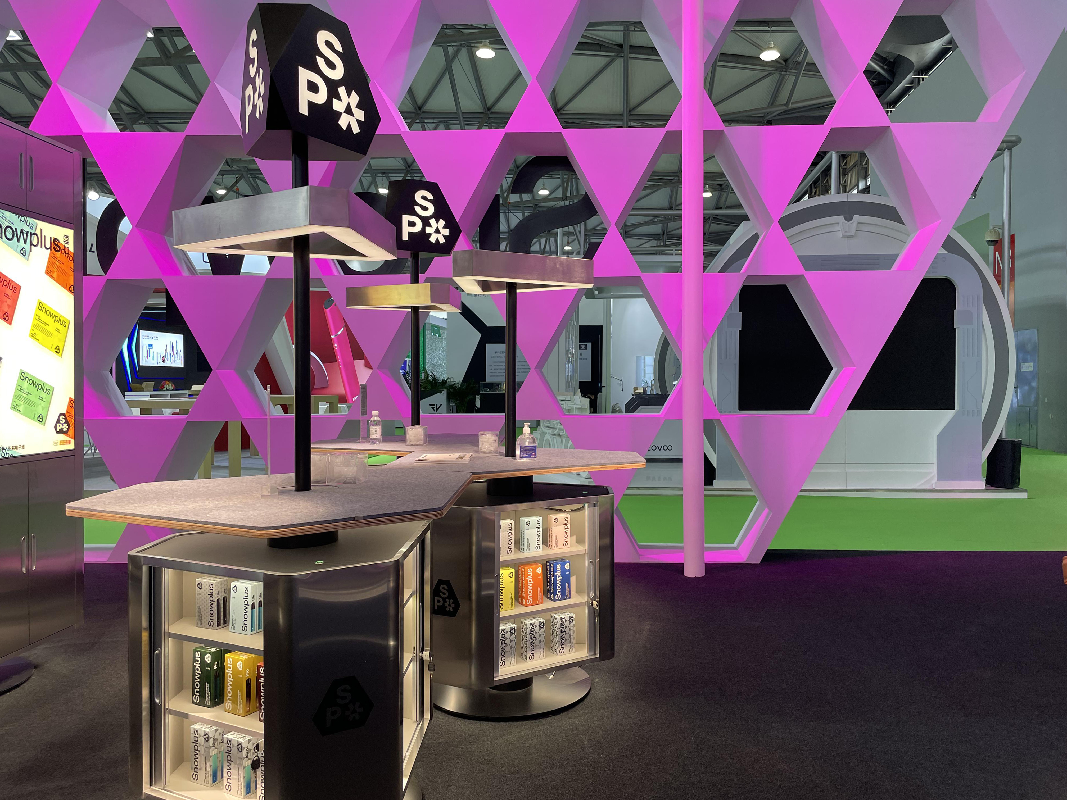
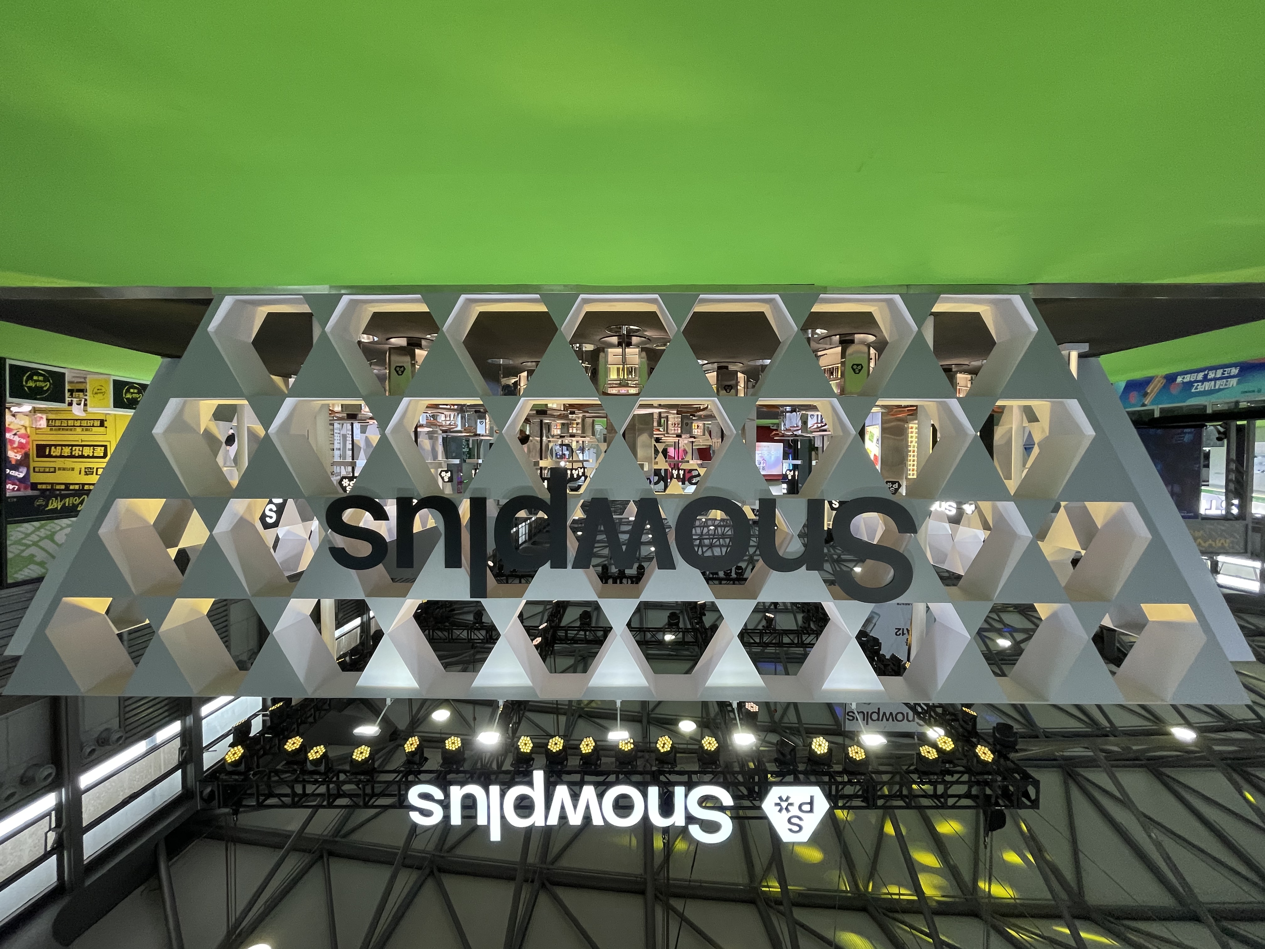
INTERIOR DESIGN: SPACESTATION
YEAR: 2021
CLIENT: Snowplus
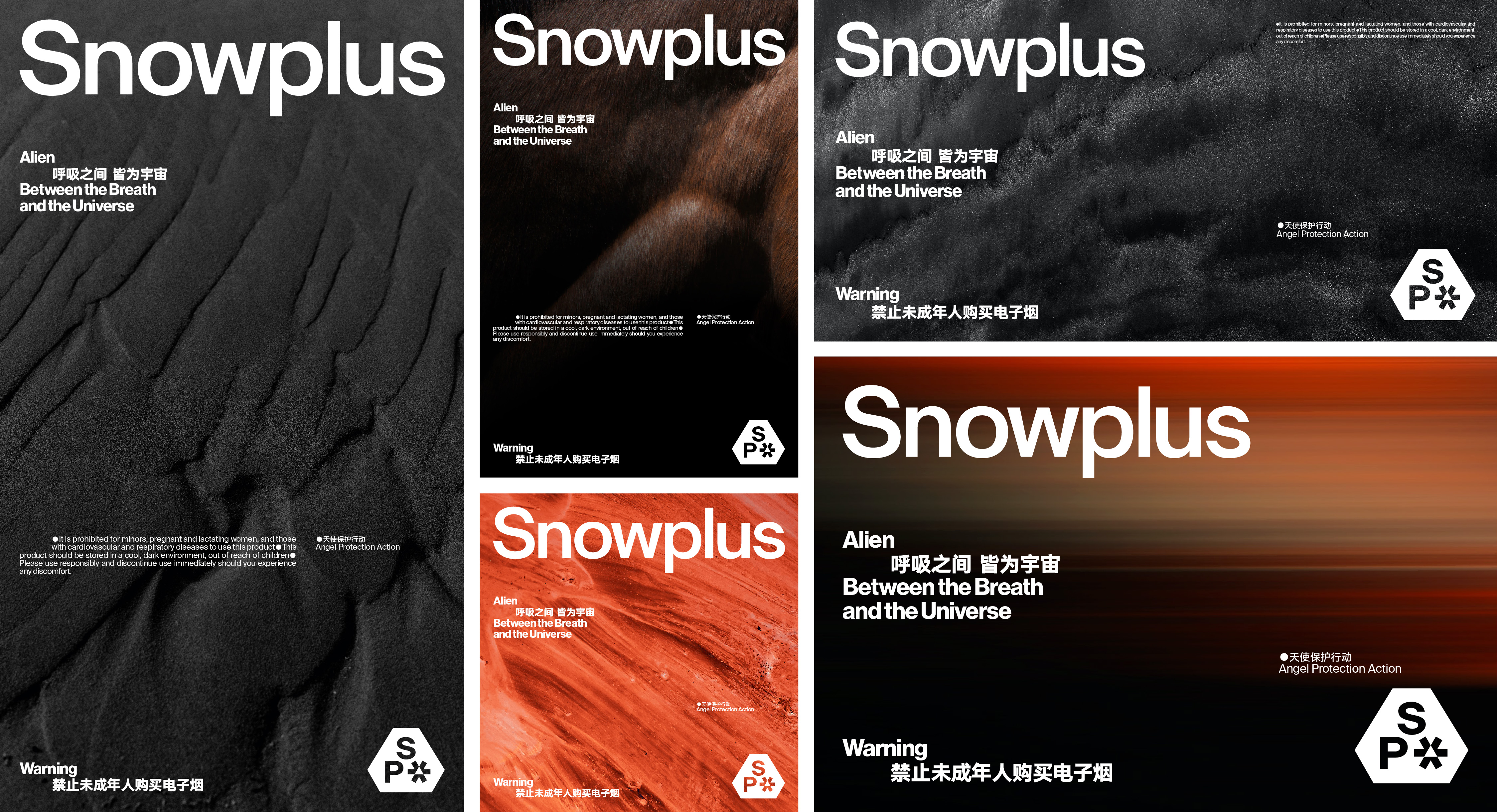
The logic in design can sometimes be contrary to common sense. For example, tradition and stability
could sometimes be better to demonstrate innovation, while seemingly simple and relaxed graphics can carry a wealth of meaning. In the design of Snowplus, we chose the most stable triangle, based
on which we made morphological changes. After nearly a hundred revisions and comparisons, we settled on a special shape that was both visually comfortable and pioneering in design --
Snowplus' unique irregular hexagon. And then, we design a small, perfectly embedded snowflake according to the shape of the hexagon. The acronym "SP" for Snowplus forms a tight and stable logo.
The polygonal shape and radial snowflake conceals a tribute to classic sci-fi. In the design of the ackaging, we have taken the technological aesthetic of Snowplus one step further, the packaging is
covered by hexagonal pattern and then printed with a special technology that makes it luminous and colorful under the light.
设计中的逻辑有时会与人们寻常的经验相反,比如经典与稳定更适合体现创新,看似简洁轻松的图形却能承载丰富的内涵。在雪加的设计中,我们选择了最具稳定感的三角形,在此基础上调整形态,经过近百次的修改、比较,最终得出一个既符合人体视觉舒适度,又在设计上充满先锋感的特殊比例,切割出雪加独一无二的不规则六边形,然后通过六边形空间的推演,设计出完美嵌入的小雪花,与 Snowplus 的缩写
SP 组合成紧密稳定的标识。多边形轮廓、放射状雪花图案,暗藏了对经典科幻的致敬,在雪加的包装设计中,我们将雪加冰冷的科技美学向前推了一步,包装被六边形暗纹整体包裹,再经过特殊工艺印刷,拿在手中流光溢彩。