Smart Devil
闪魔
ART DIRECTOR: Nod Young / Guang Yu
DESIGNER: Hu Wen / Xu Mingru / Han Lu / Wen Di
YEAR: 2022
CLIENT: Smart Devil
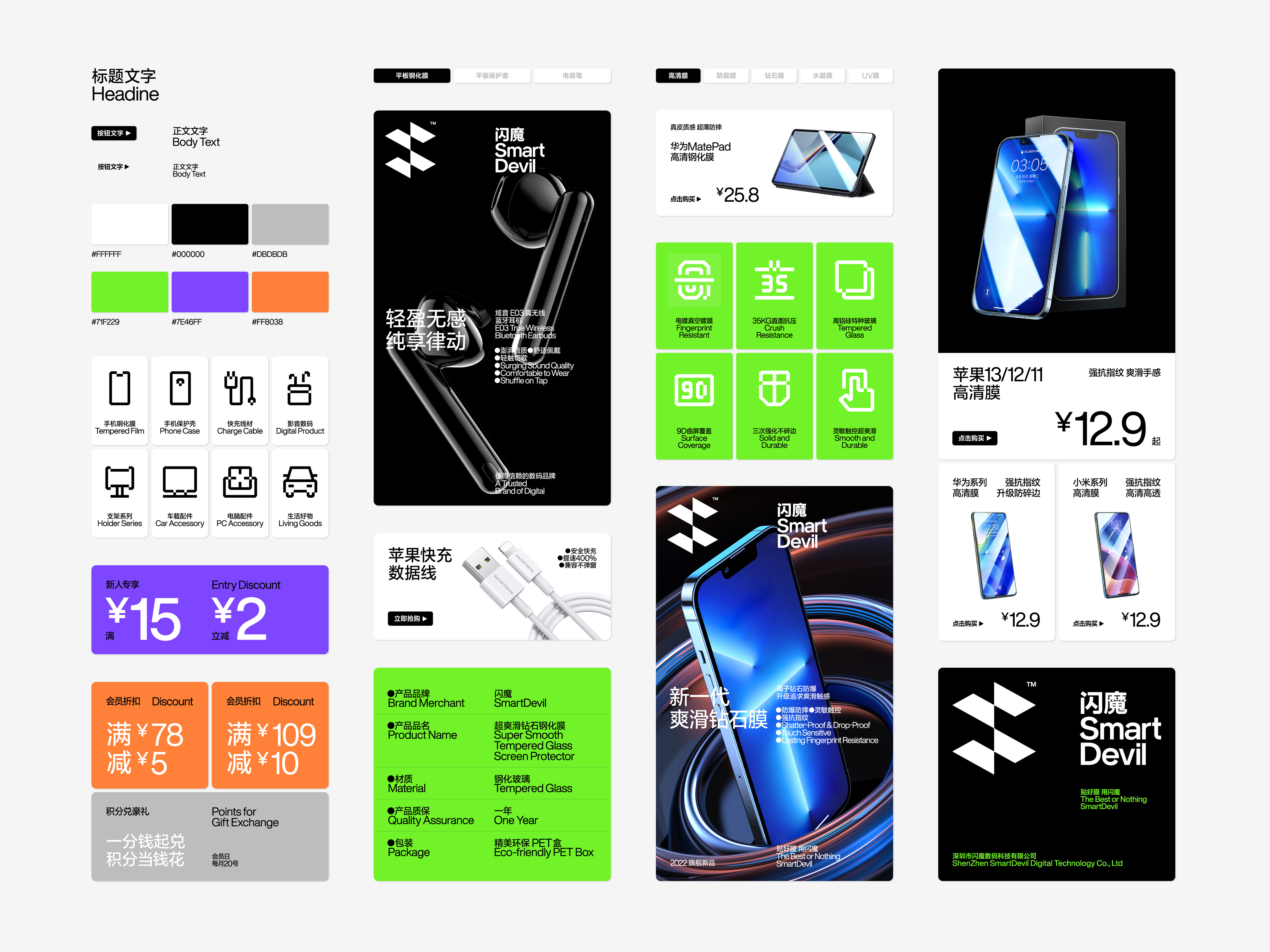
China possesses the world's largest and rapidly growing electronics market, with billions of users in the realm of smart devices. The market scale and development prospects behind it have captured global attention. As the most influential high-tech brand in China, Smart Devil combines research, design, and manufacturing of 3C digital accessories. It stands out from the competition through its exquisite technological craftsmanship and formidable development capabilities, earning the recognition and trust of millions of consumers.
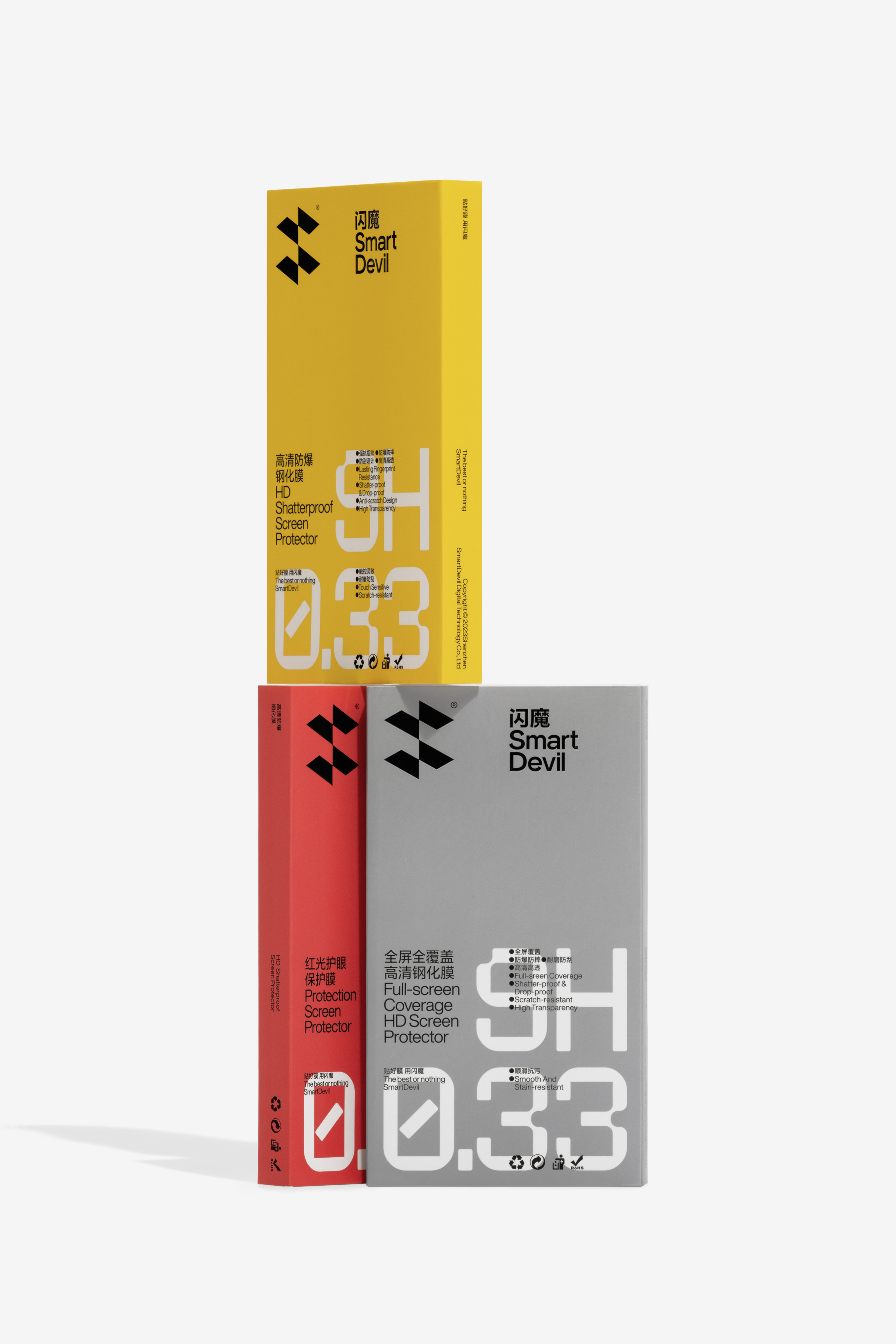
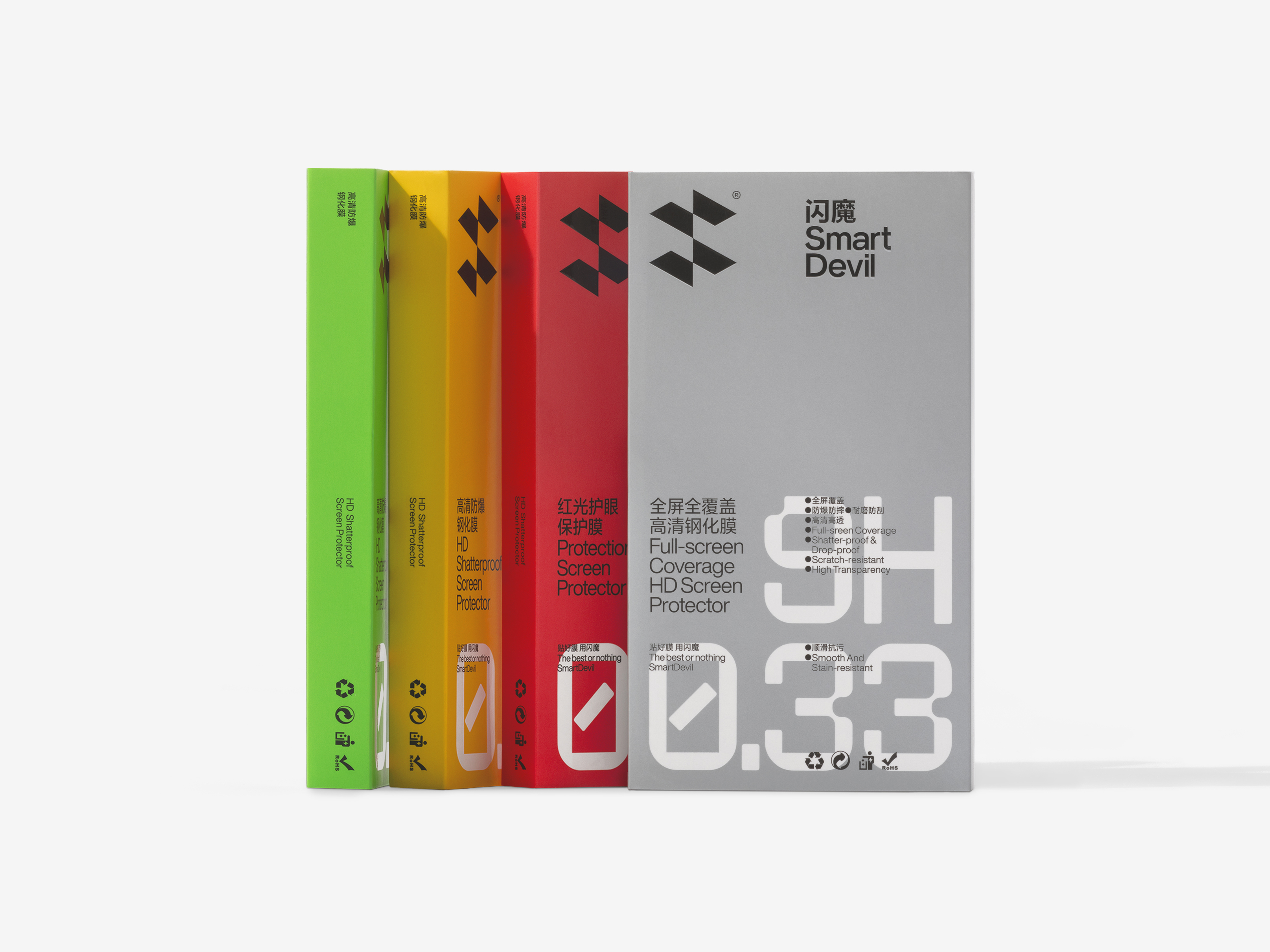
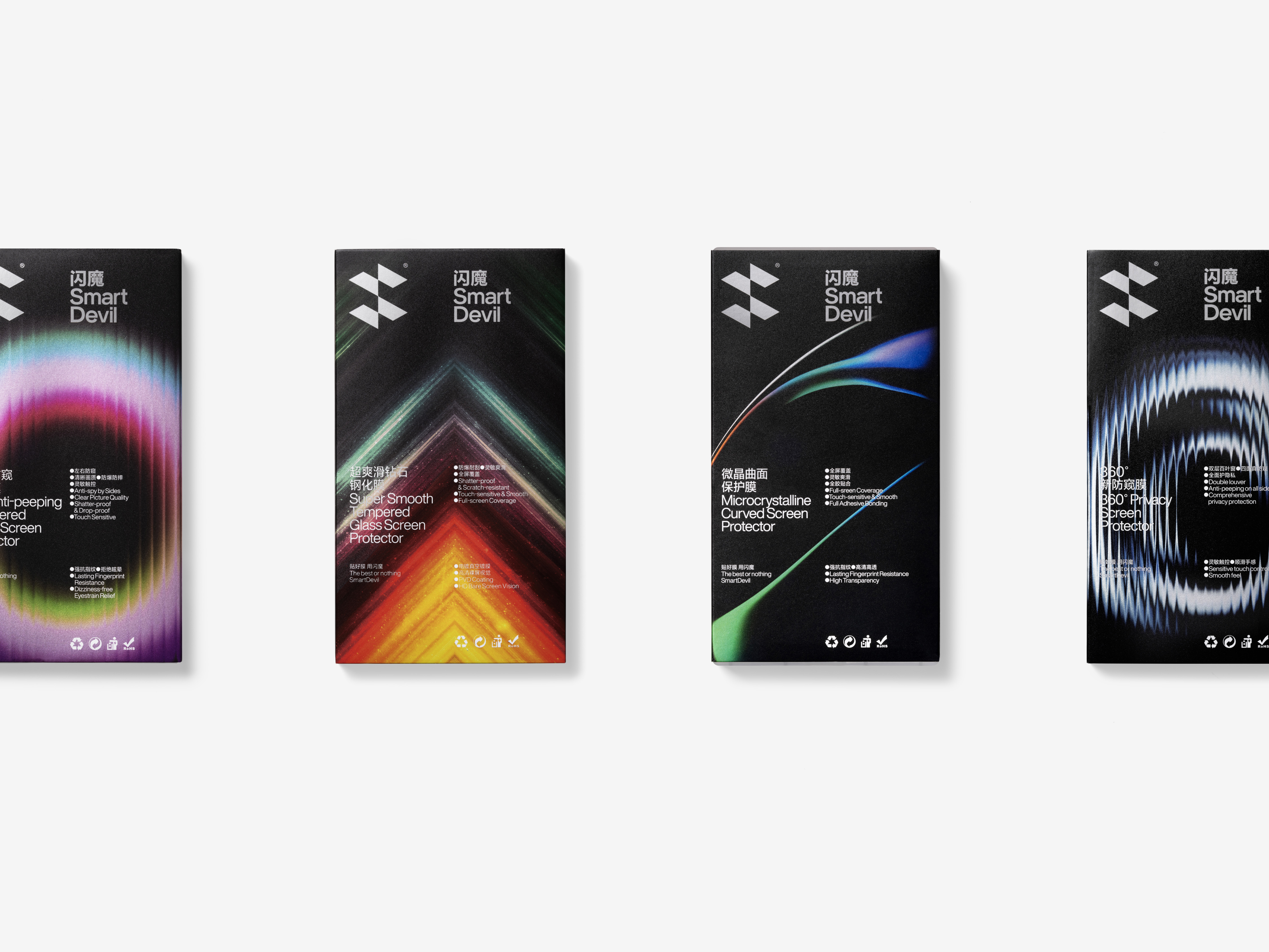
The development of Smart Devil signifies a certain degree of transformation within the consumer electronics industry.The redefined Smart Devil is not only disruptive but also visionary. We have shifted the brand's visual focus from "magic" to "flash," replacing the previous descriptions related to "magic" with a more professional and futuristic lightning motif. Consumer electronics products often embody a strong sense of the times and are a part of urban trend culture. This technology-driven aesthetic, which we define as "urban functionality," goes beyond design forms and represents an explicit elevation of the brand's spirit. It stirs consumers' desire for technology and their aspirations for the future.
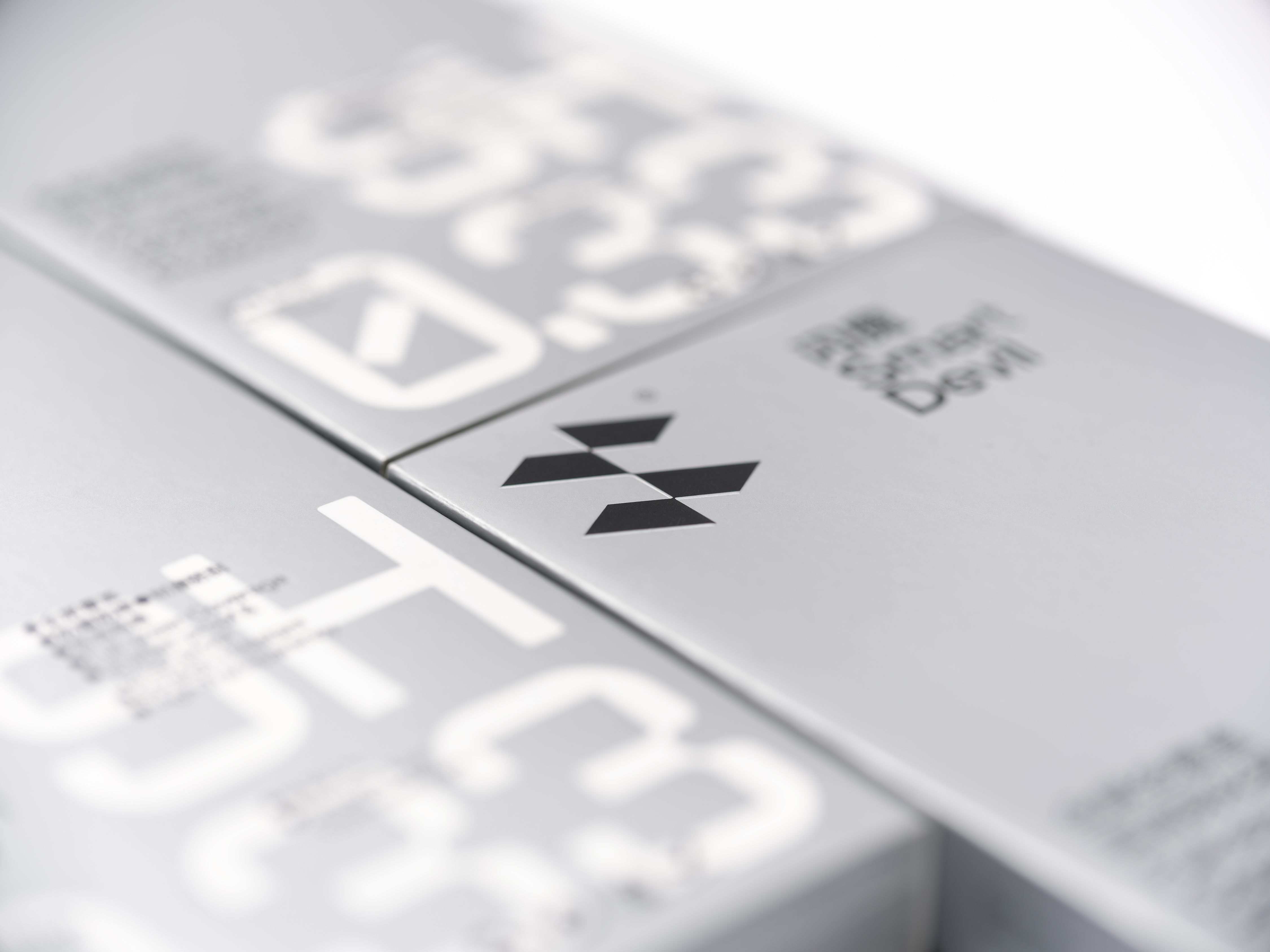
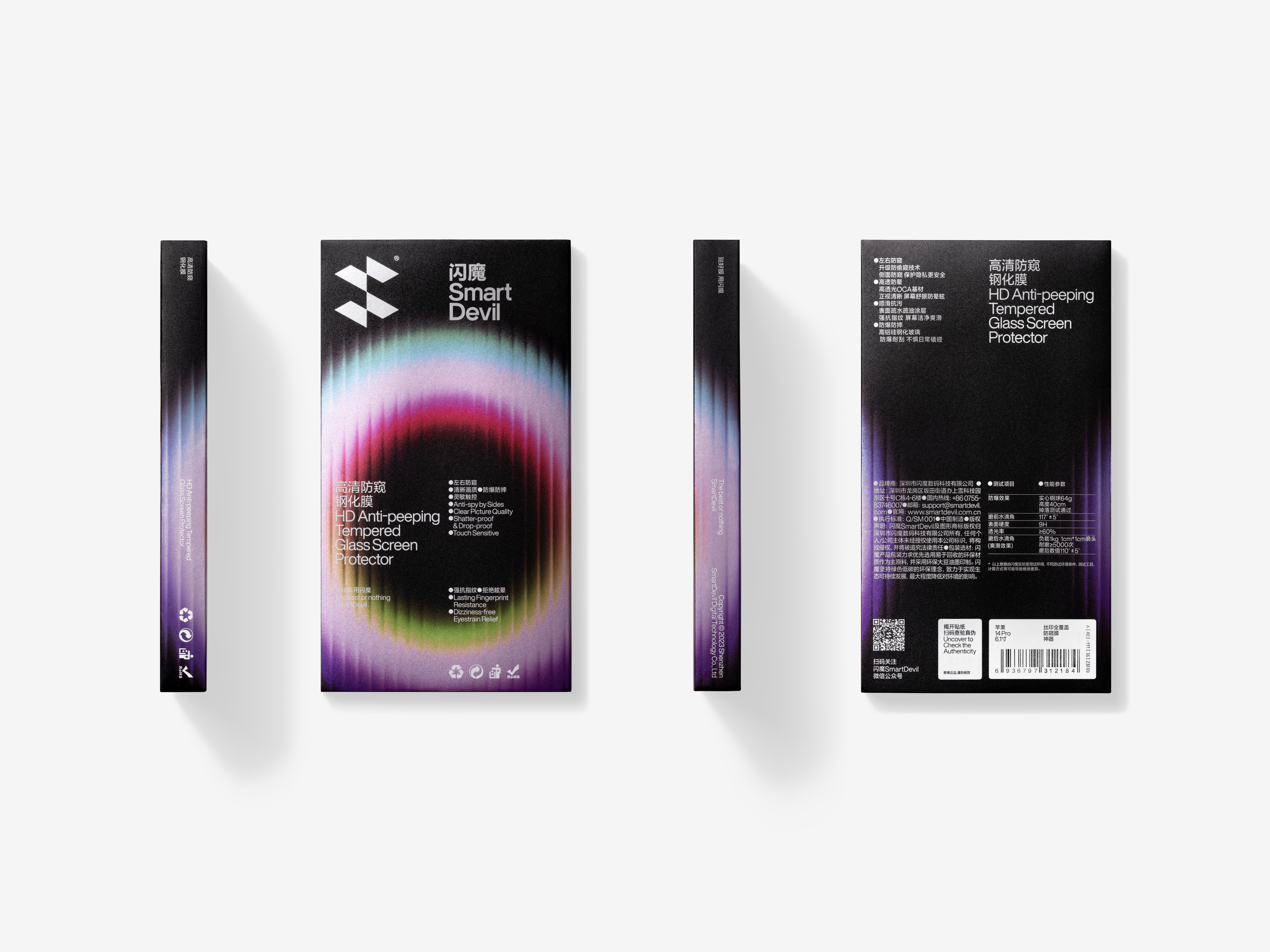
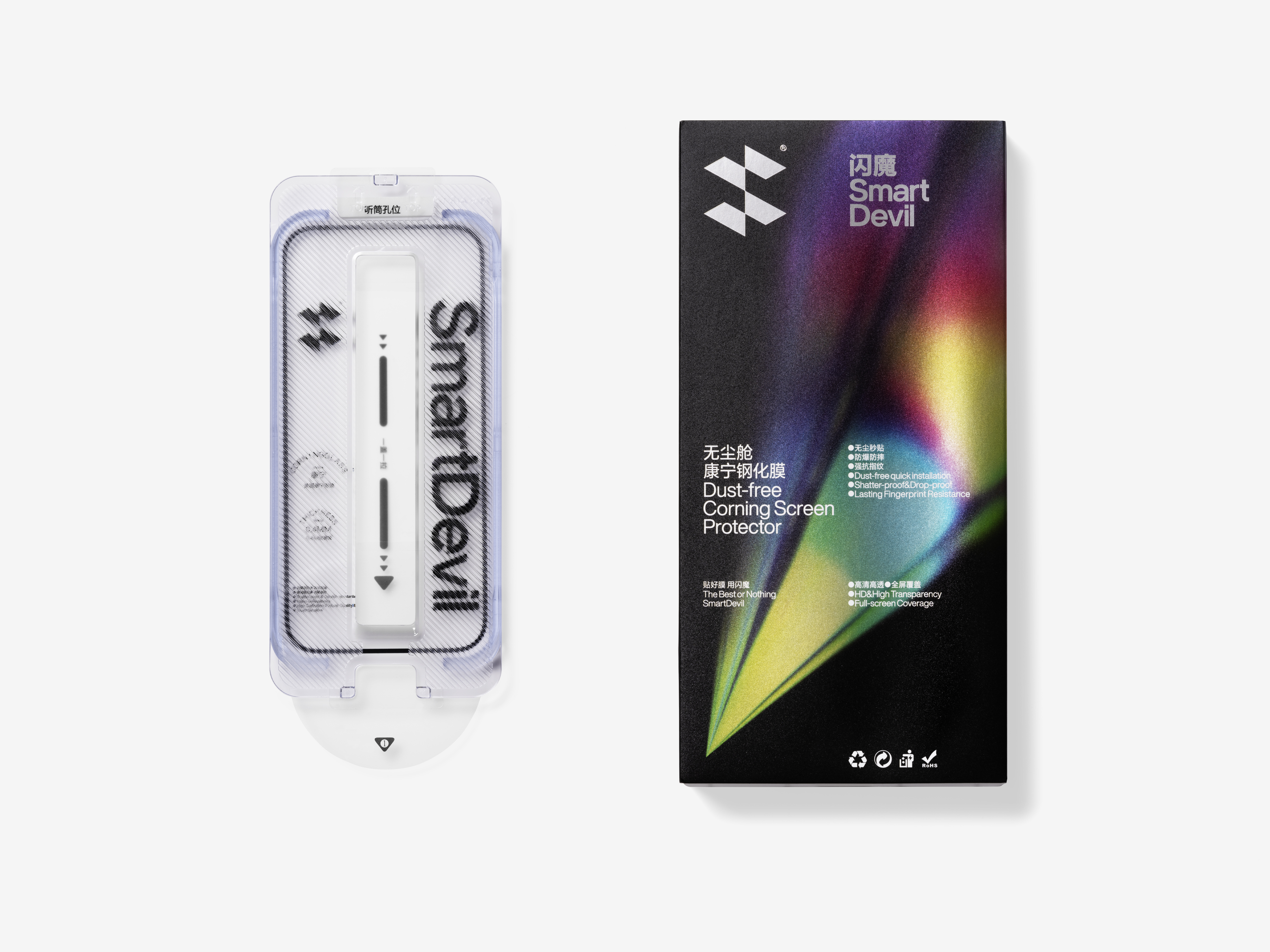
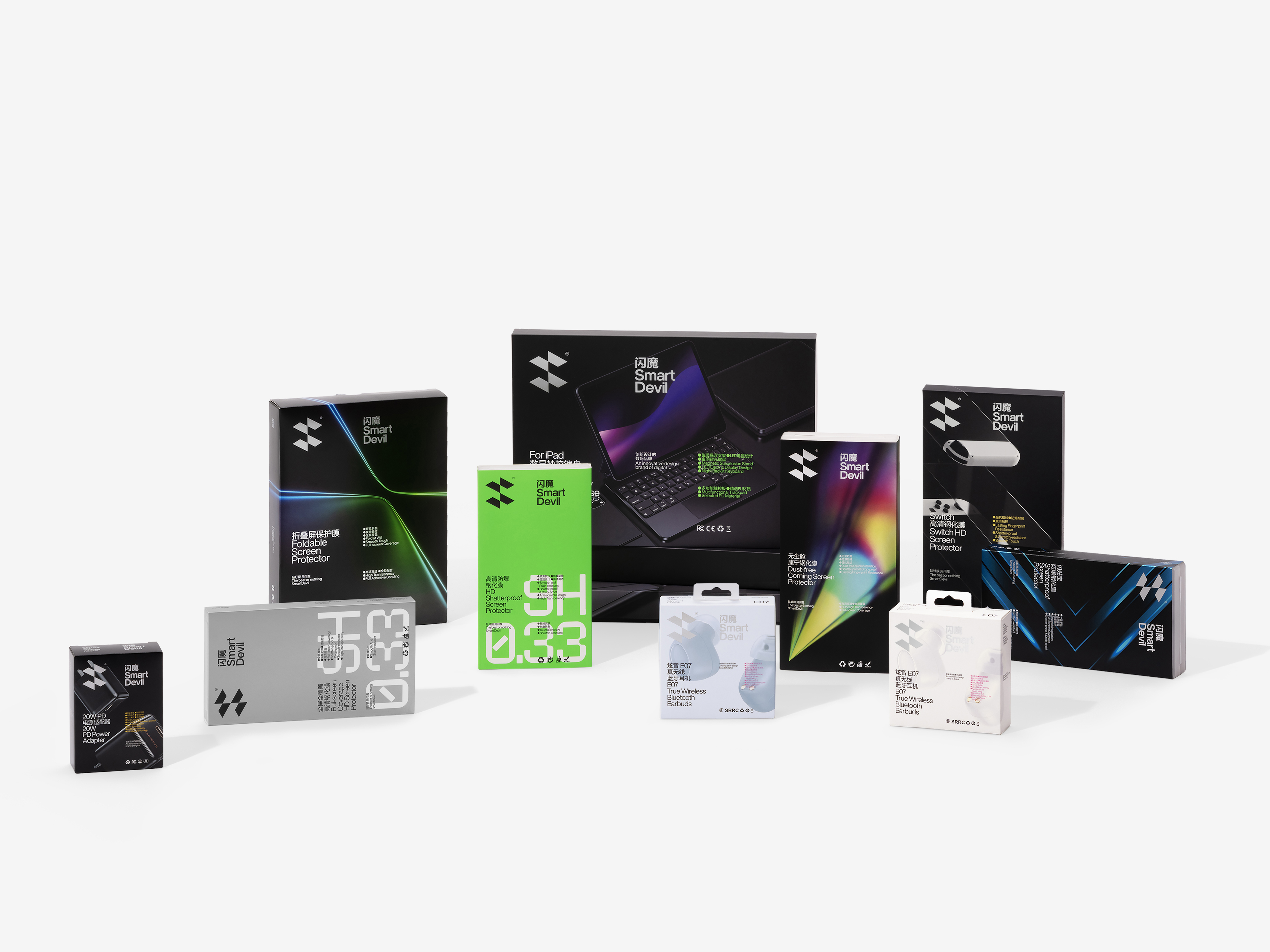
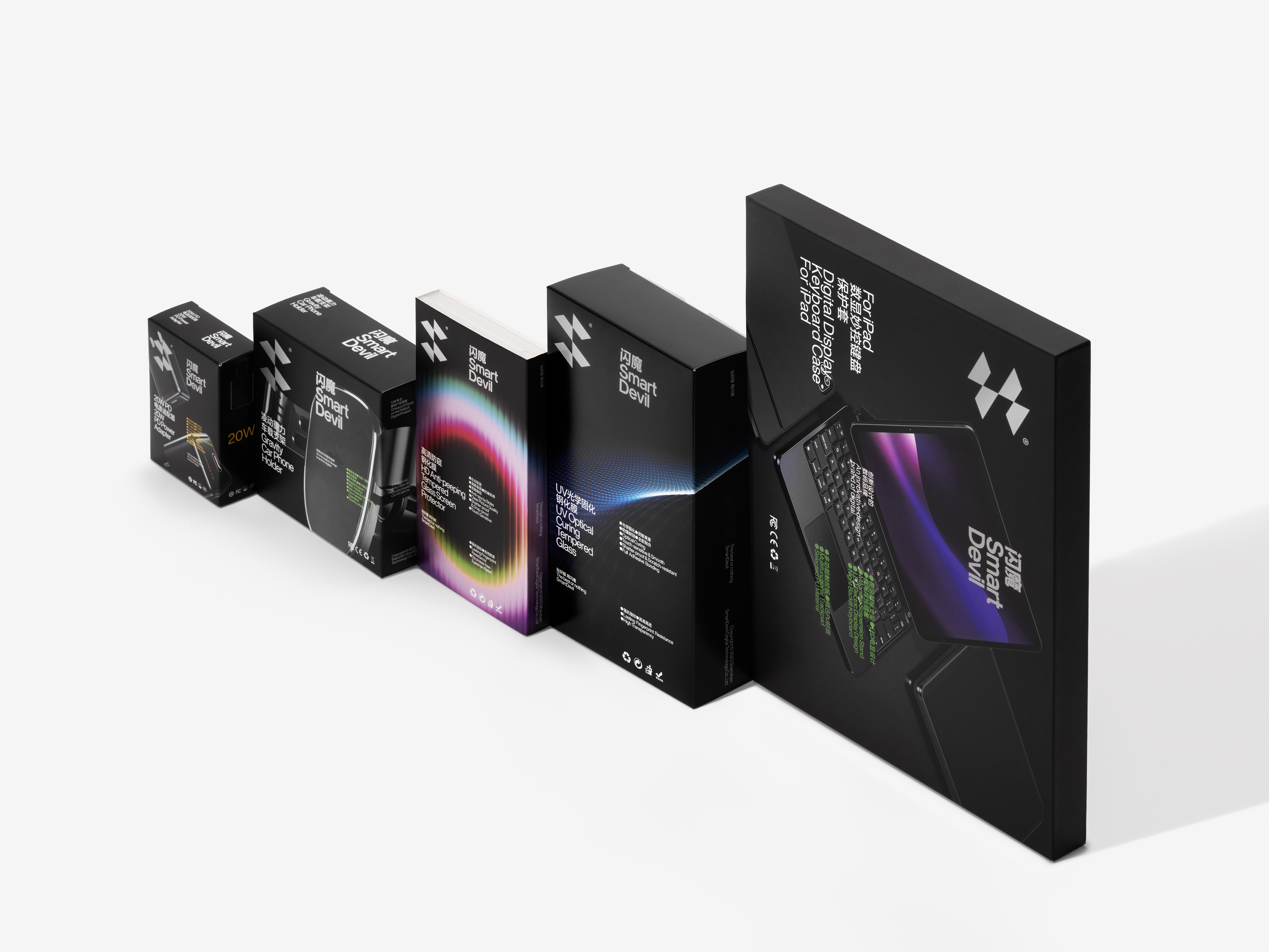
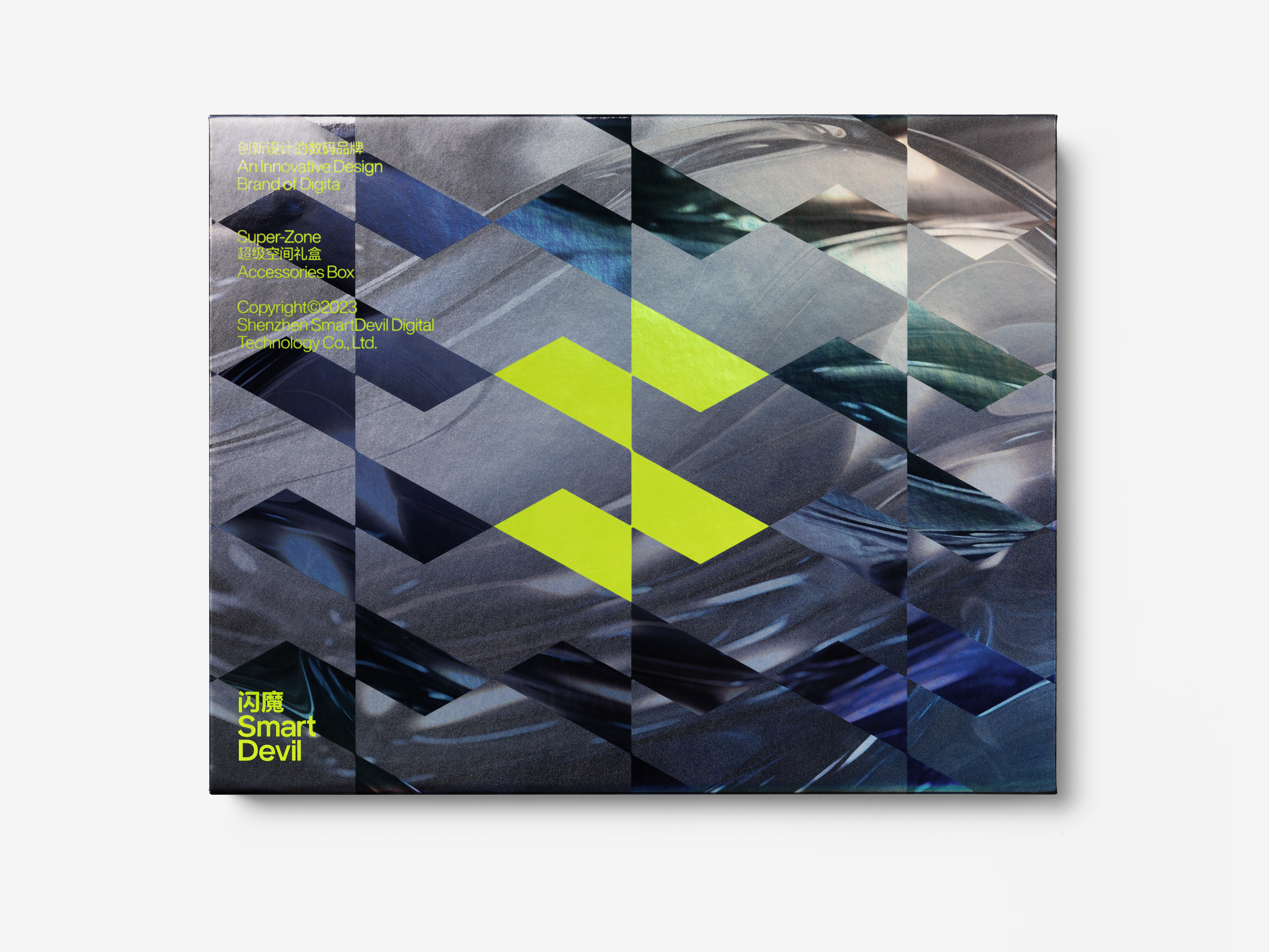
The Smart Devil logo is composed of two horizontally aligned lightning bolts, forming an overall S-shaped structure that corresponds to the initials "S" of the brand's English name, "Smart Devil." Through precise calculations of positive and negative space, the logo achieves a minimalistic and stable design, while the balanced relationship between light and dark perfectly embodies the concept of "flash." In the planning of the visual system, the application of the logo and the layout logic of typography are considered as a cohesive whole. The relationship between the logo graphic and the text directly influences the overall composition, aiming to integrate the logo with the content rather than treating it as an isolated visual element. The precise layout, rigorous visual system, and sleek logo design form the foundation and core of Smart Devil's urban functionality visual style. Smart Devil does not pursue individuality for the sake of it, nor does it chase differentiation just for the sake of being different. Smart Devil is committed to exploring the possibilities of technology and craftsmanship, embracing the future with a cautious yet proactive attitude. The brand design of Smart Devil embodies this very concept.
The development of Smart Devil signifies a certain degree of transformation within the consumer electronics industry.The redefined Smart Devil is not only disruptive but also visionary. We have shifted the brand's visual focus from "magic" to "flash," replacing the previous descriptions related to "magic" with a more professional and futuristic lightning motif. Consumer electronics products often embody a strong sense of the times and are a part of urban trend culture. This technology-driven aesthetic, which we define as "urban functionality," goes beyond design forms and represents an explicit elevation of the brand's spirit. It stirs consumers' desire for technology and their aspirations for the future.
The Smart Devil logo is composed of two horizontally aligned lightning bolts, forming an overall S-shaped structure that corresponds to the initials "S" of the brand's English name, "Smart Devil." Through precise calculations of positive and negative space, the logo achieves a minimalistic and stable design, while the balanced relationship between light and dark perfectly embodies the concept of "flash." In the planning of the visual system, the application of the logo and the layout logic of typography are considered as a cohesive whole. The relationship between the logo graphic and the text directly influences the overall composition, aiming to integrate the logo with the content rather than treating it as an isolated visual element. The precise layout, rigorous visual system, and sleek logo design form the foundation and core of Smart Devil's urban functionality visual style. Smart Devil does not pursue individuality for the sake of it, nor does it chase differentiation just for the sake of being different. Smart Devil is committed to exploring the possibilities of technology and craftsmanship, embracing the future with a cautious yet proactive attitude. The brand design of Smart Devil embodies this very concept.
中国拥有全球最大且发展最快的电子市场,智能硬件的用户数以亿计,其背后蕴藏的市场规模和发展前景令世人瞩目。闪魔,作为中国最具影响力的集3C数码配件研发、设计和生产于一体的高新技术品牌,以精湛的技术工艺和强大的开发能力在竞争中脱颖而出,获得了亿万消费者的认可和信赖。闪魔的发展,一定程度上预示着消费类电子行业的变革。
全新定义下的闪魔,不仅是颠覆性的,也是更为前瞻性的。我们将品牌的视觉焦点由此前的“魔”转移至“闪”,将原有品牌形象中有关“魔”的描述替换为更为专业、更具未来感的闪电造型。消费类电子产品往往带有极强的时代感,从属于都市潮流文化的一部分,这种具有未来趋势的科技美学风格被我们定义为“都市机能”,与此相关的都市机能美学不仅仅是设计形式的一种体现,更是品牌精神追求的明确提升,它能够激起消费者对于科技的向往,以及对于未来的憧憬。
闪魔的标识,由两枚横置的“闪电”组合而成,整体造型呈现为S型,呼应品牌英文名称 “Smart Devil” 的首字母“S”。经过精准计算的正负空间,令标识不仅极简而且稳定,而均衡的明暗关系更是完美地呈现了“闪”的概念。在视觉系统的规划中,标识应用以及版式逻辑是作为一个整体进行布局的,标识图形与文字的关系直接影响整个版面,如此规范的目的是为标识与内容更好的结合,而不仅仅将标识视为一个独立的视觉元素。精密的布局,严谨的视觉体系,配合极简硬朗的标识设计,组成了闪魔最为基础、也是最为核心的都市机能视觉风格。闪魔,不为追求个性而个性,不为追求差异而差异。闪魔,是在不断探索科技与工艺的可能,以谨慎且积极的态度去迎接未来——闪魔的品牌设计也正是这一观念的缩影。


All Images Copyright © 2022 Smart Devil 闪魔. All Rights Reserved