SONG SHAN
松山棉店
ART DIRECTOR: Nod Young / Guang Yu
DESIGNER: Xu Mingru / Han Lu / Liu Xianping
YEAR: 2022
CLIENT: SONG SHAN
Songshan Cotton Store is a home apparel brand that exudes a profound sense of Eastern aesthetic. Since its inception, the brand has continuously sought for fabrics, craftsmanship, and product designs that embody the essence of Eastern temperament and language. In 2022, through our collaboration, we completed a comprehensive brand upgrade, achieving a transformative shift from within to the outer world, from form to spirit. We established a completely unique aesthetic style for Songshan through a fresh visual system. We summarize this process as "Tracing the Origins" – returning to the most fundamental form of Songshan, rediscovering our original aspirations, and interpreting our essence.
As the name suggests, Songshan Cotton Store originates from Songshan. Songshan represents reverence for nature and serves as an exploration of Eastern mountain and forest culture. It embodies vastness, loftiness, intricacy, and expansiveness. From a product perspective, Songshan has always advocated for a green, healthy, and natural way of life. Whether it's the selection of cotton or the methods of printing and dyeing, the brand sees organic and nature-friendly principles as possibilities for catering to a high-quality lifestyle. Subsequently, we have incorporated the language of nature into the brand image design of Songshan Cotton Store, allowing for an interpretation of nature and a profound understanding of Songshan.
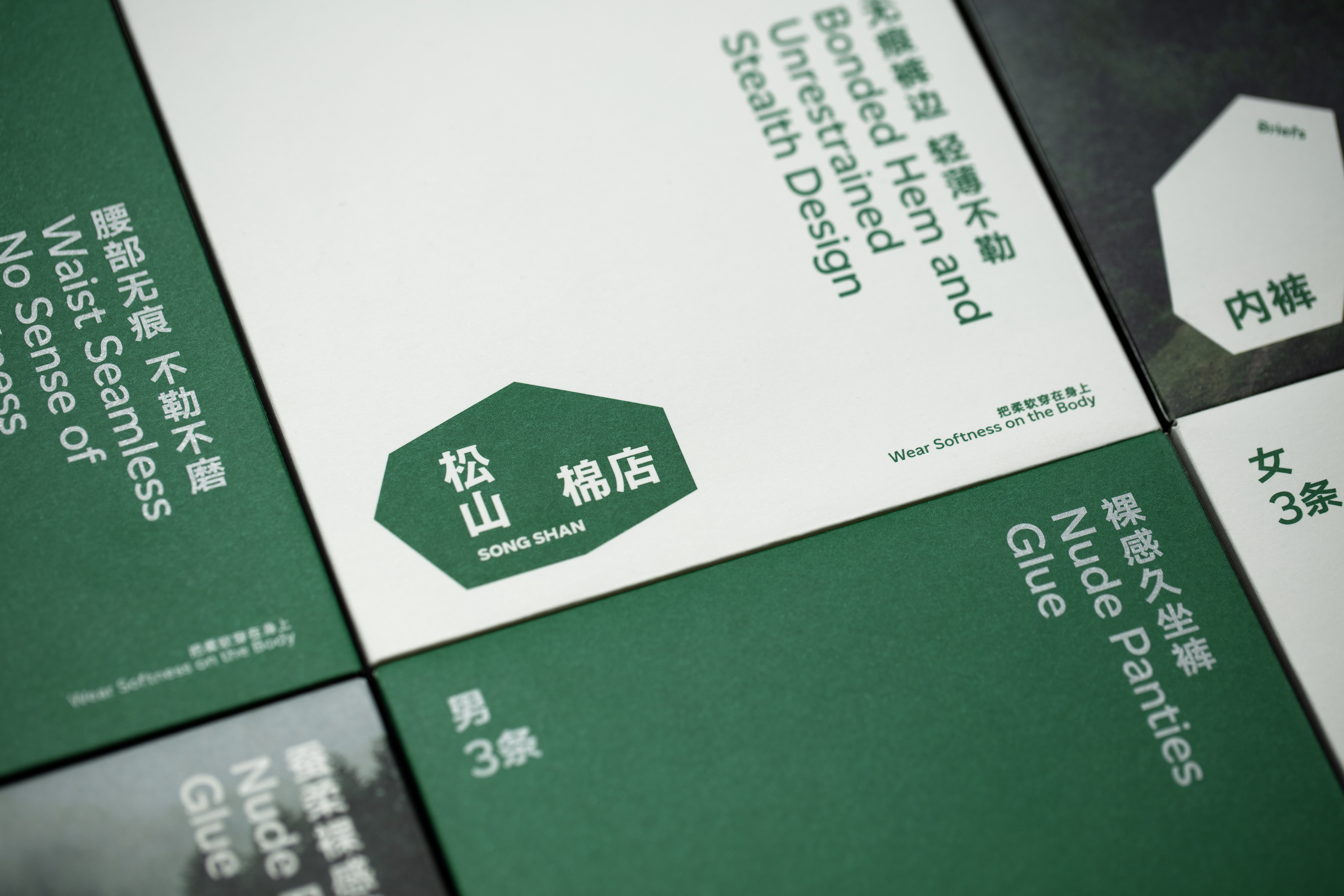
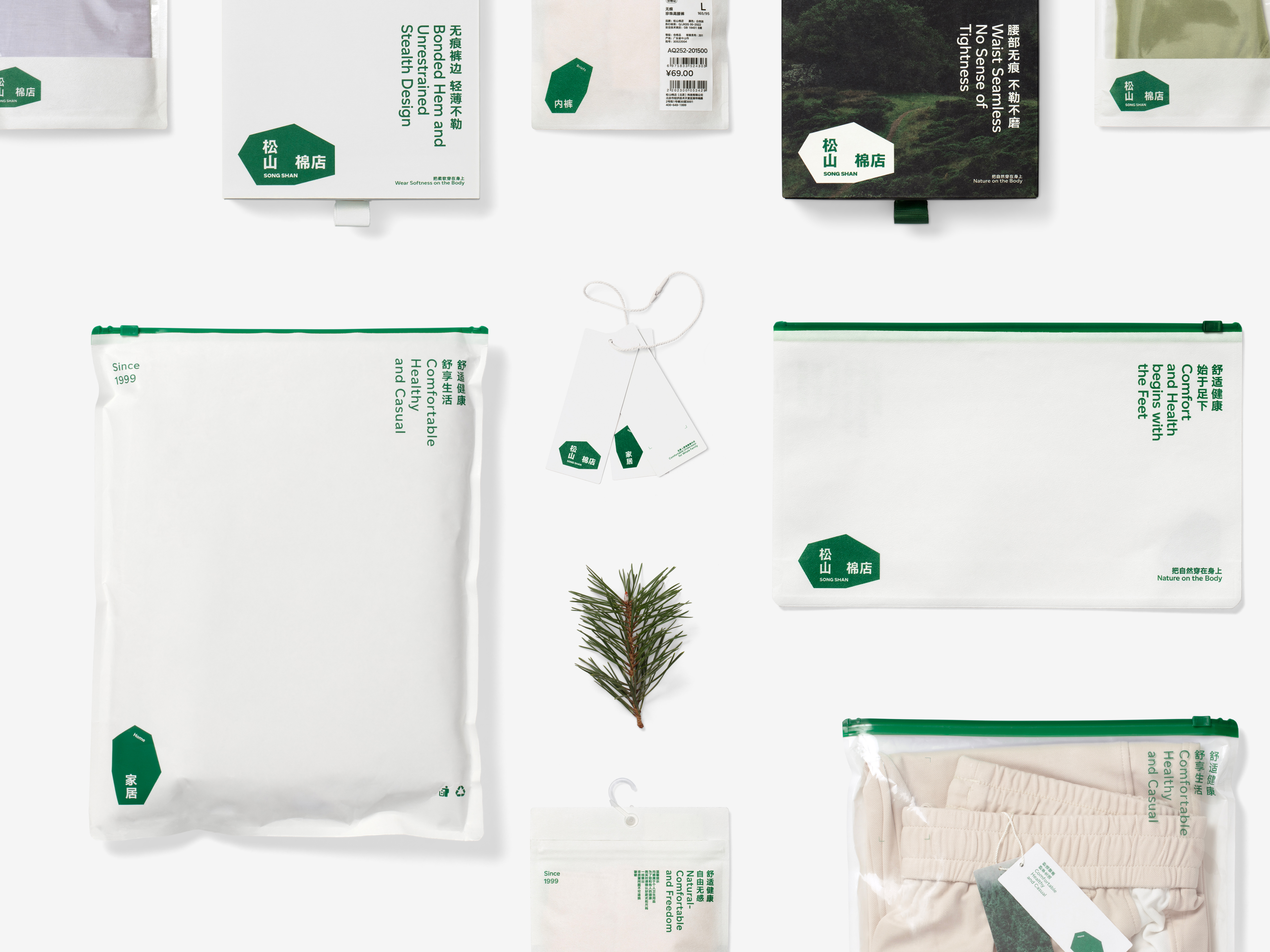
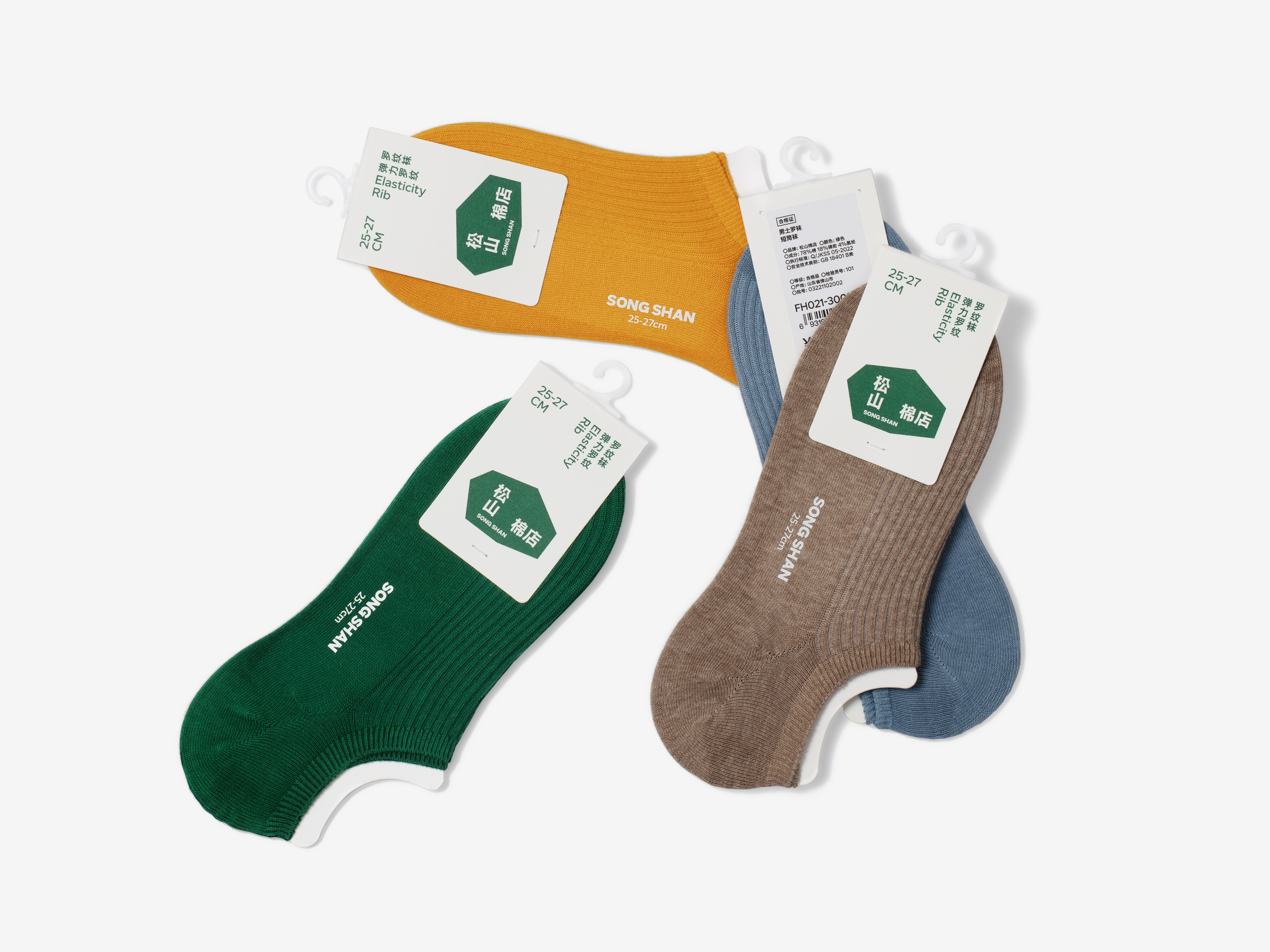
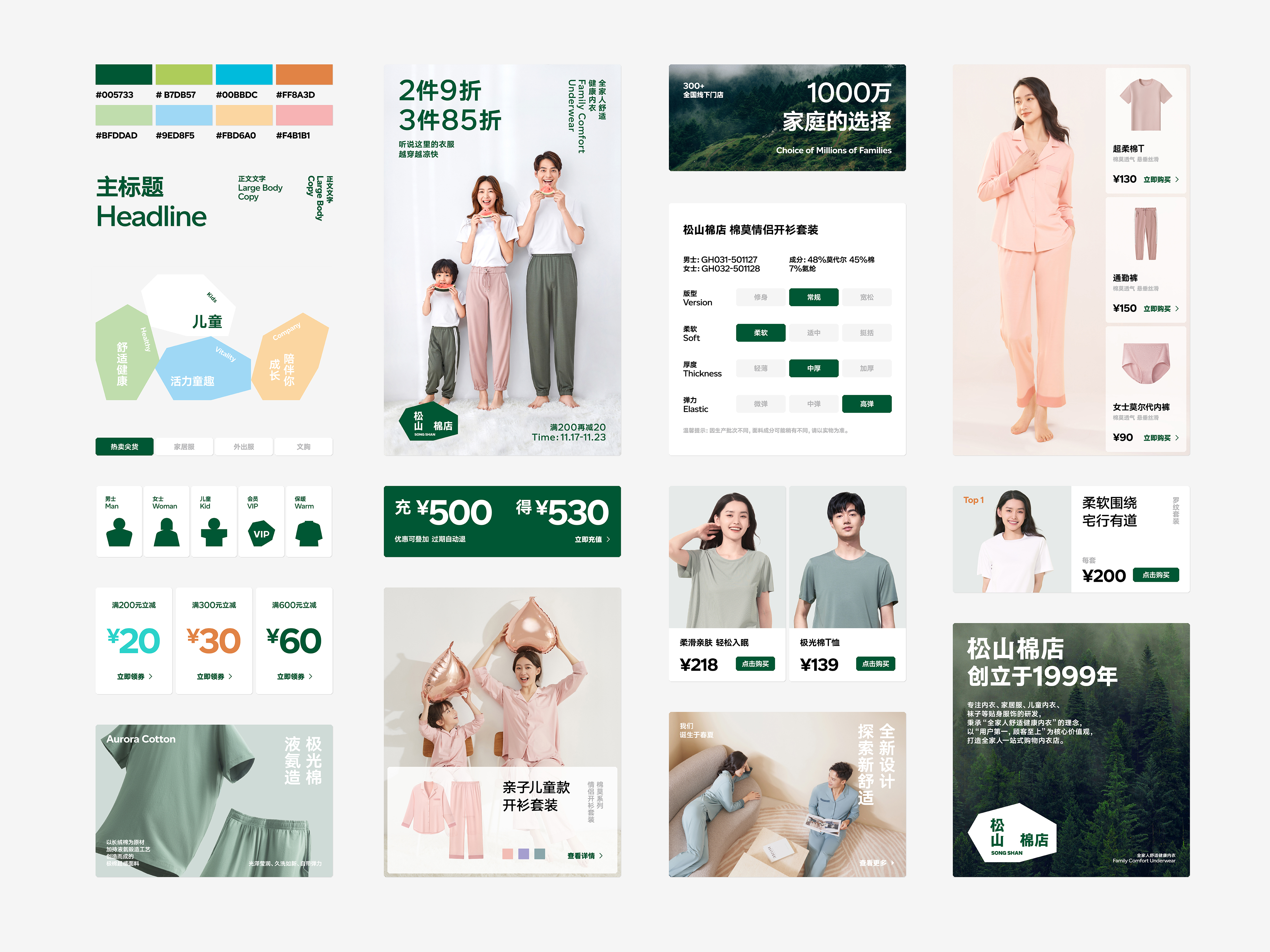
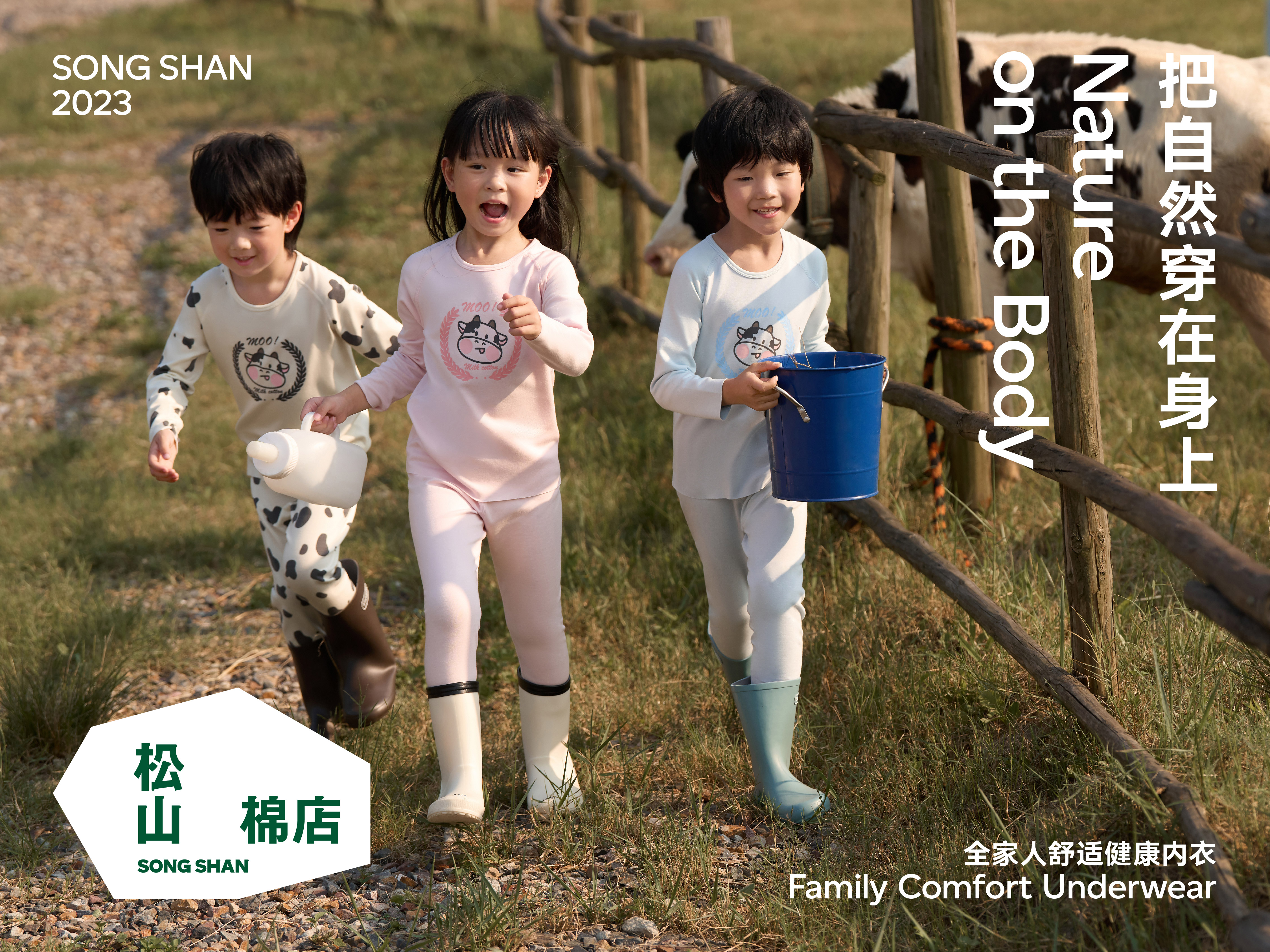
The logo of Songshan Cotton Store features an organic and irregular polygon, resembling the crown of a pine tree or resilient rocks in the mountains. It possesses distinct edges and a profound rusticity. The arrangement of the typography for Songshan Cotton Store is particularly unique: "Songshan" is arranged vertically, while " Cotton Store" is arranged horizontally. Apart from enhancing textual recognition and adding visual interest, the true purpose behind this arrangement is to leverage the unique vertical layout structure of the East. Through modern interpretation, it helps convey the brand's spirit. In practical applications, the logo of Songshan Cotton Store can be rotated and mirrored to create over ten different forms, corresponding to various product categories. This not only enhances graphic memorability but also allows consumers to fully experience the richness and diversity of the brand's products.
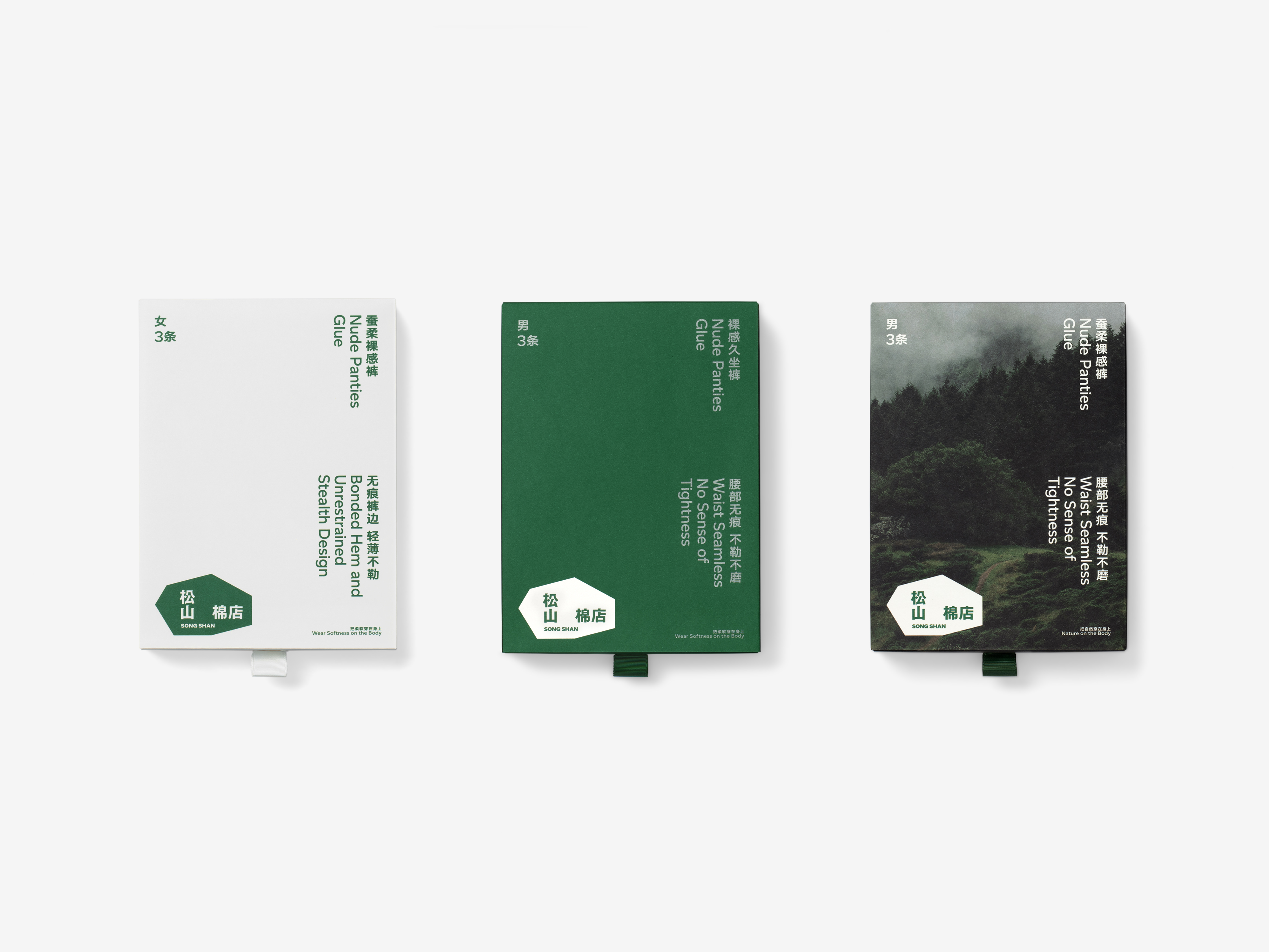
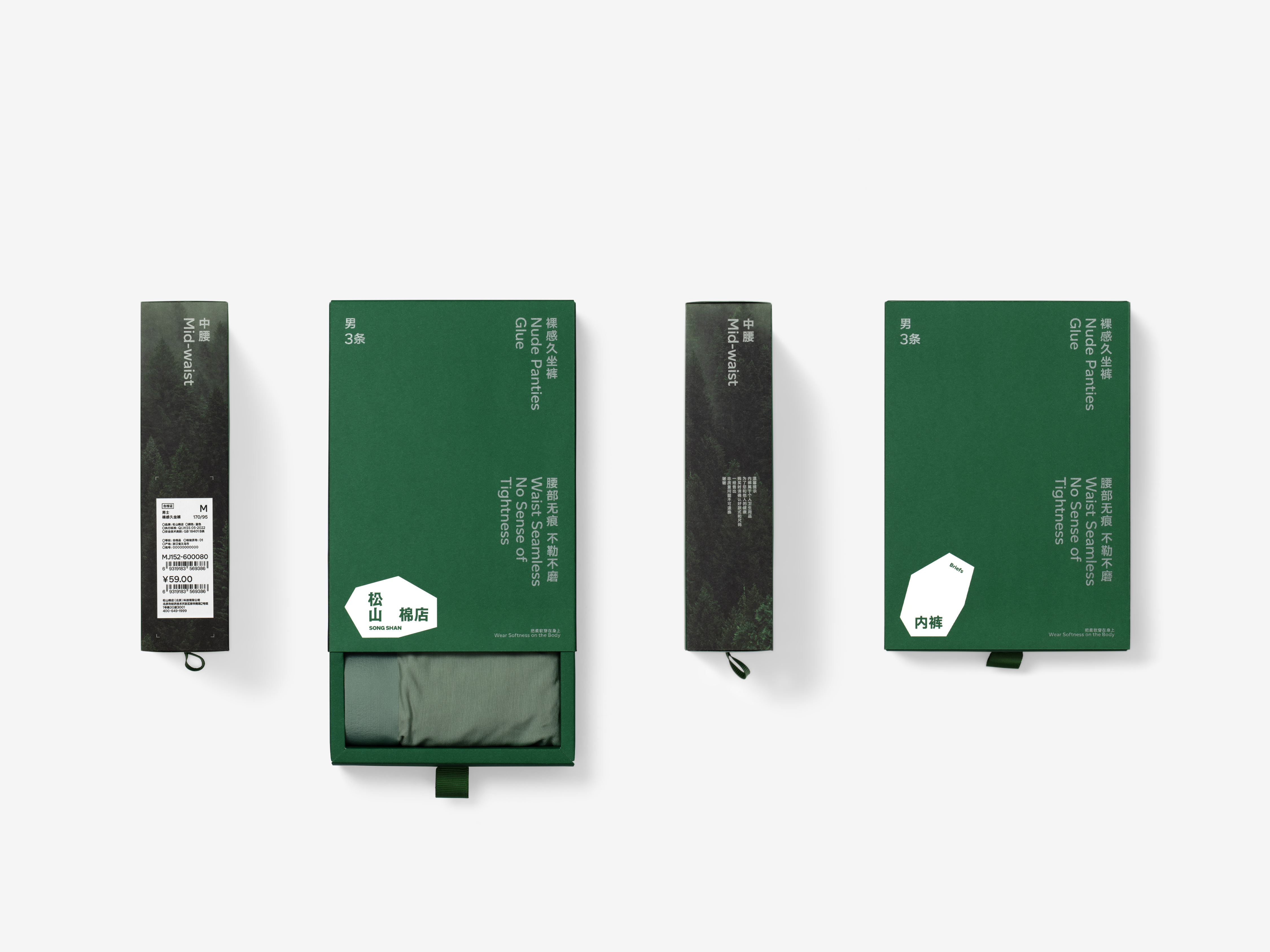
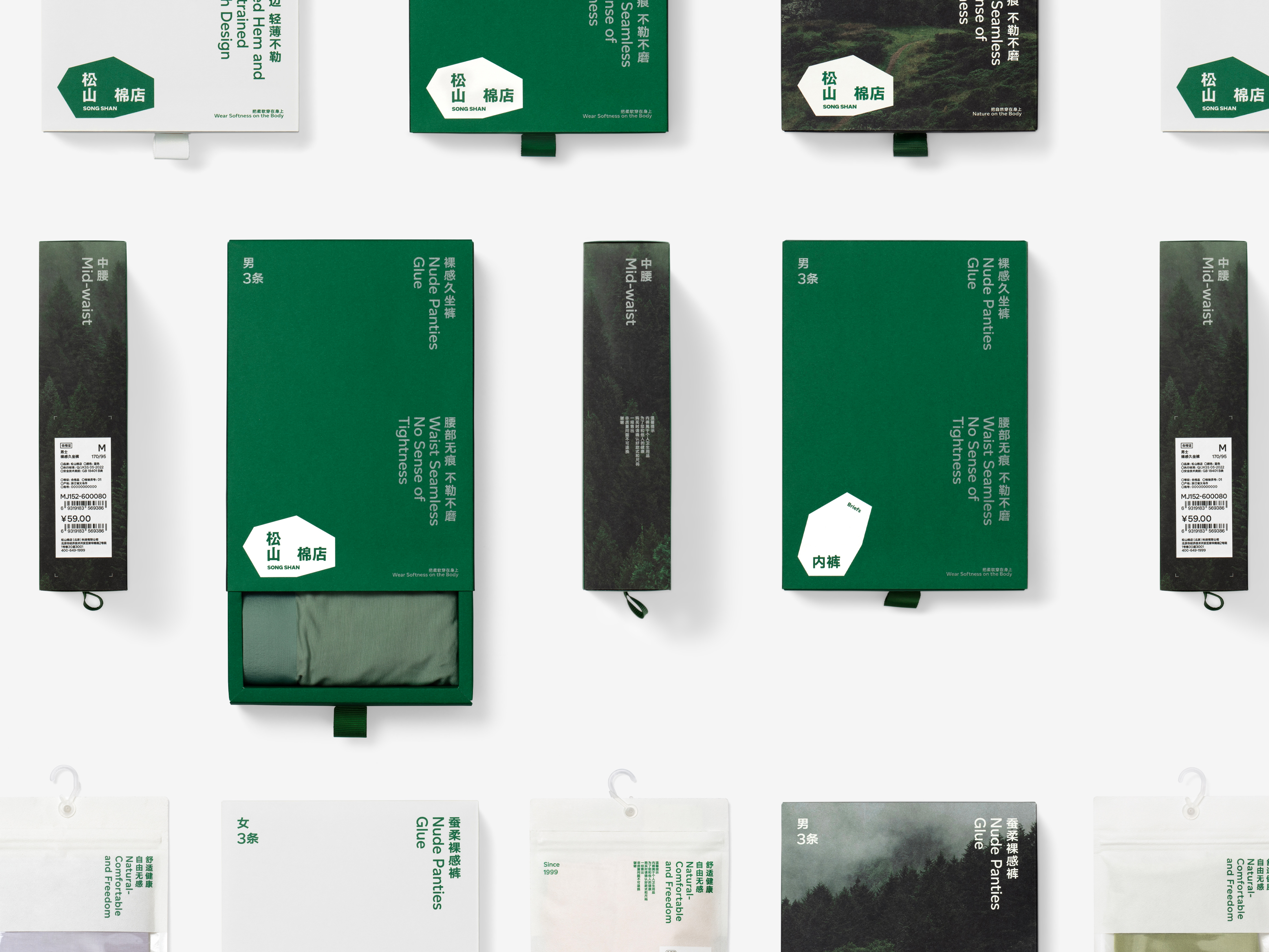
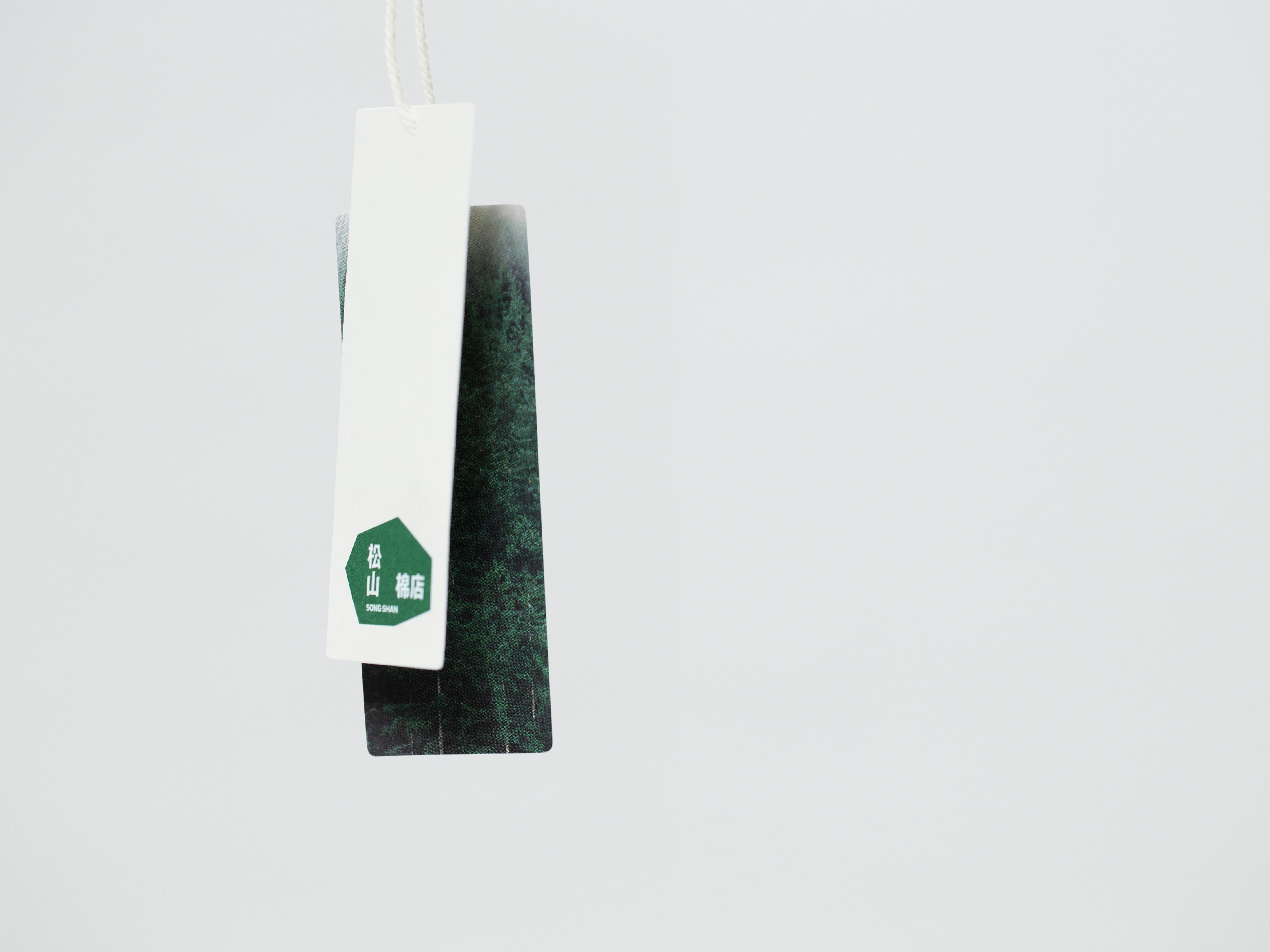
In the design of product packaging, we boldly utilize imagery as the background to create a sense of natural space akin to the mountains and forests of Songshan. When consumers choose products from Songshan Cotton Store, they will instantly feel a sense of detachment, transcending from the bustling city to the lush greenery of the woods. This natural, refreshing, and serene ambiance precisely captures the core value that Songshan Cotton Store aims to convey.
松山棉店,是一个极具东方美学气质的家居服饰品牌。从品牌建立之初,松山棉店就在面料工艺以及产品设计上不断寻找属于东方气质的性格和语言,2022 年与我们合作完成全新的品牌升级后,品牌真正做到由内向外、从形到神的彻底转变,通过全新视觉系统建立起完全属于松山的独特美学风格,我们将这一过程总结为:溯源——回到松山最本源的形态,发现初心,诠释本质。松山棉店,顾名思义,它源于松山。松山,是对自然的敬畏,更是对东方山林文化的探寻,它是宽阔的、高远的、细密的、舒展的。从产品来看,松山一直在倡导绿色、健康、自然的生活方式,无论是棉的选择,还是印染的方式,有机和亲近自然在品牌看来,存在面向高品质生活的发展可能性。于是,我们将自然中的语言带入到松山棉店的品牌形象设计中,通过诠释自然进而解读松山。
松山棉店的标识为一个有机的、不规则的多边形,它神似松的树冠,山间的顽石,不仅有着分明的棱角,更有浑厚的质朴。松山棉店的字体排列方式是非常特殊的,“松山”二字竖排,“棉店”横排,除了增加文字的识别性和阅读的趣味之外,其背后的真正目的是将东方特有的竖排版式结构,在现代手法的演绎下,助推品牌精神的传达。松山棉店的标识,在应用中可以通过旋转和镜像的方式,衍生出多达十余种的形态,以此对应不同的产品门类,在提高图形记忆度的同时,也让消费者充分体会品牌产品的丰富、多元。
在产品包装设计中,我们大胆地使用图像铺底营造山林的空间感,将松山的自然气息以最直接的方式进行呈现。当消费者在选购松山棉店的产品时,会瞬间油然而生一种的抽离感,从喧嚣的都市一步穿越至郁郁葱葱的山林之间。这种自然舒爽、开阔淡定的情绪,也正是松山棉店要想传递的核心价值。







All Images Copyright © 2022 SONG SHAN 松山棉店. All Rights Reserved.