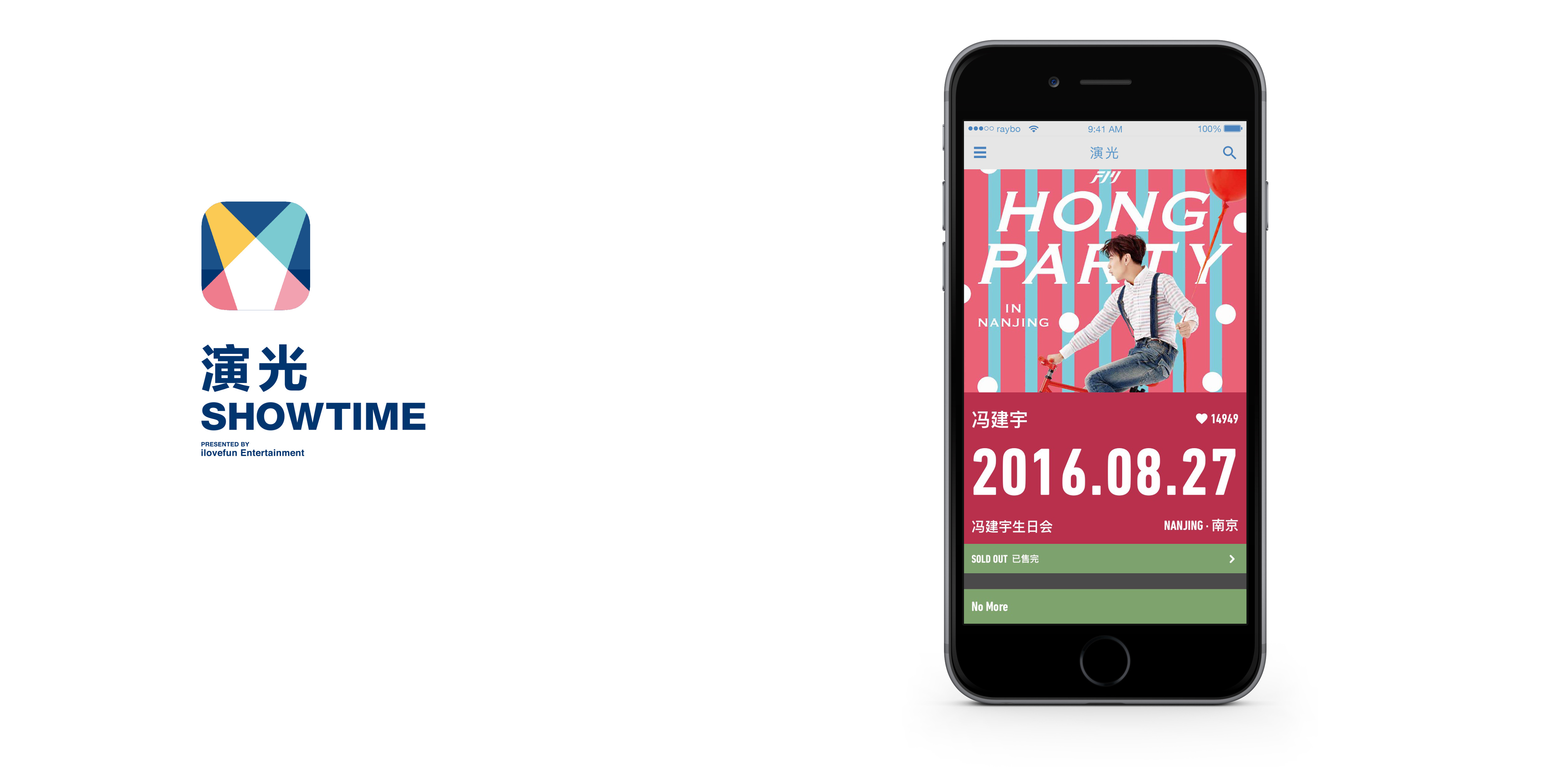
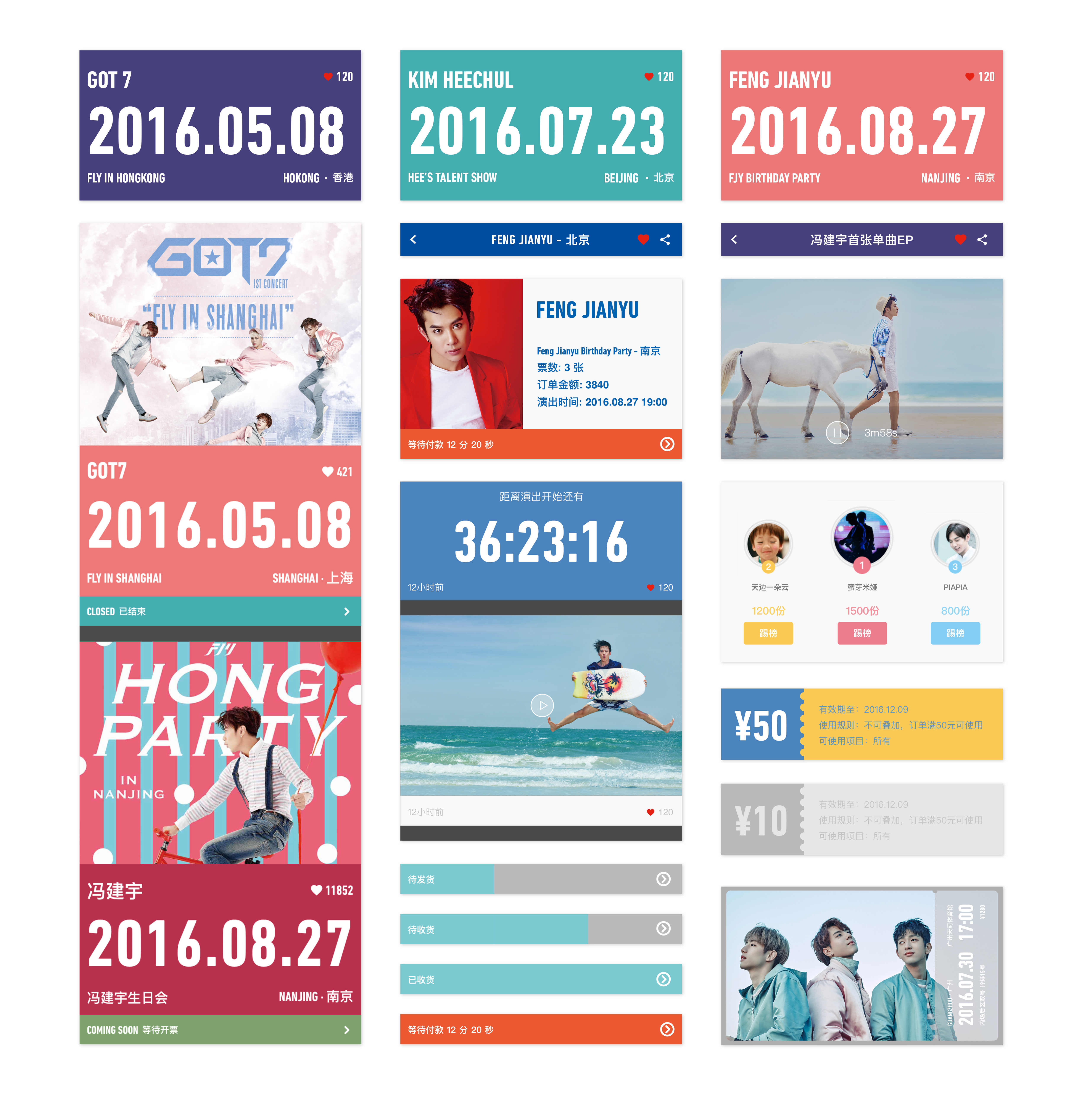
SHOWTIME
ART DIRECTOR: Nod Young / Guang Yu
DESIGNER: Nod Young / Mia
YEAR: 2015
CLIENT: F.I.M Entertainment
What Showtime needs is consolidation and connection of information centering on its entertainment and shows. Clarify the past, and warm up the show. The poster-like interface highlights information,
but at the same time it certainly leaves little room for consumers to take action. However, it happens to
be a help with provision of additional efficiency.
演光,需要的是围绕它的演出,汇总并连接信息,把过往讲清楚,为演出升温。海报似的界面,突出信息的同时,留给消费者操作的余地自然变小,但这恰好就是一种帮助,属于效率的提供。同时,国际主义设计风格的选用是出于功能的需求,因为页面中的信息数量必须是清晰明了和被有效控制的。