拉面说
Ramen Talk
ART DIRECTOR: Guang Yu / Nod Young
DESIGNER: Wen Di
ILLUSTRATOR: Ramen Talk Team
FONT DESIGN: FounderType
YEAR: 2020
CLIENT: 拉面说 Ramen Talk
Over the past few years, Ramen Talk has built up an extremely high brand position in young consumers with its rich, unpretentious and warm image, and its sales and influence have confirmed its brand value.
We were commissioned to upgrade the brand with the aim of enhancing the visual quality.
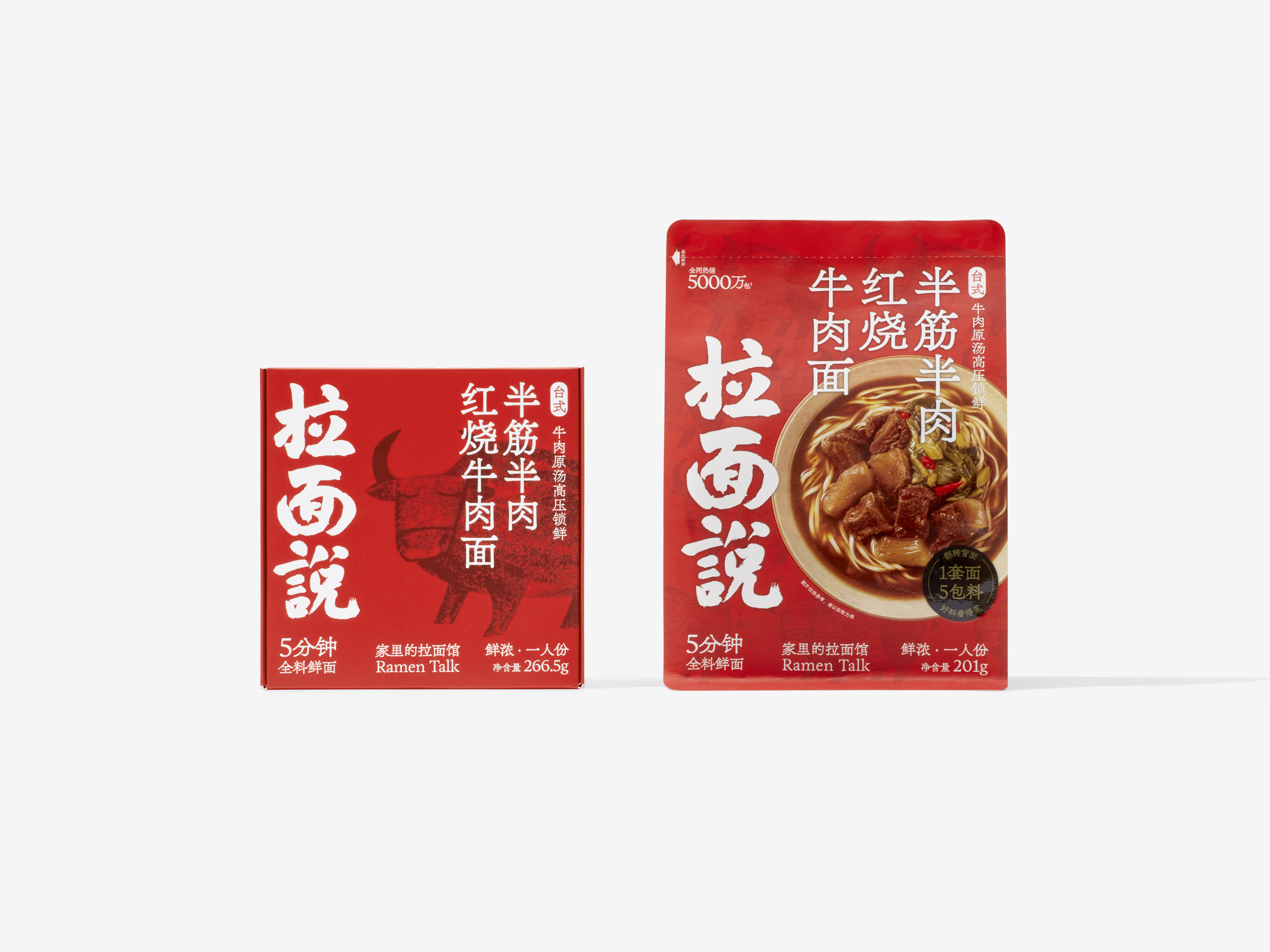
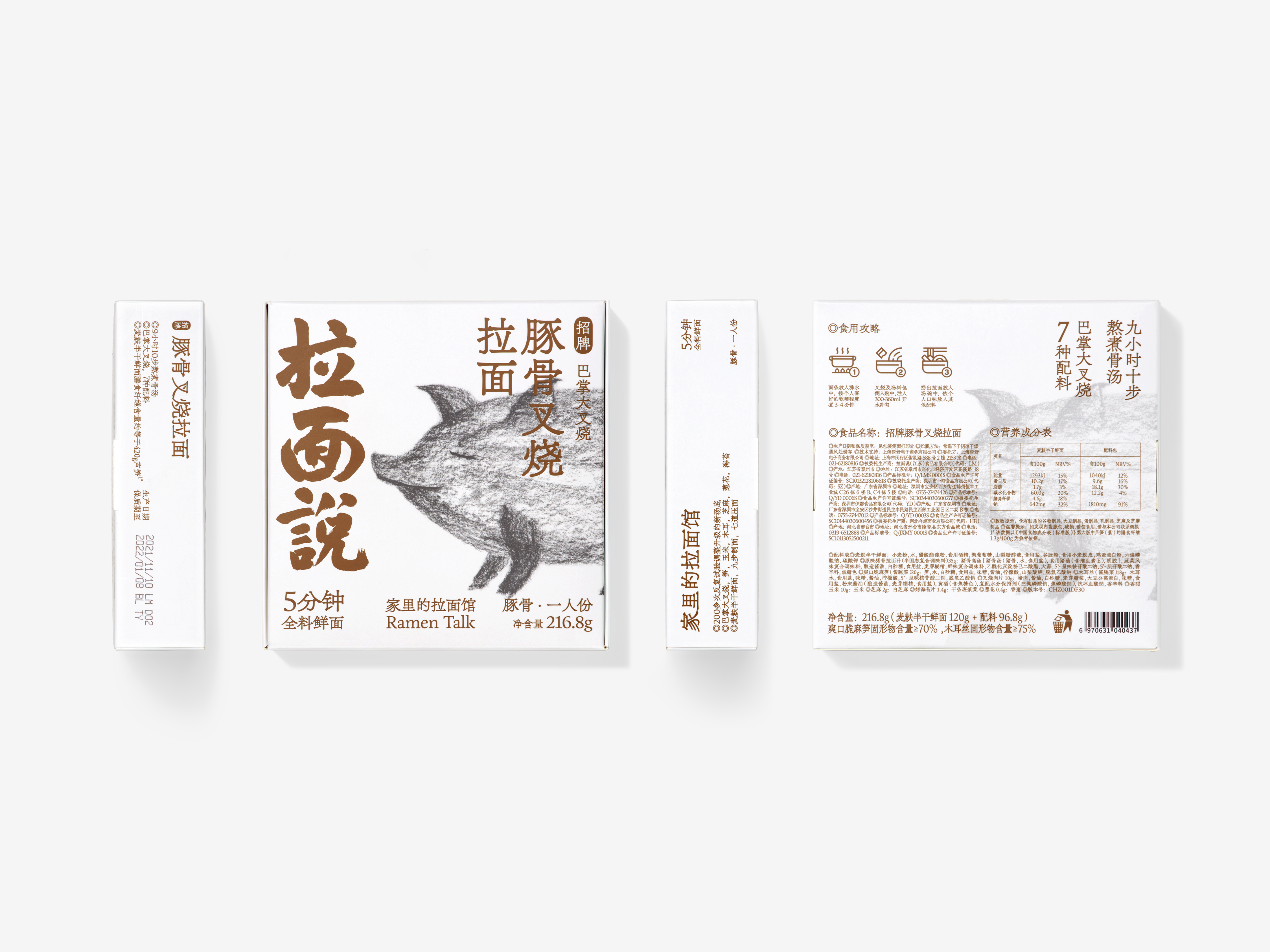
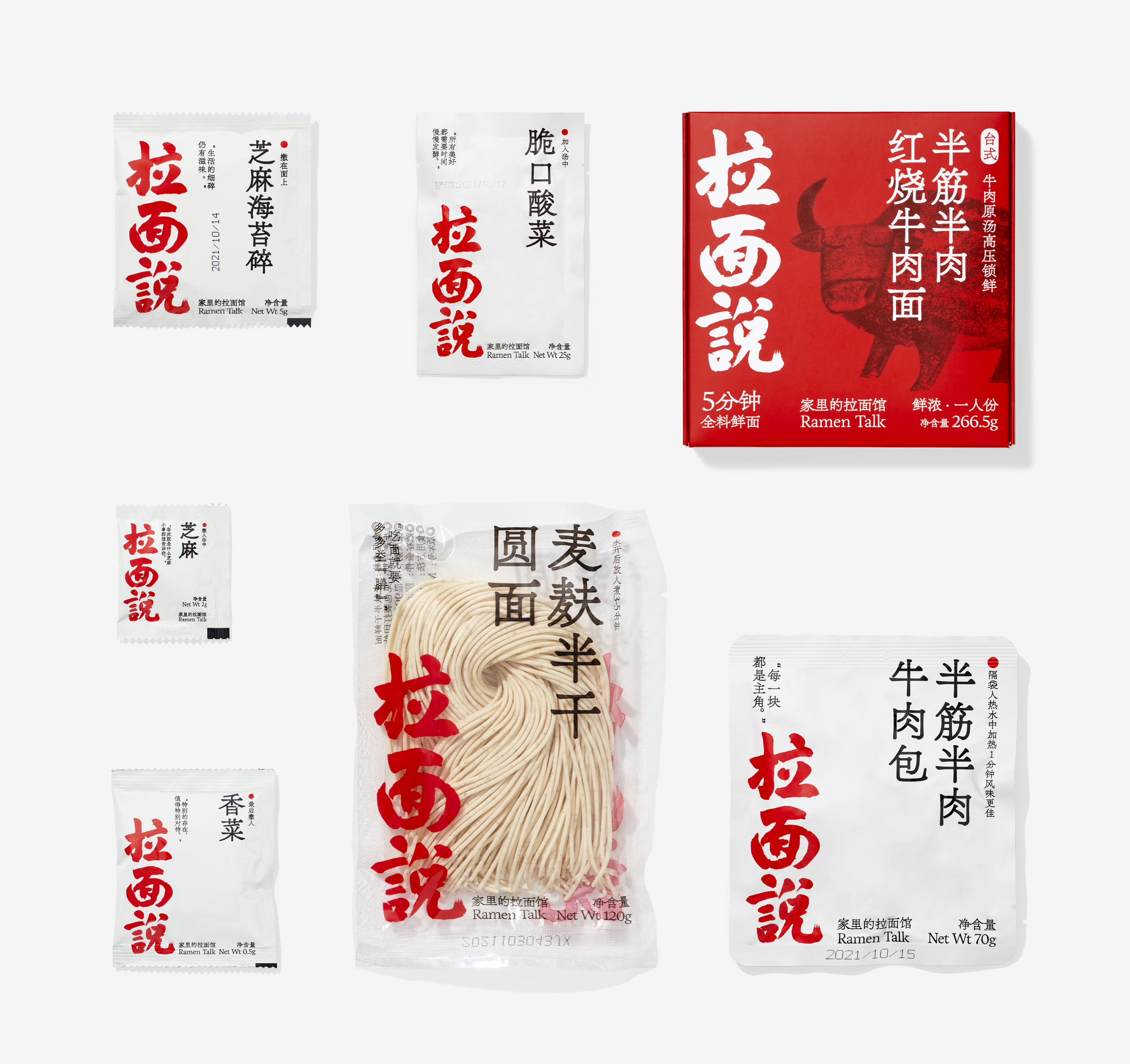
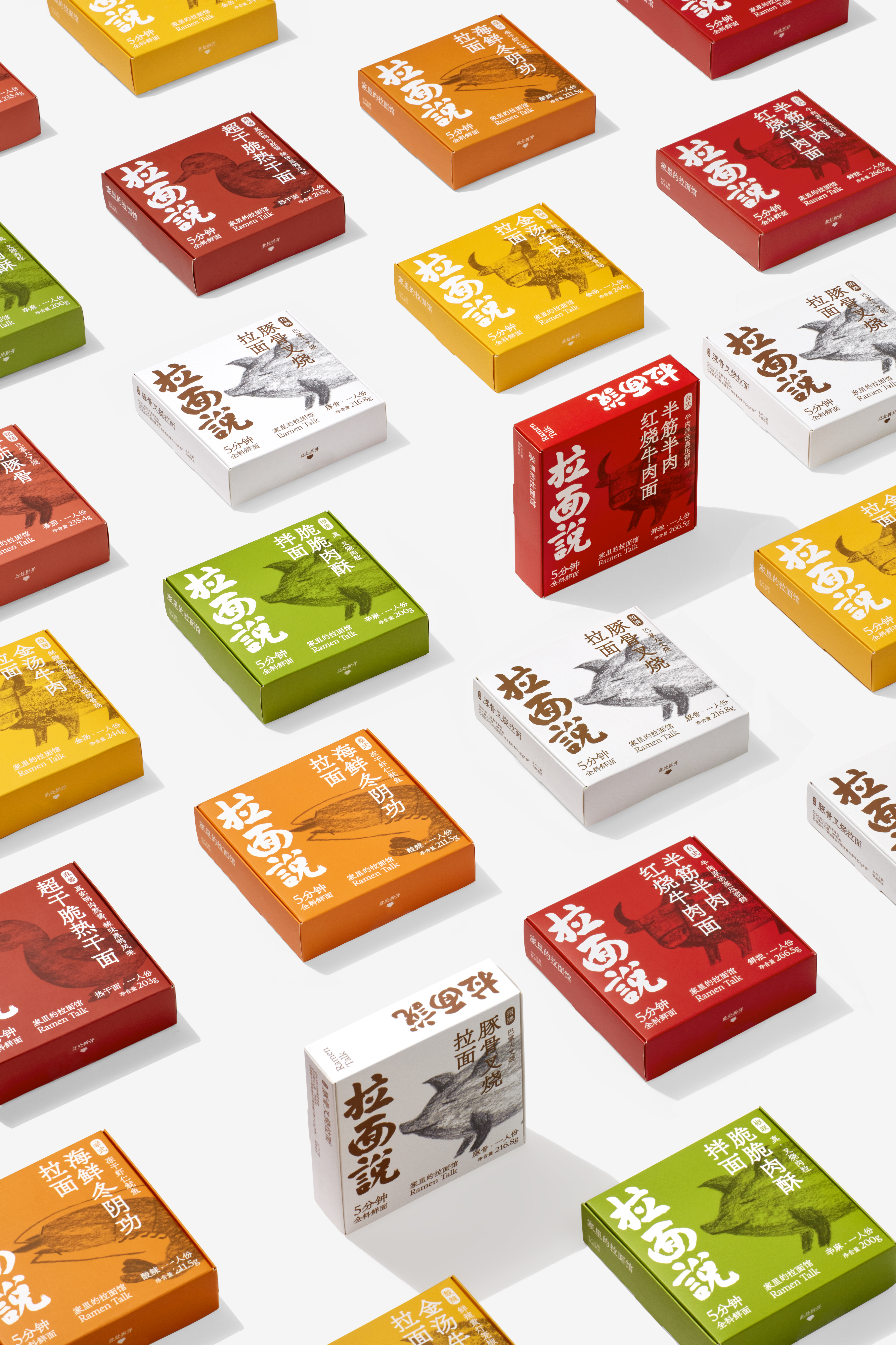
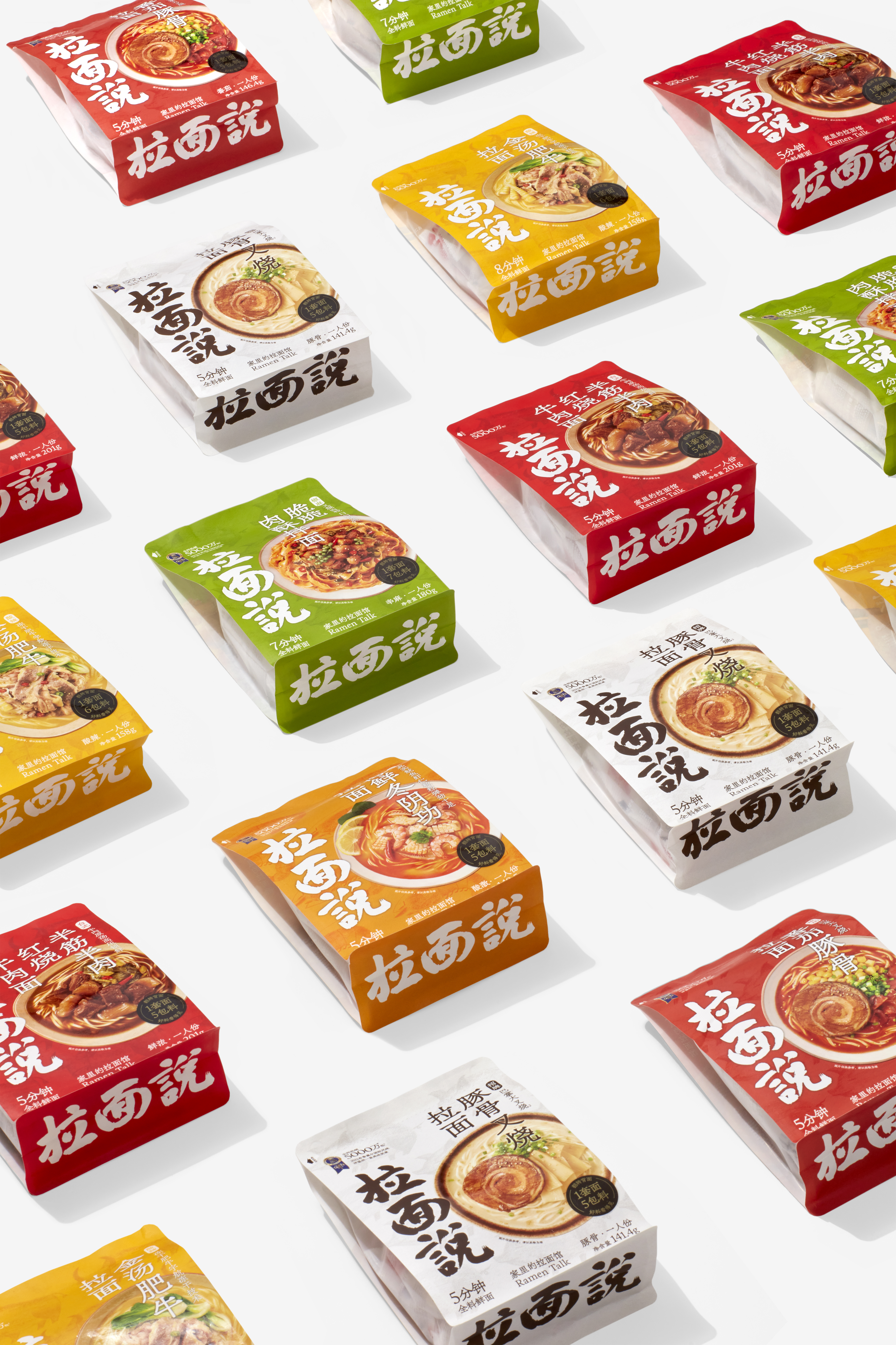
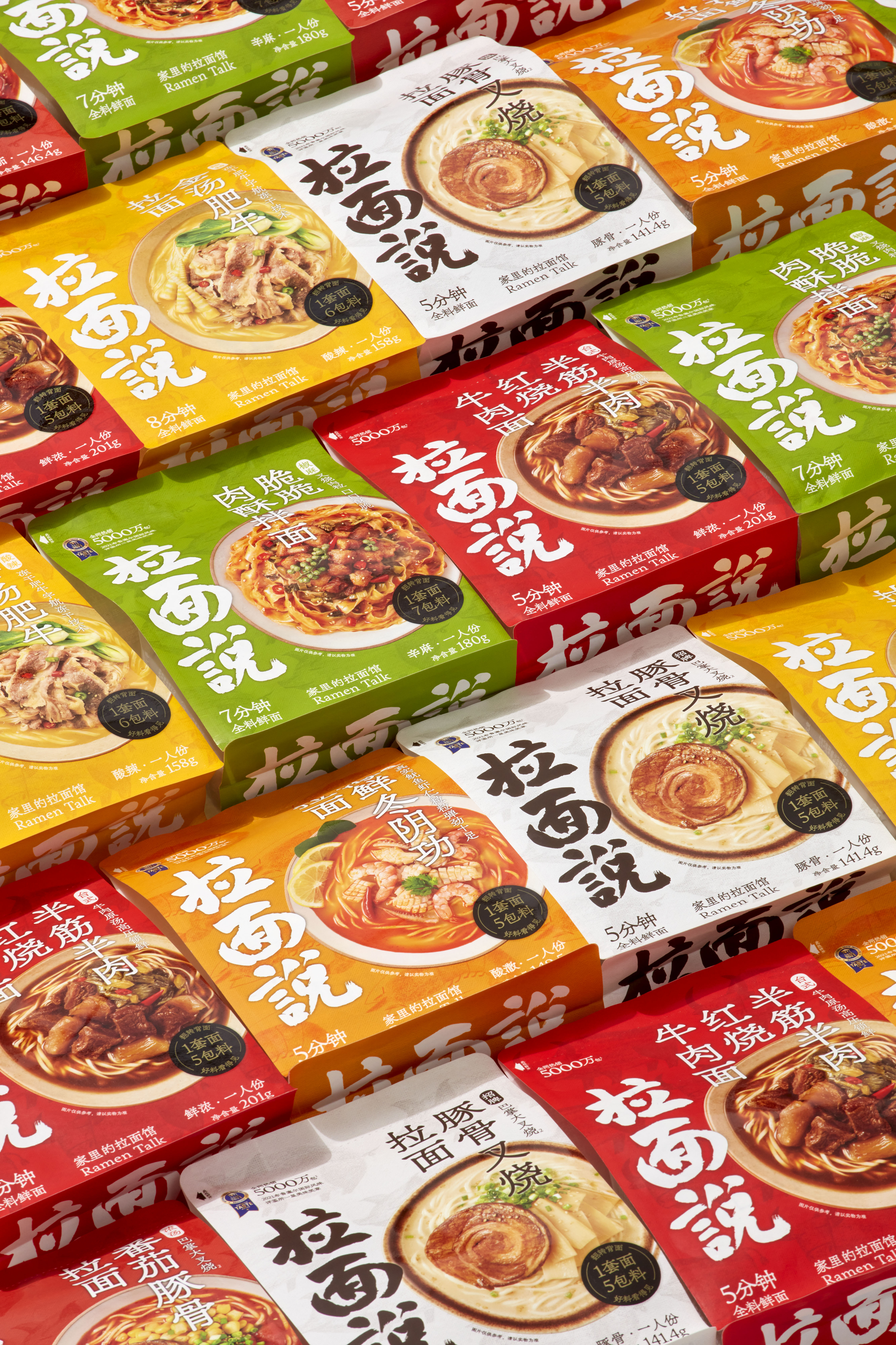
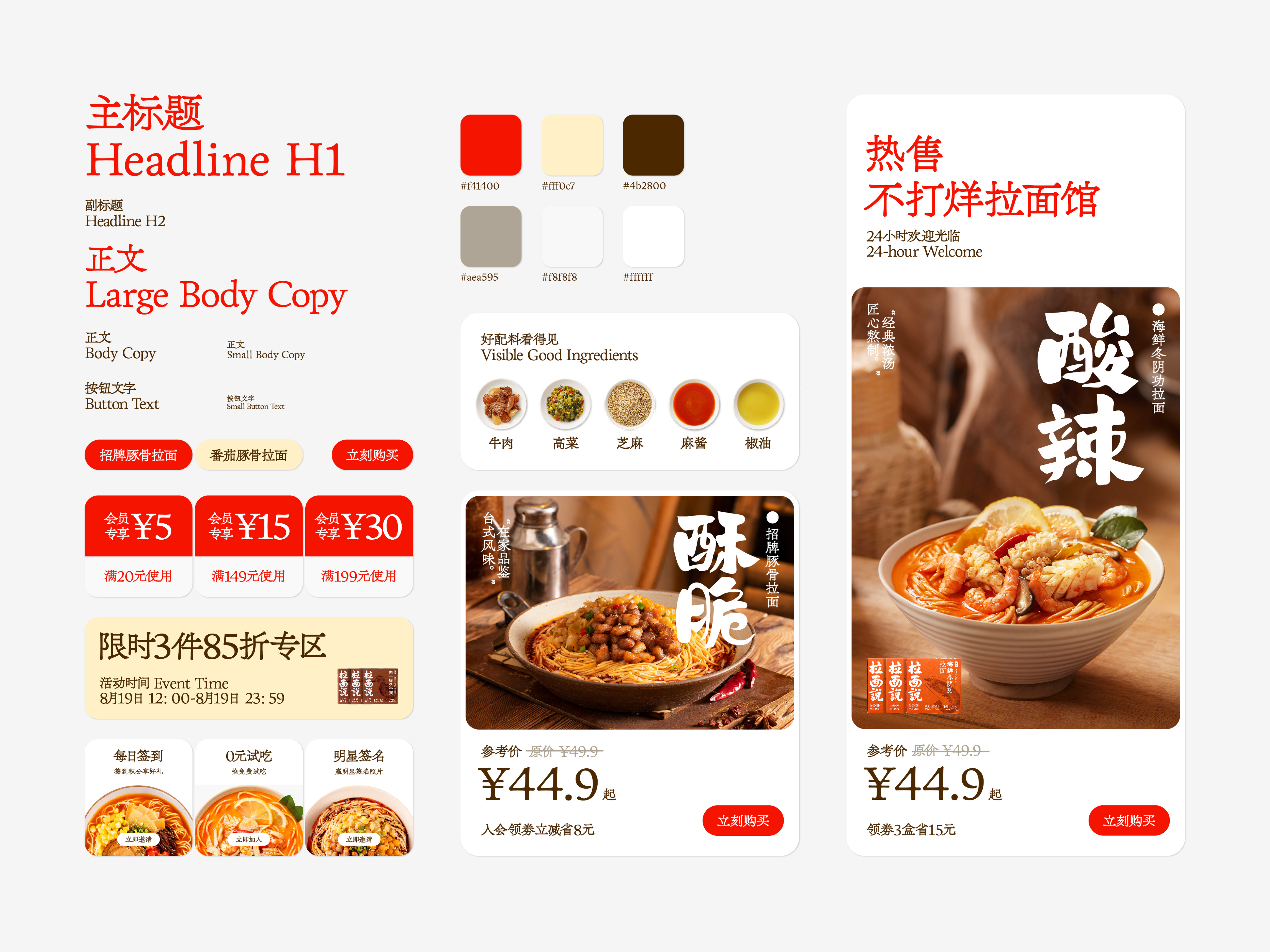
Firstly, we have rewritten the logotype while not affect the user's recognition as much as possible, and the new logo is more proportional and fuller, with more perfect details; secondly, we have re-designed the layout of the packaging and the e-commerce page, with uniform tone and precise detail in page content; at the same time, we have also developed a bag packaging that is more suitable for the offline sales environment, which not only inherits the design language of Ramen Talk's classic square box packaging, but also presents the temptation of noodles and meat.
Firstly, we have rewritten the logotype while not affect the user's recognition as much as possible, and the new logo is more proportional and fuller, with more perfect details; secondly, we have re-designed the layout of the packaging and the e-commerce page, with uniform tone and precise detail in page content; at the same time, we have also developed a bag packaging that is more suitable for the offline sales environment, which not only inherits the design language of Ramen Talk's classic square box packaging, but also presents the temptation of noodles and meat.
在过去几年时间里,拉面说以浓郁的、朴实的、温暖的形象,在年轻消费者心中建立起极高的品牌位置,它的销量和影响力也印证着自己的品牌价值。这次,我们为拉面说重新梳理了视觉系统,并以提高视觉品质为目的进行品牌升级。
首先,我们在尽量不影响用户识别的基础上,重新书写了标识字体,新标识更加匀称丰满,细节更趋近完美。其次,我们重新规划了产品包装及电商页面的版式规则,在内容呈现上更强调格调和气质的统一,细节表现上有更为精致的表达;同时还开发了更适合线下销售环境的袋状包装,不仅继承了拉面说经典方盒包装的设计语言,还呈现出面与肉的真实诱惑。
首先,我们在尽量不影响用户识别的基础上,重新书写了标识字体,新标识更加匀称丰满,细节更趋近完美。其次,我们重新规划了产品包装及电商页面的版式规则,在内容呈现上更强调格调和气质的统一,细节表现上有更为精致的表达;同时还开发了更适合线下销售环境的袋状包装,不仅继承了拉面说经典方盒包装的设计语言,还呈现出面与肉的真实诱惑。


