REVER
ART DIRECTOR: Guang Yu / Nod Young
DESIGNER: Liao Liao / Han Lu
YEAR: 2021
CLIENT: REVER
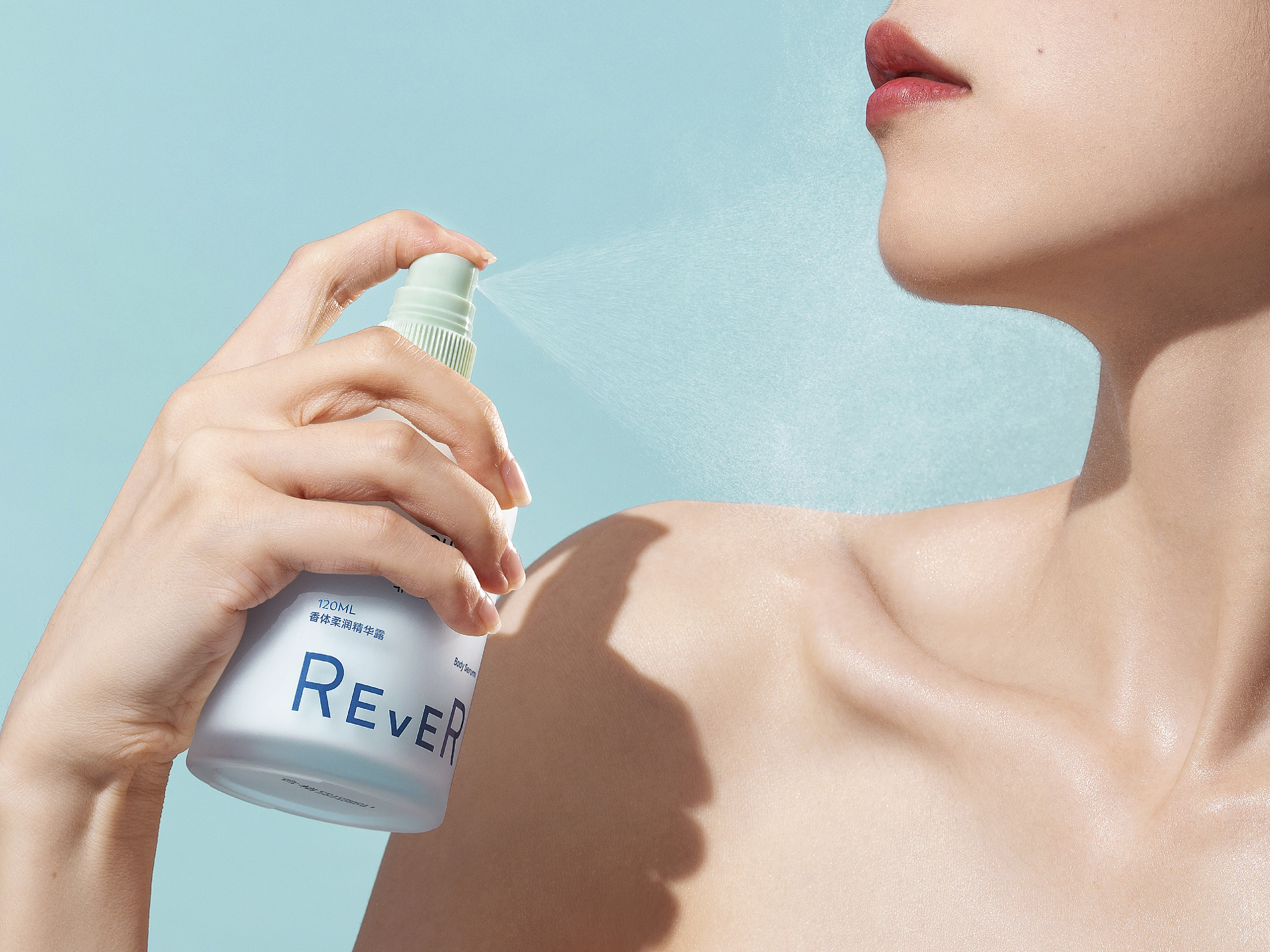
Rever, founded in 2016, is a leader in bathroom culture. Rever’s products can be seen everywhere in the bathroom, from fragrances to skin care, face to feet care, and bath oil to bath balls. Rever brings us a new brand derivative from this brand image design, that is, music.
The design comes from the question how to understand the bathroom culture. A scented bathroom is completely different from a bathroom without any scent; a bathroom with bubbles is also quite different from the one without bubbles; similarly, a bathroom in the music is entirely different from the one with no music. As far as we can see, bathroom is a very important place in life where we can enjoy a complete set of experience from body care to mood care. As a result, how to bring consumers a feeling of pleasure by a bottle of essential oil and make the bathroom full of joy in music has been the core demand of Rever for rebranding.
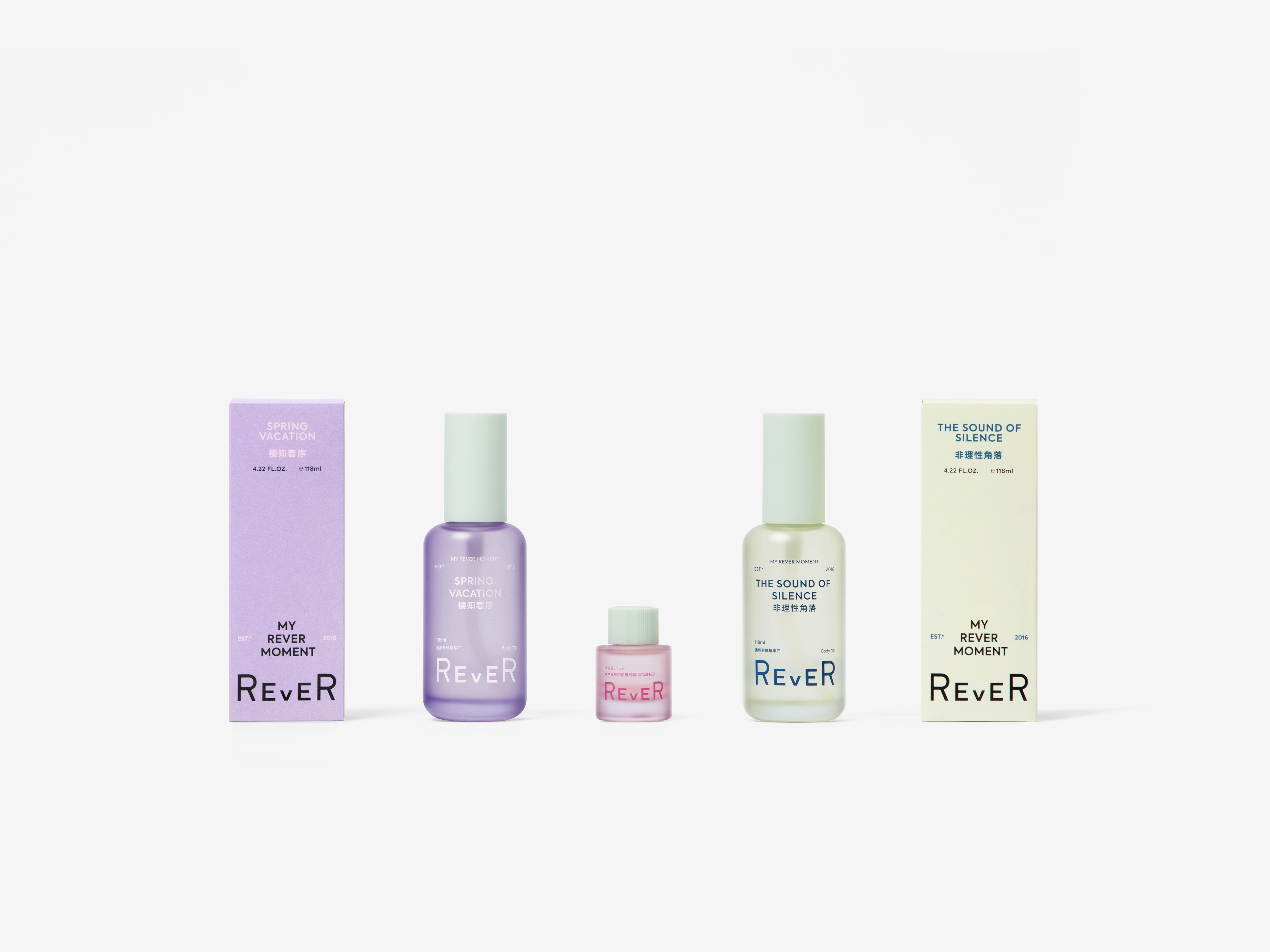
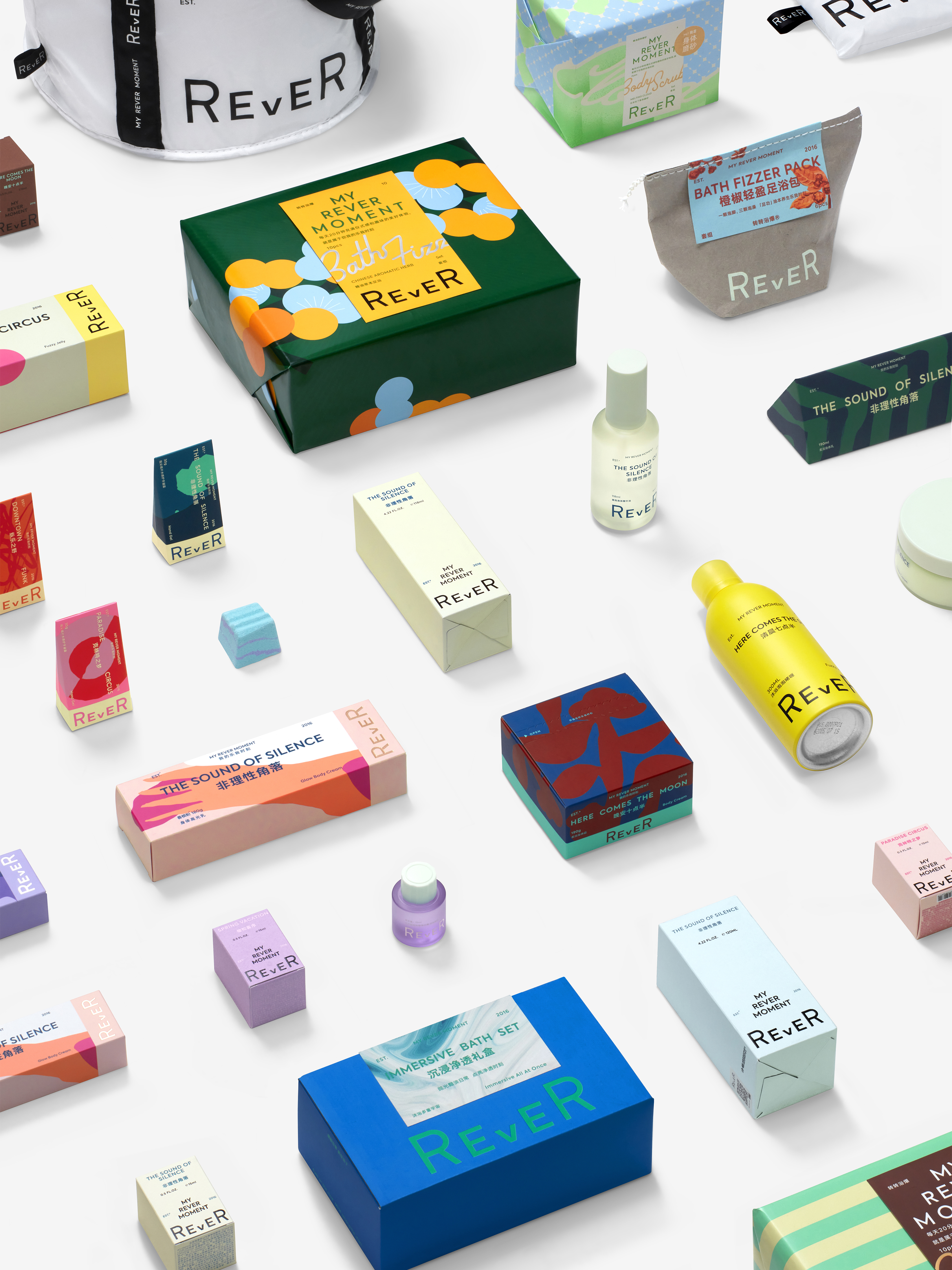
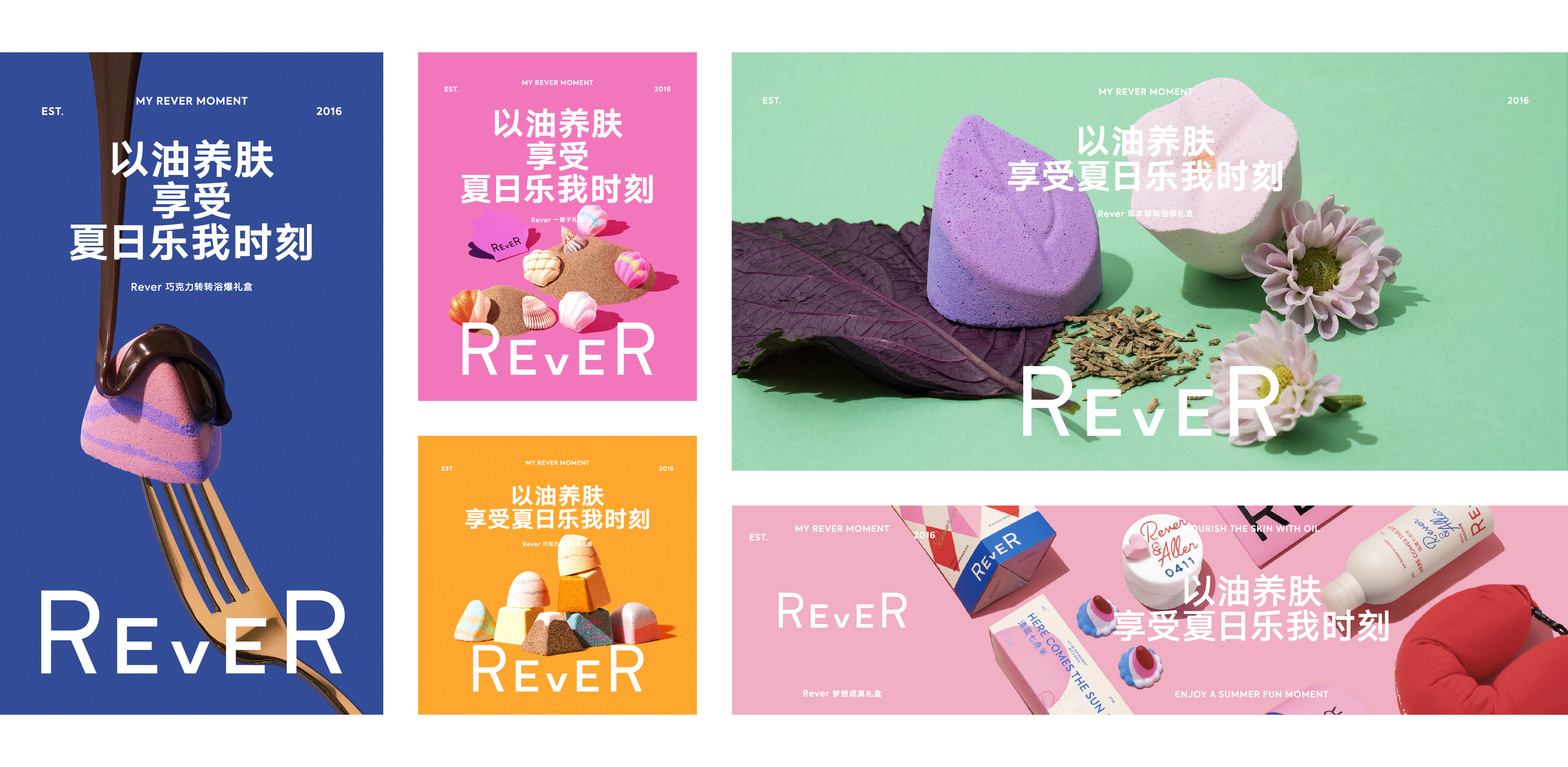
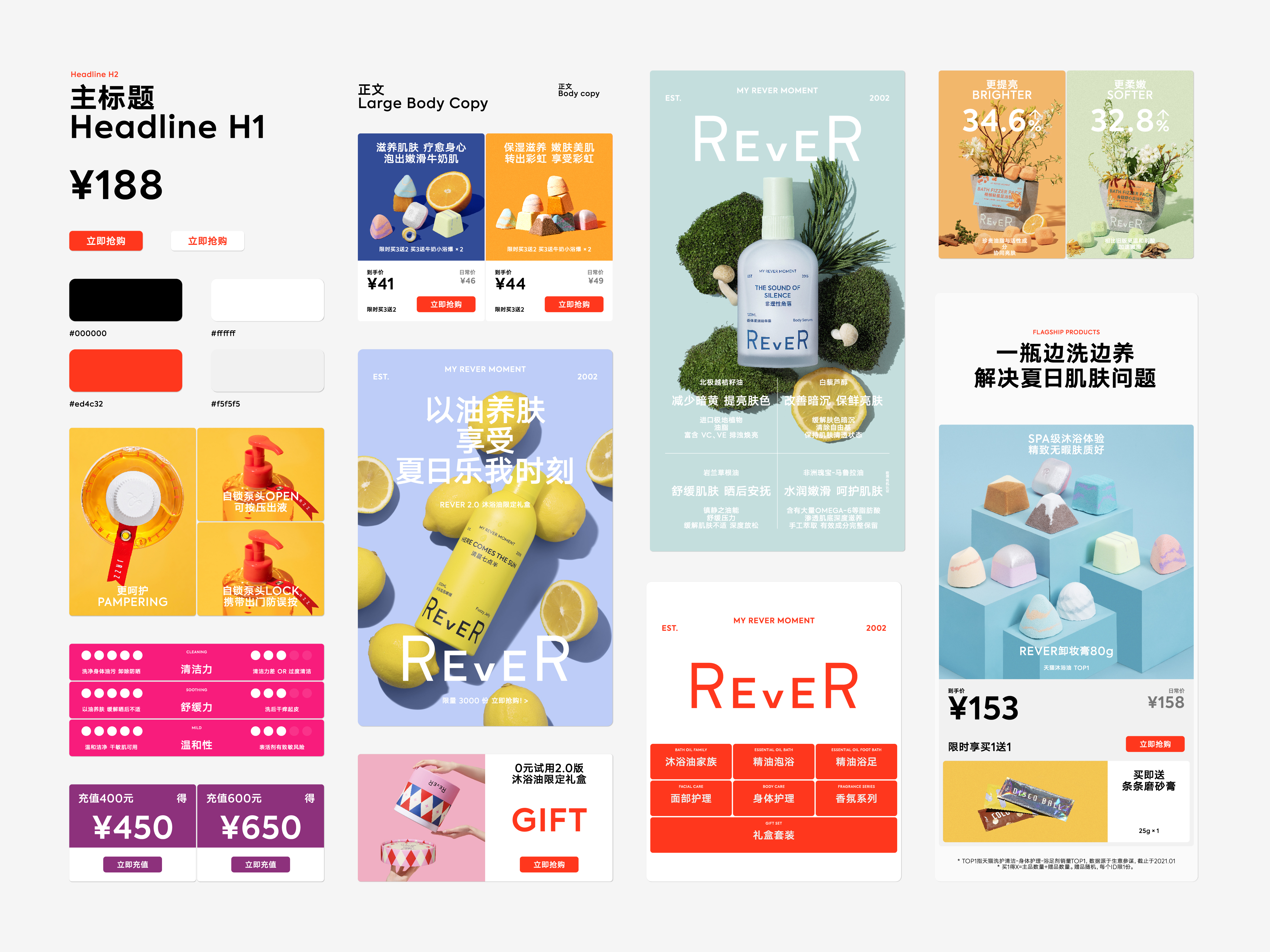
Rever aims to stimulate the brand vitality beyond the visual effect. Rever’s rebranding is implemented from outside to inside, the logo to the color matrix, the packaging design to the product pages, and the product naming to the communication context. Just as Rever’s official statement, we have taken on an entirely new look. The overall changes in visual effect bring more possibilities and vitality to Rever. Rever’s logo comes from the rhythm of music, because the bouncing letters can easily evoke people’s rhythmic associations. In the meantime, the symmetrical structure presents a sense of more refined and stable quality. In the design of the font, we adopted boldface that is more compatible for the purpose of connecting with more product lines with different styles in different price ranges, such as jazz, pop, electronic music and rock.
The new design of Rever shows tremendous changes, which completely gets rid of the previous restrictions of vintage and fresh styles and enters a bigger world. It has opened up a new vision in the presentation of professional quality and the delivery of product disposition. It makes products not limited to the boring functional explanation and brings a distinctive character to the brand. More importantly, the new Rever allows consumers to see the happy factors in the bathroom, as if they can hear music from the products. Such a sense of silent music comes from the successfully established bathroom culture.
成立于 2016 年的 REVER 是浴室文化的引领者,从香氛到护理,从面部到足部,从沐浴油到泡澡球,REVER 的产品遍布浴室的每一个角落。而这次的品牌形象设计,REVER 又带来了一份新的品牌衍生品:音乐。
设计的源头是:如何理解浴室文化?一个有香味的浴室与没有味道的浴室是完全不同的;一个有泡泡的浴室与没有泡泡的浴室是完全不同的;同样,一个有音乐的浴室与没有音乐的浴室是完全不同的。在我们看来,浴室是生活中非常重要的场景,而完成从身体到心情的护理才是完整的浴室体验。因此,如何让一瓶精油带给消费者愉悦的感觉,如何让浴室里充满音乐般的快乐,就是 REVER 需要完成的品牌升级的核心诉求。
彻底激发品牌的活力,远不止视觉。REVER 的品牌升级,是由外及内的,从品牌标识到色彩矩阵,从包装设计到单品页面,从产品命名到沟通语境,正如 REVER 官方所说的一样:这次,我们整很大。我们以整体视觉的改变为 REVER 带来更加广阔的可能,并注入了活力。REVER 的标识概念源于音乐的律动,弹跳的文字很容易让人产生节奏的联想,同时对称的结构呈现出更加精炼稳定的品质感。在字型的设计上,我们使用了兼容性更强的黑体,目的是在未来可以衔接更多风格不同和价位段不同的产品线,可以爵士,可以流行,也可以电子和摇滚。
新 REVER 的变化是巨大的,它彻底摆脱了原有复古清新的限制,步入一个更大的天地,在专业素质的呈现上,以及在产品性情的传递上,开启了全新的视野。让产品不再受限于枯燥的功能性讲解,让品牌性格变得更加鲜明,更重要的是:新 REVER 让消费者看到浴室中的快乐因子,仿佛听到音乐从产品中传来,而这种无声的音乐感正来自于浴室文化的成功建立。







All Images & Video Copyright © 2021 REVER. All Rights Reserved.