N12 #5
ART DIRECTOR: Guang Yu
DESIGNER: Xu Lei / Guang Yu
YEAR: 2015
CLIENT: N12
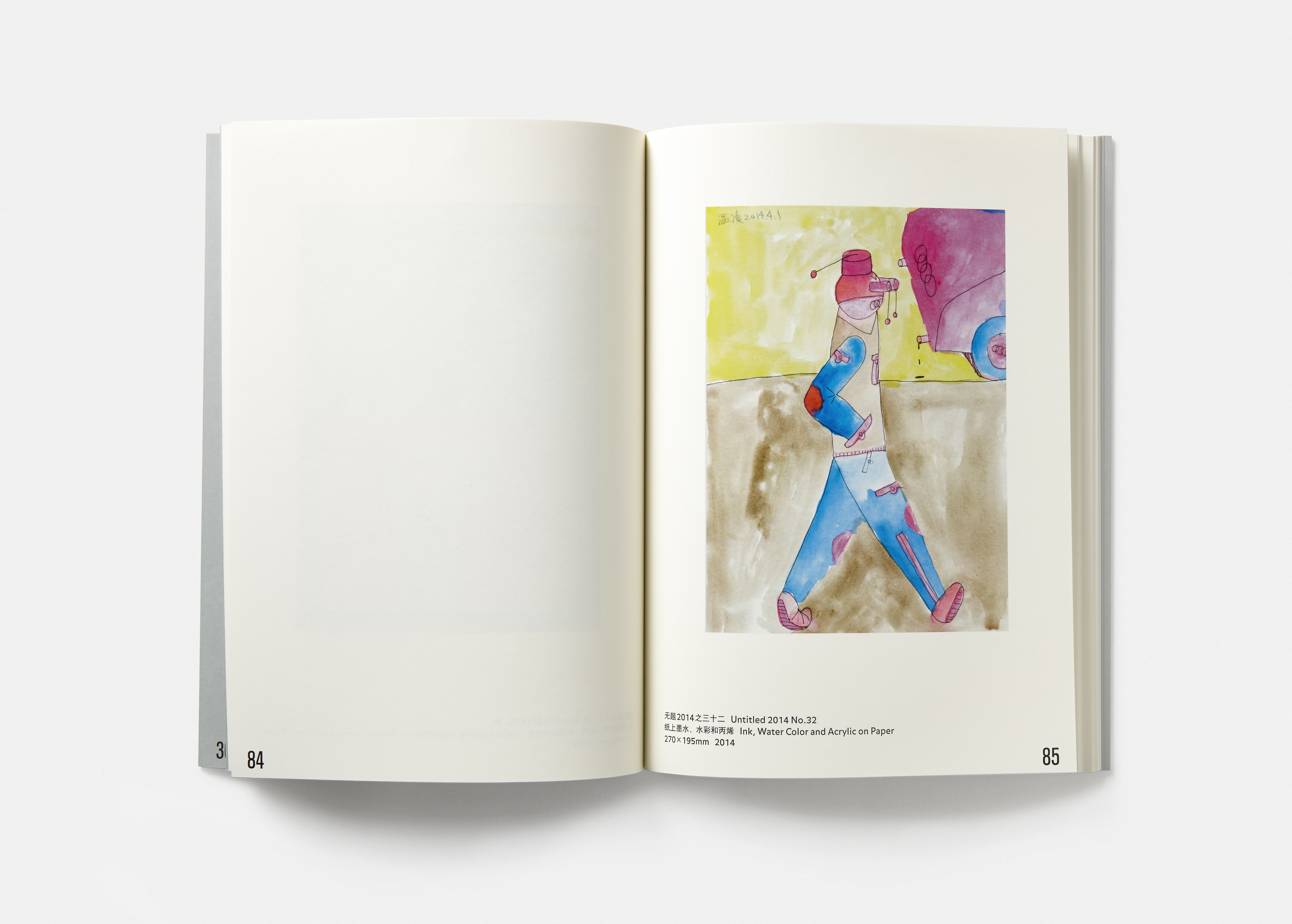
Except for a neat arrangement for the artists and their works, N12 is deliberately designed in an
orderly chaos, looking purposefully wrong, messy and ugly.
The rules for fonts and layout, including punctuation, isolated words, page numbers, have been intentionally abandoned in this book, and basic principles and common understanding of design are purposefully ignored. There are two versions of the cover. Some read Chinese version first, others may start from the English.
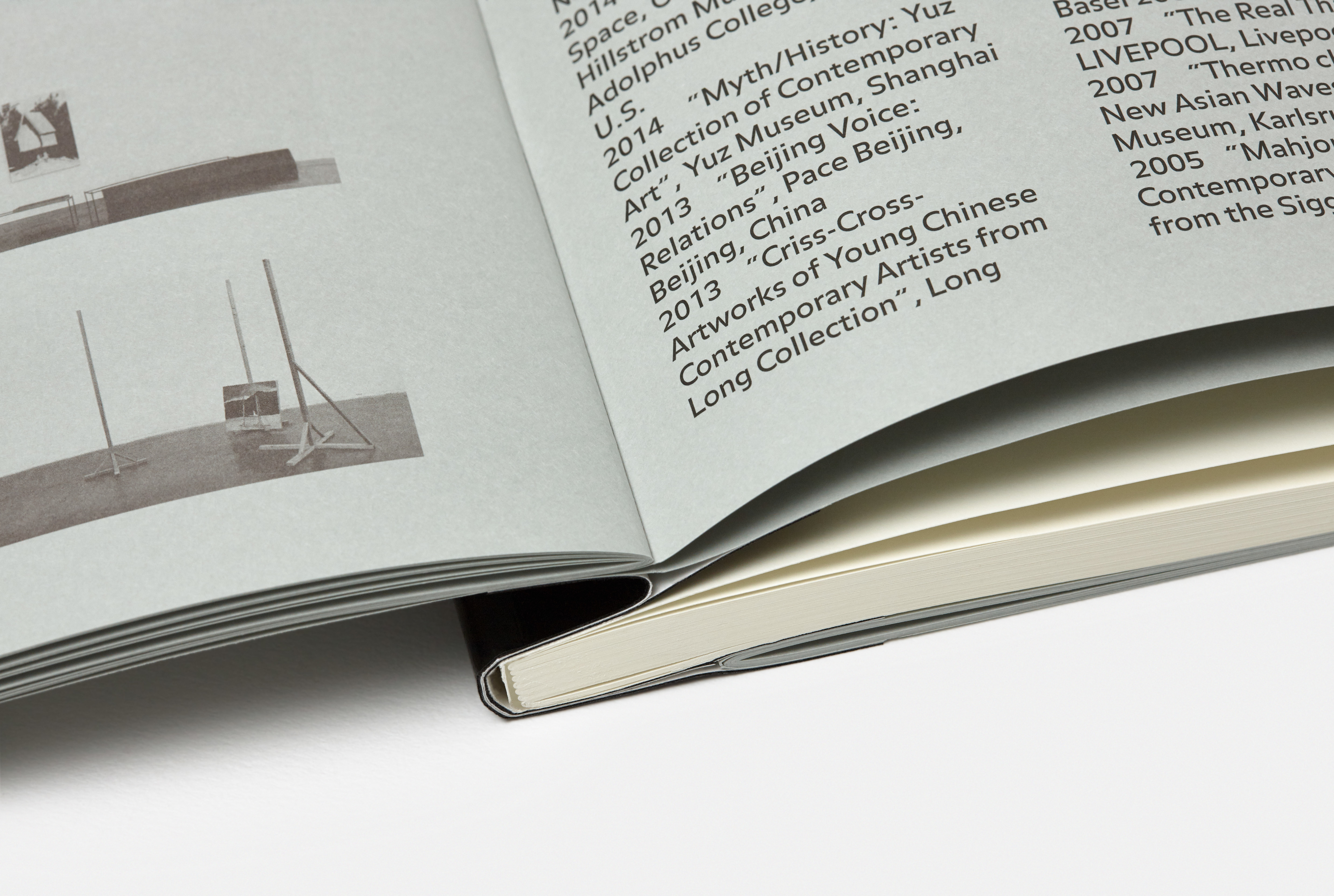
These “vulgar and mediocre” expressions, however, cannot match the black tape on the spine. Mostly commonly used in a construction site, the black tape serves as certain manifesto.
除去艺术家与作品的整齐出场,N12画册的设计就是有序的放纵、多错、乱、陋。
字体和排版的规则在这本书里都被有意识的放逐了:断句、孤字、页码等,类似的设计基本常识全部被刻意忽视;封面还做出来了两个版本:有的人看到的是中文在前,有的人看到的是英文在前。
当然,所有这些关于“平庸和粗糙”的表达,都不及书脊处包装使用的那截儿在施工队里常见的黑胶带,这应该是某种宣言。
字体和排版的规则在这本书里都被有意识的放逐了:断句、孤字、页码等,类似的设计基本常识全部被刻意忽视;封面还做出来了两个版本:有的人看到的是中文在前,有的人看到的是英文在前。
当然,所有这些关于“平庸和粗糙”的表达,都不及书脊处包装使用的那截儿在施工队里常见的黑胶带,这应该是某种宣言。


