MITATA
ART DIRECTOR: Guang Yu / Nod Young
DESIGNER: Liao Liao
YEAR: 2021
CLIENT: MITATA
The brand of MITATA is defined as an eye contact artist. MITATA, as a company of cosmetic contact lenses, has its unique understanding of product aesthetics that falls between individual needs and social needs. That is to say, cosmetic contact lenses play a role of social communication (eye contact) while pleasing people themselves. It requires MITATA’s brand design to meet personalized and diversified demands and conform to its high recognition and stylized features in social needs. We translated the social needs as follows: With an exclusive and sharp design language style, MITATA can function as an unforgettable “artist of eye contact” in the communication process.
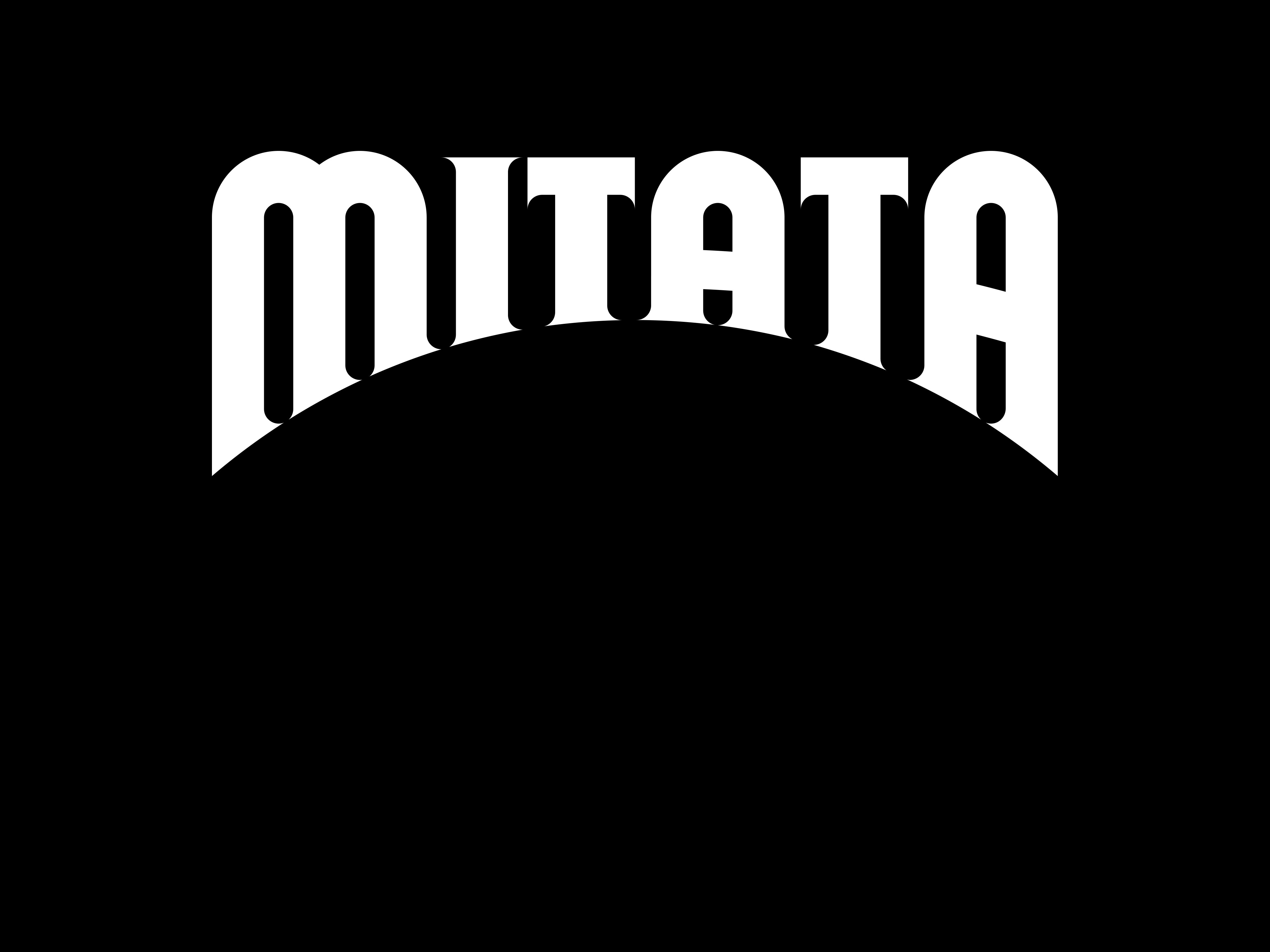
The eyes with cosmetic contact lenses will instantly become twinkling and attractive magically. We looked for the foothold of design language from the perspective of “magic eyes”, created the mystery and charm of magic with the unique font form, and boldly set the bottom of the logo as a very dominant circular arch shape. The wordmark of MITATA was designed in the combination of modern geometric modeling and classical serif, and the characteristics of classical serif make the logo more mystery. At the same time, the geometric modeling also avoids the old-fashioned style that a completely classical shape brings, which allows the relationship between modern and classical styles to be perfectly balanced.
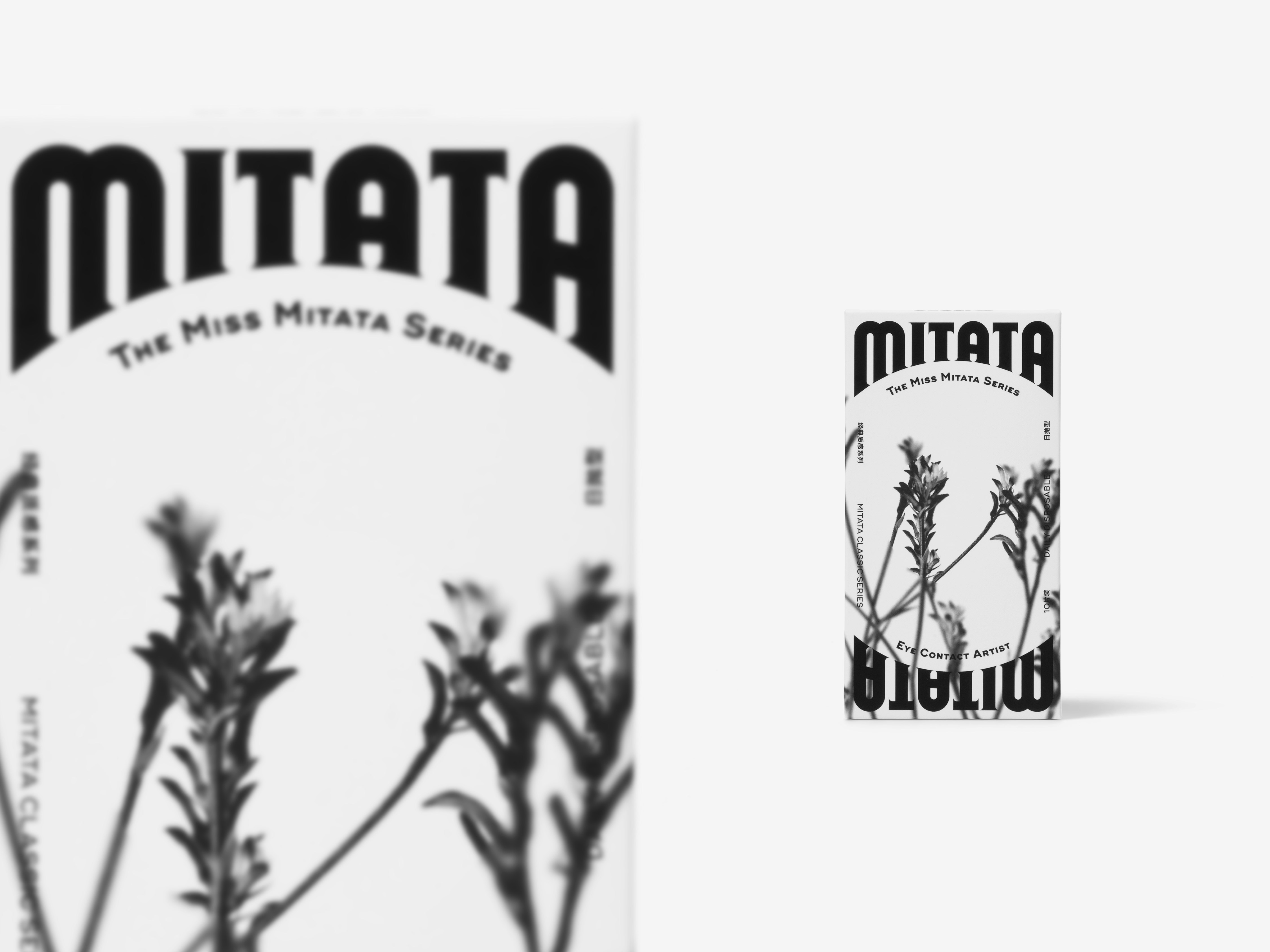
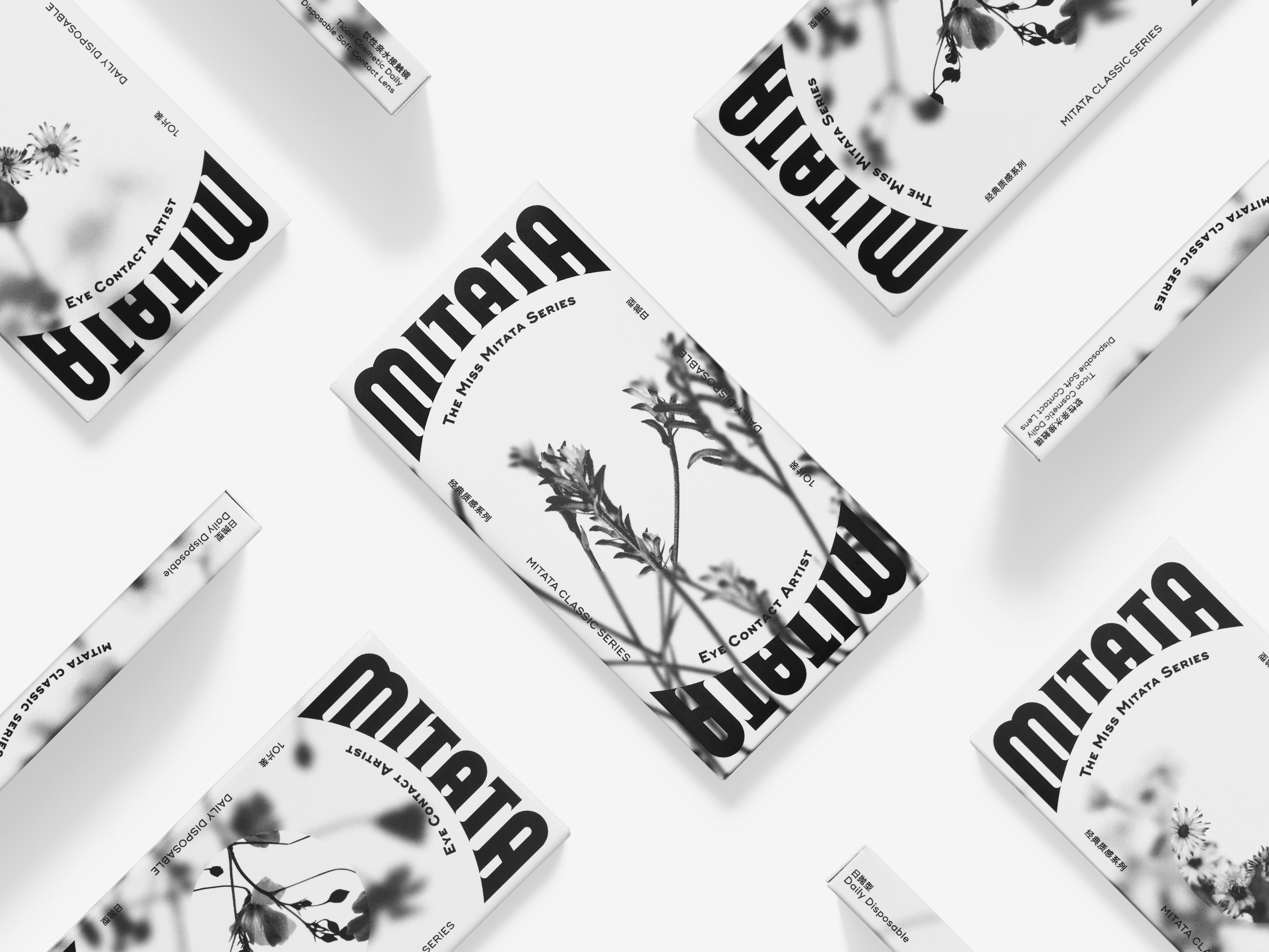
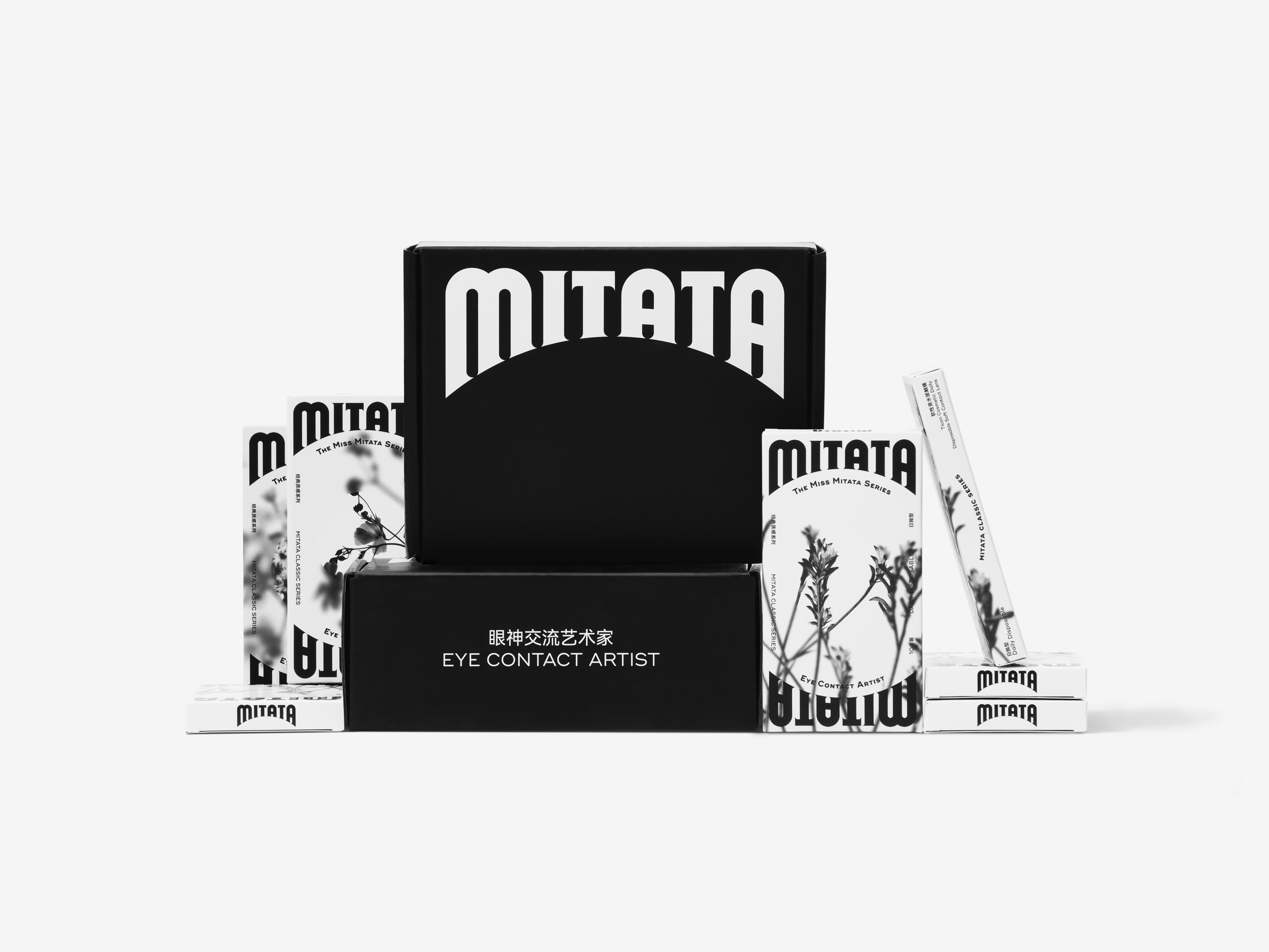
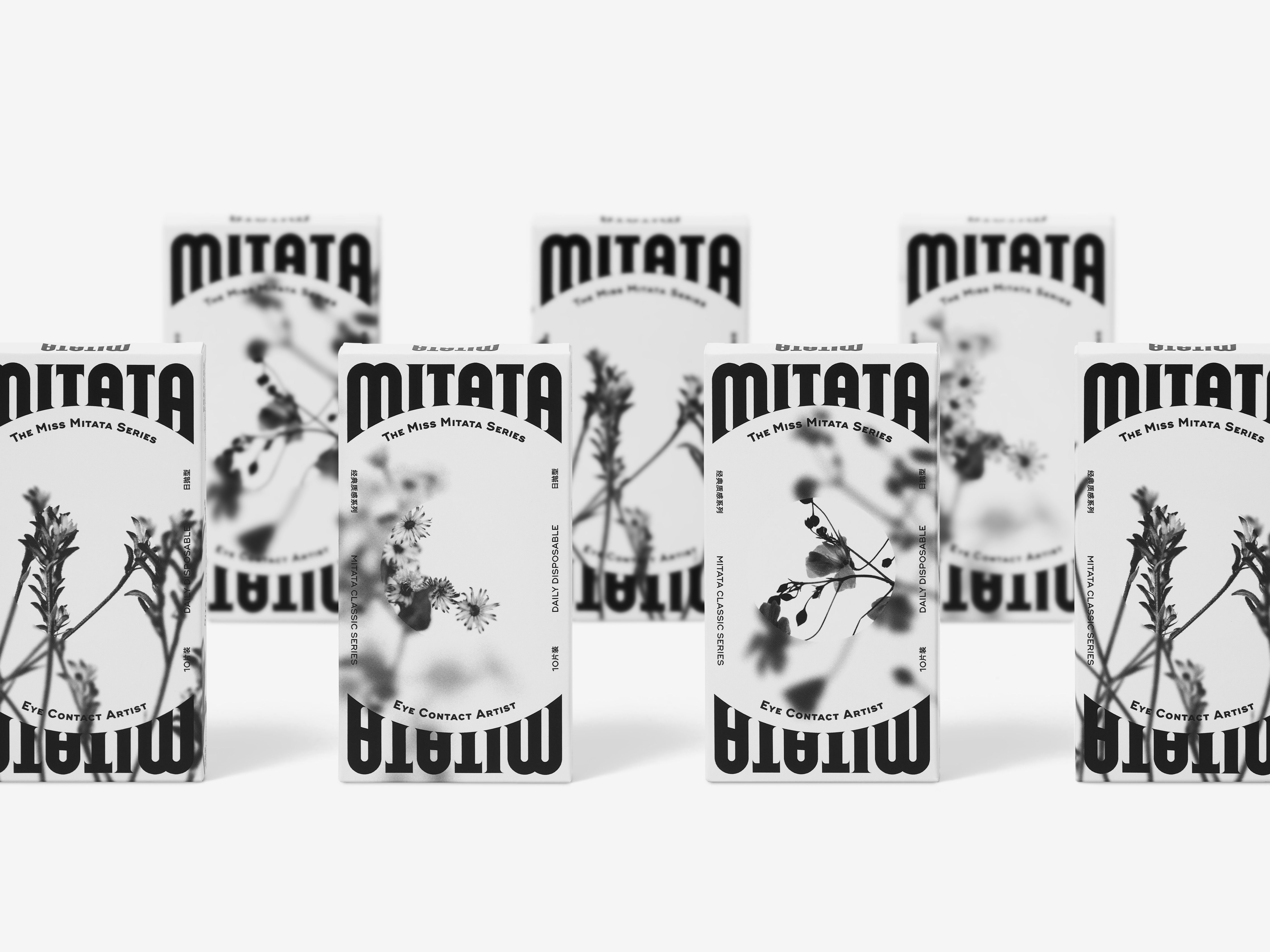
The most important recognition feature of MITATA is its circular arch design, for the intention of good decoration and high recognition. The logo of MITATA is always used in the maximum size in packaging and advertising pictures, and the circular arch at the bottom is the main decorative link for contents. Both the word and image appear to be more elegant and mystery in such an arch structure. In addition, the logo used in the maximum size seems to be high recognized, expressing its confidence and individuality.
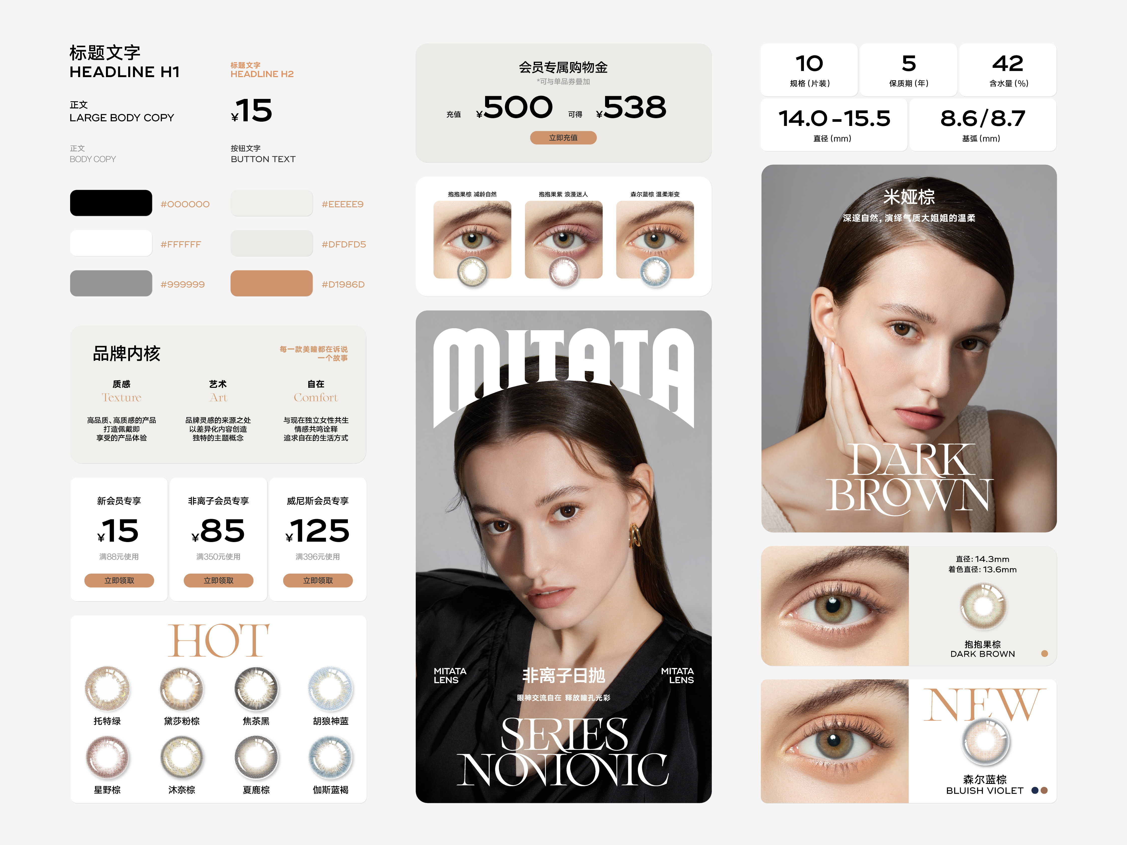
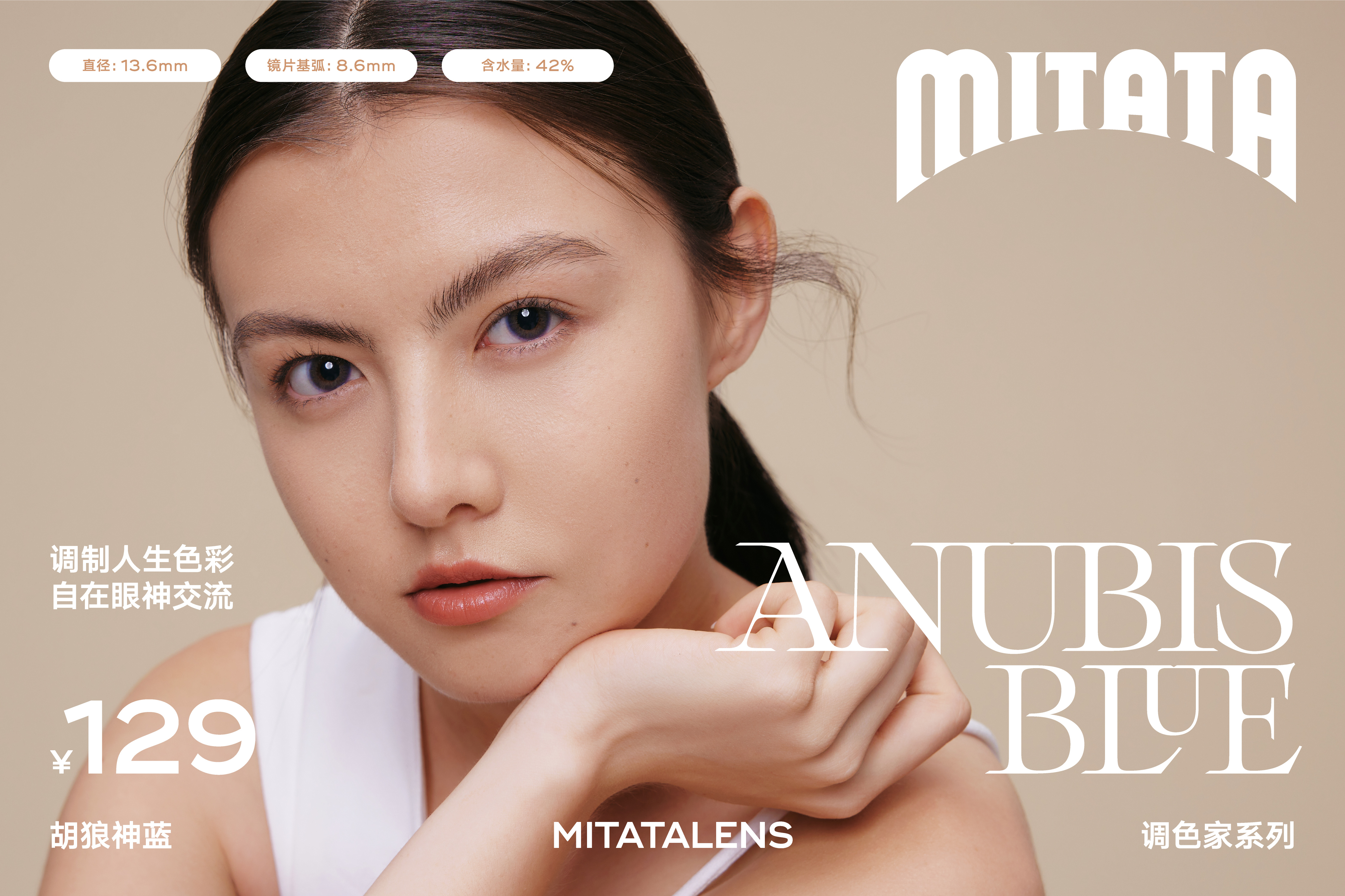
The MITATA logo was designed in a combination of magical fonts and arch structure, and a complete visual identity system giving consideration to classical mystery and modern bold styles has been established by taking the logo as the core. MITATA, together with elegant and exquisite model images, has successfully established its unique aesthetic style. It stands out in the competitive market and becomes a new “goddess” in the heart of many female consumers.
The eyes with cosmetic contact lenses will instantly become twinkling and attractive magically. We looked for the foothold of design language from the perspective of “magic eyes”, created the mystery and charm of magic with the unique font form, and boldly set the bottom of the logo as a very dominant circular arch shape. The wordmark of MITATA was designed in the combination of modern geometric modeling and classical serif, and the characteristics of classical serif make the logo more mystery. At the same time, the geometric modeling also avoids the old-fashioned style that a completely classical shape brings, which allows the relationship between modern and classical styles to be perfectly balanced.
The most important recognition feature of MITATA is its circular arch design, for the intention of good decoration and high recognition. The logo of MITATA is always used in the maximum size in packaging and advertising pictures, and the circular arch at the bottom is the main decorative link for contents. Both the word and image appear to be more elegant and mystery in such an arch structure. In addition, the logo used in the maximum size seems to be high recognized, expressing its confidence and individuality.
The MITATA logo was designed in a combination of magical fonts and arch structure, and a complete visual identity system giving consideration to classical mystery and modern bold styles has been established by taking the logo as the core. MITATA, together with elegant and exquisite model images, has successfully established its unique aesthetic style. It stands out in the competitive market and becomes a new “goddess” in the heart of many female consumers.
MITATA 的品牌定义是:眼神交流艺术家。作为一家美瞳企业,MITATA 所理解的产品美学是非常独特的,是一种介于个人需求与社交需求之间的产品需求,也就是美瞳除了悦己(艺术家),更担负着社会交往中沟通(眼神交流)的作用。这就要求 MITATA 的品牌设计既能满足个性化、多样化需求,同时也能满足社交需求中的高识别性以及风格化的特点。我们将社交需求部分转译成:MITATA 有专属且强烈的设计语言风格,且能在传播过程中担负起过目不忘的功能,像一个“眼神交流艺术家”。
佩戴了美瞳的眼睛,就像获得了魔法一样,一瞬间变得闪闪发光,深邃动人。我们从“魔法的眼睛”这个角度去寻找设计语言的落脚点,通过独特的字体形式去营造魔法带来的神秘和魅惑感,并且大胆地将标识底部设置为非常显性的圆拱形。MITATA 的标识字体是综合了现代几何造型与古典衬线设计而成的,其古典衬线的特点让标识更富神秘感,同时几何造型又避免了单纯的古典造型带来的陈旧感,完美地平衡了现代与古典之间的关系。
圆拱形设计是 MITATA 最重要的识别特征,其设计用意是:强装饰性与高识别性。MITATA 的标识在包装和广告画面中通常以最大尺度进行使用,标识底部的圆拱便成为衔接内容的主要装饰,无论是文字还是图片,都能在圆拱形结构的烘托下显得更加典雅和充满神秘气息。并且,由于标识的大尺度使用,使得 MITATA 在识别性上获得最大程度的输出,表现出自信和个性的一面。
我们通过带有魔法感的字体和圆拱的结合设计了 MITATA 的标识,同时以标识为核心建立了一整套兼顾古典神秘与现代大胆的视觉识别系统,配合优雅精致的模特影像,MITATA 独特的美学风格被成功地建立起来,在竞争激烈的市场中脱颖而出,成为众多女性消费者心中的新“女神”形象。


All Images Copyright © 2022 MITATA. All Rights Reserved