LILANZ 利郎
ART DIRECTOR: Nod Young / Guang Yu
DESIGNER: Wen Di / Feng Shiwen
YEAR: 2023
CLIENT: LILANZ
Lilanz, a well-known men's fashion brand in China, has undergone significant transformations since its founding in the 1980s, continually adapting while maintaining its vitality and influence. We were fortunate to be invited to participate in the brand's image reconstruction project in its 36th year, helping to define a new starting point for the next phase of Lilanz's development. "Simplicity is not simple" has been the guiding aesthetic and business philosophy of Lilanz for many years. However, fully grasping the meaning behind this concept is not easy—how can one reflect years of experience and careful deliberation through minimal expression? This has been the central challenge throughout the design process. After a lot of internal attempts, we came to a conclusion: achieving 'simplicity is not simple' isn't possible through mere simplicity. It requires a sense of "breakthrough".
In Lilanz's new brand identity, we did three important things.
Today, Lilanz has refined its brand slogan from "Simplicity is not simple" to a more concise "Simple men's wear," removing a word to reduce the slogan-like feel while adding a tone of confidence and calm. We hope that Lilanz’s refreshed brand image will continue to uphold its core philosophy of "simplicity is not simple," guiding the company toward a future of confident and steady growth.
In Lilanz's new brand identity, we did three important things.
-
Balancing the Typography:
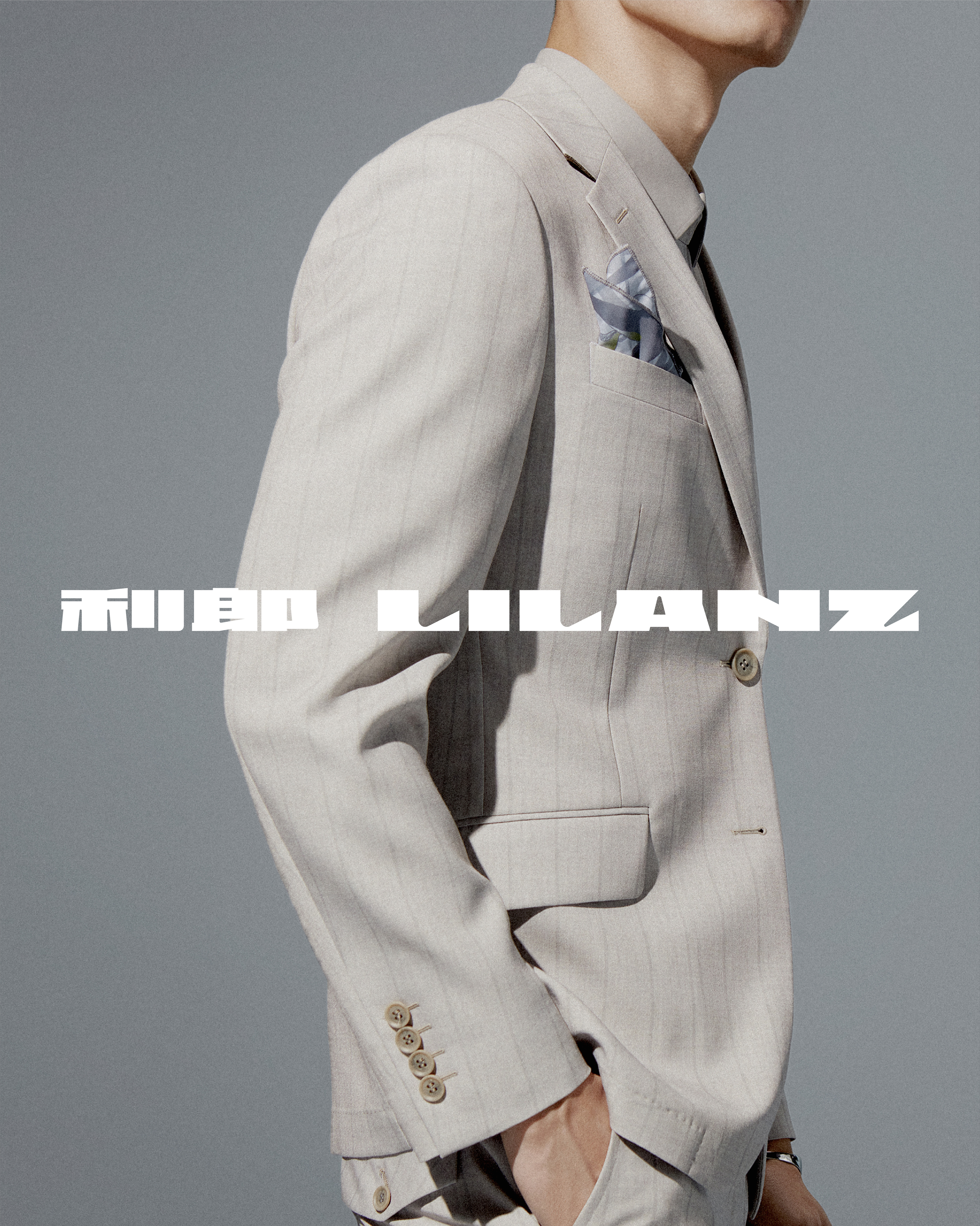
Maintaining harmony between bilingual signage and ensuring readability is extremely important at all times. We aimed to ensure that the relationship between the Chinese and Western forms of LILANZ is balanced, harmonious, and inevitable. We retain the original combination of Chinese and western characters, and also introduced an alternative where the Chinese name precedes the English one. Both combinations coexist, even appearing together in visuals. This openness in text design introduces a fresh way to perceive balance, encapsulating our understanding of "simplicity is not simple."
- Proportional Visual Design:
Lilanz's new logo has a standard ratio of 100:5, resembling a long and full horizontal line. The reason for choosing this proportion is because it reflects the key quality that men’s fashion should embody: strength. A simple, elongated line evokes a sense of power and clarity, which aligns with the brand's philosophy of "simplicity is not simple."
-
Modern Classic:
In the clothing industry, tile pattern is a very classic design language in the brand image, and even often outlasting logos themselves. However, tile patterns can lose vitality if their style is too rigid or lacks versatility. Considering both applicability and durability, we extracted the most basic element the letter “L” from the Lilanz logo, and extended it into a user-friendly and recognizable tile pattern. By doing so, we filled a gap in Lilanz’s visual assets, creating a user-friendly and enduring design. This also embodies our approach to "simplicity is not simple."
Today, Lilanz has refined its brand slogan from "Simplicity is not simple" to a more concise "Simple men's wear," removing a word to reduce the slogan-like feel while adding a tone of confidence and calm. We hope that Lilanz’s refreshed brand image will continue to uphold its core philosophy of "simplicity is not simple," guiding the company toward a future of confident and steady growth.
利郎,是中国家喻户晓的男装品牌,自上世纪八十年代创立到今天,风云变幻,利郎几经转变,始终保持着品牌活力与影响力。我们有幸受邀在利郎三十六年之际,参与到品牌形象重塑的项目中,为利郎的下一个品牌发展阶段去寻找新的起点。“简约不简单”,是利郎秉持多年的美学理想,更是企业的经营哲学。如何理解简约不简单,不是一件容易的事——如何在尽可能少的表达或表现中,体现出经年累月的沉淀和深思熟虑的慎重,这是我们在利郎方案设计过程中一直在探讨、在论证的核心问题。在经历了大量内部尝试后,我们得出了一个结论:解释“简约不简单”这个概念,仅靠简约的表现形式是不可能实现的,必须要通过“突破”。
在利郎的新品牌形象中,我们做了三件重要的事。
一,文字的平衡。平衡双语标识的重心和阅读关系,在任何时候都是极为重要的。在文字的体量关系上,我们希望利郎的中文和西文LILANZ是融洽的,是平等的,是必然的关系。我们保留了利郎原有的西与中的文字组合方式,同时提供了中与西(中文前置)的组合方式,并允许两种组合方式共存,甚至可以同时出现于画面内。文字组合的开放性设计,带来一种新的平衡理解方式。这是我们所理解的简约而不简单。
二,视觉的比例。利郎的新标识标准比例为100 : 5,像是狭长且饱满的一道横线。之所以设计这样的视觉比例关系,是我们认为最能体现男装用户需求的关键就在于:力量。而一道简洁而干练的长线,更容易让用户感受到力量,一种干脆而爽快的感觉。这是我们所理解的简约而不简单。
三,现代的经典。服装行业中,平铺图案是品牌形象中非常经典的设计语言,甚至经典的平铺图案的使用寿命要长于标识。导致平铺图案缺乏生命力的可能性很多,最突出的问题是风格性太强导致适用性差,以及造型语言不够扎实耐不住时间的考验。我们从适用性和耐用性的角度去思考,从利郎标识中提取最基本的元素 L,将其延展成为既好用又具辨识度的平铺图案。专属平铺图案的缺席,是利郎视觉资产的短板,我们借用这个更新的机会,把这个问题解决了。这是我们所理解的简约而不简单。
今天的利郎,将品牌口号从“简约不简单”升级为更加精炼的“简约男装”,减去的一个字数,削弱了口号感,平添了自信与从容。希望利郎的品牌新形象亦能曾经秉承“简约不简单”的品牌主张,为企业带来更加自信和从容的发展视野,助力品牌远航。


All Images Copyright © 2024 LILANZ. All Rights Reserved.