金粒门 Kinglomo
ART DIRECTOR: Guang Yu / Nod Young
DESIGNER: Wang Anan / Wang Xiaoshuai / Feng Shiwen
YEAR: 2025
CLIENT: Kinglomo
Positioned as a “fresh snack store,” Kinglomo enters the vast, diverse, mass-market snack category with a brand image that is distinctly modern and forward-looking. Rather than continuing the usual stall-like impression of traditional grocery shops, it presents itself in a way that is efficient, clear, fresh, and visually unified—meeting contemporary expectations for both quality and variety.
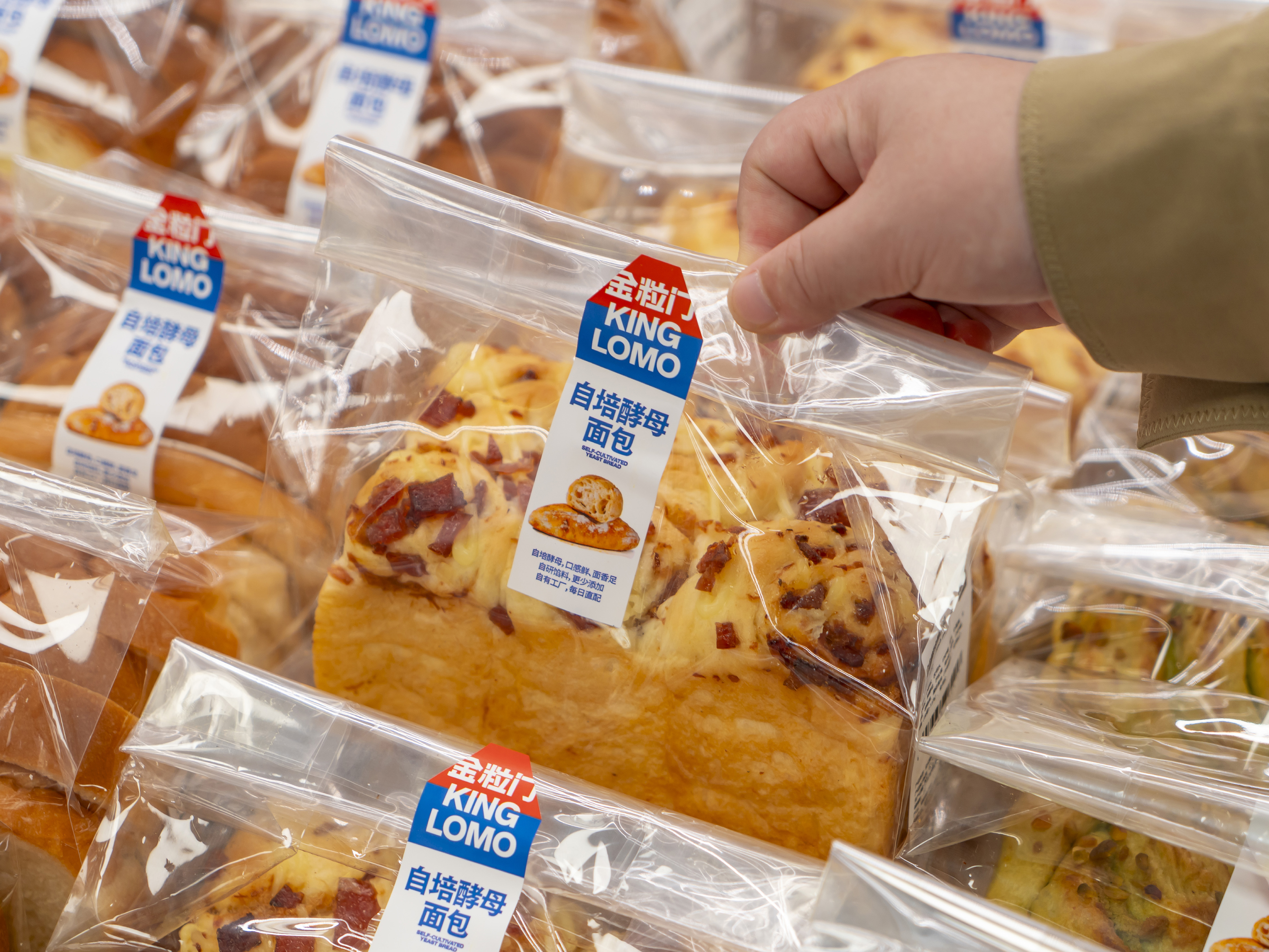
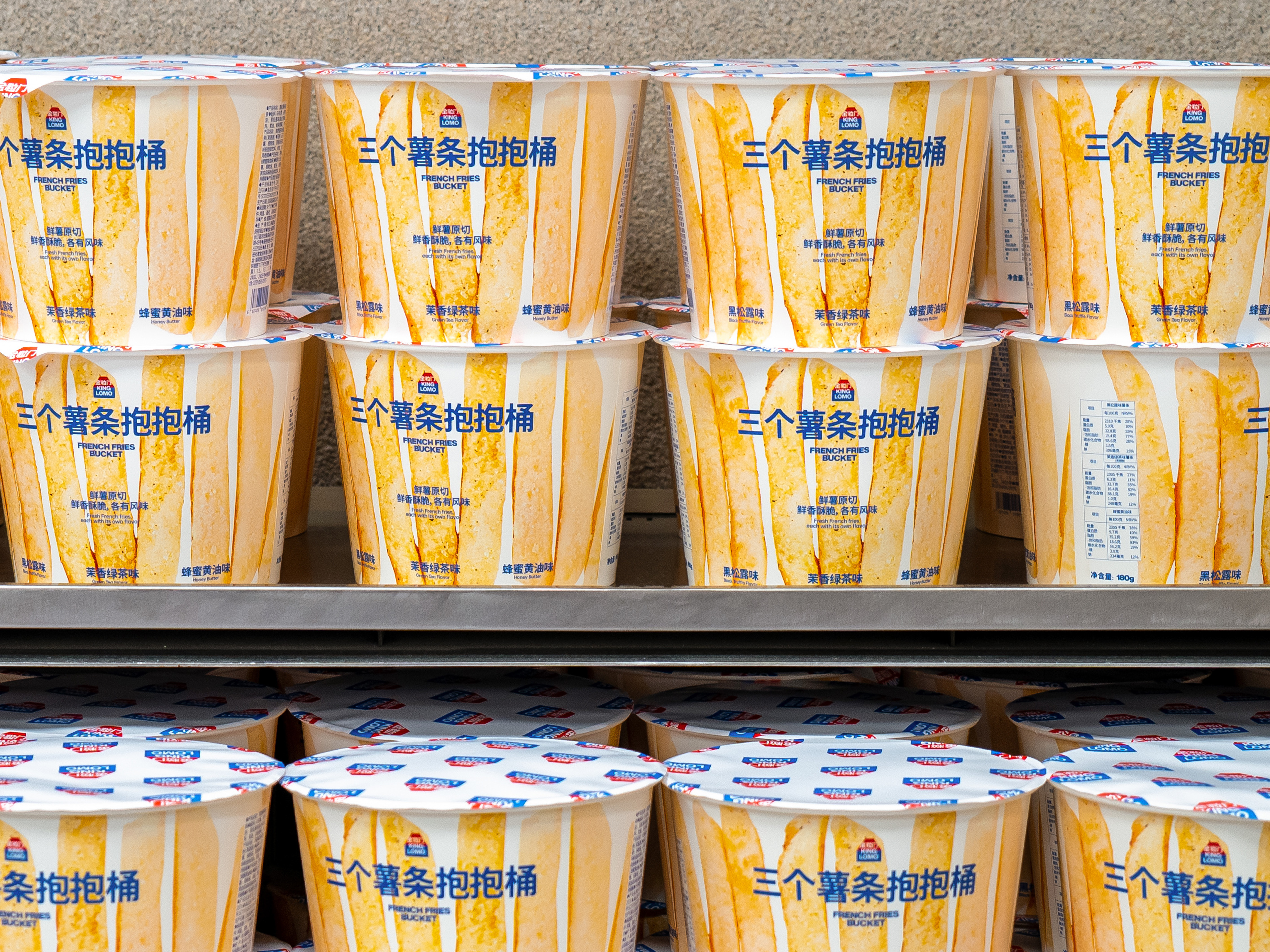
For food brands, “friendliness and approachability” are essential. They are the first emotional entry point for consumers. Accordingly, in both the logo and packaging, Kinglomo puts clear friendliness first. The red–blue contrast is direct and striking, giving the brand strong shelf visibility and instant recognition.
The Kinglomo logo blends the dual ideas of a “door” and a “store”: an open entrance that signals welcome and sharing; a cohesive space that represents the everyday reality of a snack shop. This dual metaphor moves the brand beyond mere functional recognition and makes it a place consumers can emotionally return to—a familiar part of daily life.
Kinglomo’s modernity and distinctiveness are not loud; they are embedded in the system’s simplicity and order. As people look more closely at the logo and packaging, the difference becomes clear: this is not a shop that piles up miscellaneous goods, but a genuinely curated, quality-driven modern snack space.
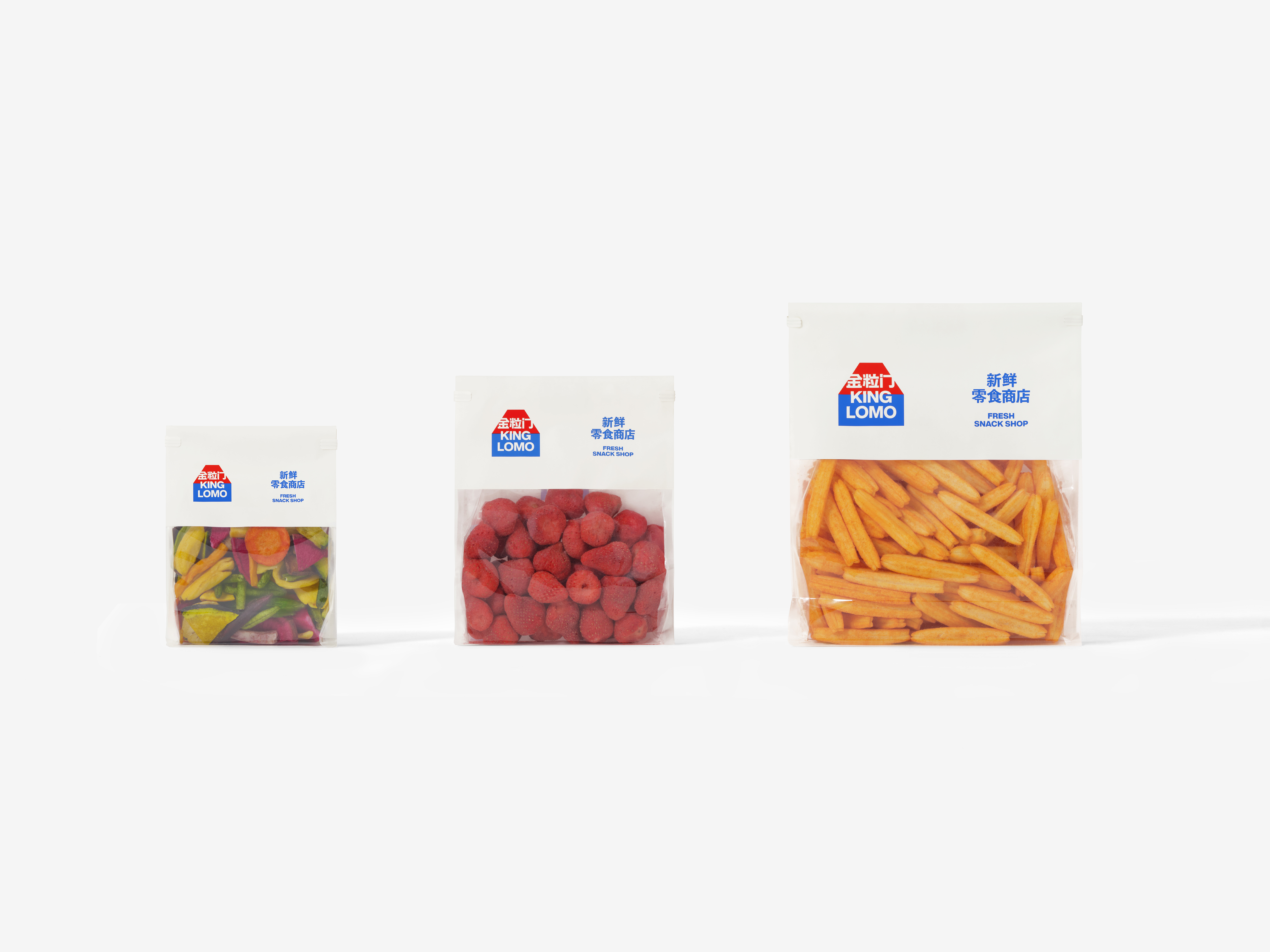
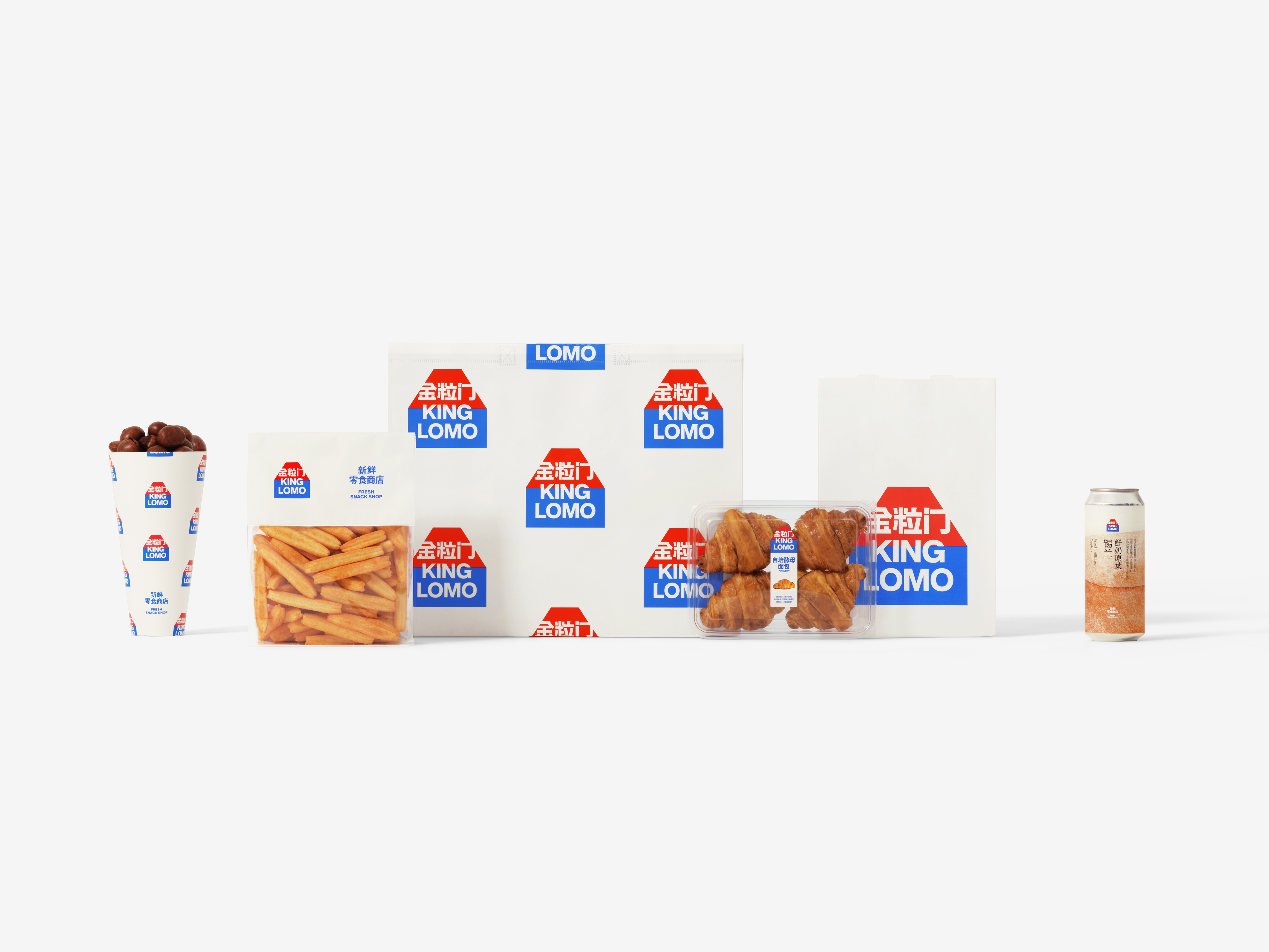
In application—from transparent product packs to simple takeaway bags—Kinglomo prioritizes the direct presentation of freshness. What consumers see is not decorative graphics, but the food itself. This honest materiality is precisely the core value Kinglomo wants to convey in quality control and trust.
Kinglomo is more than a snack shop;
it is a modern case study in freshness, friendliness, and trust.
For food brands, “friendliness and approachability” are essential. They are the first emotional entry point for consumers. Accordingly, in both the logo and packaging, Kinglomo puts clear friendliness first. The red–blue contrast is direct and striking, giving the brand strong shelf visibility and instant recognition.
The Kinglomo logo blends the dual ideas of a “door” and a “store”: an open entrance that signals welcome and sharing; a cohesive space that represents the everyday reality of a snack shop. This dual metaphor moves the brand beyond mere functional recognition and makes it a place consumers can emotionally return to—a familiar part of daily life.
Kinglomo’s modernity and distinctiveness are not loud; they are embedded in the system’s simplicity and order. As people look more closely at the logo and packaging, the difference becomes clear: this is not a shop that piles up miscellaneous goods, but a genuinely curated, quality-driven modern snack space.
In application—from transparent product packs to simple takeaway bags—Kinglomo prioritizes the direct presentation of freshness. What consumers see is not decorative graphics, but the food itself. This honest materiality is precisely the core value Kinglomo wants to convey in quality control and trust.
Kinglomo is more than a snack shop;
it is a modern case study in freshness, friendliness, and trust.
市场定位为“新鲜零食商店”的金粒门,在零食这一庞大、多元且大众化的赛道中,选择以极富现代性和前瞻性的品牌形象切入市场。它并没有延续传统副食品店铺的档口印象,而是以一种高效、清晰、新鲜并整齐划一的姿态回应当下消费者对于高品质与多元化的期待。
我们认为,与食品相关的品牌形象无论如何都要表现出“友好与亲切”的直观感受。这是消费者第一眼看到品牌时,与其建立情感连接的入口。因此在标识与包装的设计中,金粒门始终将“清晰的友好”放在首位。红色与蓝色的对比,直接而醒目,这也使得品牌在货架上具备极强的识别力。
金粒门的 Logo 融合了“门”与“店”的双重概念:它既是一个开放的入口,象征欢迎与分享;也是一个聚合的空间,代表了零食商店的现实与日常。这种双重隐喻让品牌超越了功能性的识别,成为消费者心理中可停留、常出入的生活场所。
同时,金粒门的“现代与独特”并未采取一种张扬的方式,而是隐藏在系统整体的简洁与秩序感中。消费者在凝视包装与标识的过程中,才会逐渐感受到其中的差异:它不是一个随意堆叠各色商品的小店,而是一个真正有态度、有品质的现代零食空间。
在品牌的实际应用中,从透明的食品包装到简洁的外带包装,金粒门都以直接呈现“新鲜”为首要语言。消费者看到的不是被修饰的图案,而是食物最真实的模样。这种清晰的实物感,正是金粒门在品控方面希望传递的核心价值。
金粒门不仅仅是一家零食商店,它是一个有关“新鲜、友好与信任”的现代案例。


All Images Copyright © 2025 ABCD and Kinglomo. All Rights Reserved