Kasimir
卡西米尔
ART DIRECTOR: Guang Yu / Nod YoungDESIGNER: Wang Xiaoshuai / Wang Anan
YEAR: 2023
CLIENT: Kasimir
Taking pencils as an example, more than 70% of the world's annual production of approximately 15 billion pencils is made in China. As China's largest pencil manufacturer, Hongxing Stationery produces around 3 billion pencils each year, accounting for 15% of global production. Kasimir, a new stationery brand launched by Hongxing Stationery founded in 2021, not only meets the evolving needs of the young generation in study and life, but also strives to explore the infinite possibilities of stationery categories. It is committed to becoming a high-quality domestic stationery brand suitable for all ages.
We position Kasimir as a professional stationery brand with a smooth, clear and enjoyable user experience at its core, and this concept is inspired by the benefits that "a good pen" can provide.
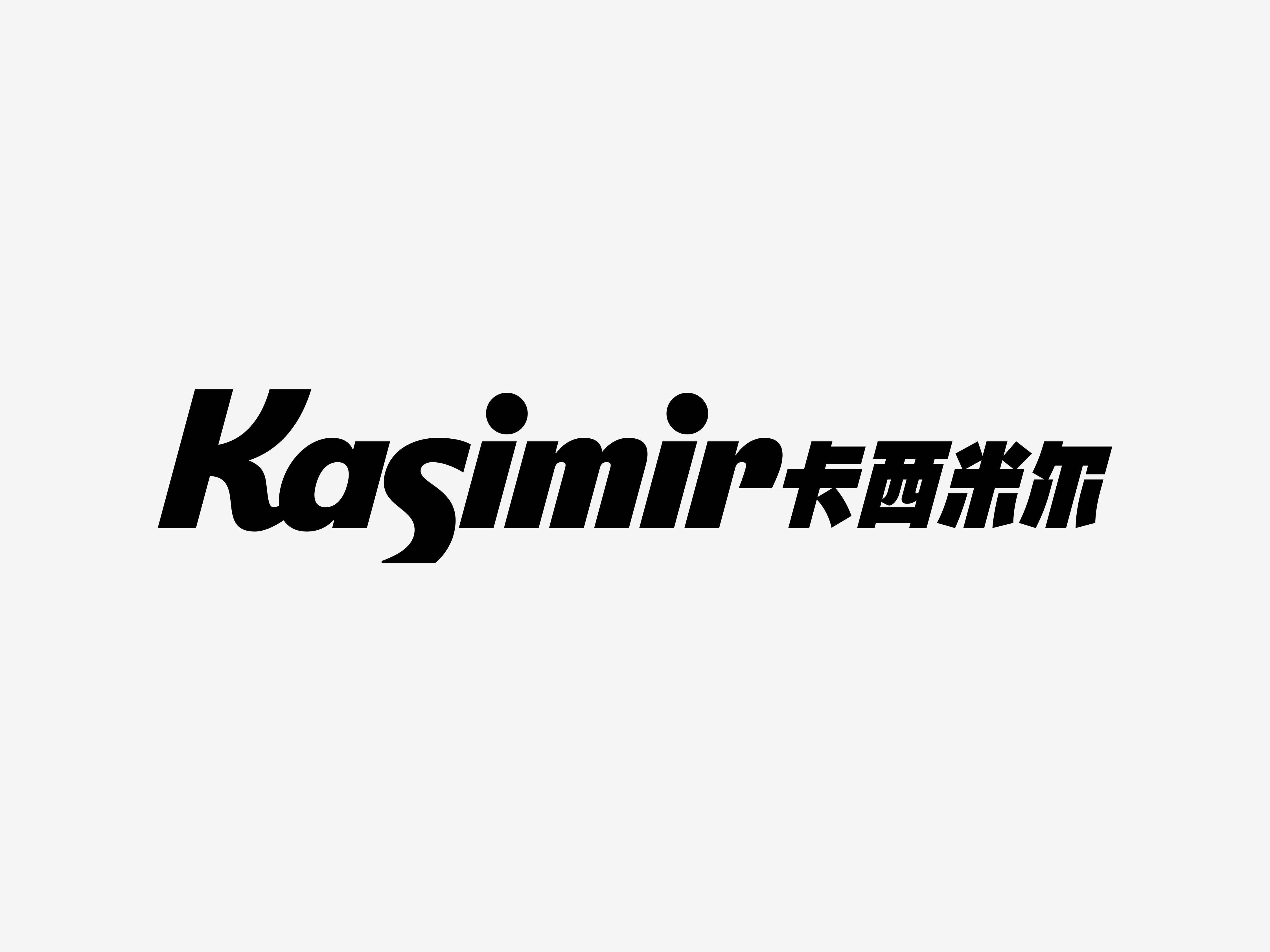
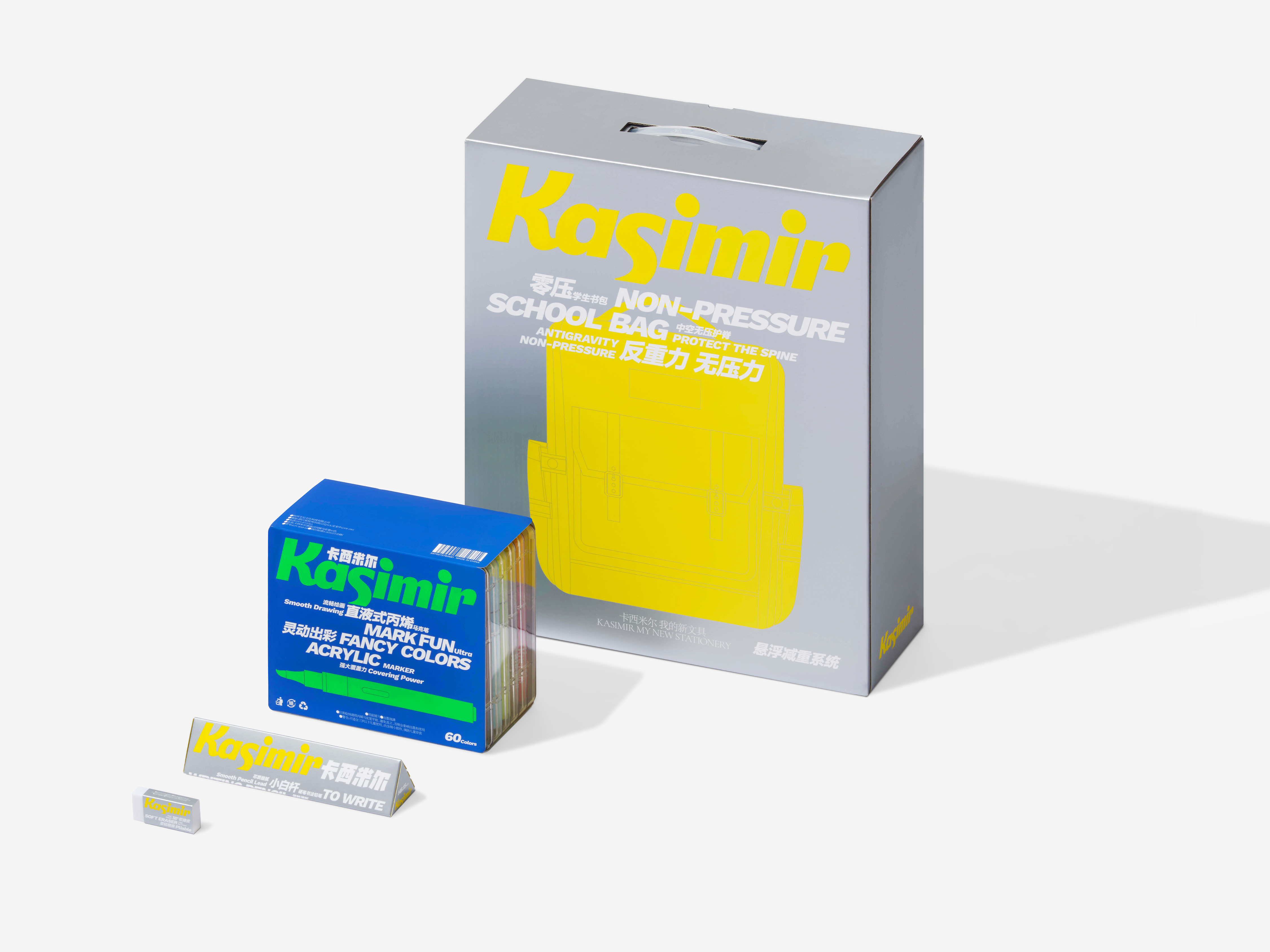
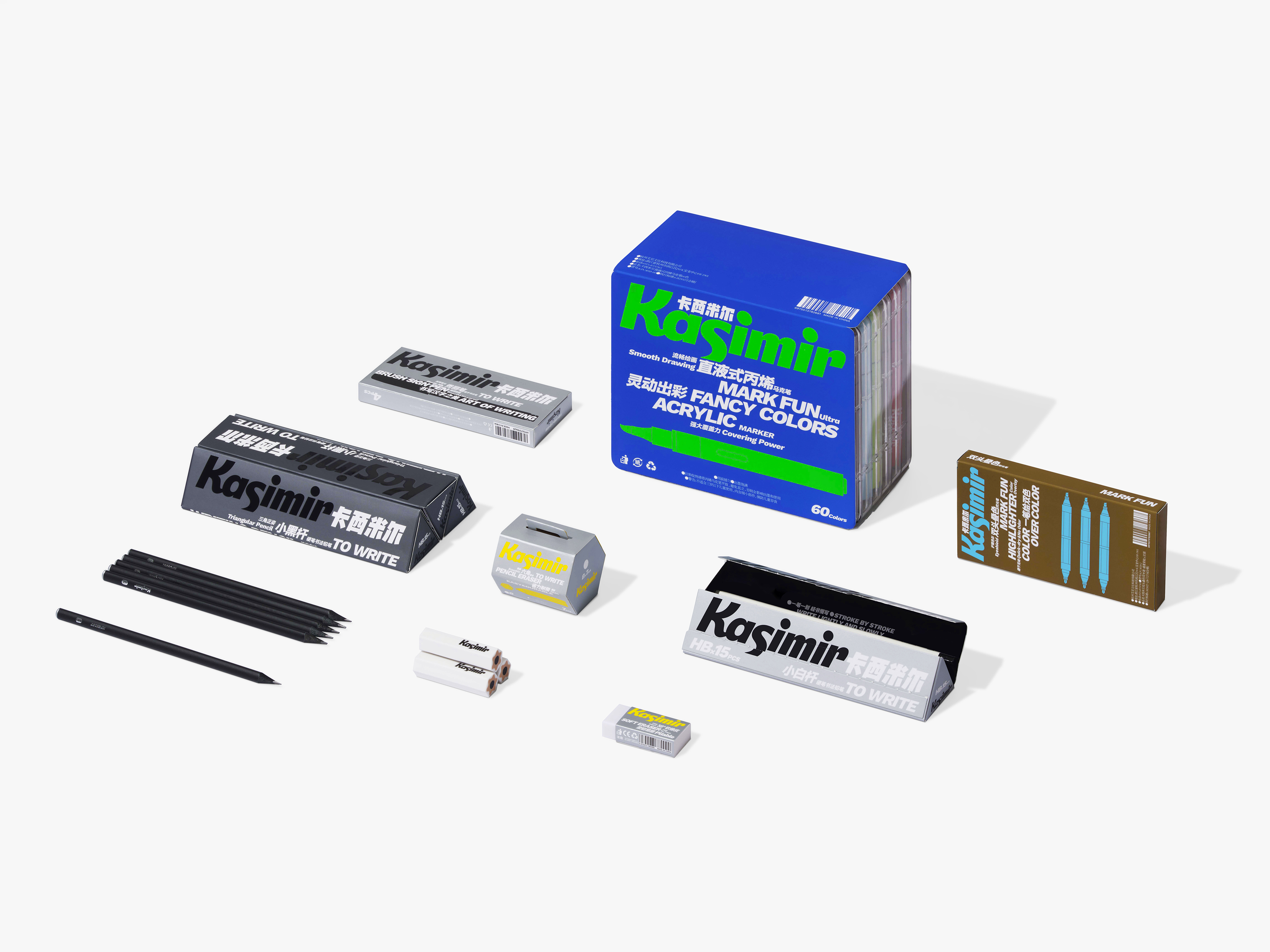
In the design of the brand identity, we integrated the sensation of writing into the font design, exaggerating the "K" and "S" to enhance both information clarity and the expressive brushstroke qualities that highlight the brand’s stationery attributes. To further convey the "smooth" experience, the logo design adopts the italic way, as one of the design elements, which has become the core element of Kasimir's visual recognition system. For packaging, key details such as product names and specifications are displayed in italics, with delicate and concise illustrations to create a visual effect that is both dynamic and rhythmic, which is exactly the intuitive feeling users get when using high-quality, practical, and convenient stationery.
Color is also one of the most important elements in stationery design. Kasimir’s color palette is vibrant and engaging, featuring bold, high-saturation hues, including fluorescent colors. Rather than being dictated by the designer, Kasimir’s color system is derived directly from the products themselves, with the design faithfully reflecting the brand’s identity through its color characteristics.
We position Kasimir as a professional stationery brand with a smooth, clear and enjoyable user experience at its core, and this concept is inspired by the benefits that "a good pen" can provide.
In the design of the brand identity, we integrated the sensation of writing into the font design, exaggerating the "K" and "S" to enhance both information clarity and the expressive brushstroke qualities that highlight the brand’s stationery attributes. To further convey the "smooth" experience, the logo design adopts the italic way, as one of the design elements, which has become the core element of Kasimir's visual recognition system. For packaging, key details such as product names and specifications are displayed in italics, with delicate and concise illustrations to create a visual effect that is both dynamic and rhythmic, which is exactly the intuitive feeling users get when using high-quality, practical, and convenient stationery.
Color is also one of the most important elements in stationery design. Kasimir’s color palette is vibrant and engaging, featuring bold, high-saturation hues, including fluorescent colors. Rather than being dictated by the designer, Kasimir’s color system is derived directly from the products themselves, with the design faithfully reflecting the brand’s identity through its color characteristics.
中国无愧于“文具生产大国”之称,以铅笔为例,全球每年生产的约150亿支铅笔中有70%以上为中国制造,而作为中国最大的铅笔制造商,鸿星文具每年生产铅笔约30亿支,占全球产量的15%。作为鸿星文具旗下的文具新品牌,创立于2021年的卡西米尔不仅满足了年轻一代在学习生活场景下的新诉求,还不断拓展文具品类的无限可能,致力于成为全年龄段适用的国产优质文具品牌。
我们将卡西米尔 Kasimir 定位为一个以流畅、清晰、愉悦感受为核心的专业文具品牌,这一品牌理念源自“一支好用的笔” 所能带来的用户体验。
在品牌标识的设计中,我们将书写的体验融入字体设计中,对“K”和“S”进行了夸张处理,既确保了信息传递,又放大了笔触特征,强化了品牌的文具属性。为了更好地体现“流畅”的感受,标识设计采用了斜体的方式,作为设计元素之一,它成为卡西米尔 Kasimir 视觉识别系统的核心基因。在包装设计中,产品名称和规格等重要属性信息均以斜体表示,配合精致简洁的插图一同营造出充满力量感和律动感的视觉效果,而这也正是用户在使用任何一件高品质、实用、顺手的文具时的直观感受。
色彩,同样是文具品类的重要元素之一。卡西米尔 Kasimir 的色彩体系富有活力,愉悦拉满,我们大胆地选择了高饱和度色彩,其中还包括荧光色的使用。事实上,品牌的色彩规则并非由设计师定义,而是源自产品本身,设计只是将卡西米尔 Kasimir 的色彩特征忠实地还原于品牌识别系统。


All Images Copyright © 2024 Kasimir. All Rights Reserved.