KUB 可优比
ART DIRECTOR: Nod Young / Guang Yu
DESIGNER: Xu Mingru / Wen Di / Feng Shiwen
YEAR: 2022
CLIENT: KUB
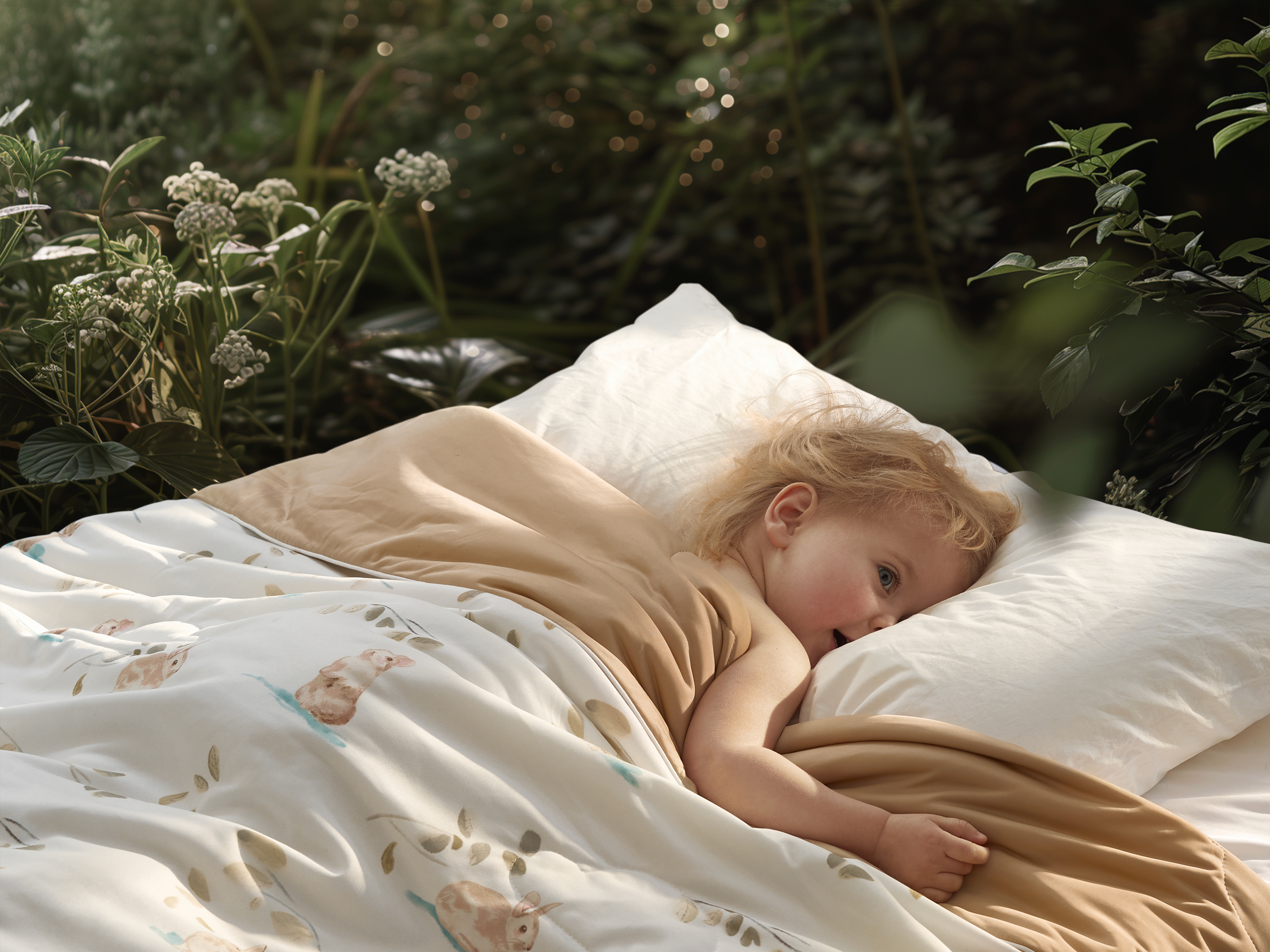
KUB is a maternal and infant brand headquartered in Hangzhou, China, offering consumers comprehensive maternity and child product solutions. After more than a decade of development, Keyoubi KUB has become a leading name in China’s maternal and infant industry, with many of its products ranking first in sales. This market success is closely tied to the product philosophy that KUB has consistently upheld: trust, vitality, and design aesthetics. Thanks to its unwavering commitment to quality and design, KUB's products, as models of outstanding design, have even been collected by the National Museum of Munich, Germany. We were commissioned by KUB to revitalize its brand, enhance the quality of the brand, and find a new starting point for its future development.
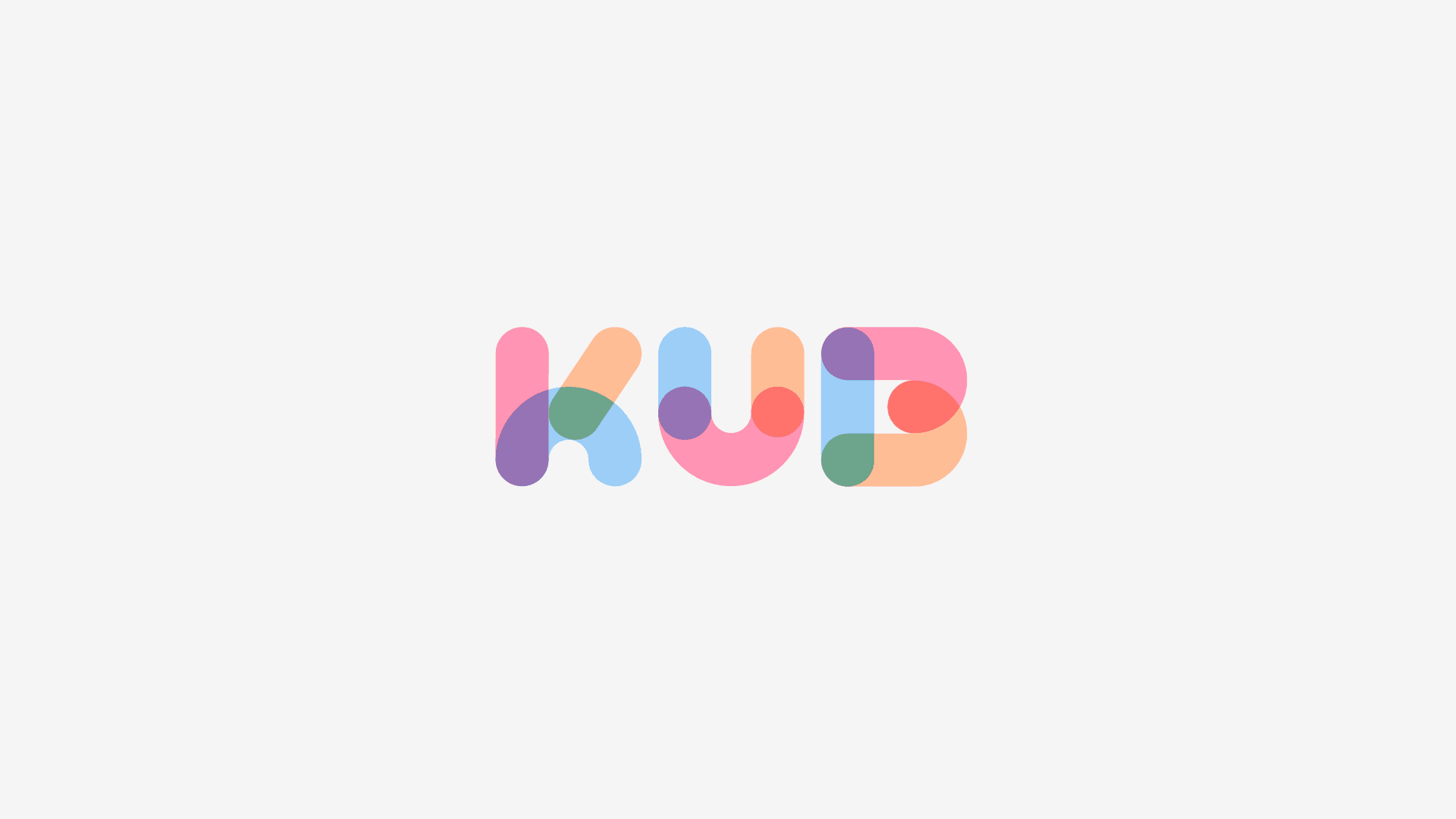
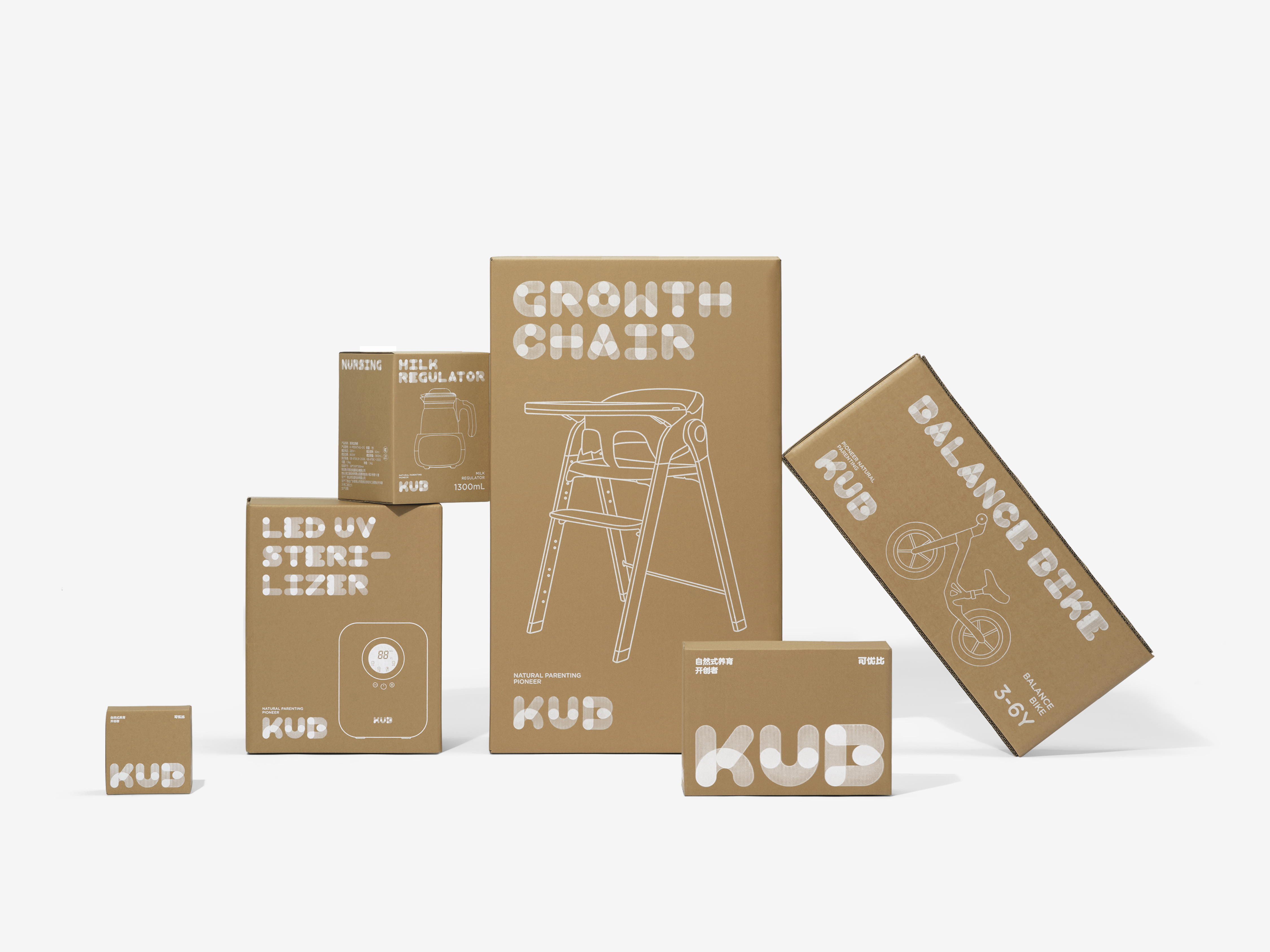
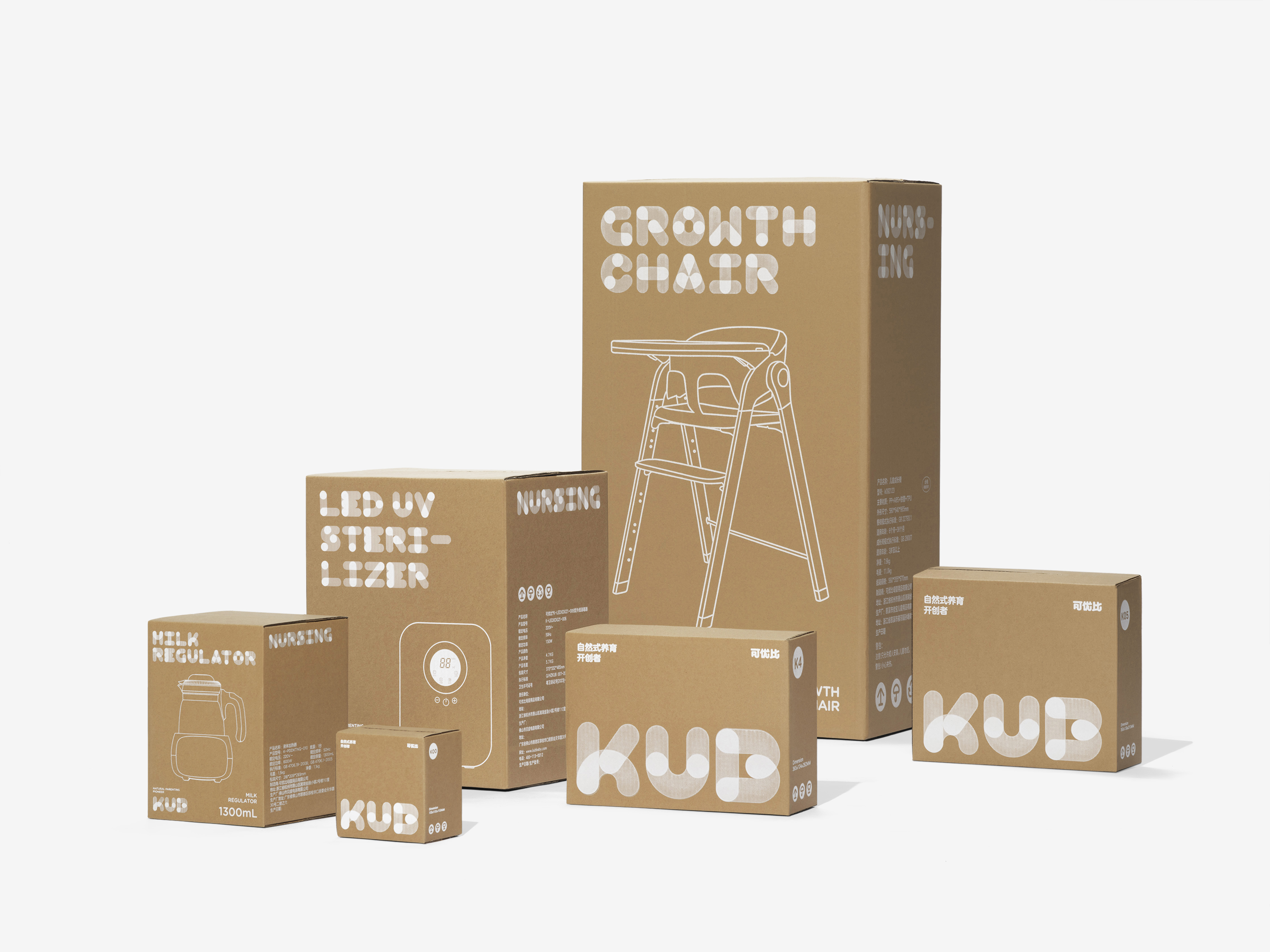
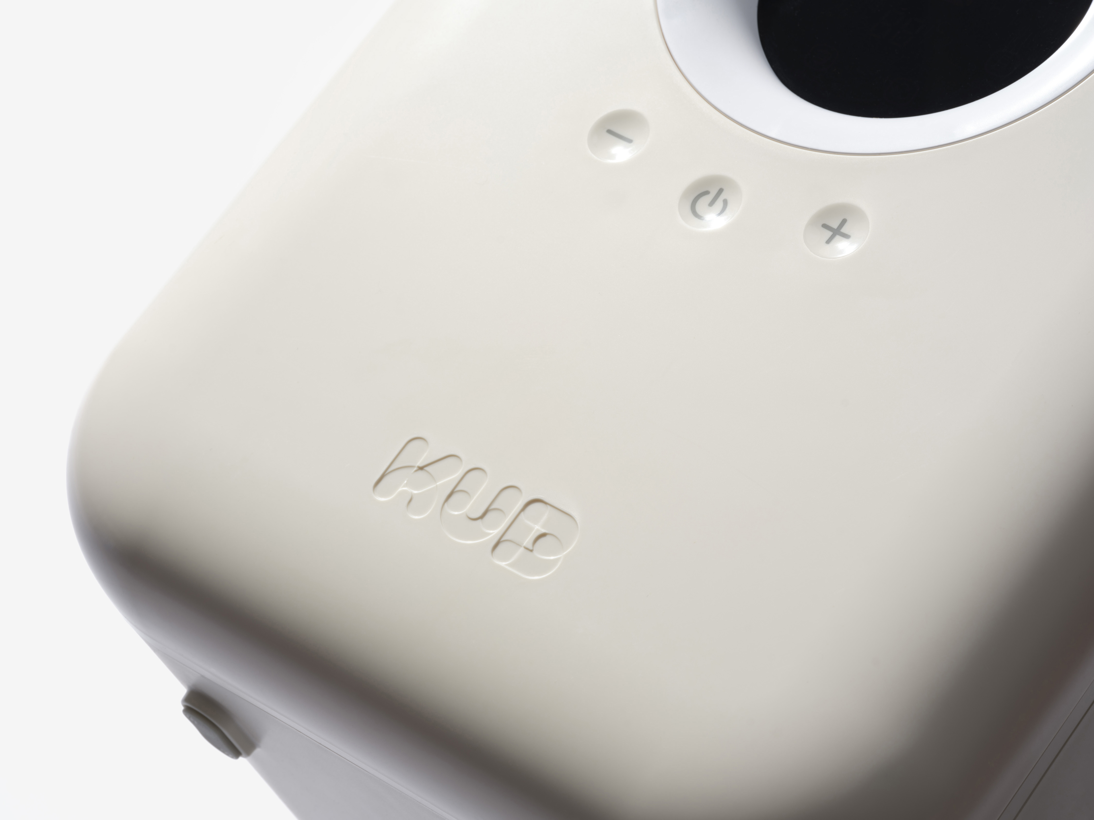
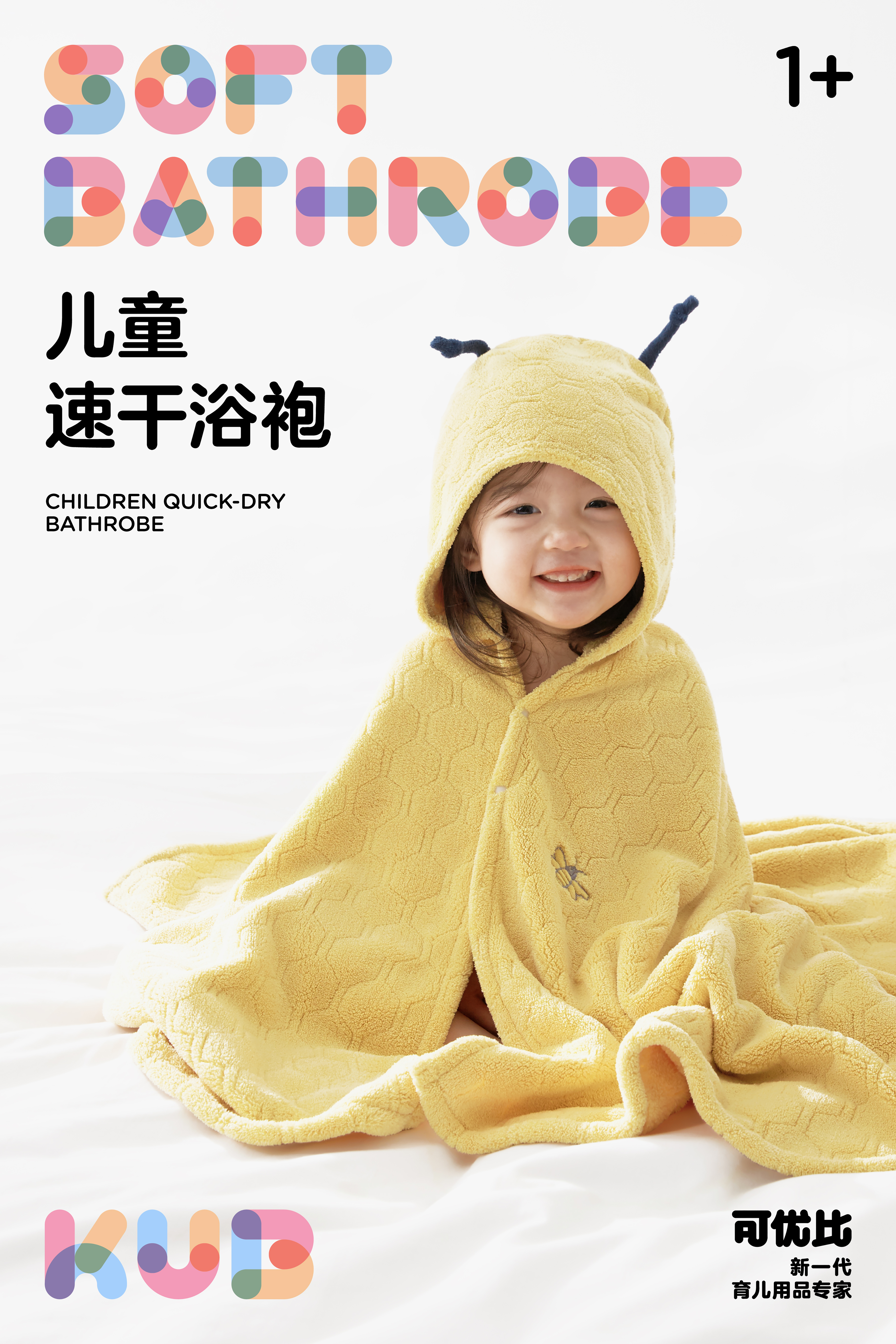
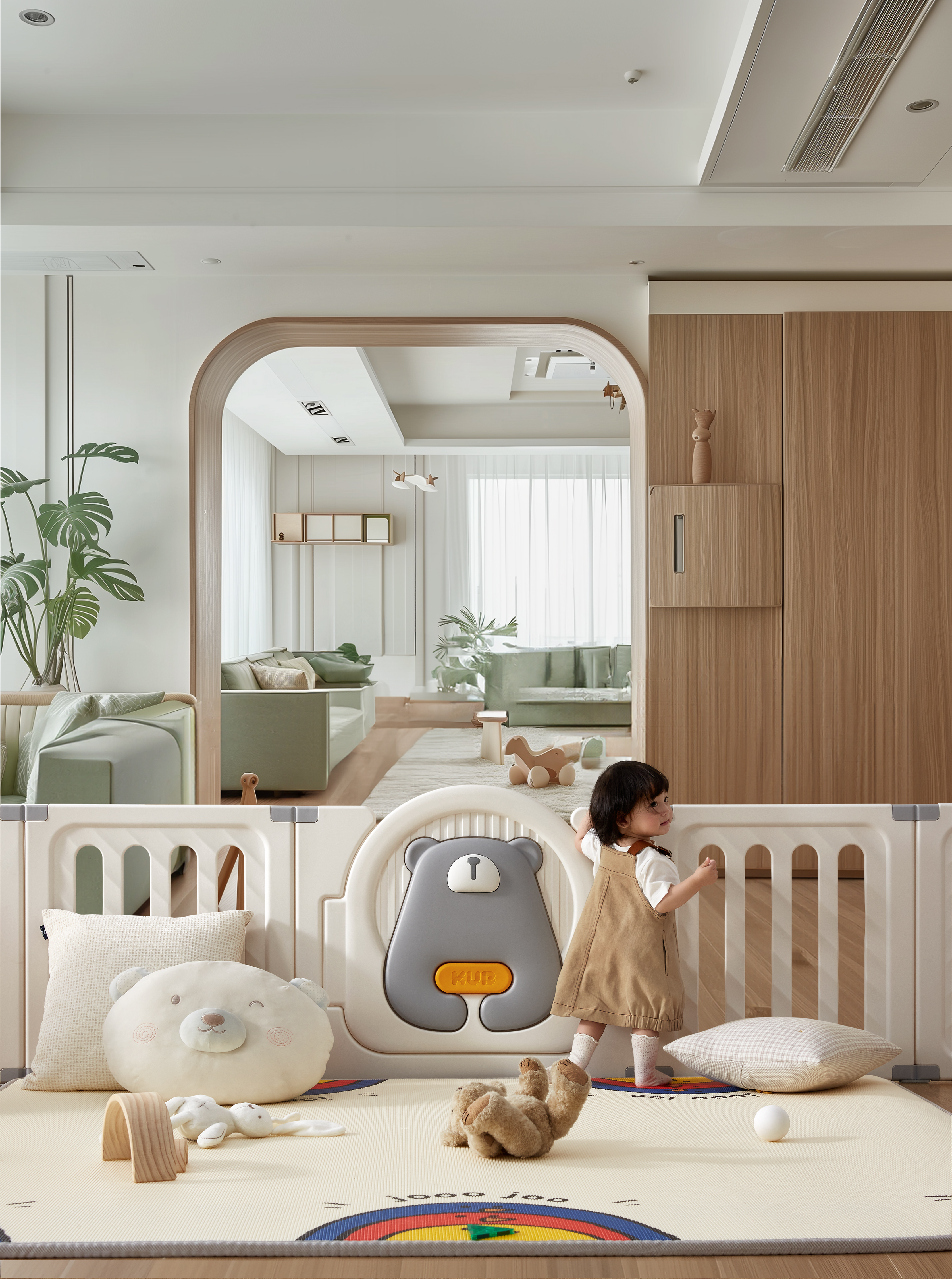
We embraced trust, vitality and design aesthetics as the brand's core values. One key insight from KUB’s product philosophy is the understanding of how children think.Children's cognitive world is different from that of adults; it is more abstract, flexible and open. Children are less focused on definitive answers and more engaged in the process of discovery, which is the foundation for fostering smart parenting. We interpret the brand spirit of KUB through the concepts of "process" and "movement". KUB's logo is inspired by the most primitive and fundamental shape—the circle. As the circle moves, it creates a path, eventually forming lines, shapes, and text structures. This process is much like children building houses, bridges and castles using simple building blocks, the process filled with imagination and beauty.
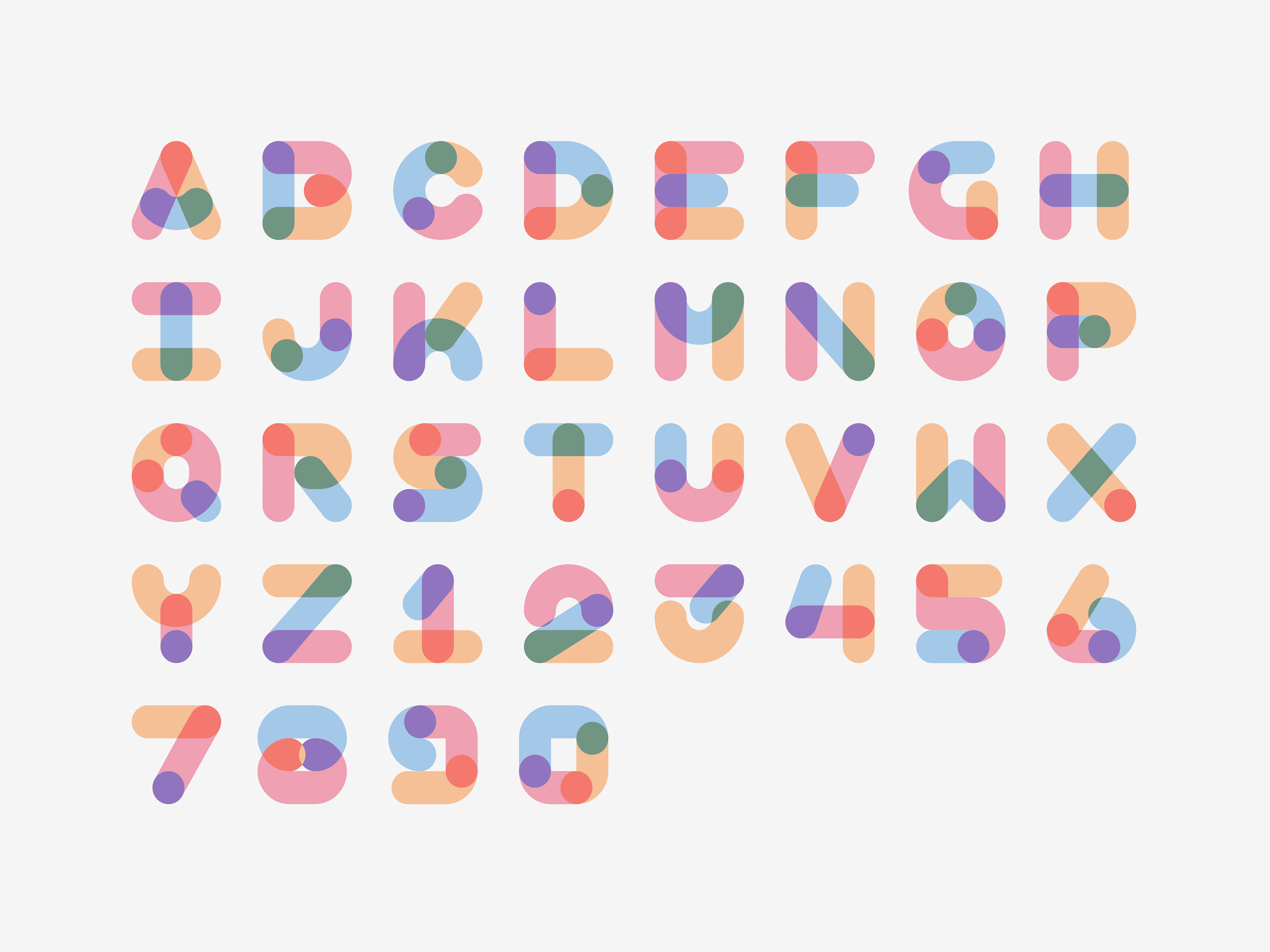
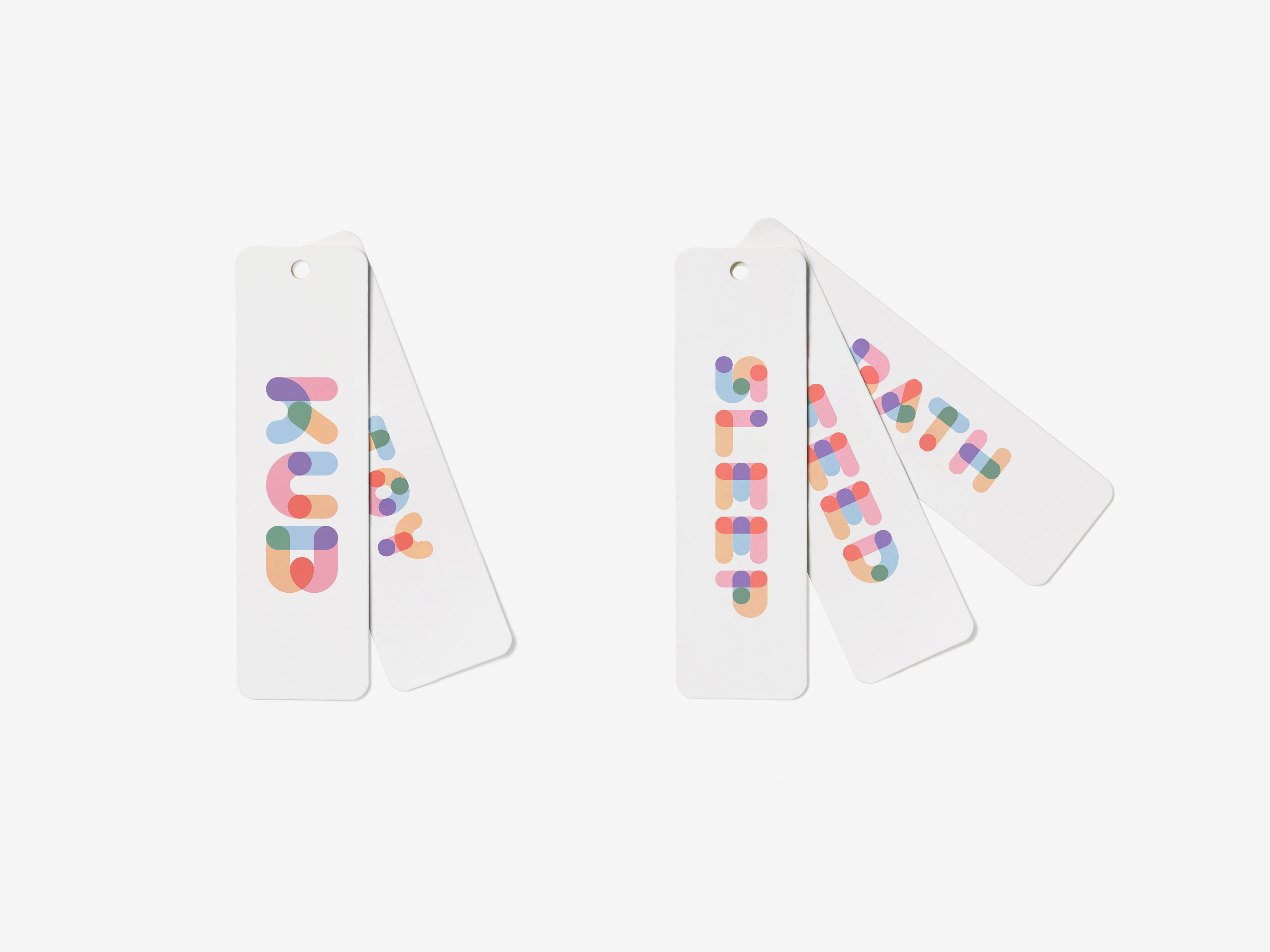
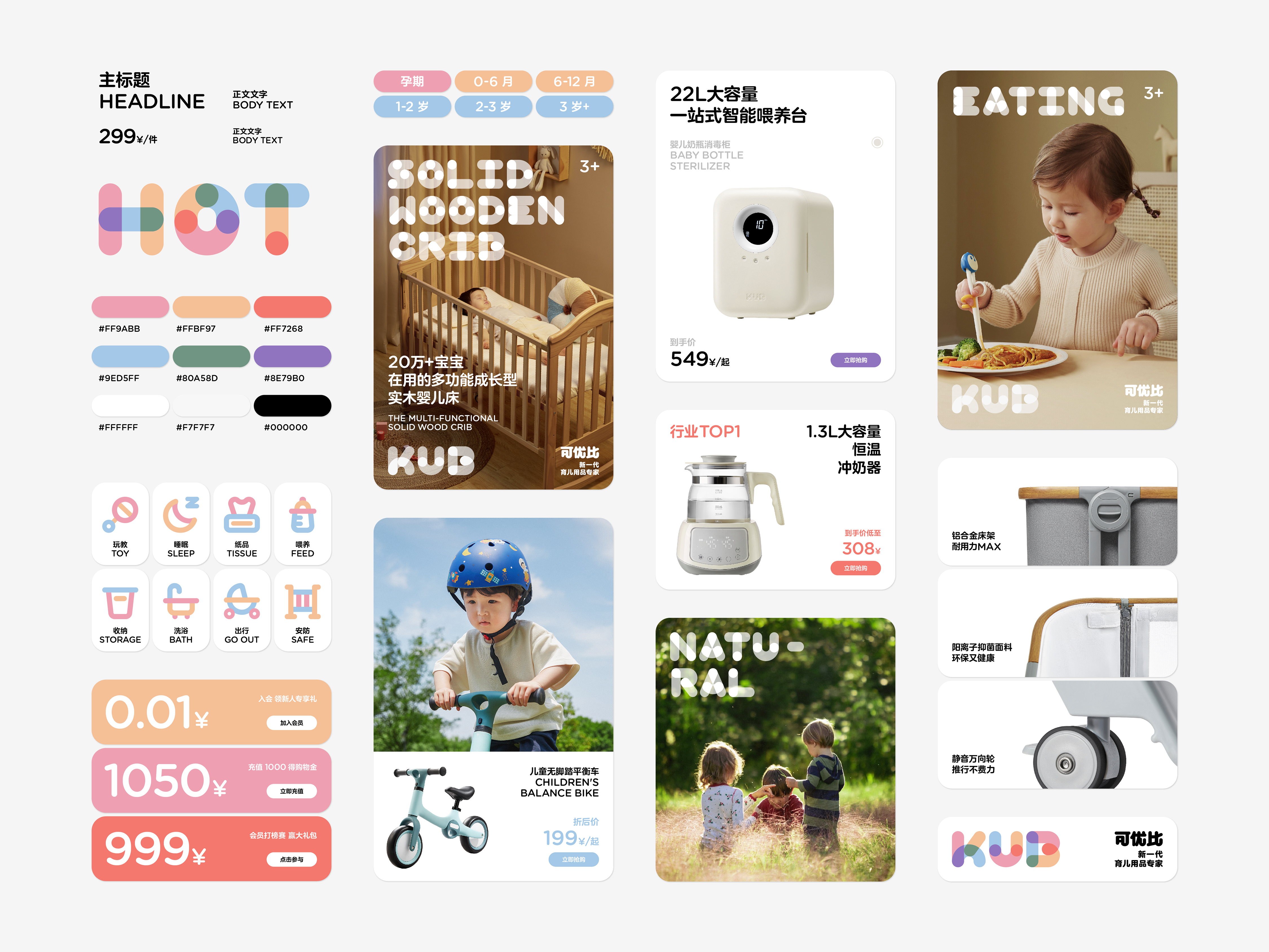
We summarize this design concept of "exploration and building," which supports KUB’s brand positioning as "the next generation of parenting product experts. Our aim is for this design philosophy to permeate KUB’s entire product line and visual identity. To achieve this, we developed a custom font and symbols for the brand. In the future, across KUB's offline stores, online e-commerce, product packaging, outdoor advertising and other media, consumers will be able to clearly identify KUB as the expert in parenting products, committed to "exploration and building."
We embraced trust, vitality and design aesthetics as the brand's core values. One key insight from KUB’s product philosophy is the understanding of how children think.Children's cognitive world is different from that of adults; it is more abstract, flexible and open. Children are less focused on definitive answers and more engaged in the process of discovery, which is the foundation for fostering smart parenting. We interpret the brand spirit of KUB through the concepts of "process" and "movement". KUB's logo is inspired by the most primitive and fundamental shape—the circle. As the circle moves, it creates a path, eventually forming lines, shapes, and text structures. This process is much like children building houses, bridges and castles using simple building blocks, the process filled with imagination and beauty.
We summarize this design concept of "exploration and building," which supports KUB’s brand positioning as "the next generation of parenting product experts. Our aim is for this design philosophy to permeate KUB’s entire product line and visual identity. To achieve this, we developed a custom font and symbols for the brand. In the future, across KUB's offline stores, online e-commerce, product packaging, outdoor advertising and other media, consumers will be able to clearly identify KUB as the expert in parenting products, committed to "exploration and building."
可优比 KUB 是一家总部位于中国杭州的母婴品牌,为消费者提供全场景、全类目孕婴童产品解决方案。经过十余年的发展,可优比 KUB 已经成为中国母婴行业的领军品牌,众多单品名列销售排行榜冠军。市场成绩与可优比 KUB 一直秉承的产品哲学密不可分:信任、活力与设计美学。也正是因为对品质和设计的不断锤炼和坚持,可优比 KUB 的产品作为卓越的产品设计样板被德国慕尼黑国家博物馆收藏。我们接受可优比 KUB 的委托,为其重塑品牌价值,提升品牌质感,为企业未来的发展寻找新的起点。
我们将信任、活力与设计美学作为基调,并在可优比 KUB 的产品中寻找到一个非常具有代表性的产品思维:如何通过理解孩子的思维方式来定义产品。孩子的认知世界与成人不同,是更加抽象、更加灵活、更加开放性的。相比具体答案而言,他(她)们更关心探索的过程,而这正是启发性智慧育儿的关键。我们借由展示“过程”,通过“运动”来诠释可优比 KUB 的品牌精神。可优比 KUB 的标识始于最原始基本的圆,并通过圆的移动来形成轨迹,进而形成线段、造型与文字结构,这很像是孩子们通过最简单的积木块来搭建房屋、桥梁和城堡,过程中充满了想象与美好。
我们将这个过程与运动的设计概念总结为“探索与搭建”,用于支撑可优比 KUB 的品牌定位:新一代育儿用品专家。我们希望这个设计概念能转化为品牌基因溶解到可优比 KUB 全线产品与视觉系统中,为此我们设计了完整的字体和符号,未来在可优比 KUB 的线下门店、网络电商、产品包装、户外广告等任意媒介上,消费者都可以清晰地、明确地了解到那个致力于“探索与搭建”的新一代育儿用品专家。


All Images Copyright © 2024 KUB. All Rights Reserved.