鲜果时间
It’s Time To
ART DIRECTOR: Nod Young / Guang Yu
DESIGNER: Liao Liao
YEAR: 2019
CLIENT: It’s Time To
It’s Time To was founded in 2007 and now has more than 300 stores. The purpose of this
rebranding is to respond the future development plan for the next decade, to make the brand temperament younger, more dynamic, and to achieve a high degree of unity in tonality.
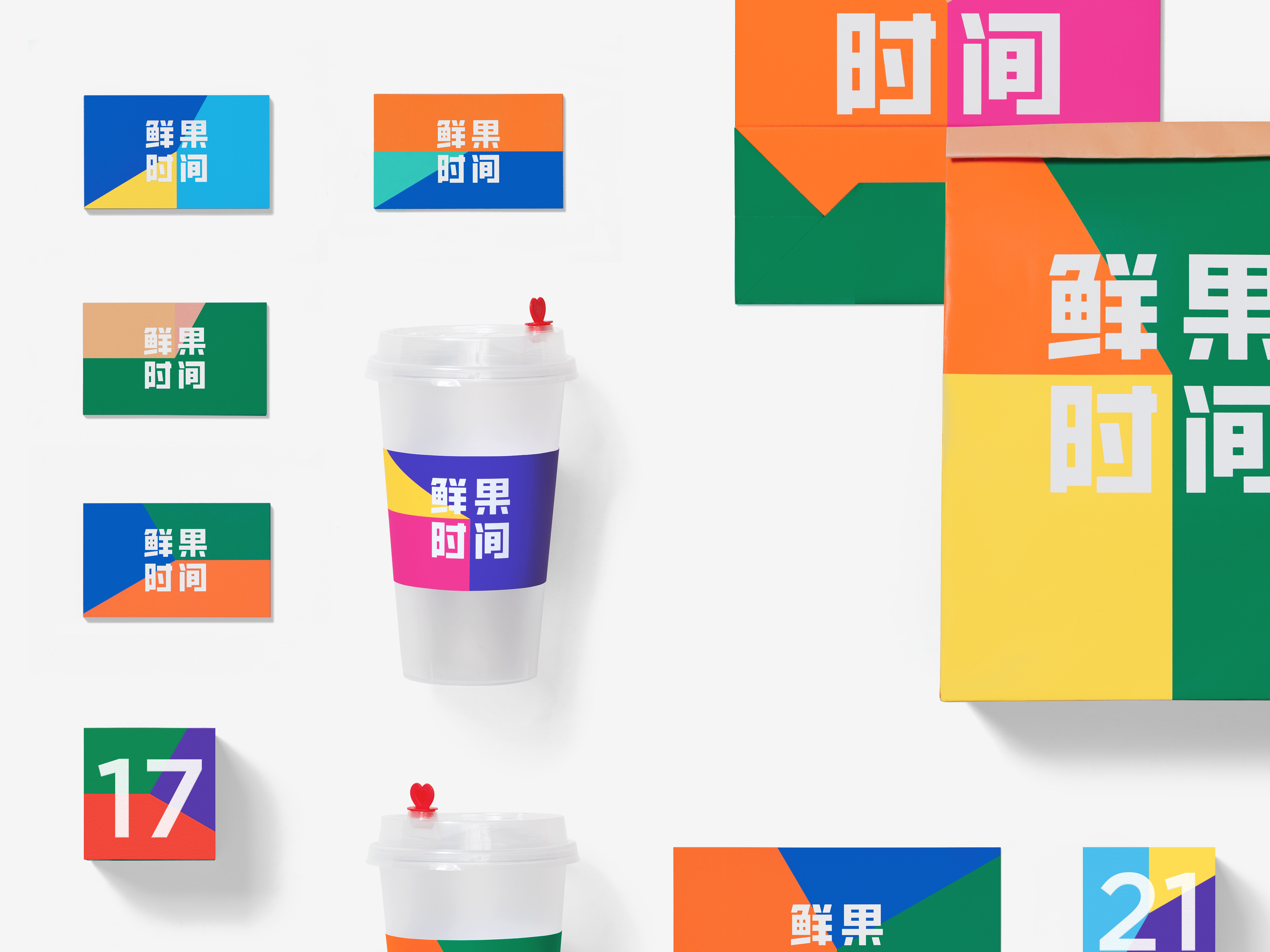
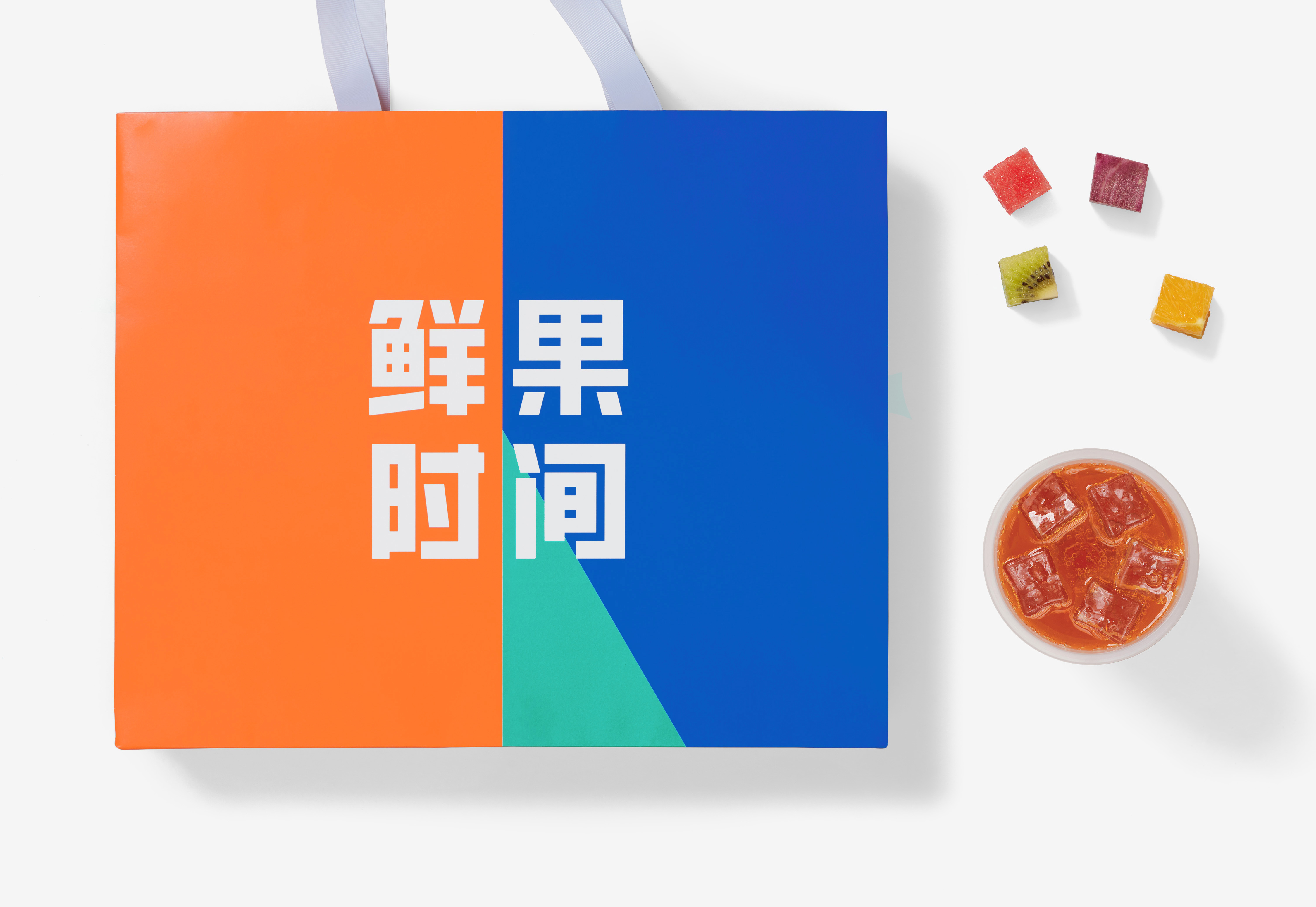
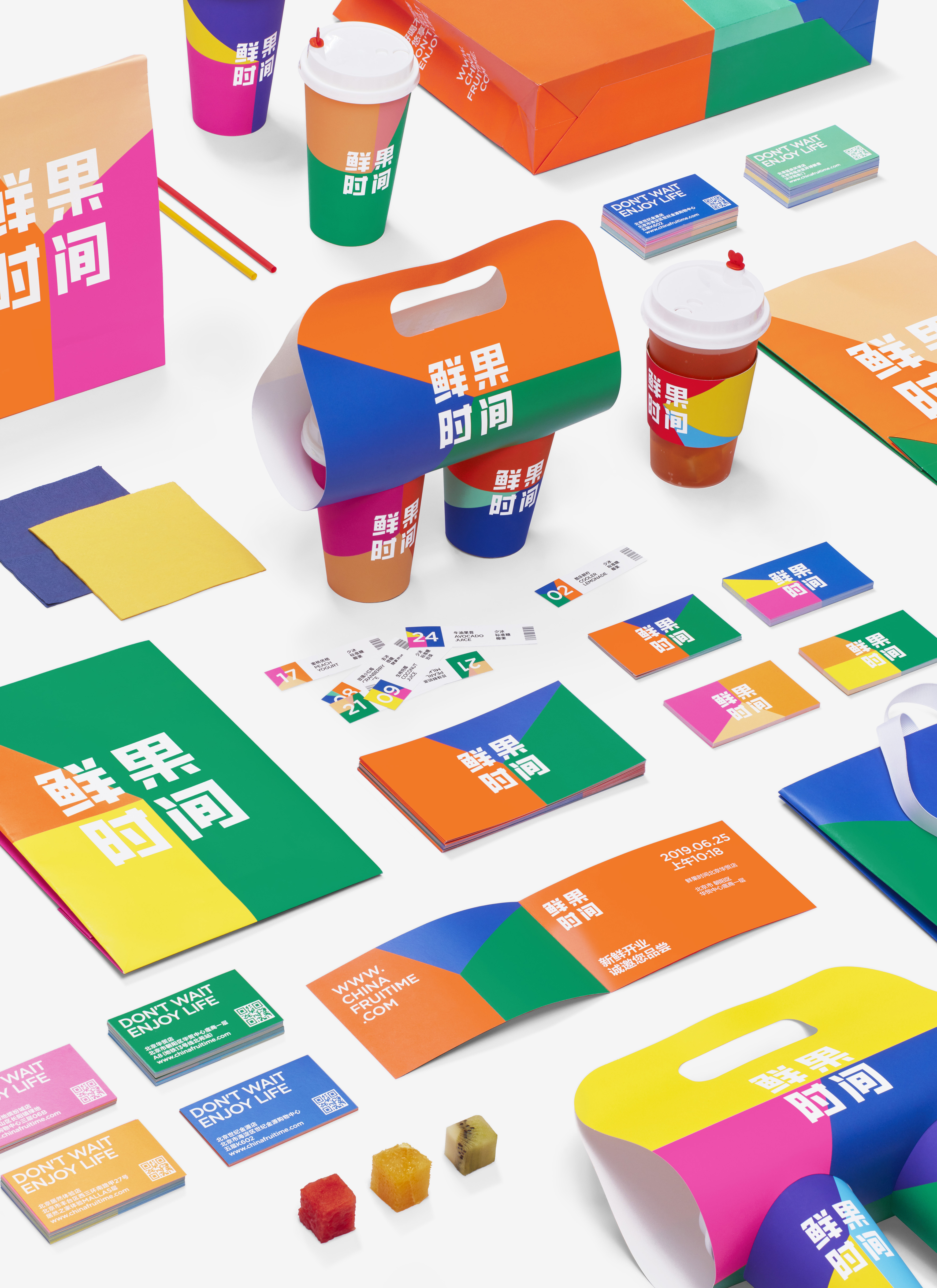
Due to the large number of stores, the future maintenance cost must be effectively controlled, so we introduced the design method of system building. In the concrete presentation, “fresh fruit” and “time” are described respectively. Among them, the color relations correspond to “fresh fruit”, and the adjustable proportional relationship between the three sectors means “time”. As time elapses, there are different color combinations, and the logo has been in a state of flexibility and freedom. The derived visual identity system is rich and diverse with an extremely high recognition degree. On the other hand, the high purity and contrast in the color relationship also triggers an intense psychological implication, producing a refreshing, sweet and sour taste experience, fresh, delicious, and naturally integrated into the underlying gene of the brand.
Due to the large number of stores, the future maintenance cost must be effectively controlled, so we introduced the design method of system building. In the concrete presentation, “fresh fruit” and “time” are described respectively. Among them, the color relations correspond to “fresh fruit”, and the adjustable proportional relationship between the three sectors means “time”. As time elapses, there are different color combinations, and the logo has been in a state of flexibility and freedom. The derived visual identity system is rich and diverse with an extremely high recognition degree. On the other hand, the high purity and contrast in the color relationship also triggers an intense psychological implication, producing a refreshing, sweet and sour taste experience, fresh, delicious, and naturally integrated into the underlying gene of the brand.
鲜果时间创立于2007年,如今已经拥有超过三百家门店。这次的品牌重塑,是为了应对未来十年的发展规划,让品牌气质更加年轻、面貌更具活力,实现调性上的高度统一。
由于门店数量众多,后期的维护成本必须得到有效控制,因此我们引入了系统搭建的设计方式。具体呈现上,将“鲜果”和“时间”分别进行描述。其中,色彩关系对应“鲜果”,三个扇形之间可调节的比例关系则意味着“时间”。伴随时间的变化,出现不同的色彩组合,而标识主体则一直处于灵活自由的状态当中。由此衍生出的视觉识别系统,是丰富多样的,识别度极高。而色彩关系上的高纯度和高对比,也引发了强烈的心理暗示,使人产生甘爽酸甜的味觉体验,新鲜、美味,自然而然地融入品牌的底层基因。
由于门店数量众多,后期的维护成本必须得到有效控制,因此我们引入了系统搭建的设计方式。具体呈现上,将“鲜果”和“时间”分别进行描述。其中,色彩关系对应“鲜果”,三个扇形之间可调节的比例关系则意味着“时间”。伴随时间的变化,出现不同的色彩组合,而标识主体则一直处于灵活自由的状态当中。由此衍生出的视觉识别系统,是丰富多样的,识别度极高。而色彩关系上的高纯度和高对比,也引发了强烈的心理暗示,使人产生甘爽酸甜的味觉体验,新鲜、美味,自然而然地融入品牌的底层基因。