INTO YOU
ART DIRECTOR: Nod Young / Guang Yu
DESIGNER: Han Lu / Xu Mingru / Wang Xiaoshuai / Wang Anan
YEAR: 2021
CLIENT: INTO YOU
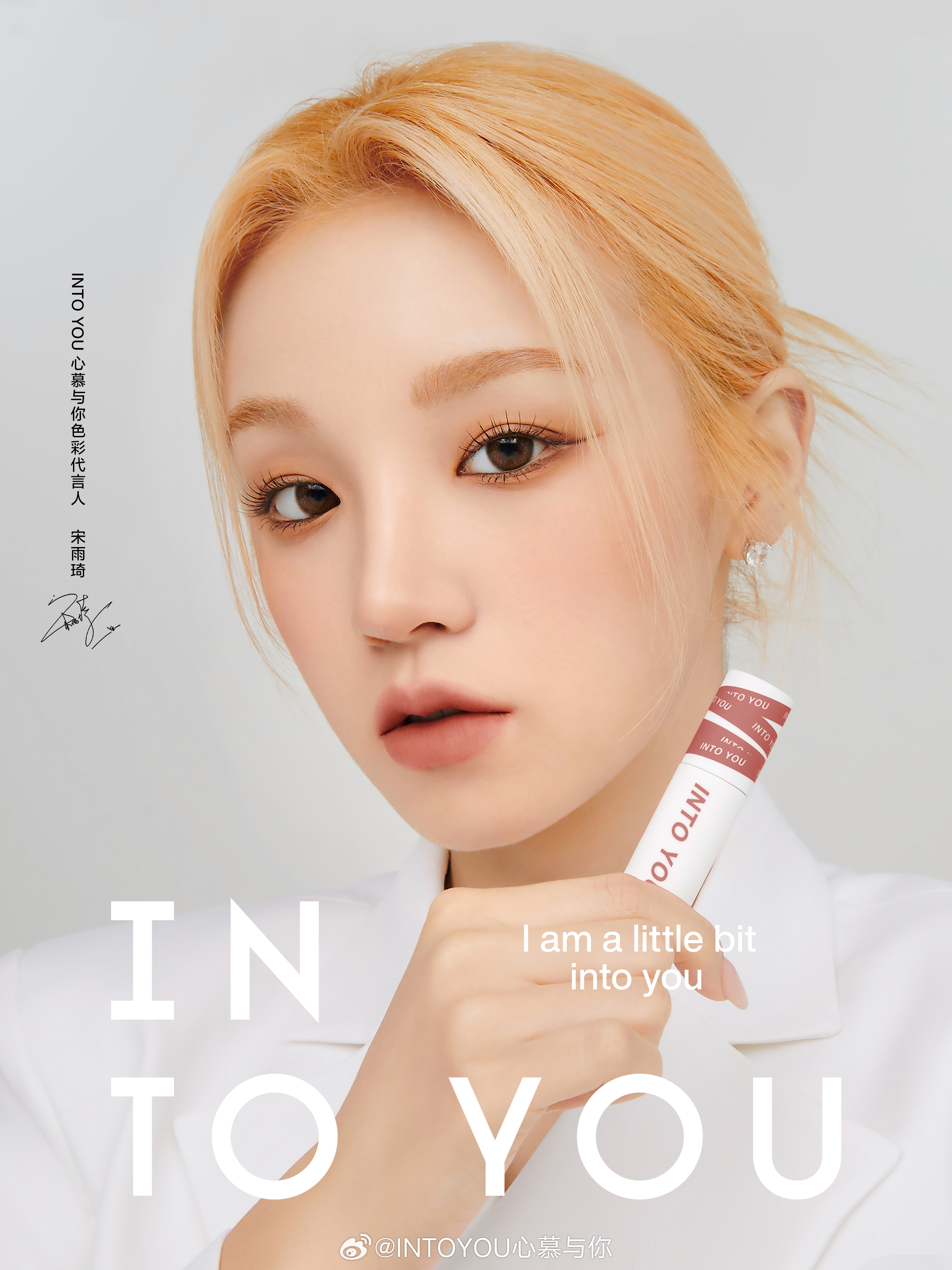
How to define "beauty"? It is an eternal topic. Throughout different eras, among diverse groups of people, and within various industries, the definition of beauty has constantly evolved. The sense of connection arising from the definition of beauty has gradually become the most cherished brand value for consumers. The brand upgrade of INTO YOU aims to redefine the "value of beauty" and, along with the times, explore: What kind of beauty best resonates with the unique understanding of modern women?
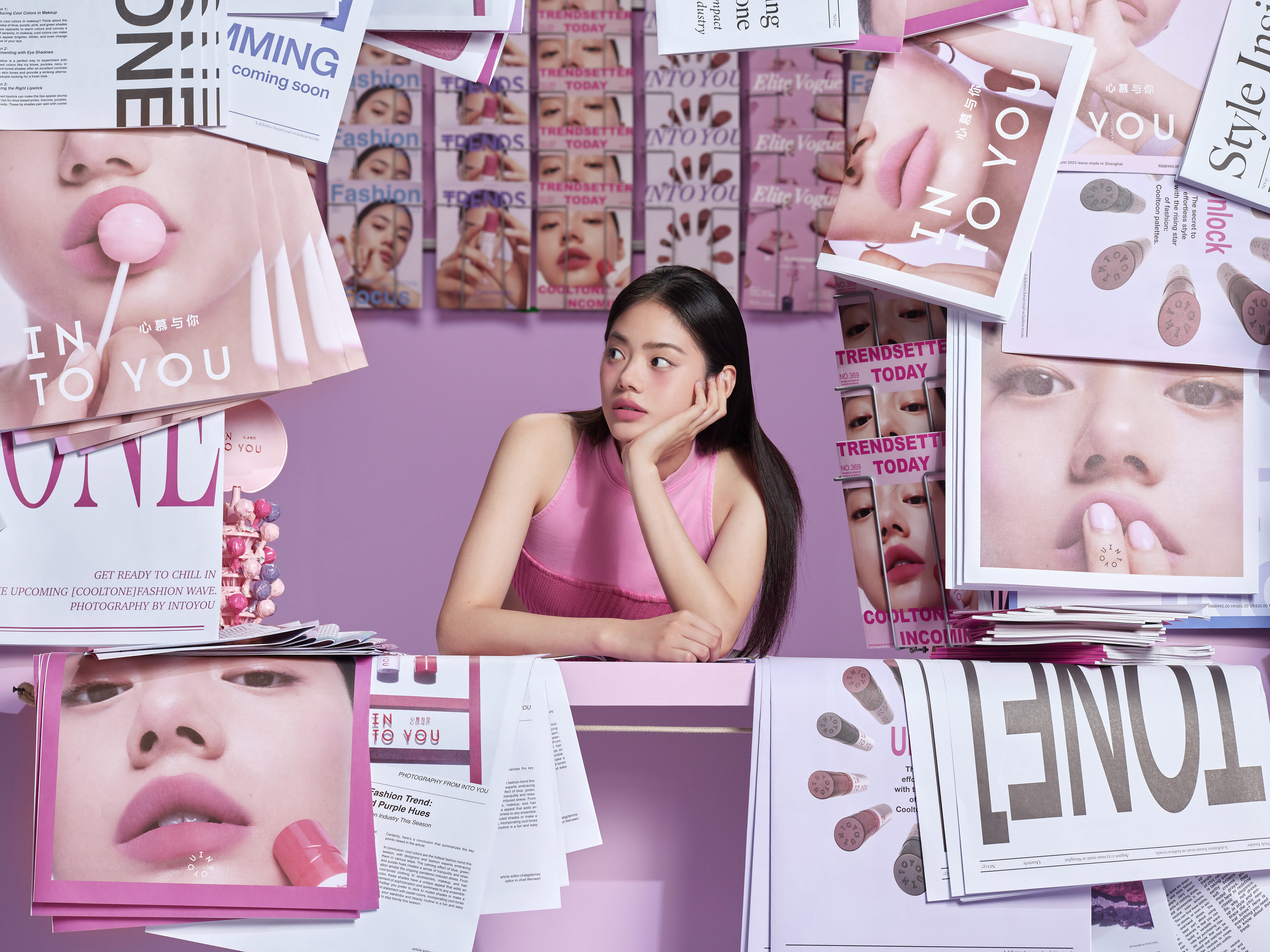
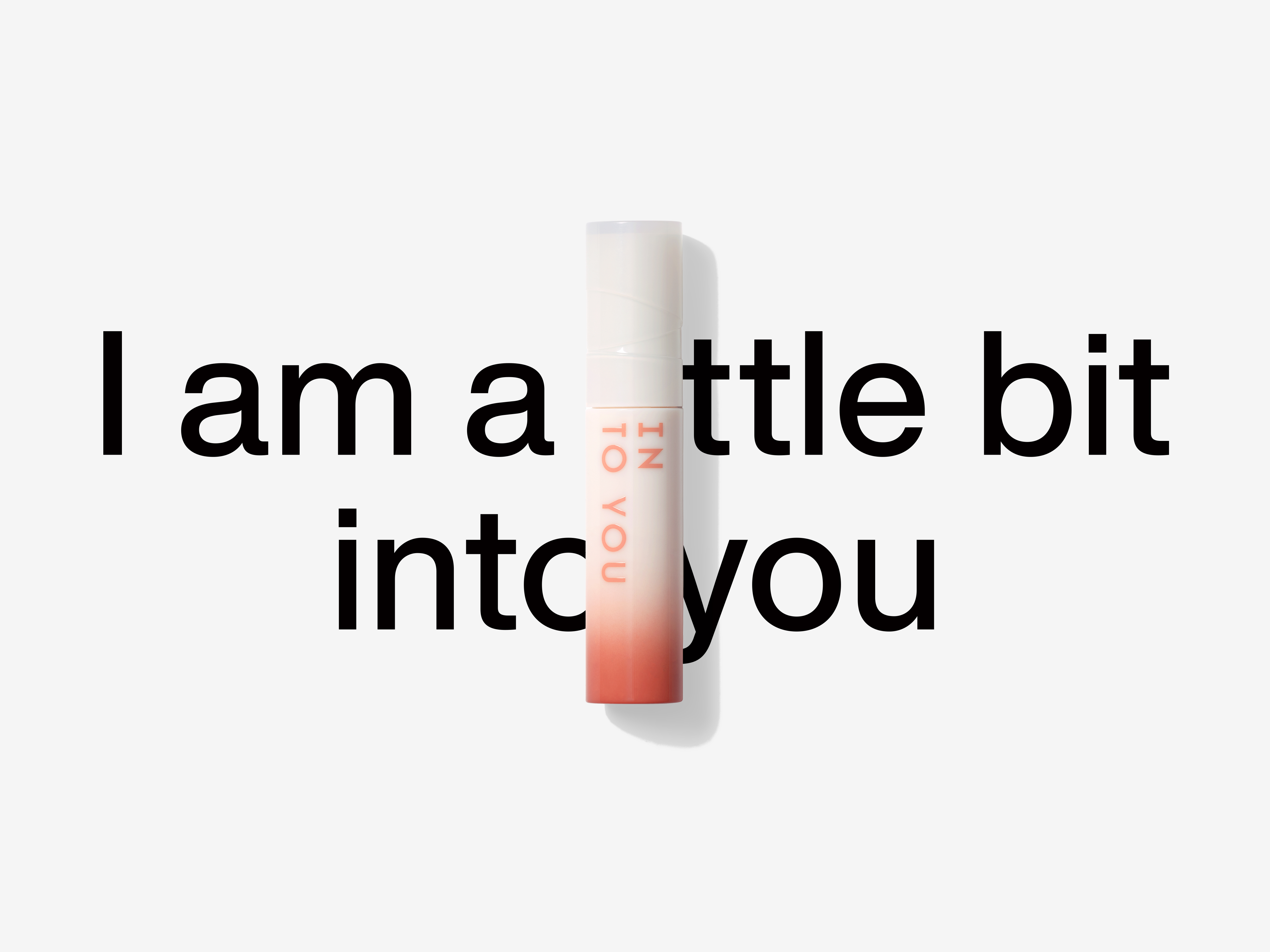
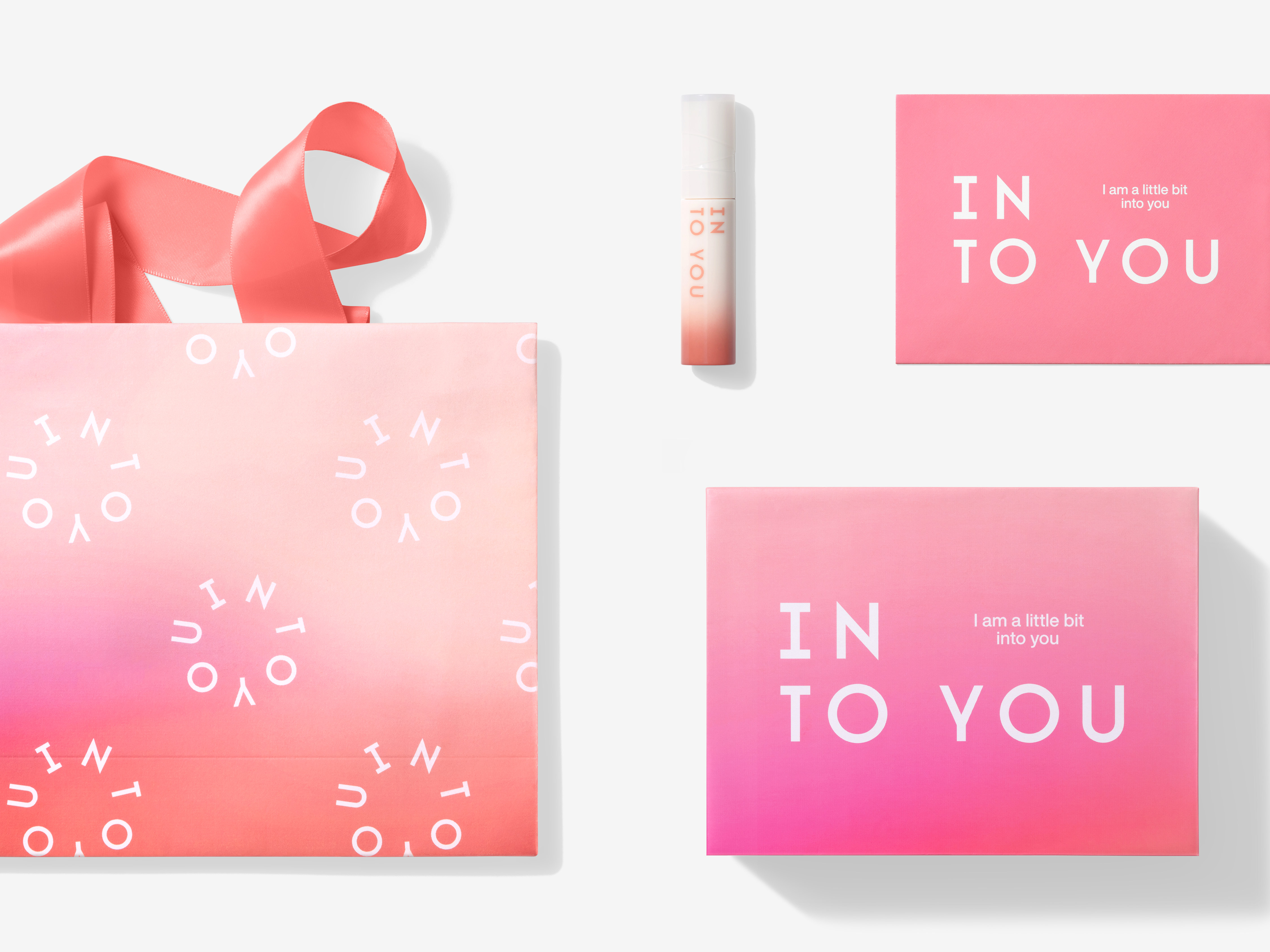
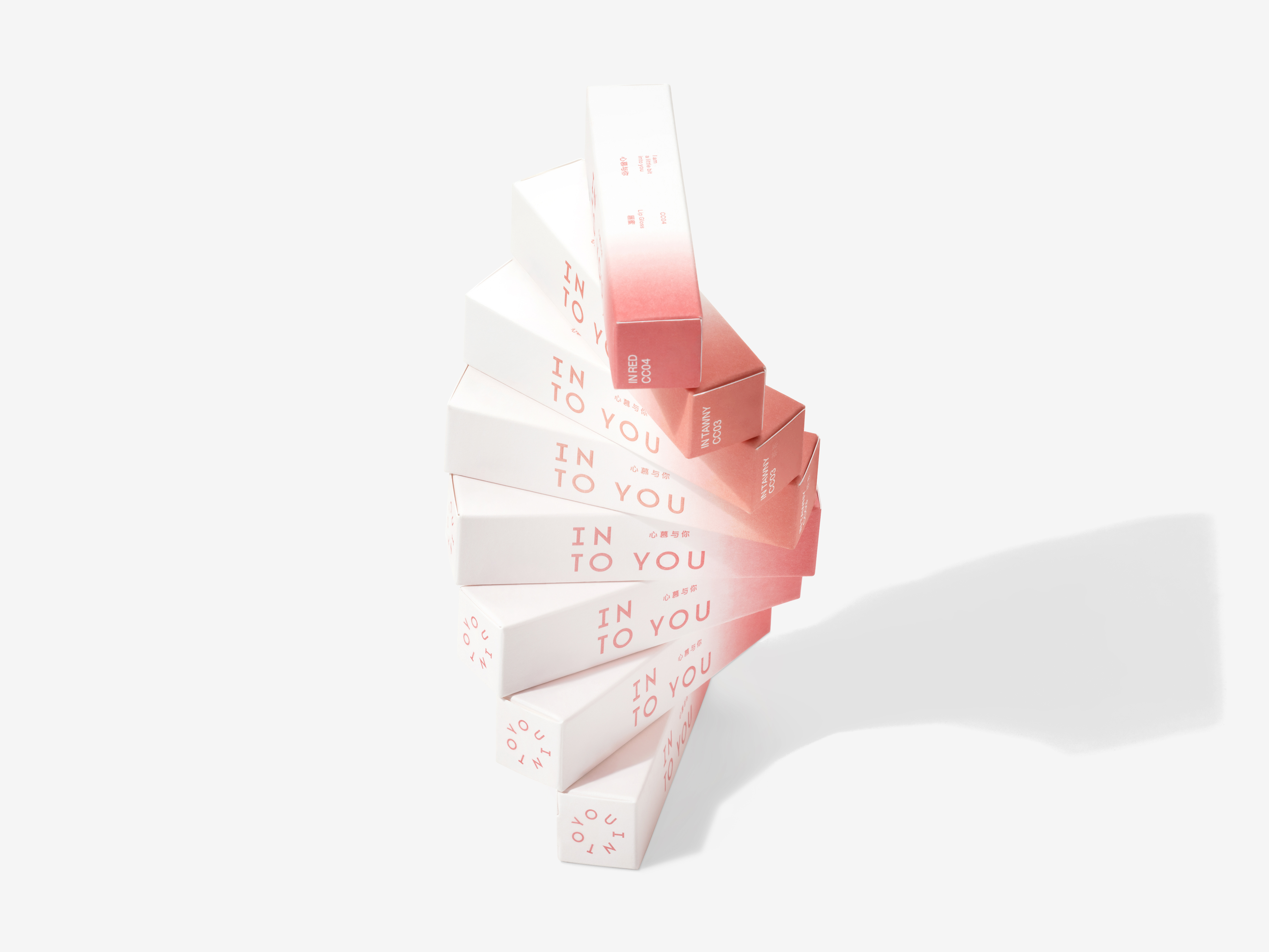
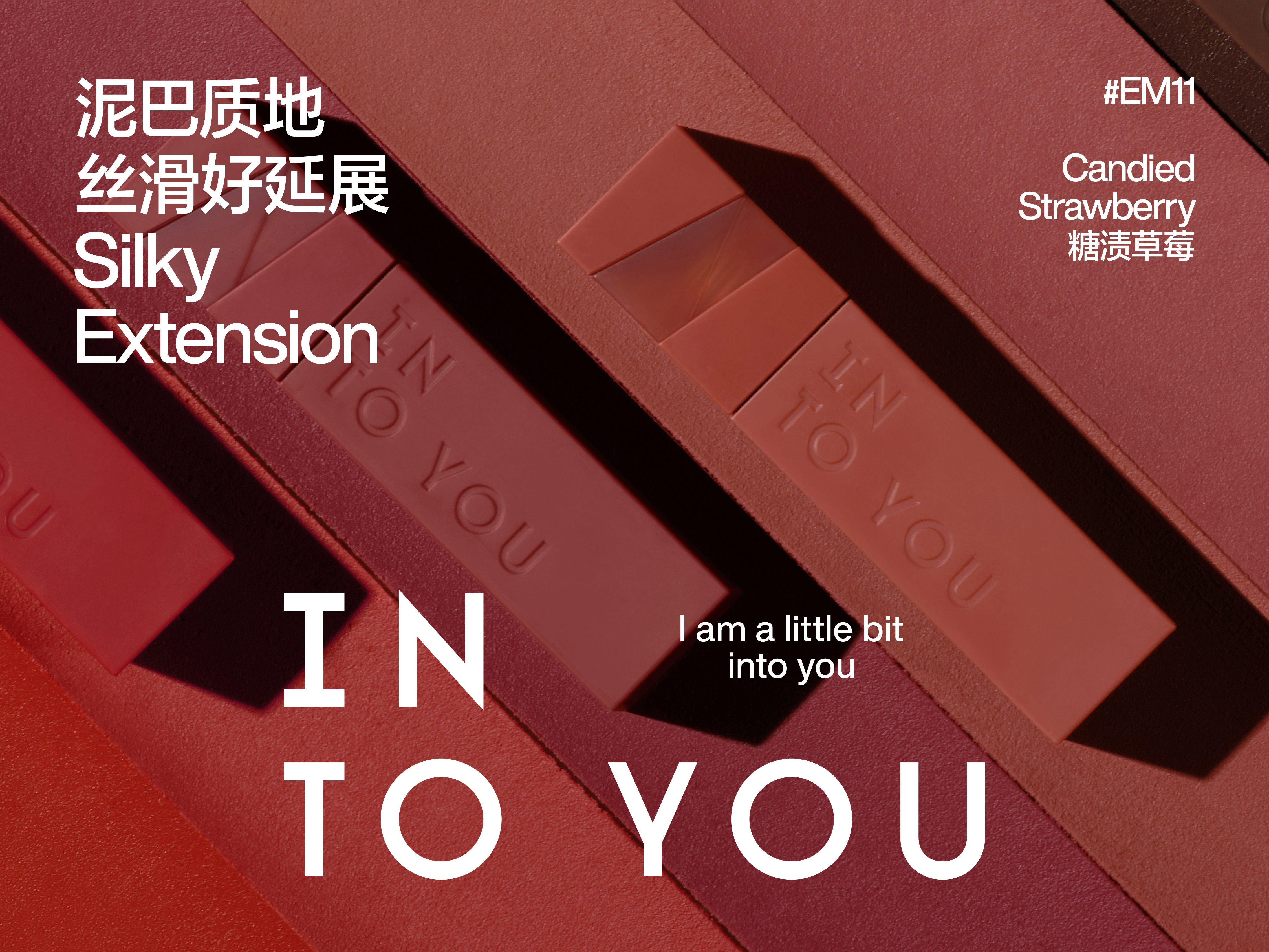
INTO YOU's new brand image establishes a distinctive visual order, a confident and decisive decision. The INTO YOU logo consists of two sets of text, forming two relatively independent textual units, which differs significantly from the common "single line" format found in traditional logos. The subtle line break between "IN" and "TO" adds a sense of visual appeal to the conventional arrangement of text, reflecting the delicate, sensitive, and emotional side of modern women: unconventional, yet elegant in demeanor.INTO YOU is a brand that possesses a unique understanding of "beauty." This understanding goes beyond the transmission of product texture and extends to an insightful exploration of the inner world of female consumers.
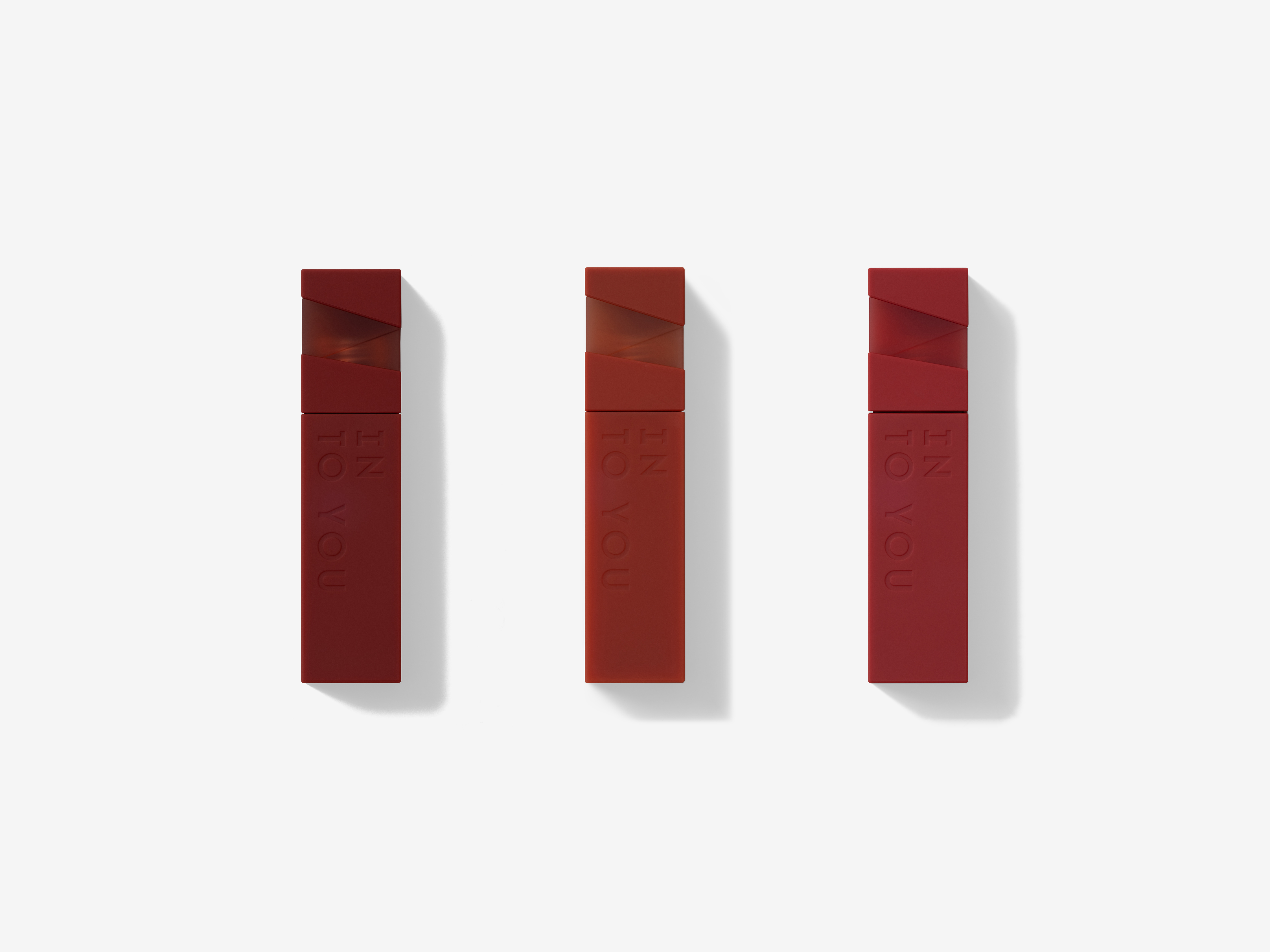
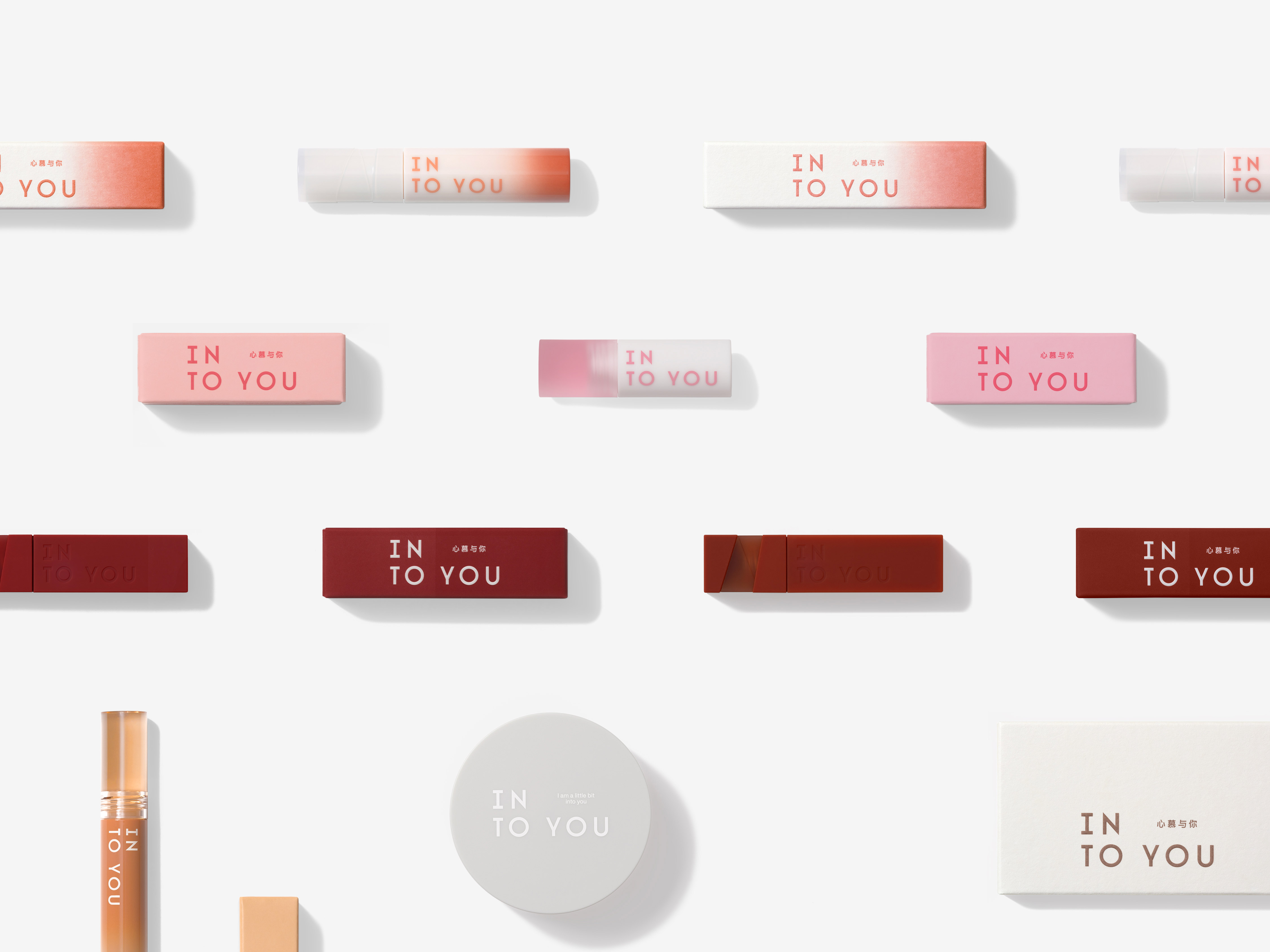
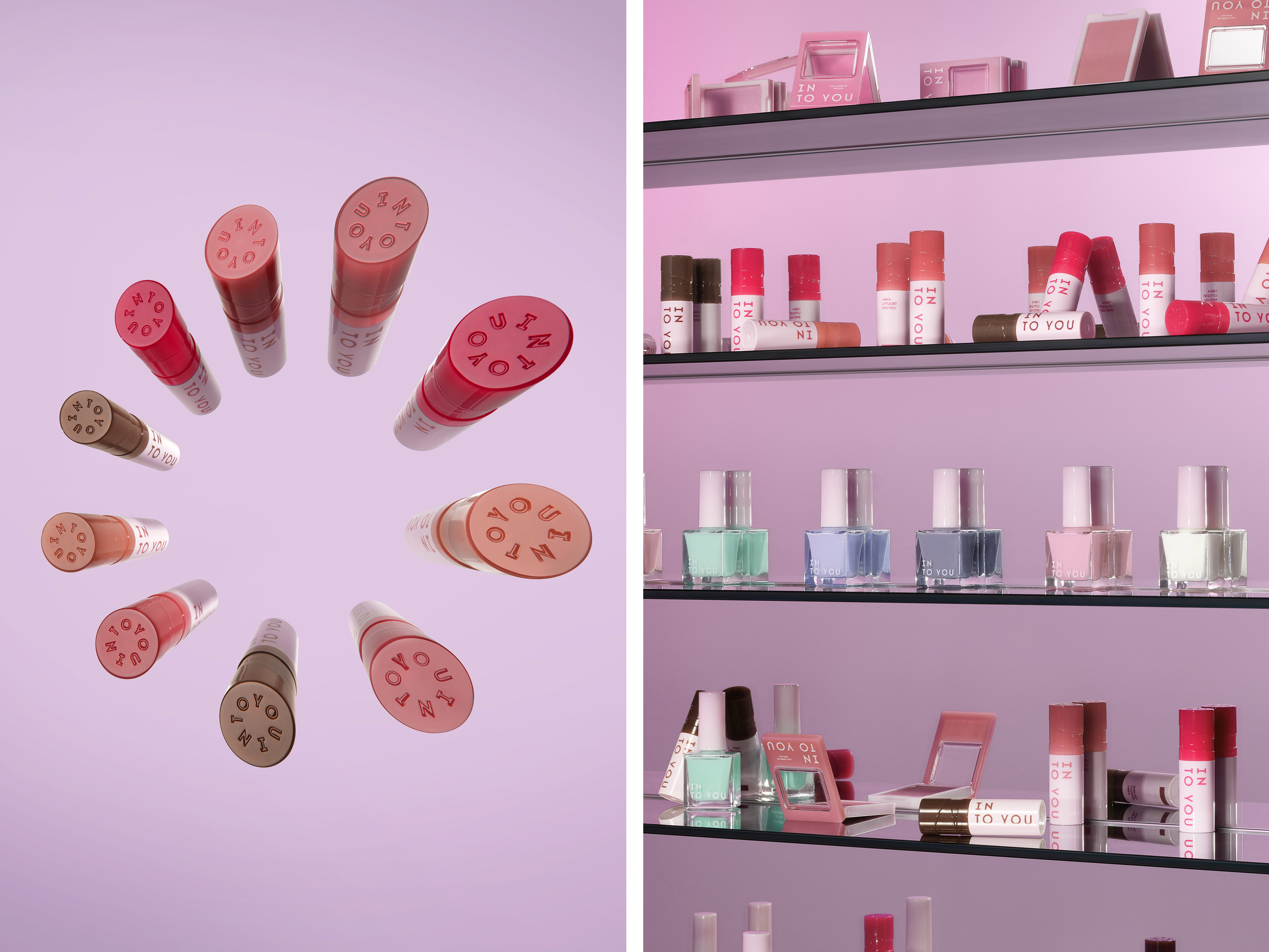
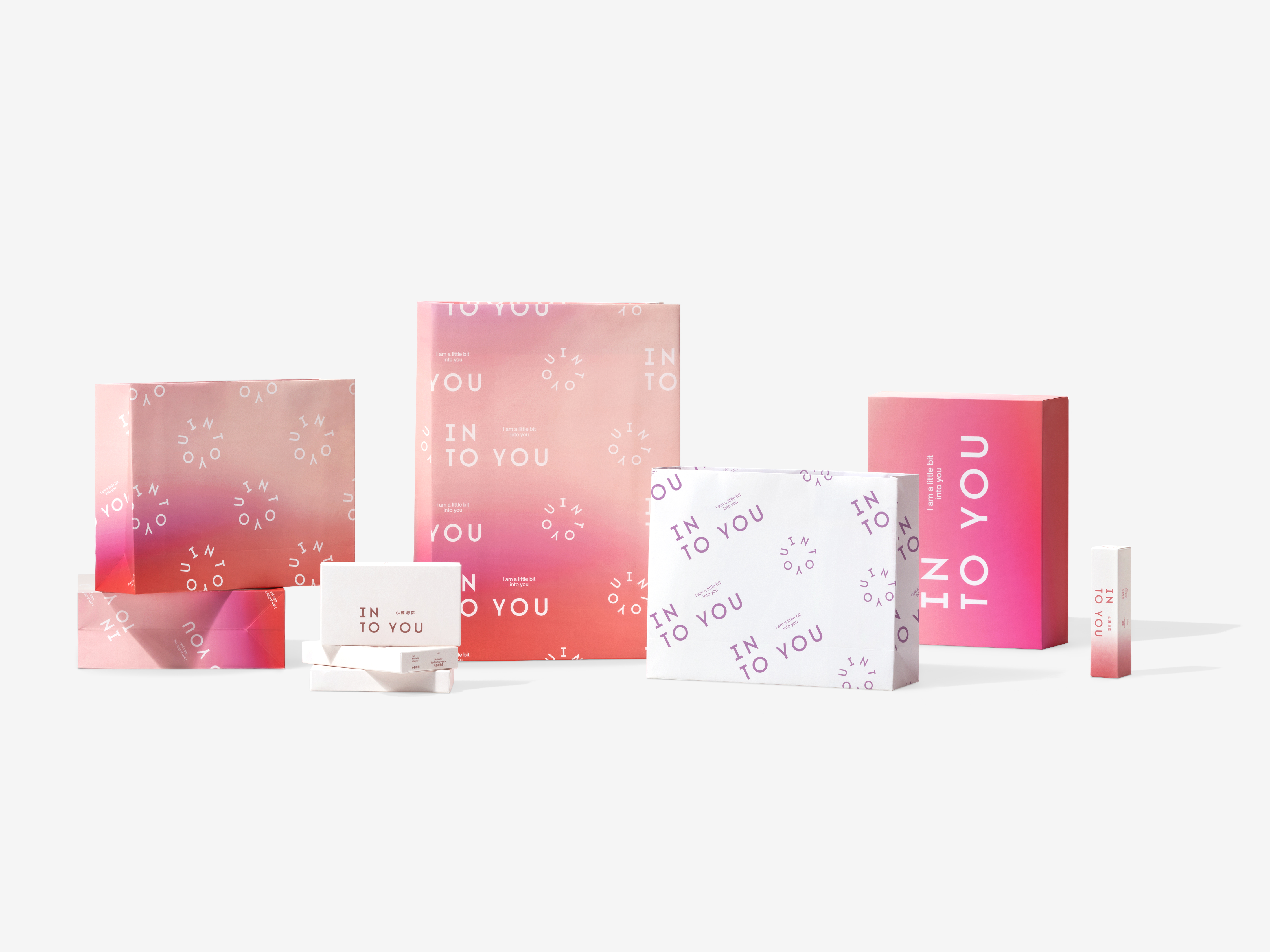
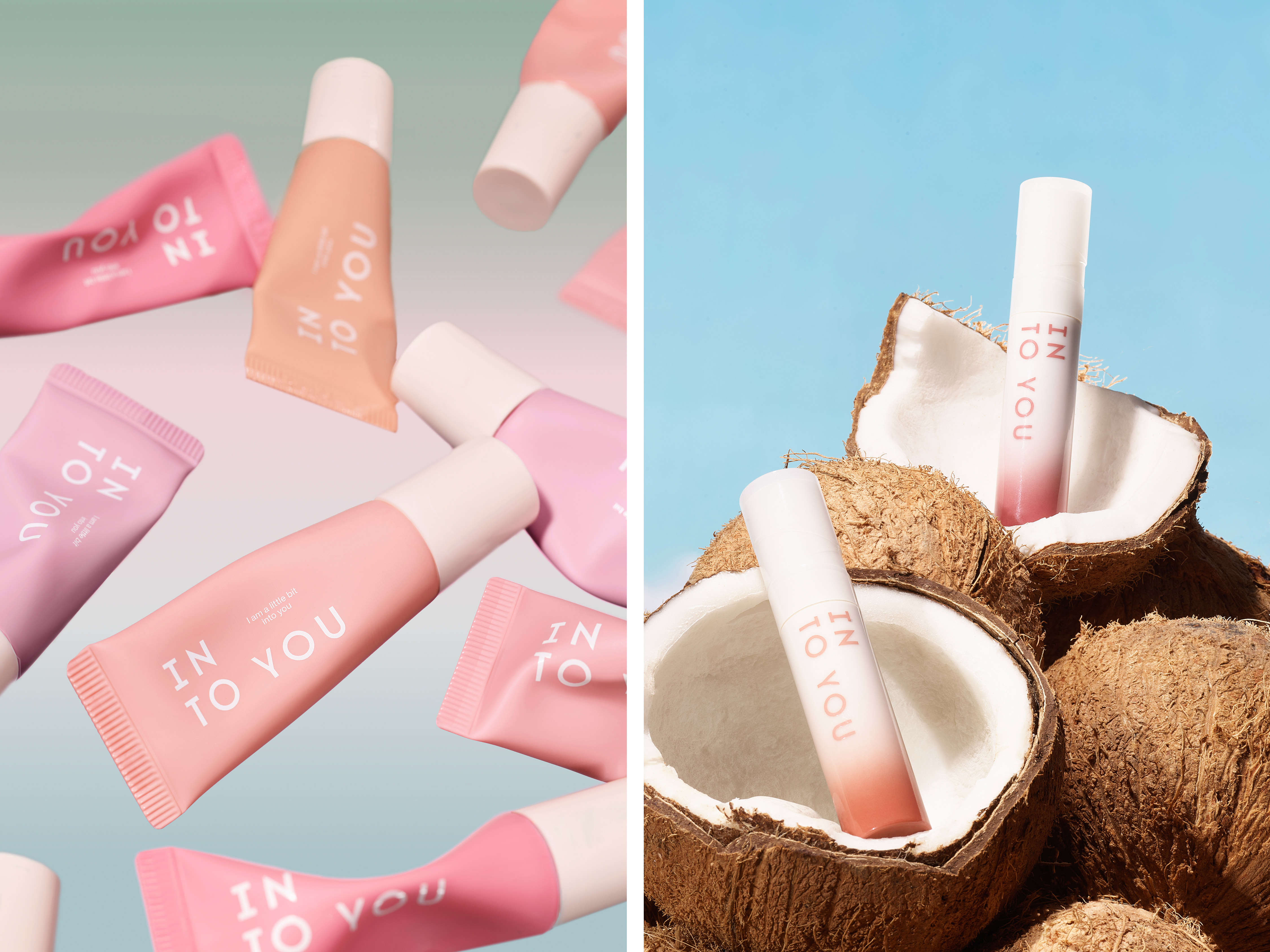
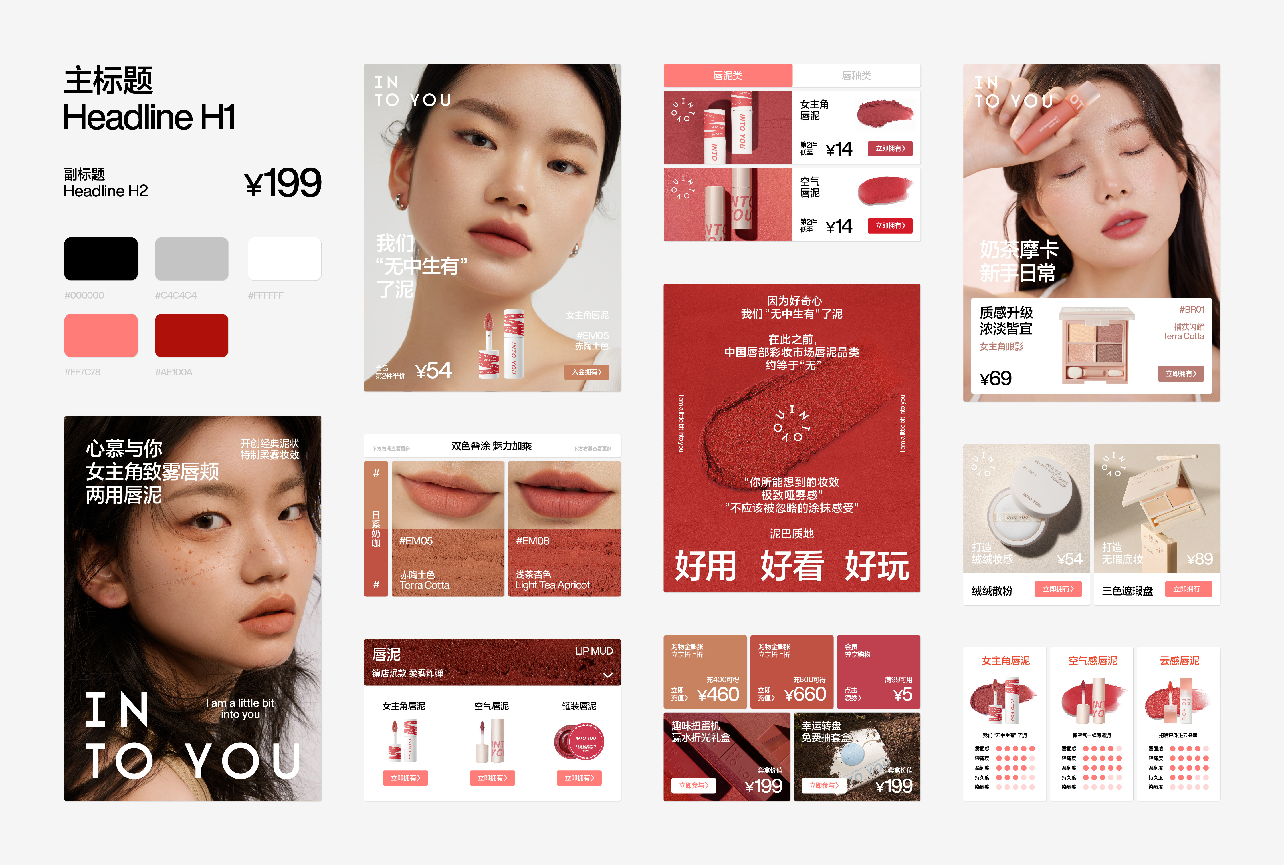
INTO YOU has always strived to discover and showcase the unique charm of every woman. This is precisely why their product range is so diverse and their color palette so delicately defined. As part of the brand upgrade, INTO YOU has also elevated its product packaging, encompassing a wider and richer product line. With a unified visual aesthetic, they aim to offer consumers a more pleasing and friendly experience.
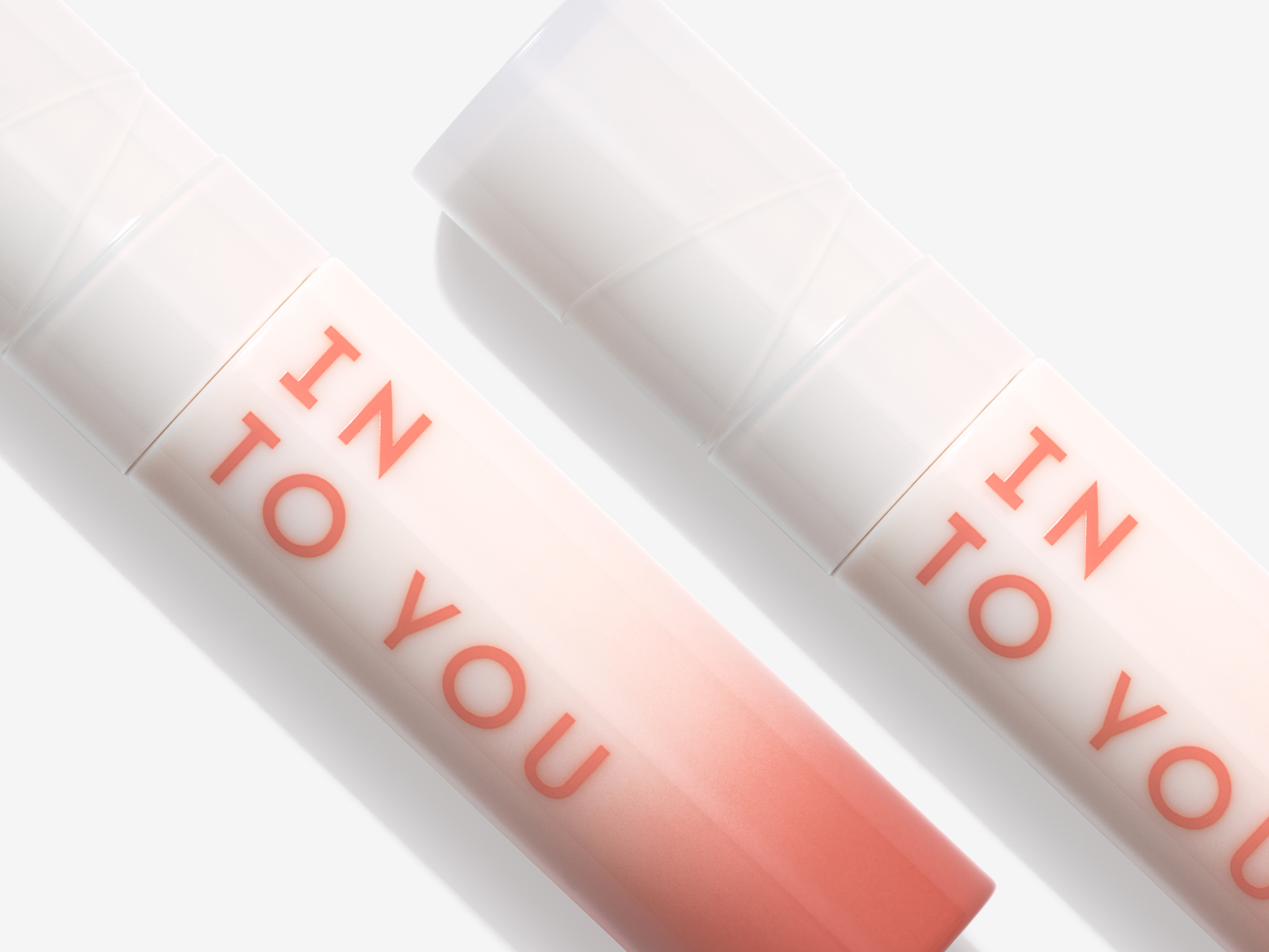
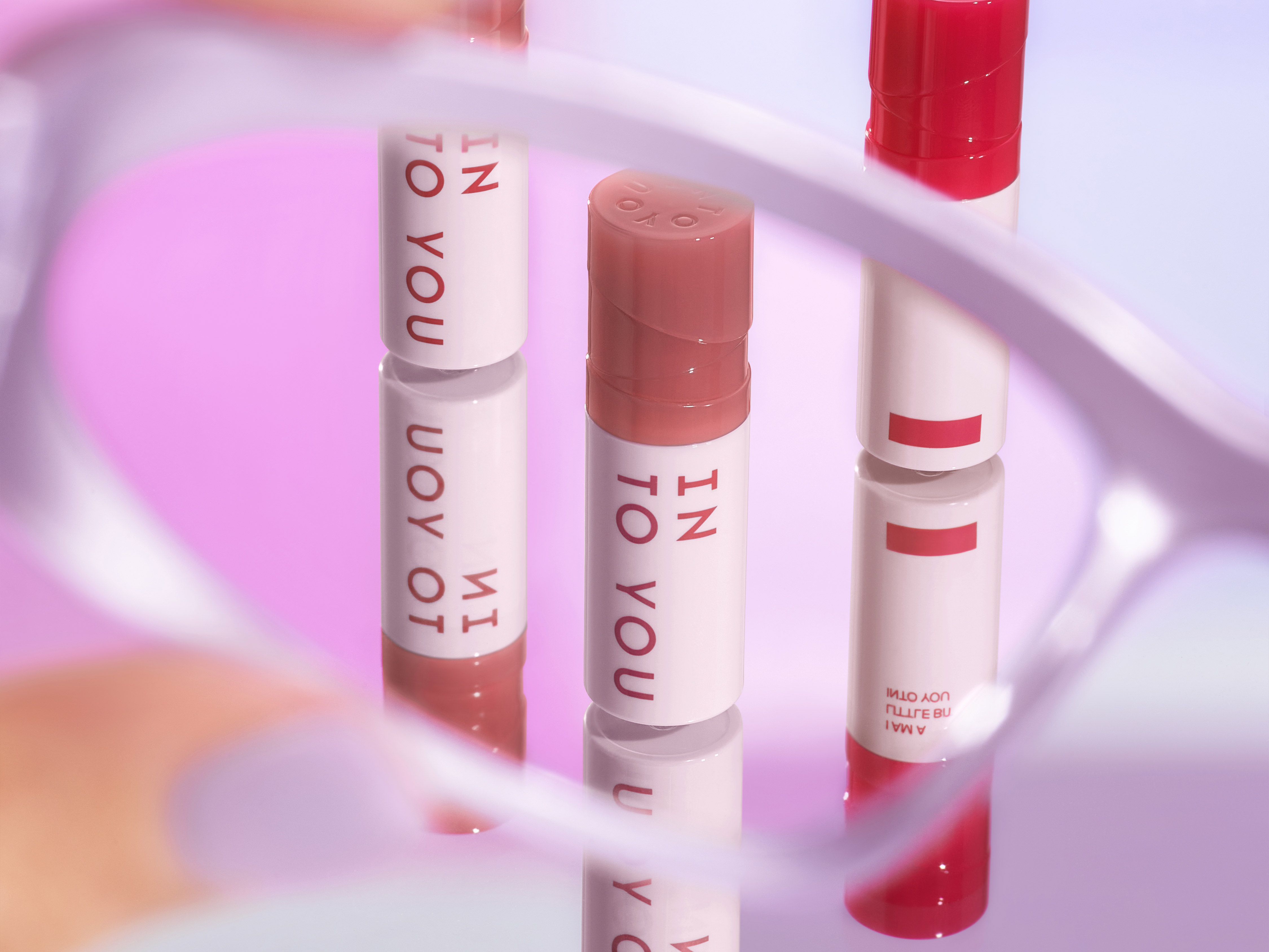
Now, let us return to the topic of "defining beauty." INTO YOU aspires to create a more friendly and diverse world for women, where small changes bring delightful surprises to everyday life. And what better way to begin than with a lipstick?
“美”要如何定义?这是个永恒的话题。在不同的时代背景下,在不同的人群中,在不同的行业领域里,美的定义一直在发生变化,围绕美的定义而产生的认同感也逐渐成为消费者最关心的品牌价值。INTO YOU 此次的品牌升级,正是为了再一次定义“美的价值”,与时代一同去寻找:到底怎样的美才最能贴合现代女性的独特理解。
INTO YOU 的新品牌形象建立了一种特殊的视觉秩序,这是一种自信且果断的决定。INTO YOU 的标识借由两组文字组成,形成两个相对独立的文字单元,这与传统标识中常见的“一行”表现形式有着截然不同的理解。IN 与 TO 的小回行,让常规的文字排列展现出图形的趣味感,体现出现代女性细腻、敏感、感性的一面:不按常理出牌,却又大方得体。
INTO YOU 是一个对“美”有着独特理解的品牌,这不仅体现在产品质感的传递上,在对于女性消费者的内心洞察上,INTO YOU 一直在努力发掘并展示每位女性独有的魅力,那也是为什么INTO YOU 的产品种类如此丰富,色彩定义如此细腻背后的原因。INTO YOU 的产品包装在此次品牌升级过程中也得到了提升,可以囊括更多更丰富的产品线,在视觉统一的前提下,提供给消费者更加悦目友好的感受。
让我们再次回到“美要如何定义”这个话题,INTO YOU 希望建立一个更加友善且多元的女性世界,通过小小的改变为生活中带来惊喜。那么就让我们先从一支口红开始做起!

All Images Copyright © 2021 INTO YOU 心慕与你. All Rights Reserved