Haoyuan 皓原
ART DIRECTOR: Guang Yu / Nod Young
DESIGNER: Han Lu / Hu Wen / Jing Junjun
YEAR: 2021-2024
CLIENT: Haoyuan 皓原箔业
Haoyuan, a thirty six-year-old factory and a leading brand in the Chinese foil industry with commercial customers all over the world, is entering the Chinese consumer market as a "to C" company in 2021. In defining the
brand image of Haoyuan, we did not look for possibilities from the old rules of the foil industry, but
turned our attention to the modern city, especially the kitchen culture of young people. Noting that most of the user groups of aluminium foil cook regularly, they are also consumers of modern kitchen appliances
such as ovens, we deduced that a more effective way to connect with consumers would be to represent 'modern kitchen culture' rather than 'kitchen tools'.
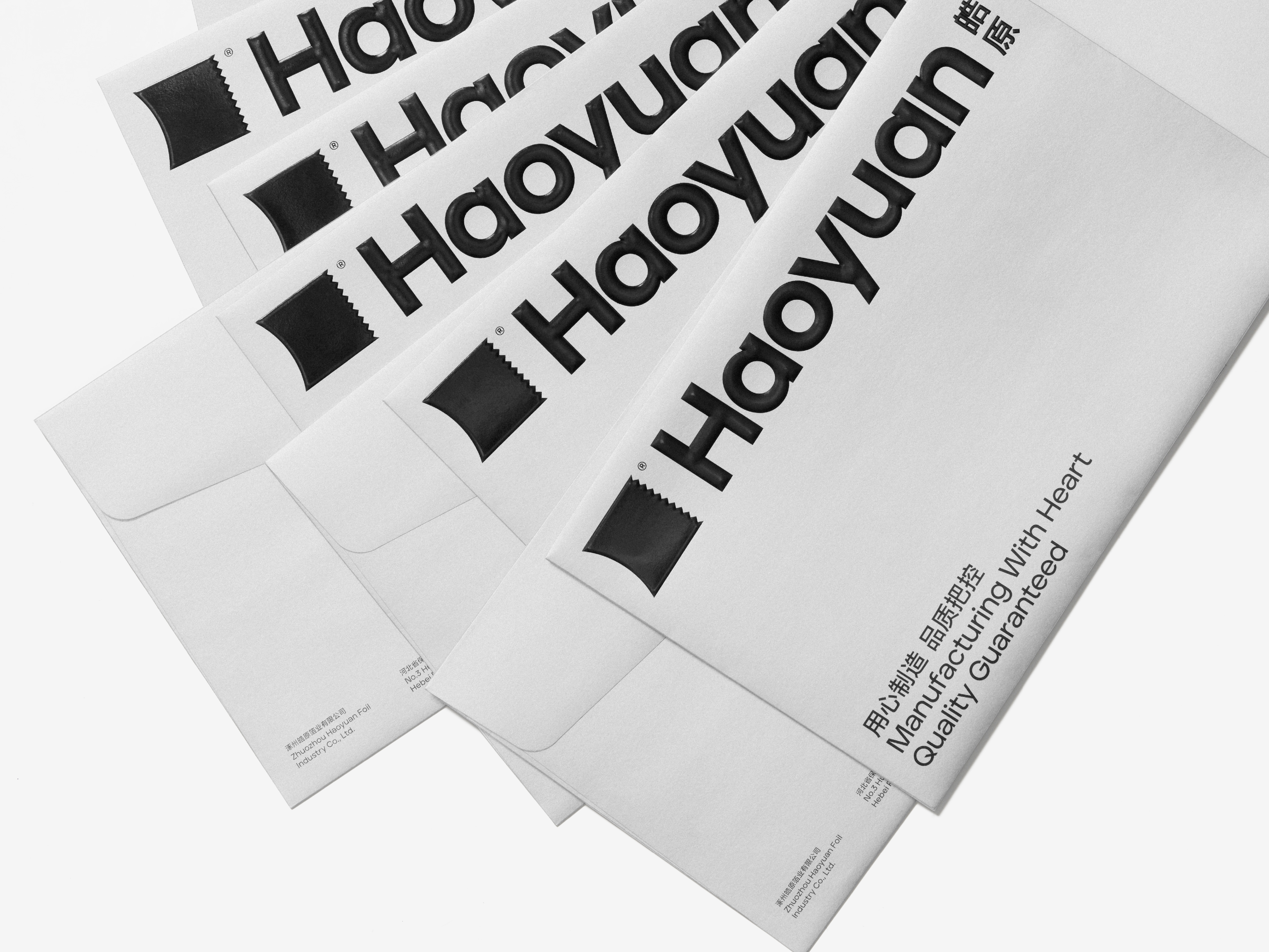
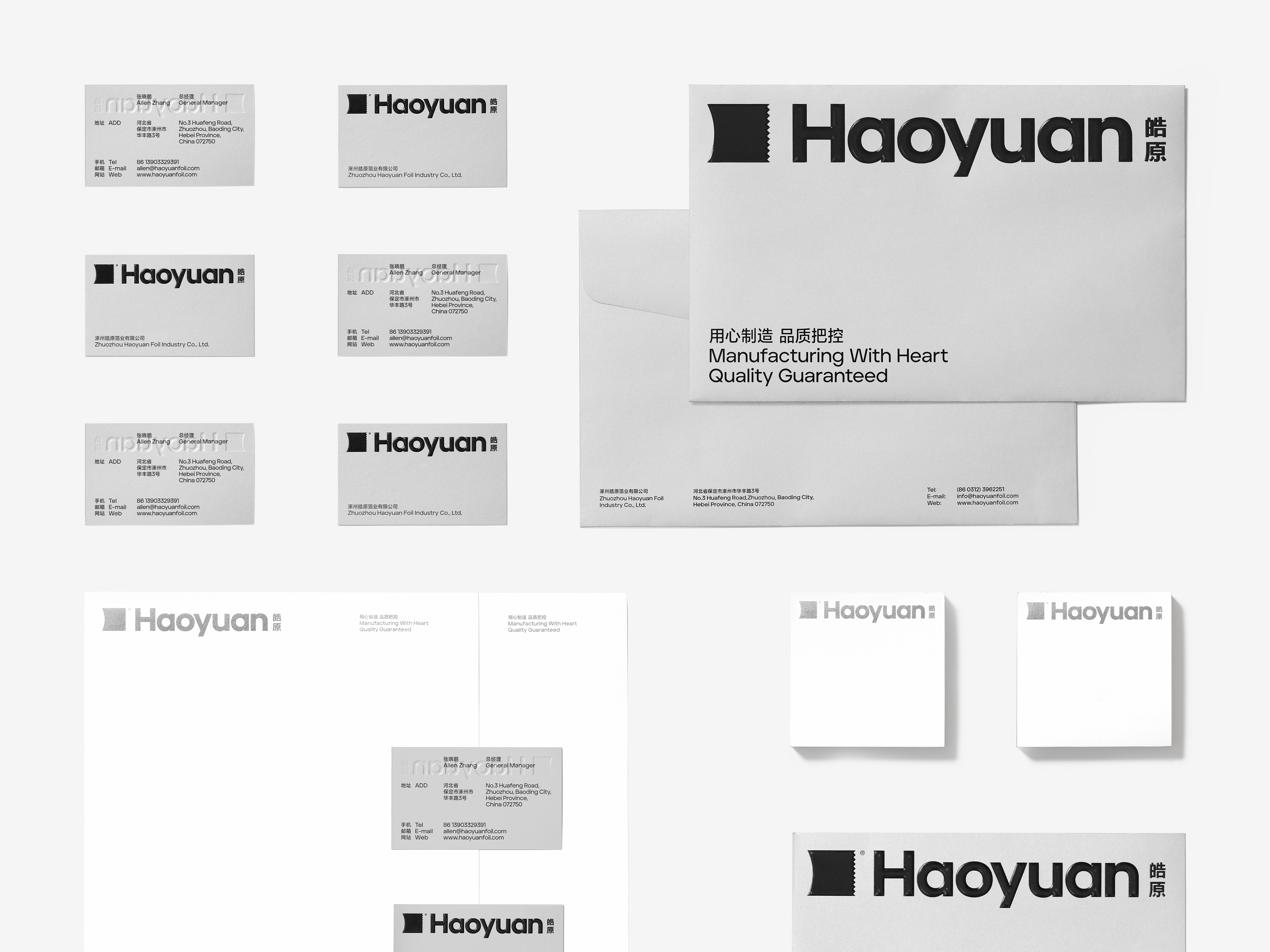
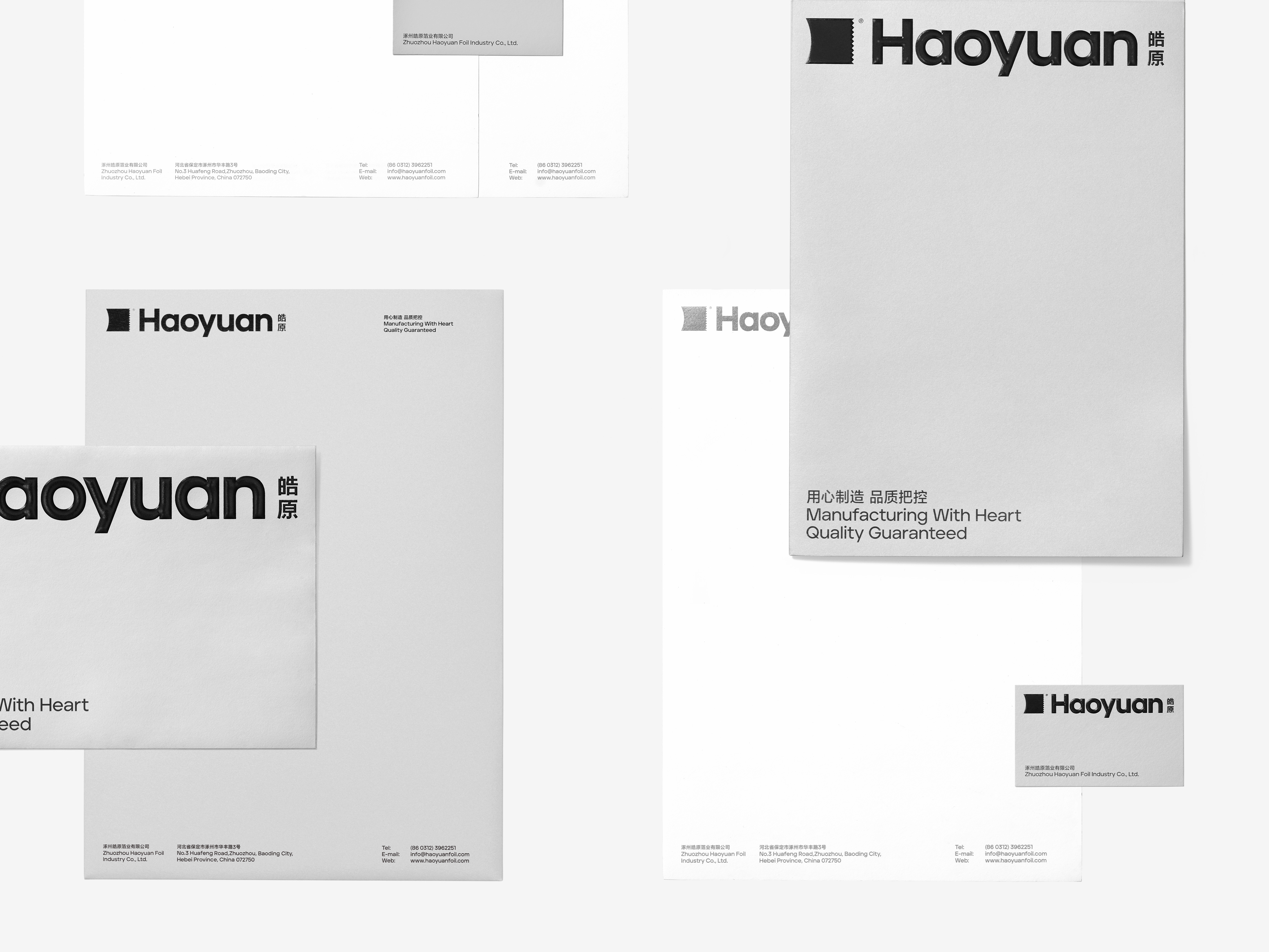
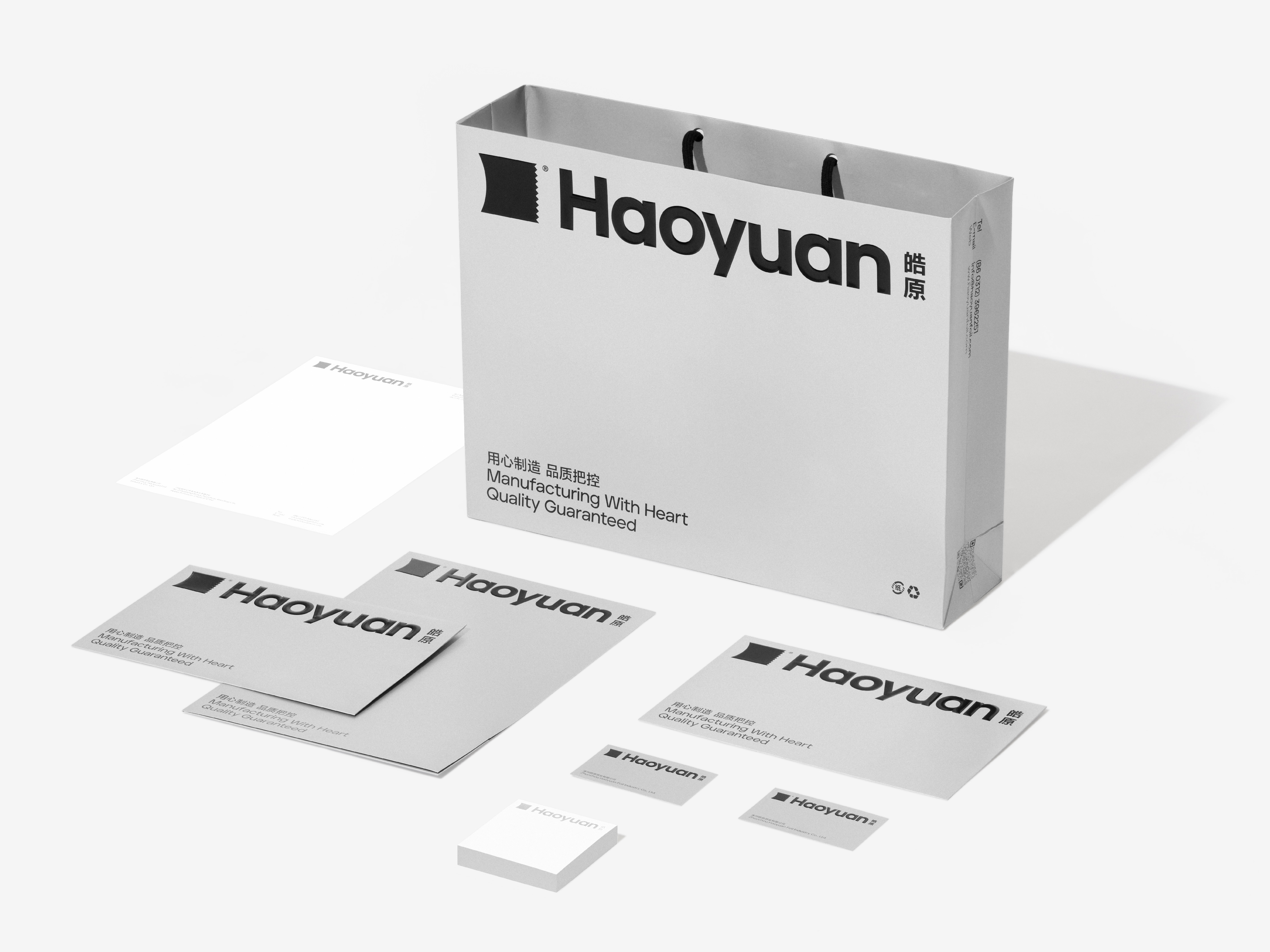
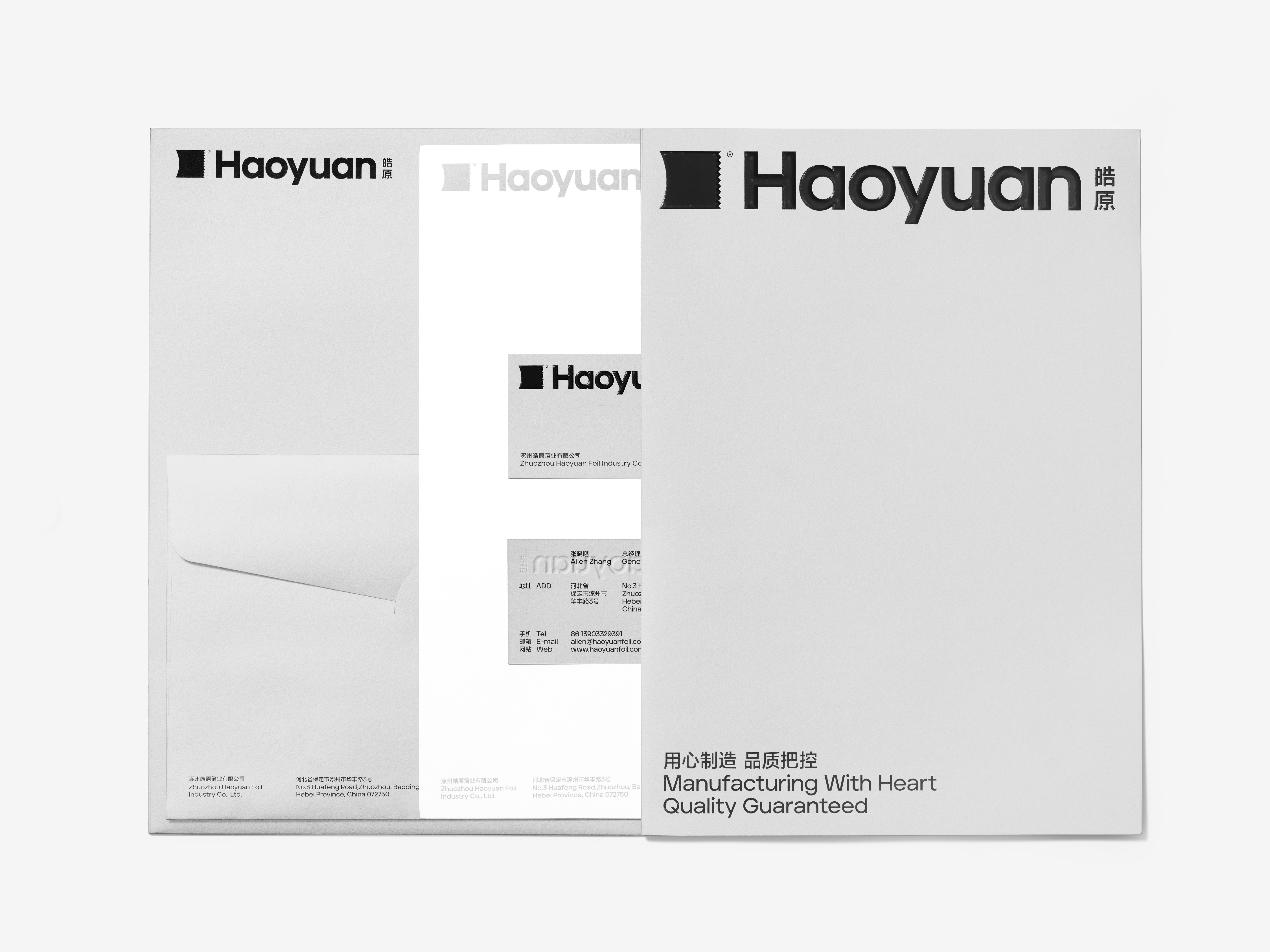
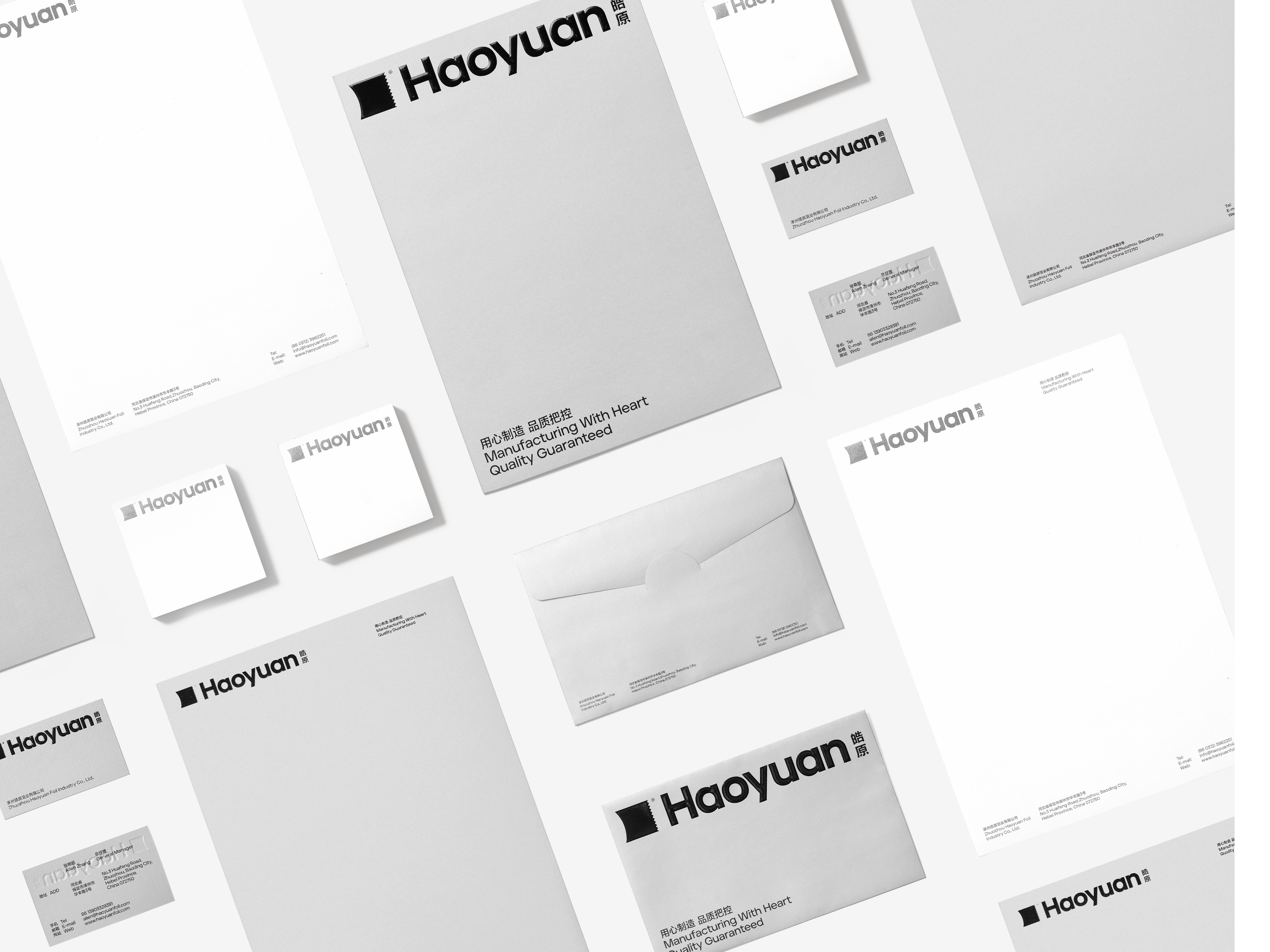
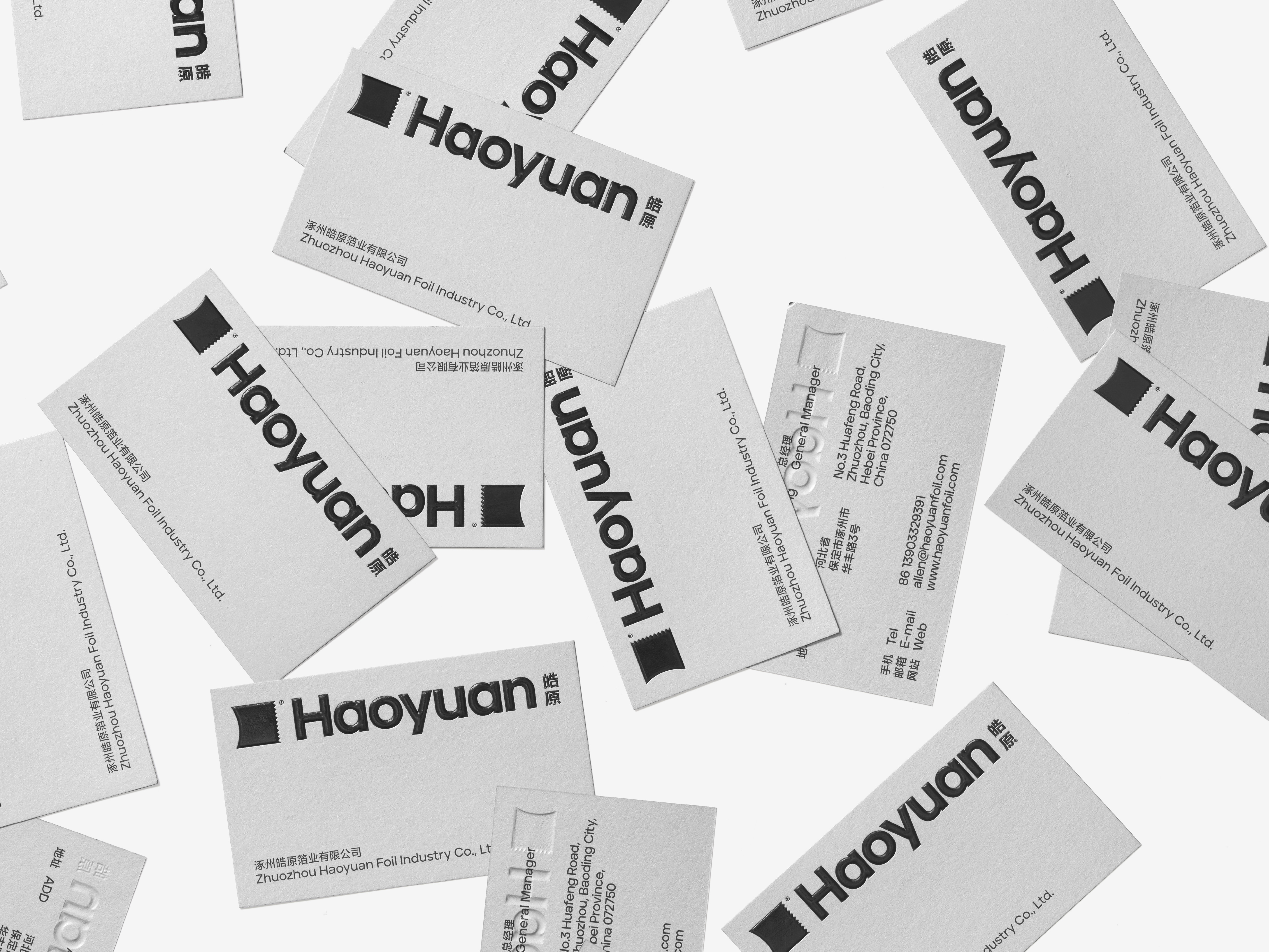
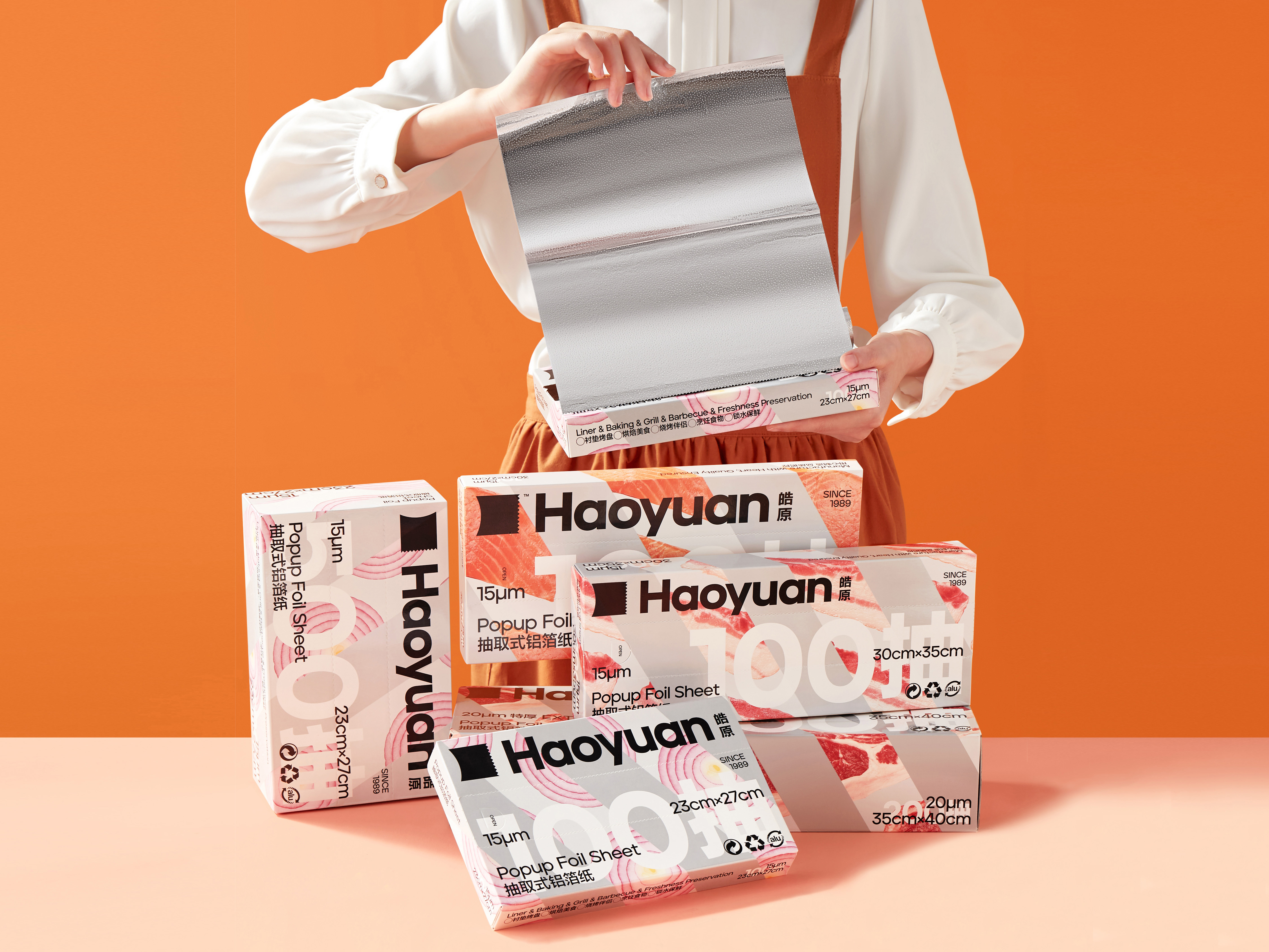
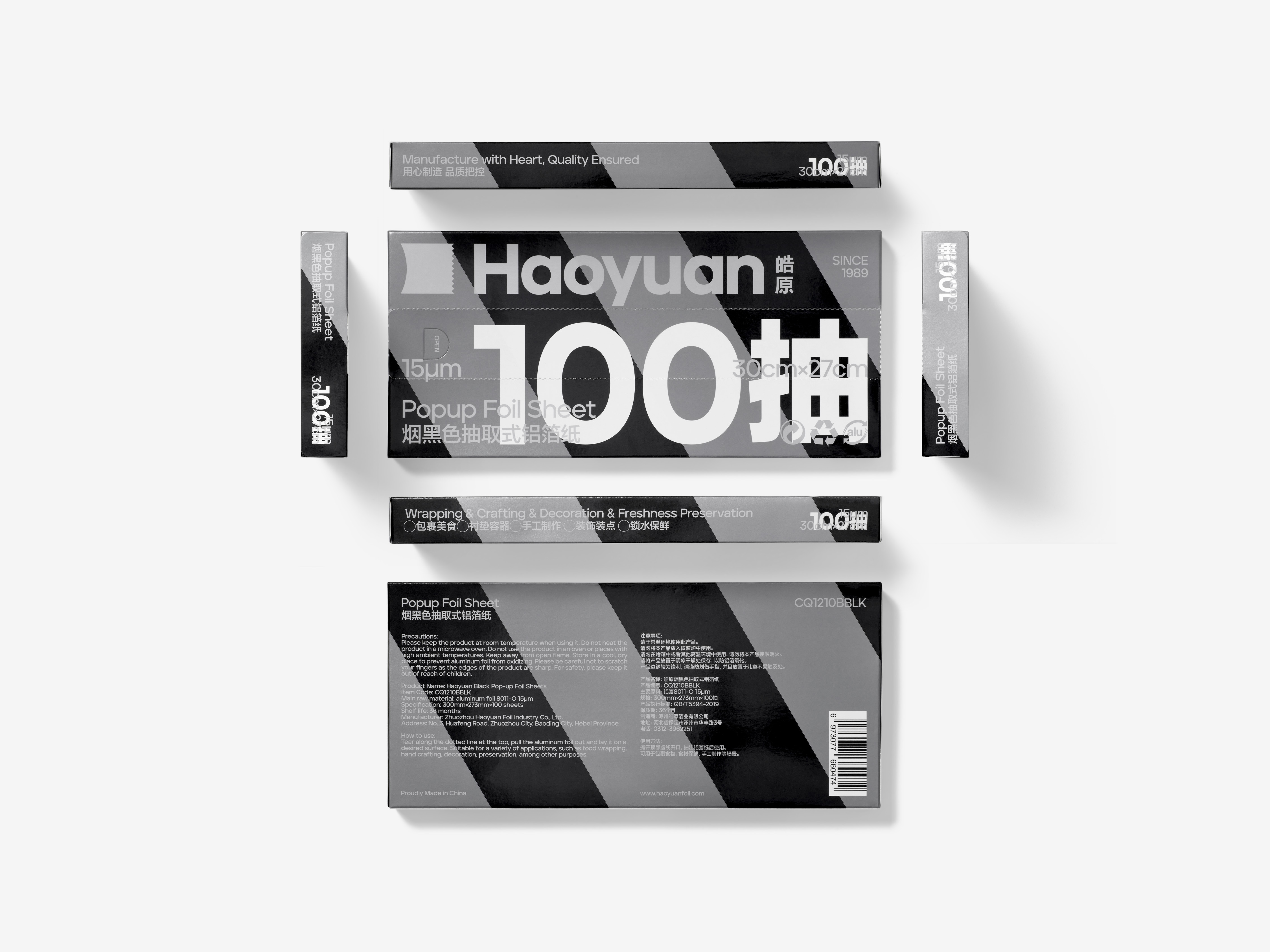
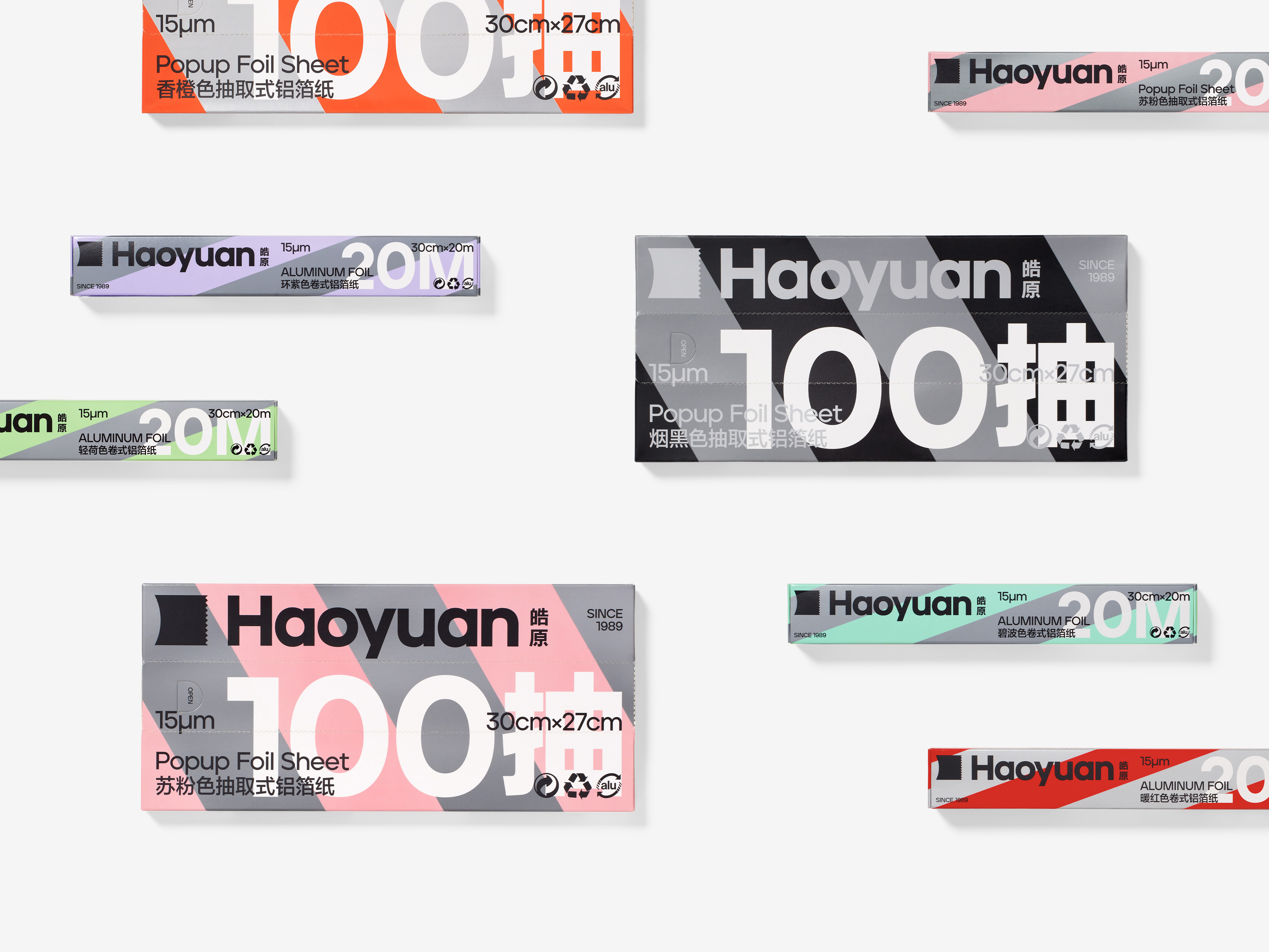
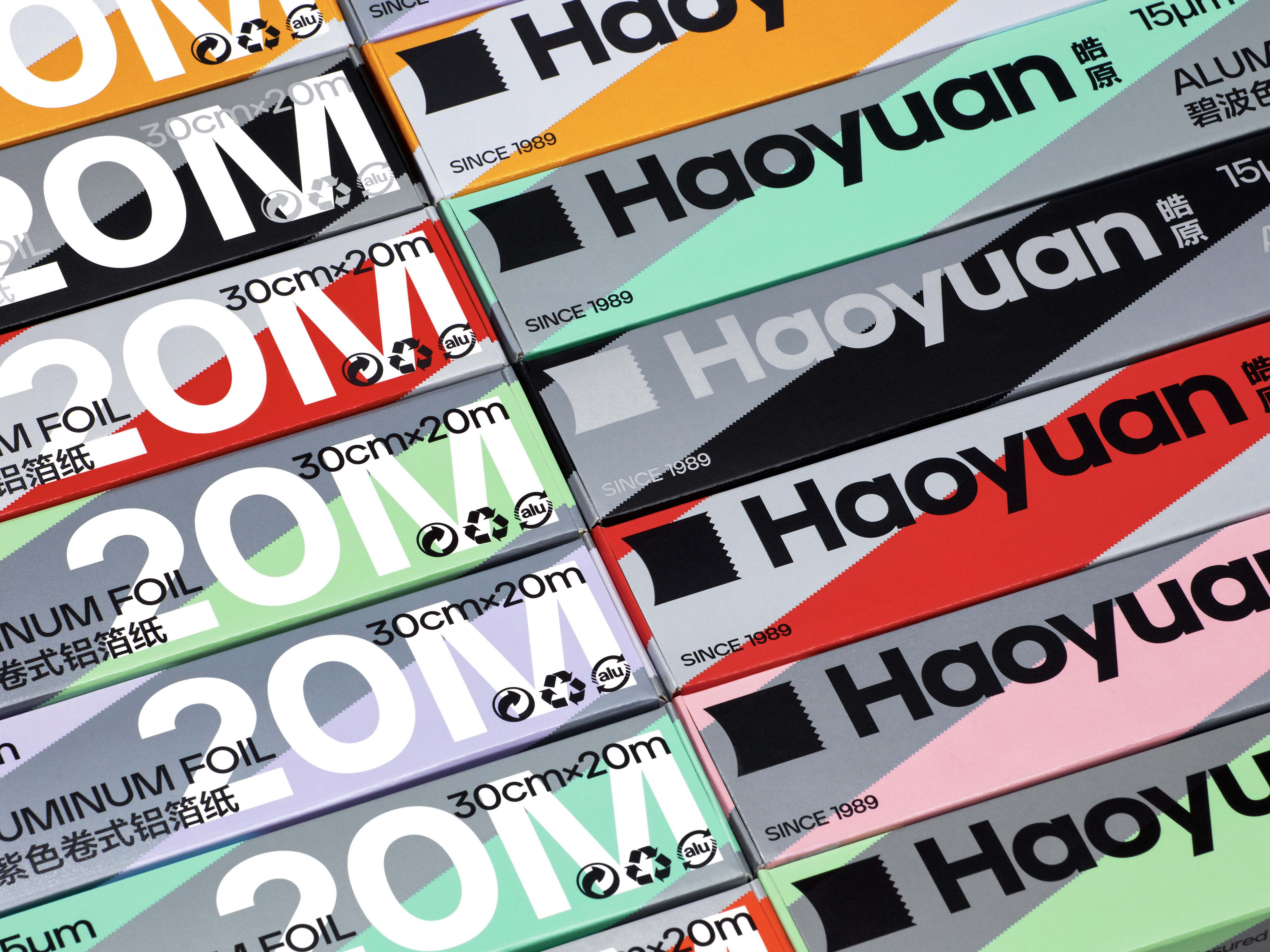
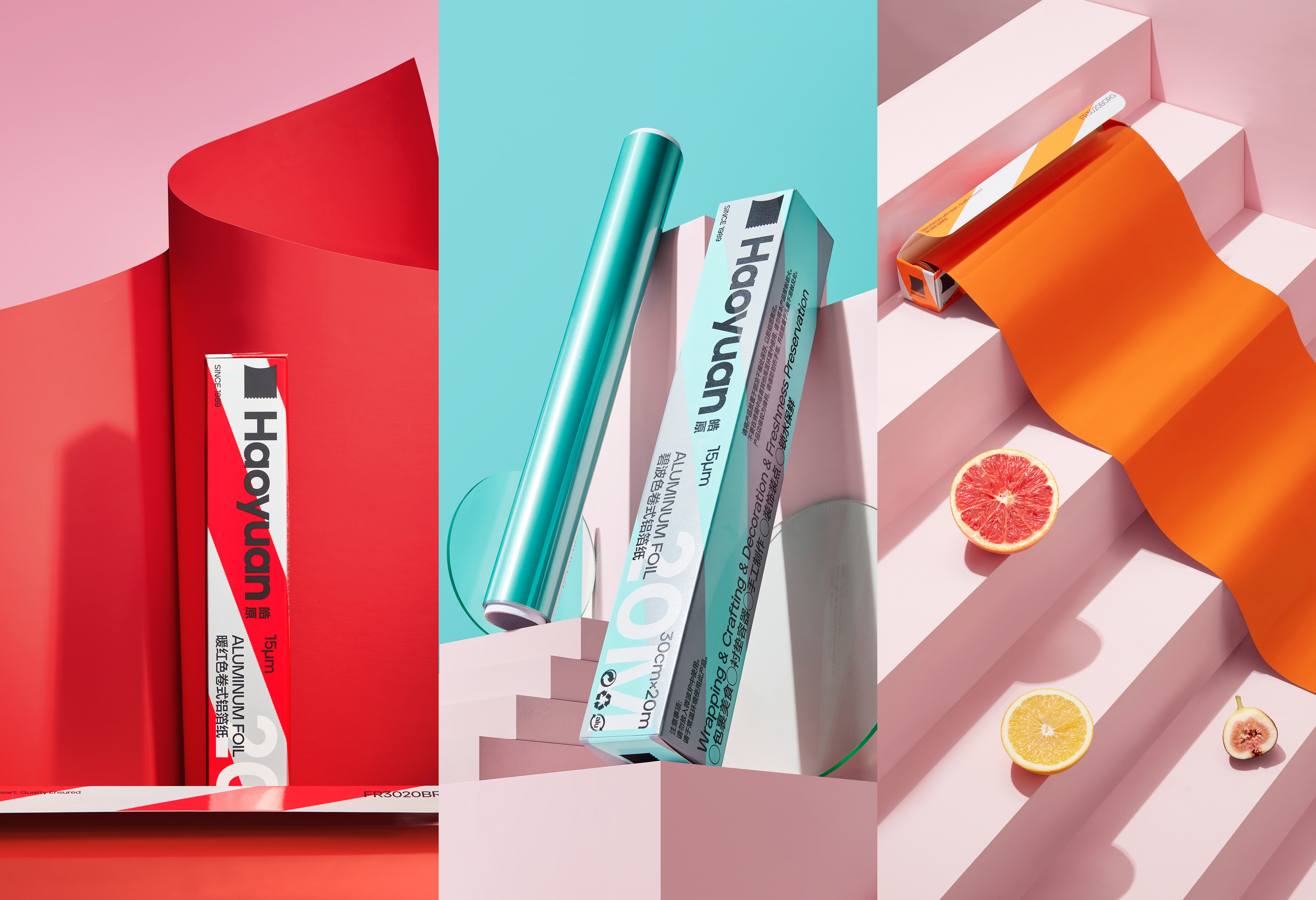
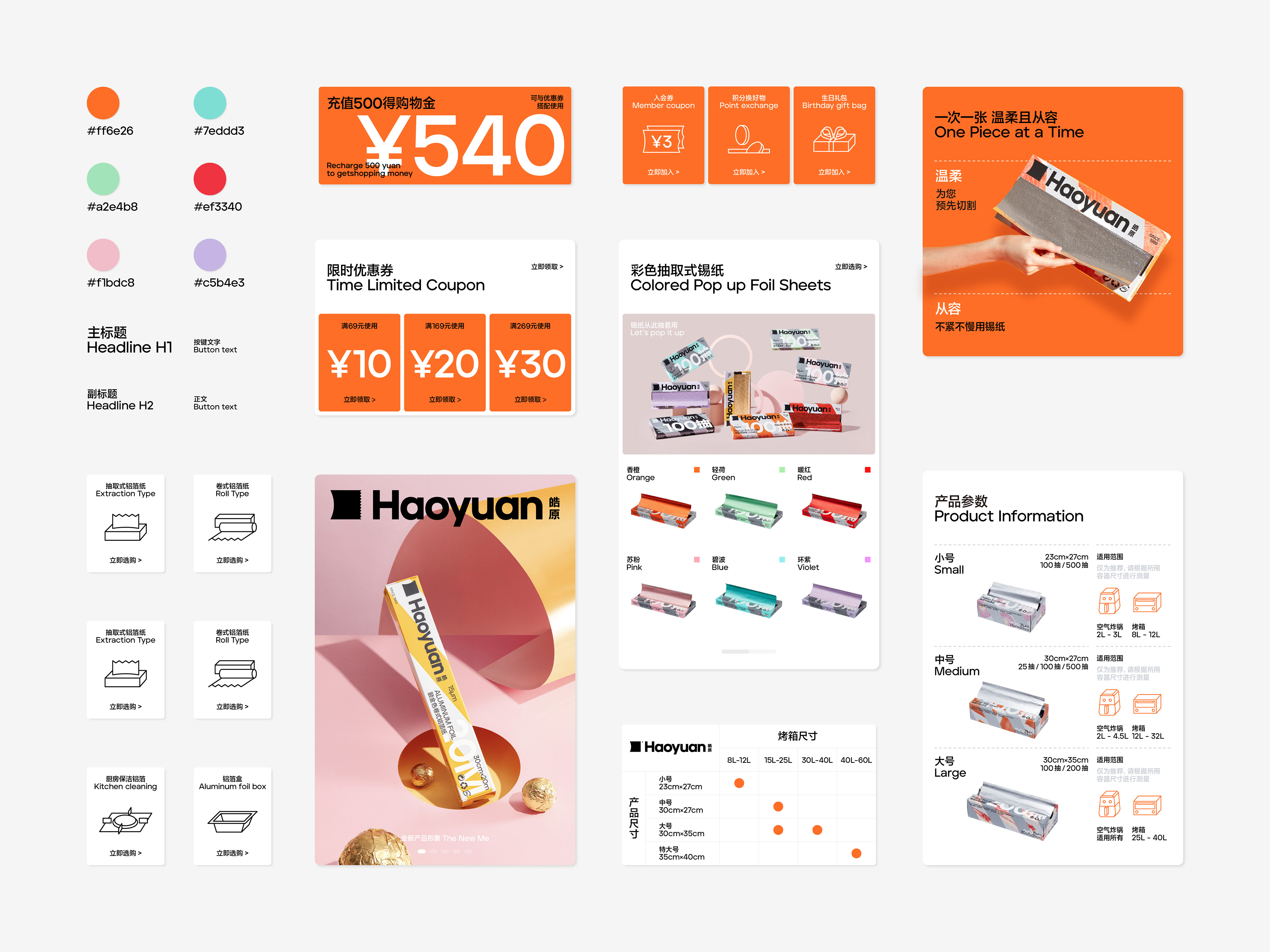
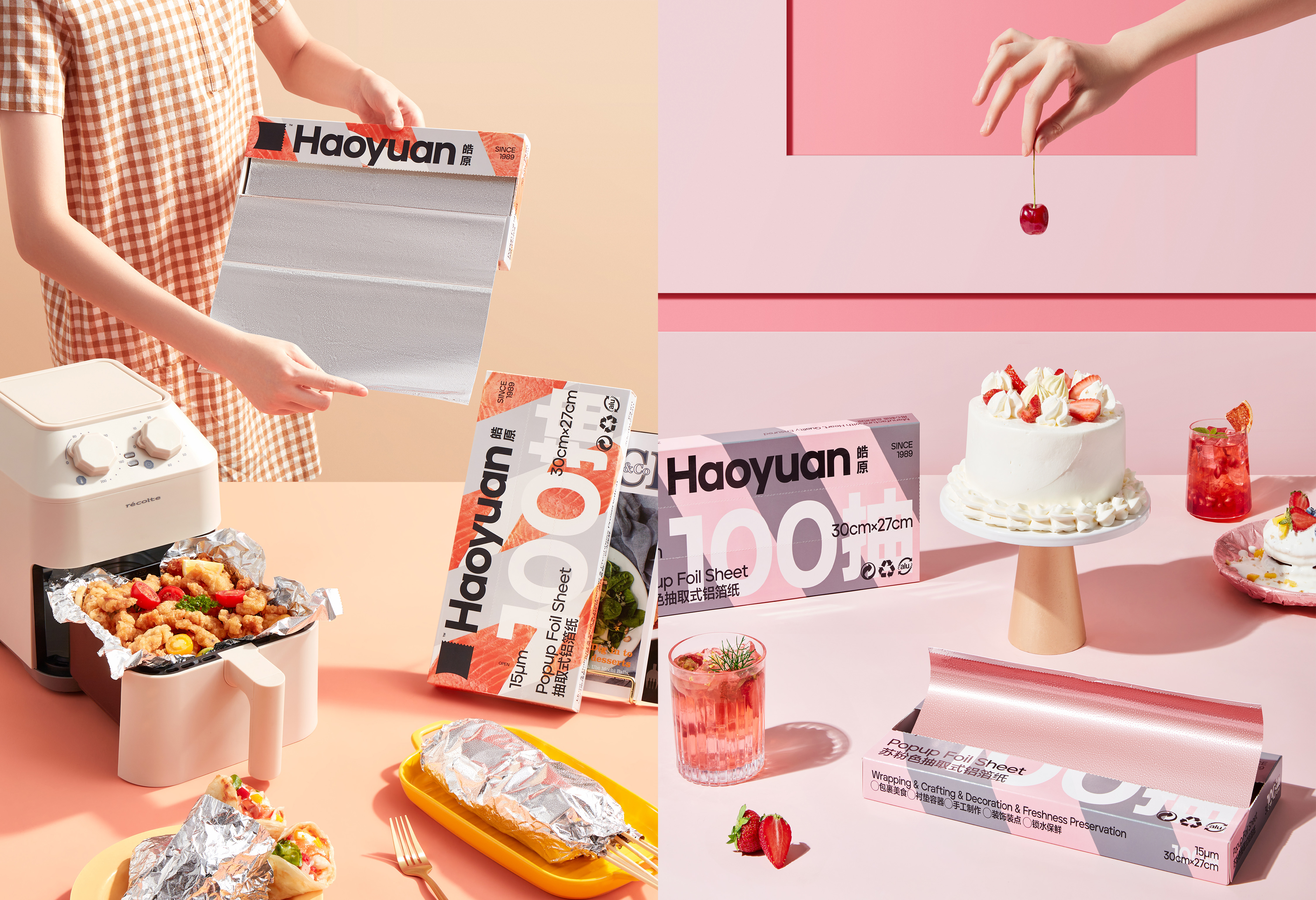
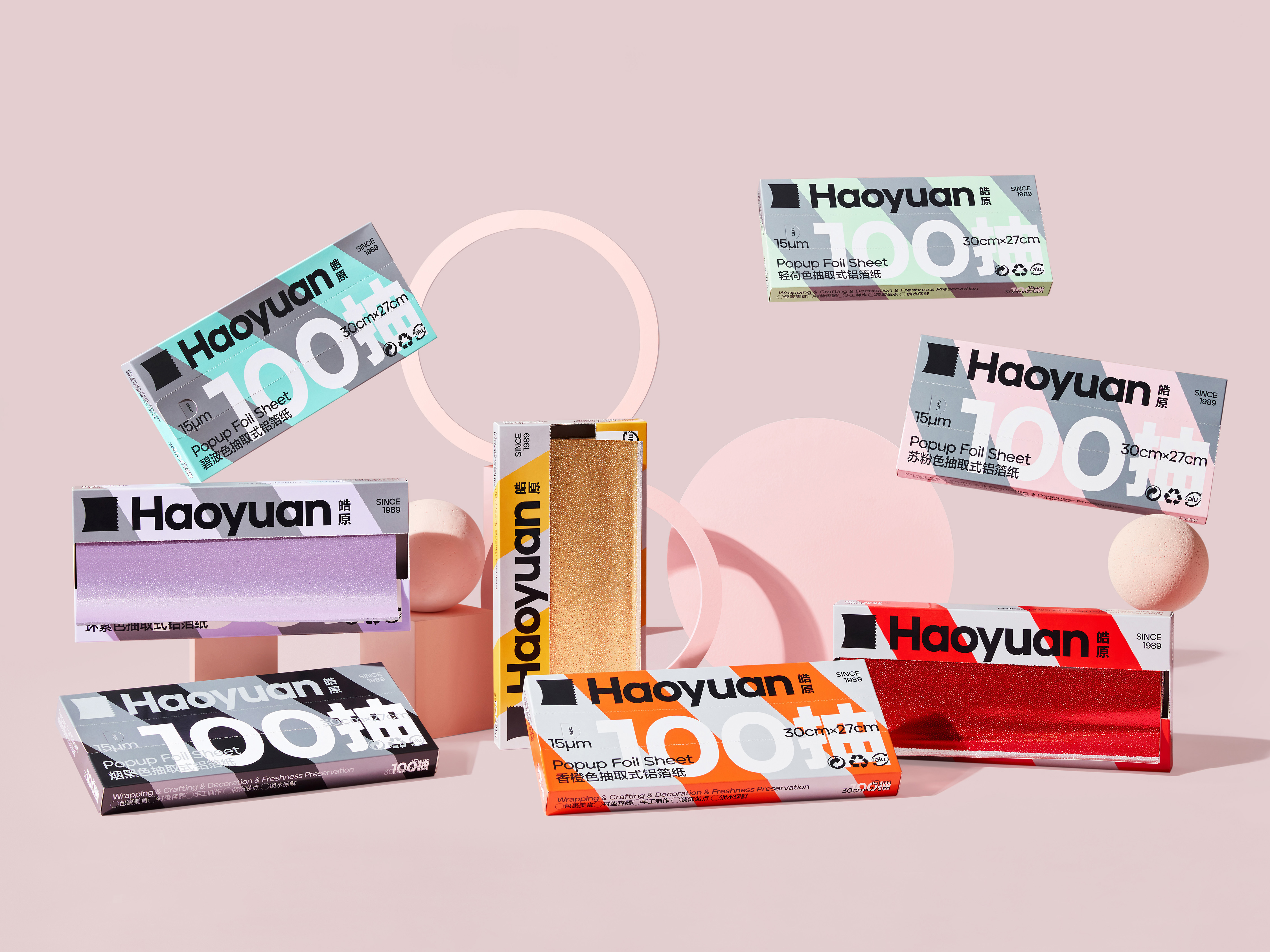
The logo of Haoyuan is a sheet of Aluminium foil waiting to be extracted, with the fine serrations on the edges representing the state of the foil when it is cut. This detail emphasizes the exclusive nature of the foil product, but also highlights the company's tireless pursuit of craftsmanship. In Haoyuan's packaging, we have added the concept of 'wrapping', wrapping the ingredients in silver, gold and color (corresponding to the colors of the foil product), using a 50:50 ratio to present the foil and the ingredients on the packaging at the same time, so that the user can feel the deliciousness of the food while being clear about the product characteristics of the foil, thus reflecting the intention that is to "create a modern kitchen culture based on the understanding of Aluminium foil as a product".
The logo of Haoyuan is a sheet of Aluminium foil waiting to be extracted, with the fine serrations on the edges representing the state of the foil when it is cut. This detail emphasizes the exclusive nature of the foil product, but also highlights the company's tireless pursuit of craftsmanship. In Haoyuan's packaging, we have added the concept of 'wrapping', wrapping the ingredients in silver, gold and color (corresponding to the colors of the foil product), using a 50:50 ratio to present the foil and the ingredients on the packaging at the same time, so that the user can feel the deliciousness of the food while being clear about the product characteristics of the foil, thus reflecting the intention that is to "create a modern kitchen culture based on the understanding of Aluminium foil as a product".
皓原箔业是一家成立了三十六年的老厂,作为中国铝箔行业的领军品牌,它的商业客户遍布全球,2021年,
皓原箔业正式以“to C”的方式进入中国消费市场。在定义皓原的品牌形象时,我们没有从原有的铝箔行业规则中去寻找可能,而是把视线转移至现代都市,尤其是年轻人的厨房文化中。我们注意到铝箔纸的用户群体大多是厨房的资深用户、是烤箱等现代厨房用具的消费者,从而推断出一个更加有效地与消费者建立情感关联的方式,就是积极响应“现代厨房文化”而非“厨房工具”。
皓原的标识是一张等待被抽取的铝箔,边缘细密的锯齿是铝箔被切断时的状态。这一细节既能强调铝箔产品的专有属性,同时也着重刻画出企业对工艺孜孜不倦的追求。在皓原的产品包装上,我们加入了“包裹”的概念,以金银色和彩色(对应铝箔产品的色彩)去包裹食材,用 50:50 的比例关系,将铝箔与食材同时呈现在包装上,让用户明确铝箔的产品特性之余,也能感受到食物的美味,从而体现“在对铝箔这一产品的理解之上建立起现代厨房文化”的用意。
皓原的标识是一张等待被抽取的铝箔,边缘细密的锯齿是铝箔被切断时的状态。这一细节既能强调铝箔产品的专有属性,同时也着重刻画出企业对工艺孜孜不倦的追求。在皓原的产品包装上,我们加入了“包裹”的概念,以金银色和彩色(对应铝箔产品的色彩)去包裹食材,用 50:50 的比例关系,将铝箔与食材同时呈现在包装上,让用户明确铝箔的产品特性之余,也能感受到食物的美味,从而体现“在对铝箔这一产品的理解之上建立起现代厨房文化”的用意。




All Images Copyright © 2021 Haoyuan Group. All Rights Reserved