方正字库
Founder Type
ART DIRECTOR: Guang Yu / Nod Young
DESIGNER: JP
YEAR: 2018
CLIENT: Founder Type
Founder Type is not only the earliest professional manufacturer engaged in the Chinese font development in China, but also the largest supplier of Chinese font products in the world. To better adapt to development
demand in the next stage, Founder Type has launched a brand upgrade.
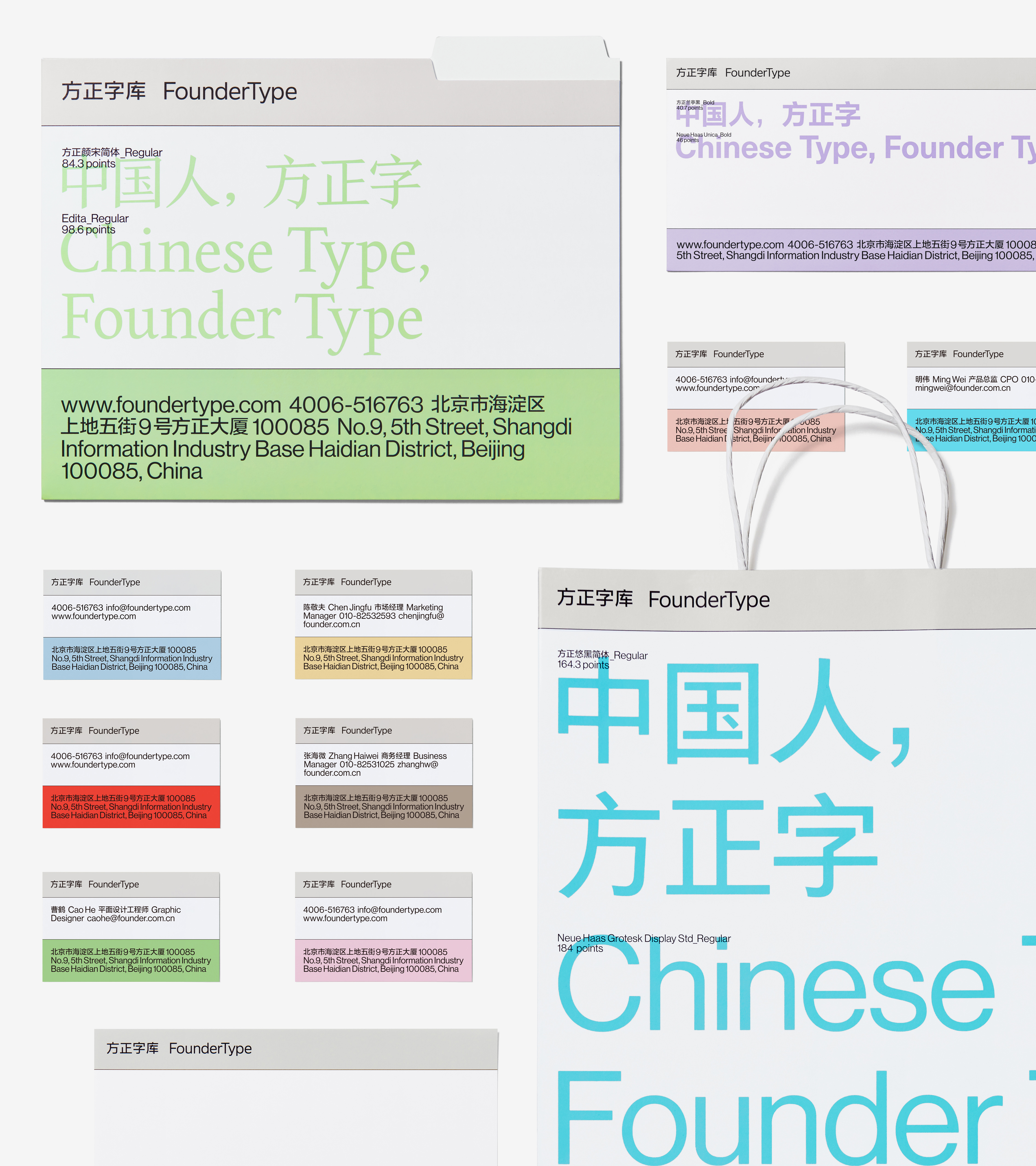
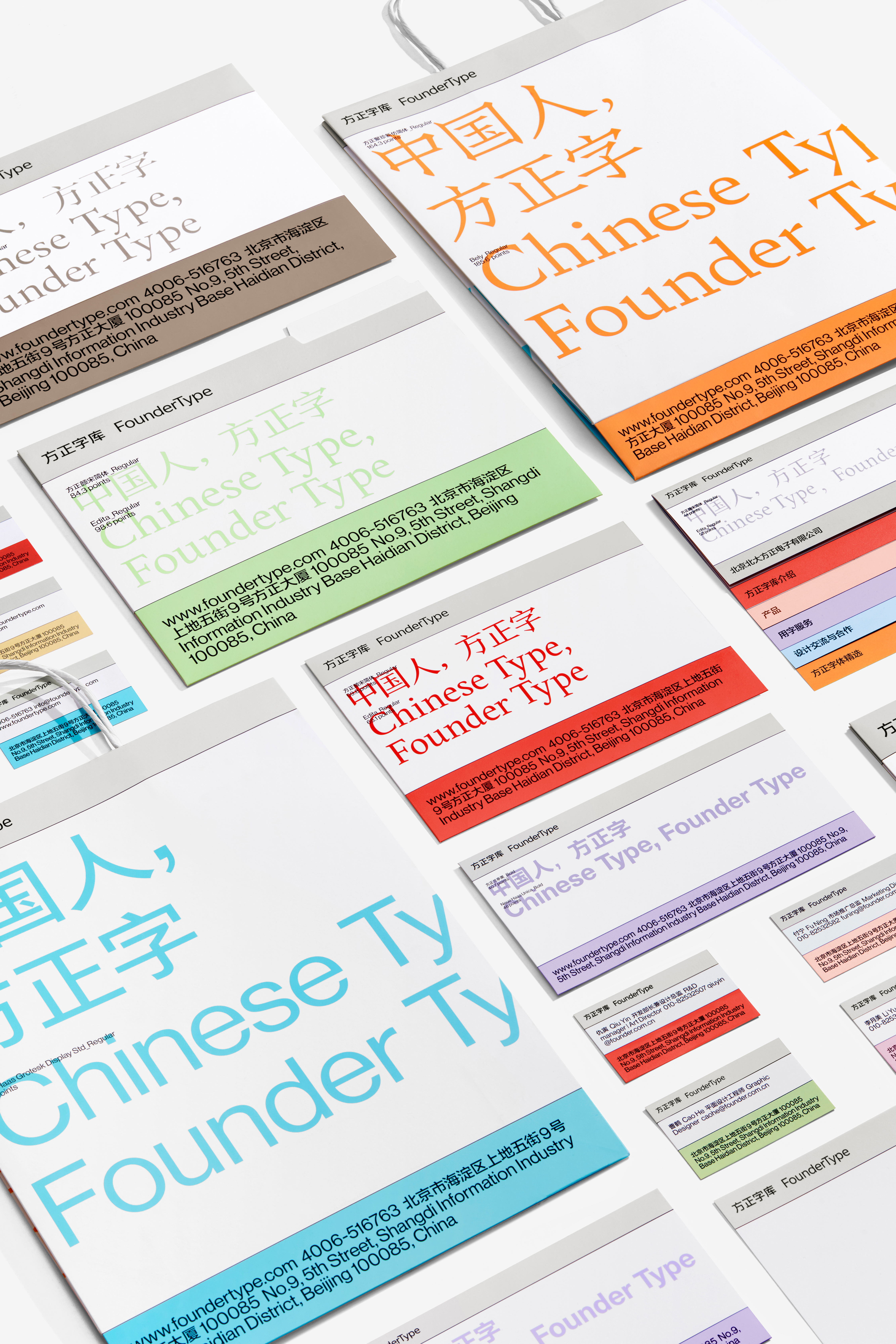
The redesign of its logo not only highlights the independent beauty of the font itself, but also takes the combinatorial balance between the Chinese and English language into consideration. In the design of the visual system, we use the rational “Fonts Preview” method to endow users with a visual experience similar to browsing online so as to generate a desire to purchase these fonts. To guarantee that Founder Type can gracefully cater to more users in the future, especially the younger user group, on the one hand, we use color intervention to enrich the brand temperament; and on the other hand, ease the cognitive difficulty caused by the professional constraint of font design.
Therefore, there is a giant disparity between the brand image of the upgraded Founder Type and that of the previous one. Users can definitely feel the impression changes brought by this update. For example: the type gets younger, more concise, and more international.
方正字库不仅是中国最早从事中文字库开发的专业厂商,也是全球最大的中文字库产品供应商。为了更好地适应下一阶段的发展需要,方正字库进行了品牌升级。
其中对于Logo的重新设计,既强调了字体本身的独立美感,又兼顾了中英文之间的组合平衡。在视觉系统的设计当中,我们使用偏理性的“字体预览 Fonts Preview”方式,让用户收获如同在线浏览并购买字体的视觉体验。为了保证方正字库在未来能够从容面向更多用户,尤其是年轻化的用户群体,我们通过色彩的介入,一方面使品牌性格更加丰富,另一方面缓解了由字体设计这一专业限定引发的难度认知。
因此,升级后的方正字库,品牌形象较之以往,差异巨大。用户可以明确地感受到这种更新带来的印象变化。比如:更年轻、更简洁、更加国际化。
其中对于Logo的重新设计,既强调了字体本身的独立美感,又兼顾了中英文之间的组合平衡。在视觉系统的设计当中,我们使用偏理性的“字体预览 Fonts Preview”方式,让用户收获如同在线浏览并购买字体的视觉体验。为了保证方正字库在未来能够从容面向更多用户,尤其是年轻化的用户群体,我们通过色彩的介入,一方面使品牌性格更加丰富,另一方面缓解了由字体设计这一专业限定引发的难度认知。
因此,升级后的方正字库,品牌形象较之以往,差异巨大。用户可以明确地感受到这种更新带来的印象变化。比如:更年轻、更简洁、更加国际化。