FRUITIME
鲜果时间
ART DIRECTOR: Nod Young / Guang Yu
DESIGNER: Wang Xiaoshuai / Jing Junjun
YEAR: 2023
CLIENT: FRUITIME
SPATIAL DIRECTION: Space Station
Across all eras and regions, food and drink have always been fundamental choices in daily consumption. Meals provide sustenance, and drinks quench thirst. But drinks also carry stories, weaving together experiences and narratives. Designing a brand for a beverage company is inherently a challenging task. How do we create a fruit and vegetable tea brand that appeals to the public's aesthetic sensibilities while standing out in a market saturated with similar designs? Before beginning the design process, we revisited the essential question: "Why do people buy a cup of fruit and vegetable tea?"
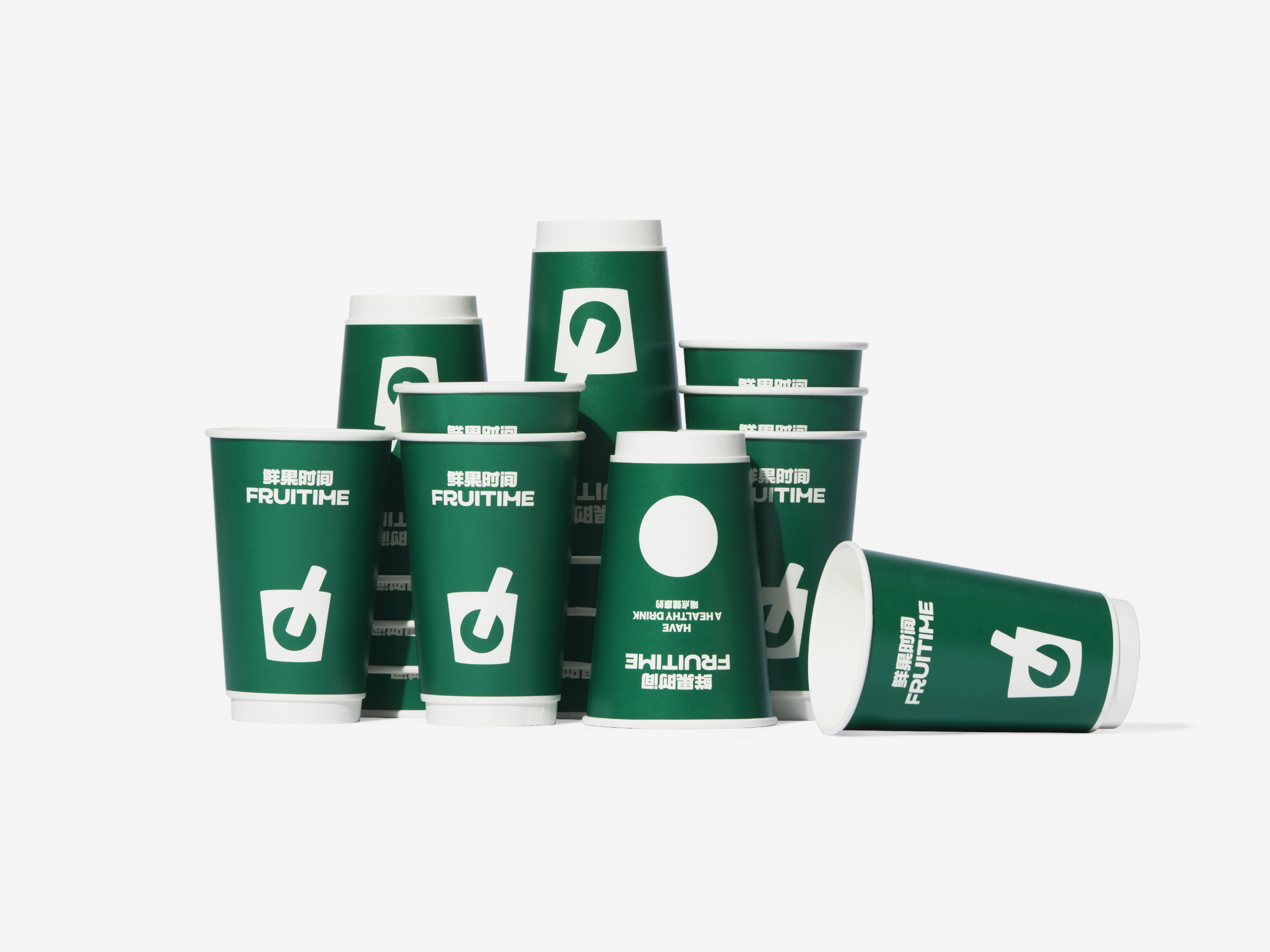
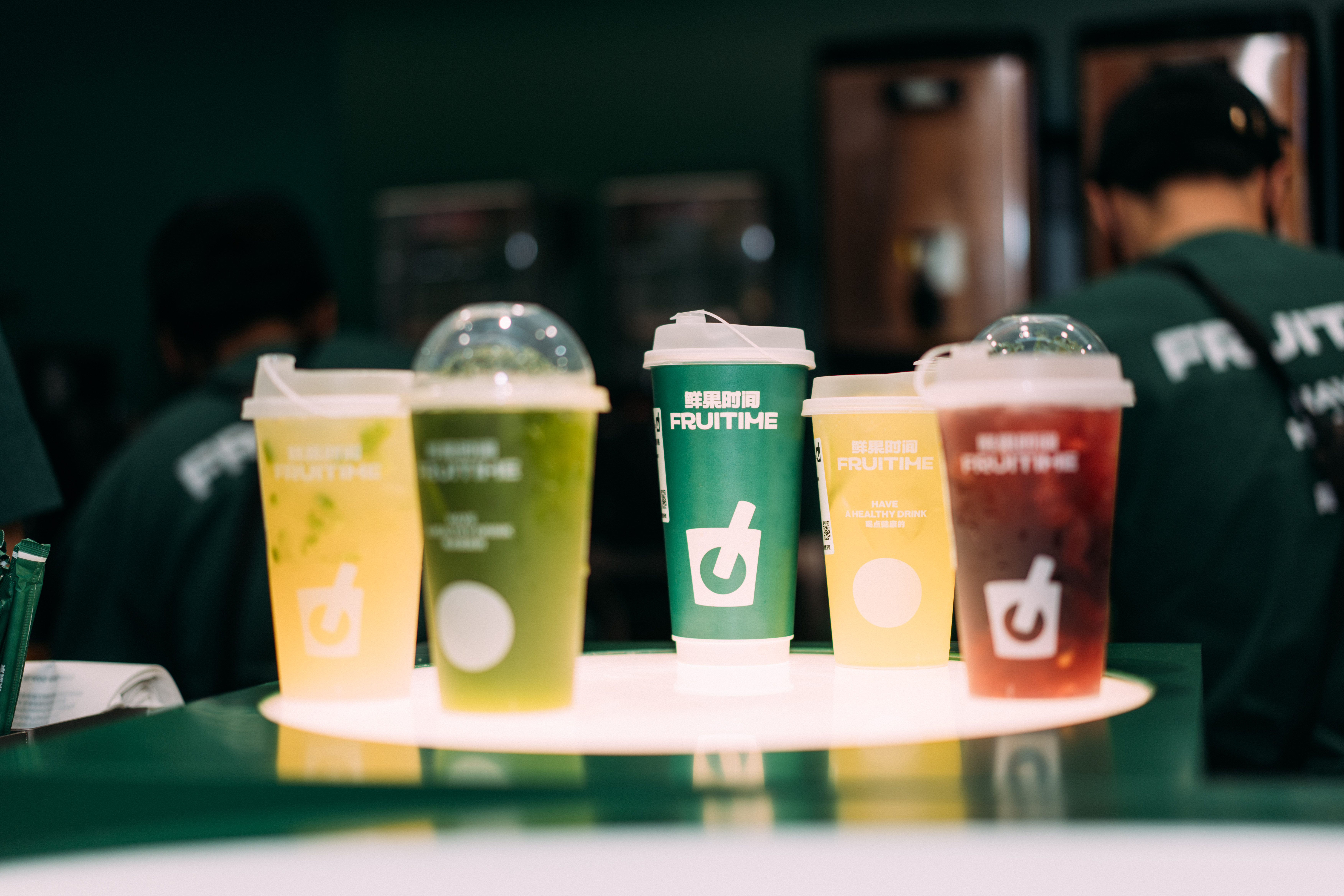
Satisfying thirst and cravings are among life’s most basic desires. Beyond that, the unique tastes associated with fruit and vegetable teas—often accompanied by interesting textures, such as chewable elements—and their rich nutritional value are key factors that attract consumers. We believe that one of the goals of design is to recreate this drinking experience. Are you thirsty? Have a drink. Do you love the taste of oranges? Take a sip. These are instinctive consumer decisions, not complex brand narratives. Therefore, how do we convey the essence of fruits and vegetables? Perhaps the most straightforward way is to visualize inserting a straw directly into a peach. It’s a fresh, appetizing image that immediately conveys the product's appeal.
By placing this image on the cup, we create a logo that is fresh, intuitive, easily recognizable, and memorable. We want the "Fruit Time" logo to evoke drinkability, much like how a knife-and-fork symbol is universally recognized as representing dining spaces. To enhance the design, we refined details by adding subtle curves to improve perspective. The straw doesn’t pierce through the fruit, preserving its completeness and making it appear more nutritious and delicious.
This new logo and brand concept align with the core qualities of the product—freshness, health, vitality, and quality—without resorting to convoluted storytelling. In today's crowded fruit and vegetable tea market, where consumers are often overwhelmed by a barrage of terms and concepts, we believe in simplifying the message. A clear, consistent voice that resonates with consumers fosters trust and builds brand loyalty.
在任何时代、任何地区,餐饮一直是人们最熟悉、最频繁的一种消费选择。餐,即食物;饮,即饮品。饮品,蕴含了无尽的故事线索,衍生出一系列情节和内容,相应地,有关饮品的设计更是层出不穷。因此,为一家饮品企业打造全新的品牌形象是一个极具挑战性的任务。如何设计出一款既符合公众审美习惯又可以脱颖而出的果蔬茶饮品牌形象,以及,当面对市面上百家争鸣的同质化设计,如何确保独树一帜的识别度和记忆度——在着手开始设计前,我们重新审视了“人们为何购买一杯果蔬茶饮”这个最为根本的问题。
解渴和解馋,属于生活中最基本的欲望,与此同时,果蔬茶饮对应的不同口味、包括可能出现的“咀嚼”等特殊口感体验和丰富的营养价值,都是吸引消费者购买的关键因素。我们相信设计的使命之一就是去还原这种饮用的体验。口渴了吗?来一杯。喜欢橙子味道吗?来一杯……这些都是出自本能的消费选择,而非多么繁复的品牌故事。因此,如何让人们感受到果蔬的吸引力呢?最直接的方式不就是将吸管直接插入果蔬、例如一颗桃子当中吗?这无疑是最能体现新鲜与美味的画面了。进而,将这一画面置于杯子上,便得到了一种最新鲜、最直观、最易识别也过目不忘的标志形态。我们希望“鲜果时间”的标志能极富饮用这一本能,也就是说,它应当可以成为公共空间的识别标志(如:代表餐饮区的标识“刀叉”)。同时,在细节上我们对标志进行了优化处理,例如,添加一些必要的曲线,以增强透视效果;吸管没有贯穿水果,这使得水果的形象更加完整,看起来也更为营养美味。更贴近本能的新标志与品牌理念,摒弃了繁琐的“故事弯路”,直接传递产品的核心特质:新鲜、健康、活力、高品质。在我们看来,简化品牌形象传播过程中的信息尤为重要,尤其是在当今果汁果蔬茶饮市场,当消费者已经被各种概念和名词搞得晕头转向时,一个坚定、一致的声音及其回响,将使人们更容易产生信任感和认同感。
解渴和解馋,属于生活中最基本的欲望,与此同时,果蔬茶饮对应的不同口味、包括可能出现的“咀嚼”等特殊口感体验和丰富的营养价值,都是吸引消费者购买的关键因素。我们相信设计的使命之一就是去还原这种饮用的体验。口渴了吗?来一杯。喜欢橙子味道吗?来一杯……这些都是出自本能的消费选择,而非多么繁复的品牌故事。因此,如何让人们感受到果蔬的吸引力呢?最直接的方式不就是将吸管直接插入果蔬、例如一颗桃子当中吗?这无疑是最能体现新鲜与美味的画面了。进而,将这一画面置于杯子上,便得到了一种最新鲜、最直观、最易识别也过目不忘的标志形态。我们希望“鲜果时间”的标志能极富饮用这一本能,也就是说,它应当可以成为公共空间的识别标志(如:代表餐饮区的标识“刀叉”)。同时,在细节上我们对标志进行了优化处理,例如,添加一些必要的曲线,以增强透视效果;吸管没有贯穿水果,这使得水果的形象更加完整,看起来也更为营养美味。更贴近本能的新标志与品牌理念,摒弃了繁琐的“故事弯路”,直接传递产品的核心特质:新鲜、健康、活力、高品质。在我们看来,简化品牌形象传播过程中的信息尤为重要,尤其是在当今果汁果蔬茶饮市场,当消费者已经被各种概念和名词搞得晕头转向时,一个坚定、一致的声音及其回响,将使人们更容易产生信任感和认同感。


Images Copyright © 2024 FRUITIME, Space Station. All Rights Reserved.