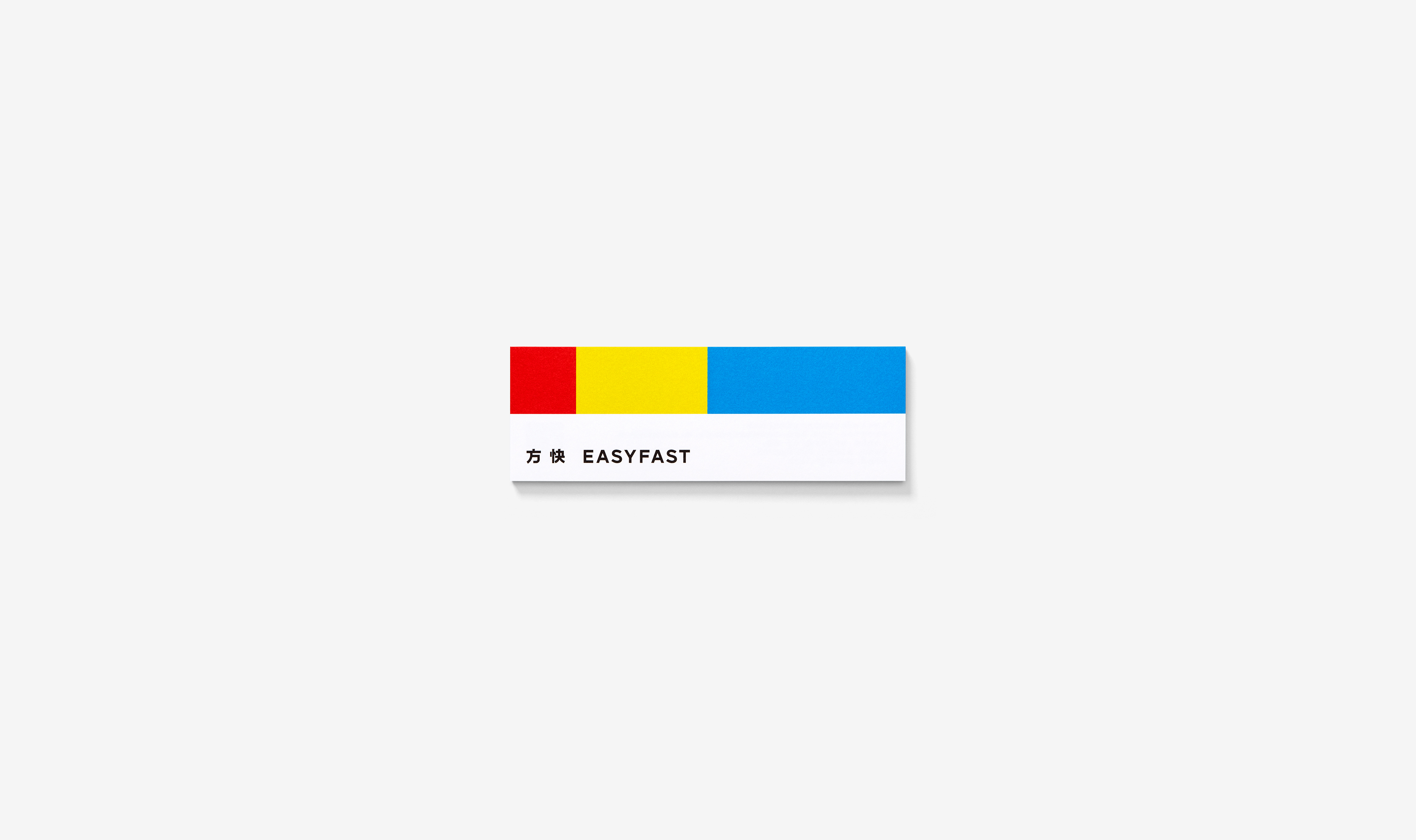
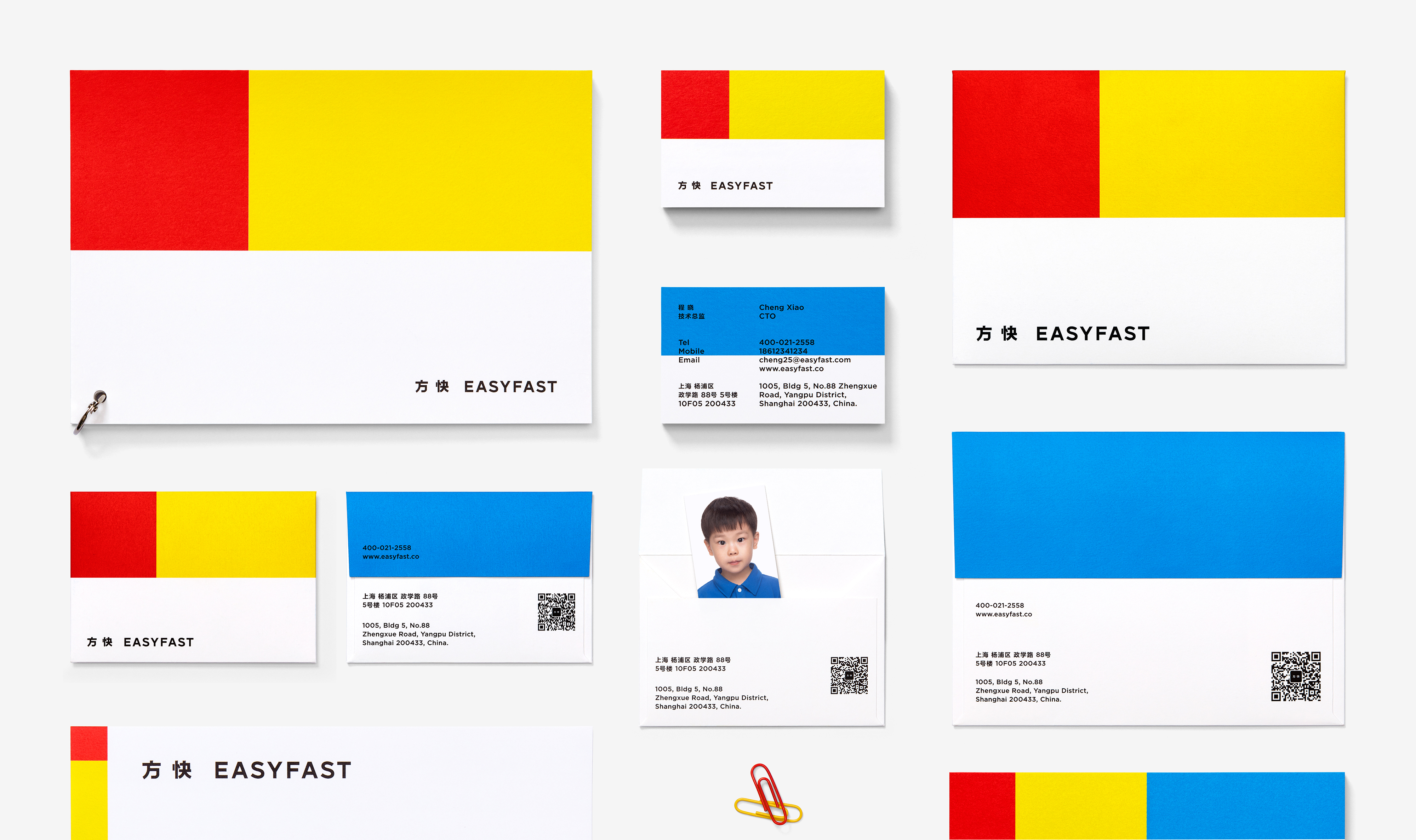
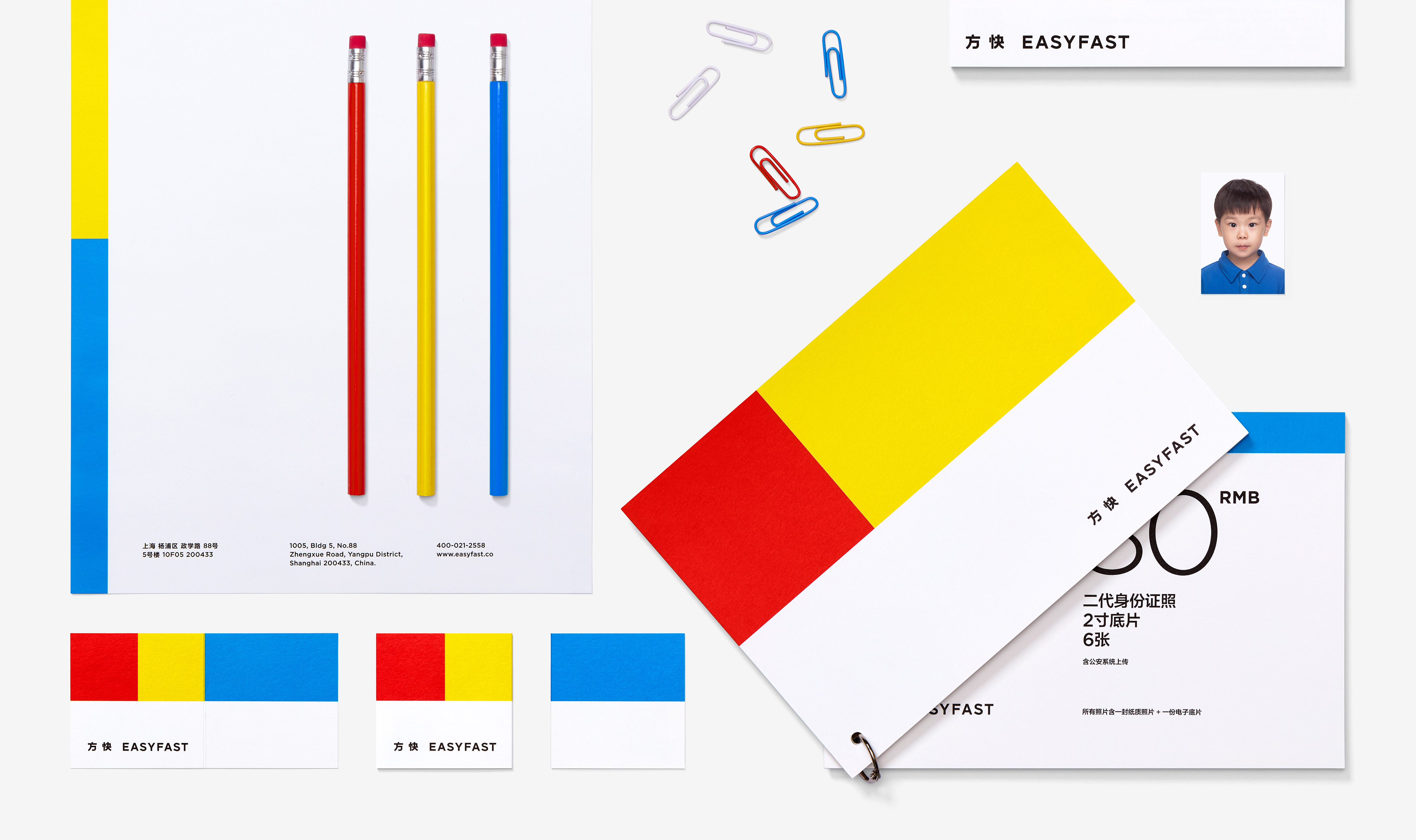
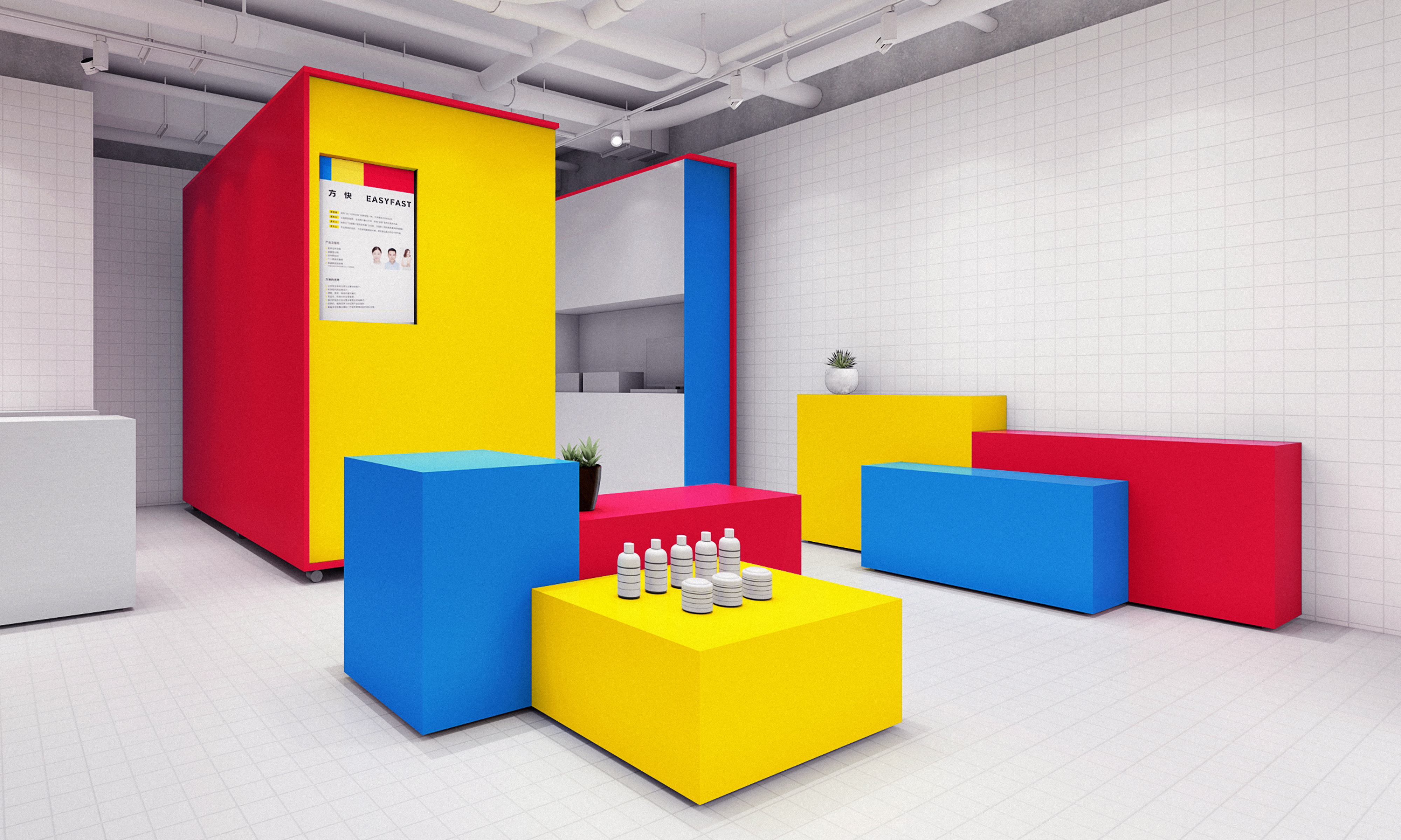
EASYFAST 方快
ART DIRECTOR: Nod Young / Guang Yu
DESIGNER: Nod Young / Pan Zhengzhong
INTERIOR DESIGNER: Shuhei Aoyama
YEAR: 2017
CLIENT: EASYFAST
EASYFAST is a chain convenient photography shop that has a very small operation area (maybe less than ten square meters). Its uniqueness lies in “size” and “speed”: small business volume and fast
identification.
In visual positioning, we describe EASYFAST as a colorful gravel in the eyes. EASYFAST always chooses to operate in the busiest or the most complicated environments, which means they are commercial spaces with a heavy density of logos. Since EASYFAST occupies a small space, using graphics as its identification is actually risky method. Thus, we decided to give up on designing a pattern as its logo. Instead, the whole space was designed to be as recognizable as a colorful gravel blown into the eyes. The entire shop has become a logo identification system. From this perspective, EASYFAST has the largest and most conspicuous logo in the commercial environment.
In visual positioning, we describe EASYFAST as a colorful gravel in the eyes. EASYFAST always chooses to operate in the busiest or the most complicated environments, which means they are commercial spaces with a heavy density of logos. Since EASYFAST occupies a small space, using graphics as its identification is actually risky method. Thus, we decided to give up on designing a pattern as its logo. Instead, the whole space was designed to be as recognizable as a colorful gravel blown into the eyes. The entire shop has become a logo identification system. From this perspective, EASYFAST has the largest and most conspicuous logo in the commercial environment.
方快是一个经营面积非常小(甚至可能不足十平方米)的连锁型快捷照相馆。它的特殊之处就在于“小”和
“快”。小,是商业体量的小;快,是需要快速识别。
在视觉的定位里,我们把方快描述为:眼睛里的彩色沙砾。 方快的经营地点永远选择在最繁忙或者最复杂的环境里,也就是说处于Logo最密集的商业空间里。同时,方快自身的空间又特别小,以图形去做识别其实是风险更高的。所以,我们的设计是放弃设计Logo图形,直接把空间做成超高的识别性,像颜色沙砾一样吹到眼睛里。整个店铺就是一个Logo标识系统,从这个角度来看,方快的Logo是最大的,在商业环境中视觉是最强烈的。
在视觉的定位里,我们把方快描述为:眼睛里的彩色沙砾。 方快的经营地点永远选择在最繁忙或者最复杂的环境里,也就是说处于Logo最密集的商业空间里。同时,方快自身的空间又特别小,以图形去做识别其实是风险更高的。所以,我们的设计是放弃设计Logo图形,直接把空间做成超高的识别性,像颜色沙砾一样吹到眼睛里。整个店铺就是一个Logo标识系统,从这个角度来看,方快的Logo是最大的,在商业环境中视觉是最强烈的。