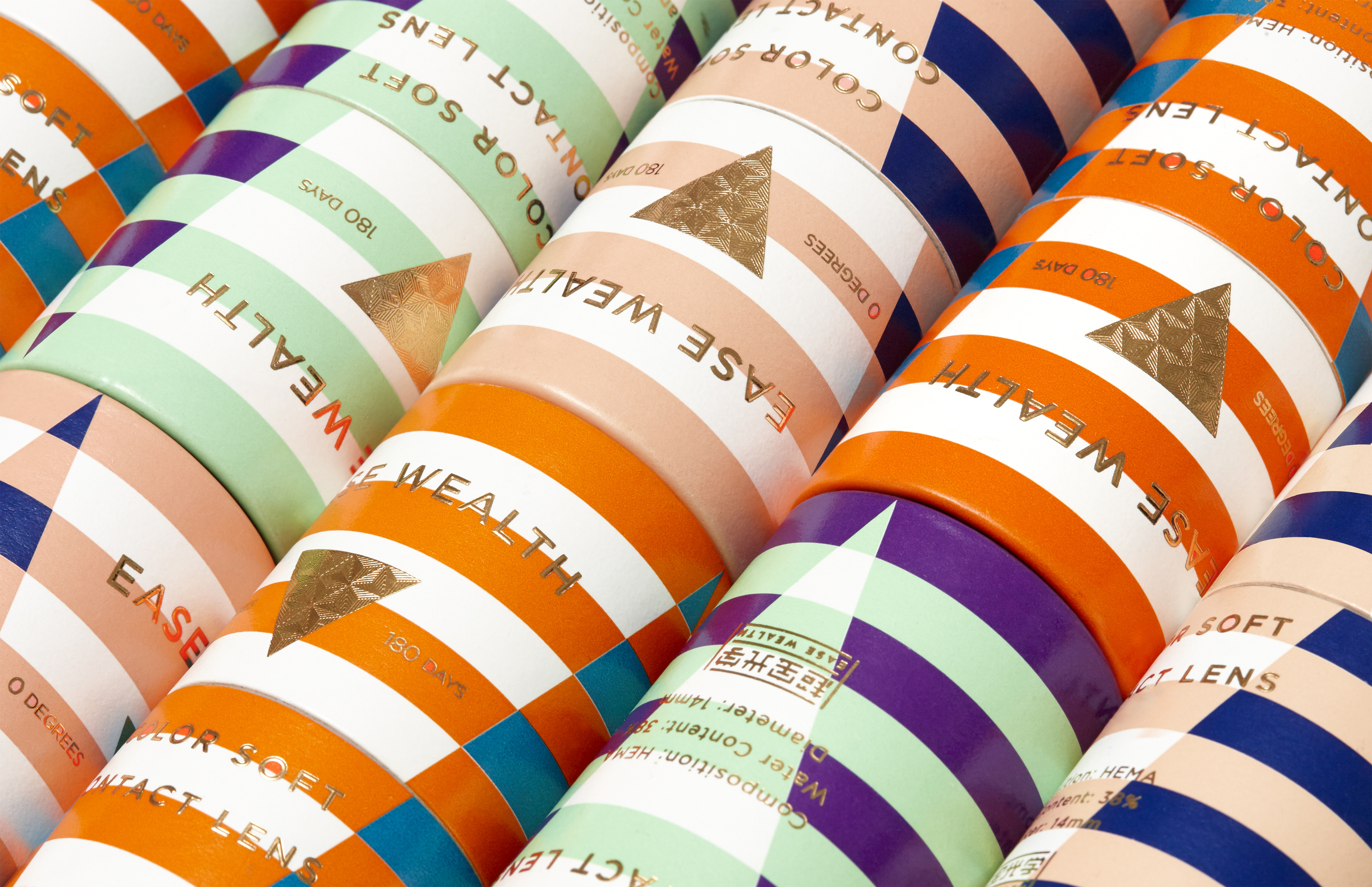
EASE WEALTH
ART DIRECTOR: Guang Yu / Nod Young
DESIGNER: Guang Yu / Yan Yaoming
YEAR: 2015
CLIENT: EASE WEALTH
How does it stand out and lead you to place the order before you turn to the next page?
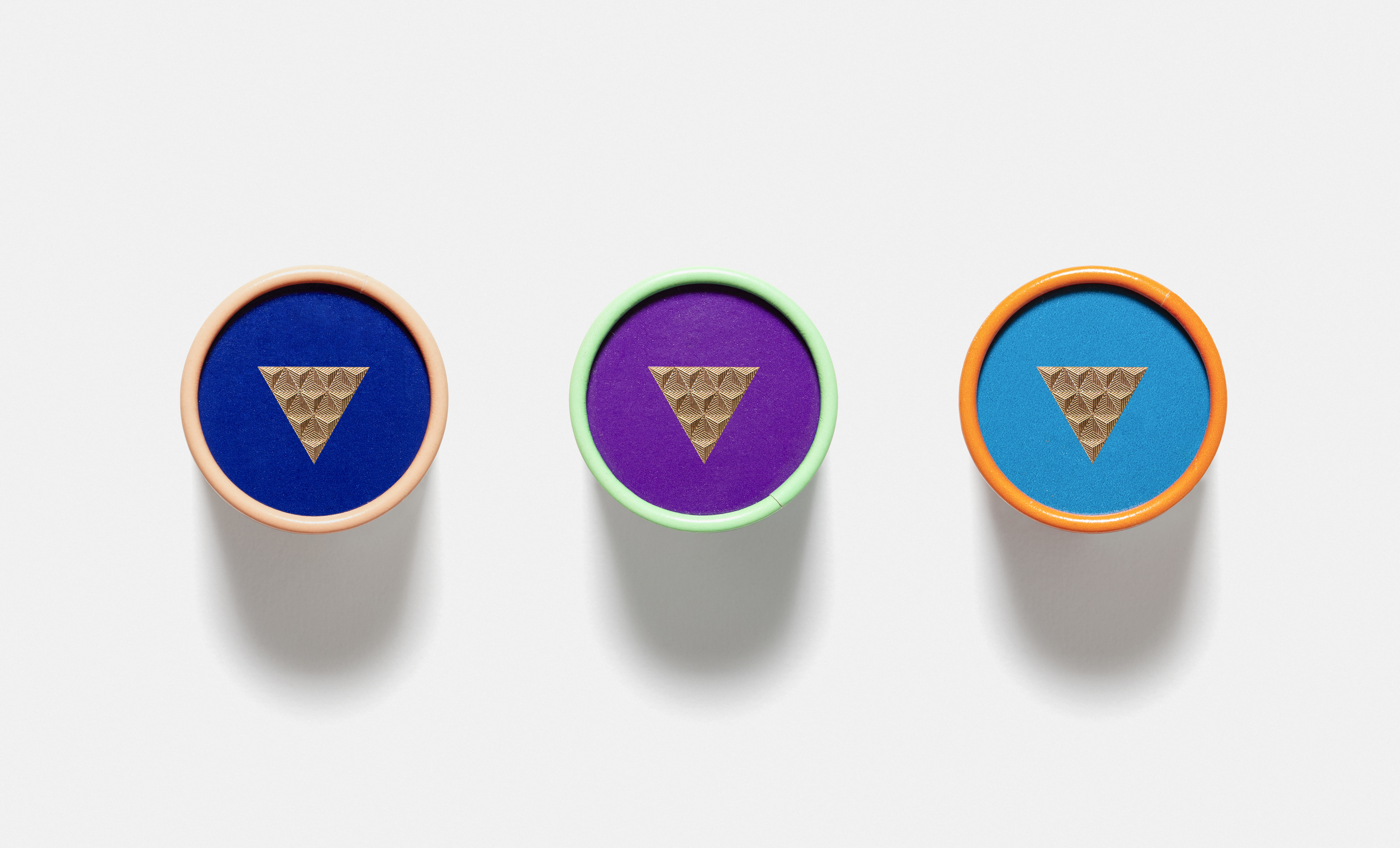
This is the requirement for an online sales based product cosmetic contact lenses. Therefore, we define the target for design as eye-catching, entry lux and accessible. The “V” sign and thermos print
of inverted triangle on the main packaging are two visual elements that best describe the product.
怎样才能在你翻页之前,出挑吸睛,并且下单?以上是这款基于互联网销售的美瞳产品的设计诉求。因此我们将设计目标制定为:夺目,轻奢,低门槛。包装主体上出现的“V”和倒三角的烫印的标记,是最容易描述这款产品的两个视觉要素。