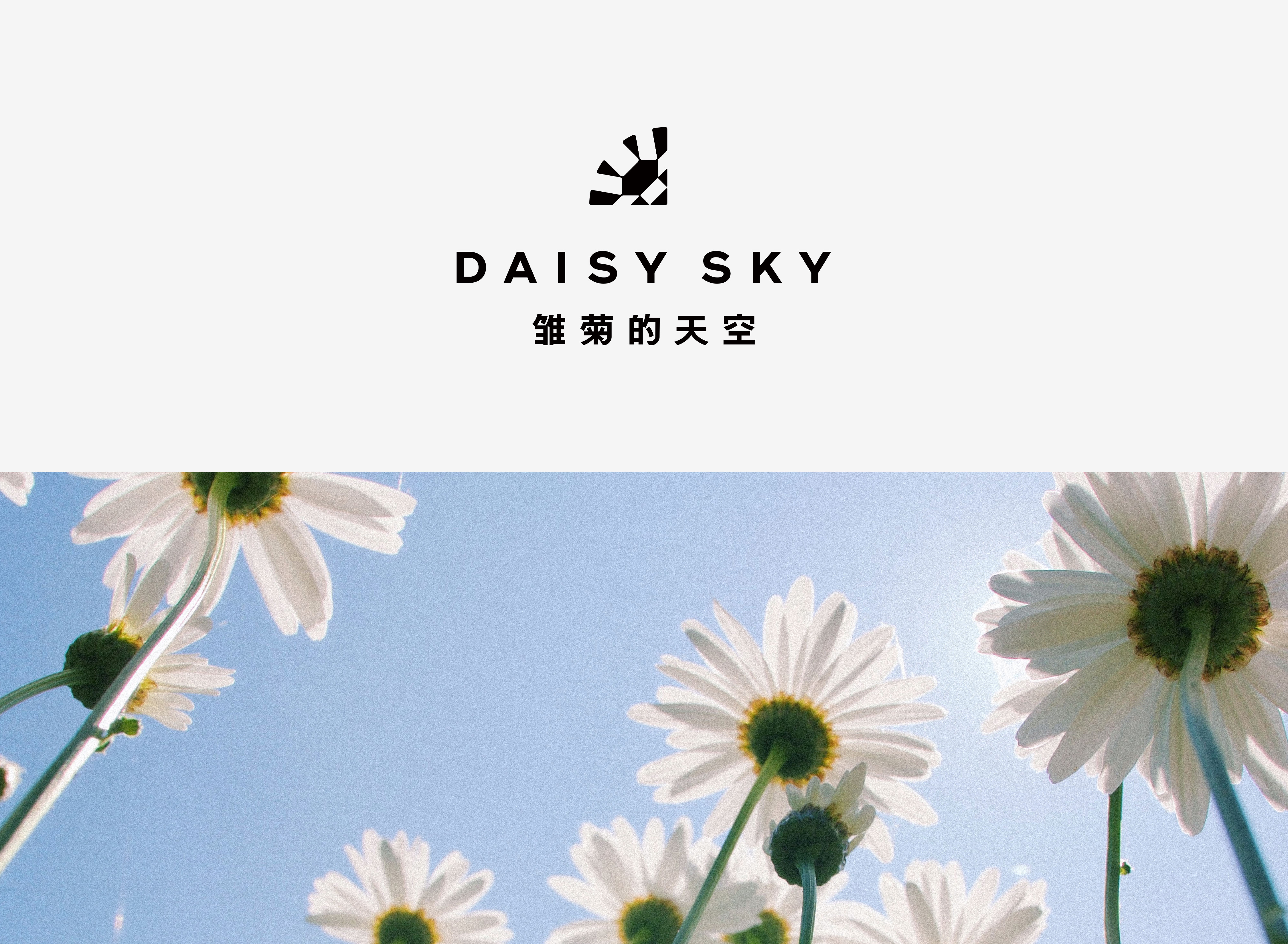
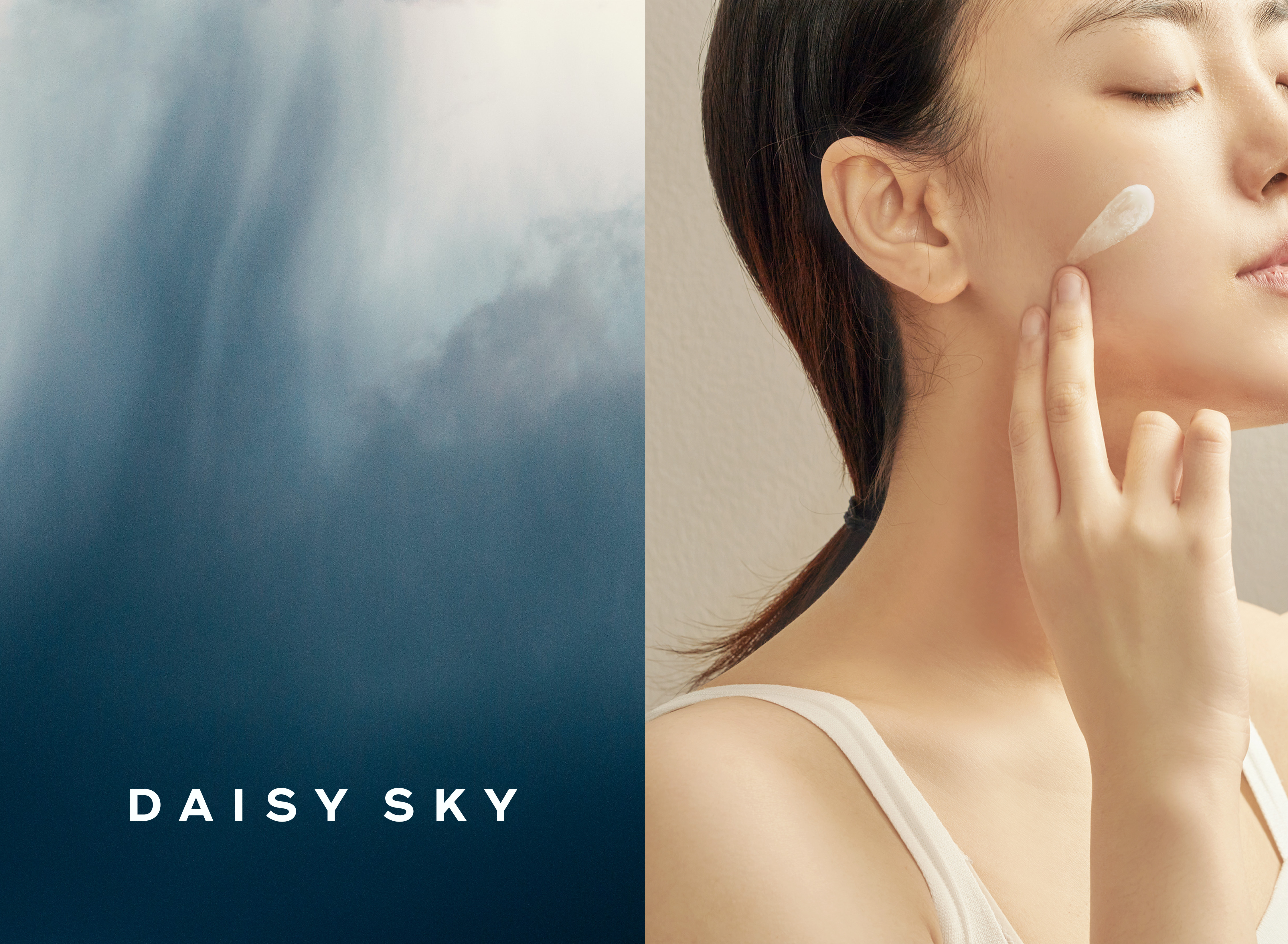
Daisy Sky
雏菊的天空
ART DIRECTOR: Guang Yu / Nod Young
DESIGNER: Han Lu / Wang Xiaoshuai
YEAR: 2021
CLIENT: Daisy Sky 雏菊的天空
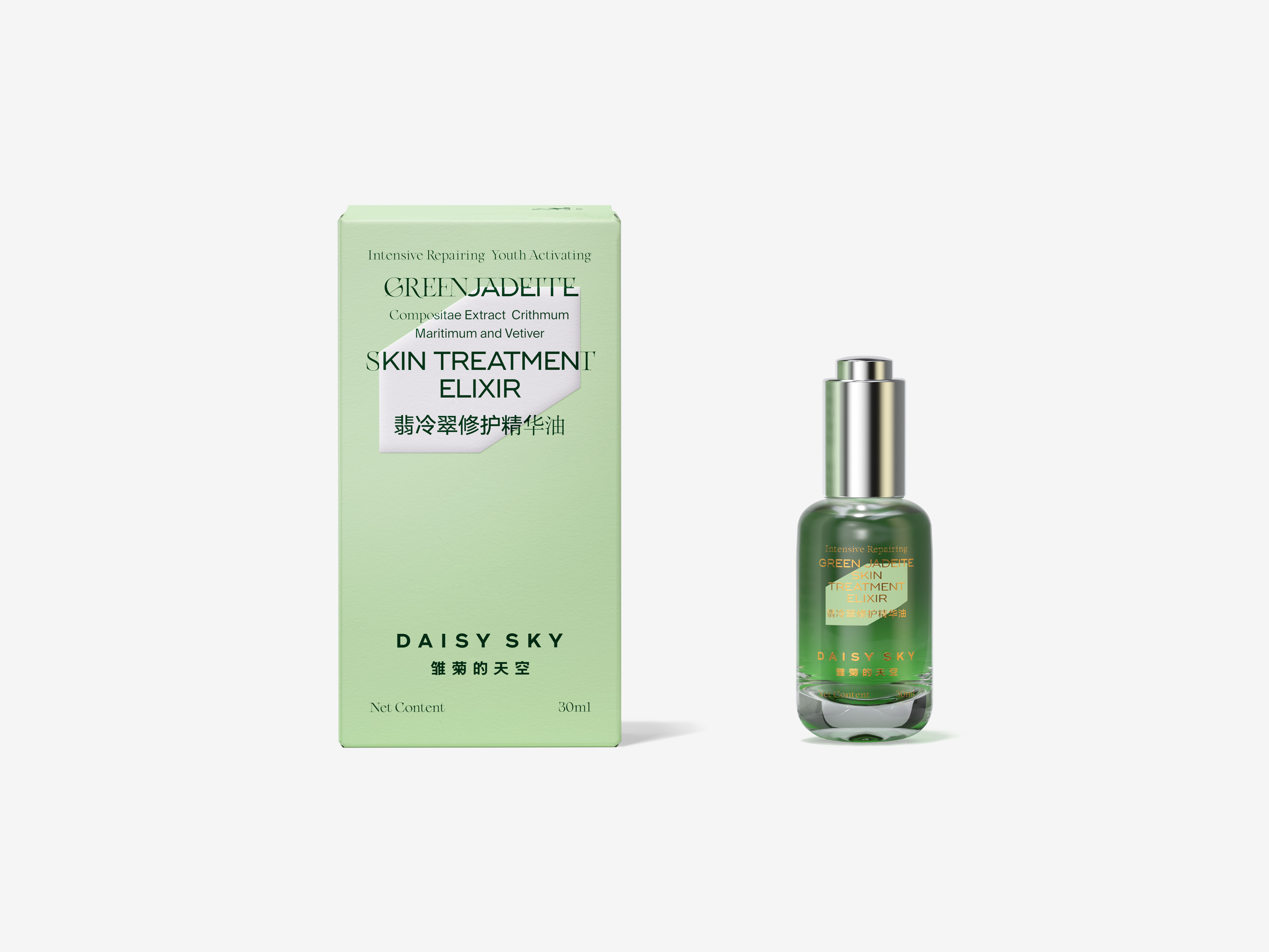
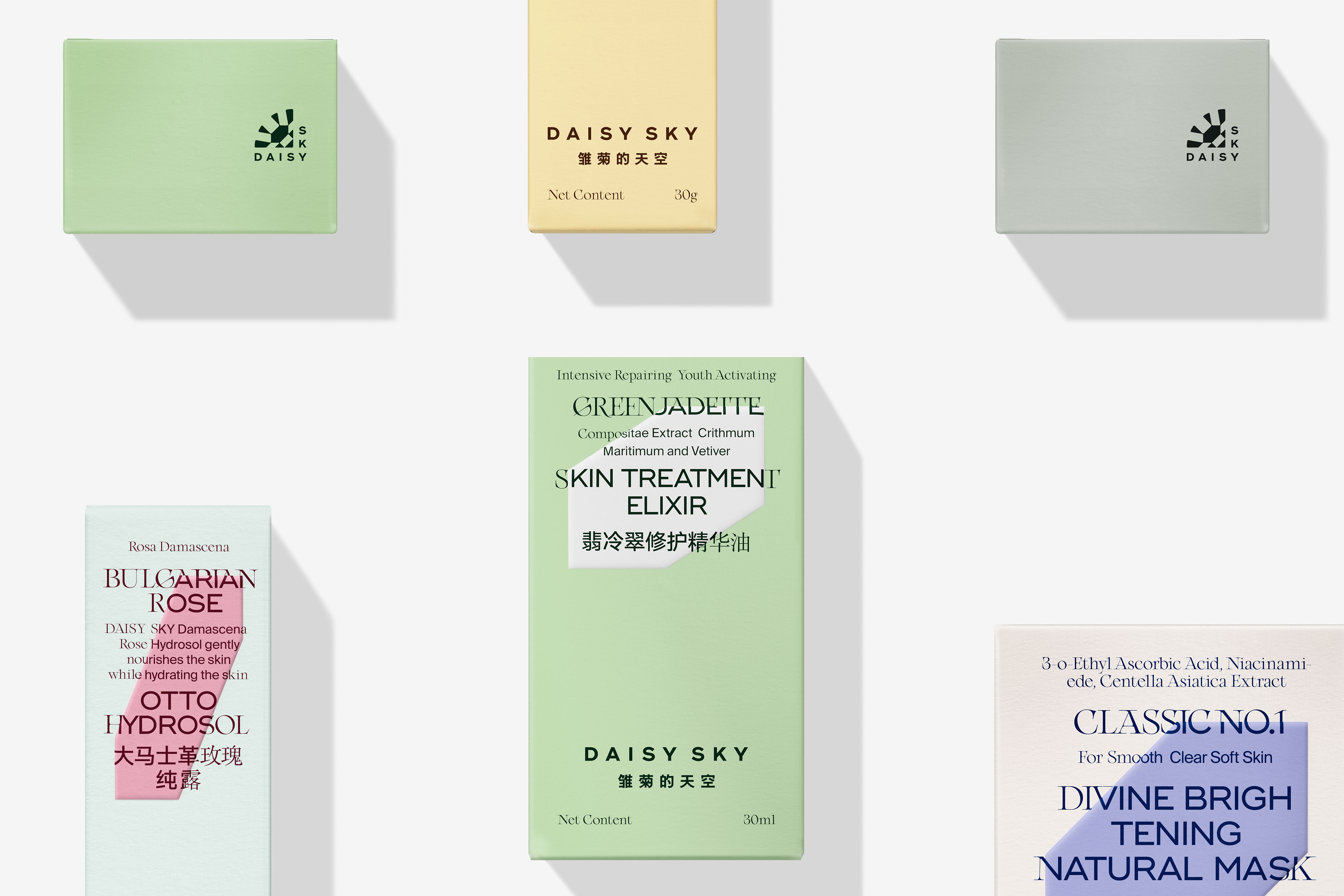
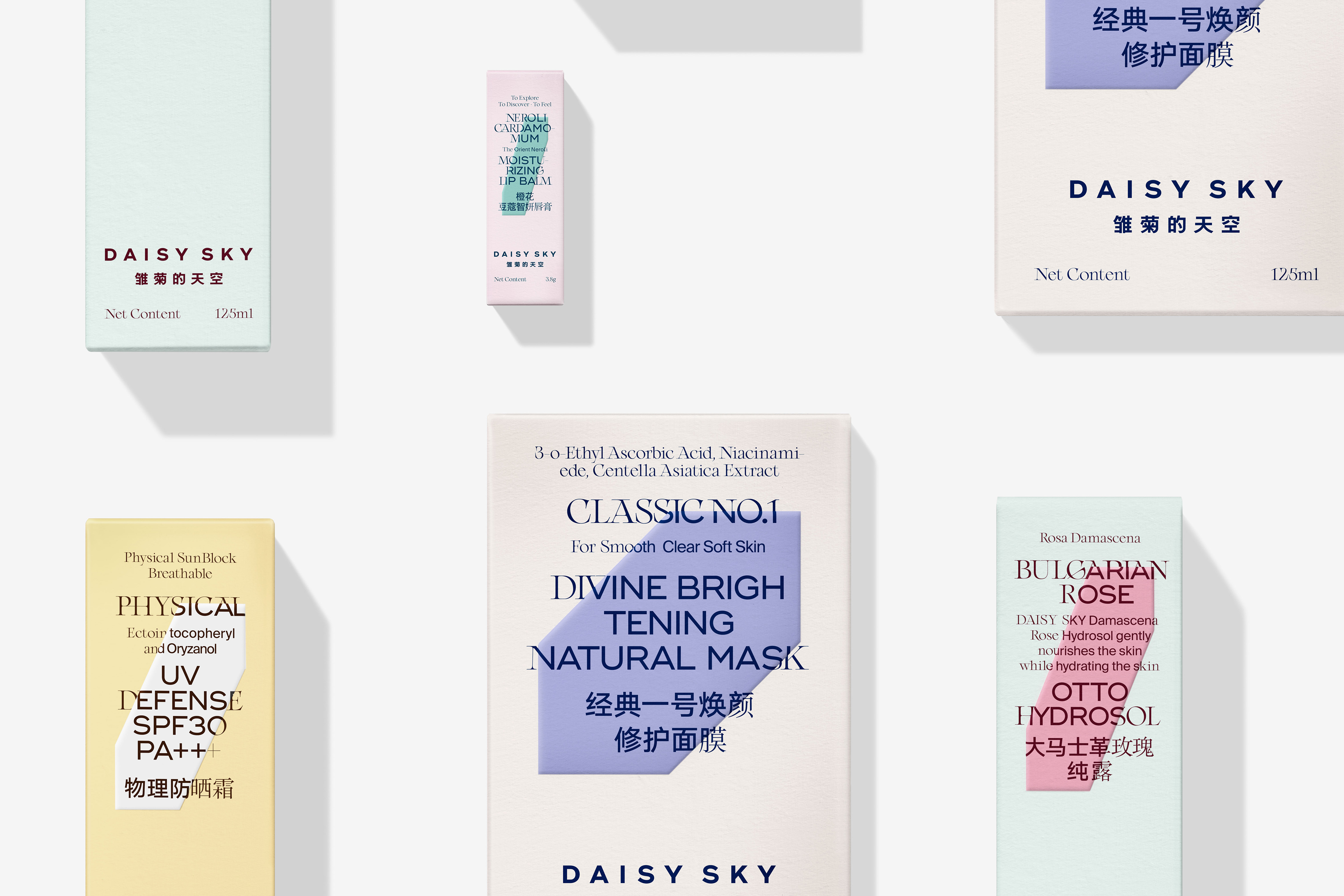
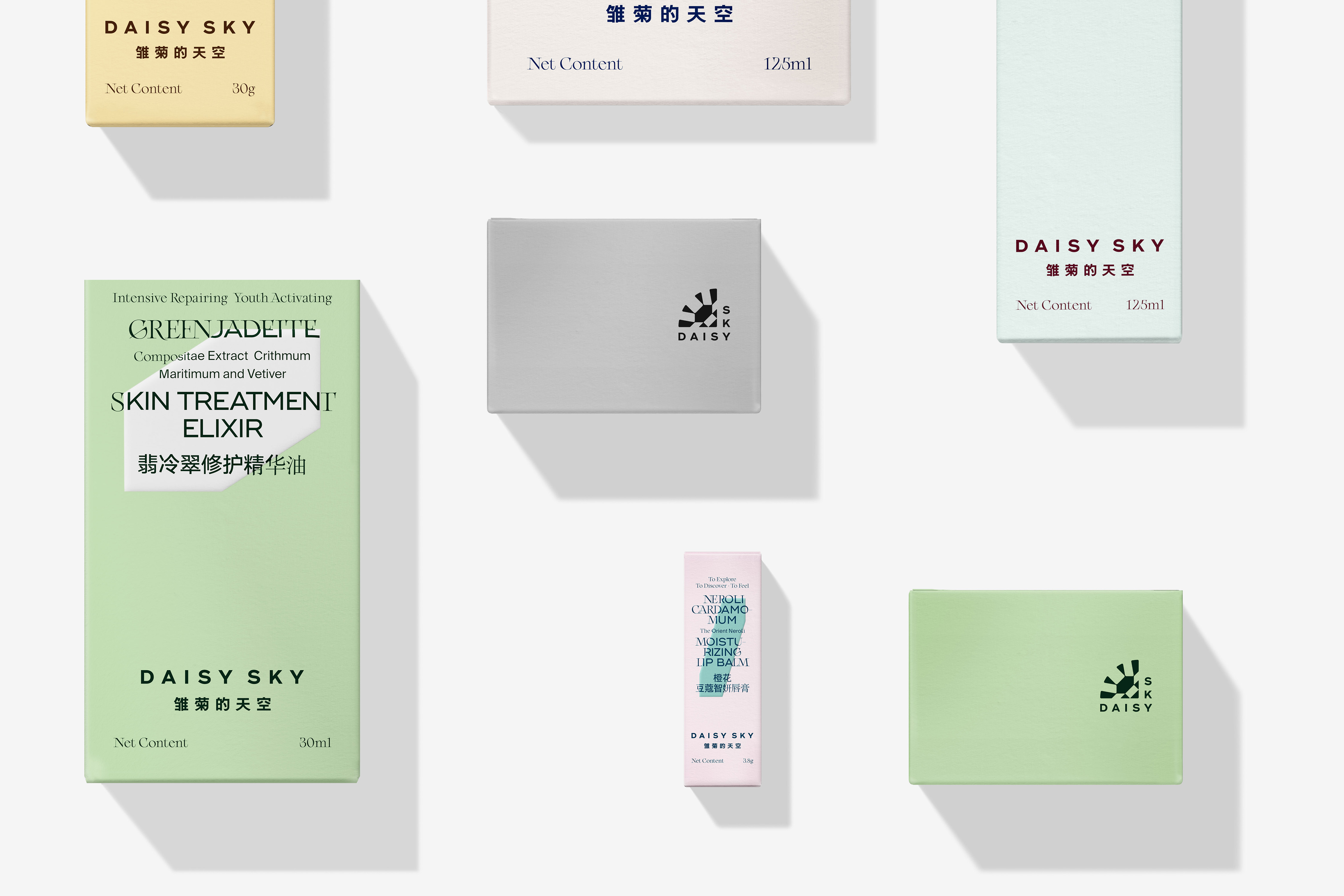
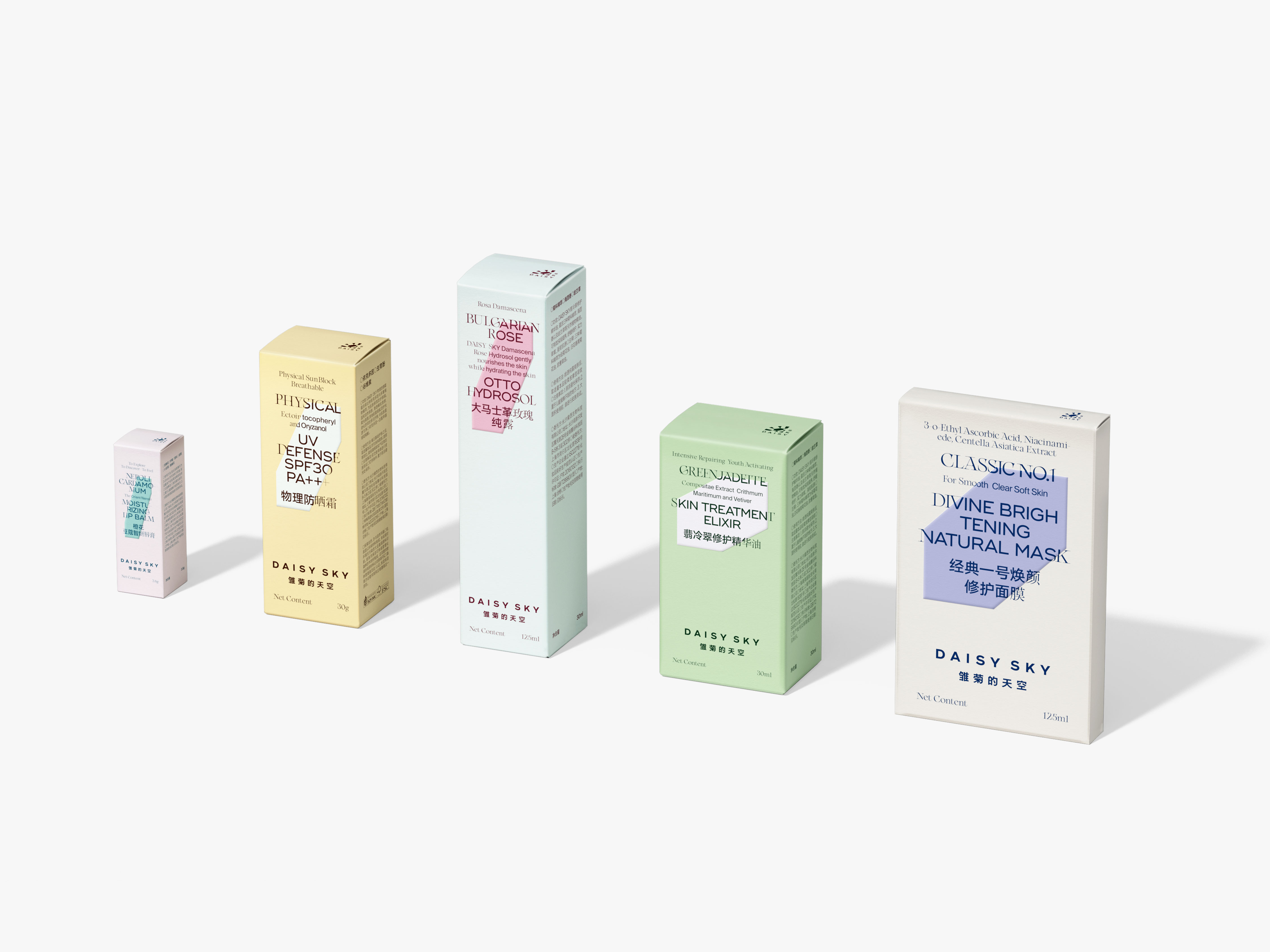
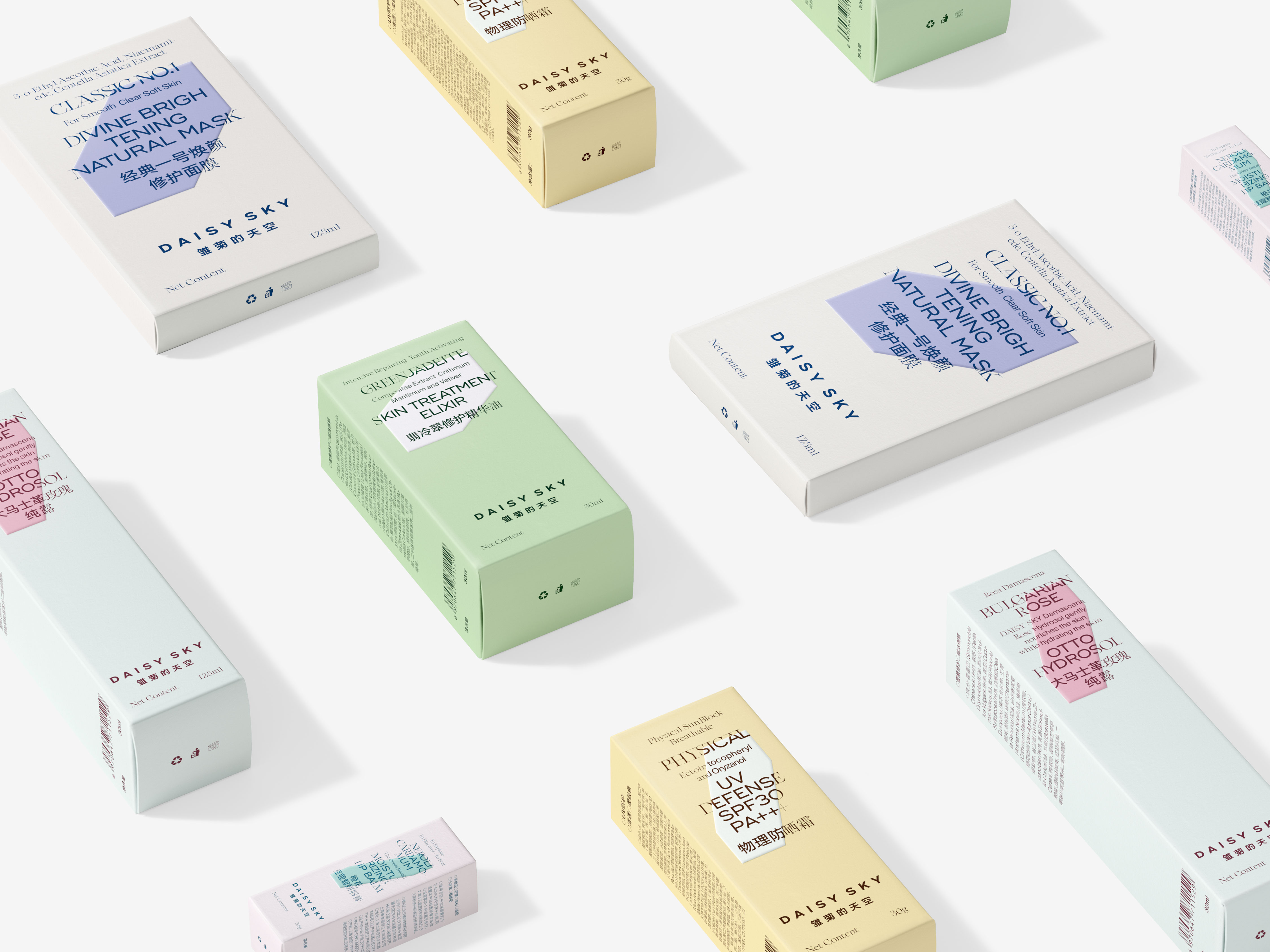
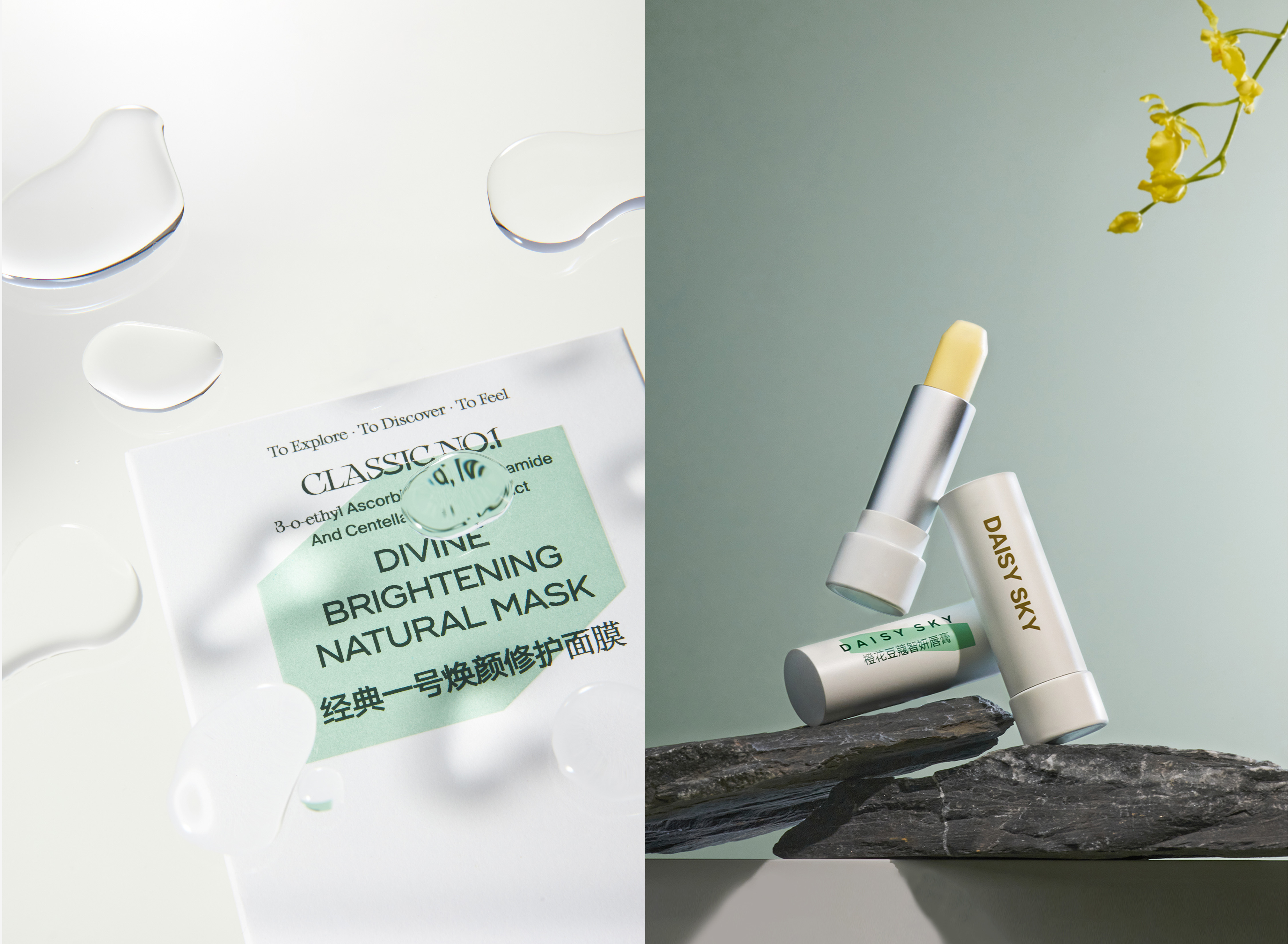
Daisy Sky is a beautiful, dreamy, natural and clear name. Its products are as simple, pure and romantic as the name suggests. The daisy is a small, short flower that blooms all over the hills and fields, whose
petals are so numerous and dense that very few people pay attention to its shape. We focused on the petals of daisy, enlarging and simplifying them into a simple, variable crystal shape, which serves as
the most basic and central element of Daisy Sky's identity. In our opinion, the weakness of the daisy petals and the strength of the logo, just describe the unique brand attitude of the Daisy Sky. The logo is
a quarter of a daisy flower, the reason for avoiding the conventional expression of a full flower shape is that we think the strong straight lines on both sides of the logo can better present the independent
attitude of the brand, balancing the scales of romance and modernity, and amplifying the weak daisy
into a naive and temperamental female spirit.
雏菊的天空,是个美好的、梦幻的、自然的、清澈的名字,它的产品就像它的名字一样,简单、纯粹、
充满浪漫主义色彩。雏菊是开满山野的低矮小花,它的花瓣多而密,极少有人会留意雏菊花瓣的形态。我们将砝码选定为雏菊微弱的花瓣,将花瓣抽离、放大并概括为简洁可变的晶体形状,以此作为雏菊的天空最基本、最核心的识别元素。在我们看来,雏菊花瓣的弱与标识形态的强,刚好能够描述雏菊的天空独特的品牌态度。品牌标识是雏菊花圆形的四分之一,之所以避开完整花朵的常规表达,是我们认为标识两侧强硬的直线能更好地呈现品牌独立的态度,将浪漫与现代的天平平衡,将弱小的雏菊放大成天真烂漫、气质非凡的女性精神。

All Images Copyright © 2021 Daisy Sky inc. All Rights Reserved