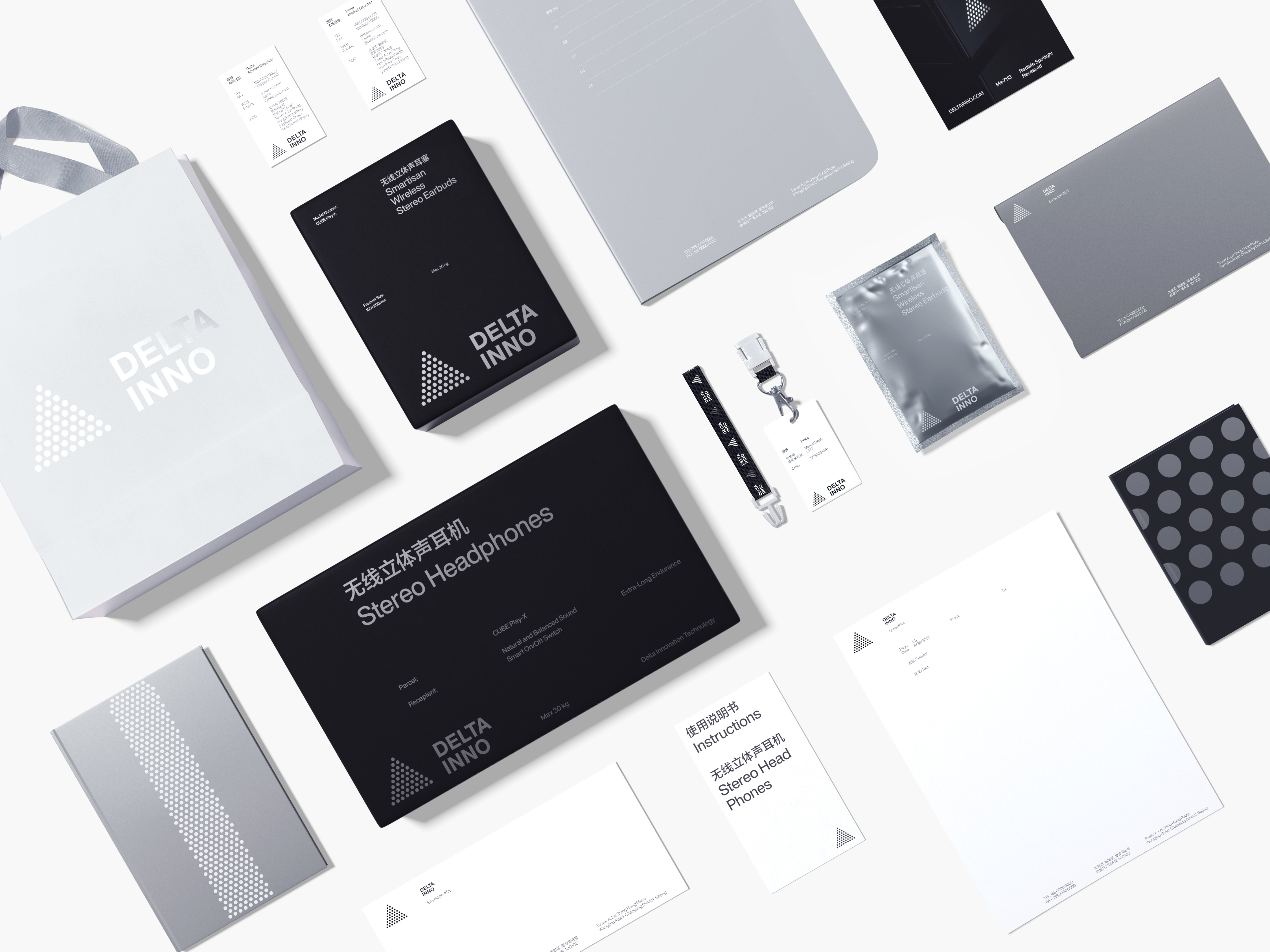
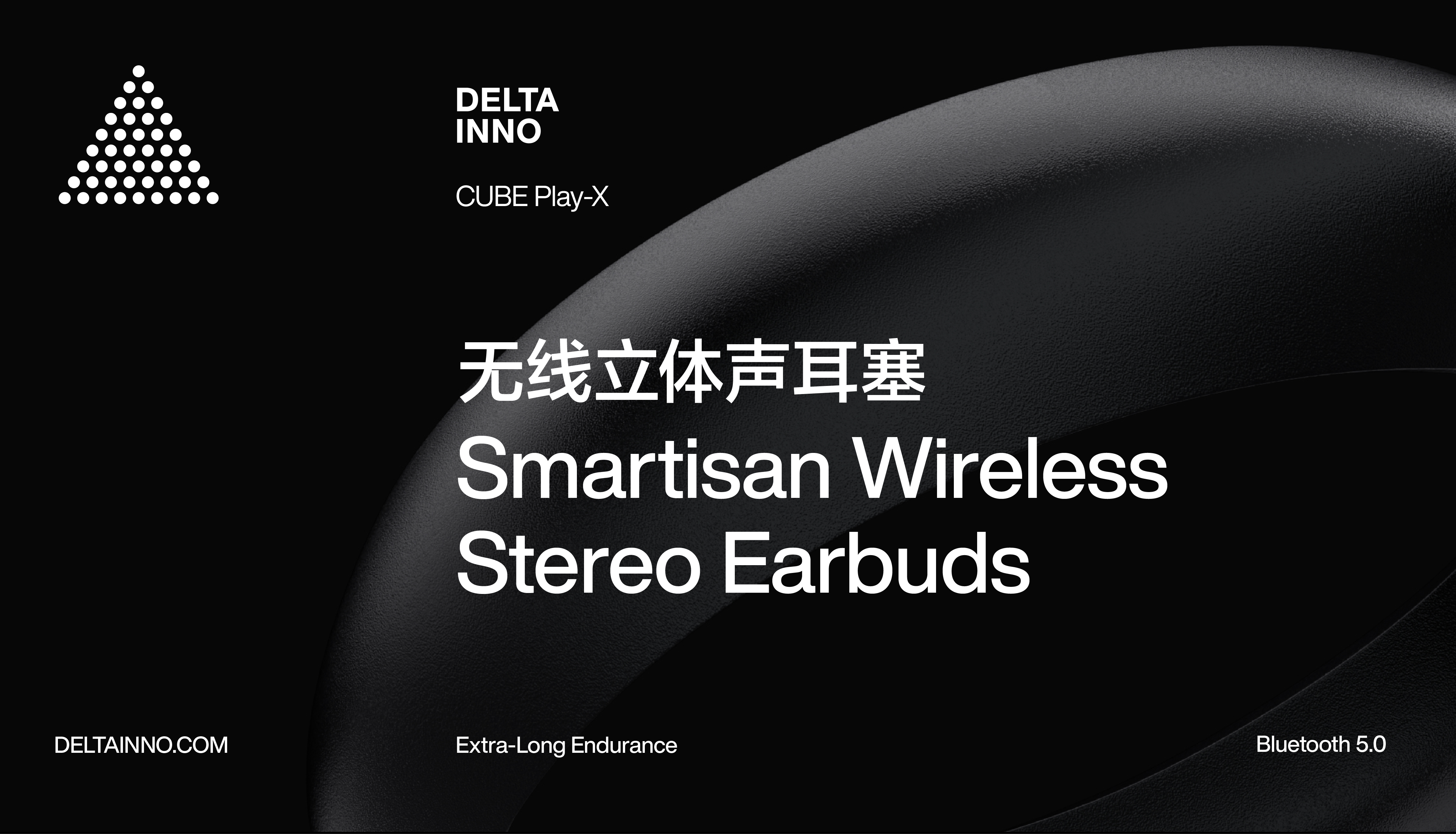
DELTA INNO 得特
ART DIRECTOR: Nod Young / Guang Yu
DESIGNER: Liao Liao
YEAR: 2019
CLIENT: Delta Innovation
Delta (originated from Delta in a geographical sense) is committed to creation of intelligent hardware with precision technology, which serves its users with exquisite technology and attractive industrial
aesthetics. In terms of brand attributes, Delta hopes to establish a simple concept of science and technology that is based on the basic logic and ends with lofty ideals. We attempts to design the logo as an engineer, so as to avoid the effects of natural aesthetics and humanities, thus finding the
"simple" concept of technology as the core of the brand.
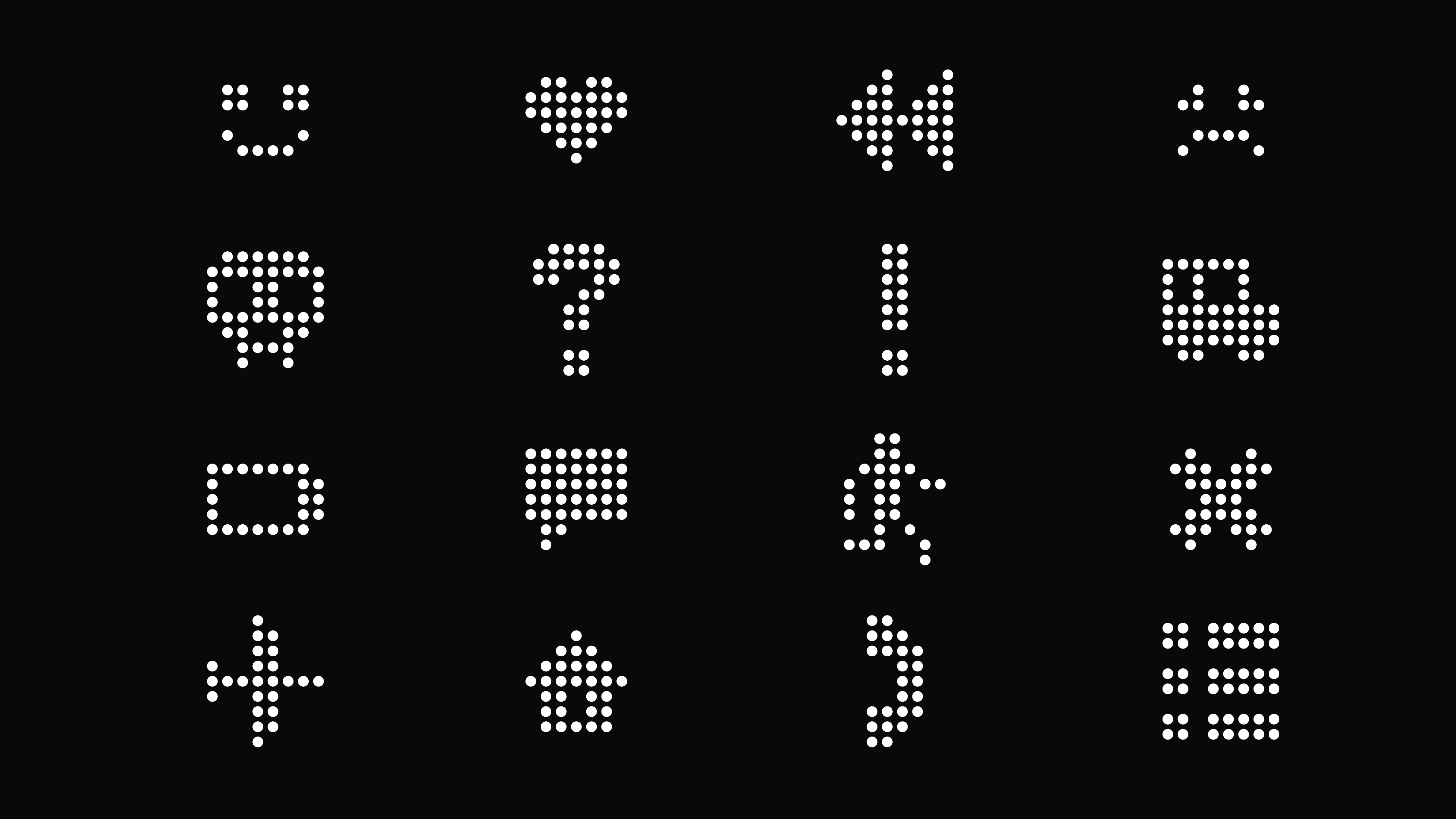
Eventually, we used a "circle", the most basic geometrical shape, to form a "triangle", another basic geometry, by means of regular repetition of multiple circles. However, although in the same rudimentary geometry, circle and triangle are totally different in terms of characteristics. The conversion from the circle to the triangle lies in the orderly overlay in quantity. So much like the driving force of technological change behind the science and technology, it brings the distinguished user experience from the conversion of accumulation and practice. The design principle generating such a conversion comes from the most simple and unsophisticated "stacking" in the engineering thinking.
Eventually, we used a "circle", the most basic geometrical shape, to form a "triangle", another basic geometry, by means of regular repetition of multiple circles. However, although in the same rudimentary geometry, circle and triangle are totally different in terms of characteristics. The conversion from the circle to the triangle lies in the orderly overlay in quantity. So much like the driving force of technological change behind the science and technology, it brings the distinguished user experience from the conversion of accumulation and practice. The design principle generating such a conversion comes from the most simple and unsophisticated "stacking" in the engineering thinking.
得特 Delta(原意为三角洲),致力于打造精密科技的智能硬件,以精湛的工艺和动人的工业美学去服务用户。从品牌特质的角度,得特希望建立一种朴素的科技观念,源于最基本的逻辑,止于最遥远的理想。我们尝试用工程师的思维去进行设计,避免受到来自自然美学和人文艺术的影响,从而希望找到品牌核心的
“朴素的”科技观念。
最终,我们用最基本的几何形状“圆”,通过阵列的方式得到另一个最基本的几何形状“三角形”。圆和三角形,同为最基本的形态,但特征完全不同,通过数量的有序叠加,完成从圆形到三角形的转化。这很像科技背后的技术驱动力,通过积累与实践转化为卓越的用户使用体验。而产生这种转变的设计原理,仅仅是源于工程思维中最朴素最单纯的“堆叠”。
最终,我们用最基本的几何形状“圆”,通过阵列的方式得到另一个最基本的几何形状“三角形”。圆和三角形,同为最基本的形态,但特征完全不同,通过数量的有序叠加,完成从圆形到三角形的转化。这很像科技背后的技术驱动力,通过积累与实践转化为卓越的用户使用体验。而产生这种转变的设计原理,仅仅是源于工程思维中最朴素最单纯的“堆叠”。