Cloudpick 云拿
ART DIRECTOR: Nod Young / Guang Yu
DESIGNER: Hu Wen
YEAR: 2020
CLIENT: Cloudpick
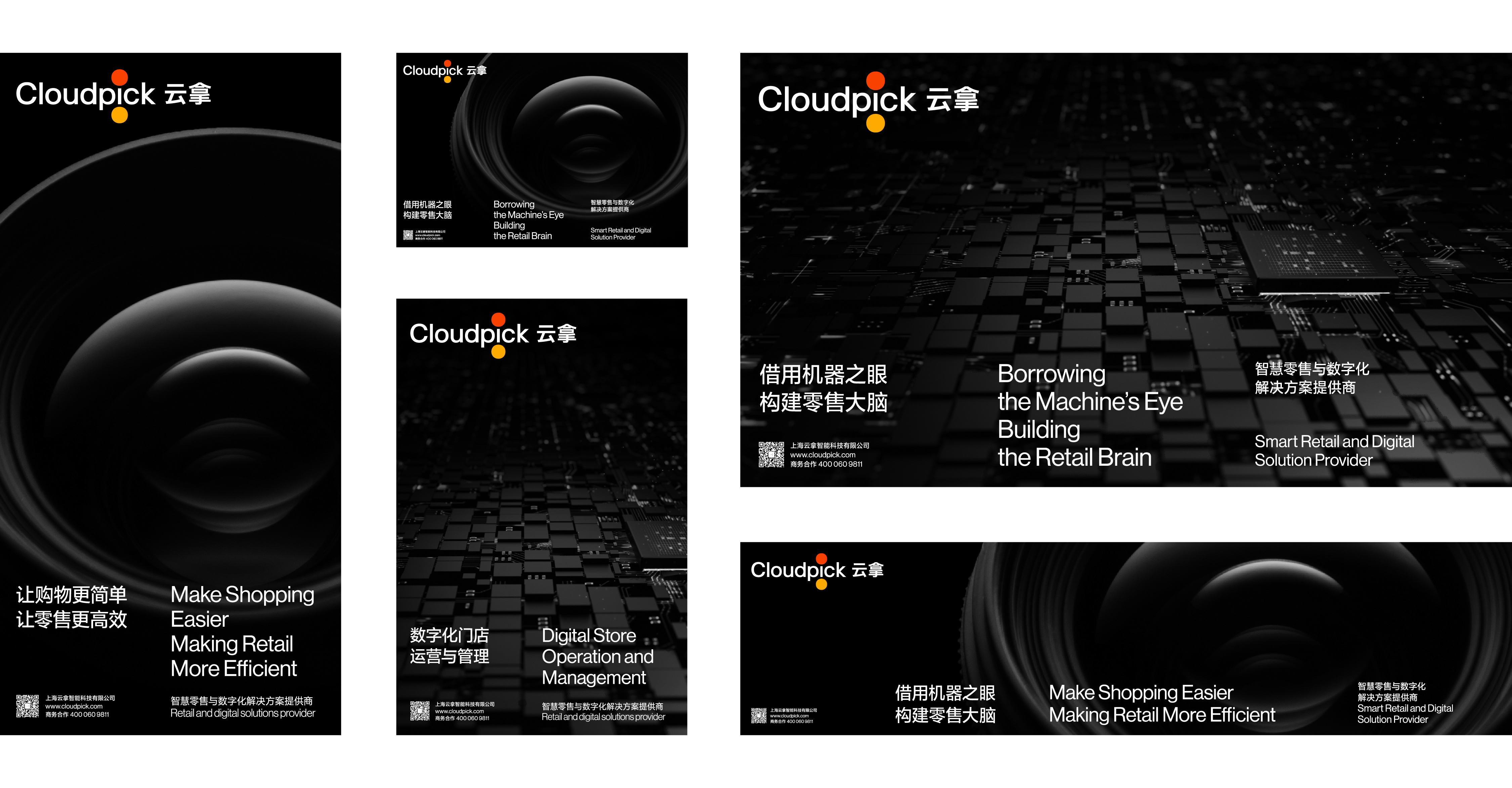
As the world's leading provider of intelligent retail and digital solutions, the rebranding of Cloudpick aims to promote advanced business philosophy and product values and gain wider recognition worldwide.
The focus of this rebranding is to make users easily and clearly experience the convenience and efficiency brought by science and technology through "simplifying complexity".
"Pick" and "Take" are the initial actions that form a basic business path, the common behaviors of consumers after rational judgment, and also the literal interpretation of "pick" in "Cloudpick". Thus, "Pick" and "Take" become the source of identification symbols with core significance in the new logo. "Take" is simplified as the gathering action between the thumb and forefinger. In the design, this action is summarized as two close dots. "Pick" takes "i" as the selection object, corresponding to the brand's service concept of taking user needs as the center. On the whole, the logo is simple, clear and friendly, while the purpose and motivation are hidden under the daily relaxed behavior of "Pick". This is exactly the scientific and technological temperament and the power of intelligence recognized by Cloudpick, which quietly changes the world, making people's life relaxed and efficient with more beauty experienced.
"Pick" and "Take" are the initial actions that form a basic business path, the common behaviors of consumers after rational judgment, and also the literal interpretation of "pick" in "Cloudpick". Thus, "Pick" and "Take" become the source of identification symbols with core significance in the new logo. "Take" is simplified as the gathering action between the thumb and forefinger. In the design, this action is summarized as two close dots. "Pick" takes "i" as the selection object, corresponding to the brand's service concept of taking user needs as the center. On the whole, the logo is simple, clear and friendly, while the purpose and motivation are hidden under the daily relaxed behavior of "Pick". This is exactly the scientific and technological temperament and the power of intelligence recognized by Cloudpick, which quietly changes the world, making people's life relaxed and efficient with more beauty experienced.
作为全球领先的智能零售及数字化解决方案提供商,云拿 Cloudpick 此次的品牌升级,目的在于把先进的运营理念及产品价值,在全球范围内进行推广并获得更加广泛的认知。通过“化繁为简”的方式,让用户轻松明确地体验到科技带来的便捷与高效,是这次品牌升级的工作重点。
“选”与“取”,是构成一条基本商业路径的起始动作,是消费者理性判断后的普遍行为,亦是“云拿”中“拿”的字面释义——由此,“选”与“取”成为新标识中具有核心意义的识别符号来源。我们将“选和取”分成两部进行描述:“取”被简化为拇指和食指间的聚拢动作,设计中,将这一动作概括为两个靠近的圆点;“选”,则把单词“Pick”中的“i”作为选择对象,对应品牌以用户需求为中心的服务理念。最终,标识整体的造型是极简的,清晰不失友好,目的与动机则隐藏在日常轻松的“选取”行为之下,这正是云拿所认同的科技气质与智能的力量,它悄然改变世界,让人们的生活轻松且高效,体验更多美好。
“选”与“取”,是构成一条基本商业路径的起始动作,是消费者理性判断后的普遍行为,亦是“云拿”中“拿”的字面释义——由此,“选”与“取”成为新标识中具有核心意义的识别符号来源。我们将“选和取”分成两部进行描述:“取”被简化为拇指和食指间的聚拢动作,设计中,将这一动作概括为两个靠近的圆点;“选”,则把单词“Pick”中的“i”作为选择对象,对应品牌以用户需求为中心的服务理念。最终,标识整体的造型是极简的,清晰不失友好,目的与动机则隐藏在日常轻松的“选取”行为之下,这正是云拿所认同的科技气质与智能的力量,它悄然改变世界,让人们的生活轻松且高效,体验更多美好。