Canban 参半
ART DIRECTOR: Guang Yu / Nod Young
DESIGNER: Wen Di / Hu Wen
YEAR: 2021
CLIENT: Canban 参半
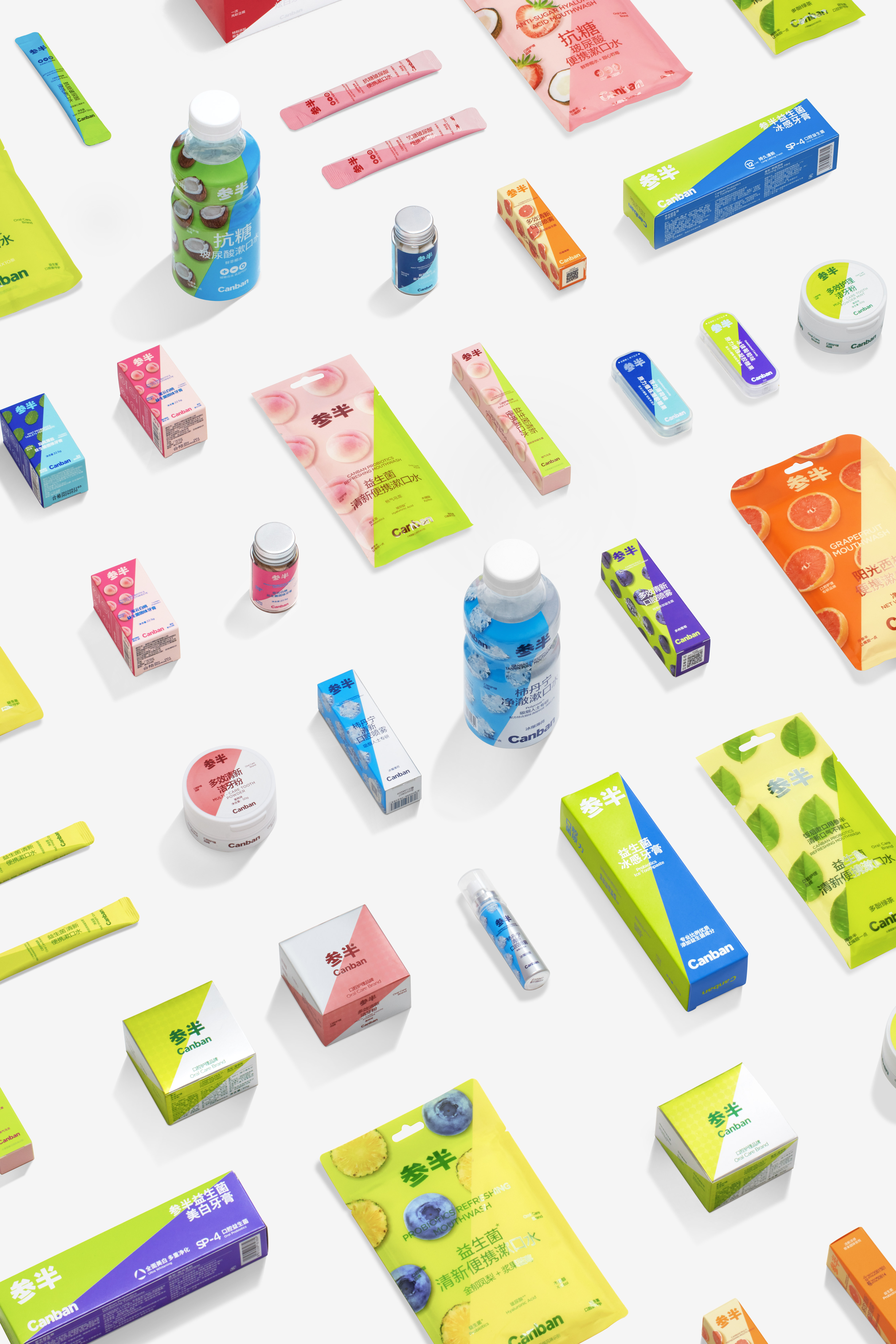
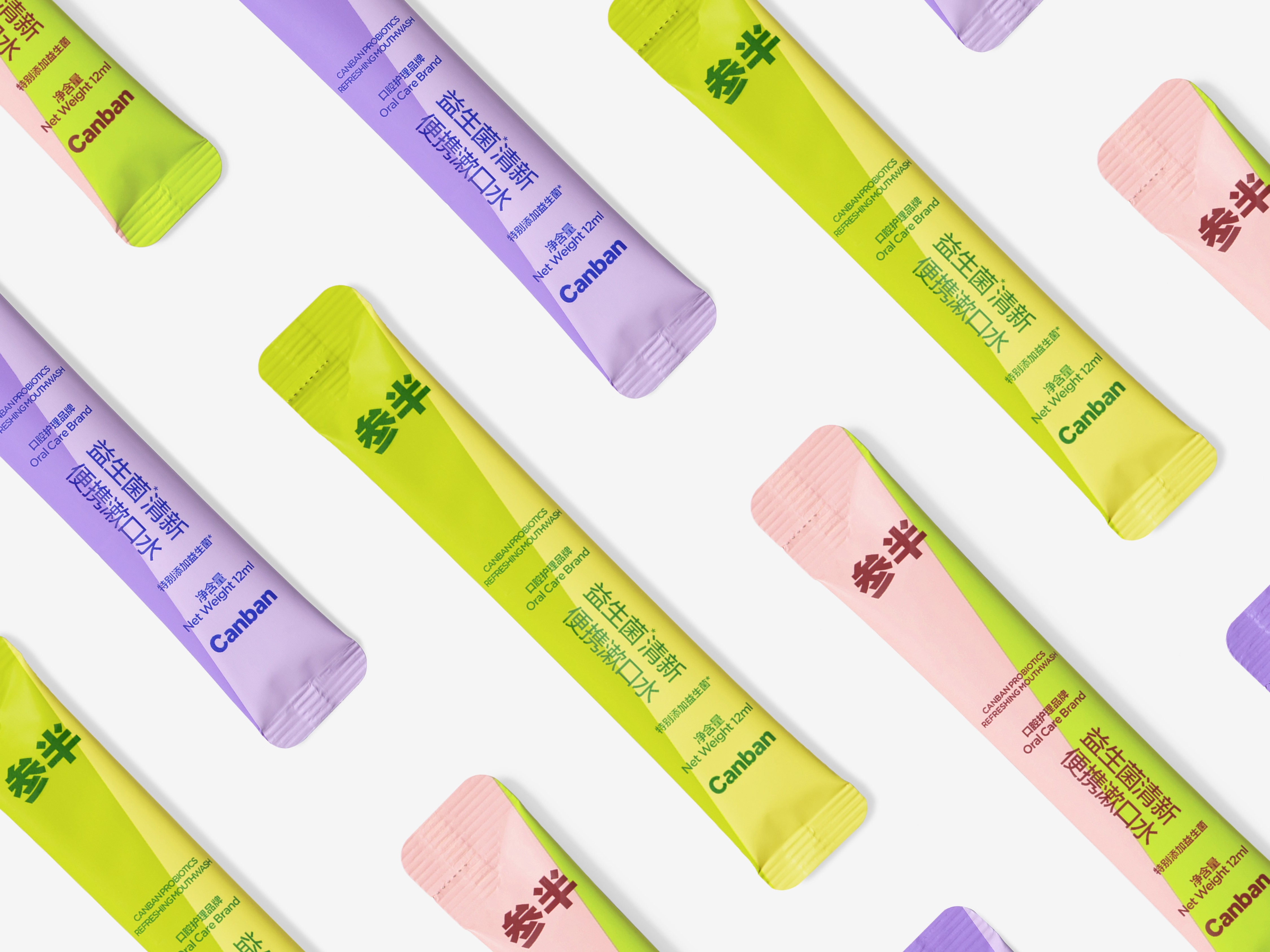
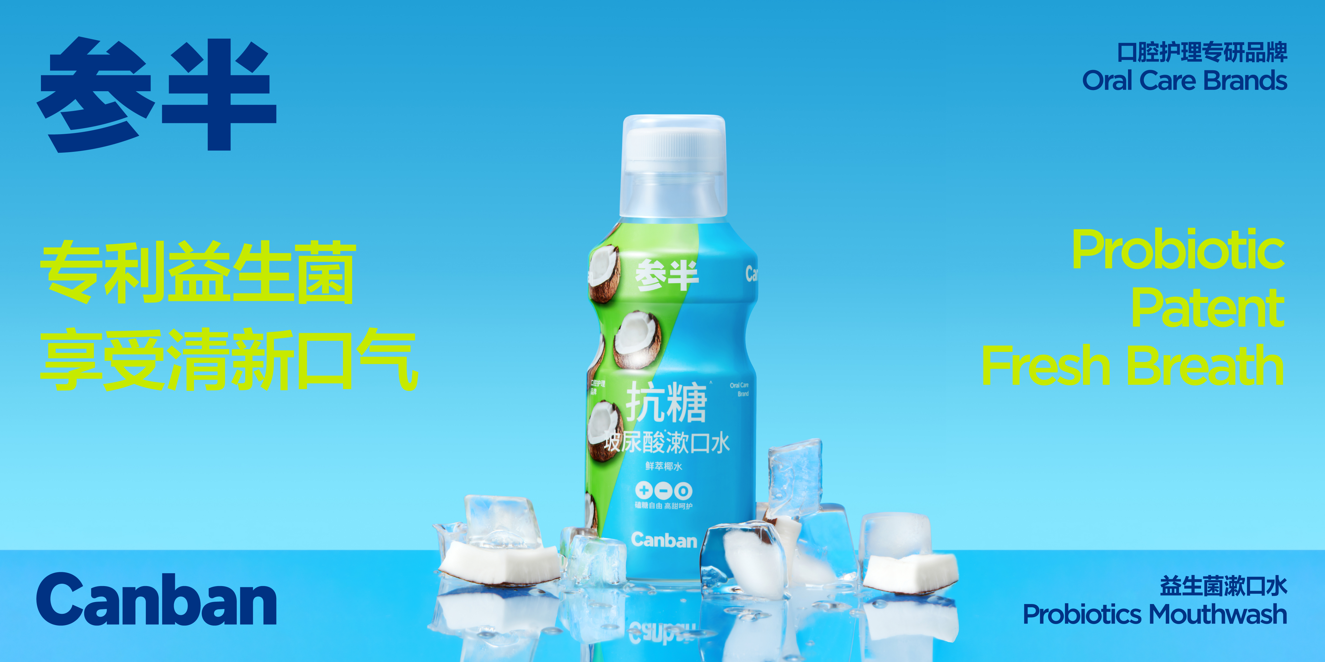
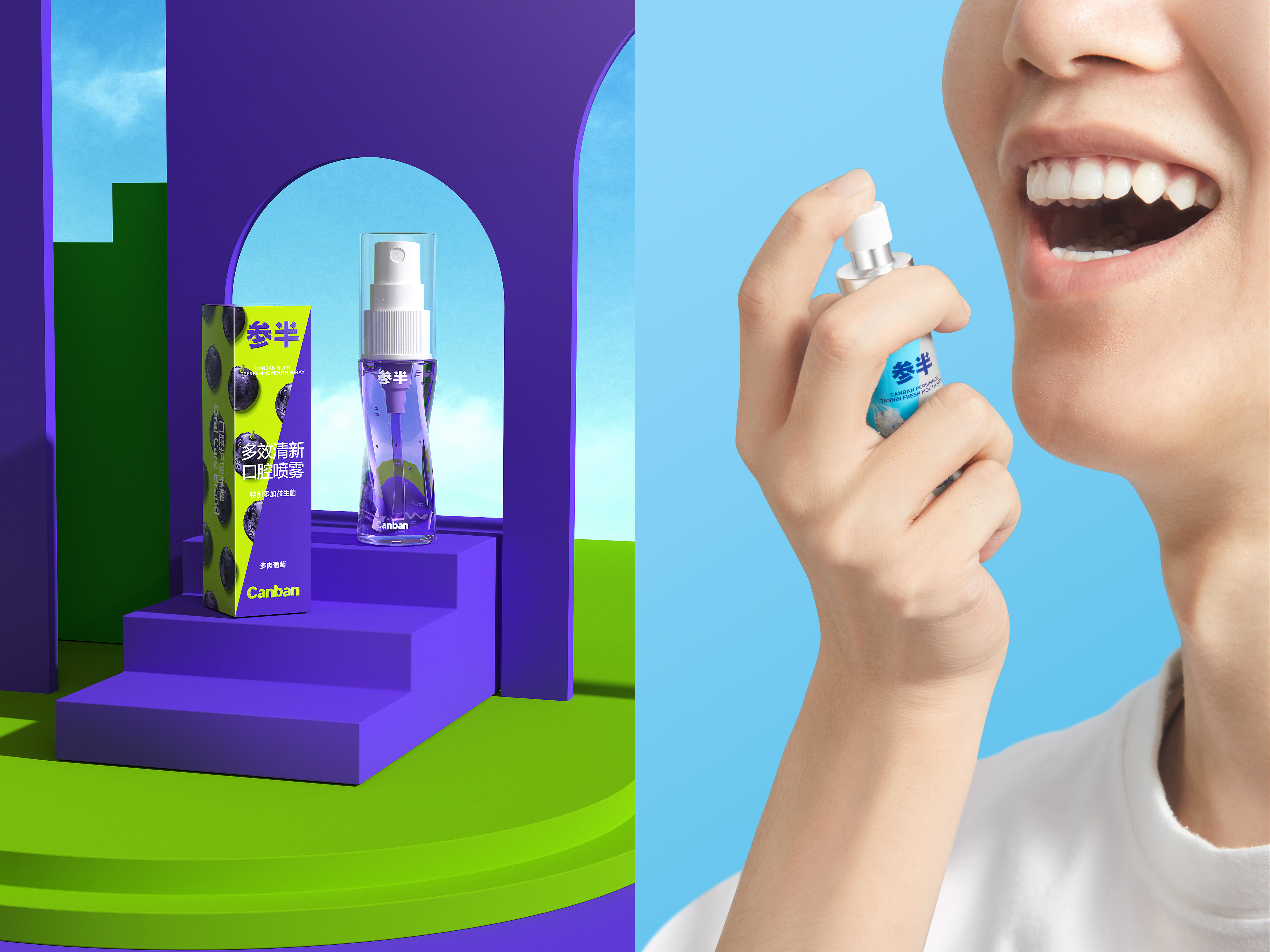
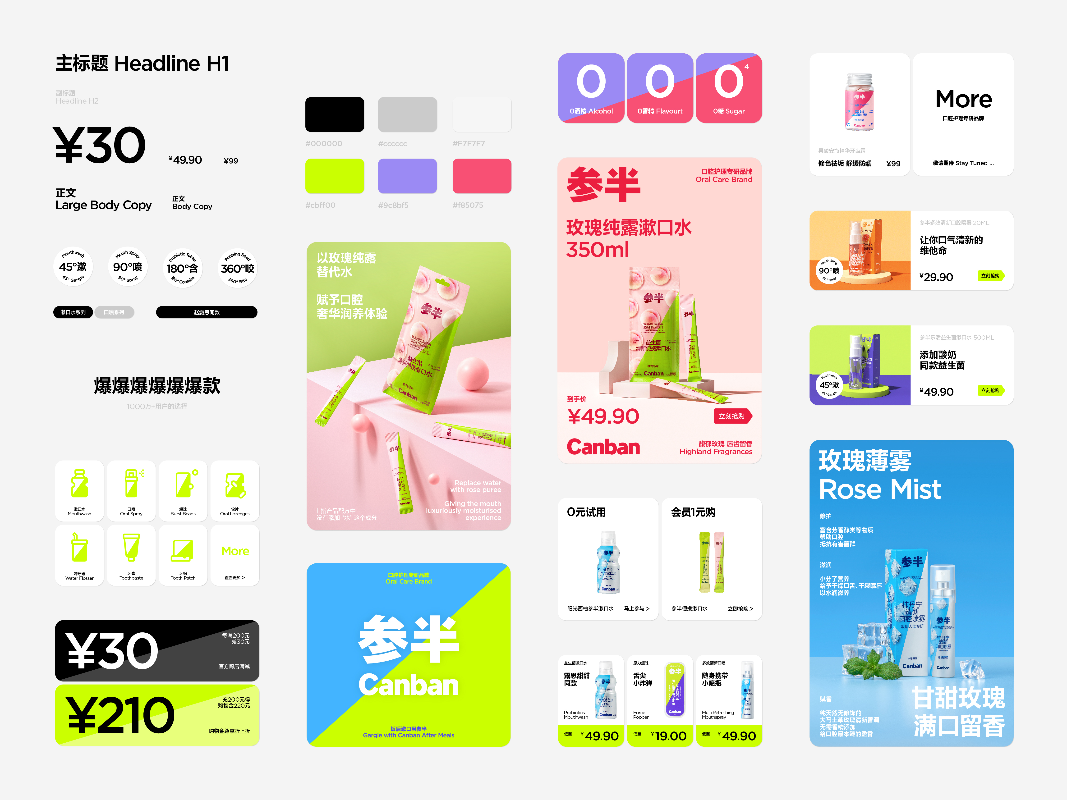
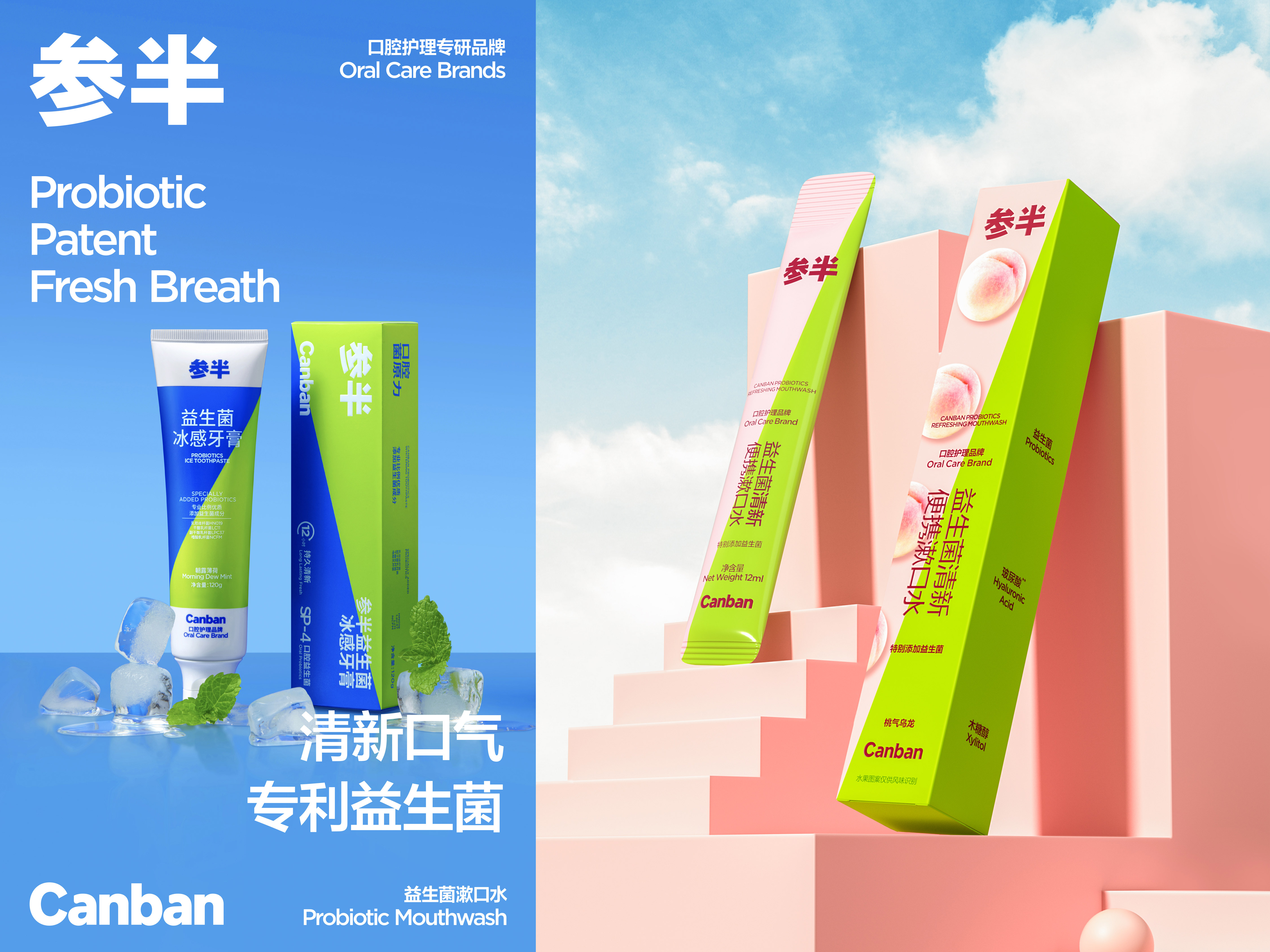
Canban is a main oral care brand in China and one of the fastest growing emerging brands. In our view, the main reason why Canban has rapidly developed and achieved success in the market competition is that Canban’s product features are defined as youthful, fashionable and daily. Such a product interpretation is quite different from those indifferent profession and changeless stereotyped image commonly seen in the traditional oral care industry. Consumers have more diversified demands for oral care, who may pursue more comfortable and fashionable daily oral care instead of only professional cleaning needs. For this reason, Canban’s rebranding lies in giving users a rich and relaxed sense of daily life while guaranteeing the product quality and professional standard.
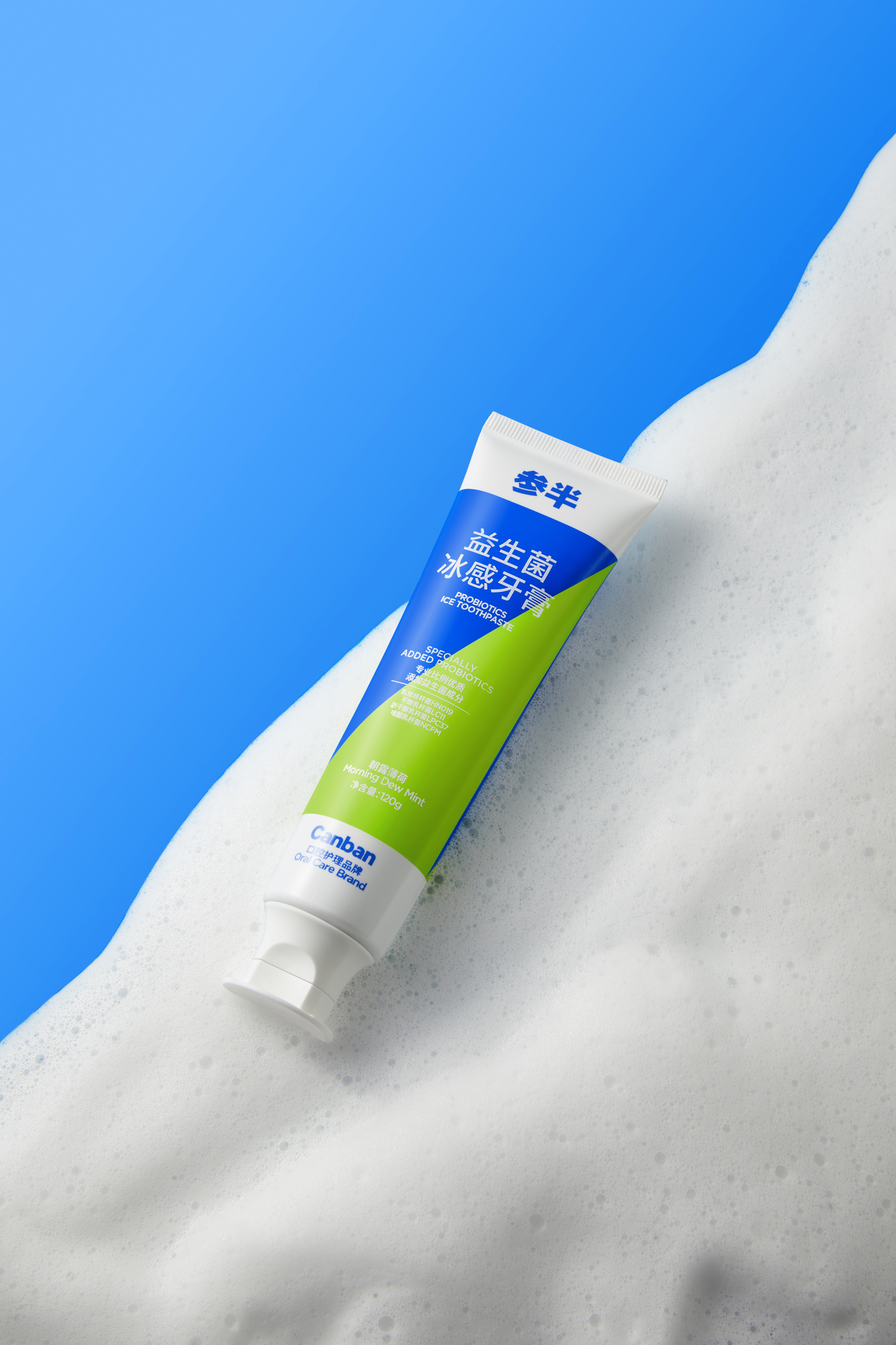
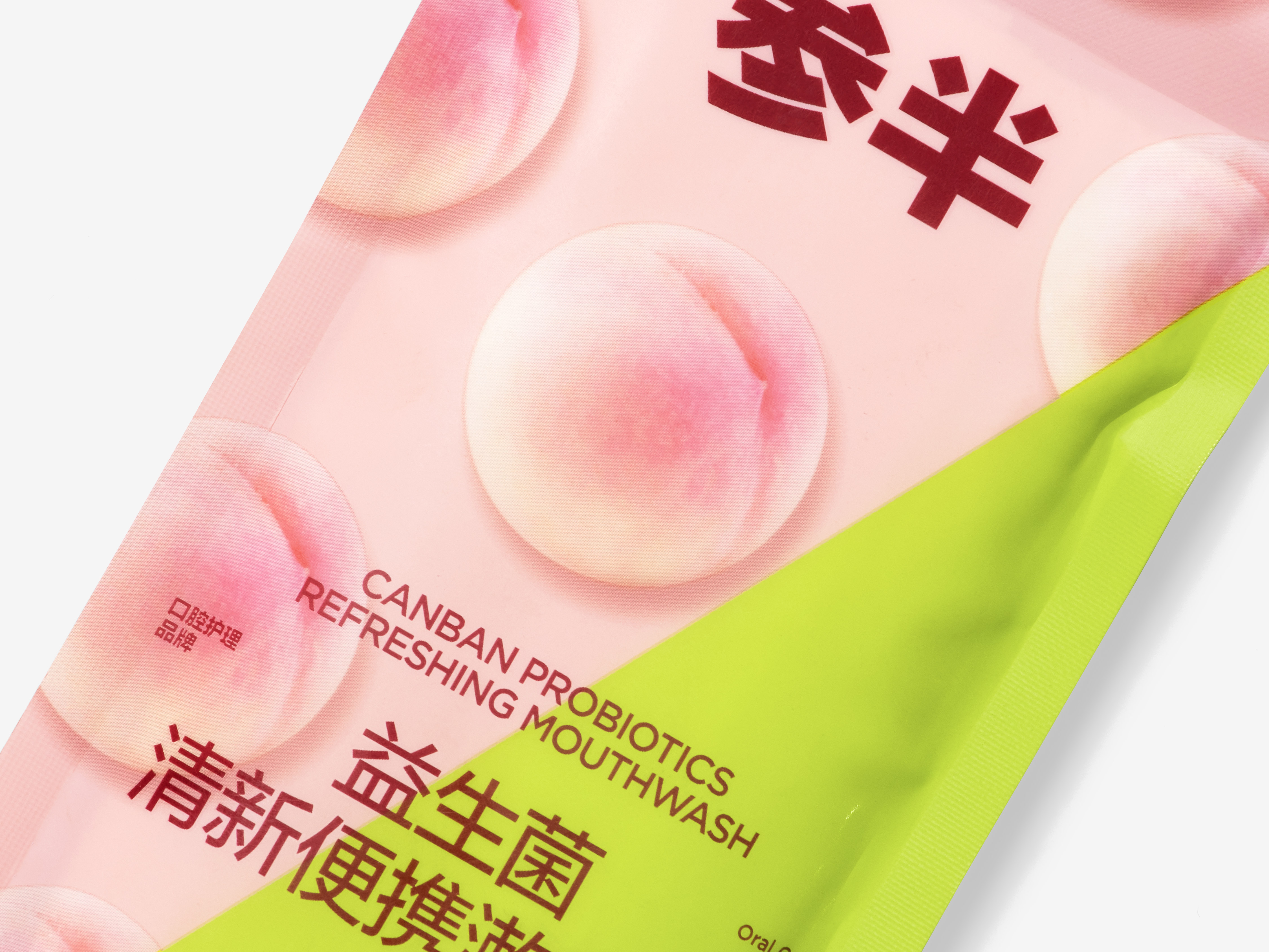
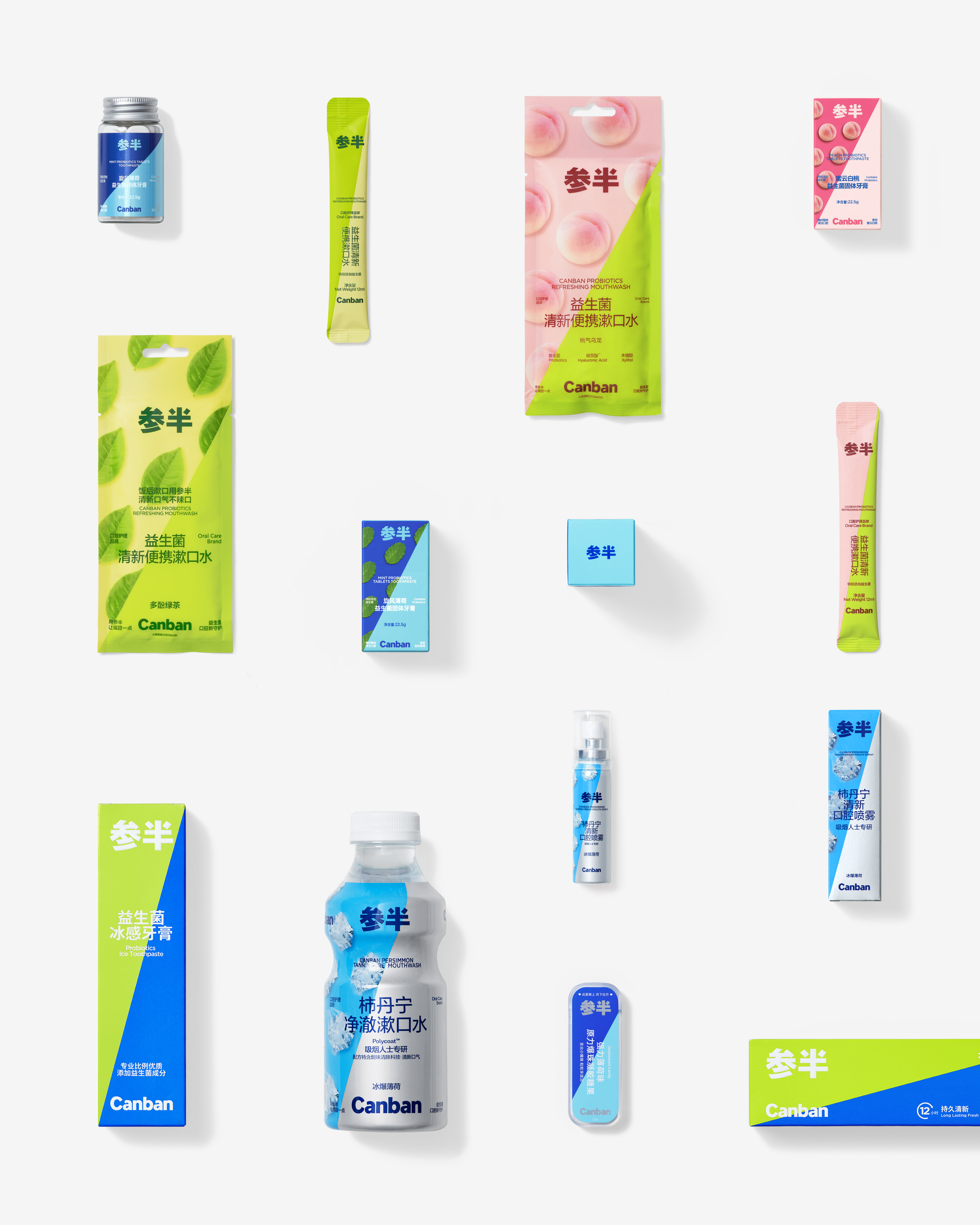
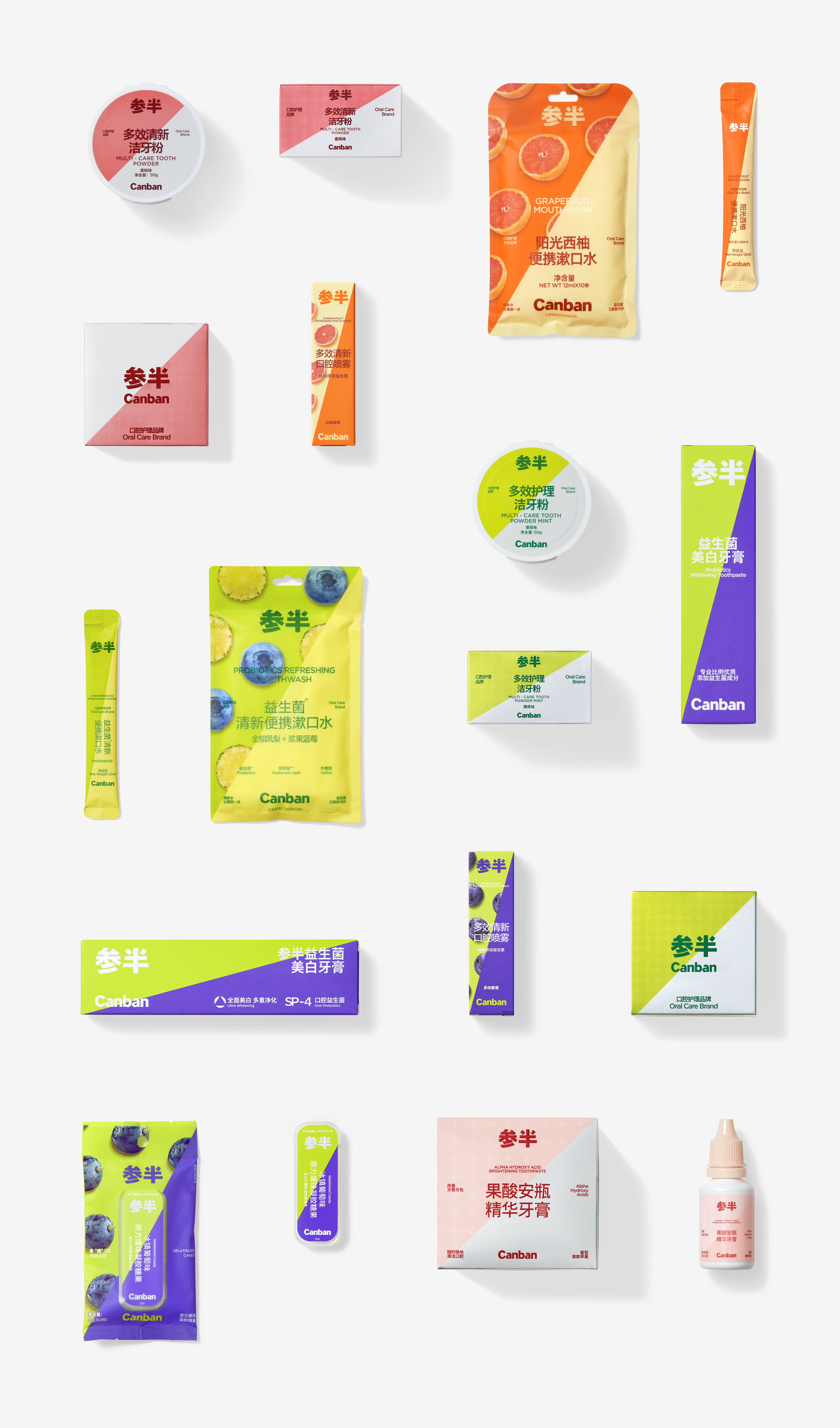
We searched for possibilities in the industries of beverage, skin care and fashion in order to realize Canban’s characteristics of nice taste, high quality and good looking. We firstly established a color system for Canban and formed its unique visual identity core through bicolor area division based on the meaning of “half” in its brand name in Chinese. The purpose is not only to make Canban’s products more distinctive but also allow consumers to quickly distinguish the different tastes and characteristics of products by colors. In addition, we created rich possibilities for content presentation in the bicolor area, including colors, images, illustrations, which can be perfectly presented and ensure the effective transmission of text information to the greatest extent. Finally, we referred to the practice of beverage products for layout, enlarged the product name and sorted out the illustrative words in priority order. This helps consumers to learn about all the necessary information at a glance and avoid reading disorder or tough choice caused by excessive key information.
We searched for possibilities in the industries of beverage, skin care and fashion in order to realize Canban’s characteristics of nice taste, high quality and good looking. We firstly established a color system for Canban and formed its unique visual identity core through bicolor area division based on the meaning of “half” in its brand name in Chinese. The purpose is not only to make Canban’s products more distinctive but also allow consumers to quickly distinguish the different tastes and characteristics of products by colors. In addition, we created rich possibilities for content presentation in the bicolor area, including colors, images, illustrations, which can be perfectly presented and ensure the effective transmission of text information to the greatest extent. Finally, we referred to the practice of beverage products for layout, enlarged the product name and sorted out the illustrative words in priority order. This helps consumers to learn about all the necessary information at a glance and avoid reading disorder or tough choice caused by excessive key information.
参半,是中国口腔护理行业的主力品牌,也是发展最快的新兴品牌之一。在我们看来,参半之所以得到飞速的发展,在市场竞争中获得成功,其背后的原因很大程度归功于参半将产品的特征定义于年轻化、时尚化、日常化,这与传统口腔护理行业中常见的冷冰冰的专业和一成不变的死板有着截然不同的产品理解,而消费者对于口腔护理的需求正处于迭代期,从对单一清洁的专业需求转化为更为舒适且更为时尚的日常需求。基于这个理由,我们将此次参半的品牌升级定位于如何在保证品质感与专业性的同时,能尽可能地提供丰富的、轻松的日常感。
我们从饮品、护肤品及时尚等行业领域去寻找可能性,让参半的设计看上去同时具备好味道、高品质以及高颜值的特点。我们首先建立了参半的色彩系统,利用参半中“半”的含义,以双色的区域划分来形成参半独有的视觉识别核心,其目的除了让参半的产品更具有差异性外,也能通过色彩的运用让消费者快速分辨产品的不同口味和特点;另外,在双色区域中的内容呈现上,我们设置了丰富的可能性,包括色彩、影像、插图等,都能得到最佳的展示,并最大程度上保护了文字信息的有效传达;最后,在文字信息的版式处理上,我们参考了饮品的做法,放大处理产品名称,并将说明性文字以优先级排序的方式进行梳理,使消费者一目了然地了解到所有的必要信息,避免了由于信息关键点过多而导致的阅读障碍和选择困难。
我们从饮品、护肤品及时尚等行业领域去寻找可能性,让参半的设计看上去同时具备好味道、高品质以及高颜值的特点。我们首先建立了参半的色彩系统,利用参半中“半”的含义,以双色的区域划分来形成参半独有的视觉识别核心,其目的除了让参半的产品更具有差异性外,也能通过色彩的运用让消费者快速分辨产品的不同口味和特点;另外,在双色区域中的内容呈现上,我们设置了丰富的可能性,包括色彩、影像、插图等,都能得到最佳的展示,并最大程度上保护了文字信息的有效传达;最后,在文字信息的版式处理上,我们参考了饮品的做法,放大处理产品名称,并将说明性文字以优先级排序的方式进行梳理,使消费者一目了然地了解到所有的必要信息,避免了由于信息关键点过多而导致的阅读障碍和选择困难。

All Images Copyright © 2021 Canban 参半. All Rights Reserved