CHOCDAY 每日黑巧
ART DIRECTOR: Guang Yu / Nod Young
DESIGNER: Hu Wen / Han Lu
YEAR: 2019
CLIENT: CHOCDAY 每日黑巧
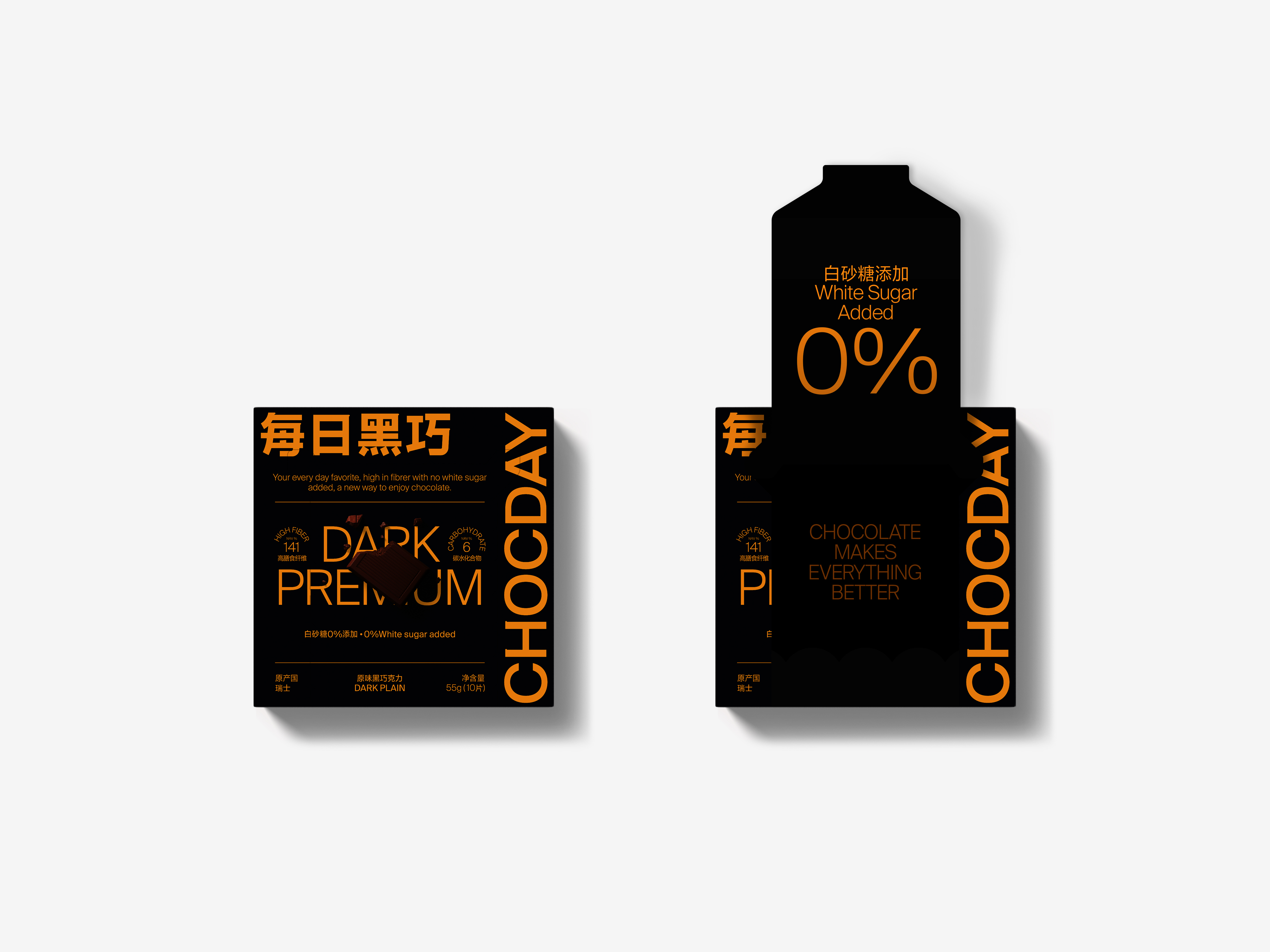
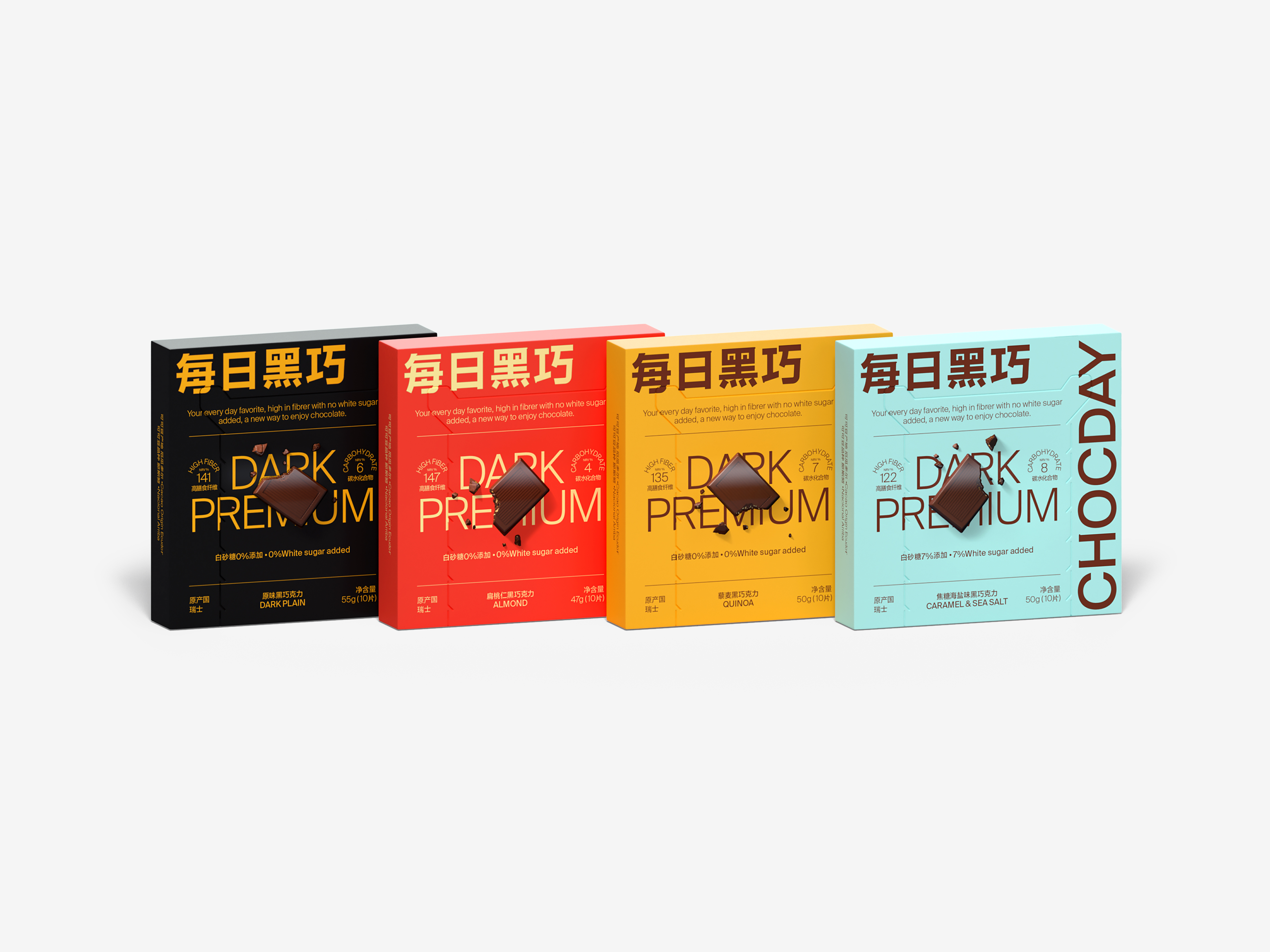
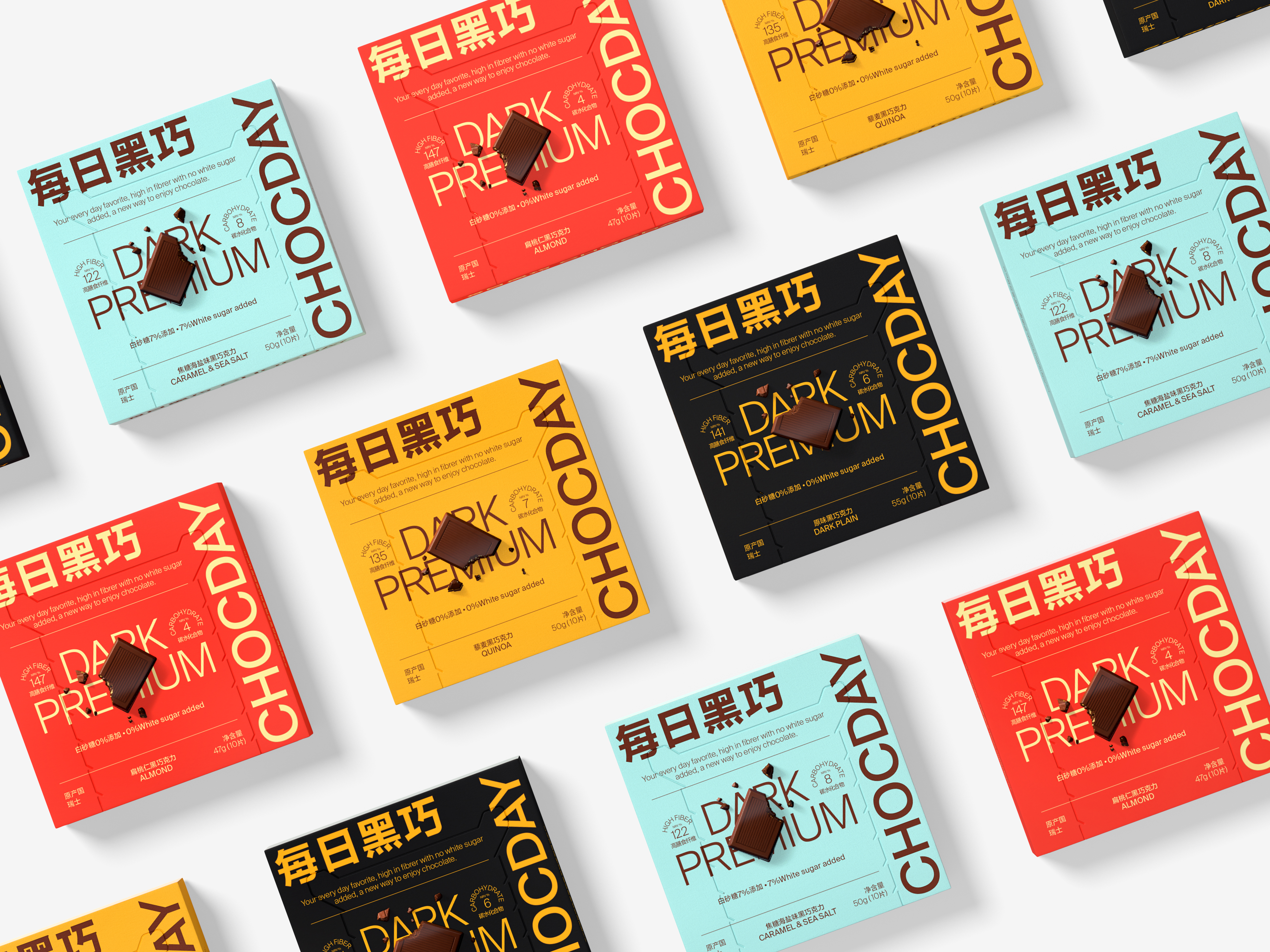
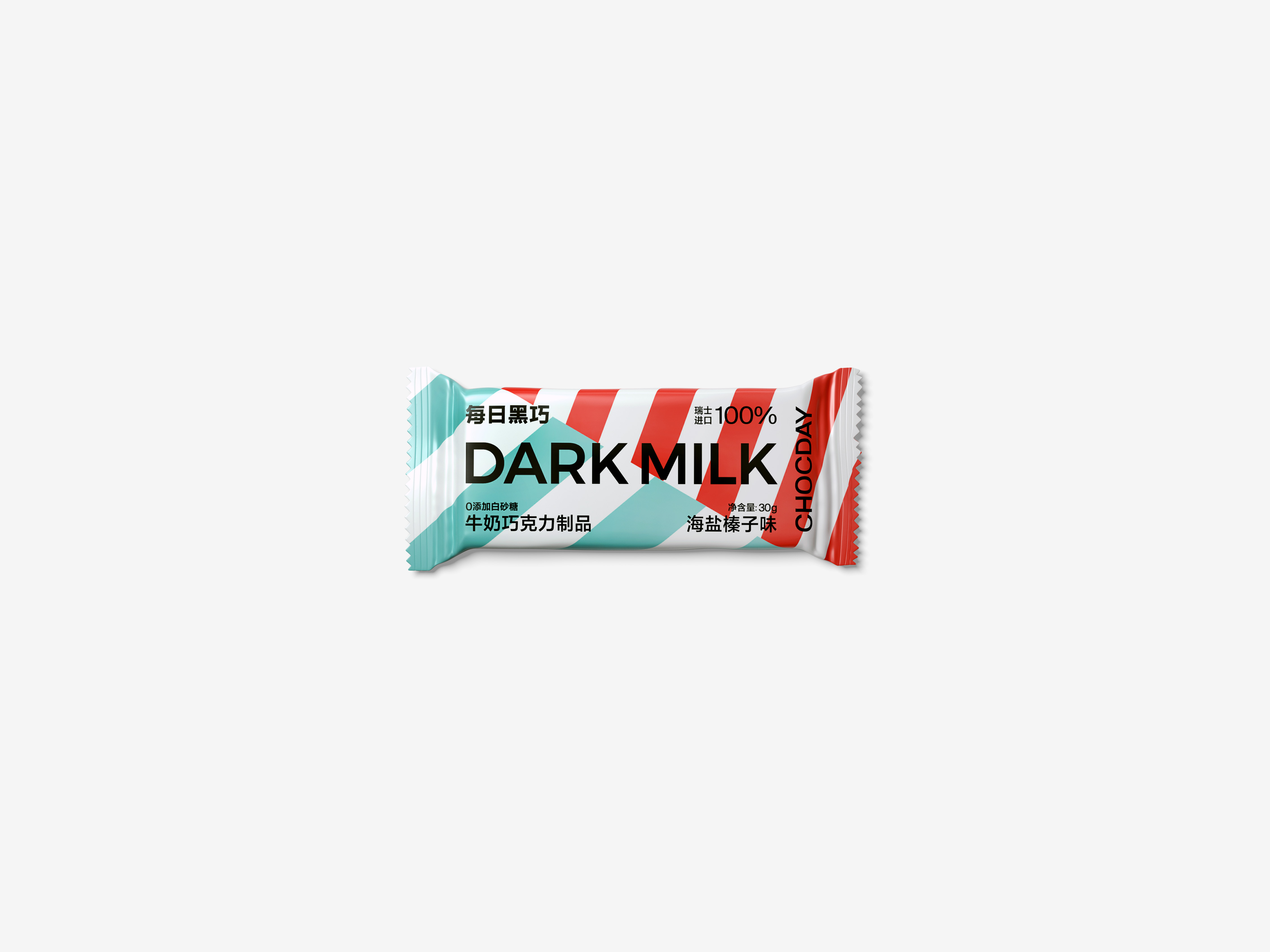
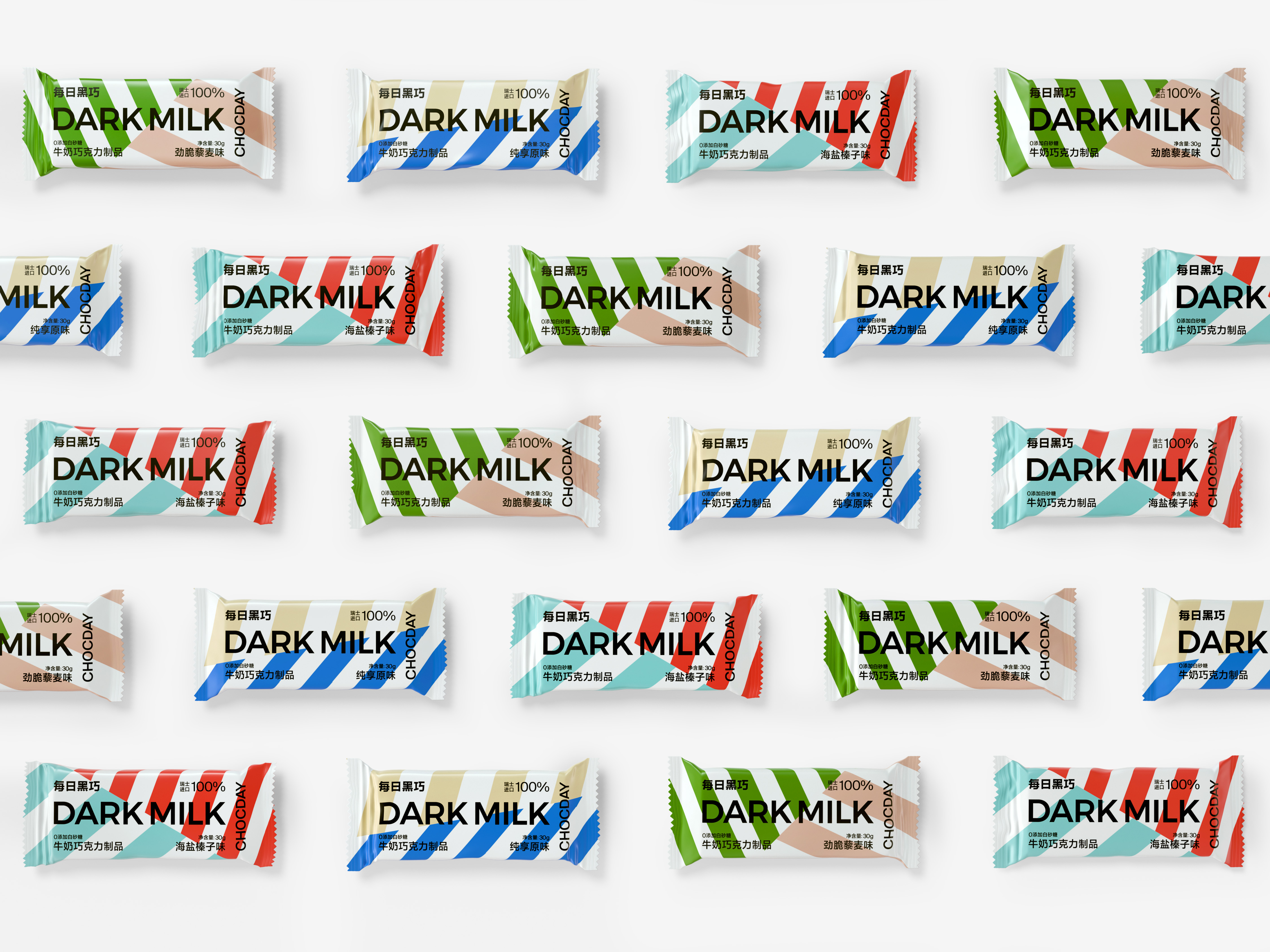
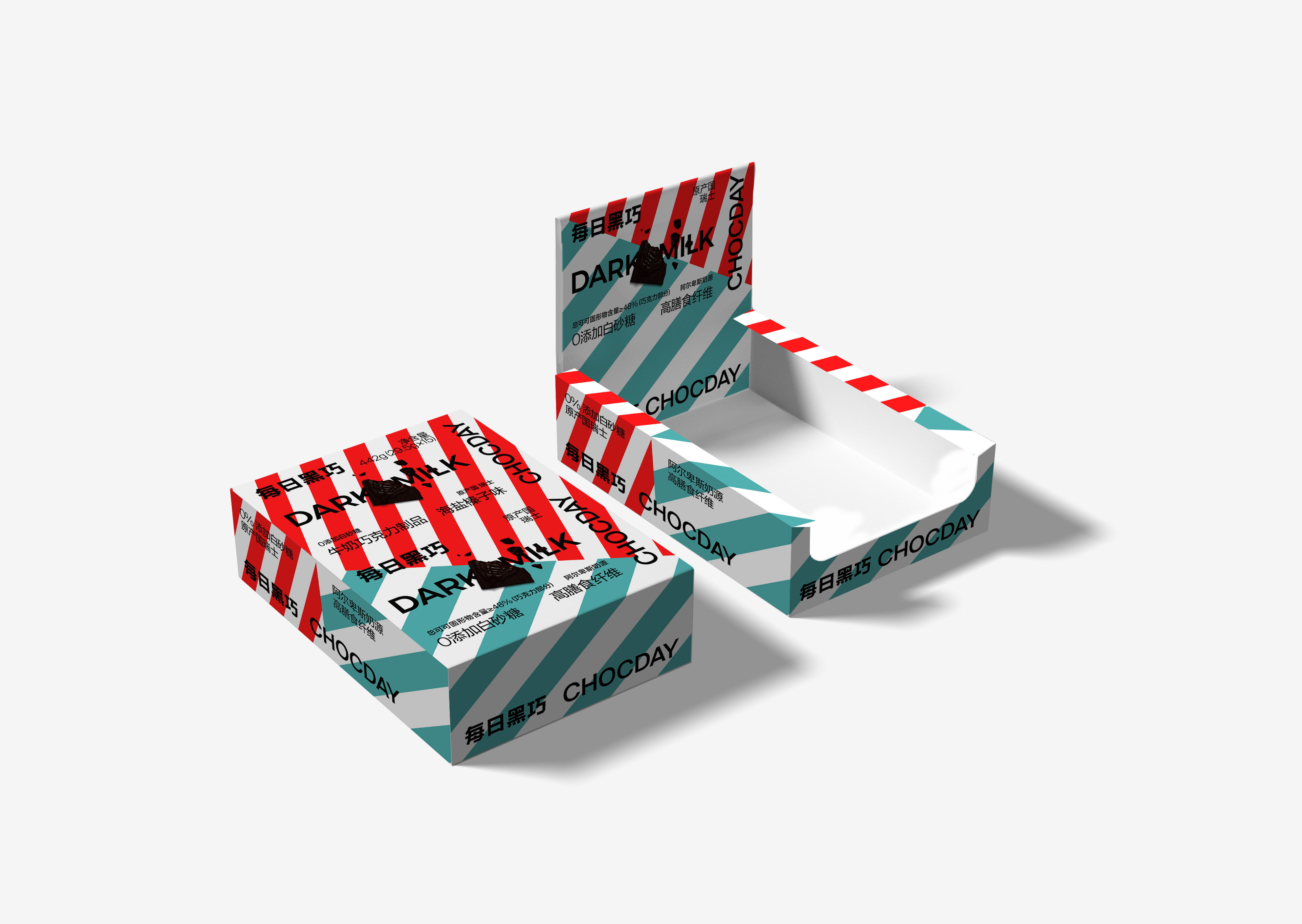
The visual identity of CHOCDAY is a result of reverse thinking, That is, we have deducted the design for
the visual identity from its package design, which is rarely seen in previous design cases. We think that, the level of importance in the package is much higher than that of its brand identity as an upscale
chocolate during sales. Simultaneously, however, the brand logo has come to be known by its consumers due to its high quality and high differentiation, which is more in harmony with the concept of CHOCDAY
- long-standing dealings and continuous update. Once the new visual identity of CHOCDAY was launched,
it has gained popularity among the market and the consumers, which, in just one year, has ranked as one
of the best-selling brands of chocolates.
每日黑巧的品牌形象设计,是一个逆向思维的结果,即通过包装设计反推出企业品牌形象的设计,这在以往的设计案例中是不常见的。我们认为,每日黑巧作为一款高端巧克力新品牌,在销售过程中,其包装视觉识别的重要层级是高于品牌形象的,但同时,品牌标识以高质量、高差异性的方式被用户熟知,更是符合了每日黑巧长期经营、持续更新的品牌理念。每日黑巧的全新视觉形象推出后,获得了市场和消费者的广泛青睐,短短一年就跃升为全网最知名、最畅销的巧克力品牌之一。