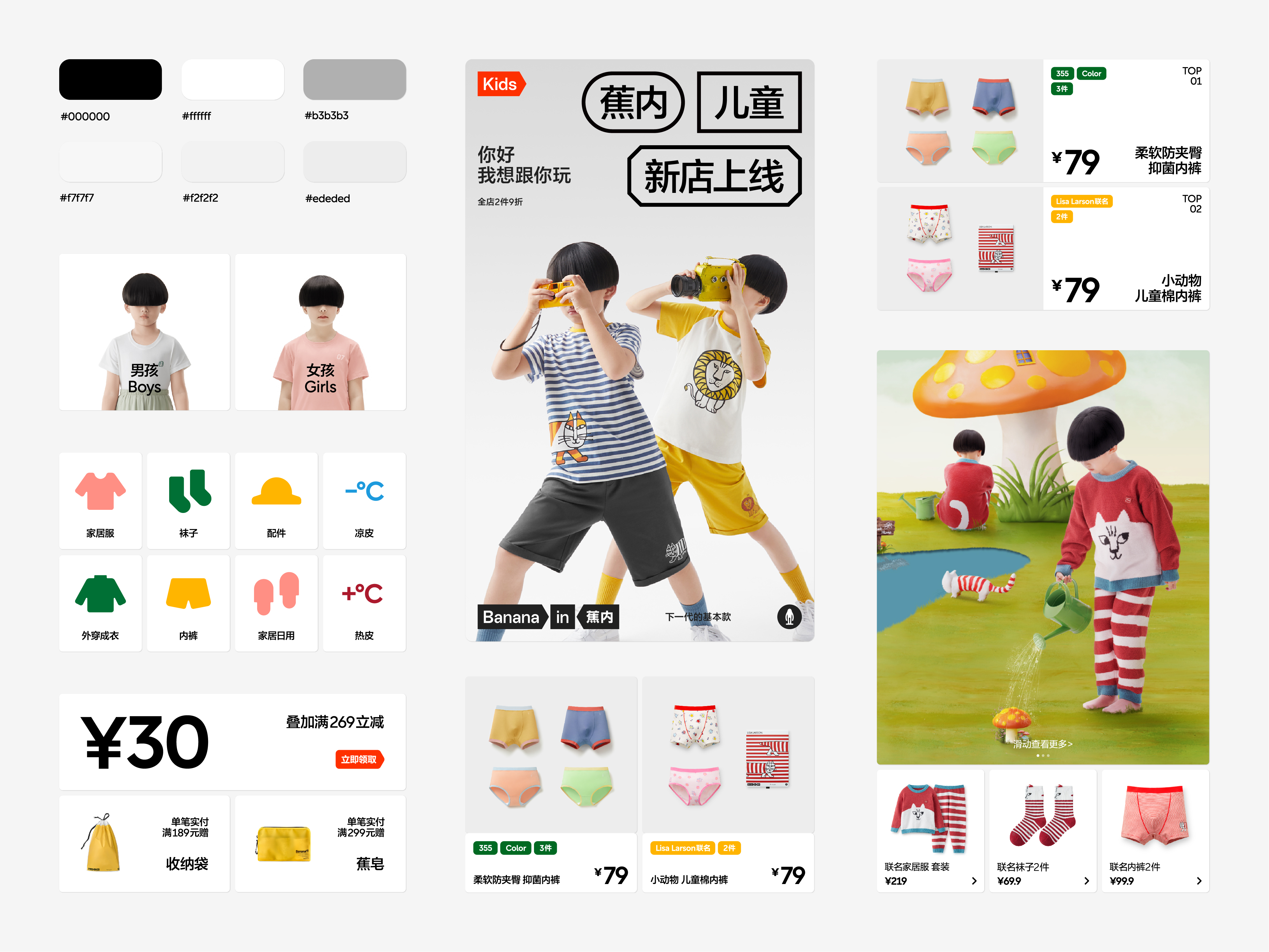
Bananain Kids
蕉内儿童
DIRECTOR: Nod Young / Guang Yu
ART DIRECOR: Han Lu
DESIGNER: Han Lu / Xi Xi
YEAR: 2022
CLIENT: Bananain
Our cooperation with Bananain can be traced back to 2019 when Bananain’s brand image we designed received very high market evaluation. Bananain has been one of the most influential brands of underwear and leisure wear in China after several years of development. Besides, the “big label” visual system used for Bananain has also become one of the brand images that Chinese consumers are most familiar with and take delight in talking about. This rebranding of Bananain Kids a special version based on the previous design of brand image. It is not only an upgrade of brand image but also a new understanding of Bananain in the perspective of kids. We made three key actions allowing Bananain Kids to show a quite different brand personality without jumping out of the main frame.
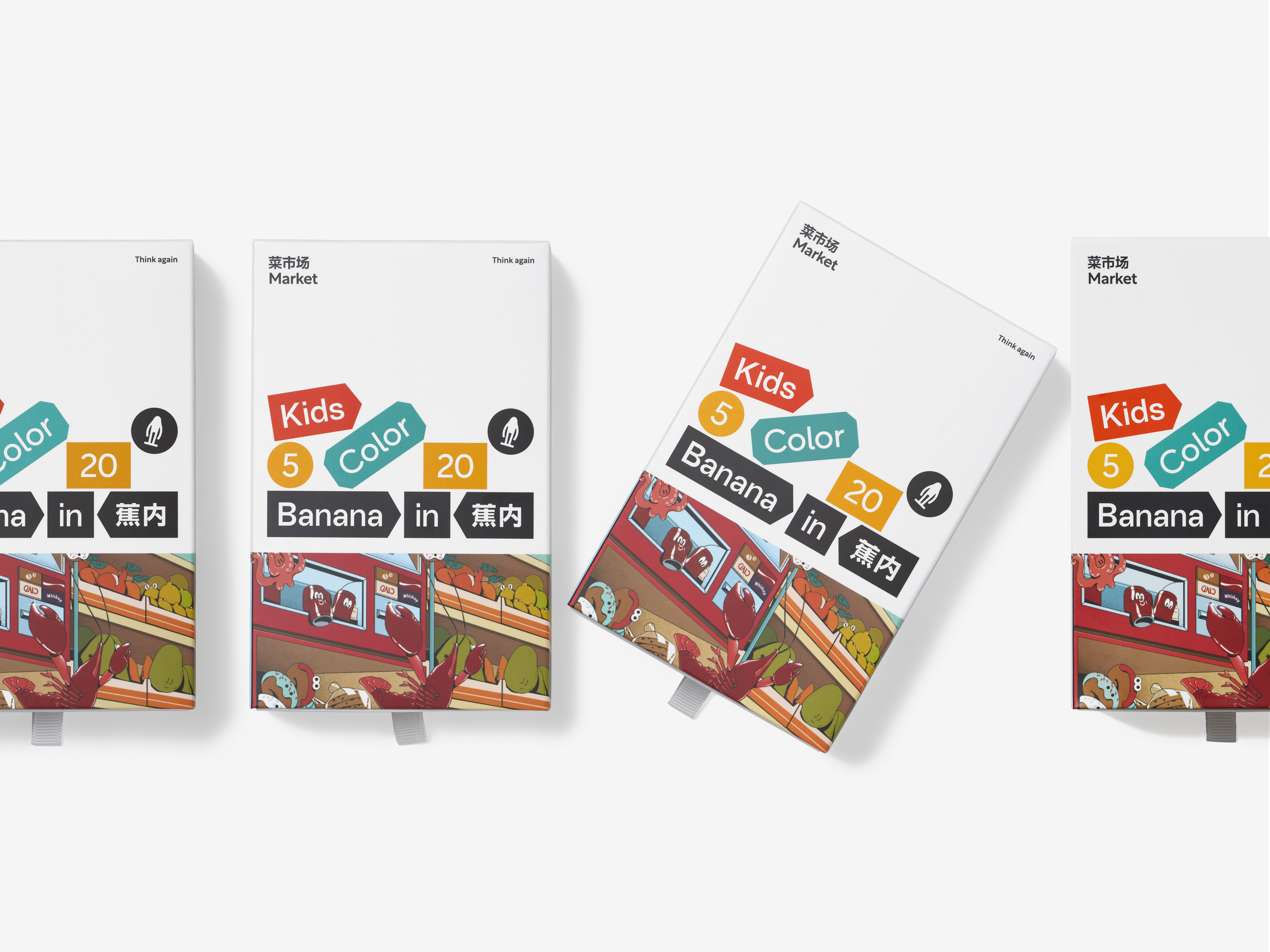
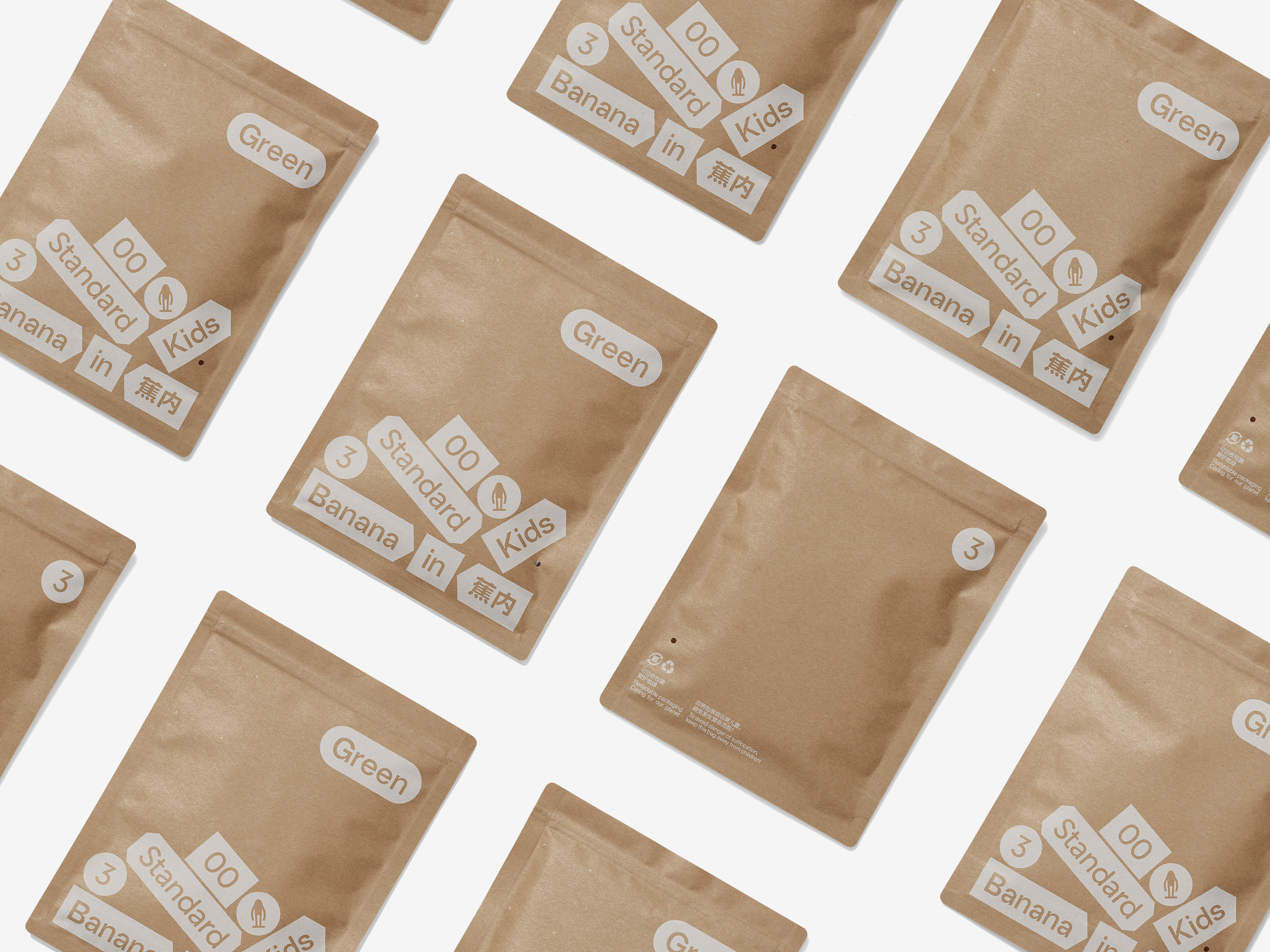
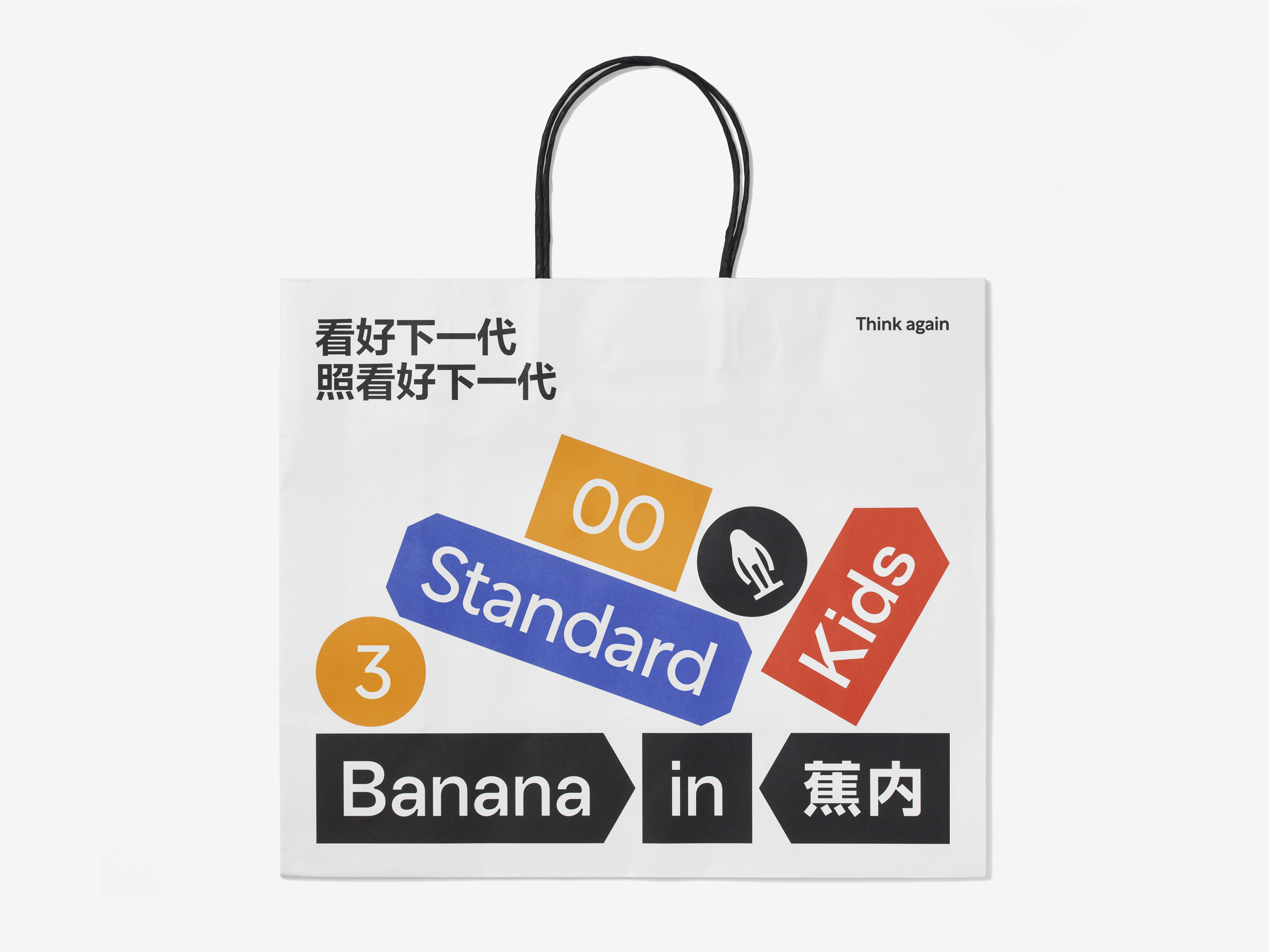
Action 1: Enlargement. Everything seems to be bigger in kids’ eyes. For example, an orange we pick up casually may look as big as a basketball to kids. We enlarged the brand information including the logo and big labels as far as possible without exceeding the horizontal width. The enlarged Bananain, compared with the previous one, seems to be more cute and clumsy, bringing more enjoyment to kids.
Action 2: Color. Kids are more sensitive to colors. Bananain Kids is a colorful and gorgeous world for kids where they have an opportunity to see more colors and have more color stimulation. The visual elements including the logo and big labels have been re-colored. All contents are not strictly restricted in colors except for the logo that needs to remain within the fixed scope of colors.
Action 3: Pile up. Among the three actions, the most childlike expression is to pile up. How can we perfectly present children’s characteristics? We achieve this purpose by destroying the original regular structure. The orderly arranged big labels are disorganized like building blocks and piled up together. In our view, it’s more in line with kids’ understanding of the world to pile everything up together in such a casual way. Of course, there is no real randomness from the perspective of brand image and design rules. The effect of random stacking we see is just the outcome of logical and precise design. The intention conveyed is that we hope kids’ innocence will not compromise the quality of brand.
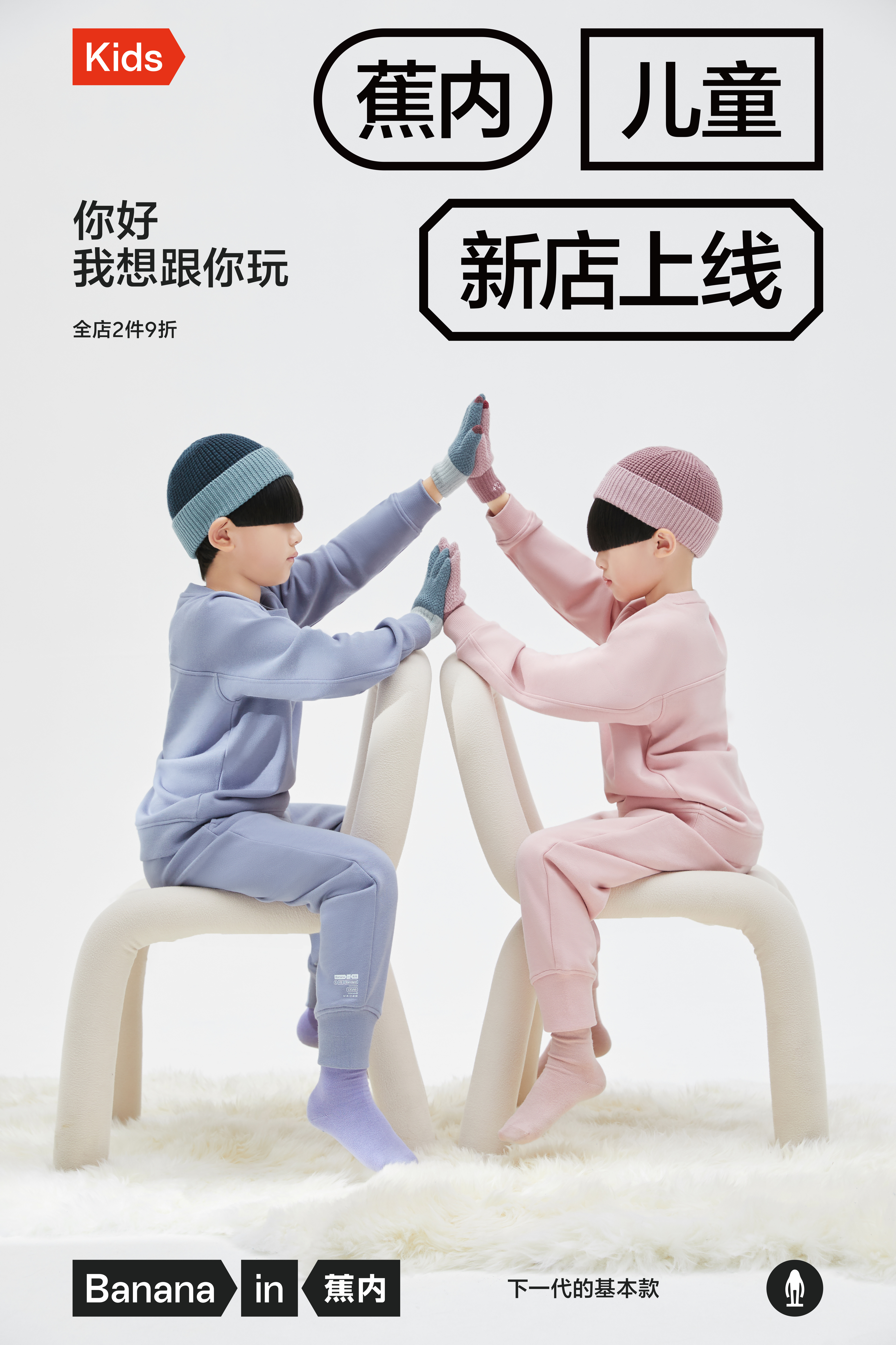
我们与蕉内的合作要追溯到 2019 年,当时我们为蕉内设计的品牌形象获得了很高的市场评价。经过几年发展,蕉内已经成为中国最具影响力的内衣、家居服品牌,而蕉内所使用的“大标签”视觉系统也成为中国消费者最熟悉、最津津乐道的品牌形象之一。此次蕉内儿童的品牌升级,是基于上一个品牌形象设计的特殊版本,不仅仅是品牌形象上的升级,而更像是站在儿童的角度如何重新理解蕉内。针对这次品牌升级,我们做了三个关键动作,而这三个关键动作让蕉内儿童在没有跳出主框架的基础上,展现出完全不同的品牌气质。
动作一:放大。在儿童的视角下,所有的东西都是更大的,我们随手捡起来的橘子,在儿童看来,可能像篮球一样。在不超出横宽的条件下,我们以极限的方式放大了品牌信息,包括标识以及大标签。放大之后的蕉内,与传统蕉内相比,显得更加可爱和笨拙,多了很多童趣。
动作二:色彩。儿童对于色彩是更敏感的,为了让孩子有机会体验更多的颜色,父母也更倾向于给孩子更多的色彩刺激,所以,蕉内儿童是一个更加缤纷绚烂的世界。包括标识与大标签在内的视觉元素都被重新染色,除了标识需保持在固定的色彩范围内,其他的内容都不再有过多的色彩限制。
动作三:堆积。在这三个动作中,堆积是最具童趣的表达。如何将儿童的特征完美地展示出来,事实上我们是通过破坏原有规整的结构来实现这个目的的:整齐排列的大标签像积木一样被打乱并堆积到一起。在我们看来,这样漫不经心地将所有的东西堆积在一起,更符合儿童对世界的理解。当然,从品牌形象和设计规则的角度是不存在真正的随机的,所有我们看到的随意堆积的结果,都是源于逻辑和精确设计的结果,而这背后的目的是:我们希望童趣的天真不会损害品牌传递出的品质。
All Images Copyright © 2022 BANANAIN 蕉内. All Rights Reserved