新装腔指南
BIGE GUIDE
ART DIRECTOR: Nod Young
DESIGNER: Nod Young
YEAR: 2018
CLIENT: BIGE GUIDE
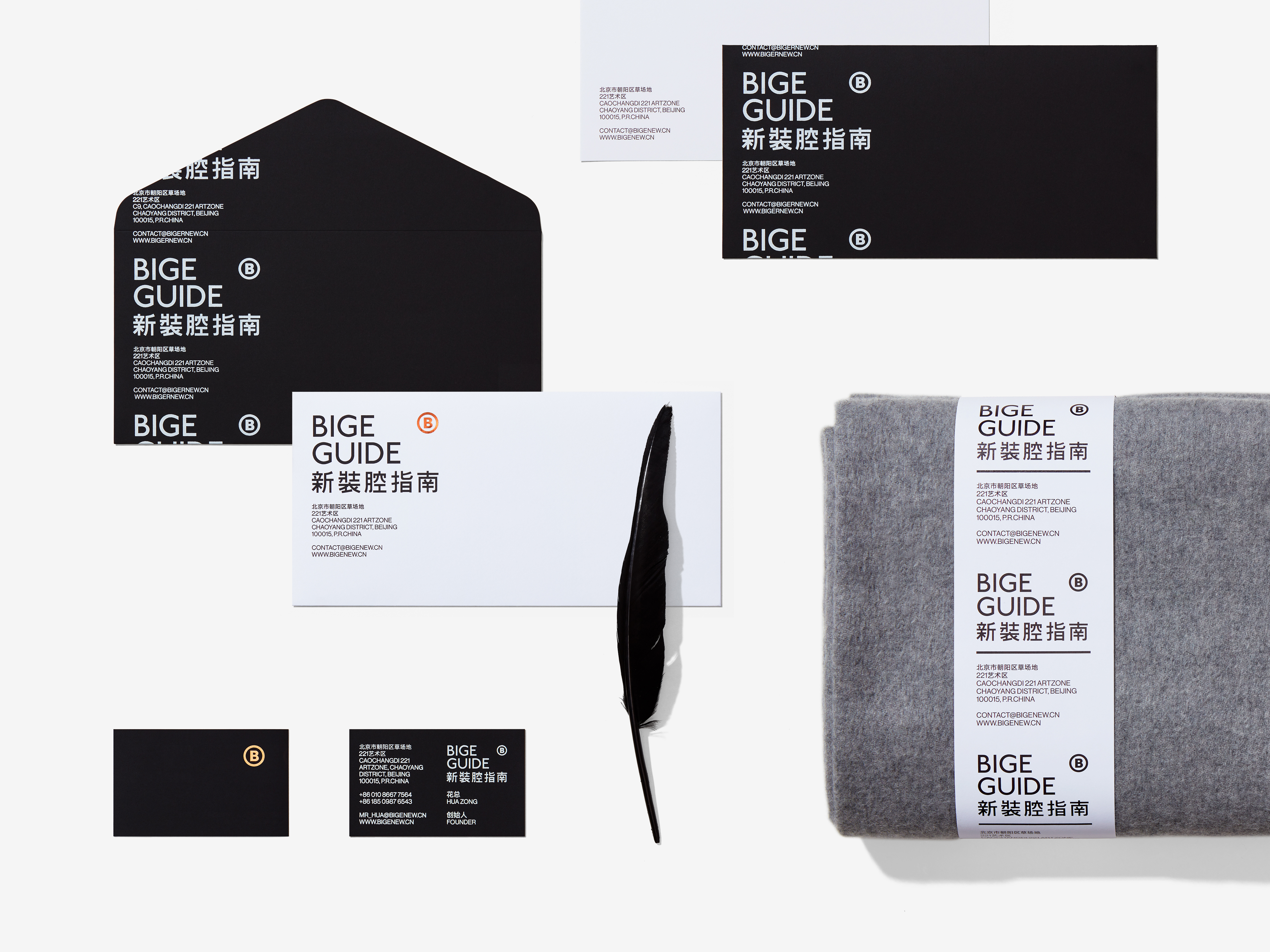
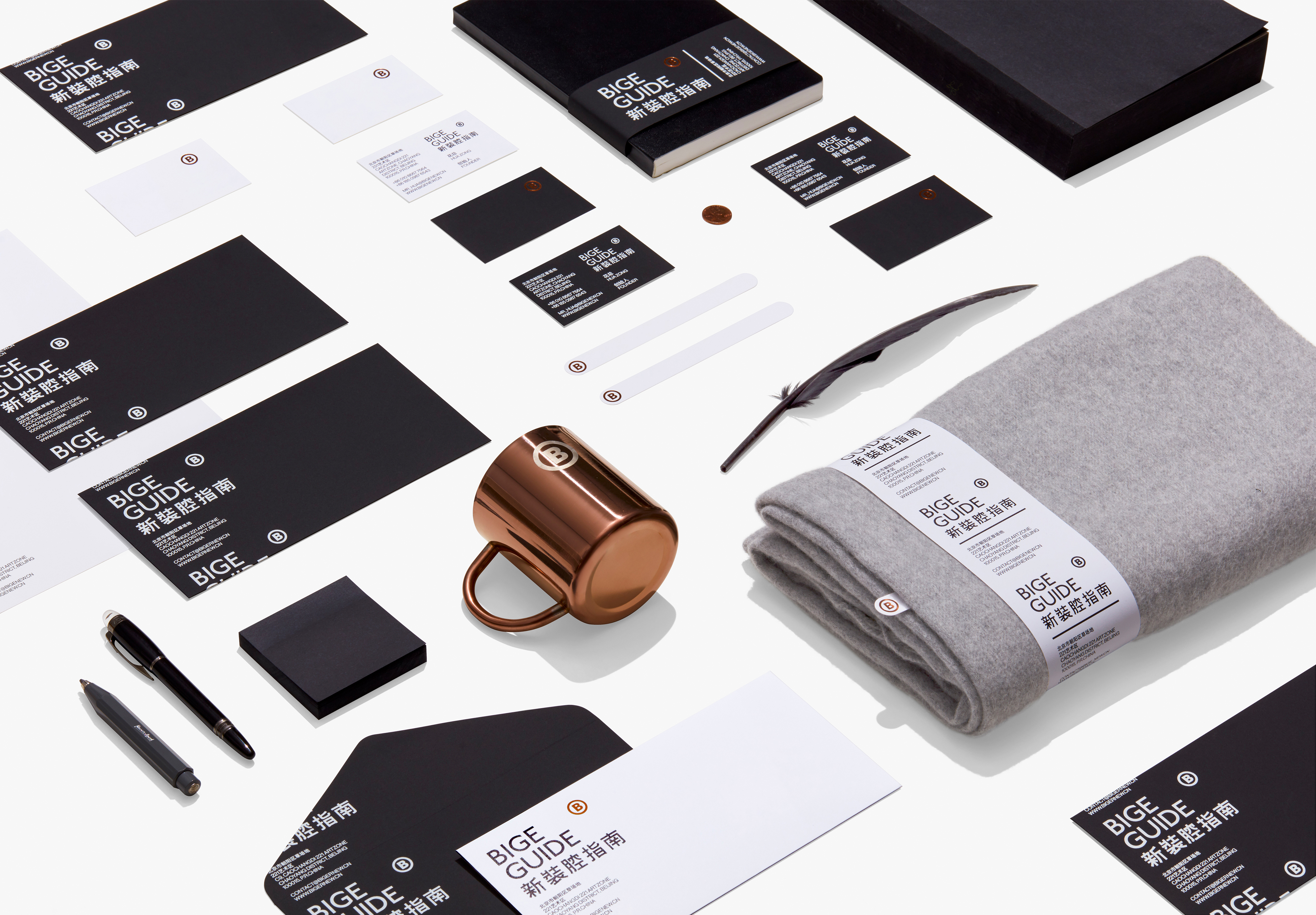
“BIGE GUIDE” was once a media platform that was favored by tens of thousands of readers,
as its content was genuine and its viewpoints struck a chord with its readers. We accept the customer’s commission to design the upgrade version of “BIGE GUIDE”. During this process,
we have tried to interpret the definitions of both “guide” and “authenticity” in a variety of ways, and finally clarified our focus on unique exactness. In the logo design, we draw on a universal
public symbol: ®, which is commonly seen in the upper right corner of graphics or text information to remind the public that this is a registered trademark. We use the letter “B” in
“BIGE” to replace the letter “R” in the symbol, and “BIGE” to replace the “registered” symbol.
Therefore, “B” has acquired some kind of universal social value, and it is also the expression
of “uniqueness” and “exactness” at the same time.
“装腔指南”,曾是一个被数以万计读者津津乐道的媒体平台,它的内容真实,观点直指人心。我们接受客户委托设计升级版本“新装腔指南 BIGE GUIDE”,过程里曾尝试使用多种方式诠释“指南”和“真实”两个定义,最终将焦点锁定在:独一无二的确切。标识设计中,借鉴了一个通行的公共符号:® ,它常见于图形或文字信息的右上角,提醒公众注意:这是已经被注册的商标。我们用“BIGE”中的字母“B”替代了符号中的字母 “R”,以“BIGE”代替“注册”,如此“B”就具有了某种社会通用价值,而这同时也是对“唯一性”和“确切性”的表达。