朝日唯品 NEW
Zhao Ri Wei Pin
ART DIRECTOR: Guang Yu / Nod Young
DESIGNER: Hu Wen
ILLUSTRATOR: Andrey Kokorin
YEAR: 2021
CLIENT: 朝日唯品
In the process of brand design, the most important and the most time-consuming part is to find the
brand's unique values, on which the design language is also built. However, Zhao Ri Wei Pin was
an exception, as its brand values were so prominent and so clearly differentiated from the competitors
that we needed to remove some distractions and set the goal as clearly as possible.
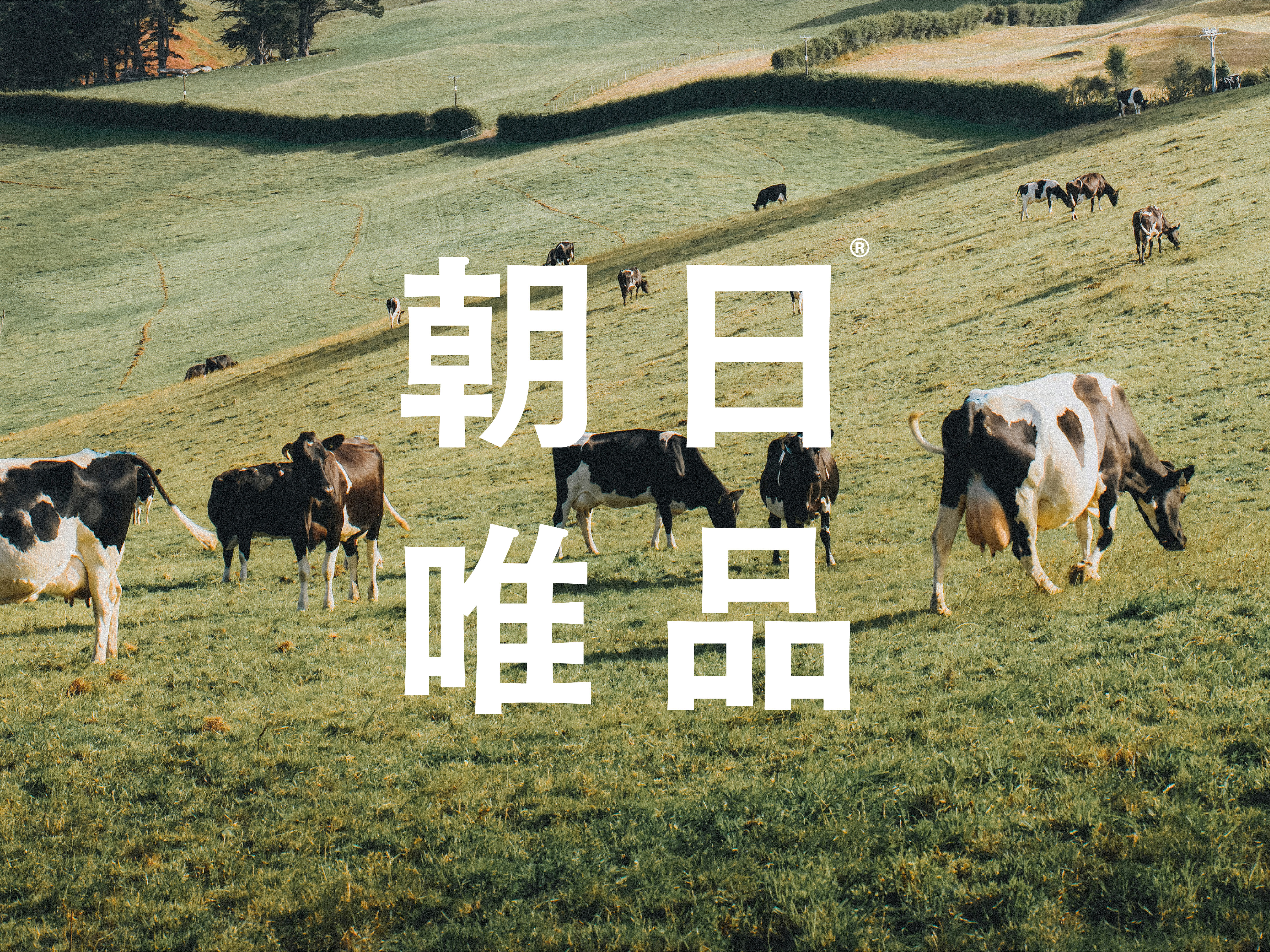
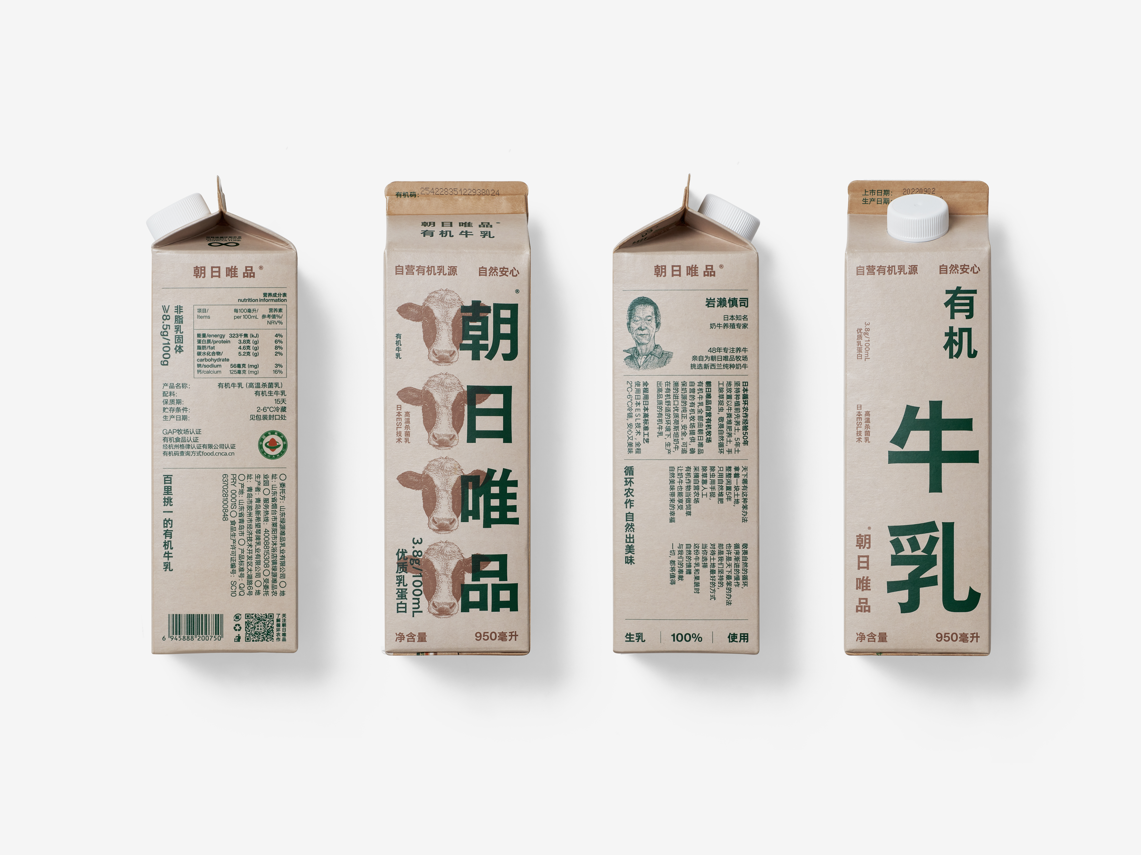
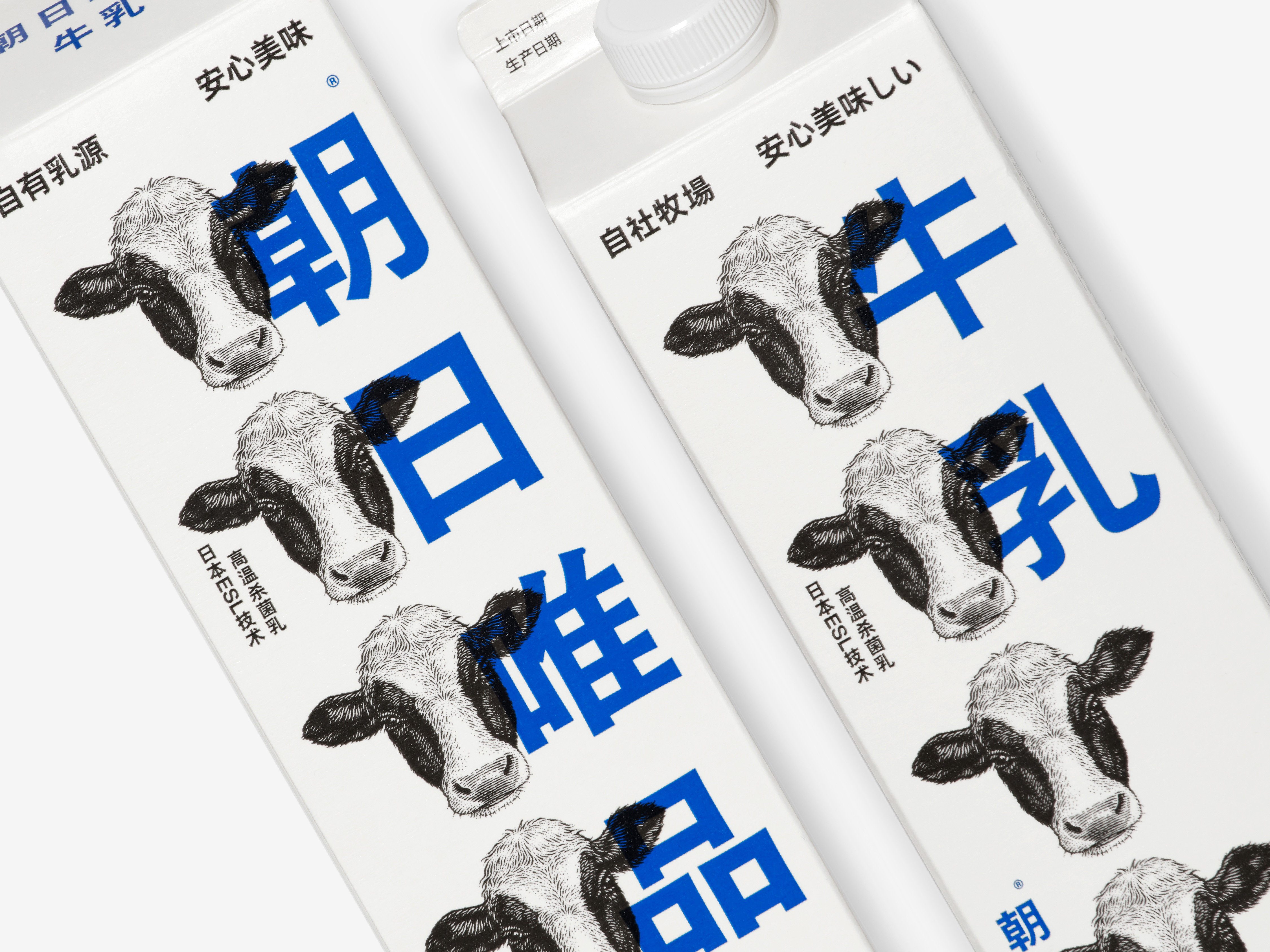
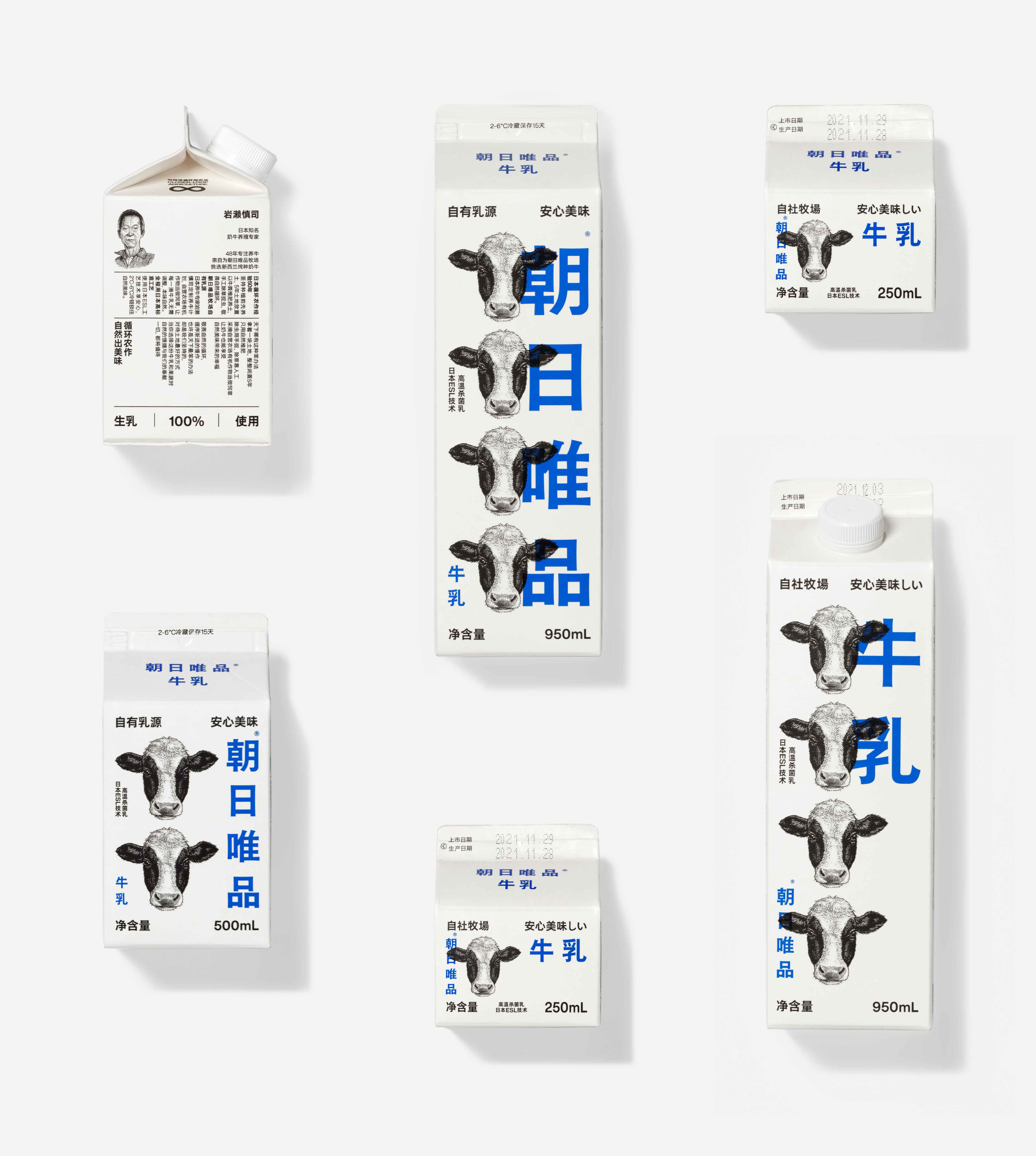
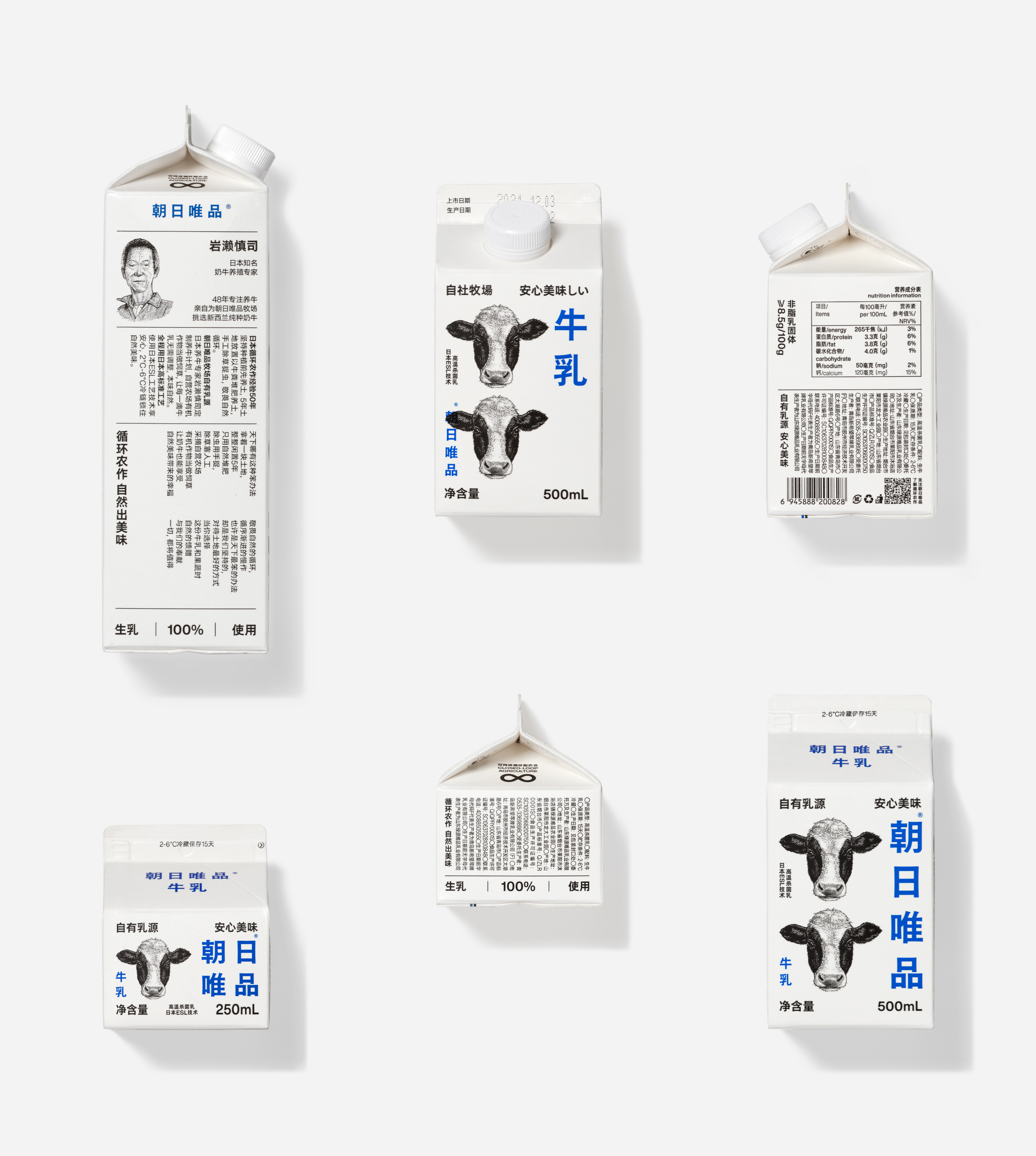
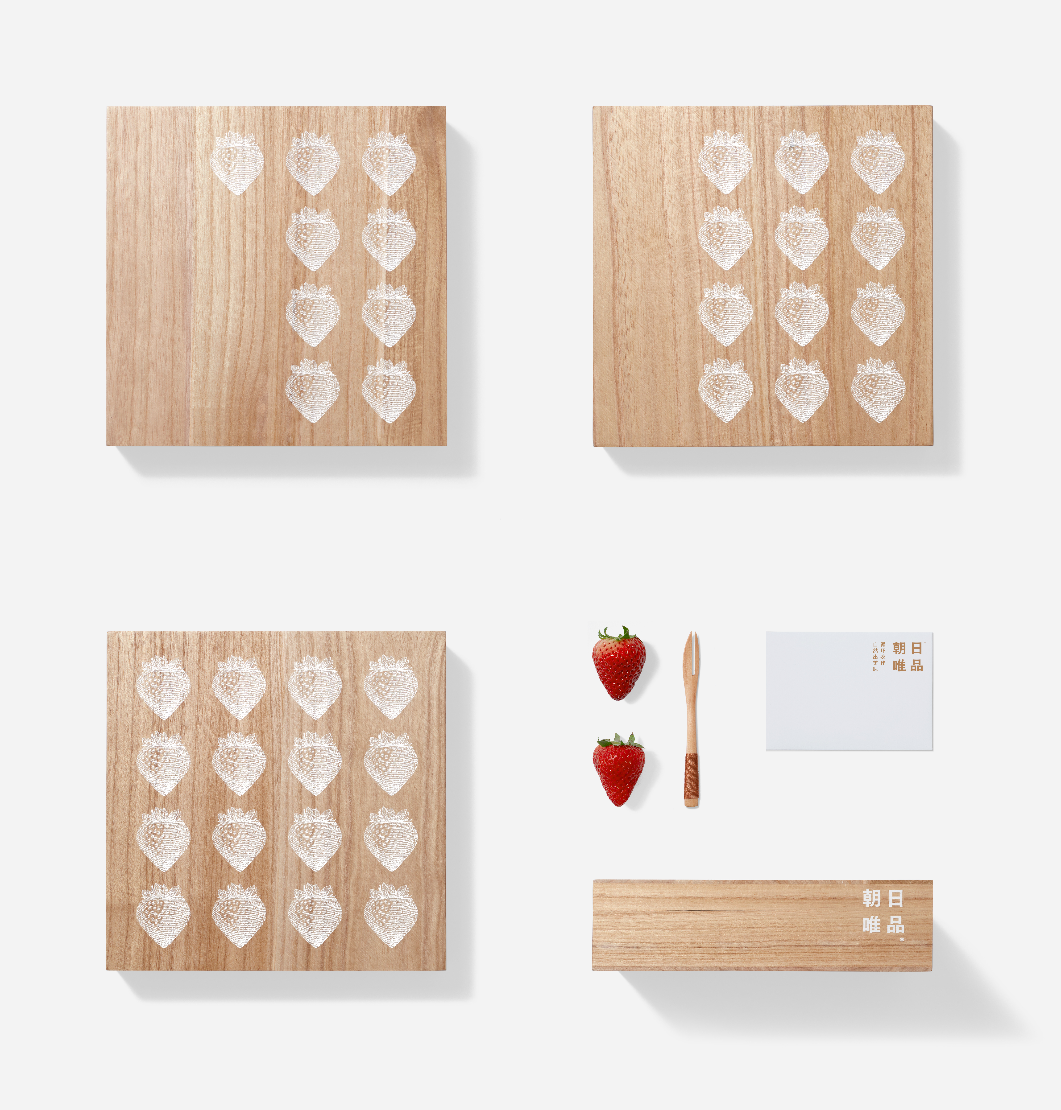
Zhao Ri Wei Pin is a very 'SLOW' animal husbandry company. When establishing the farm, they found the soil poor, so they spent several years improving the soil fertility, eventually raising good cows and producing good milk, and using circular farming to produce more vegetables and fruits of the highest quality. This company's dedication to quality, integrity and reverence for nature is rare and valuable in the "fast" times - and the brand we built for Zhao Ri Wei Pin was designed to emphasize this spirit.
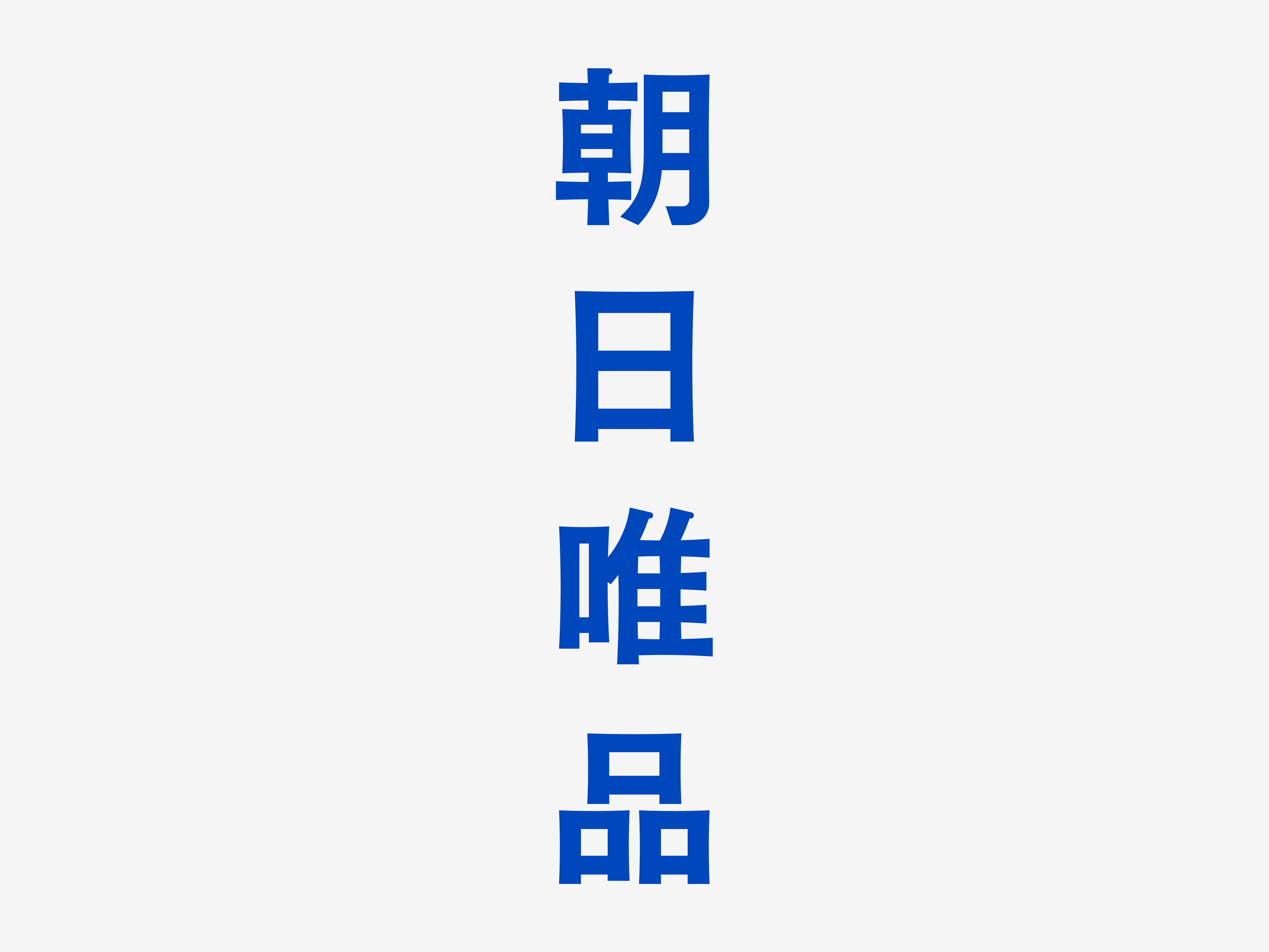
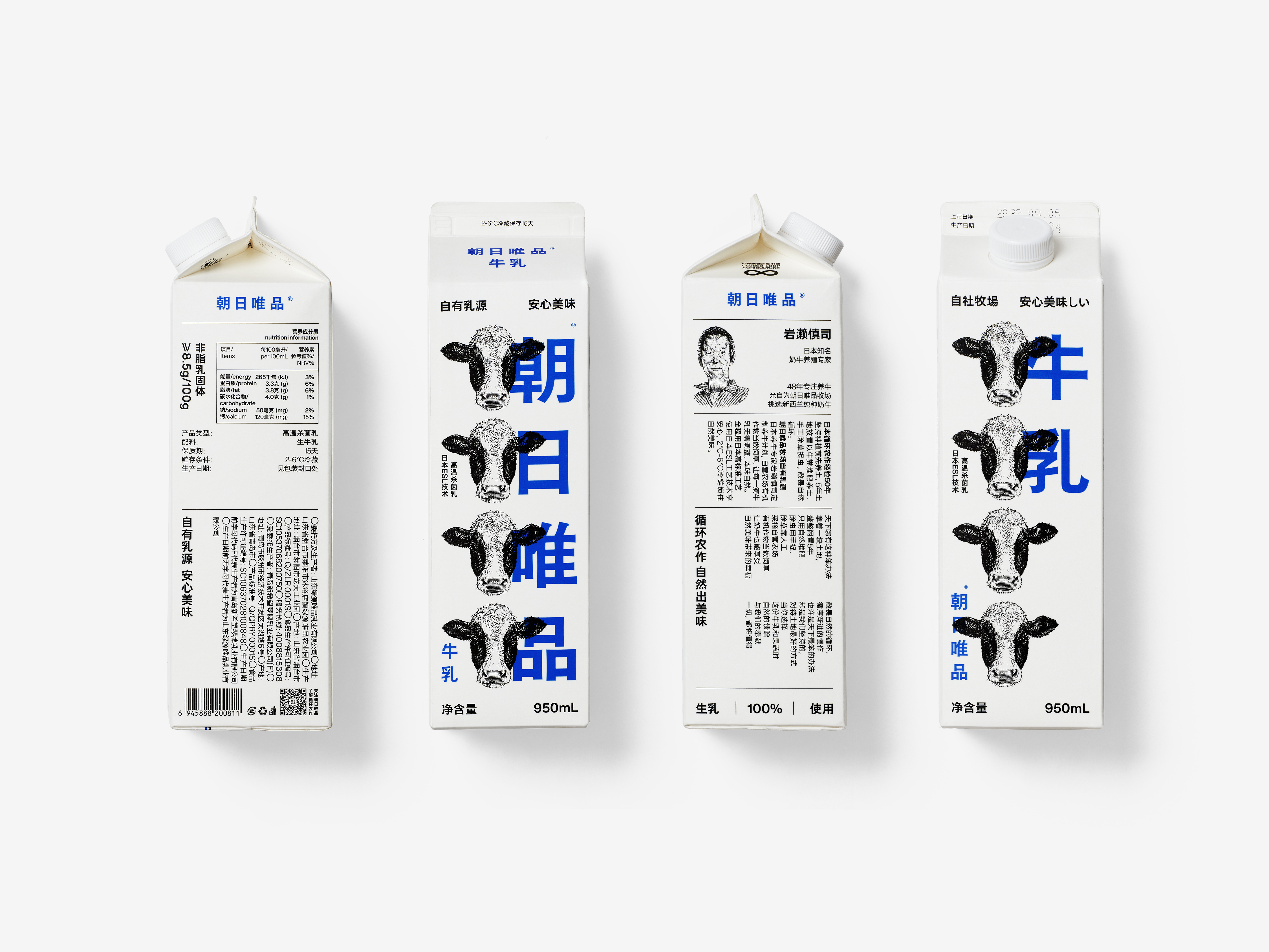
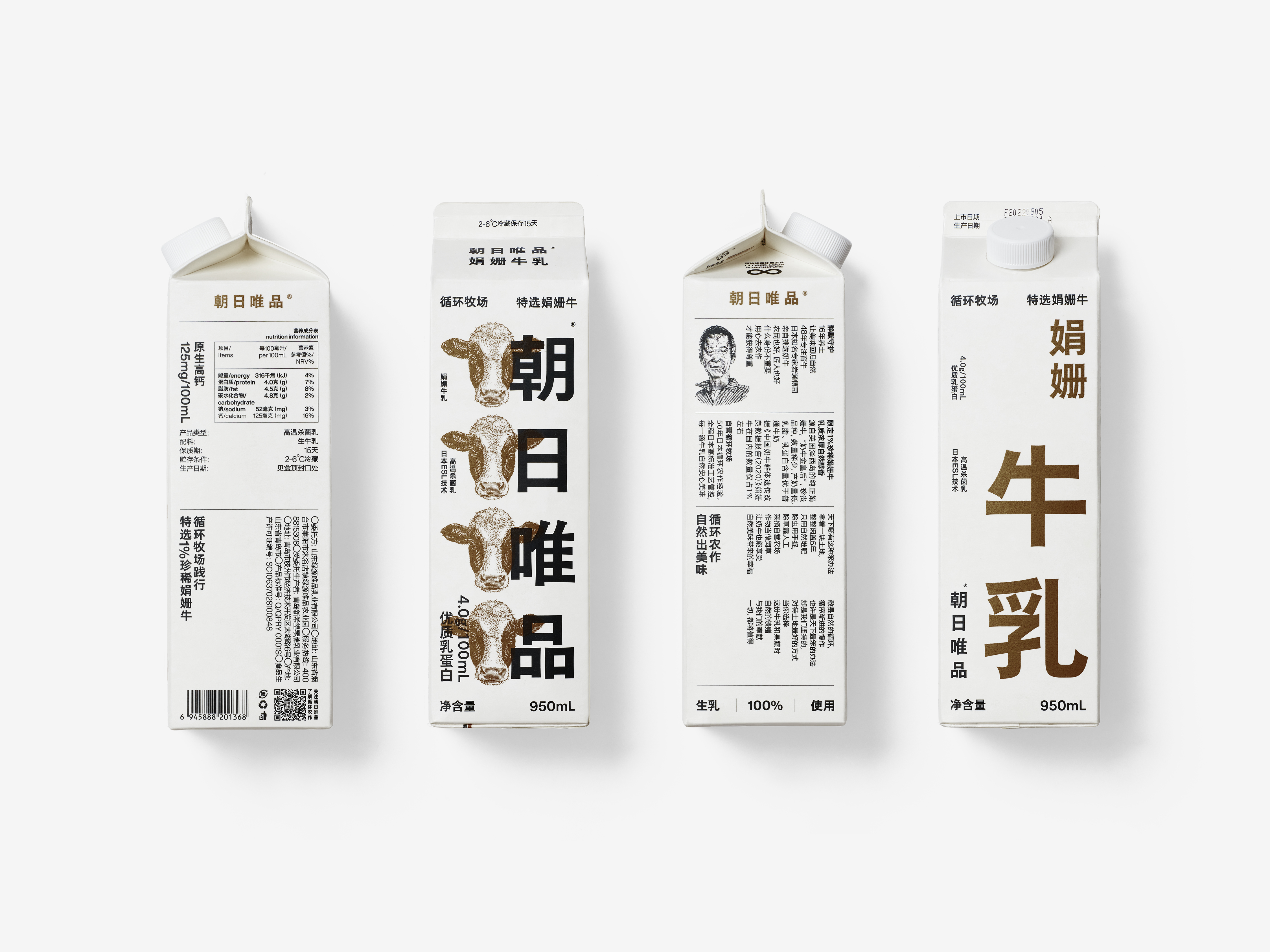
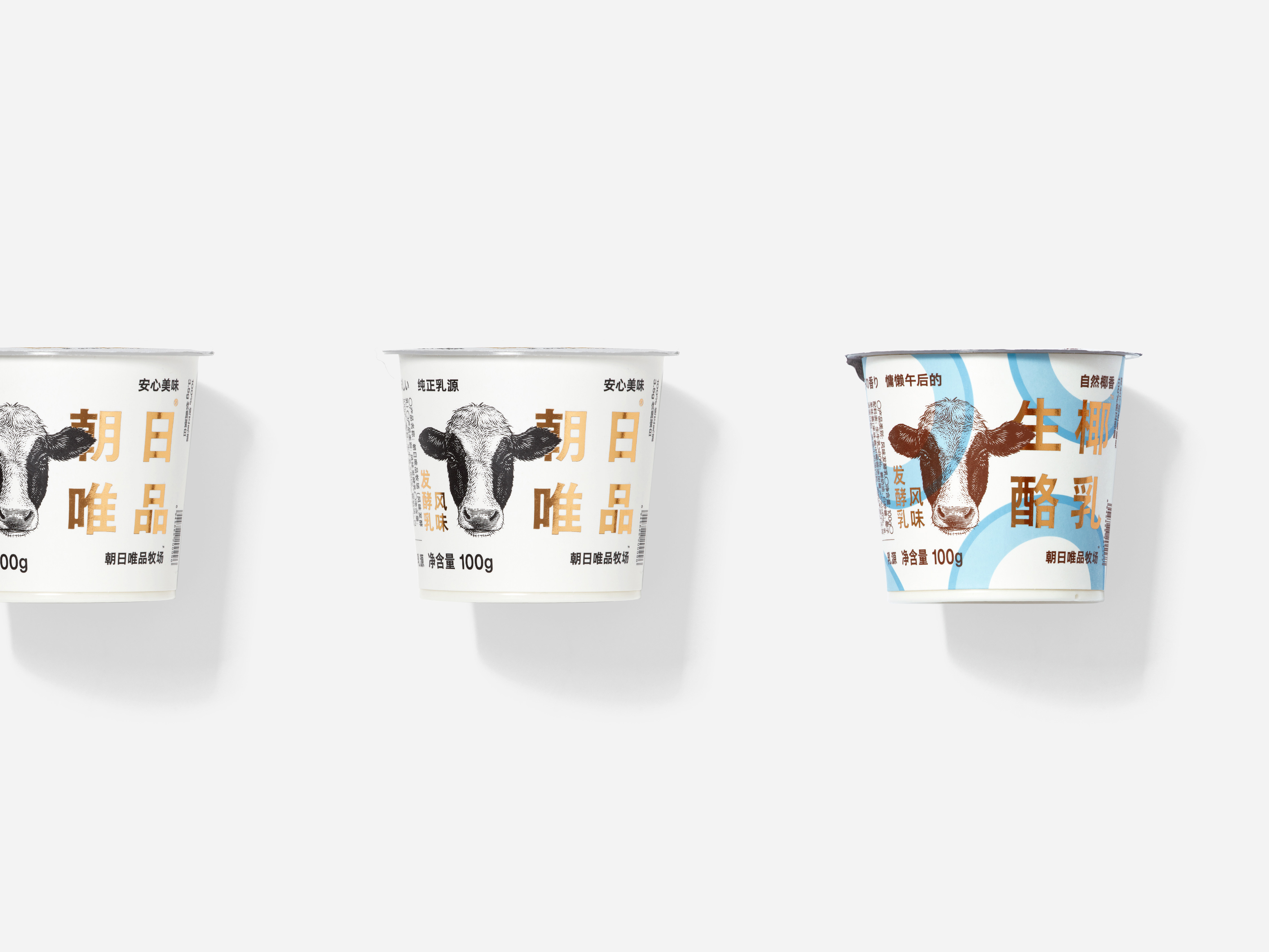
The design uses a bold visual language that is rare in the dairy industry, using an oversized font to present the logo, with fine typography, decorated by beautiful classical illustrations, to express a brand image that is resistant, restrained and unpretentious. The font size is the most crucial part in this project. Making the brand name as big as possible is a sign of determination and a sense of pride for the brand, and we hope to bring this energy to every consumer.
Zhao Ri Wei Pin is a very 'SLOW' animal husbandry company. When establishing the farm, they found the soil poor, so they spent several years improving the soil fertility, eventually raising good cows and producing good milk, and using circular farming to produce more vegetables and fruits of the highest quality. This company's dedication to quality, integrity and reverence for nature is rare and valuable in the "fast" times - and the brand we built for Zhao Ri Wei Pin was designed to emphasize this spirit.
The design uses a bold visual language that is rare in the dairy industry, using an oversized font to present the logo, with fine typography, decorated by beautiful classical illustrations, to express a brand image that is resistant, restrained and unpretentious. The font size is the most crucial part in this project. Making the brand name as big as possible is a sign of determination and a sense of pride for the brand, and we hope to bring this energy to every consumer.
品牌设计过程中,最重要的、也是整个项目中最花时间的部分就是寻找品牌的独特价值,设计语言也建立在这个价值点上。但朝日唯品是个例外,它的品牌价值过于突出,与竞品之间的差异性十分明显,以至于反而需要排除一些干扰,从而把设计目标设立得更加明确。
朝日唯品,是一家很“慢”的农牧企业。在刚建立牧场时,因为牧场土质不佳,朝日唯品花了几年时间去养土,等待大自然优质的回归,最终养出好牛、产出好奶,并利用循环农作,培育出更多质量上乘的蔬菜和水果。这家企业对品质的执著、对诚信的坚持、对自然的敬畏,在这样一个“快”时代,是非常难得且宝贵的——我们为朝日唯品建立的品牌设计就是为了强调这种精神。
在设计上,我们使用了在乳制品行业中非常少见大胆的视觉语言,用特大号字体去呈现标识,配合细密的文字排版,并以精美古典的插图做为点缀,还原了一个执著、克制、朴实的品牌形象。文字使用的尺度感,是朝日唯品设计中最关键的一项。以极限的方式将品牌名称放大,对品牌而言是一种决心,更是一种自豪感,我们希望能将这种能量带给每一位消费者。