AWKA
ART DIRECTOR: Guang Yu / Nod Young
DESIGNER: Xu Mingru
YEAR: 2024
CLIENT: AWKA 遨刻
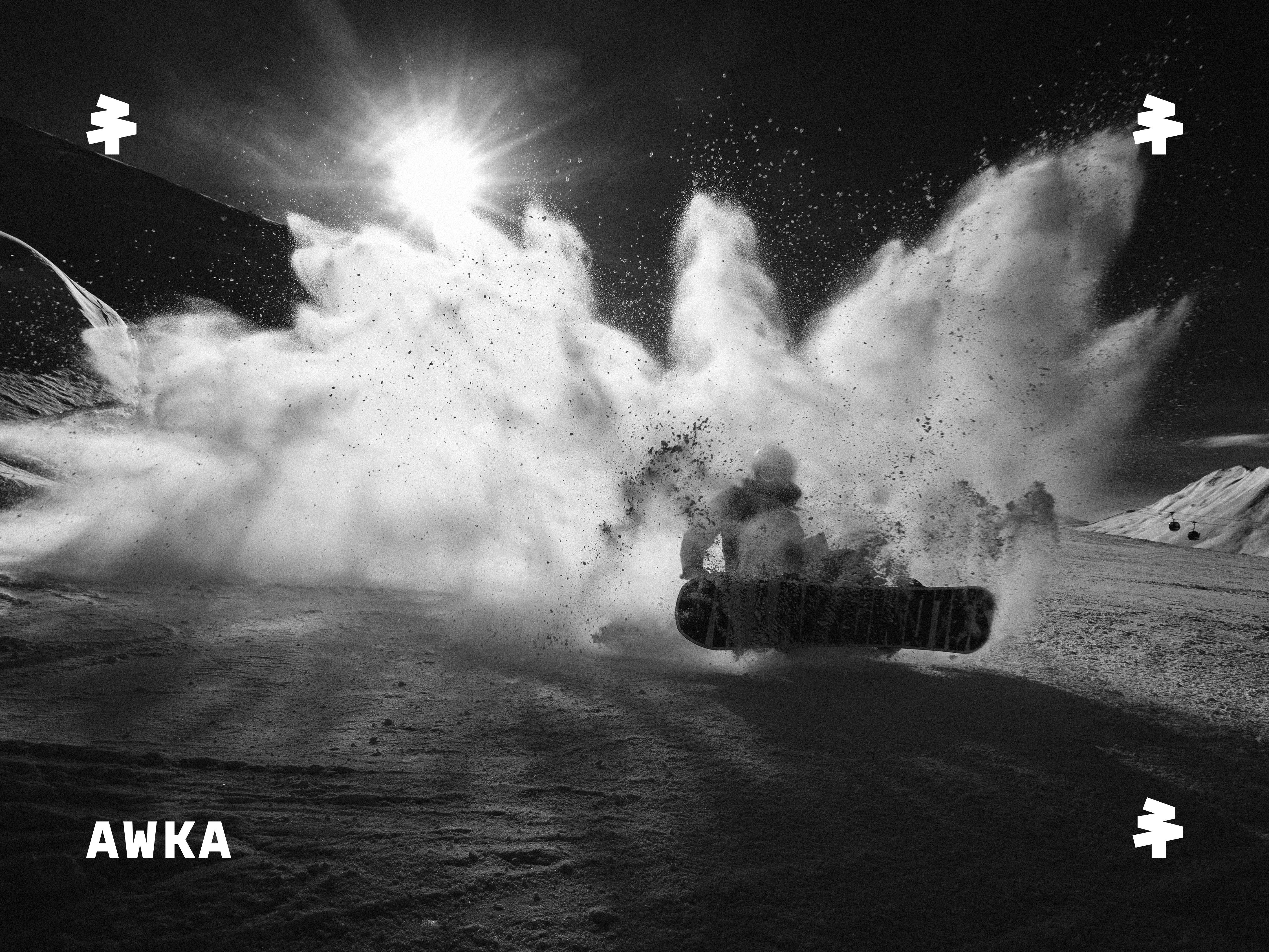
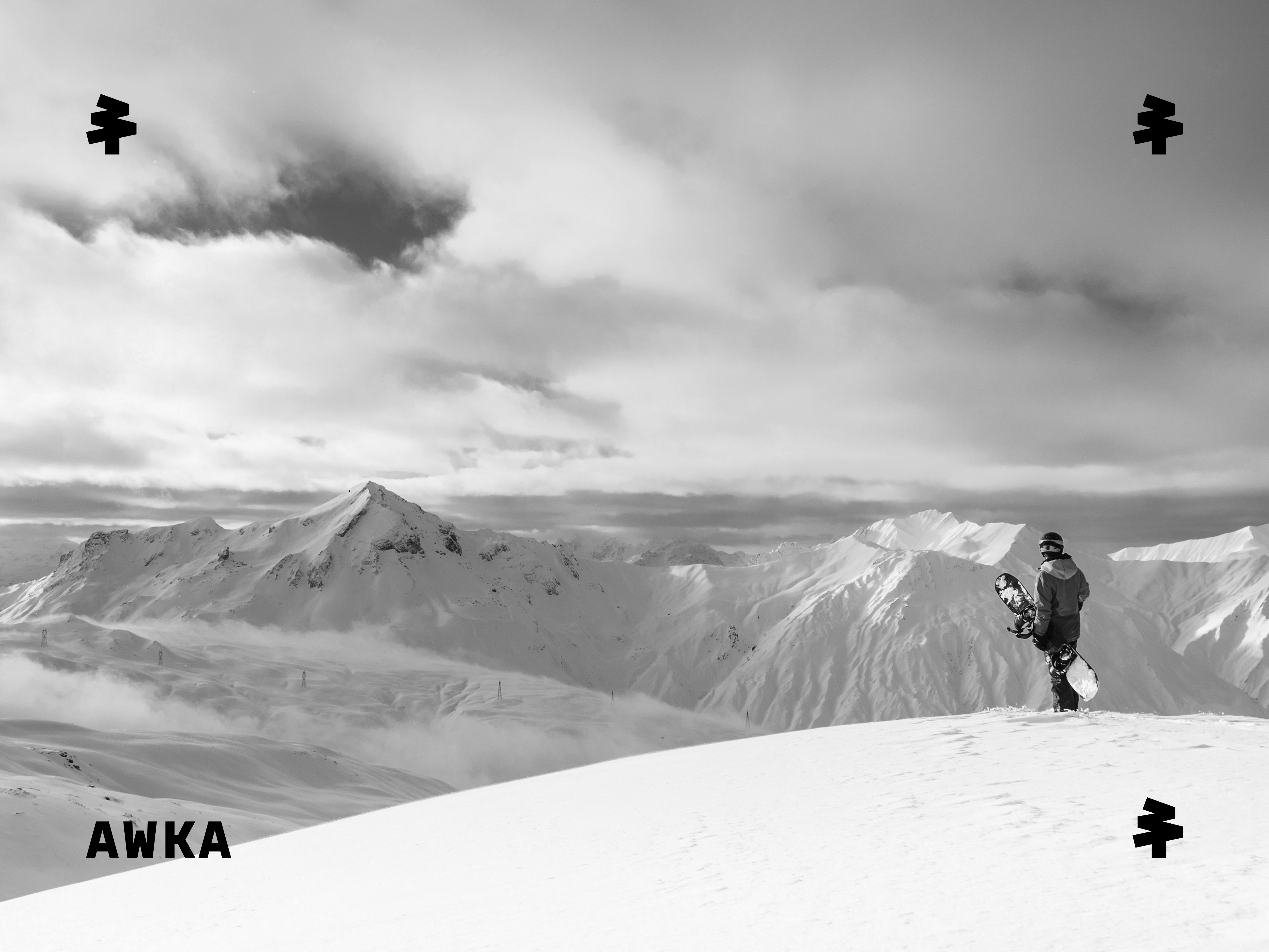
AWKA is a ski brand that provides professional equipment solutions for athletes and enthusiasts alike. On the slopes, equipment is not merely protection but the most direct connection between the body, movement, and speed. AWKA focuses on this closeness to the body, the freedom it allows, and the reliable support it provides in the snow.
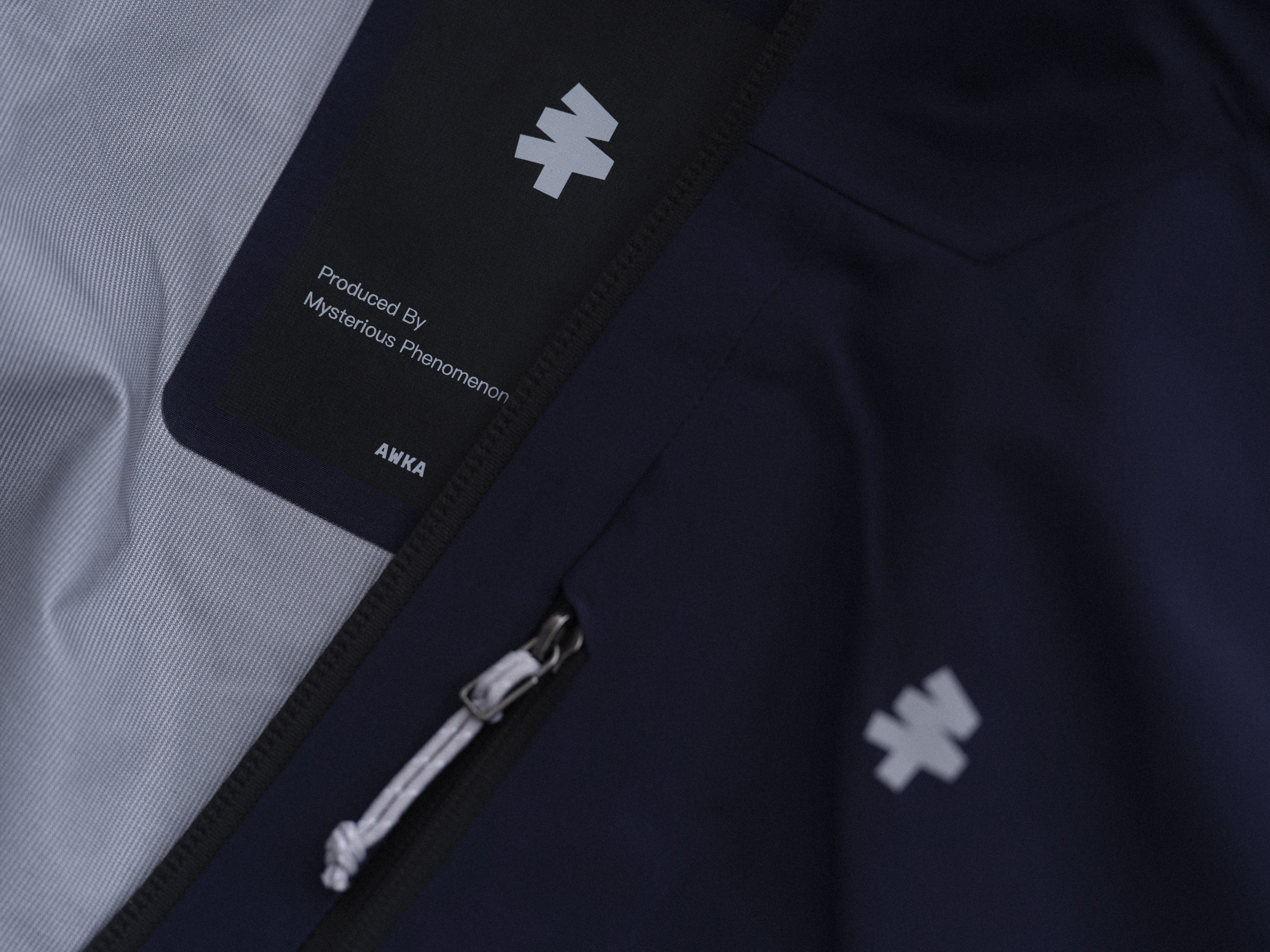
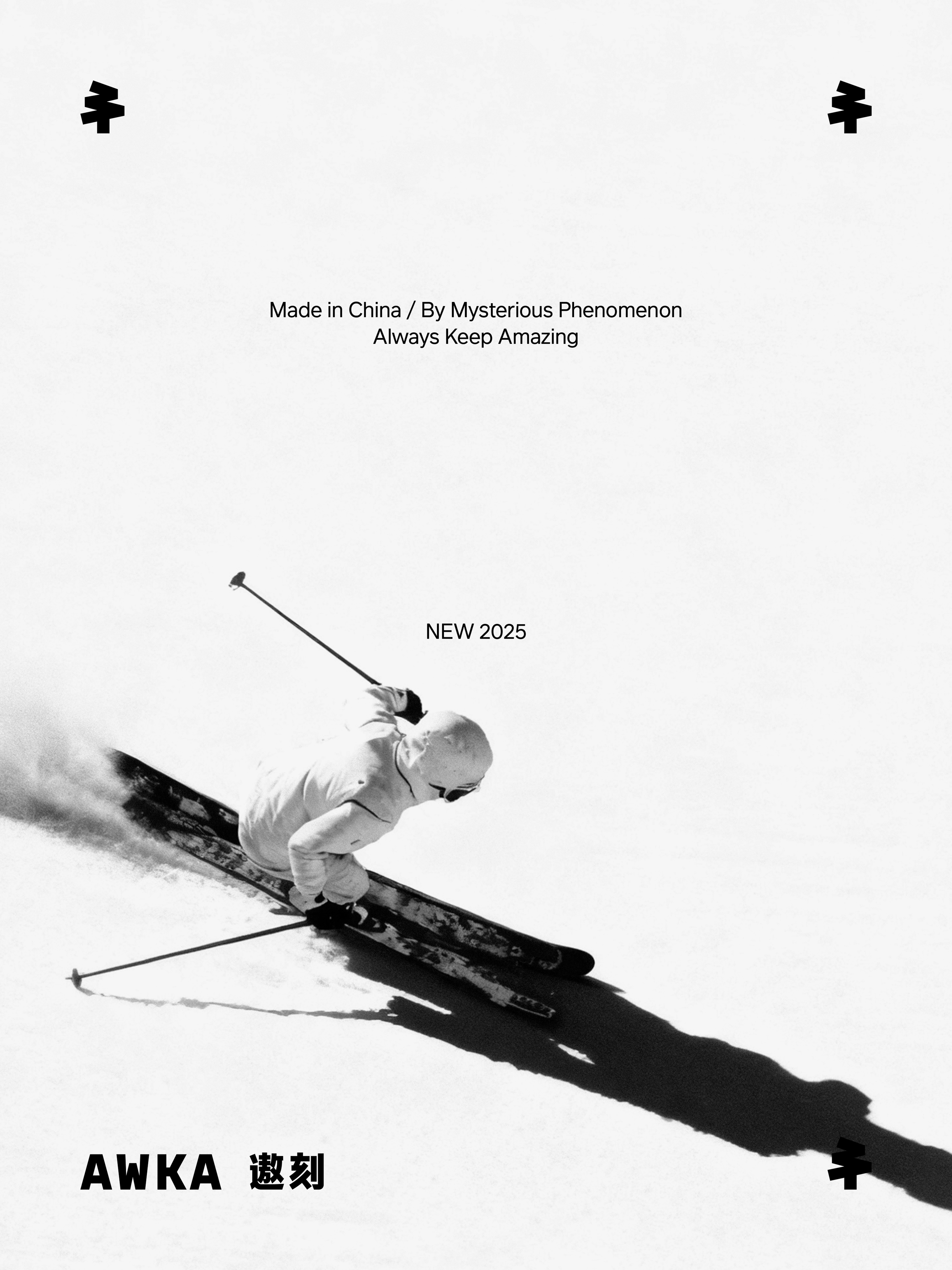
During the brand upgrade, we respected the client’s existing visual memory. The original AWKA logo featured three trees, a symbol from its early identity. We continued the idea of “trees,” refining three into one to create a form that feels more focused and powerful. The concept of “three” was transformed into the shape of the number 3 within the tree crown, preserving recognition while giving it a new layer of meaning: a zigzag ski trail that resonates with both nature and motion.
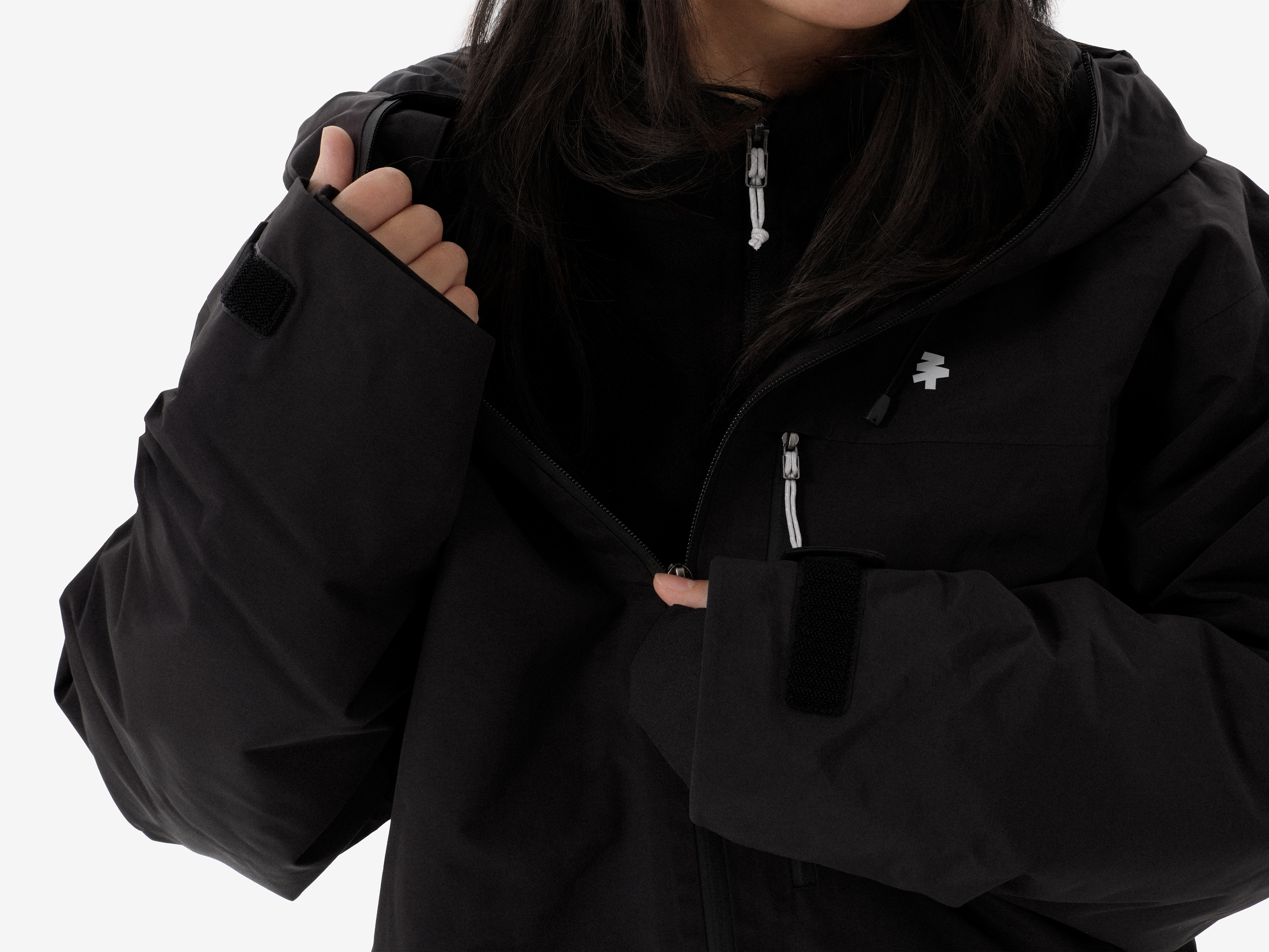
The typography and logotype follow a minimalist, modern aesthetic. The strokes are sharp and precise, reflecting the sense of speed that defines skiing itself. There are no unnecessary decorations, only clean lines that convey rhythm and strength. This calm and refined visual language expresses the aesthetic attitude AWKA wants to share.
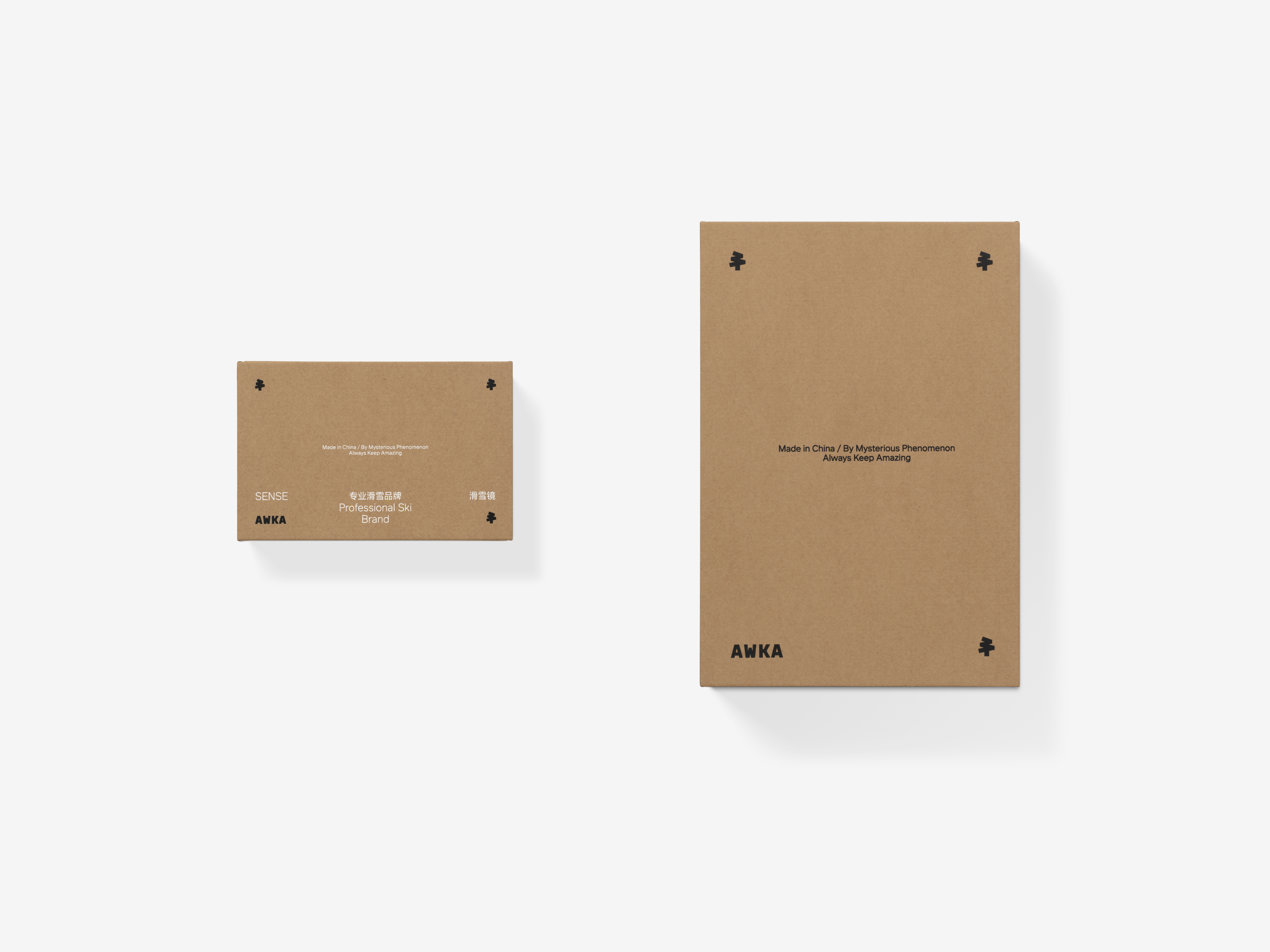
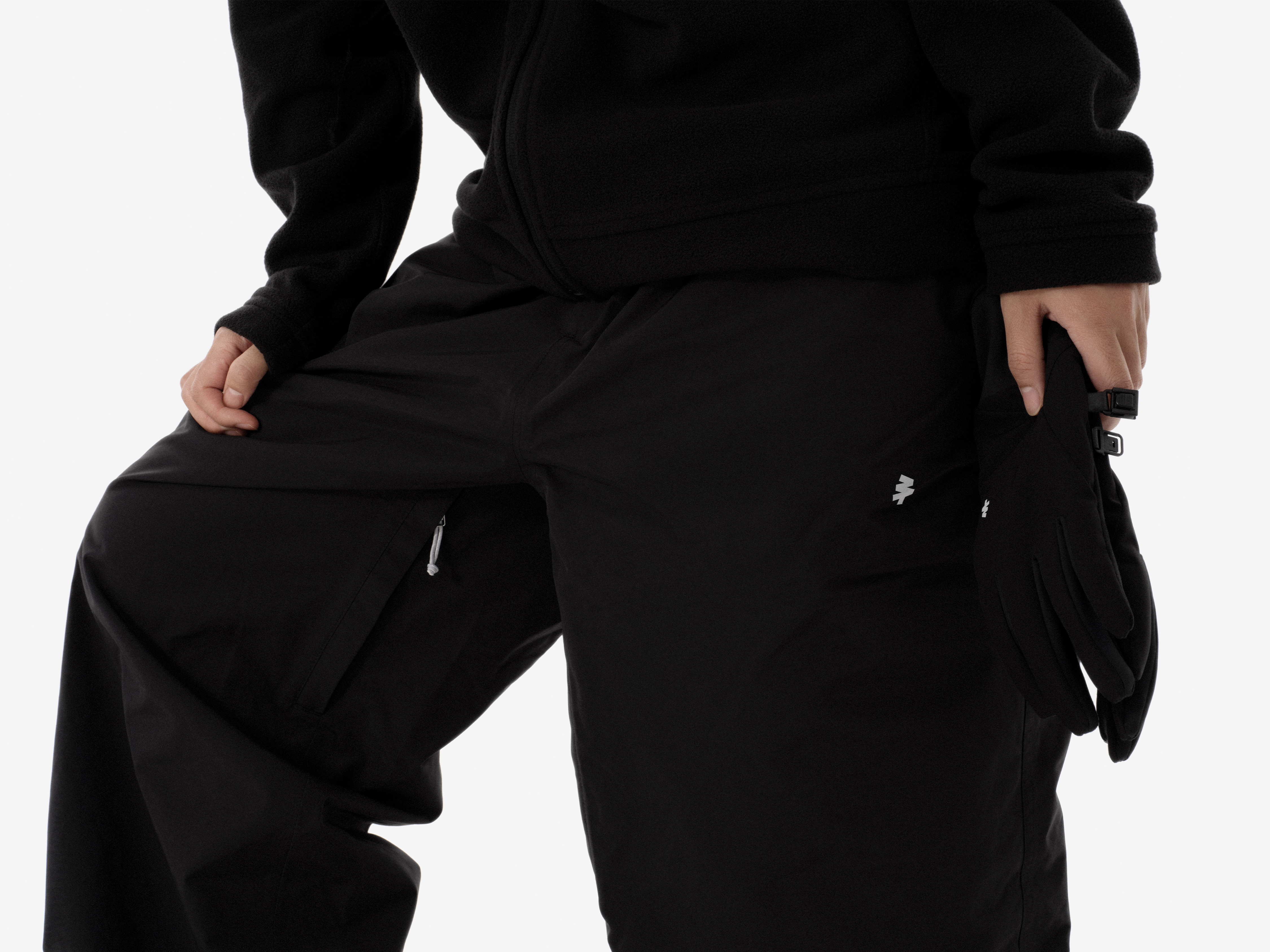
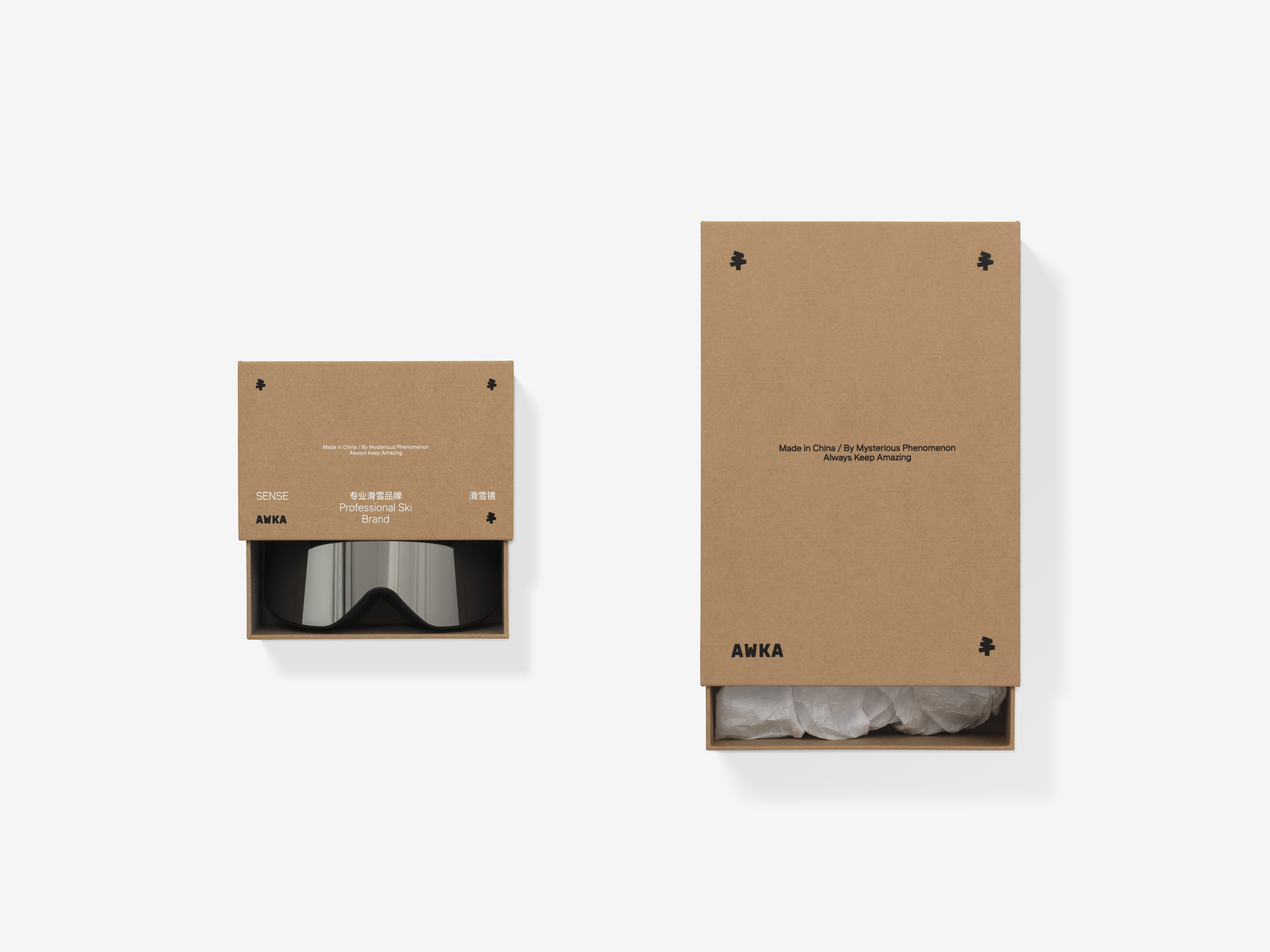
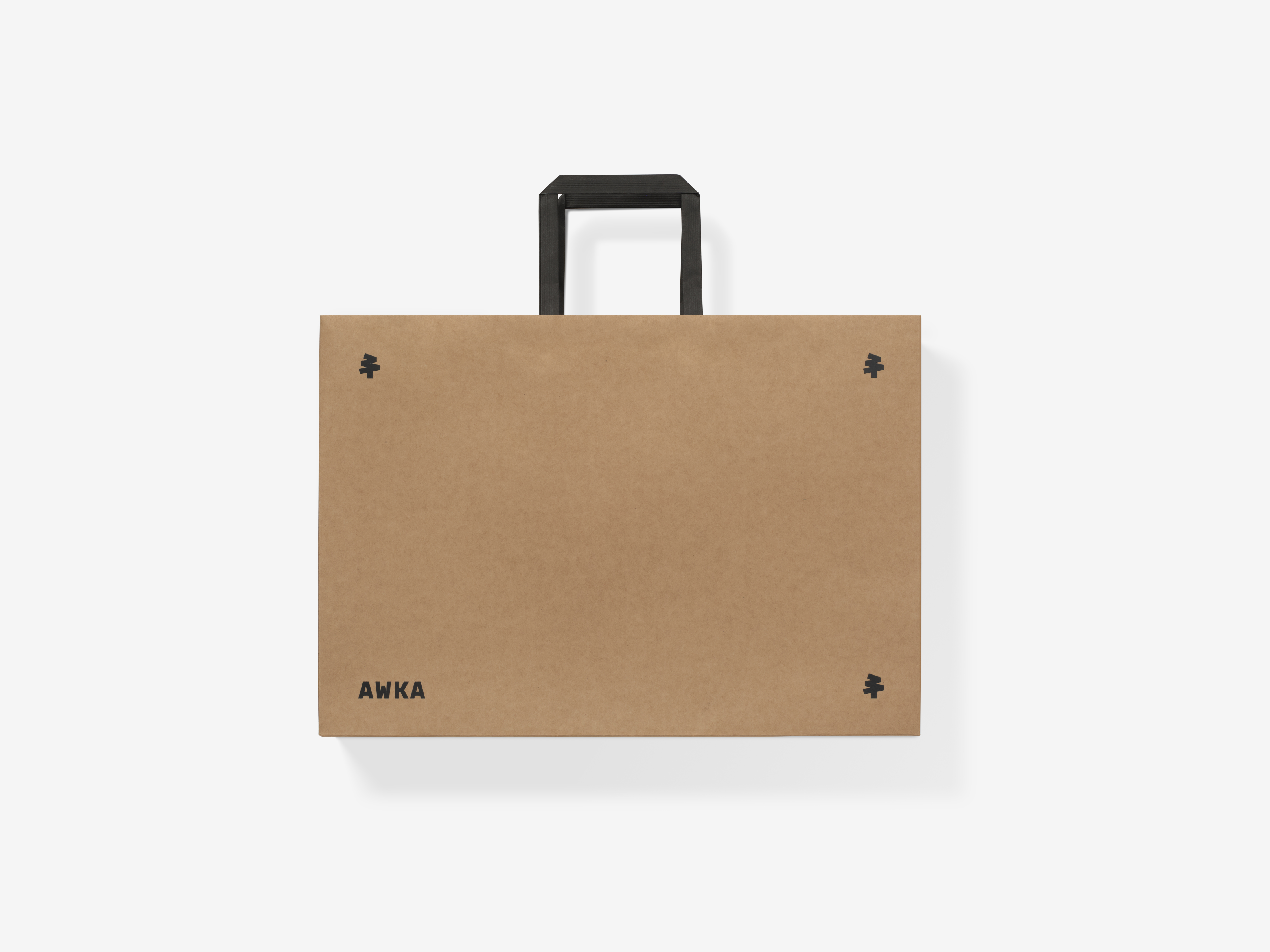
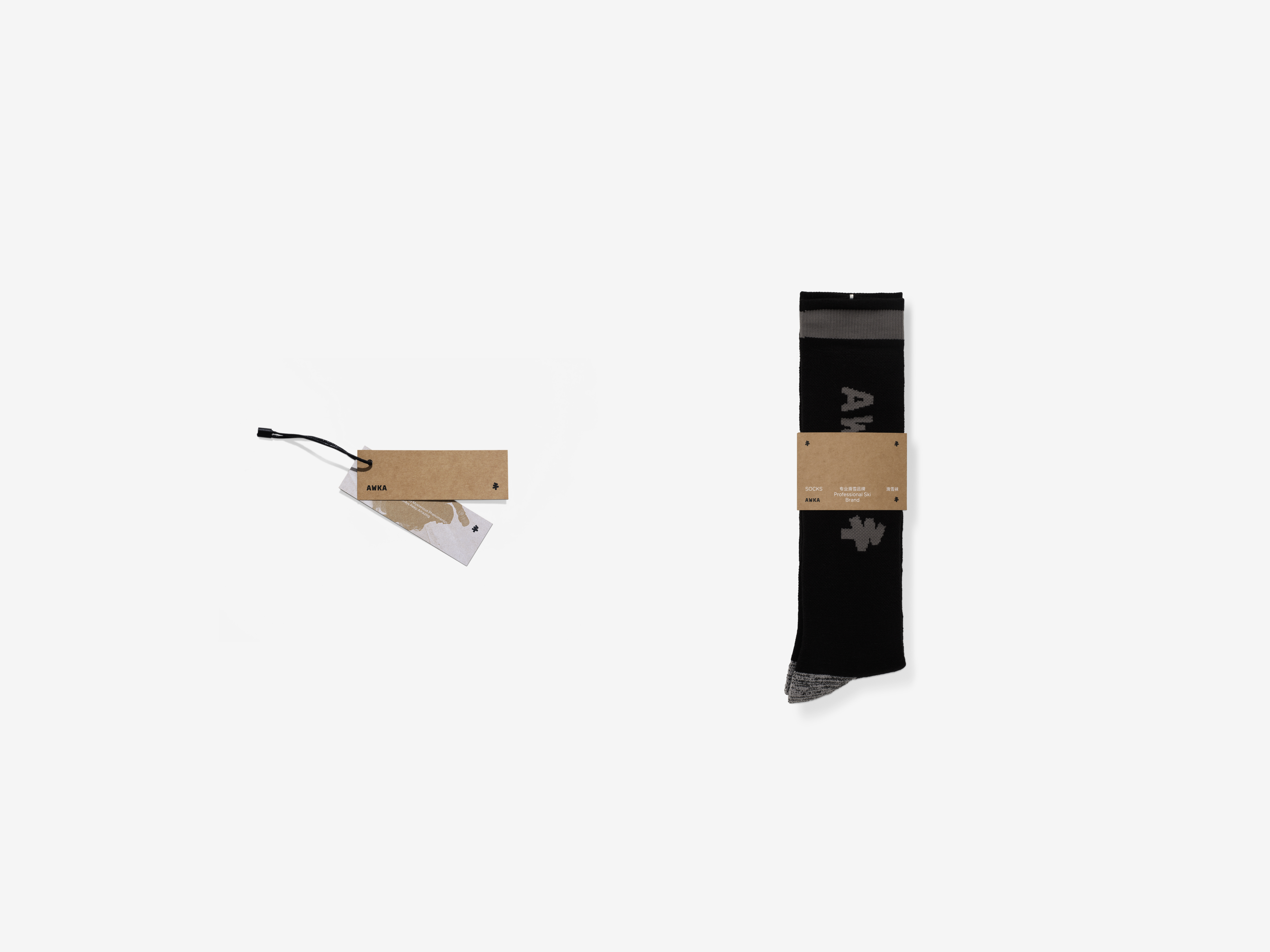
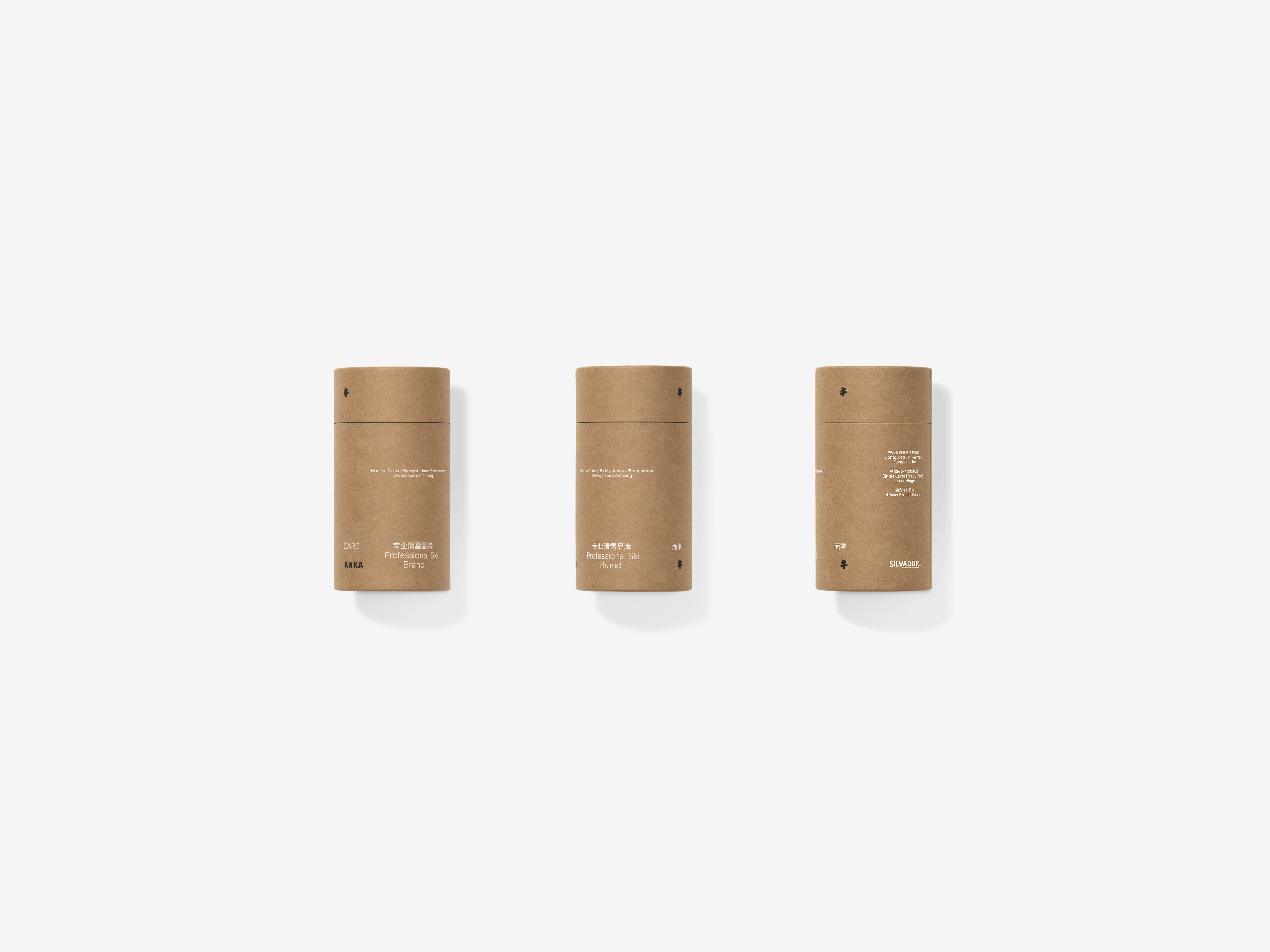
In application, the brand system extends naturally across apparel, gear, and other materials. From garment labels to slope-side signage, the concise graphics and restrained layouts maintain a consistent sense of professionalism. When consumers encounter AWKA, what they experience is not only a clear visual identity but also a credible sense of order and confidence.
AWKA’s design is more than a logo. It is a promise to accompany every skier in finding their own balance between the passion of movement and the calm of the mind.
During the brand upgrade, we respected the client’s existing visual memory. The original AWKA logo featured three trees, a symbol from its early identity. We continued the idea of “trees,” refining three into one to create a form that feels more focused and powerful. The concept of “three” was transformed into the shape of the number 3 within the tree crown, preserving recognition while giving it a new layer of meaning: a zigzag ski trail that resonates with both nature and motion.
The typography and logotype follow a minimalist, modern aesthetic. The strokes are sharp and precise, reflecting the sense of speed that defines skiing itself. There are no unnecessary decorations, only clean lines that convey rhythm and strength. This calm and refined visual language expresses the aesthetic attitude AWKA wants to share.
In application, the brand system extends naturally across apparel, gear, and other materials. From garment labels to slope-side signage, the concise graphics and restrained layouts maintain a consistent sense of professionalism. When consumers encounter AWKA, what they experience is not only a clear visual identity but also a credible sense of order and confidence.
AWKA’s design is more than a logo. It is a promise to accompany every skier in finding their own balance between the passion of movement and the calm of the mind.
AWKA 是一个为专业滑雪运动员及滑雪爱好者提供全方位专业装备解决方案的滑雪品牌。在雪场上,装备不仅是防护工具,更是身体与运动、速度之间最直接的媒介。AWKA 极为关注这种贴近身体的真实感受:在冰雪世界中保持自由,同时获得可靠的支撑。
在品牌升级过程中,我们尊重了客户原有的视觉印象。AWKA 的标识最初由三棵树组成,这是品牌早期的独特记忆。我们延续了“树”的概念,但将三棵树凝练为一棵树,使图形的表现更为集中、更有力量。同时,我们将“三”的概念转译为数字“3”的造型,作为树冠的核心元素,不仅保持了品牌原有记忆点,也赋予了全新隐喻:之字形的滑雪雪道,凝聚成自然与运动之间的共鸣。
字体与标识的设计语言保持了极简与现代的风格。笔画凌厉、直爽,仿佛滑雪这一运动本身具备的速度体验。它没有多余的装饰,而是用最直接的线条去刻画力量与节奏。这种冷静而锐利的视觉性格,也是 AWKA 希望传递给客户的美学感受。
在应用层面,AWKA 的品牌形象可以灵活延展于服饰、装备及其他周边物料上。无论是服装标签还是雪场广告,简洁的图形与克制的版式都能维系一致的专业性。消费者在接触 AWKA 产品后,收获的不仅是一种明确的穿搭风格,还有可被信服的专业秩序感。
AWKA 的设计,不只是一个符号,而是一项承诺:陪伴雪友们在运动的激情与心灵的安宁间找到属于各自的平衡。


All Images Copyright © 2025 ABCD. All Rights Reserved